lucsal.it, by Luca Salvemini
lucsal.it, how it’s made: a portfolio that moves like a cartoon
Luca Salvemini’s portfolio, a web developer from Brescia, is black, lime and pink and behaves like a cartoon: a star that explodes, letters that jump, eyes that follow you, tools that fall and can be thrown. We take it apart with three demos rebuilt from scratch.
The palette
- #141414black
- #F7F6EBcream
- #CEFF00lime
- #FF3EBApink
- #4A60FFblue
- #31A362green
Tap a colour to copy its code.
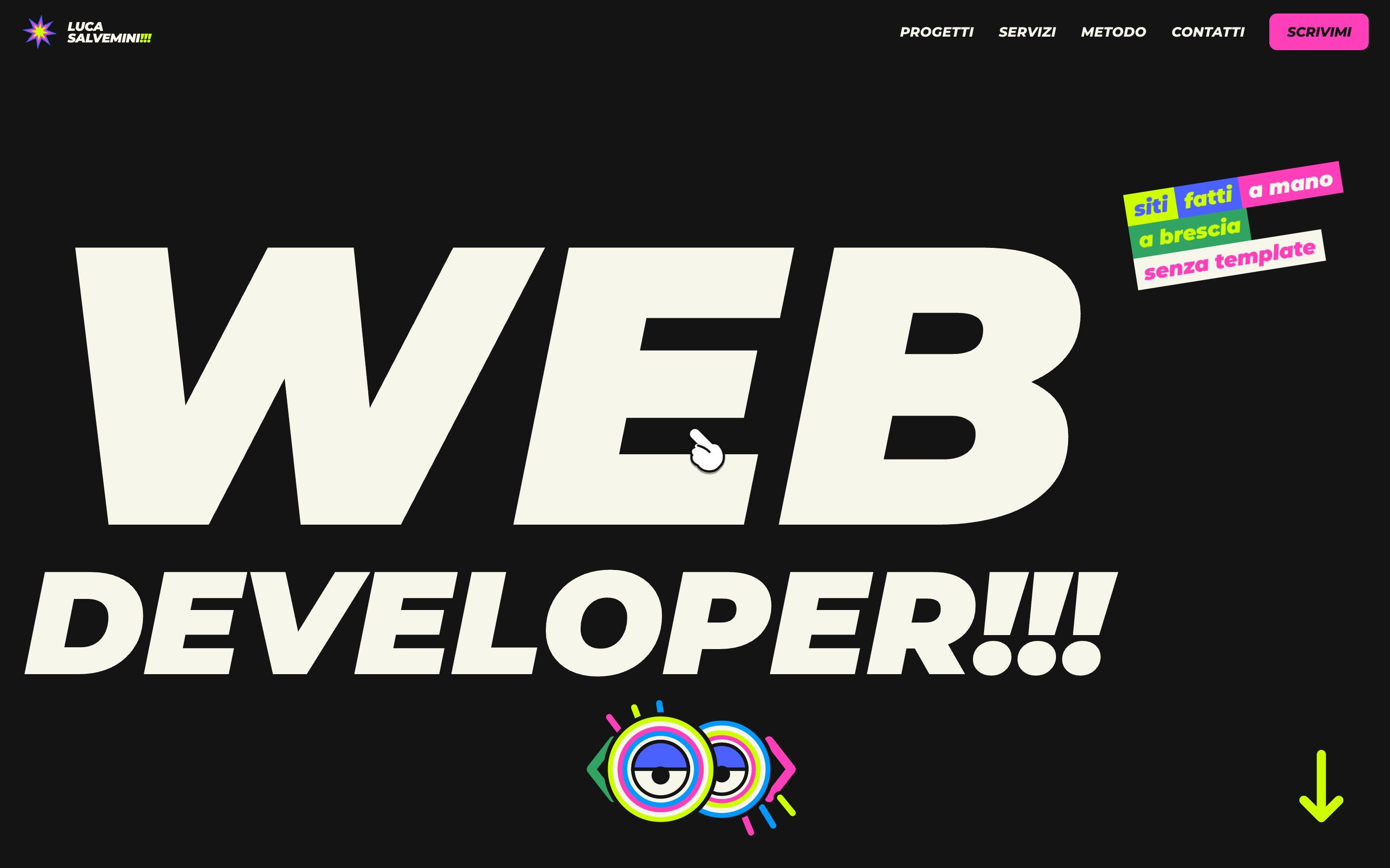
lucsal.it is the portfolio of Luca Salvemini, a web developer working in Brescia who promises, with three crooked stickers next to the title, handmade websites with no templates. The site is black and cream, with four loud colours: lime, pink, blue and green. Titles are set in a black italic grotesque, text in a rounded sans, and there are stickers everywhere.
What sets it apart is the character of its motion. Almost nothing just slides: things squash, bounce, have weight, can be picked up. It is cartoon physics applied to a website.
There is no framework underneath: a single page in HTML, CSS and one 36 KB JavaScript file. The work is done by GSAP 3.13 with ScrollTrigger, SplitText, Draggable and Inertia, Lenis for smooth scrolling and Matter.js for physics.
Here we take it apart in three moments. For each one there is a demo rebuilt from scratch with our own graphics: from the site we took the idea and the rhythm, never the code or the images.
The star that explodes and the letters that jump
The site opens with an eight-pointed star made of six stars one inside the other, one per colour, plus a small cream star in the middle. The layers grow from zero turning forty-five degrees, twist, then the star explodes: it grows sixteen times while spinning, fills the screen and the curtain fades. From below the title letters rise, the top bar arrives, the stickers slap in and two big eyes appear under the title.
The title is the best part. Moving the mouse over a letter makes it do a cartoon jump: it squashes and widens, rises a fifth of its height, tilts up to twelve degrees and takes a random colour from the palette; then it falls back on an elastic curve and returns to cream. The two neighbouring letters on each side rise slightly, fifty and a hundred milliseconds later, like a wave.
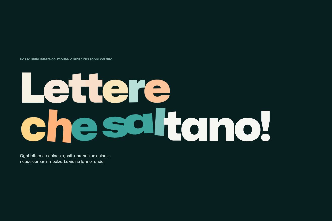
Our version also works with a finger. On the site the jump only responds to the mouse; with ours you just swipe sideways across the title, and the letter under your finger jumps. The trick is to find it with elementFromPoint on every move, because on phones the touch stays attached to the first element touched.
The tools that fall
In the method section there is a cream box. When it enters the screen, seventeen pills with the names of the tools the author uses every day fall from above, bounce on the bottom and pile up crooked. You can grab them with the mouse or a finger and throw them. It is Matter.js: each pill has an invisible body with the same shape, and on every frame the pill copies its position and rotation.
A craftsman’s detail: every body’s inertia is multiplied by two and a half. The pills tilt but rarely flip, so they stay readable even in a heap.
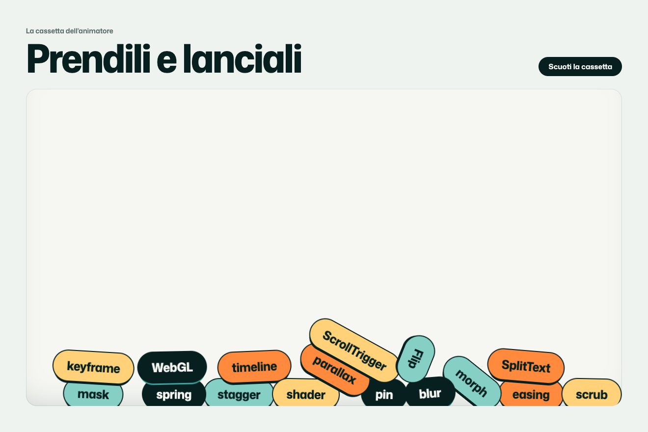
In ours the tools are the words of animation (easing, stagger, scrub, morph) and we added a button that shakes the box. The physics advances in fixed steps of a sixtieth of a second, independent of frames, and stops when the box leaves the screen.
The cards that stack
The method is told by four coloured cards: lime, pink, blue and green. They are sticky cards, each stopping sixteen pixels lower than the previous one. As the next card rises, the one below shrinks to 0.93, tilts by about a degree and a half and darkens, like a sheet ending up under the pile. When a card arrives, its illustration comes alive: speech bubbles popping, a pencil tracing an interface, lines of code writing themselves, a star saying «online».
There is a precaution in the code worth copying: the triggers are not attached to the cards, but to a zero-height element placed before each one. A sticky card changes position while it is stuck, and calculations based on it would go wrong.
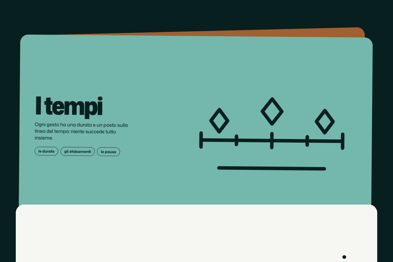
Our cards tell how an animation is born and have line drawings that trace themselves: every line starts hidden by its stroke-dashoffset and draws itself when the card reaches its place.
The other details
The rest of the site is full of characters. The cursor is a pointing cartoon glove: it tilts with speed, grows on clickable elements and squashes on click, and only appears with a real mouse. The big eyes under the title follow the pointer and blink at random, every two to six seconds; on phones they look around on their own.
The intro numbers arrive like stickers slapped on a table and count up from zero. The projects are a list of giant names: with a mouse, a round bubble with a preview of the site follows the pointer. Two ribbons of coloured pills speed up as you scroll and each pill flips over as you pass. In the contacts a typewriter writes a sentence, waits, deletes it and writes another, never the same twice in a row; next to it, a pile of stickers can be dragged and thrown, with a finger too.
Where it stumbles
The loader lasts about three seconds and comes back on every visit, even on reload. The first time it is a presentation, the fifth time it is a wait: remembering that you have already seen it would be enough.
The actual page is light: on first load HTML, styles, scripts, images and fonts weigh about 330 KB. But the services section has three videos that play on their own, about twenty megabytes in total, and the browser starts downloading them straight away. In our tests, in the first ten seconds and without scrolling, the page had already downloaded almost three megabytes of video. The fonts come from Google Fonts: in Europe it is better to serve them from your own domain.
On phones something gets lost. The bubble with the project previews only exists with a mouse, so the work showcase becomes a list of names without images. The title letters do not jump. And the sticker pile in the contacts, designed for a wide screen, turns into a tight heap where the stickers cover each other.
What we take away
The lesson is character. Every gesture here follows cartoon principles: squash and stretch, overshoot, weight, inertia. Put together they give a website a personality people remember. And small tricks are enough, a random colour or tilt, to make the same interaction never quite identical twice.
The effects
- Jumping lettersPassing over the letters, each one does a cartoon jump: it squashes, rises, takes a colour and falls back with a bounce. Its neighbours make a wave.Free
- Falling toolsTool pills fall into a box with real physics: they bounce, pile up, and can be grabbed with the mouse or a finger and thrown.Lifetime
- Stacking cardsAs you scroll, each card stops at the top and the next climbs over it: the one below shrinks, tilts and darkens, and each drawing traces itself.Lifetime