Journal
How it’s made: animated websites we love, taken apart piece by piece, with demos rebuilt from scratch.
- ESR Bespoke, by Nightjar
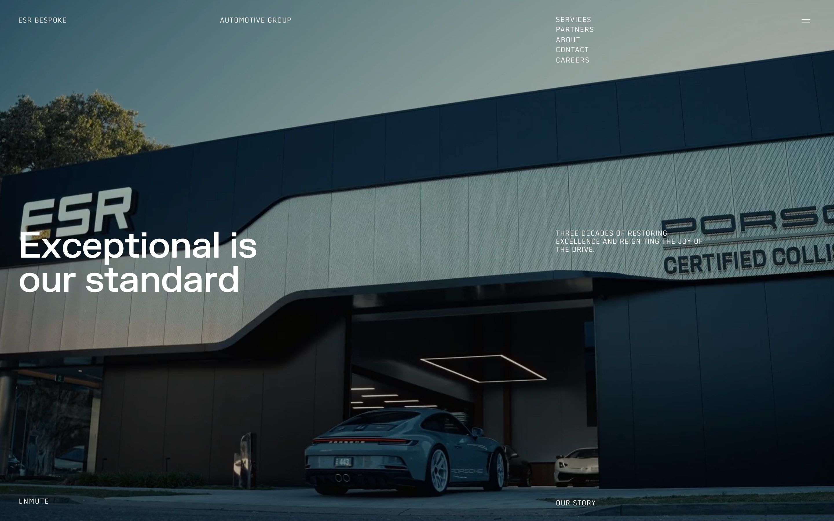
ESR Bespoke, how it’s made: the gallery where the next photo follows the mouse, the menu that types itself in steps and the marques that light up as you scroll
ESR Bespoke is the Sydney body shop that repairs luxury cars, from Porsche to Rolls-Royce, and its site is only black and white, with the photos of the cars bringing the colour. The type lights up letter by letter in steps, like a teleprinter; in the gallery the next photo chases the mouse and opens full screen on click, the menu rises like a white sheet, and the twelve marques light up one at a time as you scroll. We take it apart with three demos rebuilt from scratch.
- PSP Production, by Lynksen, Ross Burylo
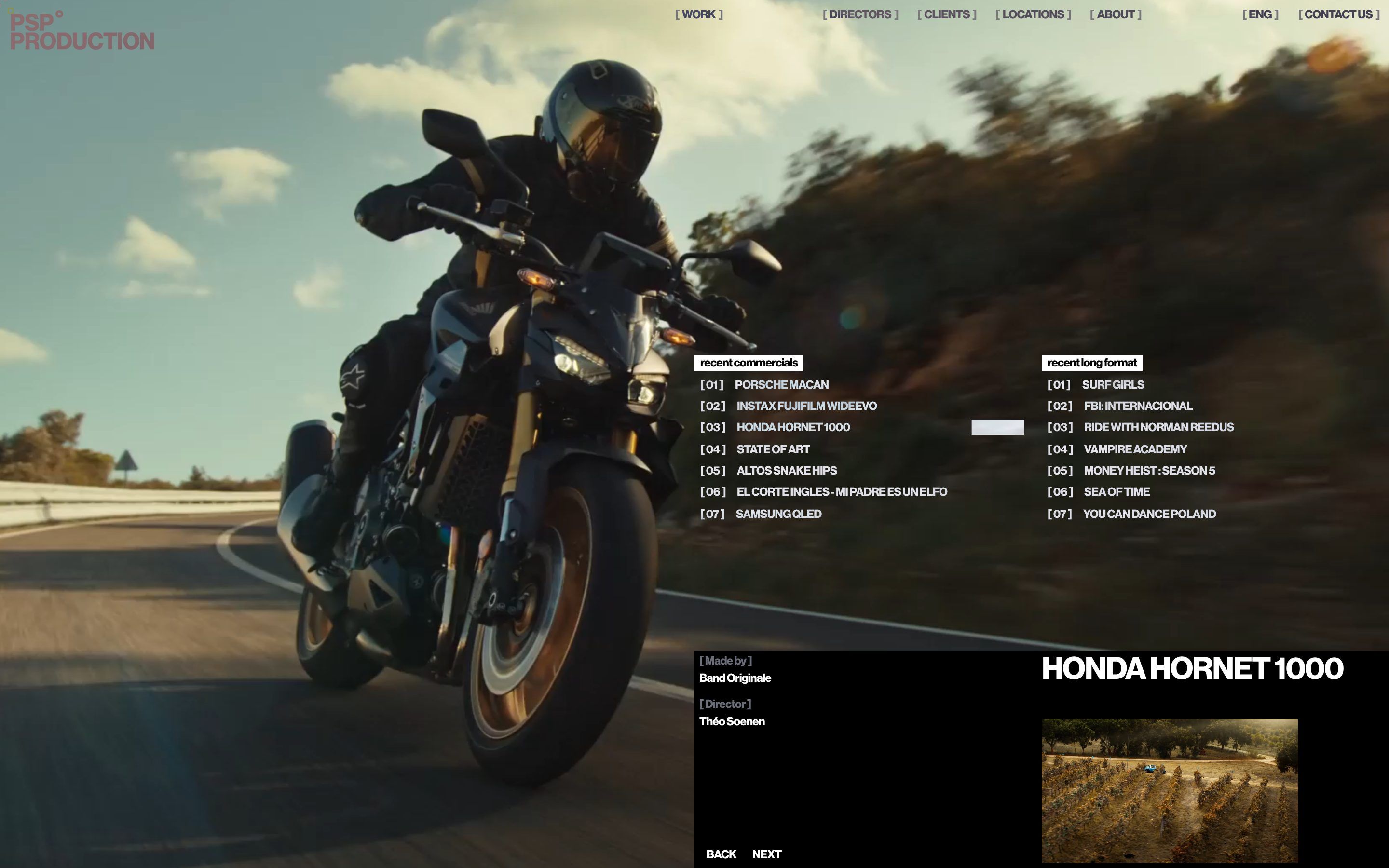
PSP Production, how it’s made: the film that opens from the centre with a colour grade, the list items that feel which side you come from and the three-wave curtain menu
PSP Production runs film, series and commercial shoots in Portugal and Spain, and its site is a magenta pink that moves like a lava lamp, with the black of the brands and a single mint green. On the first screen the works play by themselves and each new film opens from the centre with a flash of film-stock colour; the list items light up from the side the mouse comes in, and on the phone the menu drops like a curtain in three waves. We take it apart with three demos rebuilt from scratch.
- Sweet Tape, by bikebear
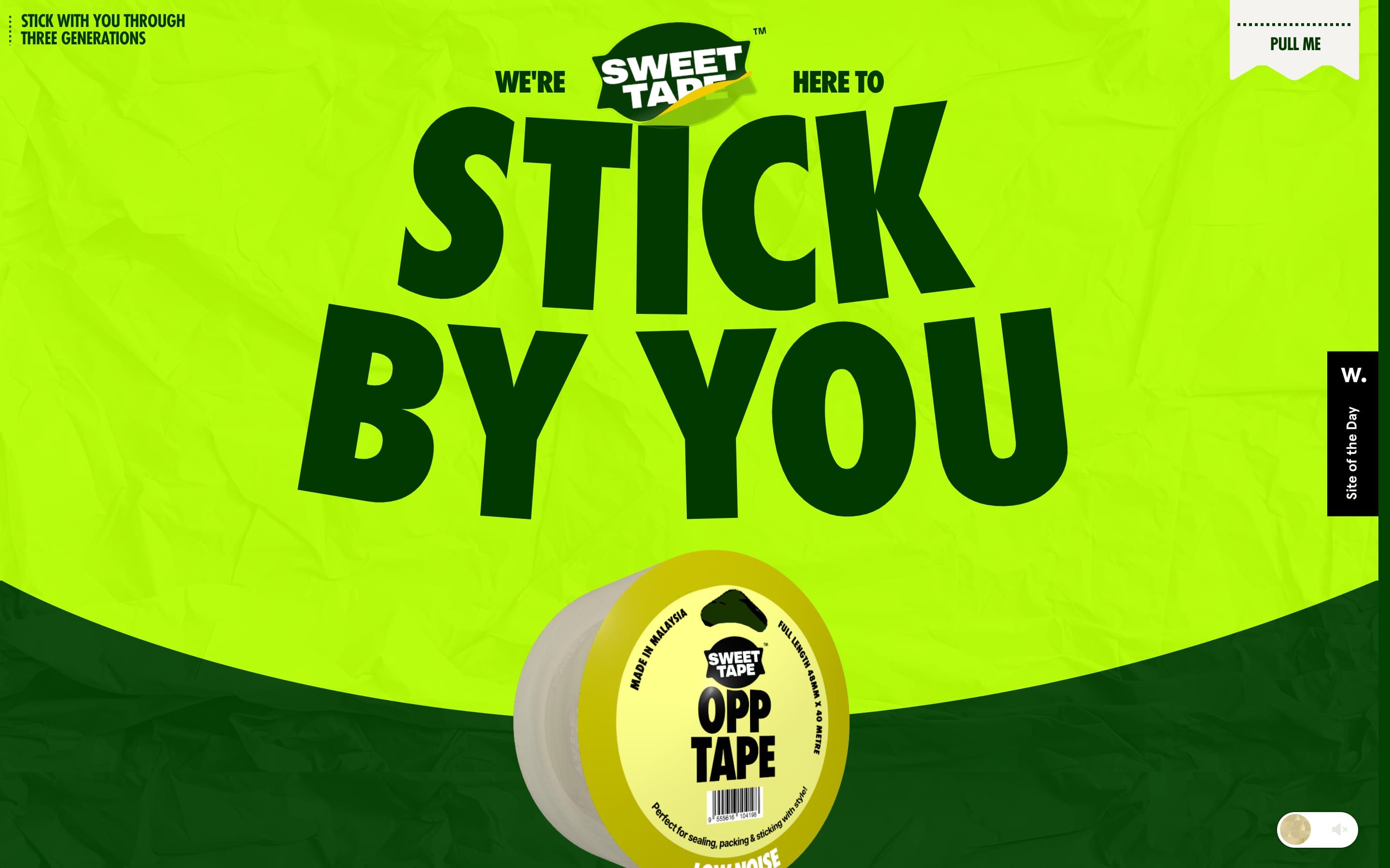
Sweet Tape, how it’s made: the tape strip that peels, the curved curtain between tapes and the rolls that fall into the footer
Sweet Tape makes adhesive tape in Malaysia, six tapes and one for every job, and its site is lime and forest green, with a roll that pulls out its strip as you scroll. The strips of tape on the photos peel off and stick back, a curved curtain brings the new colour when you change tape, and in the footer the rolls fall, bounce and can be thrown with the mouse. We take it apart with three demos rebuilt from scratch.
- Creative Reference Library, by Josh Bendall, S•BJ
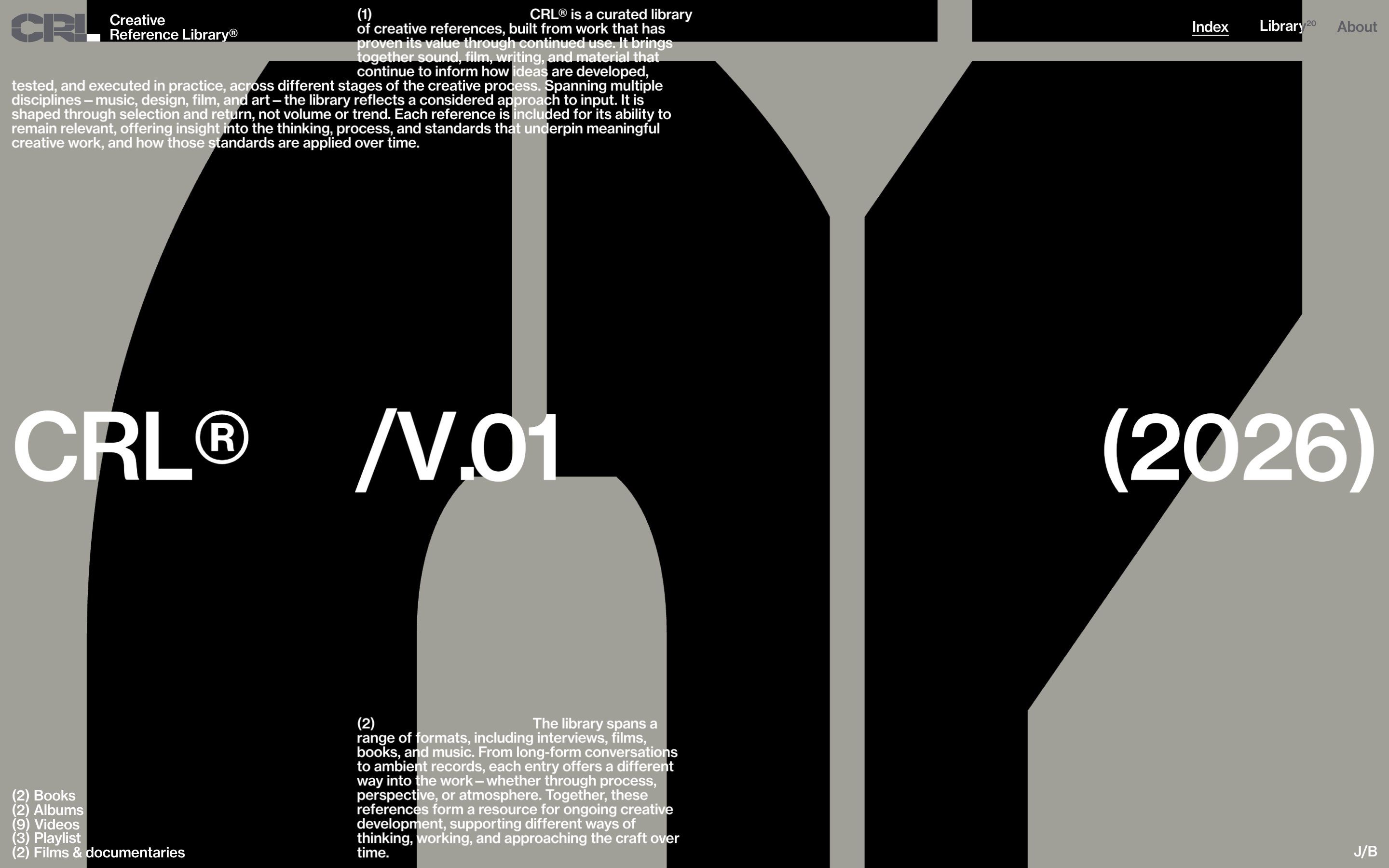
Creative Reference Library, how it’s made: letters that break into blocks, the polaroid wheel and the letter that becomes the curtain
CRL® is a curated library of creative references, records, films, books and writing, and its site is stone grey, black and white, with three giant letters scrolling behind everything. Under the pointer they break into blocks, in the library twenty photos turn on a huge wheel, and to go in, a letter grows until it covers the screen. We take it apart with three demos rebuilt from scratch.
- Henrietta Said, by Tattoo Digital
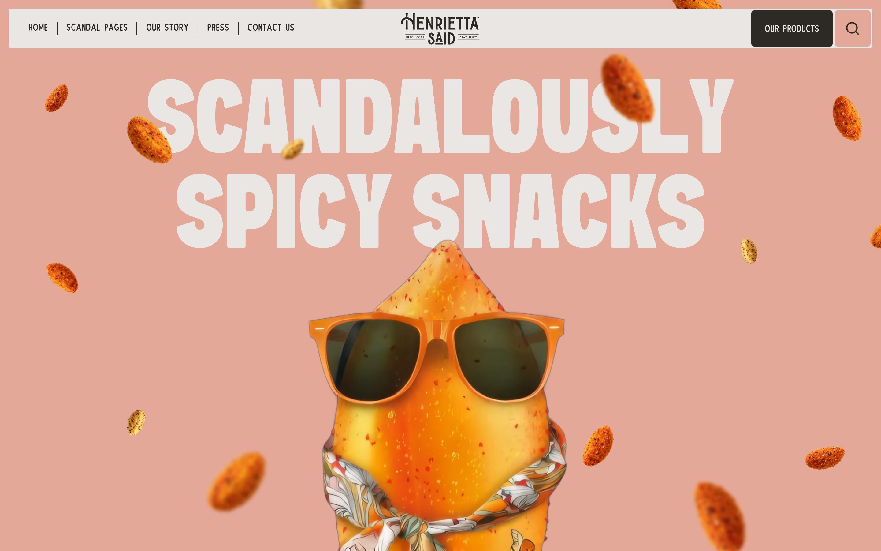
Henrietta Said, how it’s made: flavours that spin on scroll, the review that becomes the page and the badge that goes round
The site of Henrietta Said, peanuts spiced like hot chicken wings, is blush pink, huge and a little cheeky: the bags fly off spinning, the reviews flip over into the next section, the round buttons turn once and a quarter. We take it apart with three demos rebuilt from scratch.
- Star Party Silverlake, by Hayda Studios
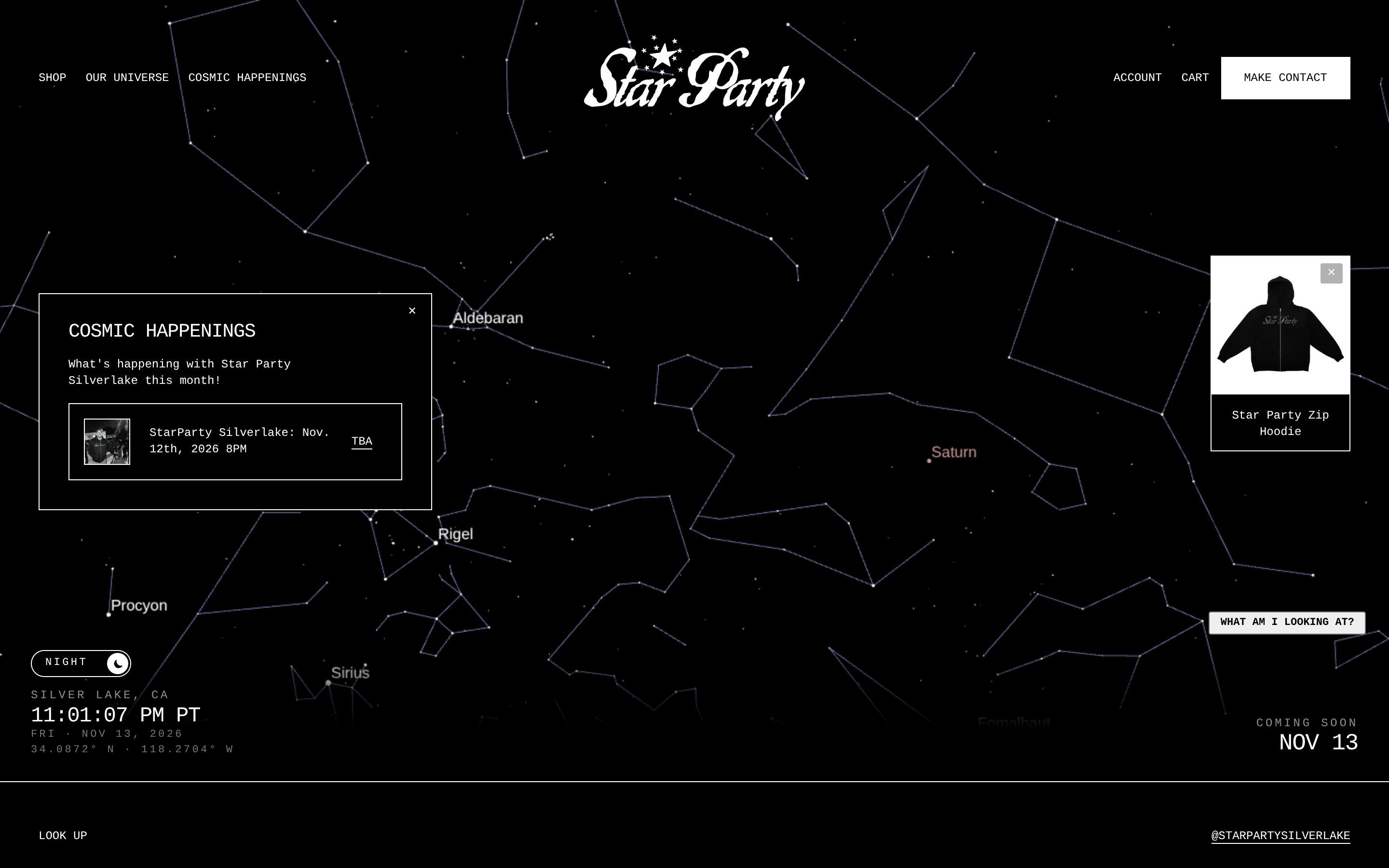
Star Party Silverlake, how it’s made: the real sky to drag, the page that follows the sun and the Windows 98 window
The site of Star Party Silverlake, an astronomy night that brings telescopes to a Los Angeles neighbourhood every month, opens on the sky of that very moment, and turns white when the sun rises there. We take it apart with three demos rebuilt from scratch.
- Polpharma Biologics, by Widelab
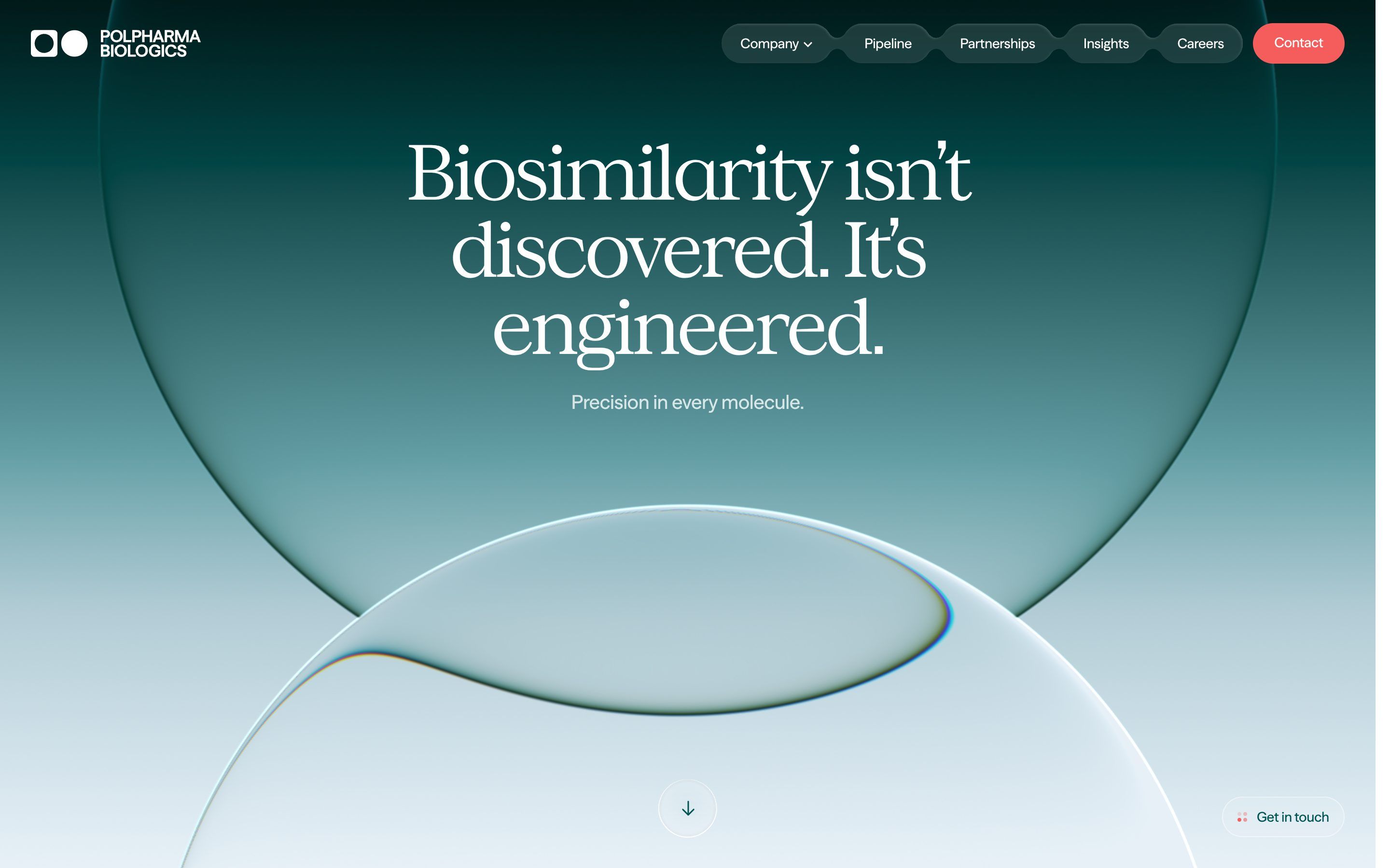
Polpharma Biologics, how it’s made: the two glass lenses on the gradient, the title that flies into the label and the page that rises like a sheet
The site of Polpharma Biologics, a company that develops and makes biosimilar medicines, opens on two large glass bubbles bending a deep teal gradient, and then tells its work entirely on scroll. We take it apart with three demos rebuilt from scratch.
- Aspen Search, by Edoardo Lunardi, Elliott Mangham, Louis Saville
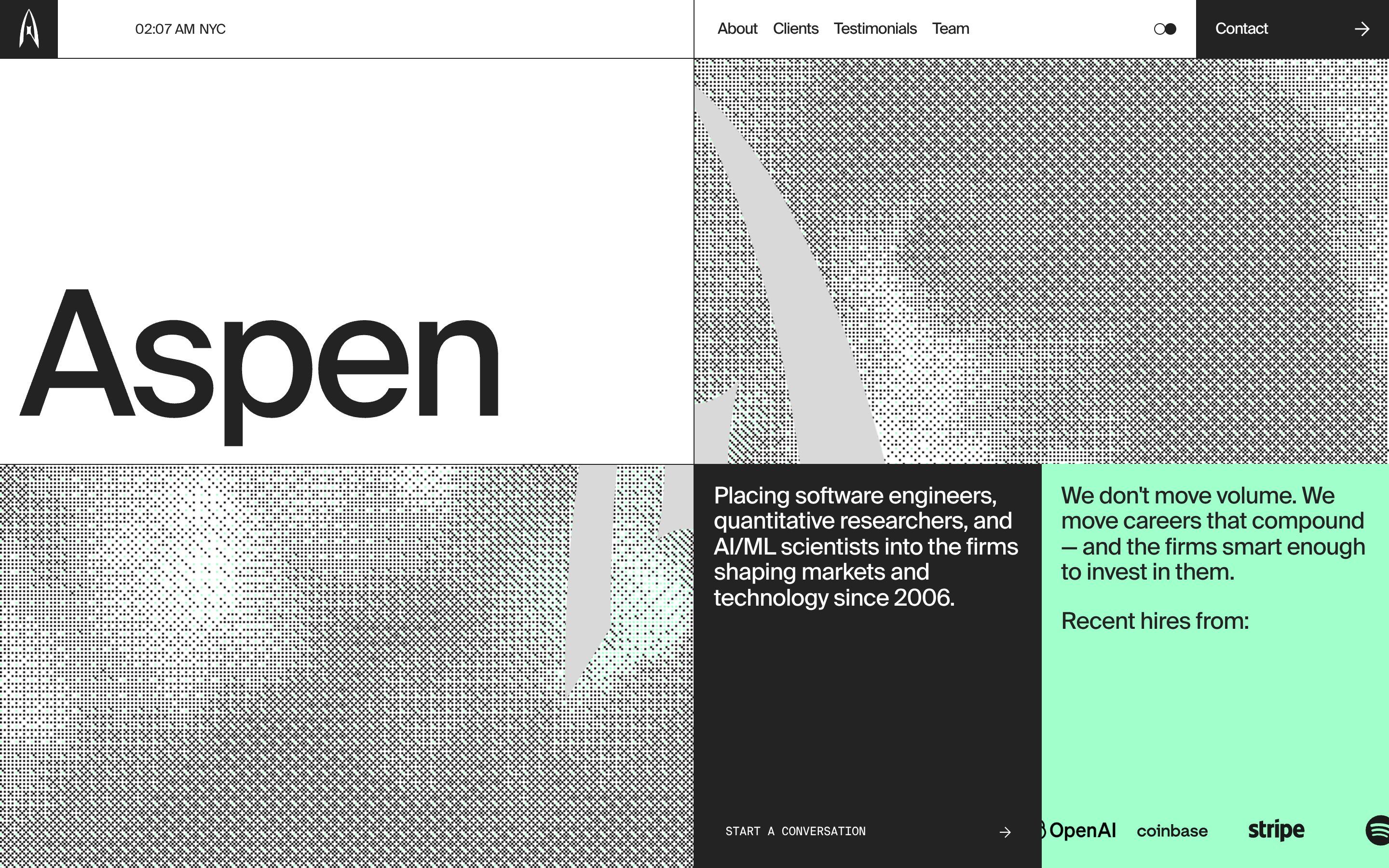
Aspen Search, how it’s made: the dithered ground with the mint smoke, the clock that changes city and the ellipses that make a sphere
The site of Aspen Search, a firm that finds engineers and researchers for quant funds and tech companies, is a black and white grid whose empty cells open onto a ground of dots, like an old one bit screen, where the pointer leaves a mint coloured smoke. We take it apart with three demos rebuilt from scratch.
- Why Zero, by Sindhur Dutta, Zero
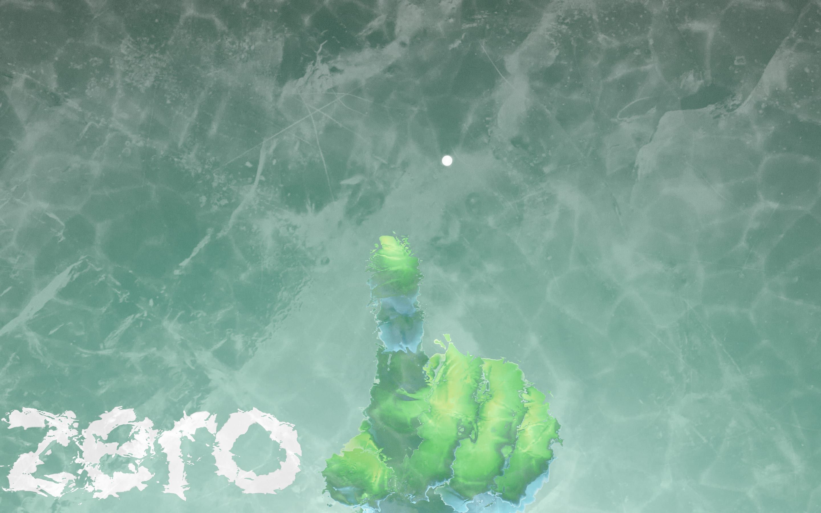
Why Zero, how it’s made: the frosted glass that opens when you draw a zero, the stage ruler and the words that light up out of the fog
Zero University’s site tells, on a single page, why a degree is not enough to get hired, and it does so without a line of text in the page: a frosted pane to wipe with a finger, a zero to draw to get in, a ruler counting the years before Zero and sentences that light up out of a fog of noise. We take it apart with three demos rebuilt from scratch.
- Vero, by Rodéo studio, plutot.cool
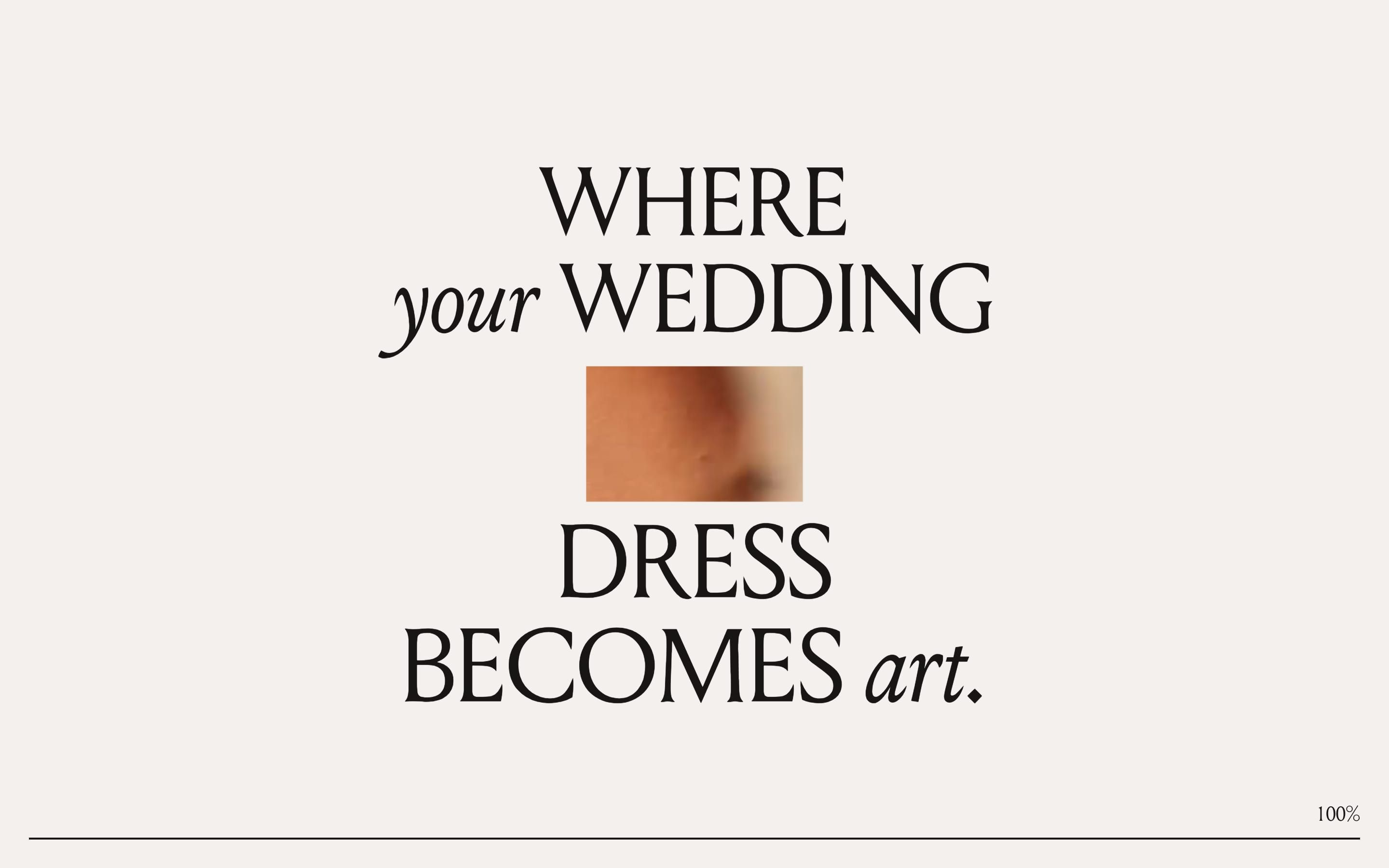
Vero, how it’s made: the sentence that opens into a window, the logo that inks itself from its thickest strokes and the coin that parts the quote
The site of a New York studio that turns wedding dresses into sculptures tells everything with very few things and a lot of care: a sentence that steps aside to make room for a window onto the video, four letters that grow from their bones in WebGL, and a silver coin that falls on scroll, opening every line of a quote. We take it apart with three demos rebuilt from scratch.
- Hearst Exhibit 2026, by OSMOS, HearstCC, Edoardo Lunardi, Daniel Velasquez, Marjoe Bacus
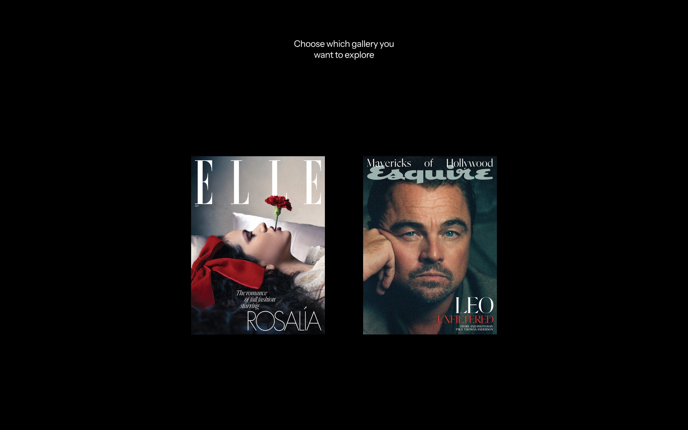
Hearst Exhibit 2026, how it’s made: the photo that folds like paper, the gallery that becomes a row of pages and the signature that writes itself
The site of the ELLE and Esquire photography exhibition treats every picture like a real print: as the mouse passes the paper lifts, on click it folds from the corner and flies to the middle turning like a page, and when the grid becomes a row every photo arrives turning over. Before all that, the title comes in piece by piece and the word «and» writes itself by hand. We take it apart with three demos rebuilt from scratch.
- Explore Primland, by Outpost, Ingamana, Robbin Cenijn, Robert Borghesi, arpeegee, Matyas Sochor
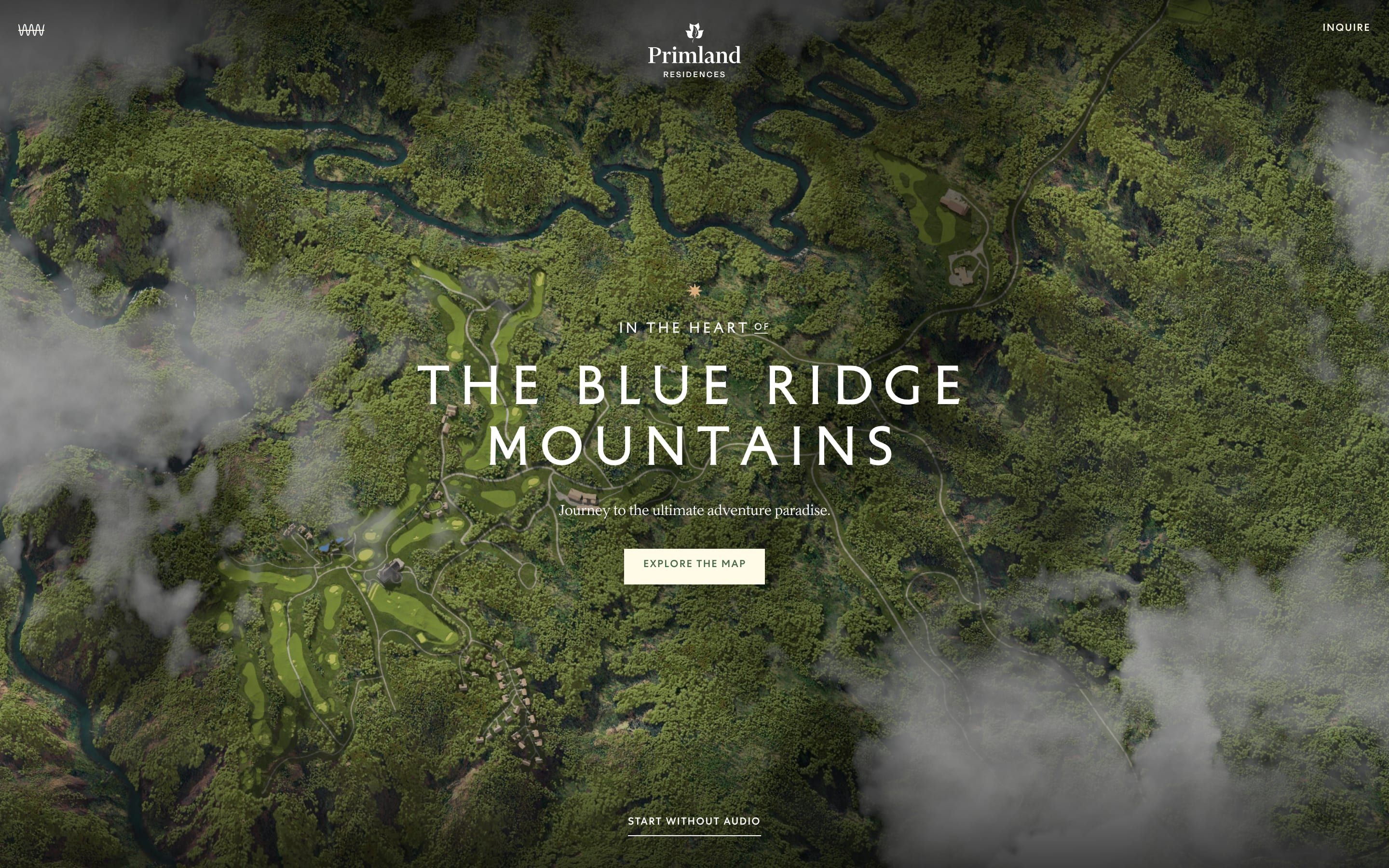
Explore Primland, how it’s made: the season change in patches, the map points that turn into a lens and the pill-shaped area menu
The site of the Primland residences isn’t scrolled: it’s explored. It is a map of the Blue Ridge Mountains seen from above, with clouds drifting by and the resort’s places to click. On top of the scene there is a switch that changes the season in patches, from the centre, with a glowing line on the front, points that turn into a lens on the ground, and a pill that opens the area menu and carries you from one to the next behind a curtain. We take it apart with three demos rebuilt from scratch, all in two dimensions.
- Champions for Good Club, by Double Play
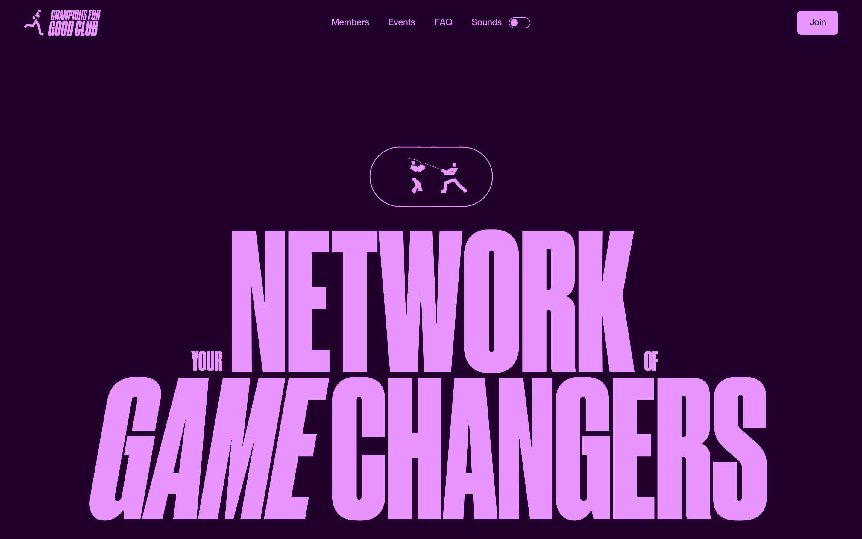
Champions for Good Club, how it’s made: the fanned plan cards, the sounds that follow the scroll and the three circles between pages
The site of the German club that brings athletes, founders and investors together looks like a sports poster: huge narrow headlines, four colour pairs, little figures running about. Underneath there is a deck of plan cards that drags all at once, a Sounds switch that gives every sport its own sound and turns it up and down with the scroll, and three circles that swell on every change of page. We take it apart with three demos rebuilt from scratch.
- The Agency of Love & Logic, by The Agency of Love & Logic, Stas Bondar
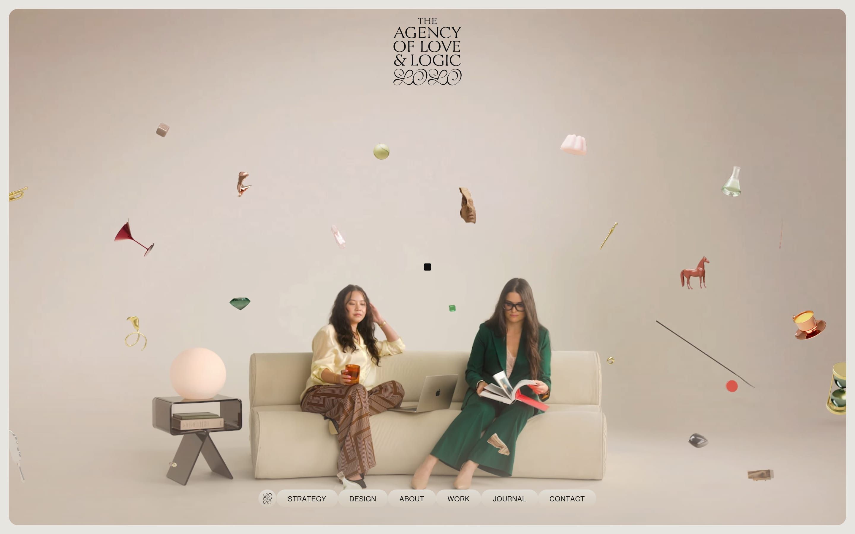
The Agency of Love & Logic, how it’s made: the split case study that follows the mouse, the toggle that calls on a spring and the two columns of work running backwards
The site of the Toronto brand agency, rebuilt for its change of name, splits every project into two sides: a border between the columns that moves with the mouse, a Love and Logic pill that gets noticed with a spring drawn in CSS, and a work gallery in two columns drifting in opposite directions that stop under the pointer. We take it apart with three demos rebuilt from scratch.
- Tresmares Capital, by Dgrees
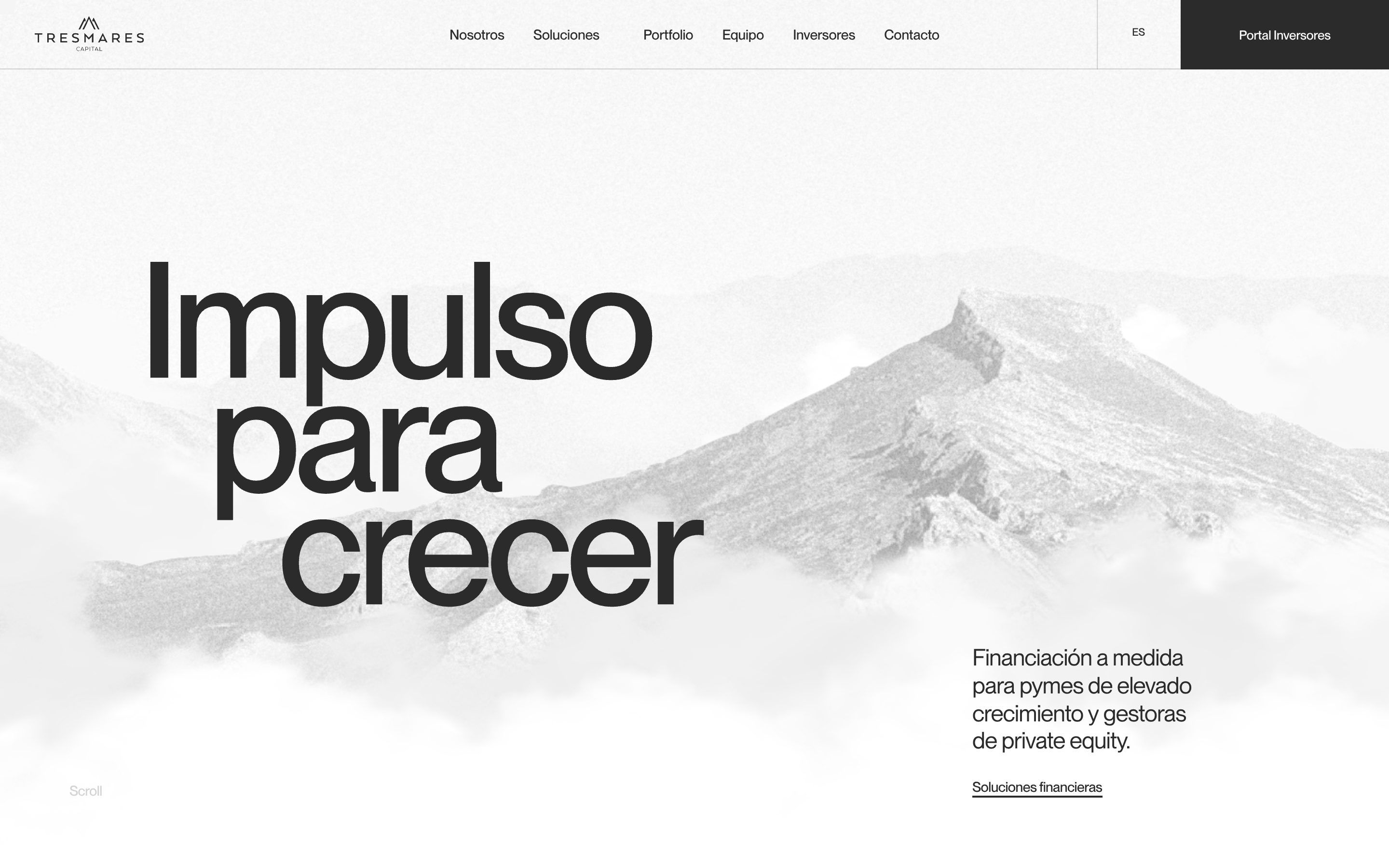
Tresmares Capital, how it’s made: the sea of clouds that parts, the red emblem that refolds and the odometer year
The site of the Madrid private credit fund manager, built by Dgrees, opens on a three.js sea of clouds that parts around the pointer, tells its four strategies with a red emblem drawn by a hand-written morphing engine and its history with a year that turns like an odometer. We take it apart with three demos rebuilt from scratch.
- Breakthrough Energy, by Resn
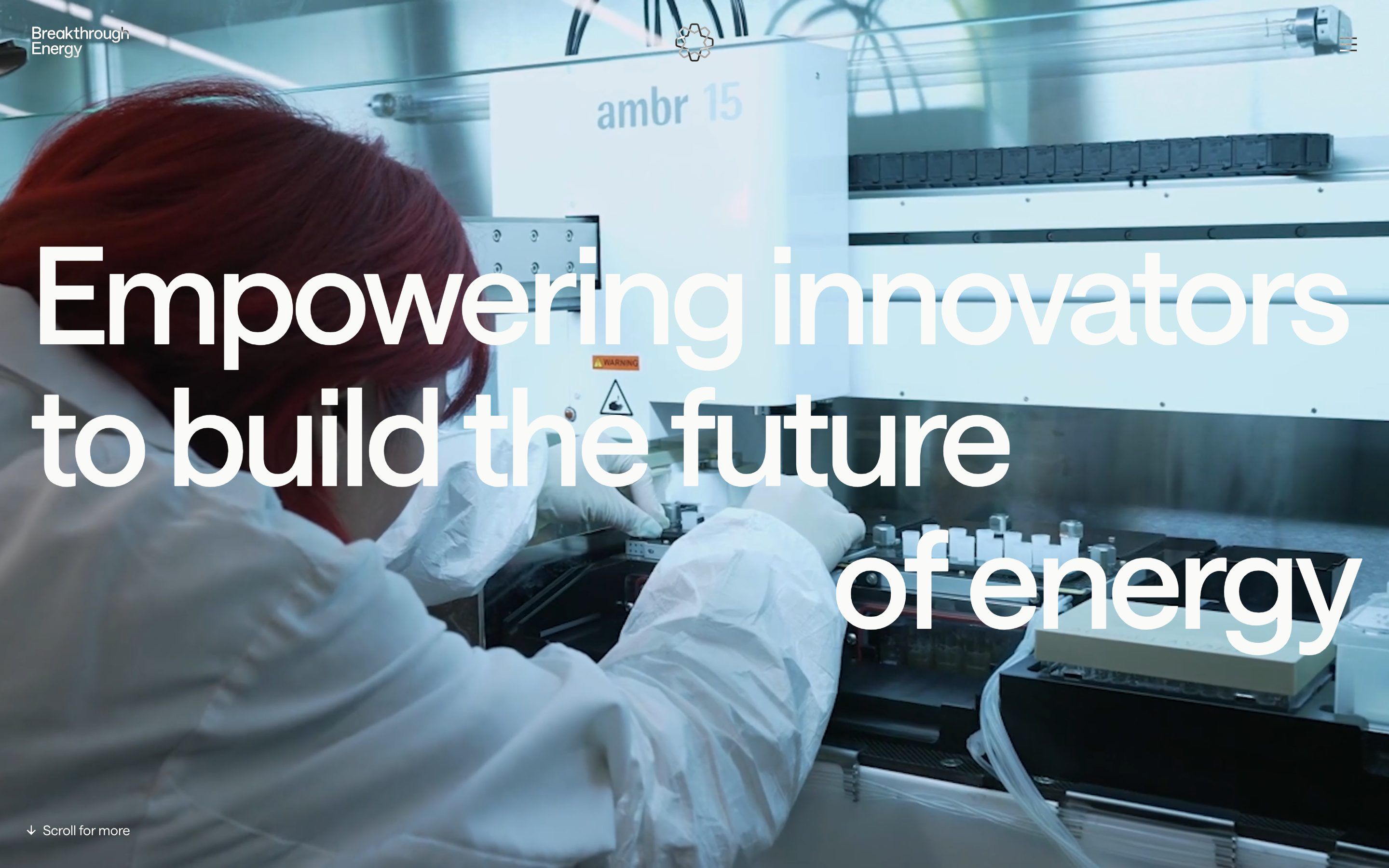
Breakthrough Energy, how it’s made: the two-colour headline over the video, the words split by the photo’s edge and the yellow curtain
The site of the platform that invests in clean energy technology, built by Resn, is a single scene almost twenty-seven screens long: a headline written twice and clipped to the video, words that change colour as they cross a photo, a yellow curtain with edges faded in thirteen steps. We take it apart with three demos rebuilt from scratch.
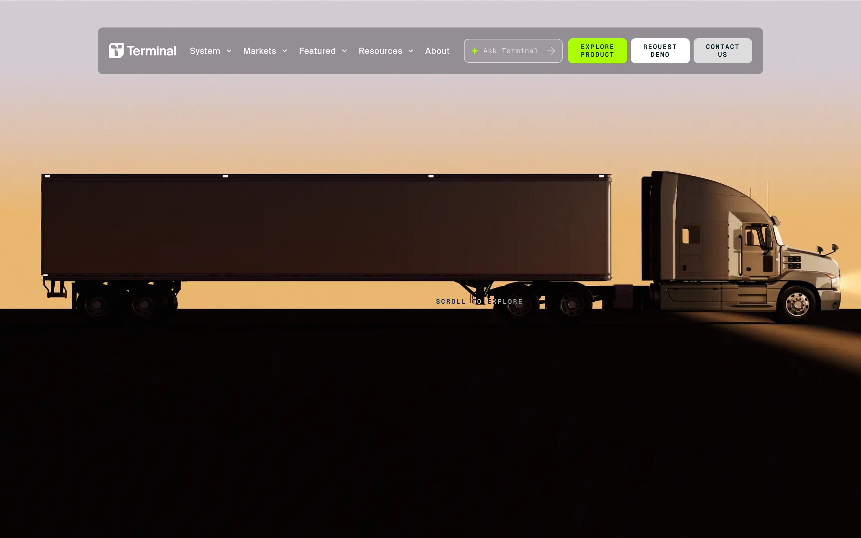
- Terminal Industries, by Rejouice, Propagande
Terminal Industries, how it’s made: the truck driving into the yard, the notched cards and the savings calculator
The site of a company that makes software for warehouse yards, built by Rejouice, opens with a semi truck at sunset that turns into a line drawing as you scroll: 410 frames on a canvas. Around it, a rounded notch bites the edge of every section and a lime glow lights up the letters. We take it apart with three demos rebuilt from scratch.
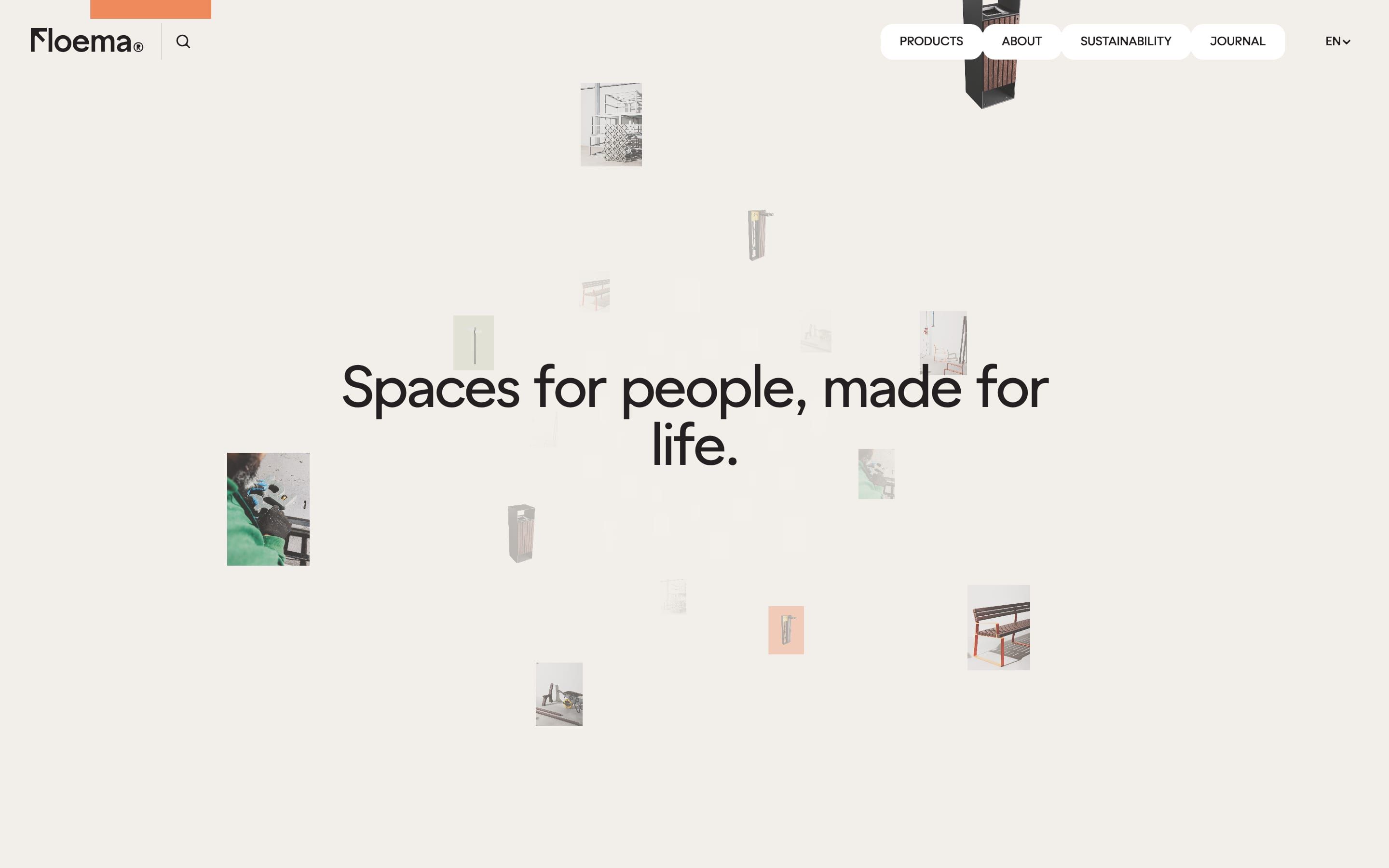
- Floema, by Bürocratik
Floema, how it’s made: the droplet menu, the collections that unveil like a blind and the finishes drawer
The site of a Portuguese maker of benches, shelters and signage for parks and beaches, signed by Bürocratik, is a catalogue full of gestures you want to touch: menu items that come apart like droplets, collections that cover each other like blinds, a drawer that comes in two beats. Underneath there are Nuxt, GSAP, Lenis and three.js shut away in workers. We take it apart with three demos rebuilt from scratch.
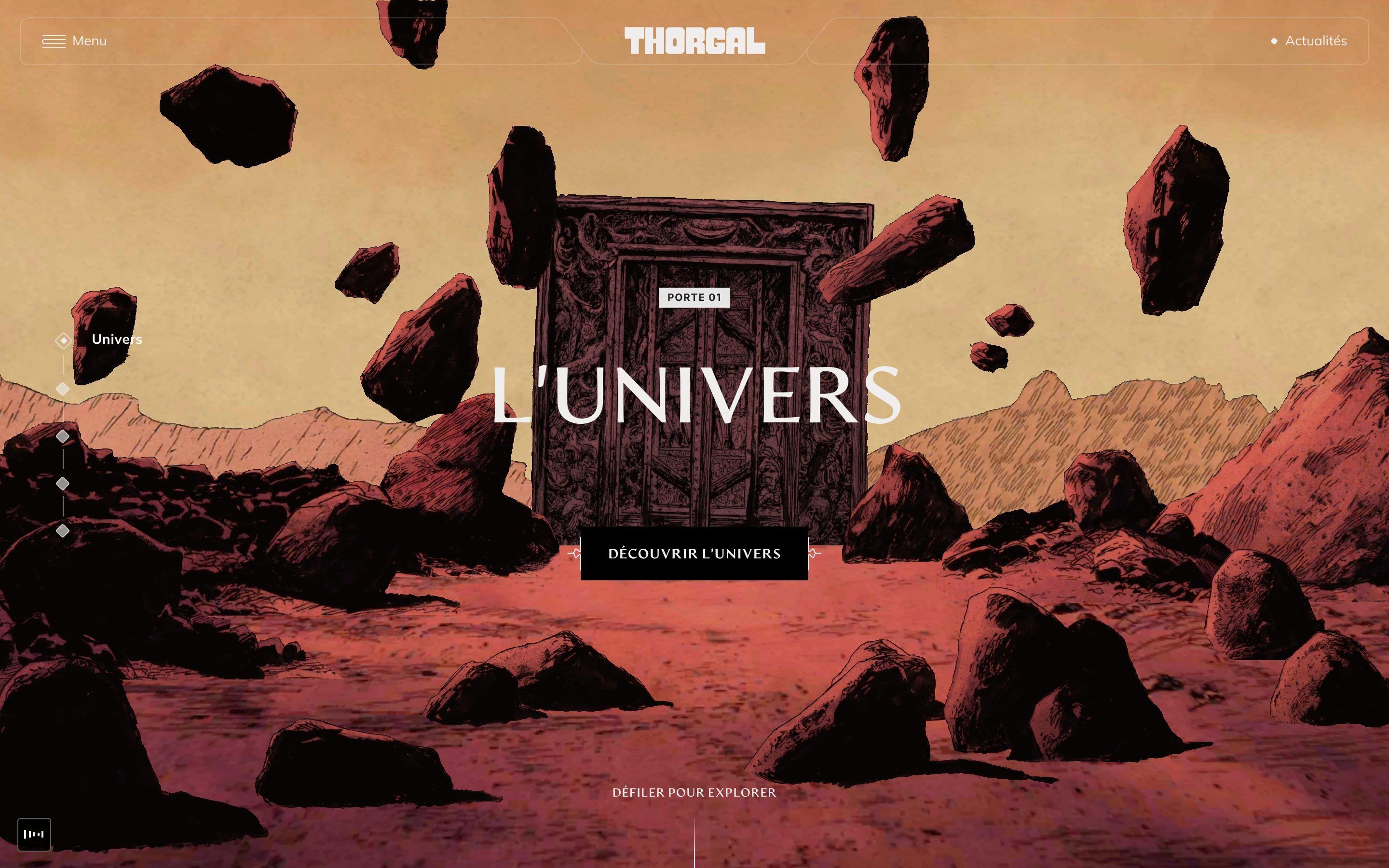
- Thorgal, by Caracal, REEPLE Studio
Thorgal, how it’s made: the brush strokes with the title inside, the worlds that dissolve into noise and the footer that bends towards the next page
The site of a Franco-Belgian comic saga, designed by Caracal and built by REEPLE Studio, is five worlds behind five doors, a brush that covers and uncovers the screen and a page that ends by bending. Underneath there is no GSAP but Motion, OGL and Lenis. We take it apart with three demos rebuilt from scratch.
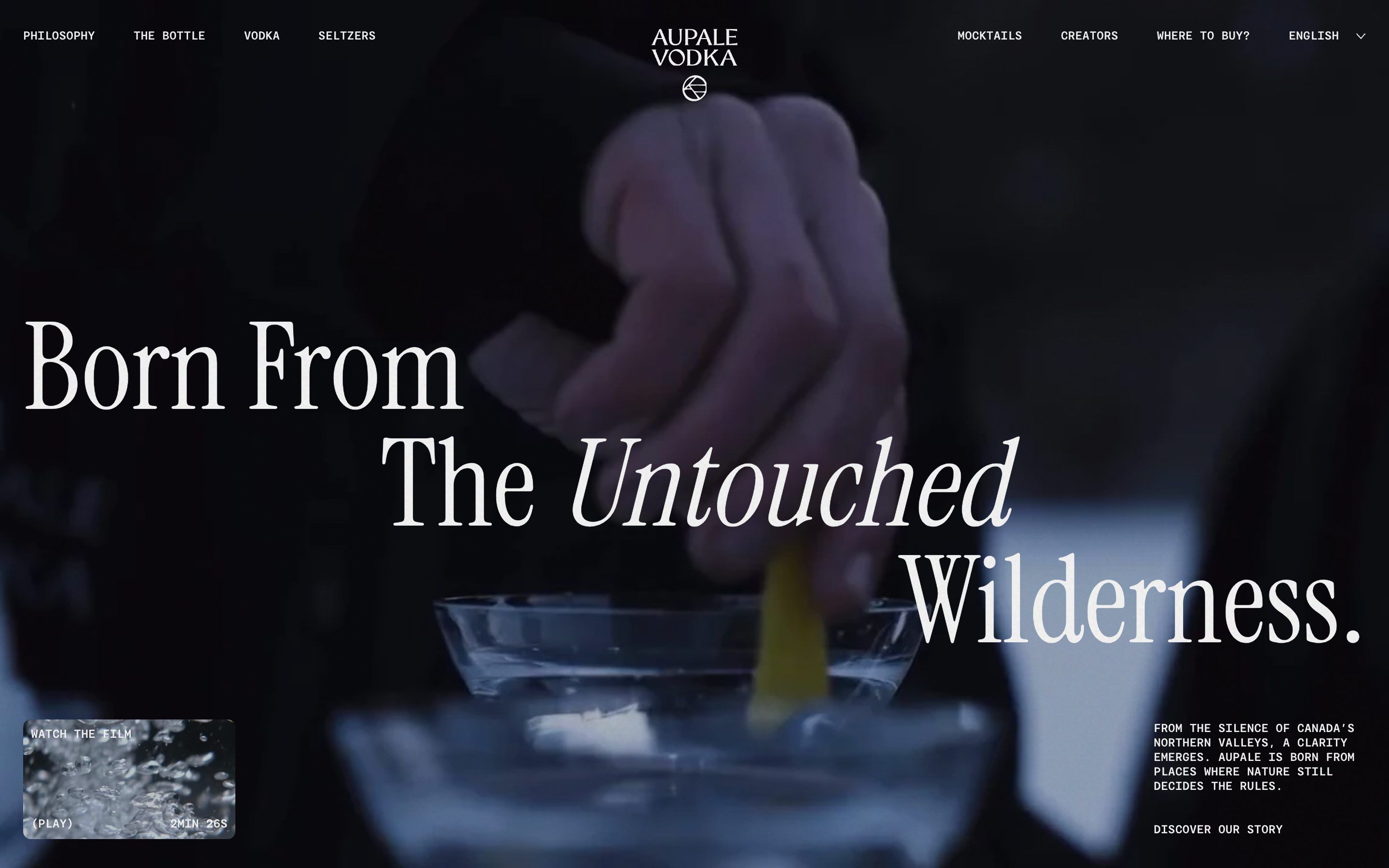
- Aupale Vodka, by Locomotive
Aupale Vodka, how it’s made: the headline that slides in askew, the chapters that swap on scroll and the arch that opens from the centre
The site Locomotive made for a Canadian vodka is light paper, sage and a serif with its words in italics. Underneath there is no GSAP but anime.js 4, with a single spring and a single way of bringing things in: askew, then straight. We take it apart with three demos rebuilt from scratch.
- Neon Rated, by 27b
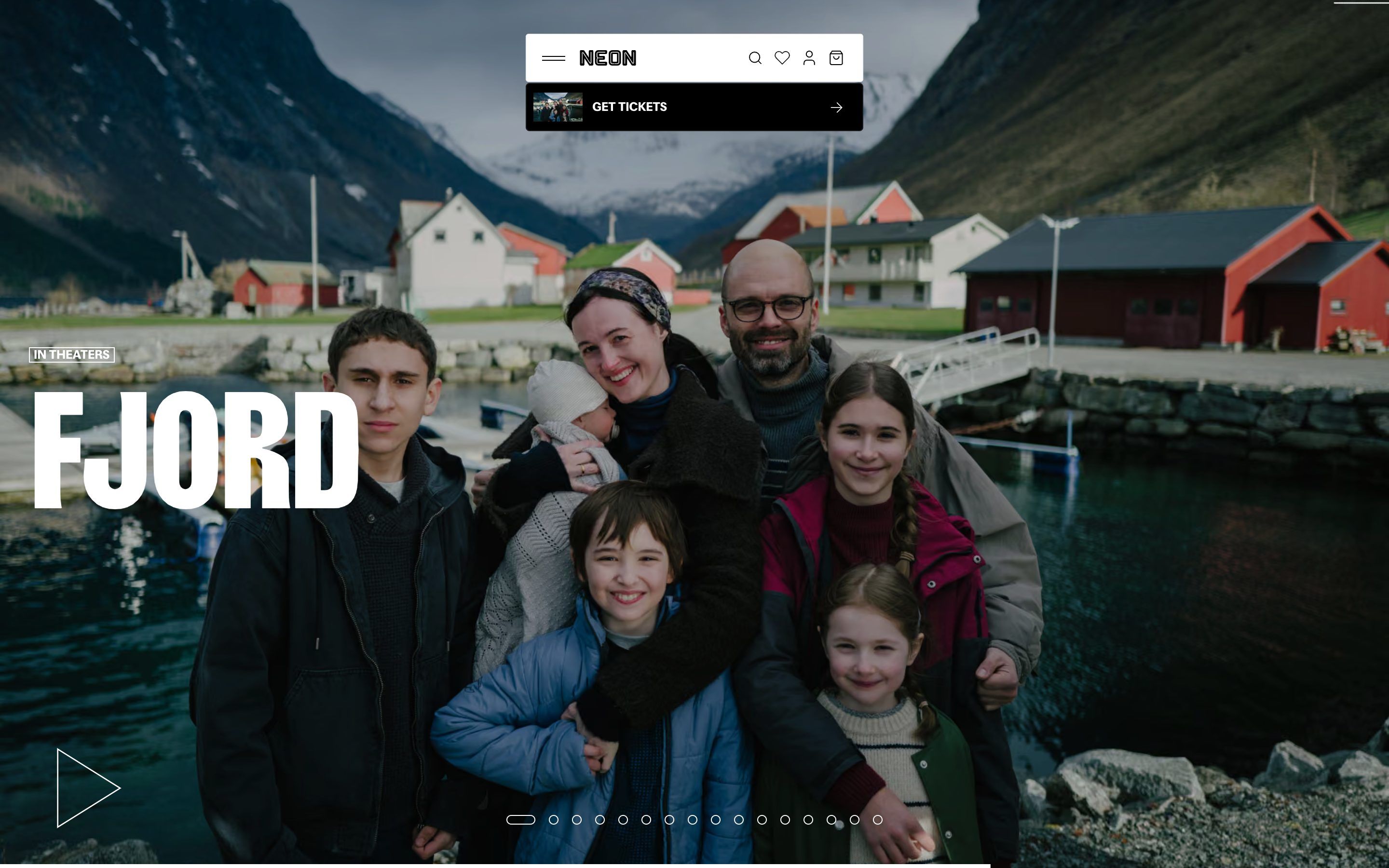
Neon Rated, how it’s made: the film slider with the image sliding the other way, the poster that turns into the trailer and the menu bar that stretches open
The site of NEON, the distributor of Parasite and Anora, is a film shop: posters, trailers, tickets and T-shirts, all black and white until a film lends its colour to the page. Underneath there is no WebGL and no GSAP, just React and framer-motion used with a watchmaker’s precision. We take it apart with three demos rebuilt from scratch.
- FC Porto Memorial, by Significa
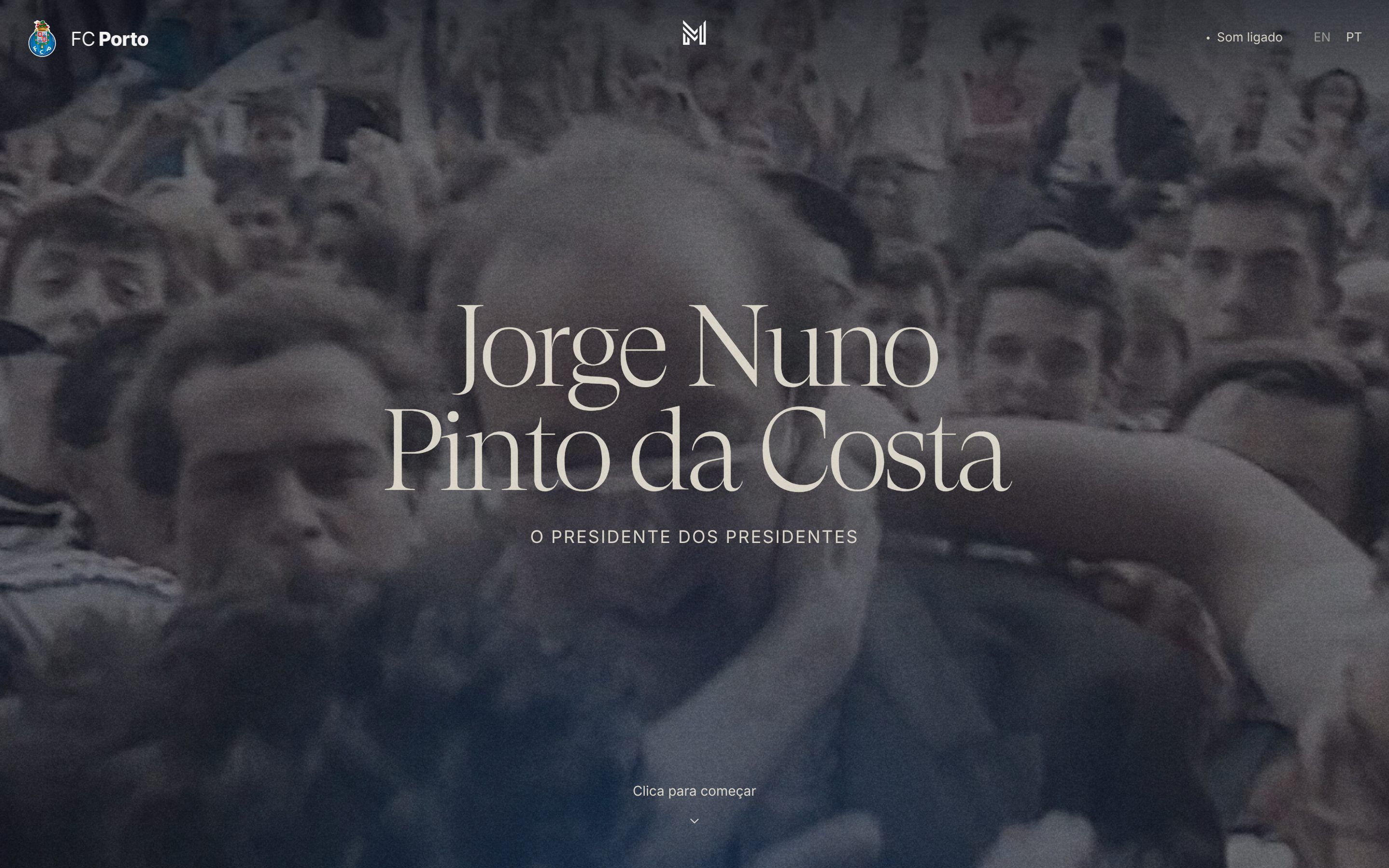
FC Porto Memorial, how it’s made: the collage that stops on one object, the numbers that roll like a counter and the steps that rise as a double curtain
The digital memorial FC Porto dedicated to its longest-serving president is a single page, in the dark, that you scroll like a documentary: numbers rolling like counters, seventy-five objects left by the fans filling the screen one at a time, and the conservation steps rising like curtains. We take it apart with three demos rebuilt from scratch.
- Max Mara Jacket Circle, by Adoratorio Studio
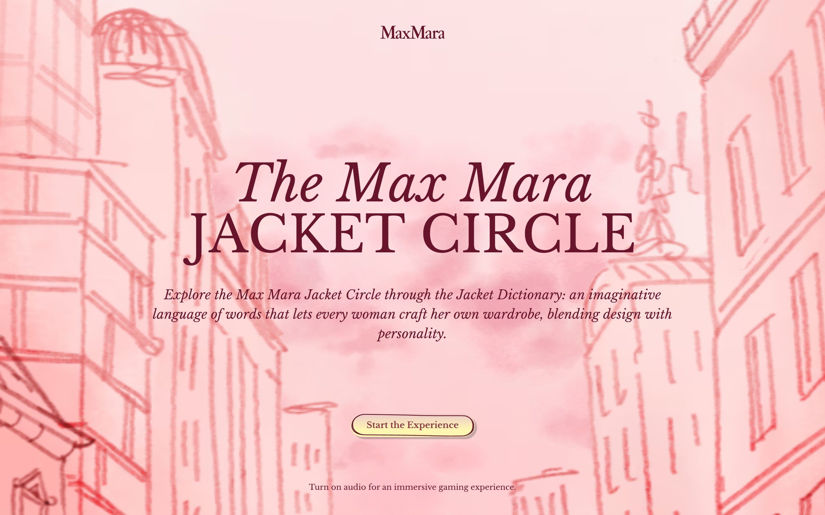
Max Mara Jacket Circle, how it’s made: the page that tears open from the centre, the title that boils like pencil and the dictionary entries that rise
Max Mara’s game for its jackets is a city drawn in pencil: you enter from a red cover with letters that slide in, every room opens by tearing the page from the centre, and every jacket has an invented word with its own dictionary entry. We take it apart with three demos rebuilt from scratch.
- Heron AI, by Bearplus, Kenny Ho
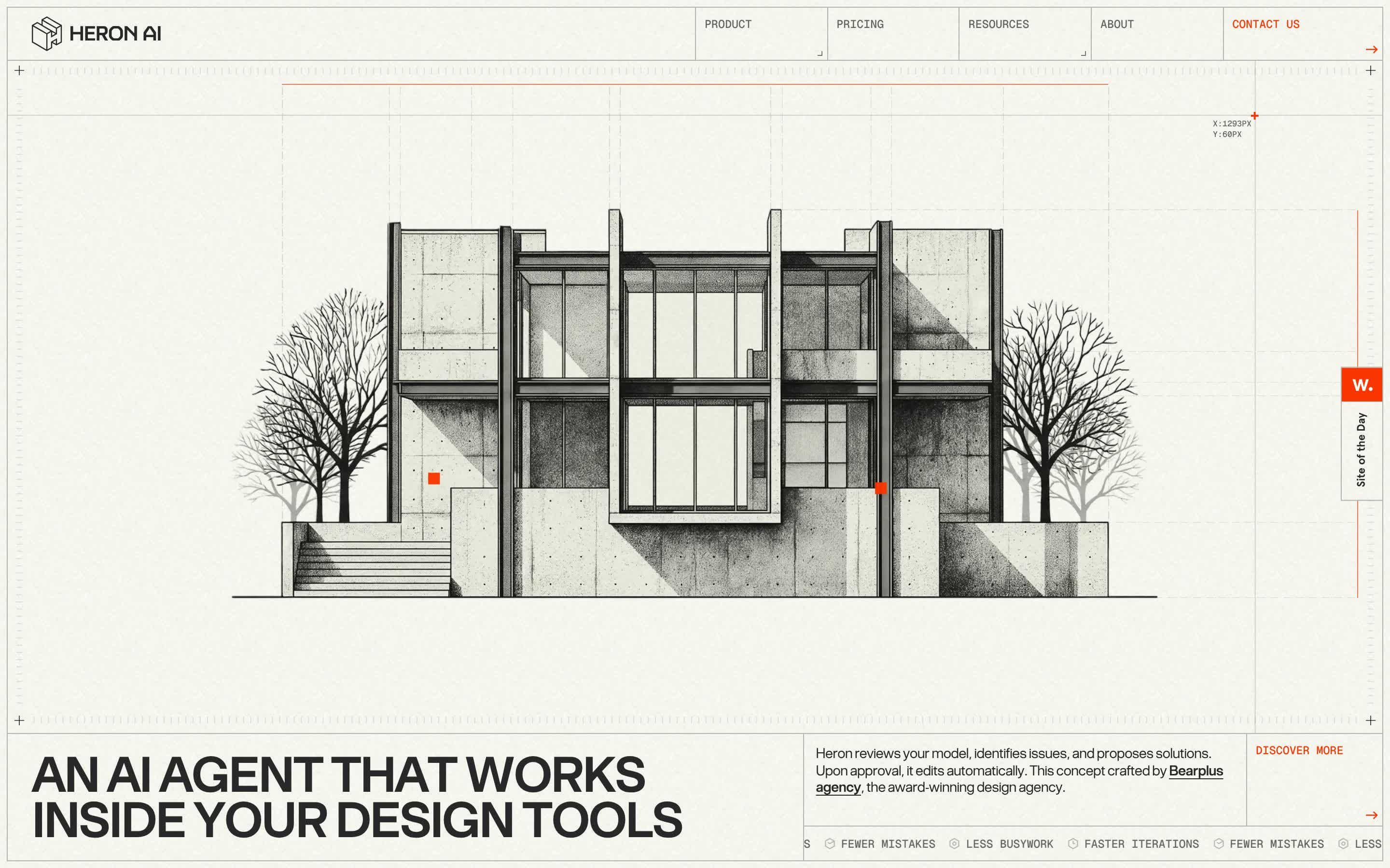
Heron AI, how it’s made: the drawing that traces itself and opens, the box that finds the errors and the floor plan that assembles as you scroll
The site of Heron AI, an artificial intelligence agent for architects, loads by tracing the elevation of a house by hand, lets you drag a box over the drawing to find what is missing and assembles a floor plan wall by wall as you scroll. We take it apart with three demos rebuilt from scratch.
- Paul Kalkbrenner, by Holographik, Ilja van Eck
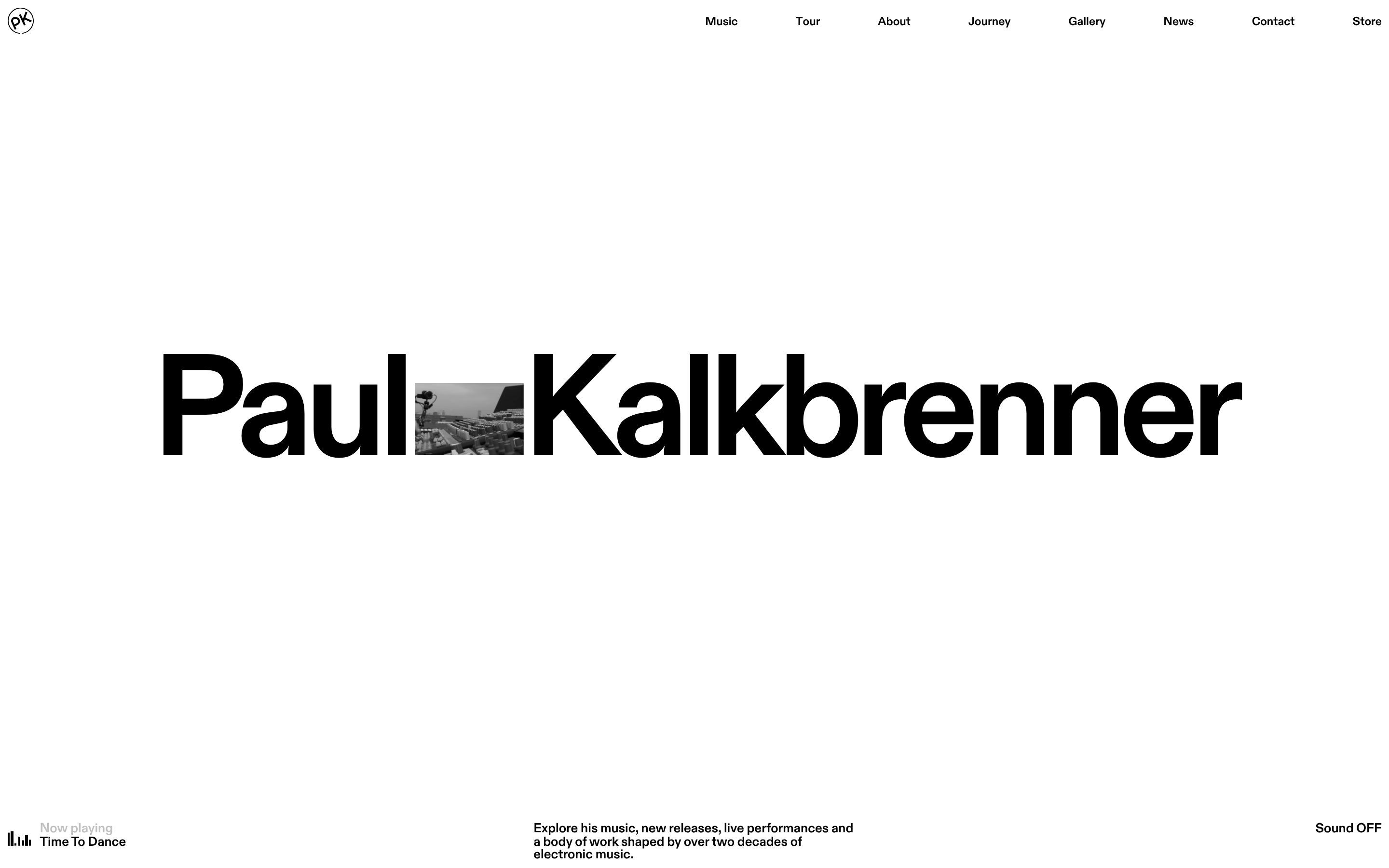
Paul Kalkbrenner, how it’s made: the name that opens around the photo, the record you spin with your finger and the sliding grid
The site of Paul Kalkbrenner, the Berlin electronic musician, opens with his name on a single line and a photo shrinking down between the two words, lets the album records spin under your hand and slides a huge sentence along a grid of lines. We take it apart with three demos rebuilt from scratch.
- Hubtown, by Unseen Studio
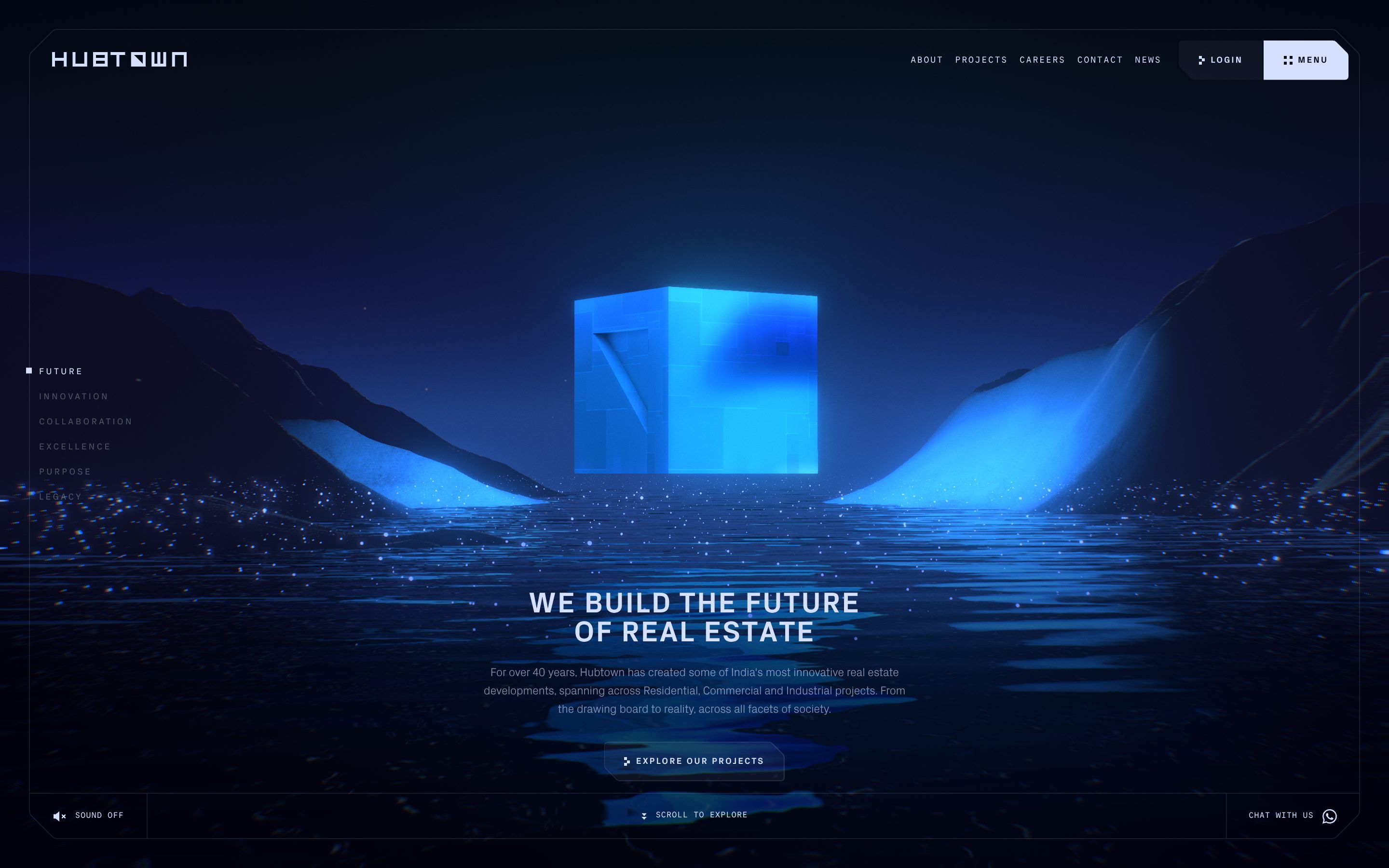
Hubtown, how it’s made: the squares that become the logo, the light cube on the water and the chapters that light up
The site of Hubtown, a Mumbai developer, loads with thirteen squares that light up in pairs and rebuild themselves into the logo, opens at night with a blue cube floating on a lake, then scrolls through six chapters whose headlines light up letter by letter at random. We take it apart with three demos rebuilt from scratch.
- Lightweight, by VKZ Studio
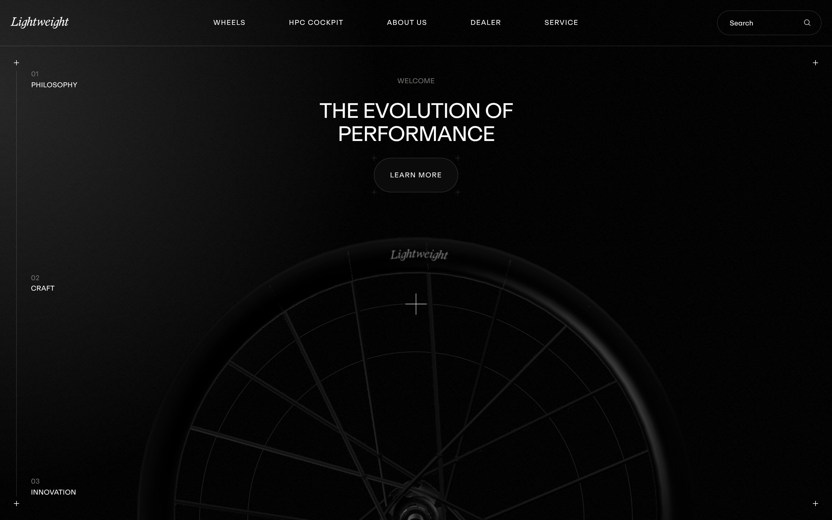
Lightweight, how it’s made: the carbon wheel you scroll through, the tumbling headlines and the crosshair circles
The Lightweight site opens in the dark with a carbon racing wheel that turns and comes closer as you scroll, then the page goes silver, the headlines arrive letter by letter, tumbling into place, and two thin circles with crosshairs move at every chapter. We take it apart with three demos rebuilt from scratch.
- Crav Burgers, by Anyflow, Vasav Prajapati, Pritam Das, Gaurav Verma
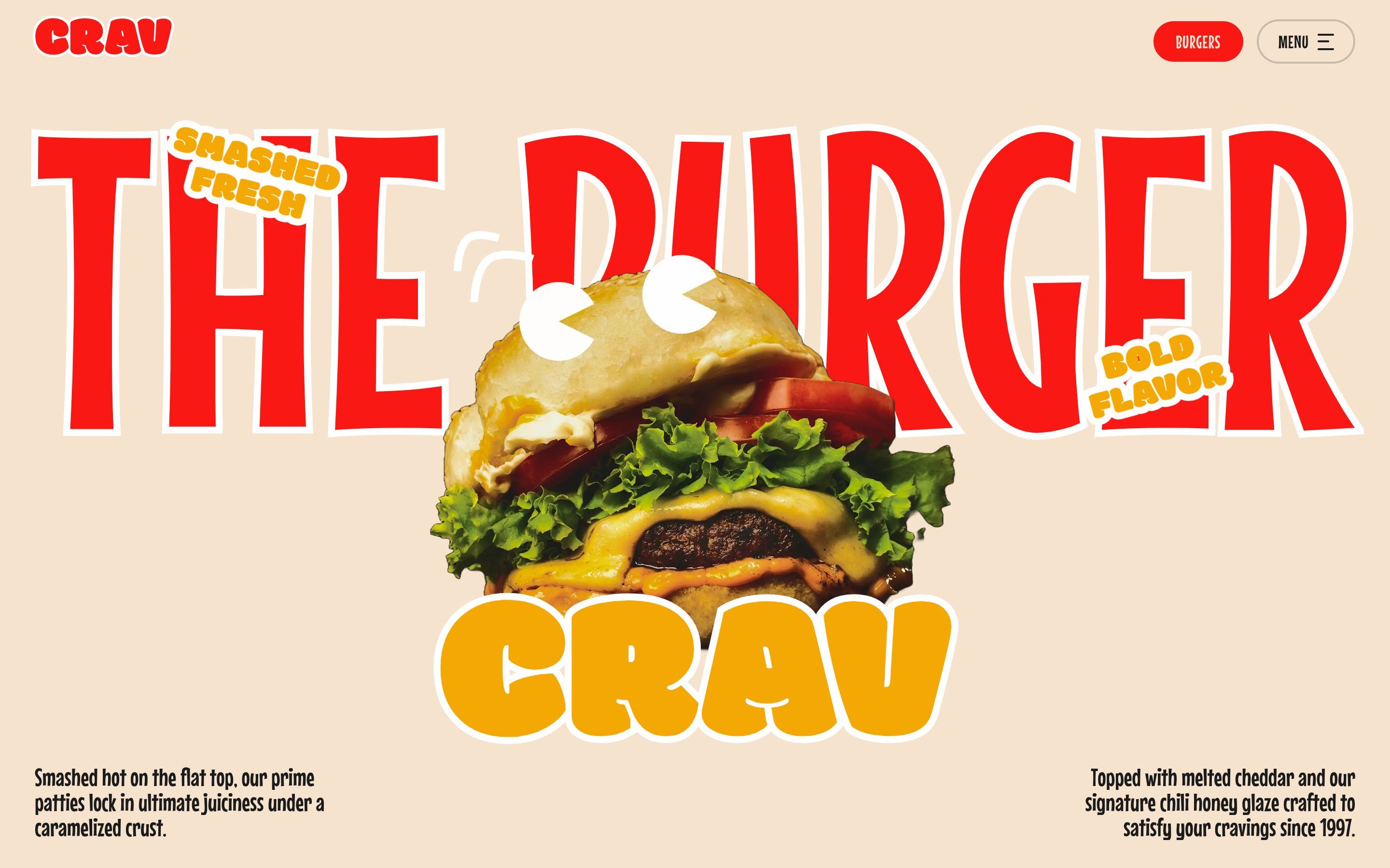
Crav Burgers, how it’s made: the burger that stacks itself, the ingredient rope and the juggling footer
The Crav Burgers site opens with a burger that builds itself layer by layer and three sauce-coloured curtains that lift away, drags a rope of ingredients behind the pointer and ends with a footer where lettuce and cheese fly through the air. We take it apart with three demos rebuilt from scratch.
- Meech213, by The Blackpepper Studio
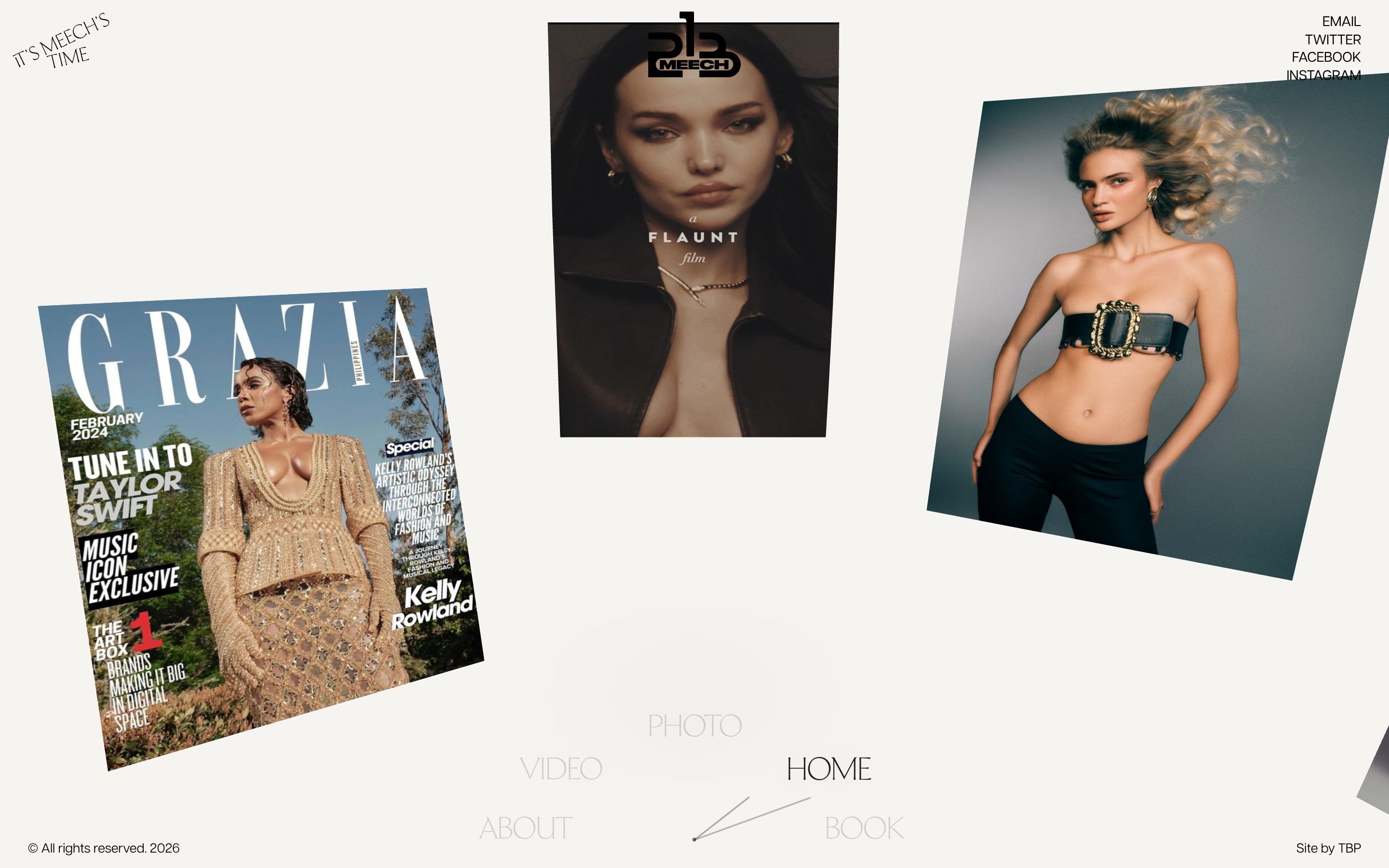
Meech213, how it’s made: the clock-face menu, the fan of photos and the dome you can spin
The site of Meech213, the fashion photographer Dametreus Ward, puts its menu on a clock face and its photos on a dome around the viewer, to be spun with the wheel or a finger. We take it apart with three demos rebuilt from scratch, in the minimal style.
- Son Daven, by The First The Last, Ivan Chopei
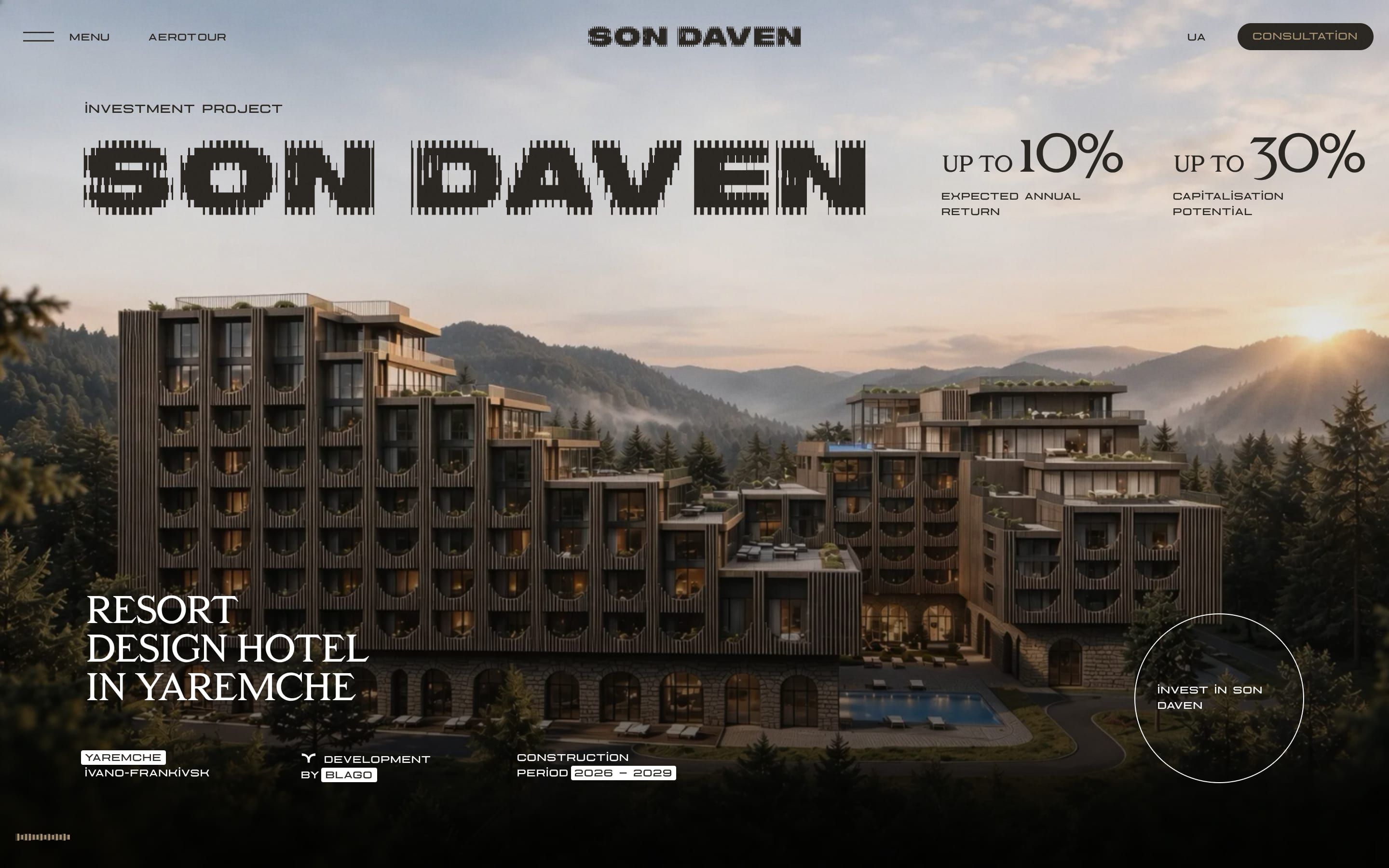
Son Daven, how it’s made: mountains in lines, cards that cross over and a curtain of cells
The site of Son Daven, a design hotel being built in the Carpathians, draws mountains, sheep and birds with vertical lines of varying thickness, like an engraving that moves. We take it apart with three demos rebuilt from scratch, in the minimal style.
- 1minus1
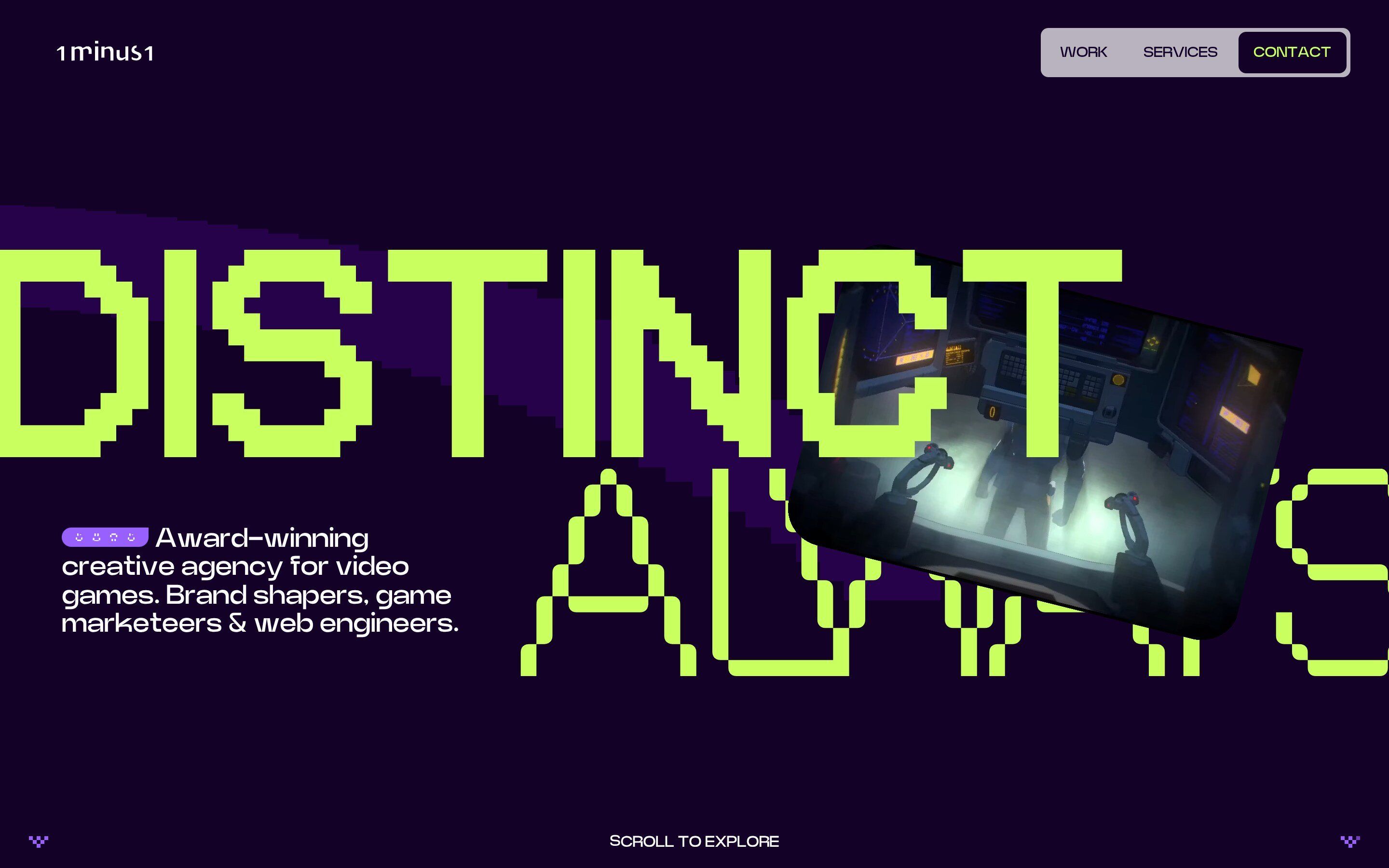
1minus1, how it’s made: the headline that arrives in pixels, the trail of pixels and the cards that straighten up
The site of 1minus1, a creative agency for video games, opens with two giant words in a pixel typeface that grow out of the middle while their letters drop in, one from above and one from below, and behind the mouse the page lights up in squares. We take it apart with three demos rebuilt from scratch, in the minimal style.
- Belgrade Arbor, by Square43 Studio
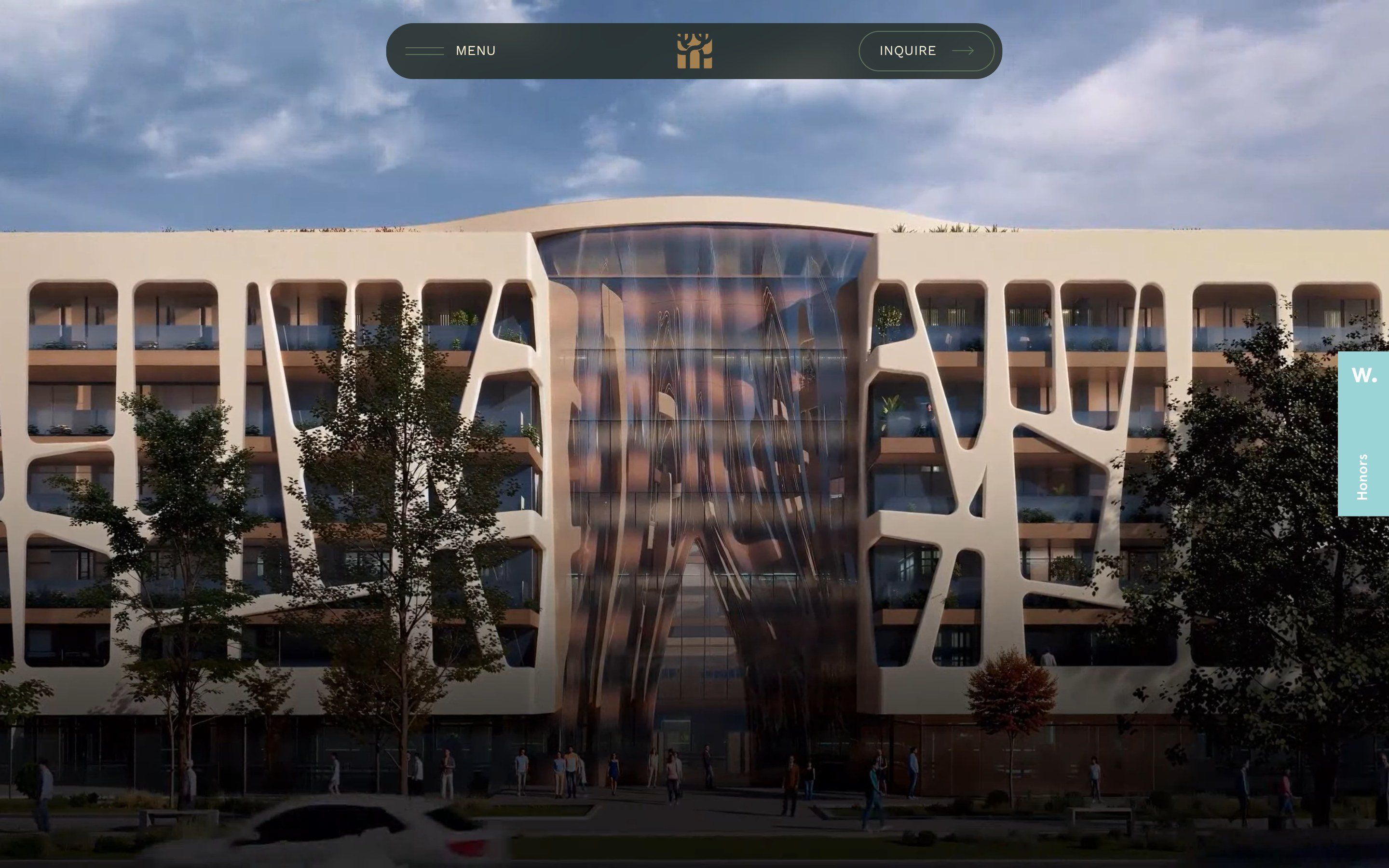
Belgrade Arbor, how it’s made: the canopy that changes shape, places on the tilted map and the view from above through the clouds
The site of Belgrade Arbor, a complex of homes and offices in New Belgrade, opens with a pencil drawing that turns into the building and tells the project as you scroll: photos cut into soft shapes that change shape, a 3D map of the surroundings, the site seen from above through the clouds. We take it apart with three demos rebuilt from scratch, in the minimal style.
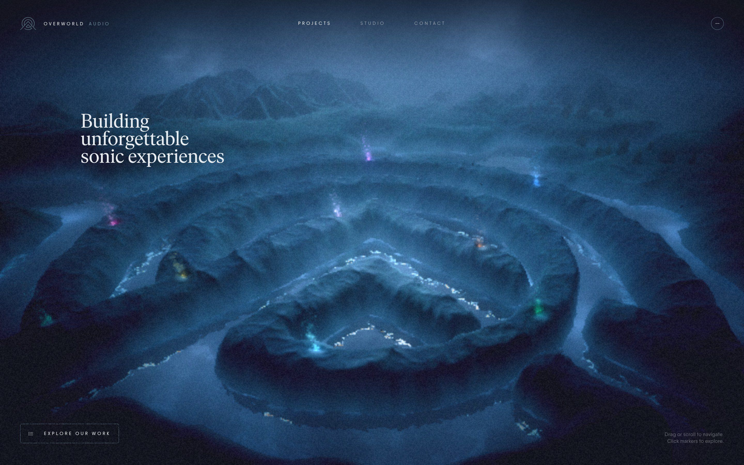
- Overworld Audio, by Rogier de Boevé
Overworld Audio, how it’s made: the mark the pointer wipes away, the mark that rises from the noise and the mark that becomes a map
The Overworld Audio site is a 3D night landscape with the logo carved into the rock: you enter through a threshold where the name appears, the logo’s outline rises out of a noise and the mouse trail wipes it away. We take it apart with three demos rebuilt from scratch, in the minimal style.
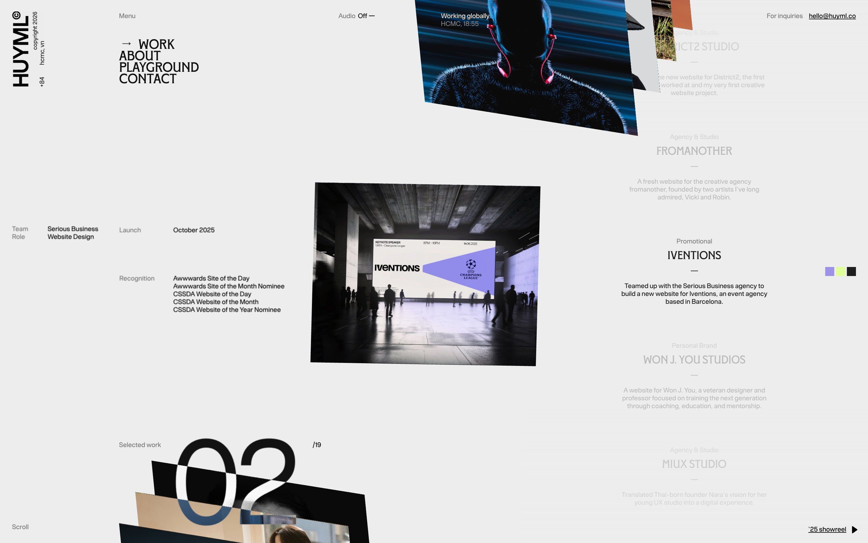
- Huy Phan
Huy Phan, how it’s made: the panel pushed by hand, pages lined up in space and the index that comes into focus
Huy Phan’s portfolio opens with a drawn boy who pushes the black away and uncovers the name, shows the projects as thin pages lined up in space that bend with the speed, and keeps an index at the side that blurs and comes back into focus at every change. We take it apart with three demos rebuilt from scratch.
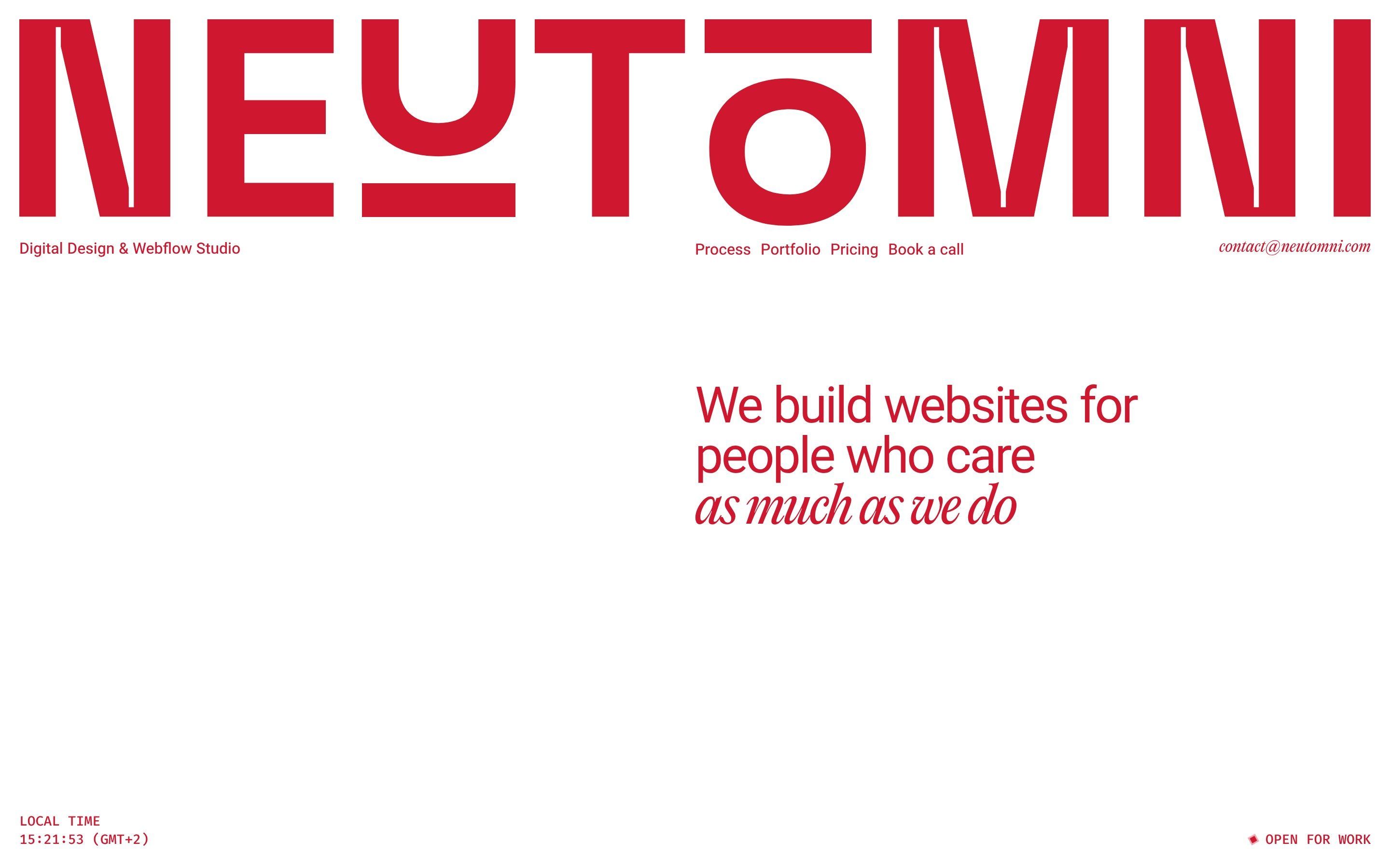
- Neutomni
Neutomni, how it’s made: the wheel that rounds off, the diamond that becomes a circle and the logo cut along the line
The site of a Polish design and Webflow studio, red on white, where every shape starts out all corners and ends up round: a square wheel rolling on catenary arches, a diamond thrown into a circle by the mouse, a loader cut open with scissors. We take it apart with three demos rebuilt from scratch.
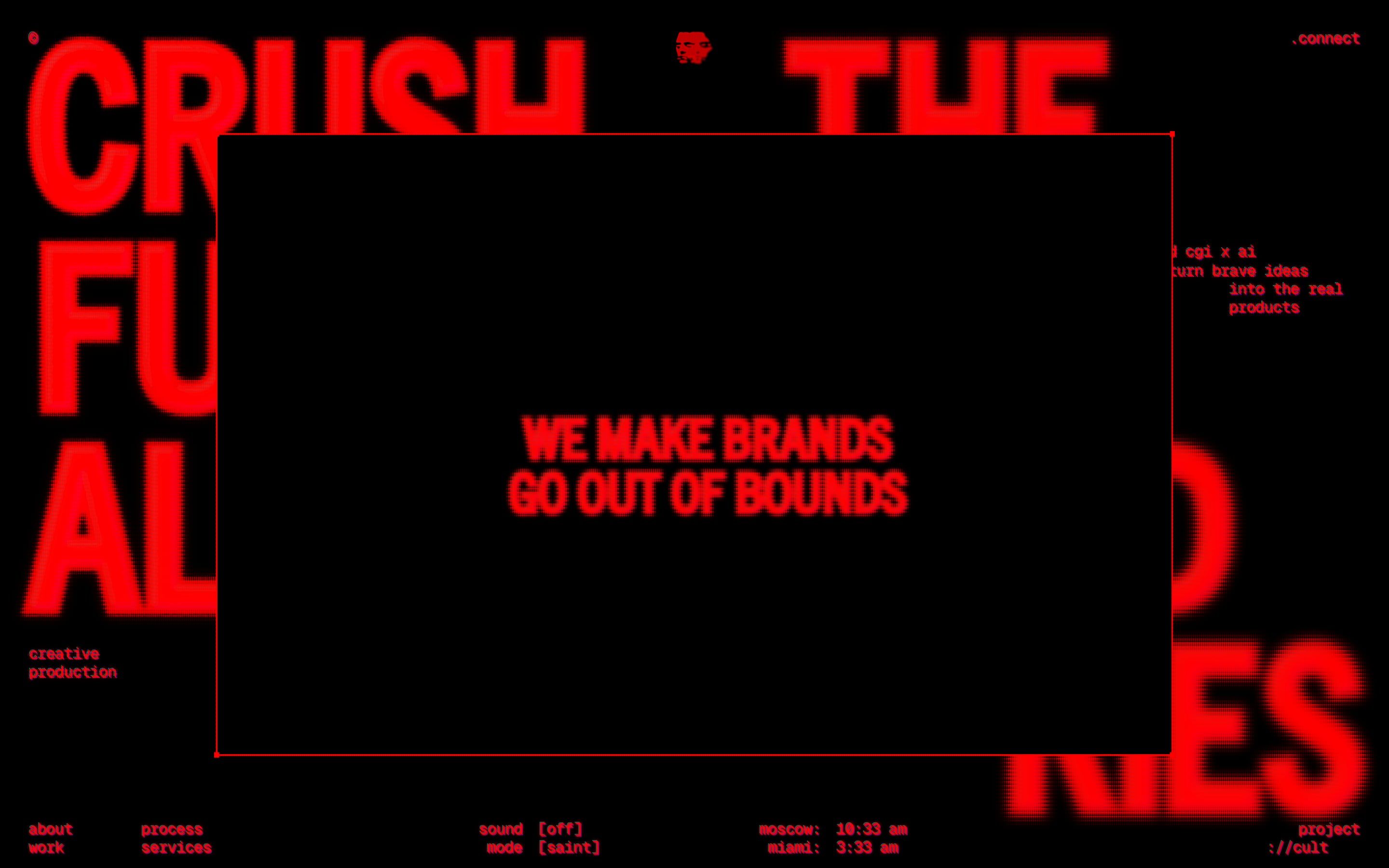
- project://cult, by CULT, Based
project://cult, how it’s made: the halftone that melts, the crew that glitches and the words between brackets
The site of a CGI and branding studio, all red on black like an old screen: renders covered by a halftone that melts under the mouse, photos that break into strips, titles that condense out of blurred blobs. We take it apart with three demos rebuilt from scratch.
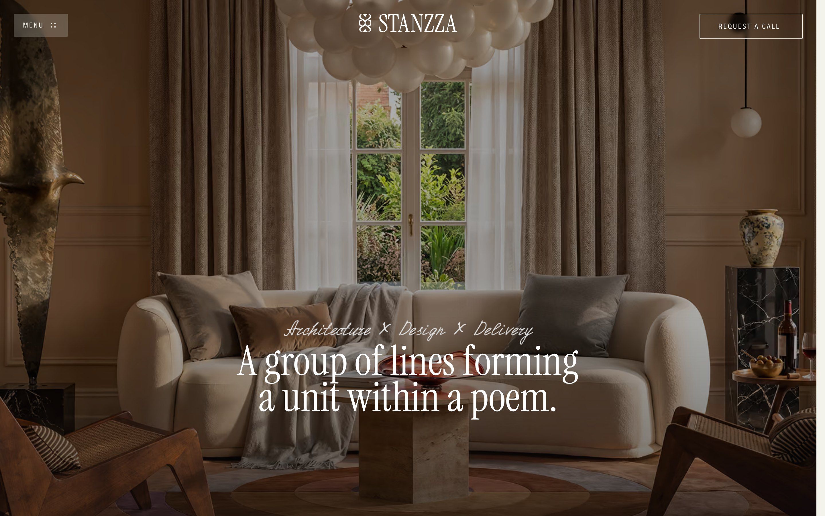
- Stanzza, by ADELT Agency
Stanzza, how it’s made: the strip of rooms, the frames of the apartment and the figures that light up
The site of Stanzza, a Barcelona interior studio, opens with a strip of photos that folds into a little square and becomes the room of the home page, shows its apartments inside frames that grow as you scroll and tells the studio in four figures that light up one at a time. We take it apart with three demos rebuilt from scratch.
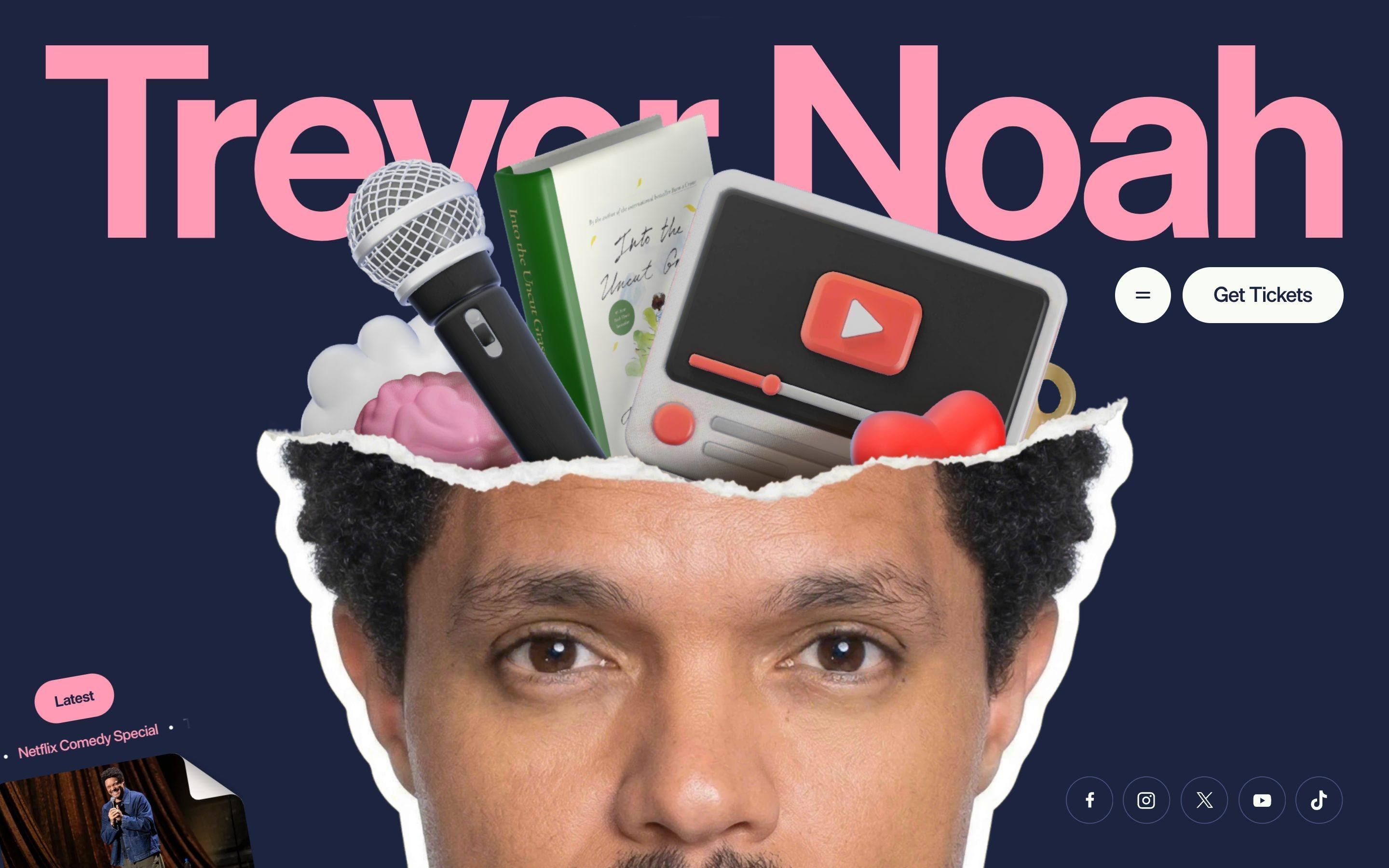
- Trevor Noah, by OFF+BRAND
Trevor Noah, how it’s made: the head that opens up, the torn paper and the sticker that follows the words
Trevor Noah’s site is a paper collage: a cut-out photo of Trevor Noah’s head tears across the forehead and out come a microphone, a book and a video in 3D, the sections part with a tear that follows the scroll, and a sticker head pops up on the pink words. We take it apart with three demos rebuilt from scratch.
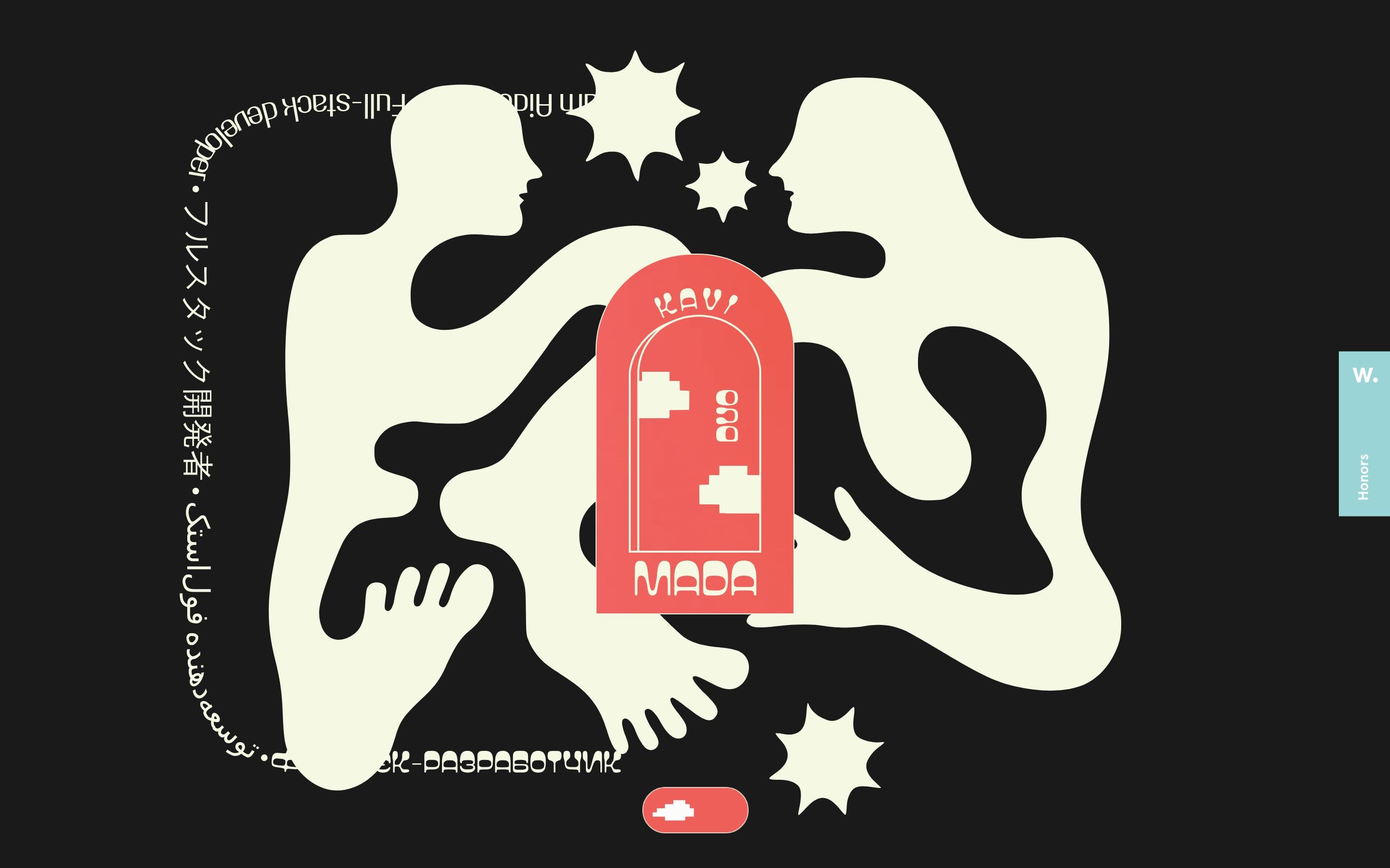
- Kavimada, by Adam Aidemirov
Kavimada, how it’s made: the star that changes shape, the lines you pull and the train of stars
The site of two people who make web and mobile products end to end, drawn with flat cut-out shapes: a star that falls and becomes an embrace, names that open and lines you pull with the mouse, stars that come down a trail as you scroll. We take it apart with three demos rebuilt from scratch.
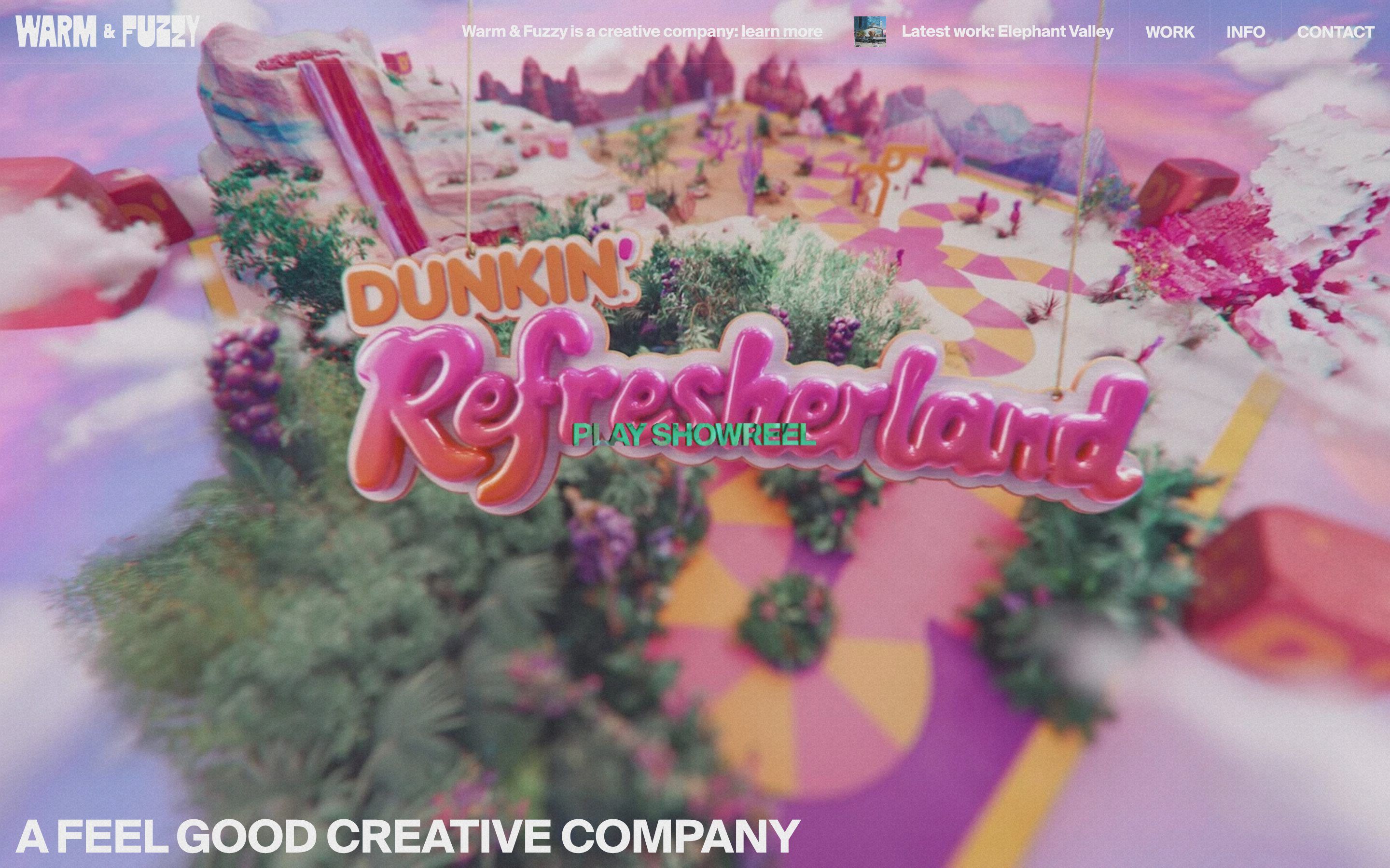
- Warm & Fuzzy, by Neutral Studio, Paulo Ferreira Jorge
Warm & Fuzzy, how it’s made: stickers, letters full of film and weightless cubes
The site of a creative studio split between Los Angeles, Boulder and New York: solid letters drawn in WebGPU that work as windows onto the videos, objects floating over the titles and, if you leave the page still, a shower of stickers. We take it apart with three demos rebuilt from scratch.
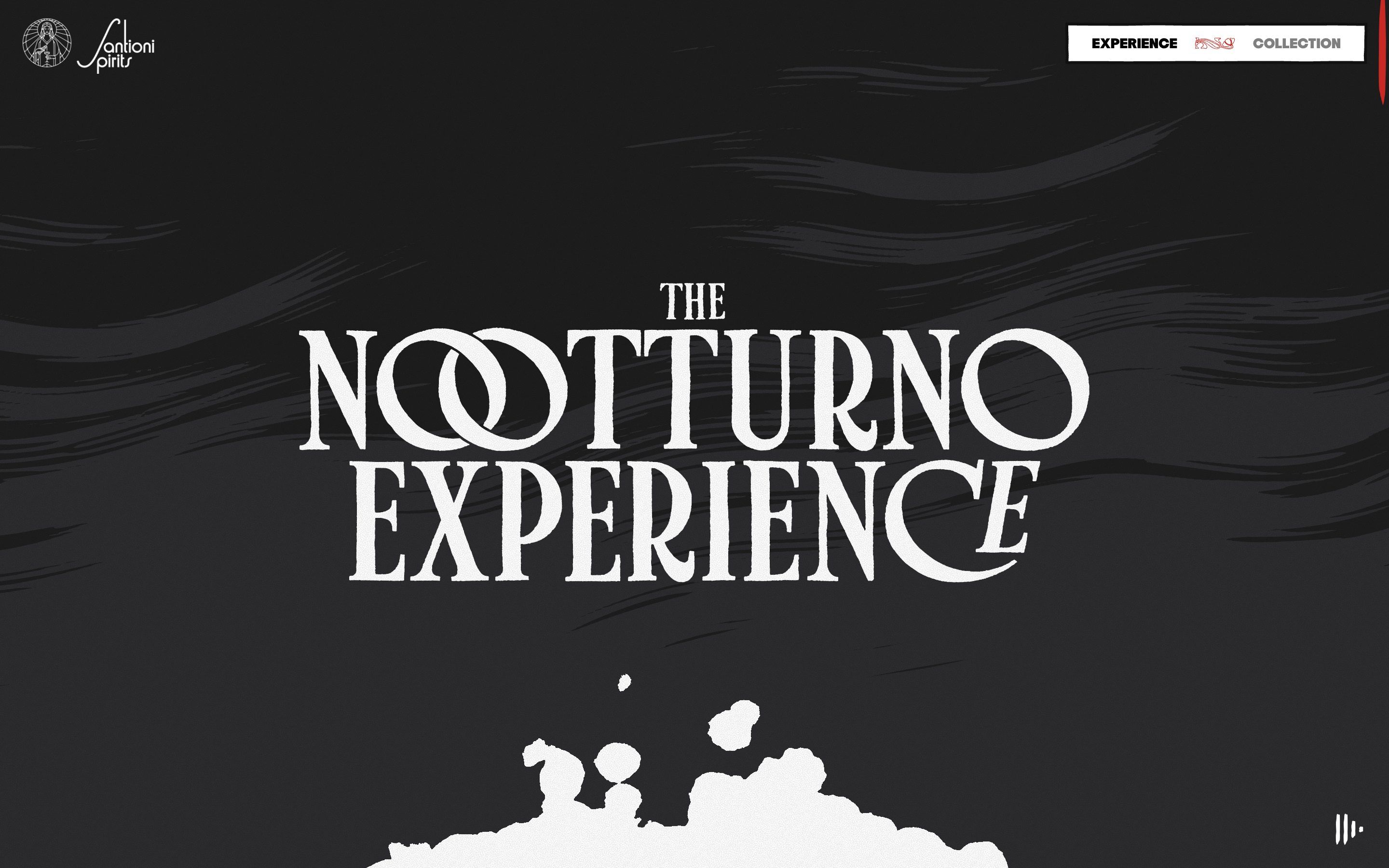
- Santioni Spirits, by Active Theory, plan8
Santioni Spirits, how it’s made: the engraved comic that reads itself
The launch site of a liqueur brand, told as a comic: captions a voice reads word by word, a bottle you hold to pour, a temple that cracks and flies away into a red sky, all drawn in real time as an engraving. We take it apart with three demos rebuilt from scratch.
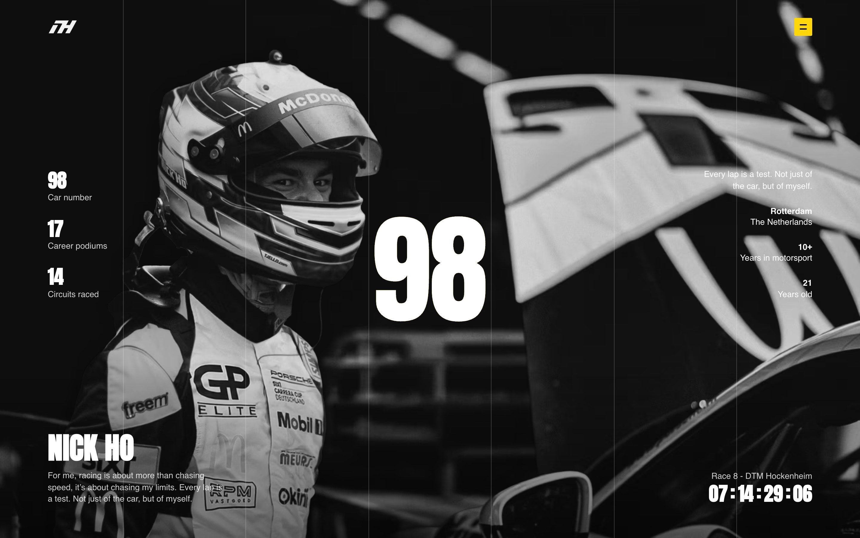
- Nick Ho, by BORING, Dion Ploeg
Nick Ho, how it’s made: the screen inside the number
The site of a Dutch Porsche Carrera Cup driver: a loader where the white screen is the inside of his number, a fluid that brings the colour back to the black and white photo, a car driving through the race calendar. We take it apart with three demos rebuilt from scratch.
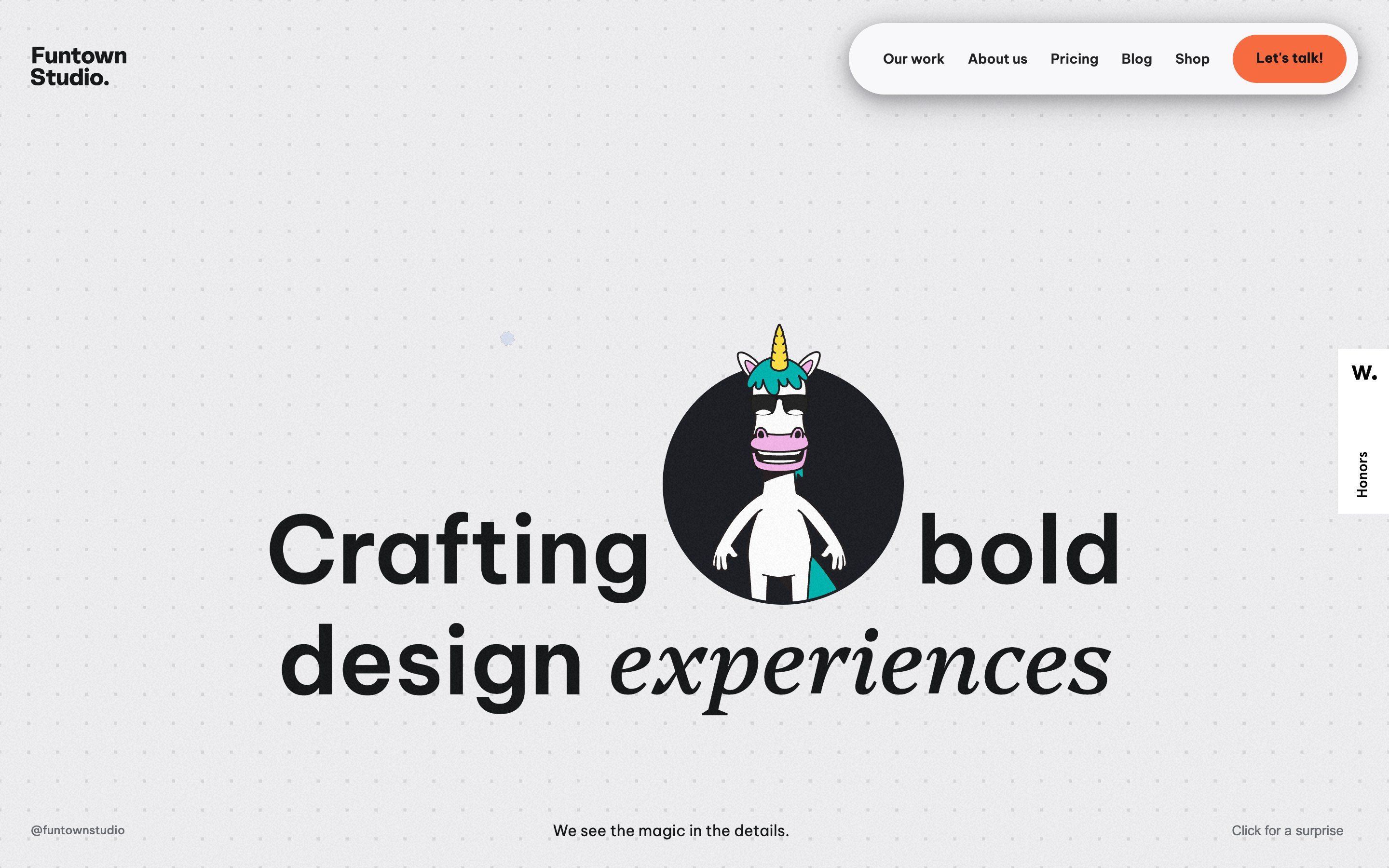
- Funtown Studio
Funtown Studio, how it’s made: a unicorn in the headline
The site of a design studio for startups: a unicorn in sunglasses in a circle inside the headline, shapes that light up near the pointer, a surprise party, services taking turns over a bar of pills and columns of projects moving opposite ways. We take it apart with three demos rebuilt from scratch.
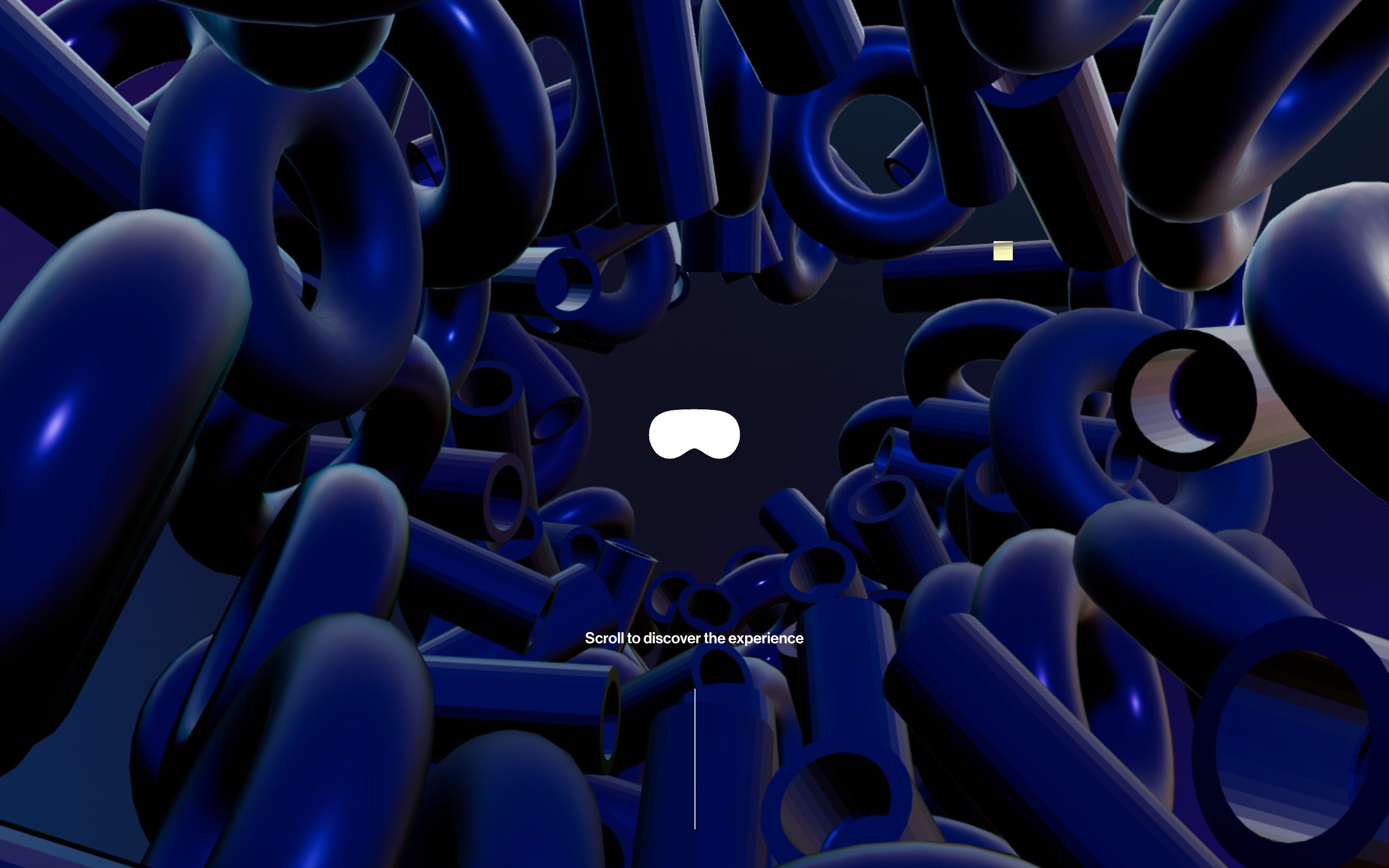
- Altitude 101, by Metabole Studio
Altitude 101, how it’s made: a site you look at through a headset
The site of a Paris studio that shoots films for the Apple Vision Pro: a tunnel of shapes that make room for the pointer, a headset that is a hole in the night and widens until the page comes in, three words on three walls of a turning room. We take it apart with three demos rebuilt from scratch.
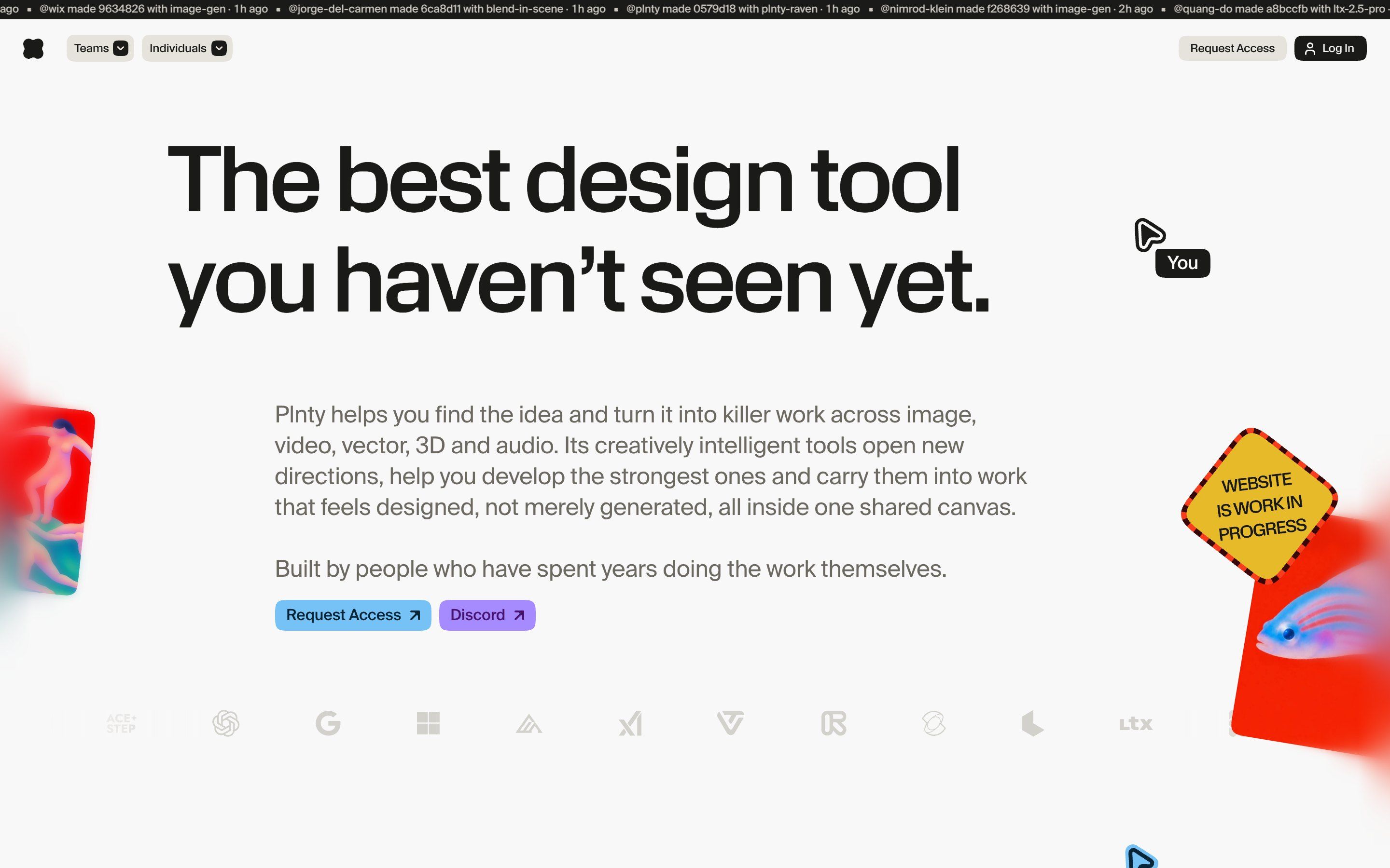
- Plnty
Plnty, how it’s made: a home page that behaves like a shared canvas
The home page of Plnty, a design tool with more than 150 tools on an infinite canvas: a cursor with a name, letters that turn into symbols when it passes over them, a floor of tiles that rise and cards that the mouse throws. We take it apart with three demos rebuilt from scratch.
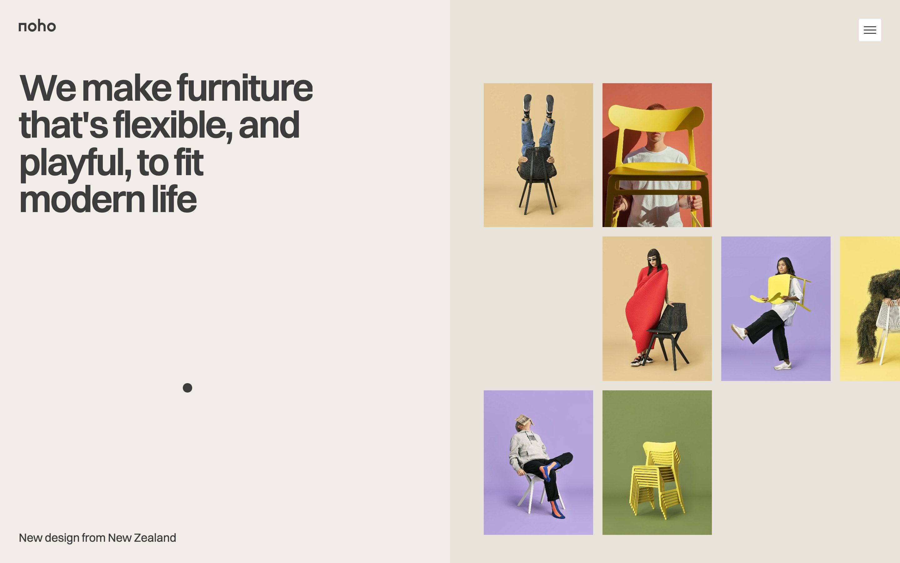
- Noho, by Eugene Morev, Alex Ivanov
Noho, how it’s made: the chair that became a screensaver
A furniture site redone for fun, in memory of a New Zealand chair brand: a sentence whose photos take turns between the words, a footer that colours itself under the hand and, if you stop touching everything for a minute, a chair that bounces around the dark like the DVD logo. We take it apart with three demos rebuilt from scratch.
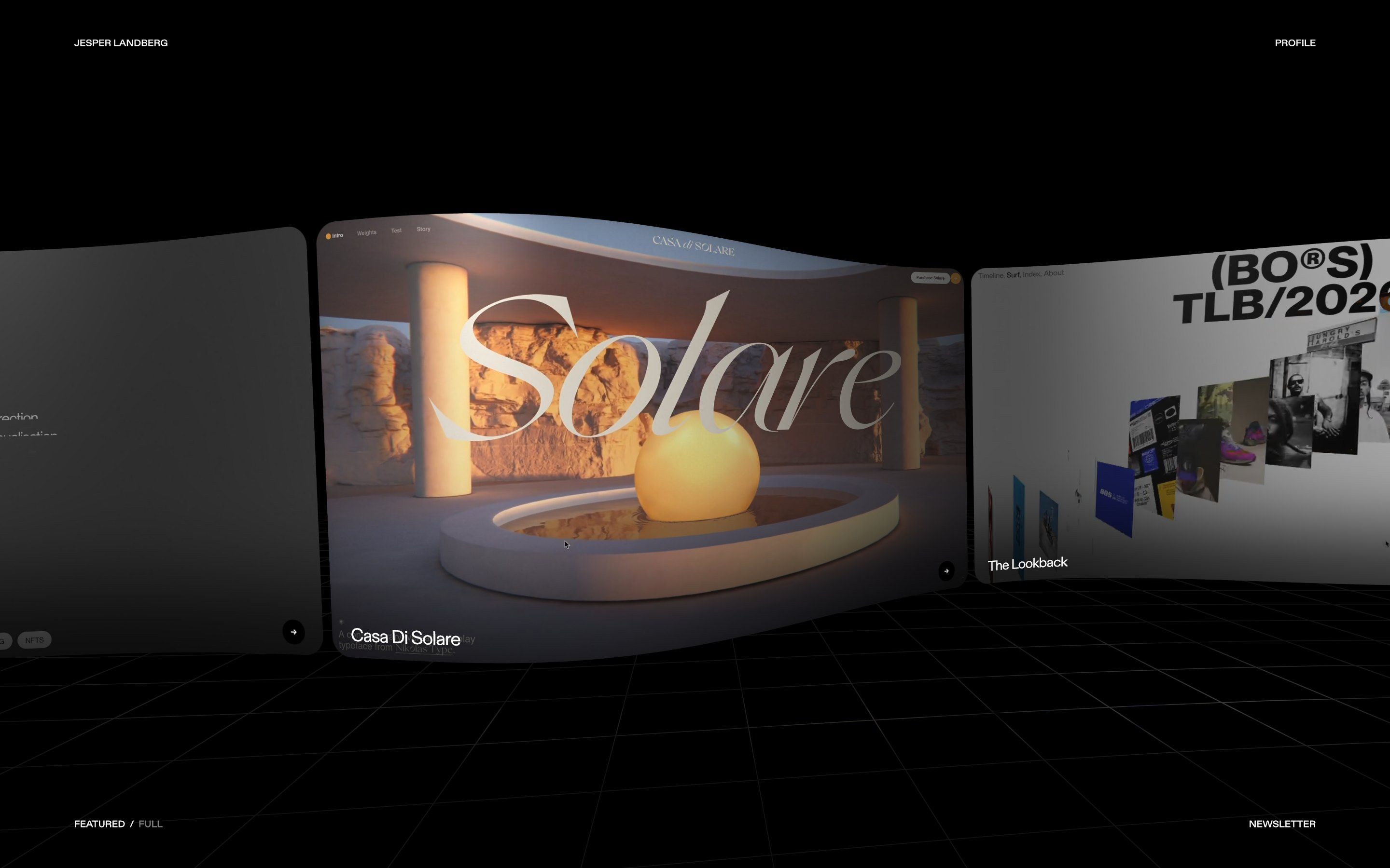
- Jesper Landberg
Jesper Landberg, how it’s made: a black hole where the profile should be
The portfolio of Jesper Landberg, Swedish design engineer: a strip of projects bent in space, a page drawn entirely in WebGL over a real HTML layout, and a profile that opens like a black hole, bending the page around it. We take it apart with three demos rebuilt from scratch.
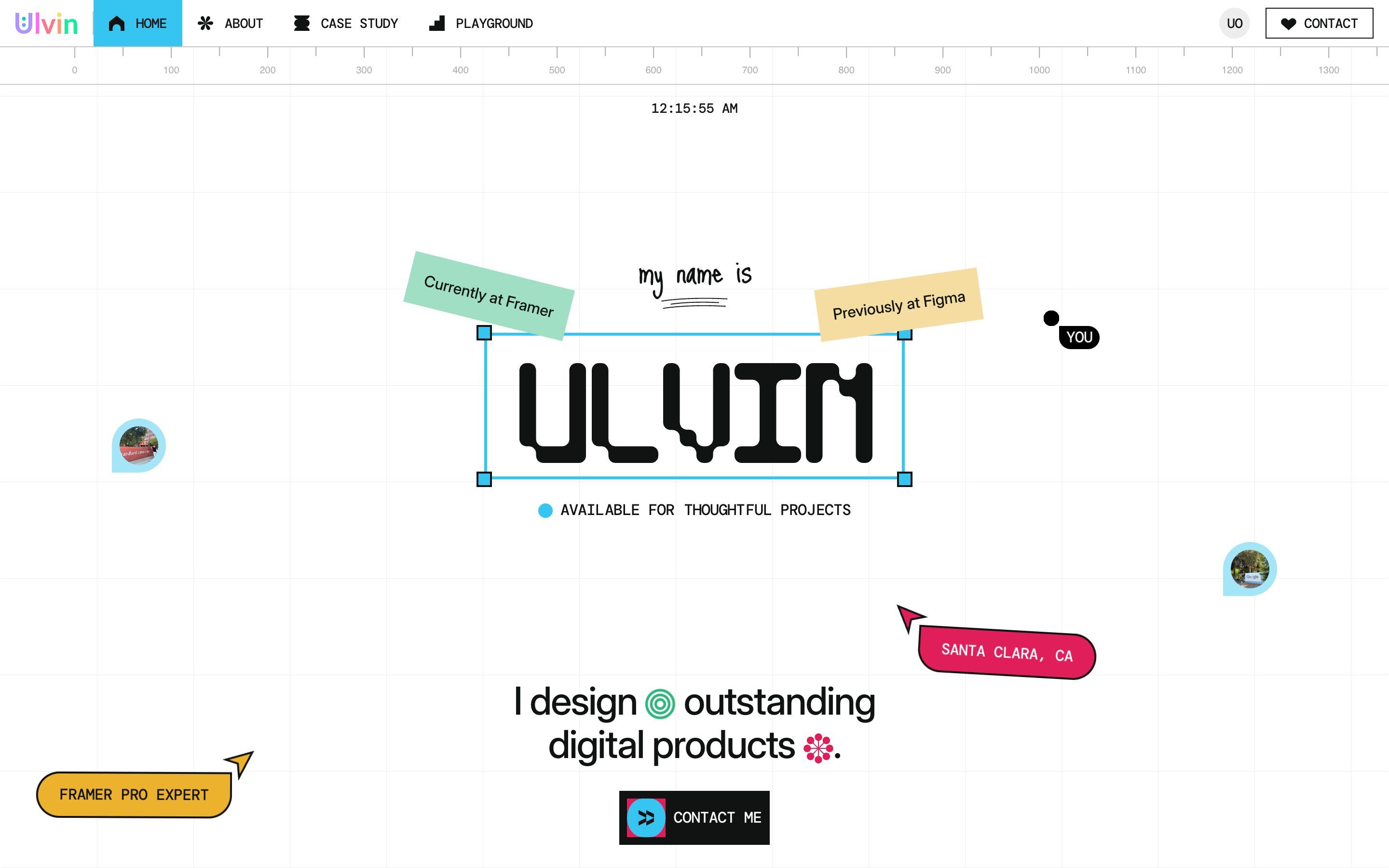
- Ulvin, by Ulvin Omarov
Ulvin, how it’s made: a portfolio inside a design tool
Ulvin Omarov’s portfolio, built in Framer: the page looks like the canvas of a design tool, with a ruler that follows the mouse, the name in a selection frame, colleagues’ cursors that step aside and project folders that pile up. We take it apart with three demos rebuilt from scratch.
- Welcome Gustavo
Welcome Gustavo, how it’s made: the frame that becomes the page
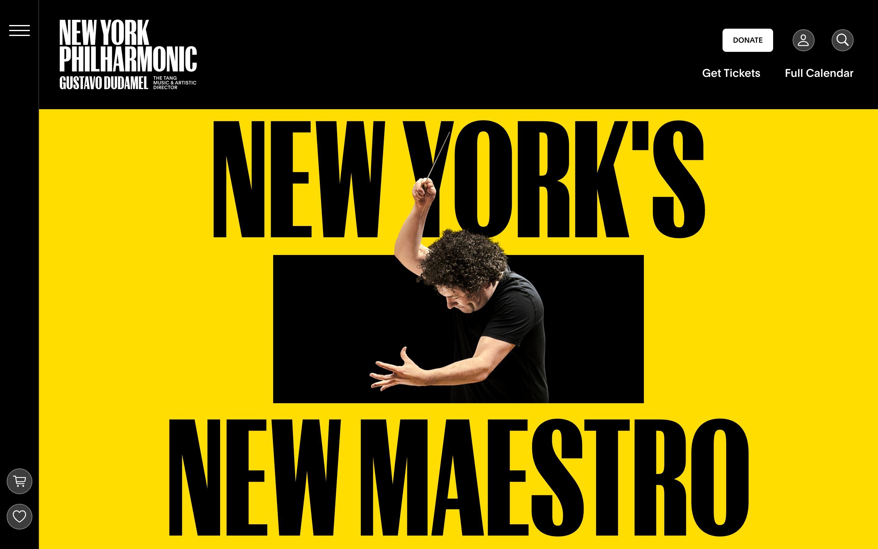
The New York Philharmonic’s page for the arrival of Gustavo Dudamel: a yellow poster with the conductor coming out of a black frame, headings that open in two as you scroll, quote marks pushed away by a photo. We take it apart with three demos rebuilt from scratch.
- Butter, by ToyFight
Butter, how it’s made: an editor made of blocks
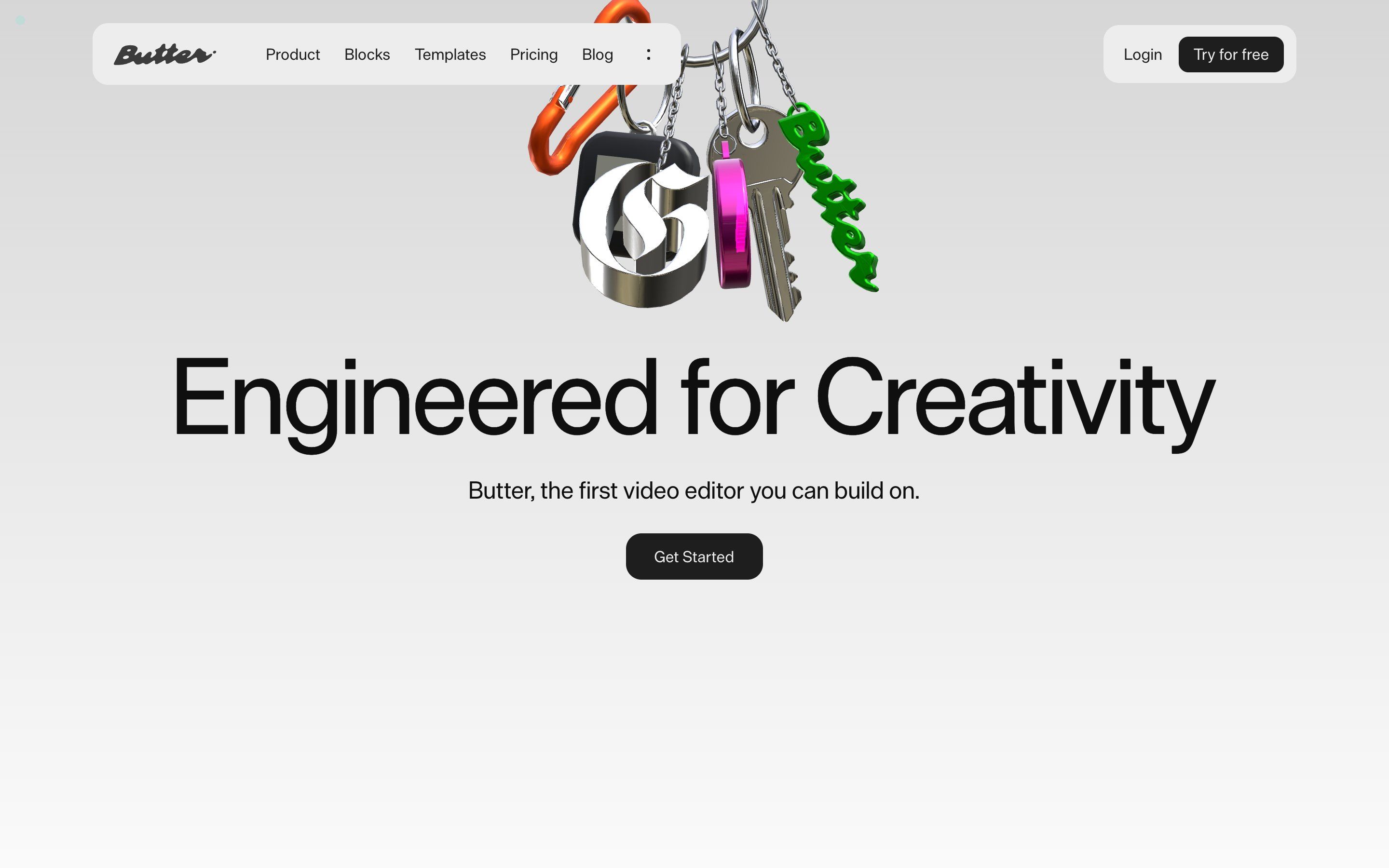
The site of Butter, ToyFight’s video editor and an Awwwards Site of the Day: tiles that drop from a sentence into the timeline, a word that tries effects on, headings that light up like neon. We take it apart with three demos rebuilt from scratch.
- Grande Charte, by Grande Charte Digital
Grande Charte, how it’s made: a charter in glass
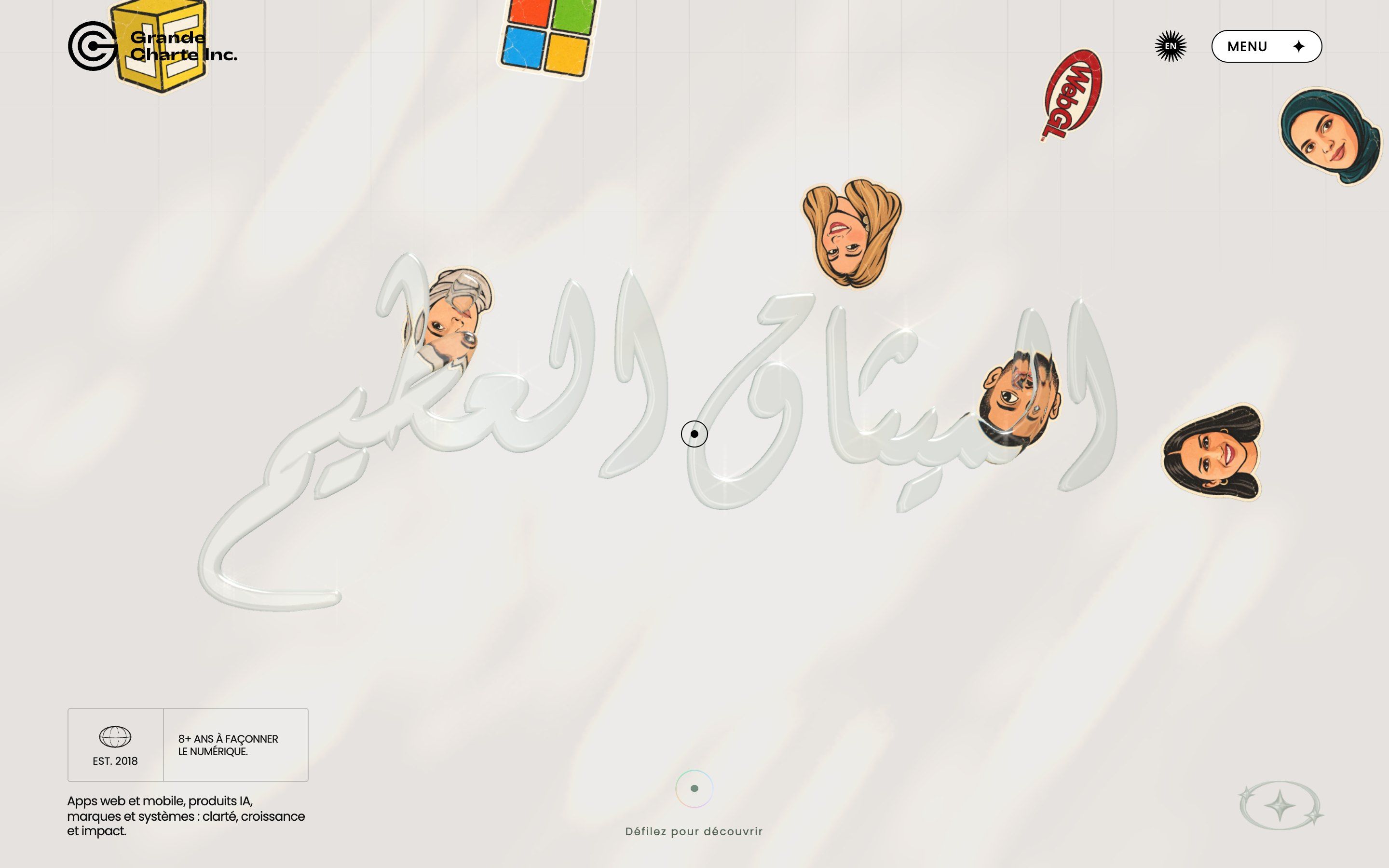
The site of Grande Charte Digital, a Casablanca agency: glass calligraphy that melts as you scroll, pictures that swell under the pointer, a loader that says hello in nine languages. We take it apart with three demos rebuilt from scratch.
- Unbelievably Crap, by Liubomyr Ulytskyi
Unbelievably Crap, how it’s made: a portfolio that tears
Liubomyr Ulytskyi’s portfolio: a field of characters the pointer tears away, a gallery of photos hanging on a 3D knot, a button that refuses twice. We take it apart with three demos rebuilt from scratch.
- A24, by Ravi Klaassens
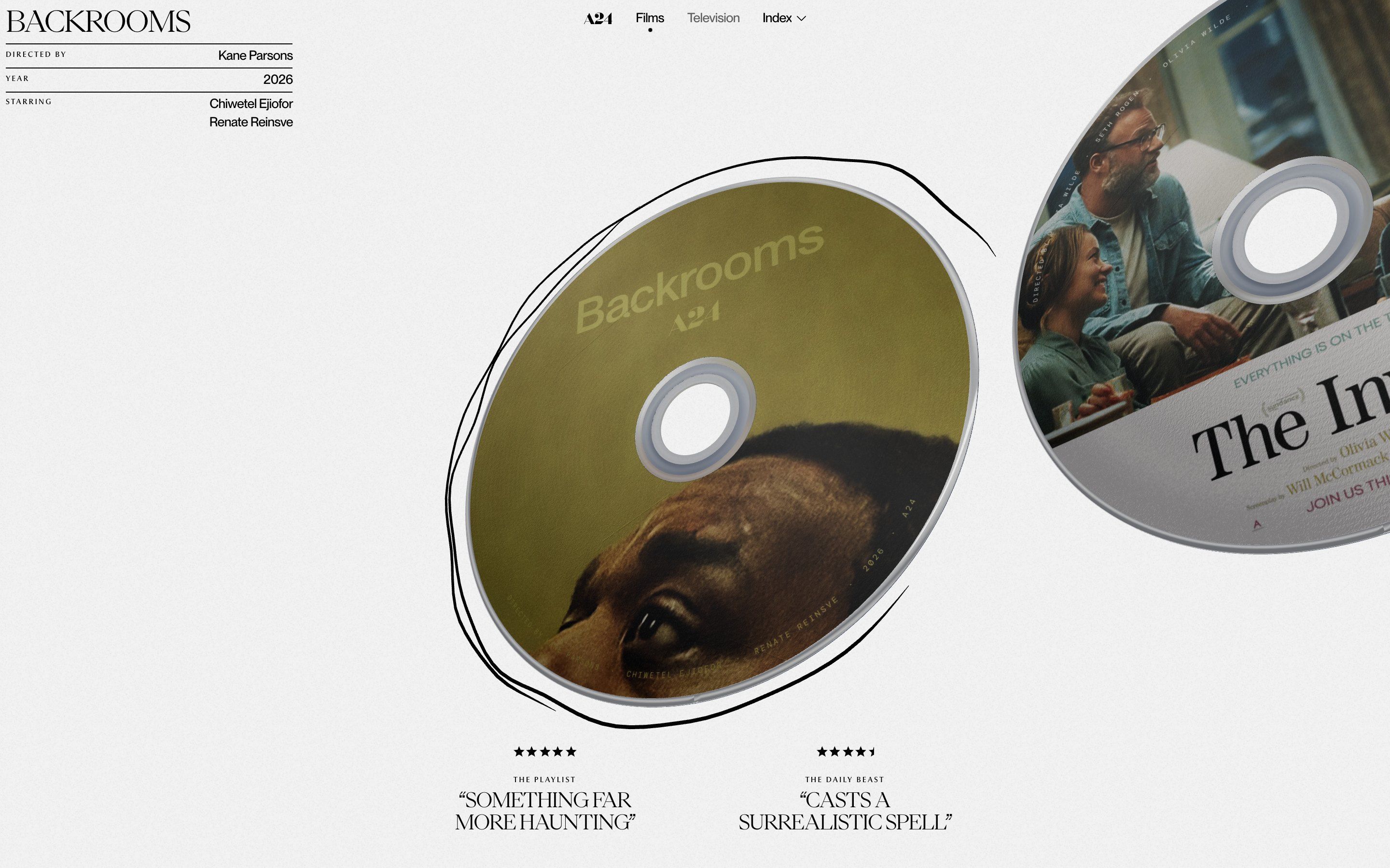
A24, how it’s made: a film archive of discs to flip
Ravi Klaassens’s concept that reimagines A24’s films as a row of 3D discs: a drum loader, discs with the poster printed on the front and an iridescent back, a sheet that melts over the film still. We take it apart with three demos rebuilt from scratch.
- Vibe, by Joel Gobin Studio
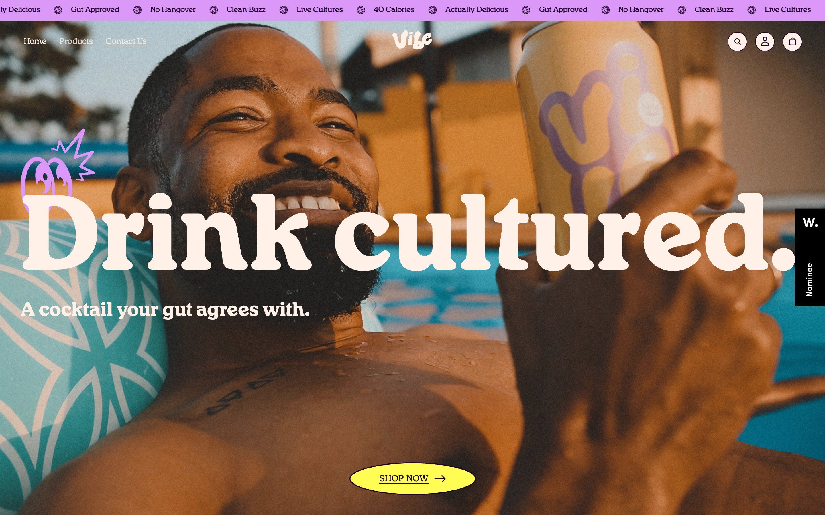
Vibe, how it’s made: a shop that opens with a scribble
The demo shop of a canned probiotic cocktail, designed by Joel Gobin Studio: a scribble that erases the cover, a can spinning between two huge words, buttons with a ticker inside. We take it apart with three demos rebuilt from scratch.
- dkton, by Studio Barry
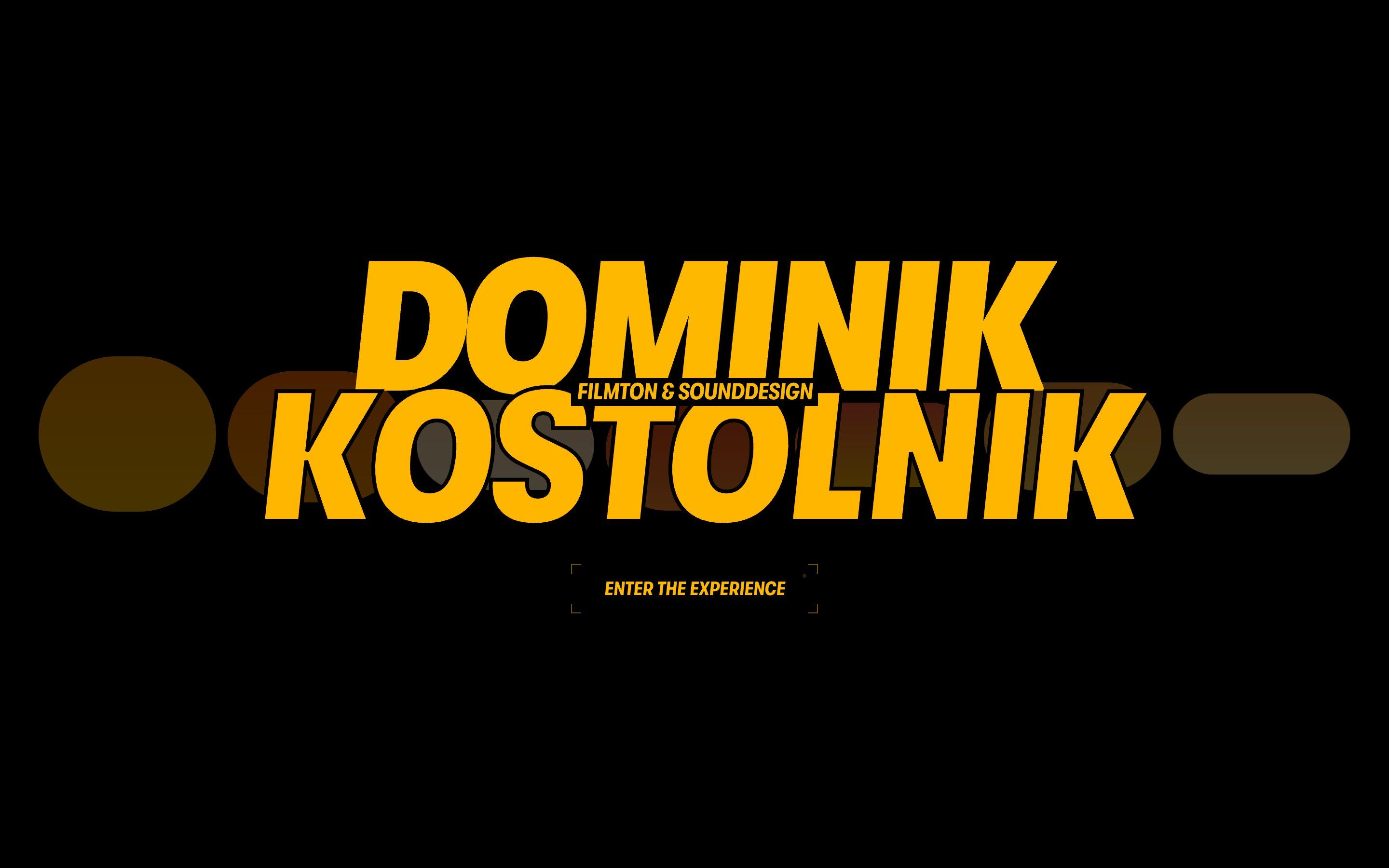
dkton, how it’s made: a site to play, even with the sound off
The portfolio of Dominik Kostolnik, who does sound for film, designed by Studio Barry: a headline that lights up as if under a torch, services set like mixer faders, a footer you pluck like a harp. We take it apart with three demos rebuilt from scratch.
- Grids S03, by Obys
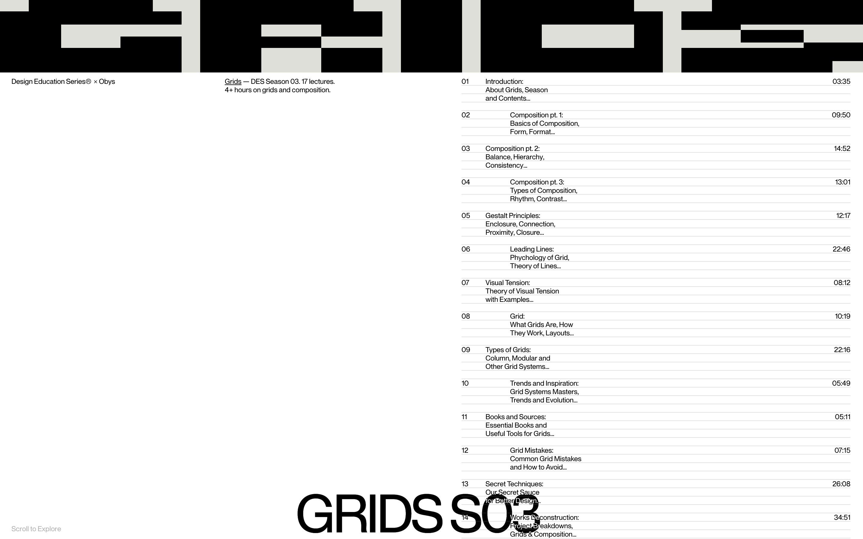
Grids S03, how it’s made: a course on grids that assembles before your eyes
The site of the third season of Obys’s course on grids: the word GRIDS made of rectangles, bending under a lens, photos that turn into squared paper, columns that assemble as you scroll. We take it apart with three demos rebuilt from scratch.
- Marimba, by Myranda Wicks
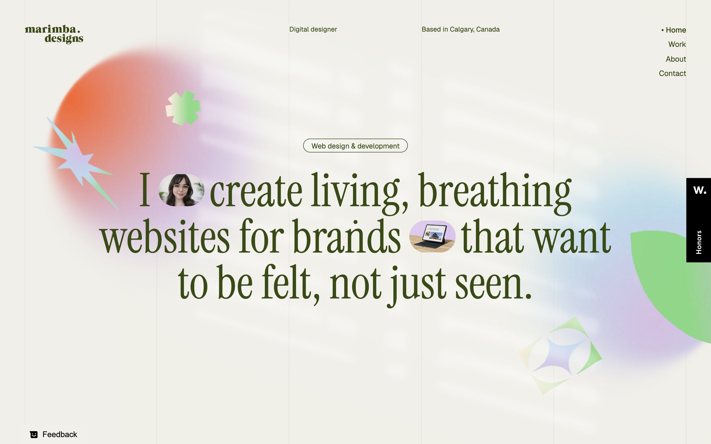
Marimba, how it’s made: a portfolio in afternoon light
The light of a window blind falls over Myranda Wicks’s portfolio, and at the bottom of the page evening comes. In between, three spheres swing until they close into a ring, and the headline opens to make room for two photos. We take it apart with three demos rebuilt from scratch.
- Chāmpo, by BAO
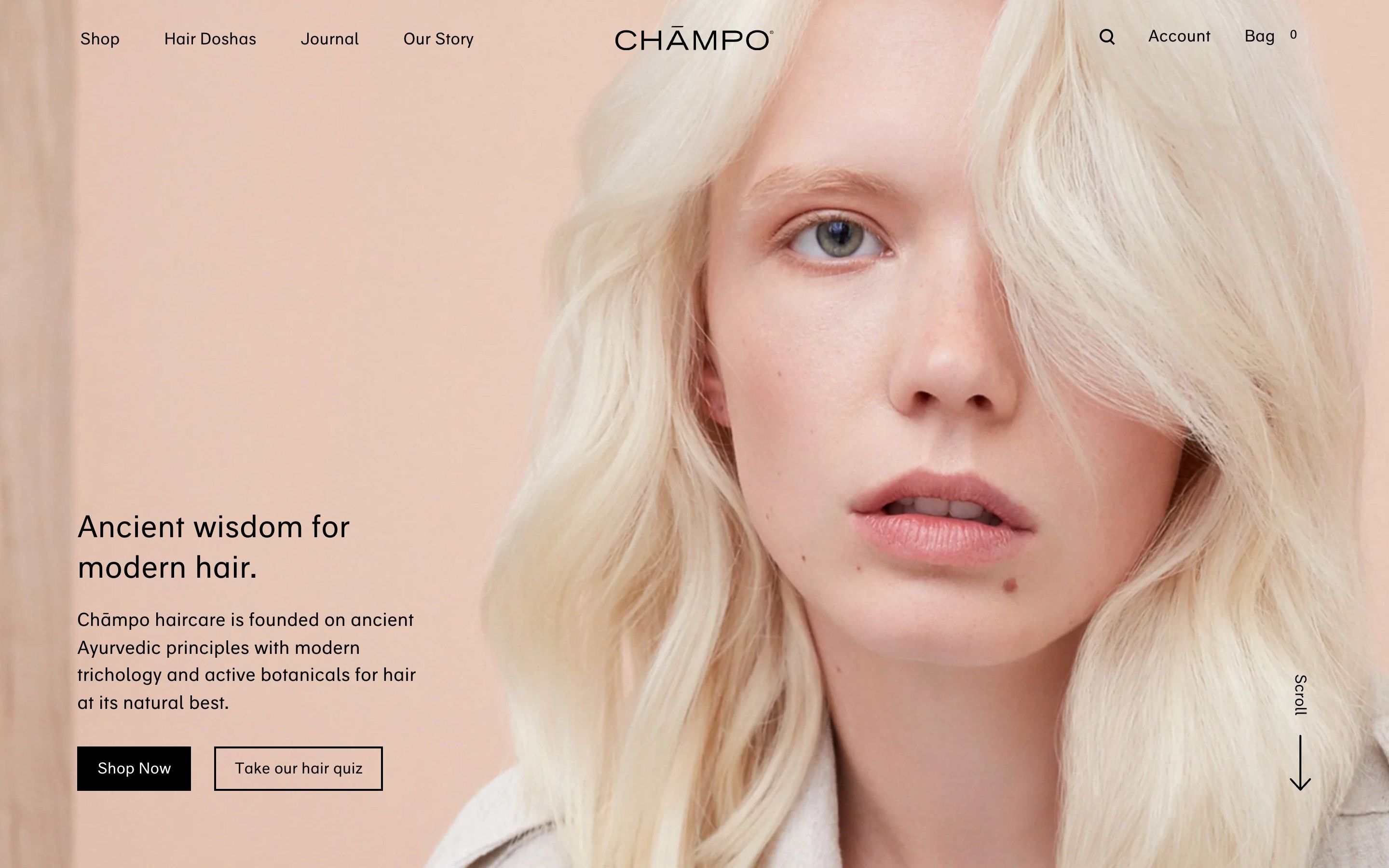
Chāmpo, how it’s made: a shop that moves little, and well
The Chāmpo shop sells Ayurvedic haircare and animates very little: buttons with an ink slab running through the text, three colour columns from which portraits emerge, coloured chapters that stay still while the page scrolls. We take it apart with three demos rebuilt from scratch.
- Point Of View
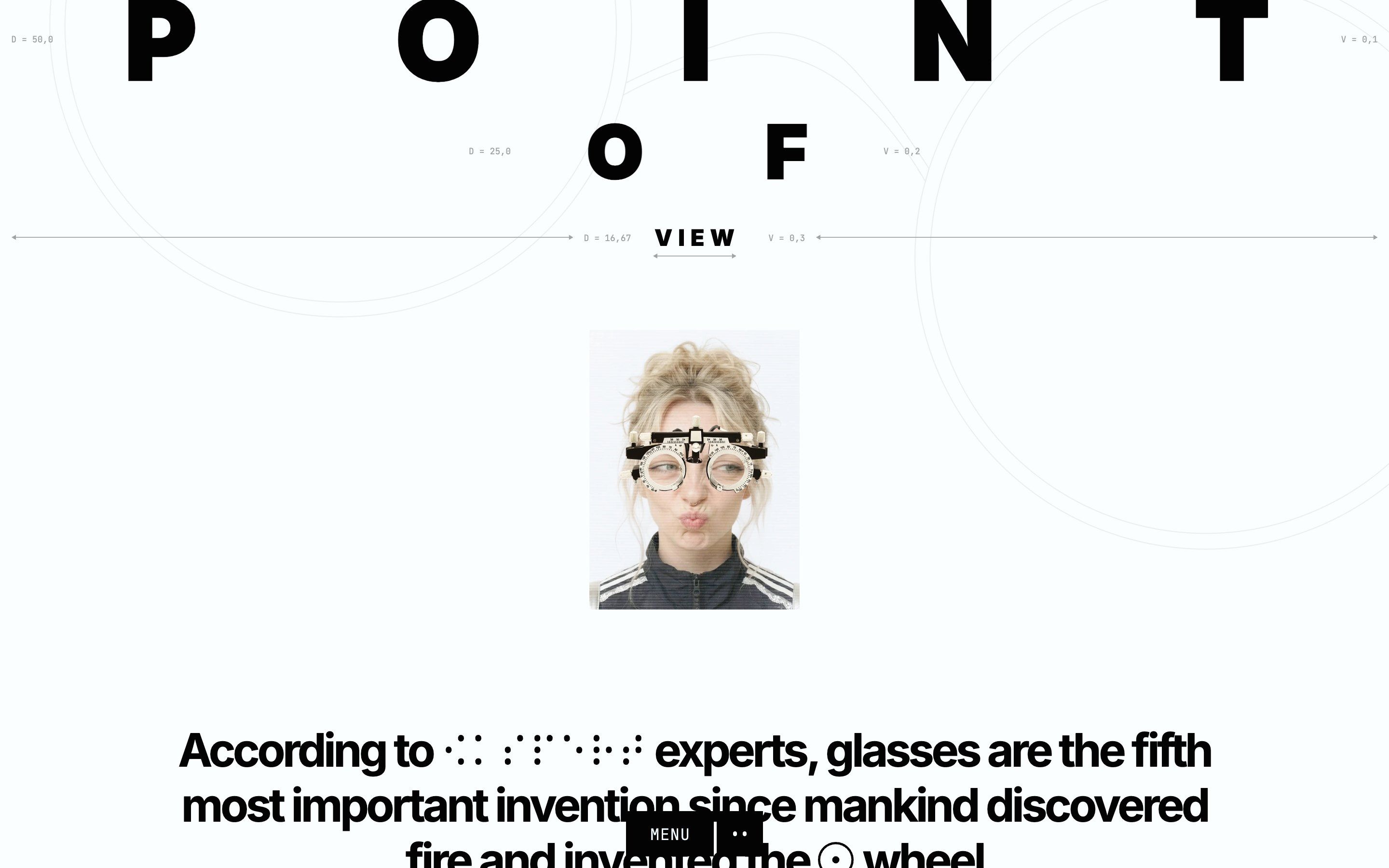
Point Of View, how it’s made: the history of glasses told with the eyes
A longread on the history of glasses, from reading stones to sunglasses, where every animation speaks about sight: a lens that brings manuscripts into focus, a window that blinks, a footer where people put on their glasses as they cross a seam. We take it apart with three demos rebuilt from scratch.
- Pensatori Irrazionali
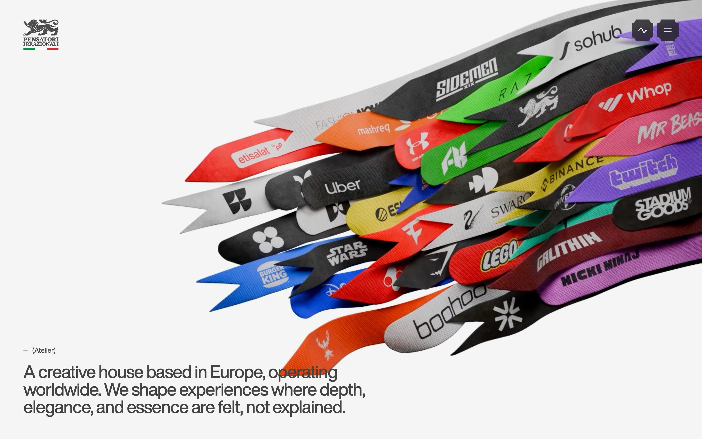
Pensatori Irrazionali, how it’s made: white plaster that wakes up as you pass
The Pensatori Irrazionali site alternates a black lab and a gallery of white plaster: a bas-relief that raking light wakes only where the pointer passes, a word that repeats itself in steps and loses its I, a menu of news that falls like paper. We take it apart with three demos rebuilt from scratch.
- EDDY-OS, by Eddy Naboulet
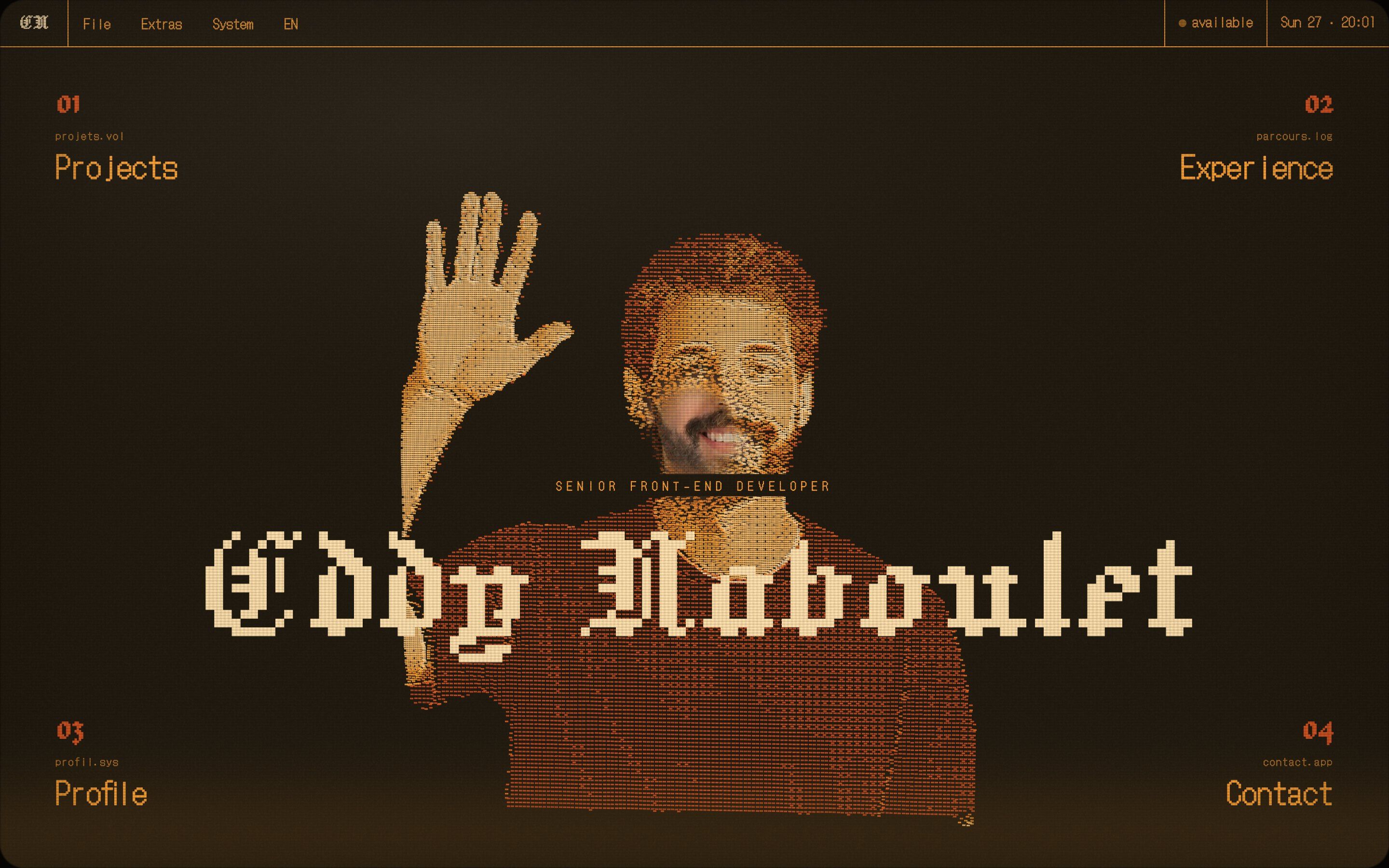
EDDY-OS, how it’s made: a portfolio inside an old television
Eddy Naboulet’s portfolio is an invented operating system seen through a cathode-ray tube: a portrait made of thousands of dashes in relief, a glass that flickers and switches off like an old TV, a dome of floppy disks. We take it apart with three demos rebuilt from scratch.
- NOTHIN’, by Thomas Carré, Pierre Patrault
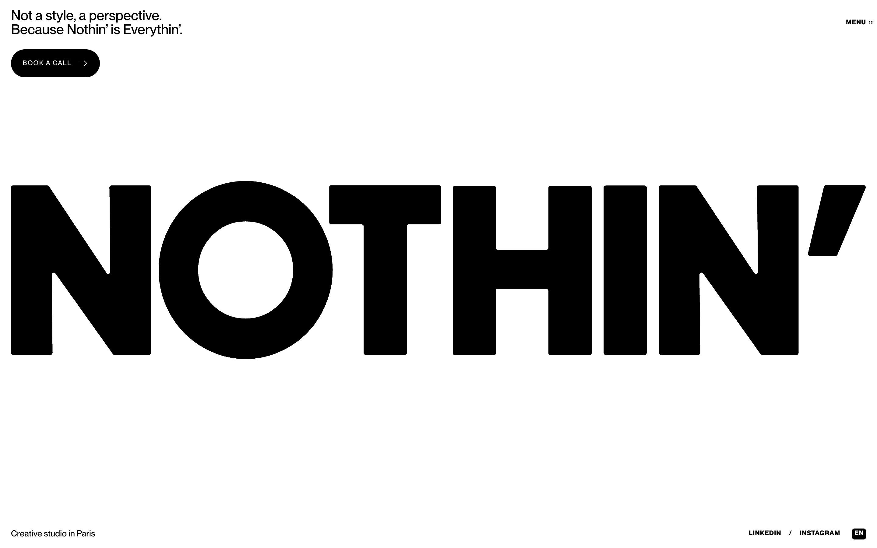
NOTHIN’, how it’s made: the word that inflates under the ink
The site of the Paris studio NOTHIN’, made by Thomas Carré and Pierre Patrault, has a black wordmark that wipes away like ink with a silver balloon version underneath, a monogram that opens like an accordion and a text that trembles and falls as you scroll. We take it apart with three demos rebuilt from scratch.
- Realevate, by Or Halevi
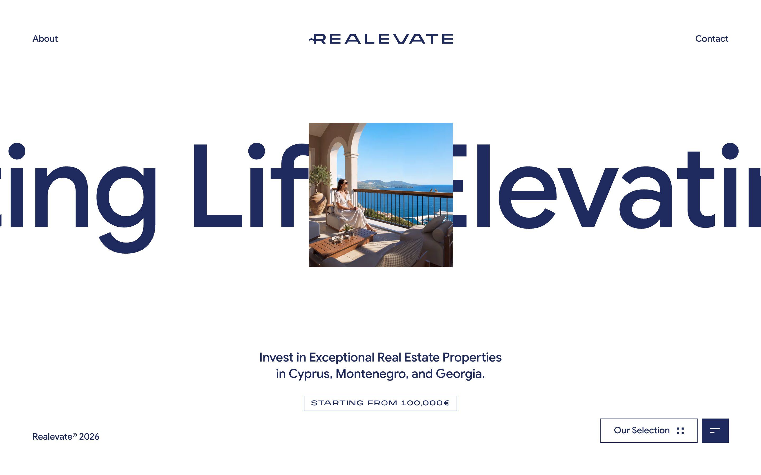
Realevate, how it’s made: a site where every page is a card
The site of Realevate, an agency selling investment homes in Cyprus, Montenegro and Georgia, made by Or Halevi with the studio MAKETHECUT, does not scroll like other sites: the home shrinks into a card, each collection ends inside the next one and the photos climb diagonally. We take it apart with three demos rebuilt from scratch.
- Le Mans Classic, by Magnetism
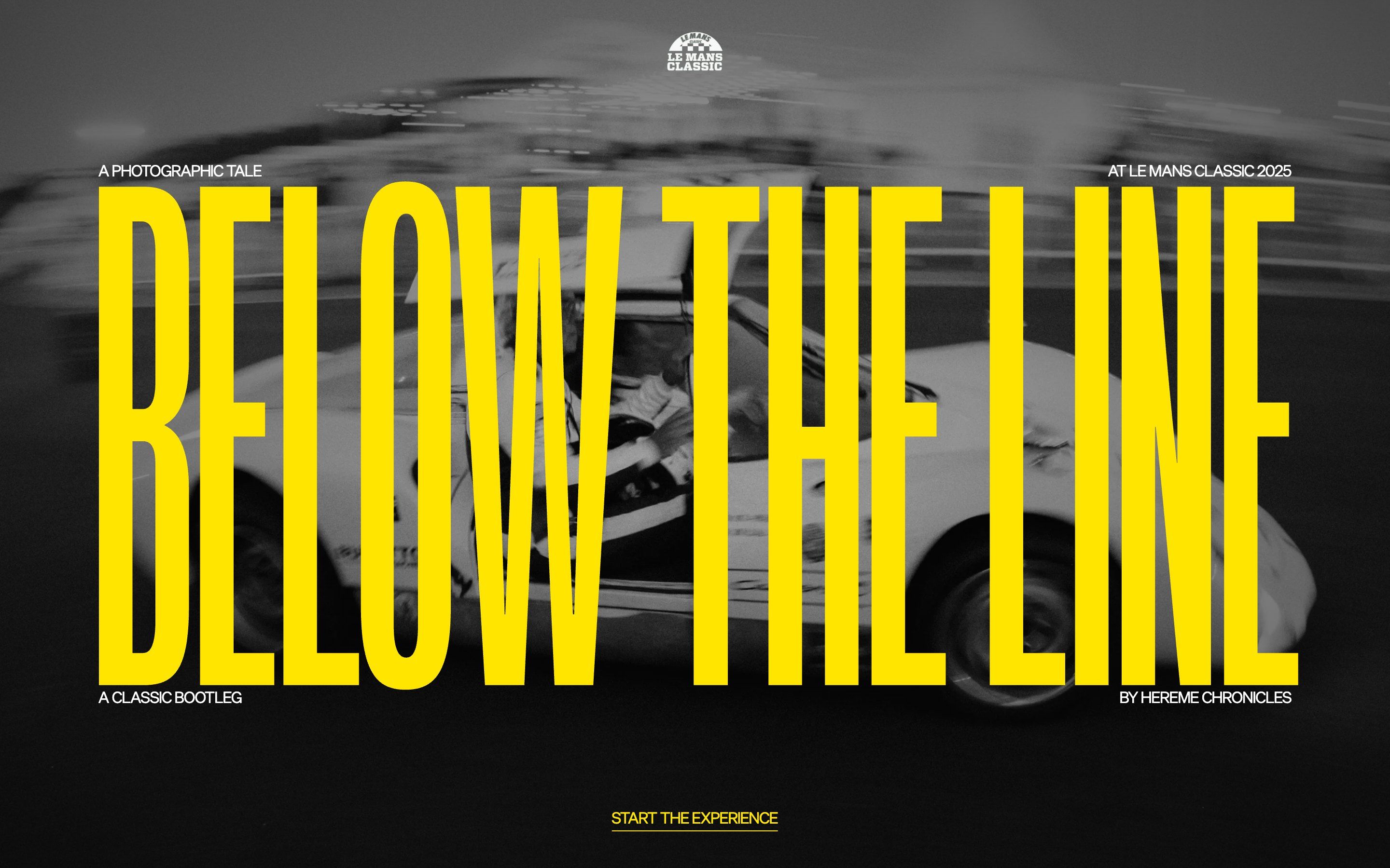
Le Mans Classic, how it’s made: a reportage that runs like a roll of film
Richard Mille’s microsite for Le Mans Classic 2025, made by the studio Magnetism, is a black and white photo story split into hours: a small window flipping through pictures, clocks counting the minutes, a strip moving sideways. We take it apart with three demos rebuilt from scratch.
- ART+TECH Report, by MoreSleep
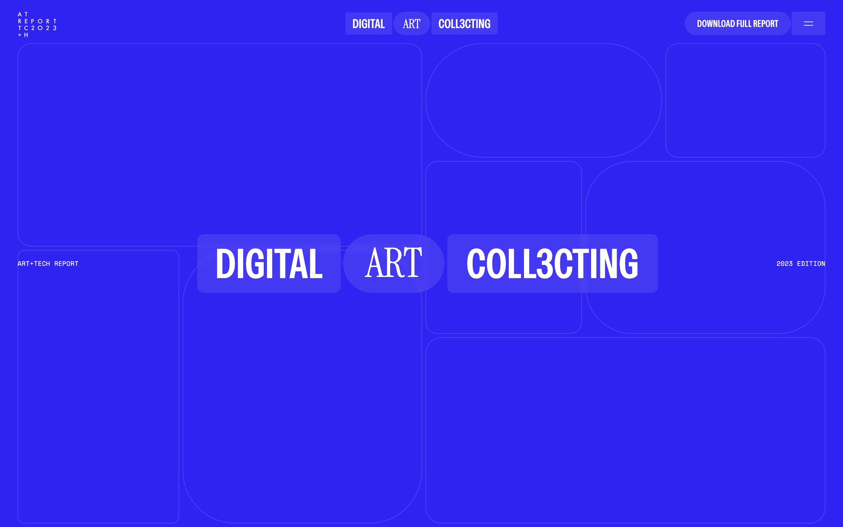
ART+TECH Report, how it’s made: a data report that assembles itself
The digital-art collecting report designed by the studio MoreSleep is electric blue, made of thin-bordered cells that move with the mouse, titles that come into focus and charts that draw themselves as you scroll. We take it apart with three demos rebuilt from scratch.
- Meer Mohsin
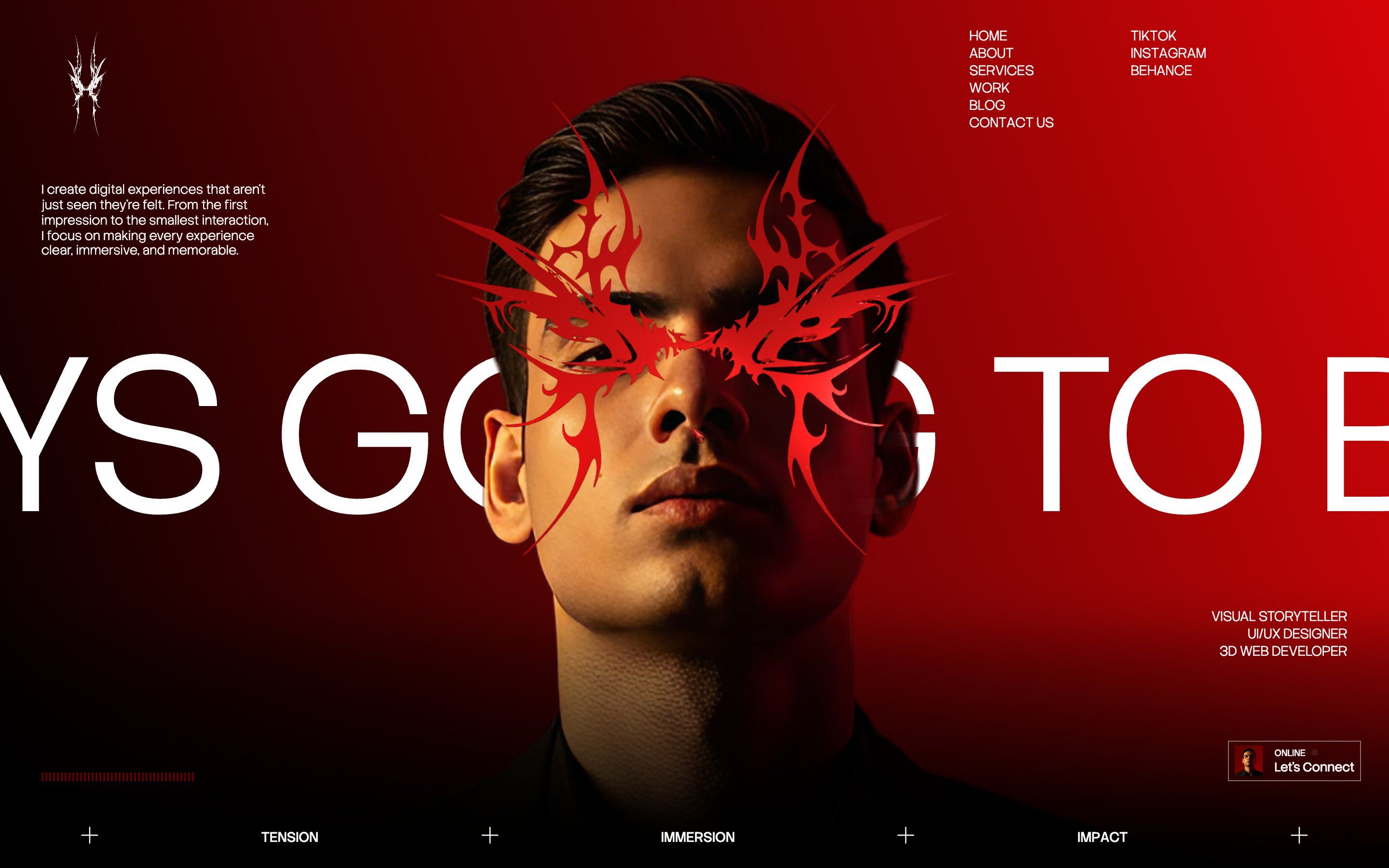
Meer Mohsin, how it’s made: a portfolio shot like a film
Meer Mohsin’s portfolio, a front-end and 3D developer, is all red and black: a count in script, a veil that dissolves into a glow, a statue turning as you scroll, the work going by in a row. We take it apart with three demos rebuilt from scratch.
- bleibtgleich, by Maksym Bleibtgleich
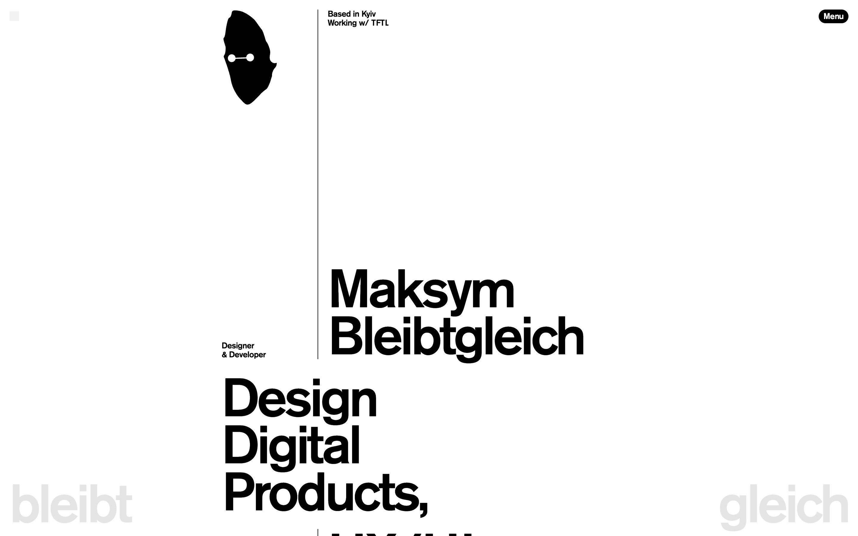
bleibtgleich, how it’s made: its name means «stays the same» and it never keeps still
Maksym Bleibtgleich’s portfolio, a designer and developer from Kyiv, is white, black and almost only type. Yet every piece moves: the logo is born from a rectangle, lines come out of the ink, the work spins on a globe. We take it apart with three demos rebuilt from scratch.
- Hayler, by Clapat
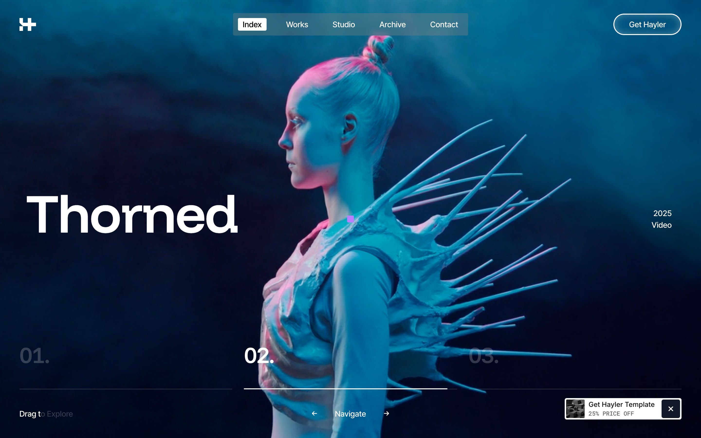
Hayler, how it’s made: one gesture for the whole site
Clapat’s template for creative studios opens the site, changes page and moves from light to dark with the same move: columns falling like a staircase. We take it apart effect by effect, with demos rebuilt from scratch.
Which site next?
Send us an animated site you love: we pick the next articles from here.