The Agency of Love & Logic, by The Agency of Love & Logic, Stas Bondar
The Agency of Love & Logic, how it’s made: the split case study that follows the mouse, the toggle that calls on a spring and the two columns of work running backwards
The site of the Toronto brand agency, rebuilt for its change of name, splits every project into two sides: a border between the columns that moves with the mouse, a Love and Logic pill that gets noticed with a spring drawn in CSS, and a work gallery in two columns drifting in opposite directions that stop under the pointer. We take it apart with three demos rebuilt from scratch.
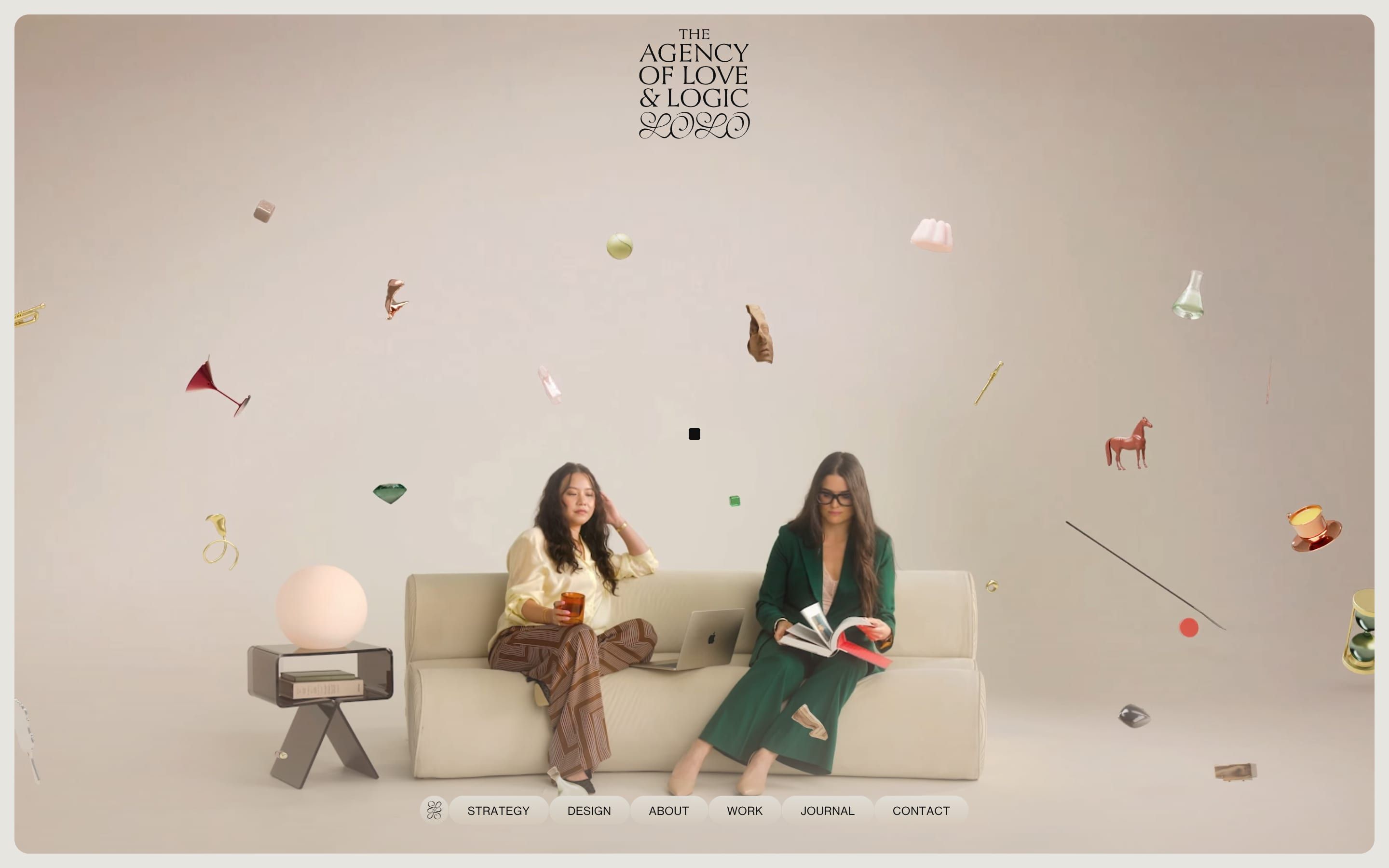
The palette
- #E6E5E0the warm grey paper behind every page
- #101010the black of the text, the logo and the square cursor
- #BFAE9Ethe beige of the tiles and the pills of the bar
- #F7D3DFthe pink, the first of the menu pastels
- #D3D6B5the sage green
- #FC933Dthe orange
- #B70600the red
Tap a colour to copy its code.
The Agency of Love & Logic is a Toronto brand agency doing strategy and design for hotels, restaurants, wellness, technology and culture. It used to be called Workhouse, and this is the site of the change of name: a banner, «The next chapter in our story», greets anyone arriving from the old address. The work includes Four Seasons, Toronto Pearson airport, LCBO’s holiday guide, the E11even restaurant, a spa and even the cover of a doom metal album. The name is already the brief: every project is told twice, once with the heart and once with the head, Love and Logic. The site is paper coloured, a warm grey, #E6E5E0, with black #101010 for the text, the logo and the cursor, which is a 12 pixel square with barely rounded corners. Beside them sit a beige, #BFAE9E, and a row of project colours: pink #F7D3DF, sage #D3D6B5, orange #FC933D, red #B70600. There are three typefaces: Victor Narrow, thin and condensed, for the uppercase headings; Neue Haas Grotesk Display for the text; and Victor Narrow Mono for the labels. The code signs nobody; according to the Awwwards credits the site is by the agency itself with Stas Bondar. It was Site of the Day on 19 April 2026, with 7.44 from the jury, and took the Developer Award, 7.02.
Underneath there is Astro 5.13.3 with Tailwind 4, the content on Sanity and the videos on Bunny. The animation is GSAP 3.13.0 with seven plugins, SplitText, MorphSVG, Draggable, Inertia, Observer, ScrollTrigger and Flip; smooth scrolling is Lenis 1.1.20. A tidy choice: Lenis and GSAP run on the same clock, Tempus, which takes GSAP’s ticker away and hands it the time on every frame, so the scroll and the animations never fall out of step. Between pages the site doesn’t use Astro’s transitions but Barba 2.10.3, with prefetch: the old page backs off to 0.95, fades to half and rises by a tenth of the screen, while the new one arrives from below like a sheet, in 1.2 seconds on expo.inOut. Every piece of the page carries a data-module attribute, and a loader imports the file it needs on the fly: Accordion, Contrast, Marque, Services, TextRange and so on.
We take it apart in three moments, with a demo rebuilt from scratch for each. The text, the brands, the photos and the code are ours; from the site we took the ideas and, where we say so, the numbers.
The split case study that follows the mouse
Every case study is a two column page: on the left the images of the project, scrolling on their own, on the right the text, with the client’s name in a huge heading. Move the mouse towards one side and the border between the columns slides the other way, as if the page leaned towards what you are looking at, and the heading widens or narrows with its column.
It is done with a single CSS variable, --split. The JavaScript measures how far the mouse is from the centre of the screen, as a fraction of the width, clamps it to plus or minus 0.1 and maps it to plus or minus 0.2; then it hands it to a GSAP quickTo, which reaches it in 0.8 seconds on power3. The CSS does everything else: the columns are calc(50% + var(--split) × 50%) and calc(50% − var(--split) × 50%), so they breathe at most to 60 and 40, and the heading measures (180 − split × 200) grid units. The images have a second Lenis of their own, with the same numbers as the first, scrolling only that column. Below 1024 pixels the moving border disappears and becomes a three way switch.
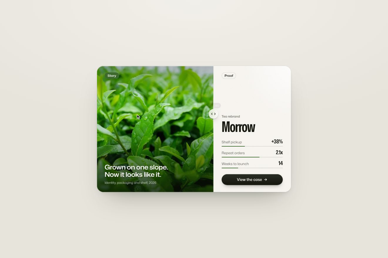
In our demo the case study belongs to an invented studio, Hinge & Hearth, for the rebrand of a tea, Morrow, inside a card on a paper coloured page. On the left the Story: a real photo of tea leaves with drops on them and a line, «Grown on one slope. Now it looks like it.». On the right the Proof: the big name, three figures with their green bars and the «View the case» button. From the site come the single variable that moves everything, the mouse clamped to 0.1 and mapped to 0.2, the 0.8 second quickTo on power3, the columns breathing to 60 and 40 and the name changing size with the formula 180 − split × 200. Ours are the name that, besides growing, widens on the width axis of a variable typeface, the photo that uncovers without squashing, the pill of the larger half filling with green, the thread of light on the border with a glass handle that follows the pointer’s height, stretches with speed and settles on a spring, briefly showing the split of the two halves, and the button that lifts by a pixel, gives when pressed and says «Case saved» with a drawn tick while the bars start again from zero. A drawn cursor does the round on its own until a real one arrives; on phones the border is dragged with a finger. With reduced motion the border stays in the middle and everything changes with a fade.
The Love and Logic toggle that calls
In every case study there is a pill with two options, Love and Logic, and the story changes completely depending on which one is on. So that nobody misses it, the pill gets noticed: every so often its white background gives a push towards the other option and swings back, like a spring touched with a finger, while around it a halo in the project colour breathes.
The spring isn’t computed: it is drawn by hand in a CSS @keyframes, toggleMoves. In a 5 second cycle the background goes to 40% at 3% of the time, back to 8% at 6%, up to 20%, then 4, 10, 2 and rest at zero at 20% of the cycle; for the rest it stands still. The cycle starts after 3 seconds and runs for only 24 seconds, then stops: whoever hasn’t seen it by then never will. The halo is another animation, tooglePulse (with the typo in the name), a shadow going from 40 to 50 pixels in 3 seconds. On click the modules of the option switched off leave with a tenth of a second between them, in half a second on power2.in, the others enter in 0.7 on power2.out, and Lenis puts the scroll back at the same proportion of the page, so you don’t lose your place.
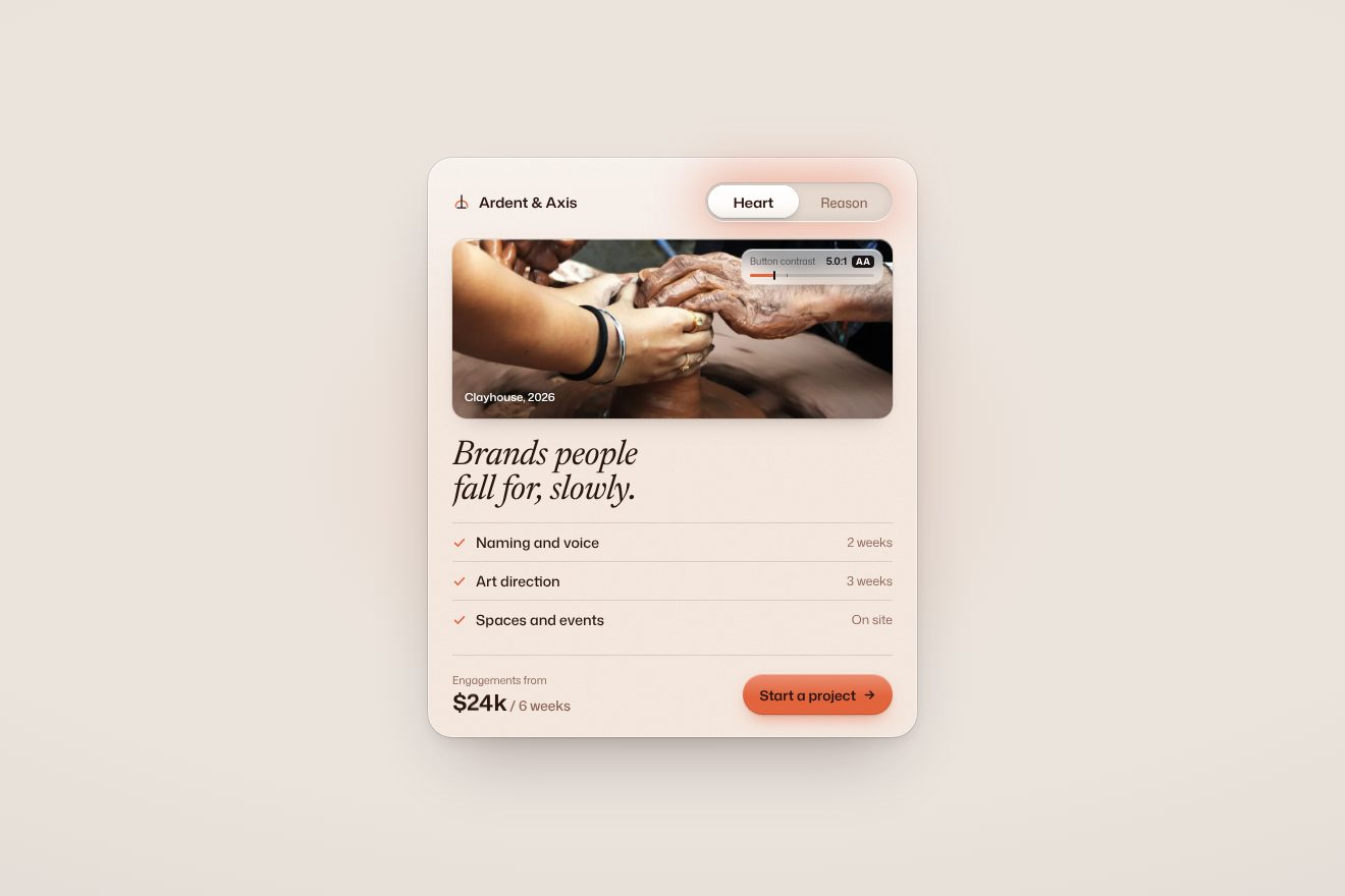
In our demo the pill sits on the services card of an invented branding studio, Ardent & Axis, and the two options are Heart and Reason. Switching changes the tone of the whole card: with Heart it is warm, terracotta, with a serif italic heading, «Brands people fall for, slowly.», and a photo of two pairs of hands on clay; with Reason it turns rational, cobalt blue, with a wide sans heading and a photo of a concrete wall. From the site come the 40% push that dies down in a few bounces, the 5 second cycle that starts after 3 and stops after 24, the inner shadow of the background, the halo breathing from 40 to 50 pixels in 3 seconds, the cascading swap, out on power2.in in half a second and in on power2.out in 0.7, and the WCAG contrast computed on every frame, which comes from the design page. Ours are the real spring with a stop instead of keyframes, the knob that leans out on hover, squashes when pressed and stretches as it runs to the other side, the sideways curtain bringing in the new photo, the ticks that redraw, the price rolling digit by digit, from $24k in six weeks to $18k in four, and a glass chip on the photo measuring the button’s contrast while the colours change: halfway the label turns from black to white on its own and the score climbs from 5:1, AA, to 7.5:1, AAA. With reduced motion the pill doesn’t call and the change is a fade.
The two columns of work running backwards
The work page is a gallery that never stands still: two columns of covers scroll on their own, the left one upwards and the right one downwards, more slowly. The wheel pushes both, and the column under the mouse stops, so you can look at a project calmly; the cover under the pointer rounds its corners and its video moves closer.
There is no ScrollTrigger. A ticker moves the left column by 0.2 pixels a frame and the right one by 70% of that; the wheel adds deltaY × 0.9, and 0.7 on the right; a finger twice as much. The real position chases the wanted one by a tenth per frame, which is why the gallery brakes and restarts softly. The endless loop is a GSAP trick: the covers are copied once, a tween moves the column by half the list with modifiers that take the height modulo, and the ticker doesn’t play it but sets it to the right point with progress(wrap(y / height)). The hover is a CSS variable, --progress, that GSAP takes from 0 to 1 in 0.6 seconds on power3: the CSS turns it into the corner radius, from 20 to 40 units, and the scale of the video, up to 1.08. On the way out the same animation runs back one and a half times faster.
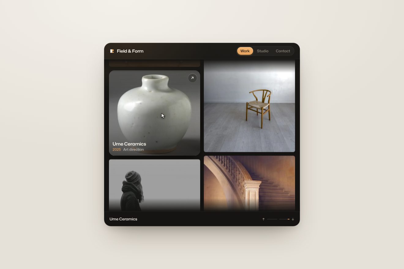
In our demo the gallery belongs to an invented creative studio, Field & Form, inside a dark card with the mark, the Work, Studio and Contact links and a footer with the name of the project. The covers are real, royalty free photographs: a wooden chair in an empty room, a white ceramic vase, a silver coffee pot, a stone staircase, people seen from behind. From the site come the two columns in opposite directions, 0.2 pixels a frame and 70% for the other, the tenth-per-frame step towards the target, the wheel pushing by deltaY × 0.9, the endless loop with the tween and the modifiers, the start at 400 and 280, the column that stops under the mouse and the cover that rounds its corners and enlarges the photo by 8%, in 0.6 seconds on power3, returning one and a half times faster. Ours are the spring brake instead of a sudden stop, the neighbouring covers that darken, the caption rising letter by letter with client, year and discipline, the round glass button with the arrow, the project name rolling in the footer and two thin lines measuring how fast each column runs. A drawn pointer does the round on its own until the real one arrives; with a finger the columns can be dragged. With reduced motion the columns stay still and the caption fades in.
The other details
The square cursor changes job depending on what it is over: it grows, it becomes a pill with a word, «view», «scroll», «drag», or it snaps to a button, moves to its centre and takes its shape, two pixels bigger and with a radius equal to its height, and follows it even while scrolling. Links swap their letters: two copies of the text, split into letters by SplitText, rise by 110% with two hundredths of a second between letters, and on the way out return one and a half times faster. The menu button is the agency’s monogram, which MorphSVG turns into an X as it slides to the centre of the bar; the panel uncovers with a gradient mask-image and behind it there is an OGL shader, four octave noise mixing five pastels and following the mouse, drawn at resolution 1 and every other frame. On the design page two colour swatches cycle through six pairs of browns and creams and the site really computes the WCAG contrast on every frame, picks white or black text on its own and moves a marker along a track from 1 to 21. And in the loader GSAP directs a Lottie: it takes the logo from frame 12 to 120 in two seconds, waits for the page to be ready and rewinds it in 1.2.
Where it stumbles
The home page is heavy: 187 requests and about 17 megabytes, almost all of it the background video, 16.5 megabytes in WebM. The loader brings along the whole of lottie-web, 309 kilobytes, to play one logo, and the menu shader, a single triangle, arrives with an OGL bundle that also contains the 3D model loaders, 133 kilobytes. Reduced motion is almost nowhere: no rule in the CSS, and in the JavaScript only the spa badges module checks it; the loader, the page change, the self-scrolling galleries and the swinging pill always run, and the galleries have no button to stop them. The images all have an empty description, 63 on the work page alone, and the whole home page has a single aria attribute. On the About page, in the featured project cards, the placeholder «props.title» in curly brackets shows on screen, a template left empty. And Barba stops every click to decide what to do with it, so links pointing to an anchor don’t work.
What we take away
Love & Logic turns its name into a design rule: everything has two sides, and the page lets you weigh them with the mouse. The best ideas are small: a border that moves by ten points instead of a page that changes, a pill that calls for 24 seconds and then falls silent, a gallery that stops exactly where you look at it. And a technical lesson worth copying: almost every hover on the site is a single CSS variable, --progress or --split, animated by GSAP and used by the CSS, so the JavaScript says how much and the CSS says how.
The effects
- Split case studyThe case study card of an invented branding studio, the rebrand of a tea brand, split into two halves: Story with a real photo of tea leaves and Proof with the name and the numbers. The border between them follows the pointer on a spring, from 50/50 up to 60/40 either way; the big name grows and stretches with the wdth axis of a variable font, the chip of the bigger half fills with green, and on the border a glass knob stretches with the speed and settles.Free
- Services toggle cardA two way switch, Heart or Reason, in the services card of a made-up branding studio, Ardent & Axis. Until someone touches it, it calls for attention: every five seconds the knob is kicked toward the other side and comes back bouncing on its stop like a real spring, each bounce half the one before, while a glow in the card's colour breathes around it. Pressed, it squashes; let go, it crosses on a spring that stretches it as it travels. On the change the card turns from warm to rational: the photo wipes in from the side, the title and the three services swap in a cascade, the fee rolls digit by digit and a glass chip on the photo works out the button's WCAG contrast live and picks white or dark words on its own.Free
- Two-column work wallThe work page of an invented creative studio, Field & Form, inside a dark card on warm paper: two columns of covers with real photos drift for ever, the left one up and the right one down at 70%, and the wheel pushes them both. The column under the pointer brakes on a spring and stops; the cover rounds its corners, the photo grows by 8%, the others dim and the caption (client, year, discipline) rises letter by letter, while the name rolls into the foot of the card.Free