Realevate, by Or Halevi
Realevate, how it’s made: a site where every page is a card
The site of Realevate, an agency selling investment homes in Cyprus, Montenegro and Georgia, made by Or Halevi with the studio MAKETHECUT, does not scroll like other sites: the home shrinks into a card, each collection ends inside the next one and the photos climb diagonally. We take it apart with three demos rebuilt from scratch.
The palette
- #FFFFFFhome background
- #1F2B5Ebrand navy
- #E3E5EBdeck background
- #222A4CBy The Sea
- #36614DEvergreen
- #2D1C2DUrban Living
- #1C181DRare Gems
- #626C95muted navy
Tap a colour to copy its code.
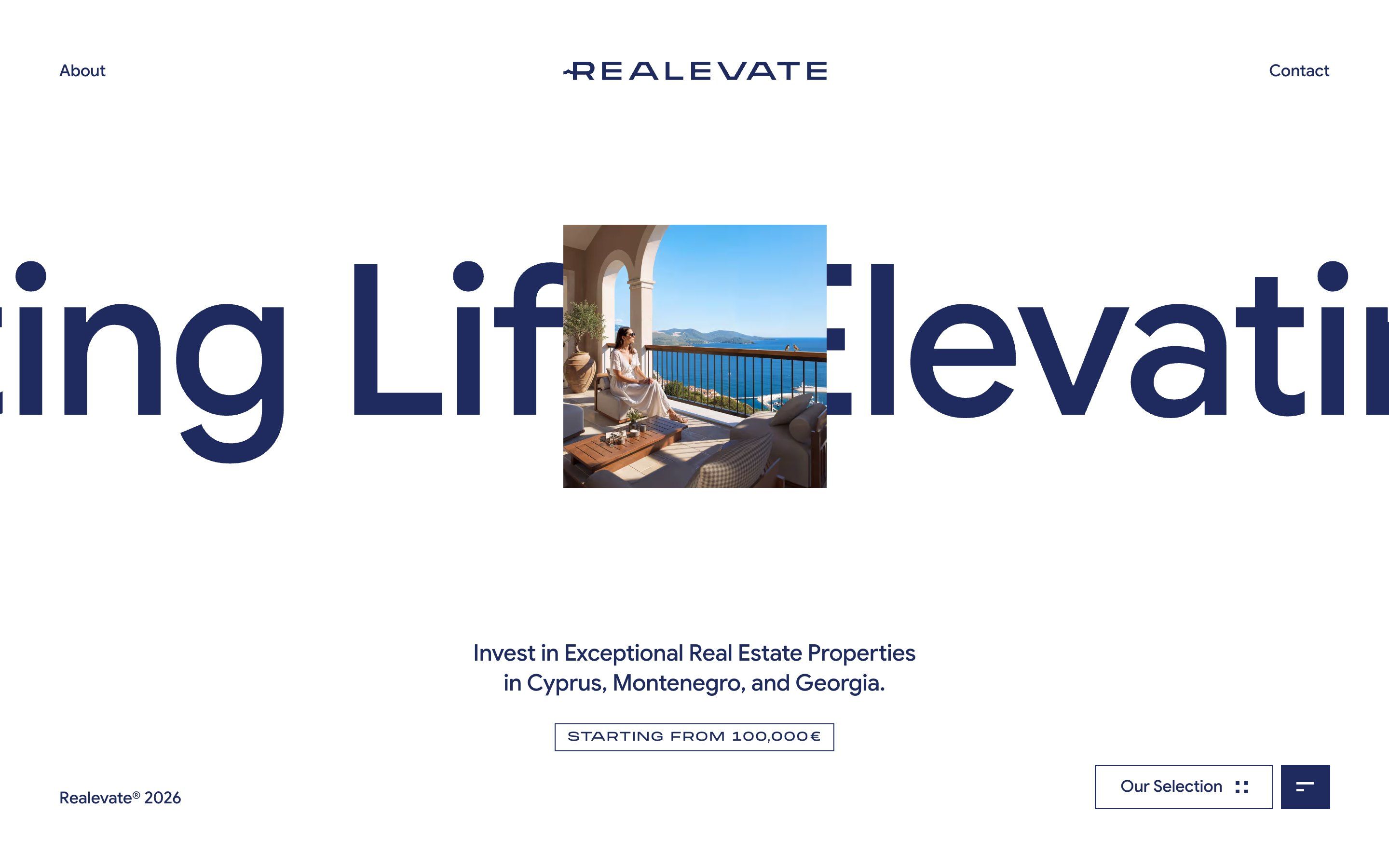
Realevate is an agency selling investment homes in Cyprus, Montenegro and Georgia, «starting from 100,000€». The site splits the homes into four collections, By The Sea, Evergreen, Urban Living and Rare Gems, plus an about page and a contact page. It was made by Or Halevi, a designer and developer from Tel Aviv, together with the studio MAKETHECUT.
At first sight it looks like a luxury brochure: a midnight blue wordmark on white, a deep, precious colour for each collection (a sea blue, a forest green, a plum, almost a black) and sun-soaked renders. Titles are set in Roslindale Display, a hairline serif, the rest in Google Sans, the price in Monument Extended, wide and in capitals. But what stays with you is something else: the whole site is a single stage, and every page gets shrunk, dealt, slid and clipped as if it were a card.
There is no framework underneath. These are static HTML pages that a single hand-written JavaScript file, 285 KB, turns into an application: it downloads the new page, mounts it behind the old one and changes the address. The animations are GSAP 3.12, with ScrollTrigger and SplitText; the smooth scrolling is home-made and the curves are cubic-beziers solved by a function written for the purpose. No WebGL. Here we take it apart in three moments, with a demo rebuilt from scratch for each: the photos are our own drawings, and so are the texts, the names and the code. From the site we took the idea and the timing.
The page that becomes a card
The home does not scroll. Behind the square photo in the middle, the words «Elevating Life» pass by, huge, and the photo looks like a window cut into the word. On the first wheel movement down, instead of going down, the whole page shrinks and rests at the bottom centre, and four tall cards rise above it, one per collection, each with its colour, a symbol, its name standing up and a photo at the bottom. Choose one and its page rises into the free gap while the old one darkens; then it grows to full screen and the cards fall back in reverse order. The card of the collection you are in turns white and takes you back home.
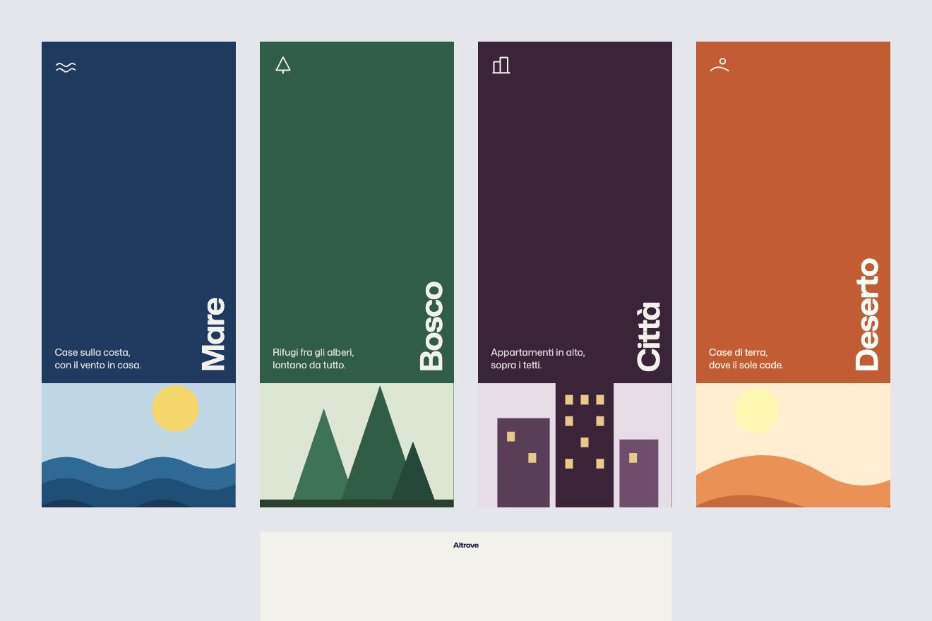
One single calculation makes it all work: the shrunken page is as wide as two cards plus the gap between them, so the scale is (2 × card + gap) / screen, with the origin at the bottom centre. Then it is lowered just enough for only its top to show, in the space left under the deck. The cards start 47 milliseconds apart and inside each one the symbol, the name and the text arrive in a row. Everything uses the same curve, a cubic-bezier(0.7, 0.6, 0, 1) that starts almost flat and brakes for a very long time: that is what gives the deck the weight of a real one. In the demo the collections become the four landscapes of Altrove, an invented brand: sea, forest, city and desert.
Keep scrolling
Each collection ends with the card of the next one, and there is no footer. At the bottom you can keep scrolling: the page no longer moves, but a ring labelled «Scroll» appears and slowly fills clockwise, and it empties if you stop or scroll back. When it is full the card detaches, grows to full screen while its words escape upwards, and the new page is born behind it; then the same photo shrinks until it becomes the picture of the page that just arrived. One collection leads to the next and the loop never ends.
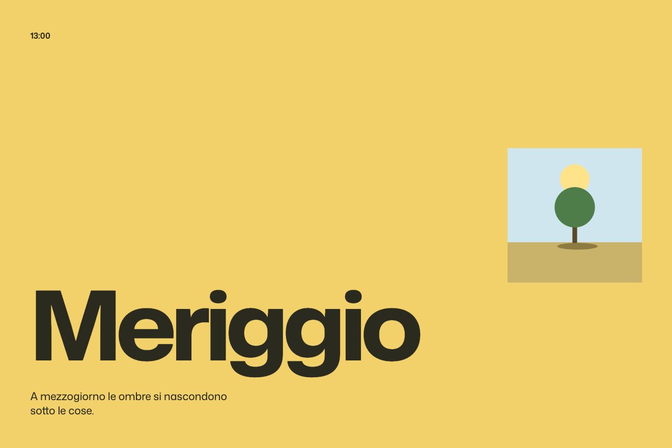
The accumulation only arms when the page is at the bottom and at least 22 percent of the card is visible: from there each wheel movement counts for eighty percent, at most 64 pixels at a time, up to 1100. The ring does not show the exact count but follows it with a brake that does not depend on the frame rate: it fills slowly and empties almost four times faster, and that is what makes it feel like a held breath. On the site it is a conic-gradient cut into a ring by a mask; in the demo it is the stroke of an SVG circle, animated through a single property. Both sit in mix-blend-mode difference, so they read on any colour. On the site, on a computer, the ring follows the pointer; in the demo it stays still in the middle, as the site itself does on phones, and while it fills the invitation line steps aside. The card can also be tapped. The chapters are three hours of the day: dawn, midday and sunset.
The diagonal gallery
Inside the collections a row of photos crosses the screen diagonally, rising to the right, but every photo stays upright. As you scroll the page the row moves sideways, one pixel for each pixel; you can grab it and drag it, and when thrown it slides a little further before stopping. It never ends.
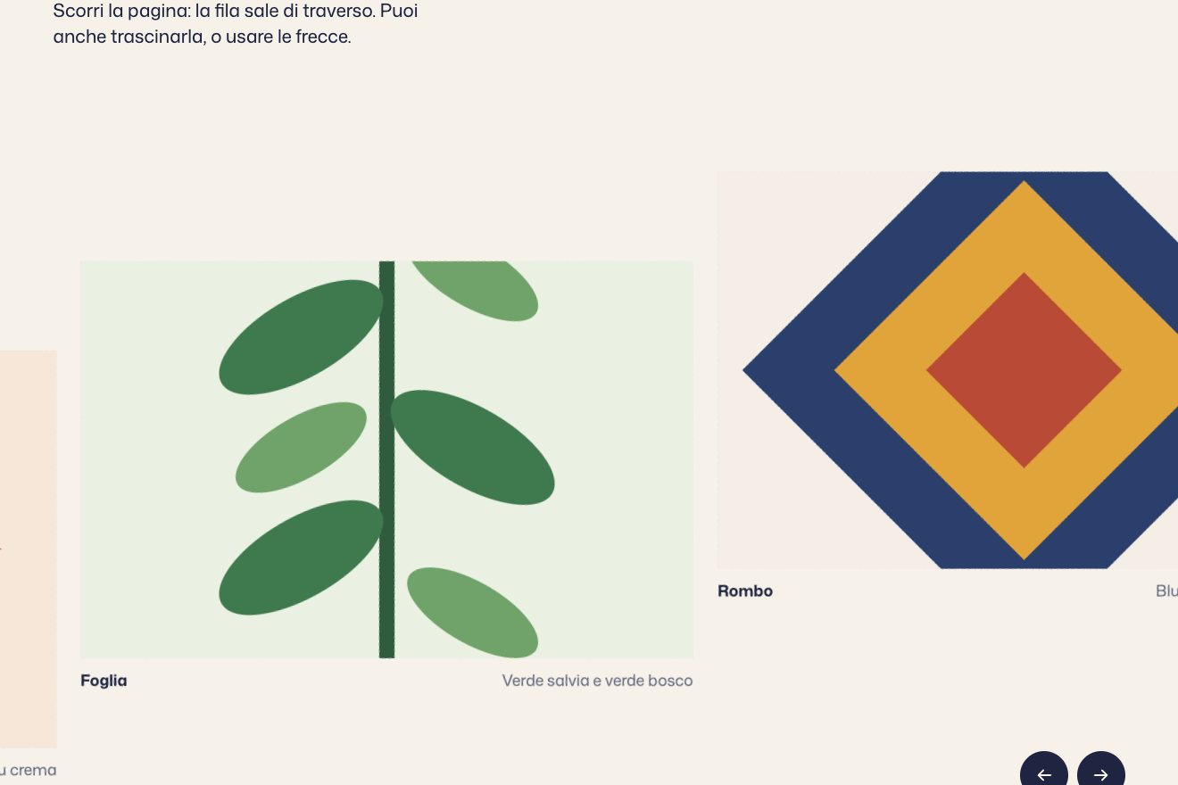
The container rotates by -8 degrees and each photo by +8: the track runs along the diagonal and the images stay standing (on phones four degrees are enough). The originals sit between two sets of copies and the position wraps around the width of one set. Scrolling, dragging, throwing and the arrows all move the same target, and the row follows it every frame: the drag is worth two and a half times the finger, the throw loses six percent every sixtieth of a second. In the demo, instead of houses, there are six majolica patterns; and we added one thing to the site’s version: when nobody touches it, the row moves on by itself, very slowly.
The other details
The loading screen is a small show: on a midnight blue background five photos as big as the home’s picture open from the centre, one every half second, like a camera’s aperture, while a two-digit counter rolls from 27 to 99. Then the blue lifts like a roller blind and the picture glides into place. The price tag draws itself one side at a time, clockwise. The menu is a blue square that opens from the button itself, and on hover its items roll their letters upwards one after the other. The about and contact pages arrive inside a window that opens to full screen, while the old page moves up and darkens.
Every size, then, is in vw multiplied by the smaller of one and the screen height divided by 950: the home always fits in one screen, whatever the shape of the window. And Shift and G bring up the twelve-column grid everything is drawn on.
Where it stumbles
Reduced motion is only half respected: with the setting on, the loading screen disappears and scrolling goes back to the browser’s own, but the huge word on the home keeps moving, and there is no way to stop it.
With a keyboard you cannot see where you are, because the focus outline is removed from the links and the menu button. No text can be selected, not even the phone number and the email address. On a phone held sideways the site asks you to rotate it. And the green of the Evergreen texts on white has a contrast of 3.09 to 1, below the 4.5 minimum.
Scrolling, too, hardly ever does what you expect: on the home it opens the menu, at the end of a collection it takes you away from the page, and during transitions the wheel, fingers and keys do not respond. It is the choice that makes the site memorable, but anyone just looking for a piece of information has to learn the game first.
Finally the weight: almost four seconds of loading on every first visit, half a megabyte of images before the home shows and 285 KB of hand-written JavaScript holding it all together.
What we take away
A menu can be the most memorable gesture of a site, if it uses a physical metaphor: the page that becomes a card among the others needs no explanation. And the end of a page can be a door instead of a footer, as long as there is always a visible handle too, the card to tap.
The effects
- The page that becomes a cardAt the first scroll gesture the page shrinks into a card and four tall cards arrive above it; choose one and its page rises into the gap, then takes the whole screen.Lifetime
- Keep scrollingAt the end of the chapter you keep scrolling and a ring fills; when it is full the next chapter's card grows to full screen and lands as the picture of the new page.Lifetime
- The diagonal galleryAn endless row tilted by eight degrees, with its pictures kept upright, that slides sideways as you scroll the page and can be dragged and thrown with inertia.Free