Floema, by Bürocratik
Floema, how it’s made: the droplet menu, the collections that unveil like a blind and the finishes drawer
The site of a Portuguese maker of benches, shelters and signage for parks and beaches, signed by Bürocratik, is a catalogue full of gestures you want to touch: menu items that come apart like droplets, collections that cover each other like blinds, a drawer that comes in two beats. Underneath there are Nuxt, GSAP, Lenis and three.js shut away in workers. We take it apart with three demos rebuilt from scratch.
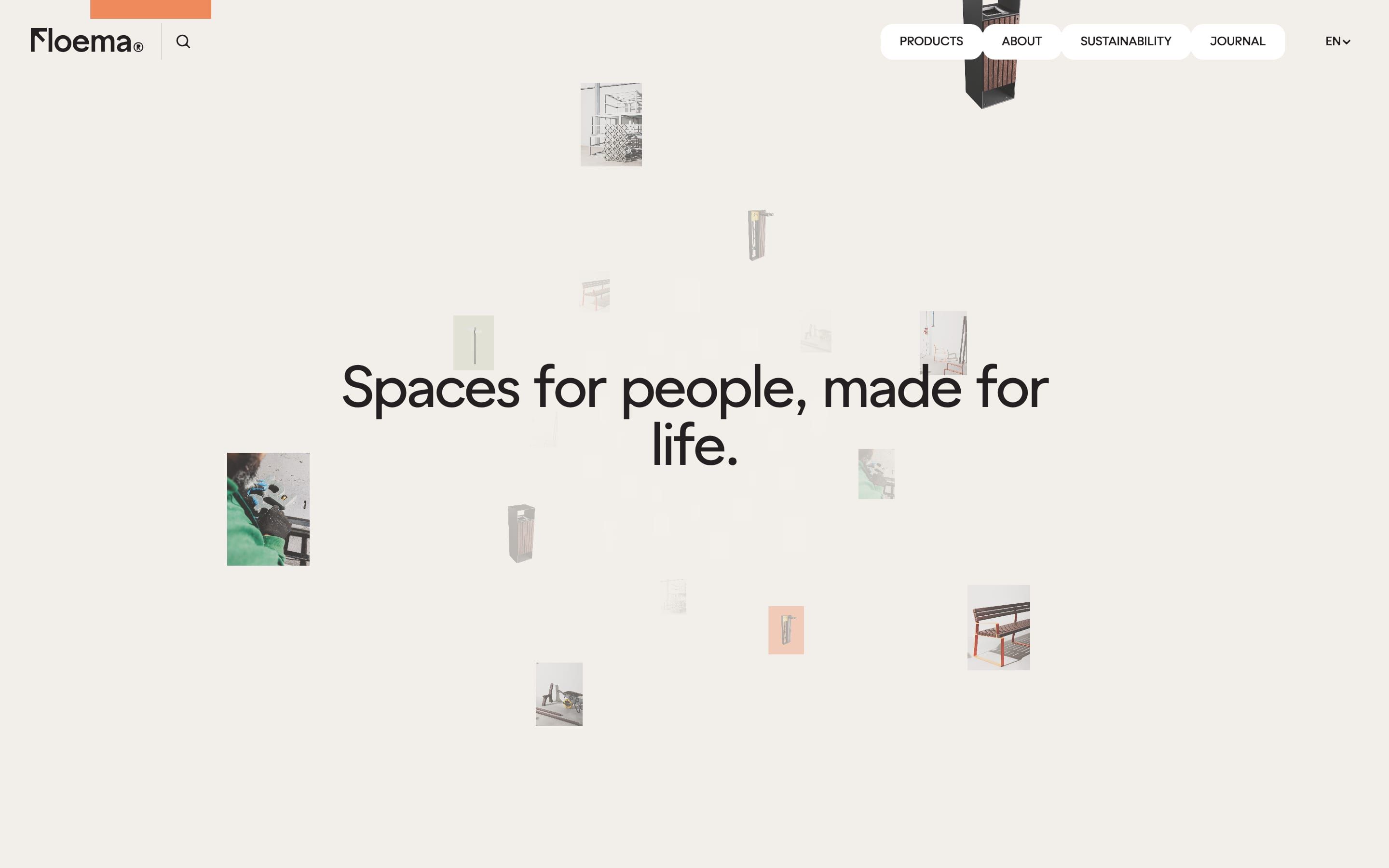
The palette
- #F2EFEAthe ivory of every page background
- #241F21the stone brown of the text and the dark buttons
- #E9E778the flour yellow of the menu glow and the before-and-after line
- #042D2Bthe forest green
- #F76C46the coral of the Urban collection
- #85A1C5the blue of the RePlastic collection
Tap a colour to copy its code.
Floema designs and builds, in Portugal, signage, benches, shelters and equipment for parks, trails, beaches and squares, «made for life», as the home page headline puts it. The catalogue holds 227 products split into collections, Urban, Nature, Golf, Details and RePlastic, the last one in fully recyclable plastic, and each collection has its own colour: coral, kraft, celadon, blue. The rest of the site sits on a warm ivory, #F2EFEA, with text in an almost black stone brown, #241F21, and a single accent, a flour yellow, #E9E778, that shows up wherever the page wants to be touched. There is only one typeface, Zimula, variable, with an axis of its own, «cnct», always kept at 1000, and almost everything at weight 500. The site is by Bürocratik, the Portuguese studio that signs it at the bottom of every page and with a logo drawn in the console. On Awwwards it was Site of the Day on 13 May 2026, with 7.65 from the jury, where the highest mark is creativity, 7.82, and the developer award, 7.67, where the animations got 8.2.
Underneath there is Nuxt 4.5.2 with Vue 3.5.42, the content comes from Sanity and the images from Vercel. The animations are GSAP 3.13.0, with SplitText, ScrollTrigger, CustomEase, Draggable with inertia and Observer; the most used curve is circ.out, 72 times, then power2.out and expo.out. The smooth scroll is Lenis 1.3.8 on its default settings, driven by the GSAP ticker. The 3D is three.js r181, but shut inside a small framework of the studio’s own, BüroGL 0.1.0, which runs every scene in a Web Worker on an OffscreenCanvas: the photo tunnel on the home page, the leaf shadows, the materials cube, the product outline, the model to turn. That way the page’s main thread stays free for the scroll and for GSAP. The favourites pictogram is a Rive animation, search is Fuse.js, and seven audio tracks go with the pages about the story and about sustainability.
We take it apart in three moments, with a demo rebuilt from scratch for each one, for a made-up brand, Verdant Atelier, that makes benches, shelters and signs in wood and steel for parks and beaches: the text, the materials and the code are ours. We leave the 3D to the site: we take the interface gestures, which are the most polished part. From the site we took the ideas and, where we say so, the numbers.
The menu items that come apart like droplets
At the top of every page the menu items, Products, About, Sustainability, Journal, are white pills joined to each other by soft bridges, like drops of mercury. Hovering an item, its pill widens and moves away from its neighbours: the bridges stretch, thin out and at some point break. Inside the bar, a yellow glow follows the pointer.
The pills are SVG paths drawn by hand, rounded rectangles with a radius of 0.34 times the height, in an SVG as big as the bar. The bridges are metaballs computed line by line: for each pair of neighbouring items two circles half as big as the pill, the angles of the attachment points found with the arccosine of the distance, and two Bézier curves with handles at 90 degrees. The tension of the bridge grows with the distance, from 0.1 to 0.4, and past 30 pixels apart the bridge is gone. Items sit 6 pixels from each other; on hover they take 20 pixels of margin on each side with a half-second CSS transition and the curve cubic-bezier(.175, .885, .32, 1.275), the one that overshoots and comes back, and they return in 0.3 seconds with a drier curve. A ResizeObserver recomputes the bridges on every frame in which the margins change, so the droplet follows the CSS transition without anyone animating it. The glow is an ellipse with a radial gradient of yellow at 28 per cent, in mix-blend-mode: difference, clipped by the shape of the pills: it chases the pointer with a lerp of 0.12, stretches to 60 by 30 while you move and turns round again, 30 by 30, after half a second still, always over one second with expo.out.
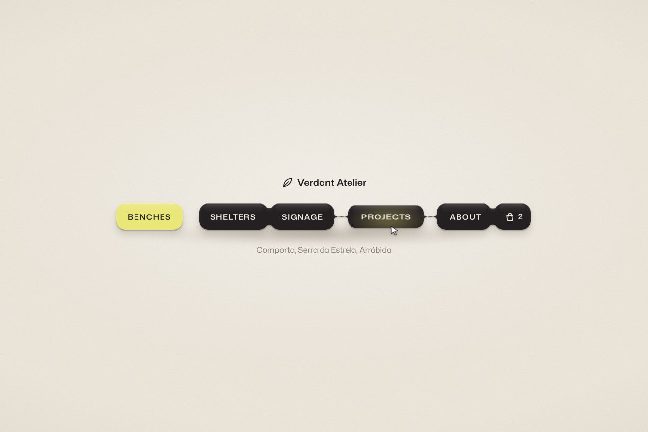
In our demo the bar belongs to Verdant Atelier: six pills of almost black lacquer, Benches, Shelters, Signage, Projects, About and the cart with its number, on a grainy ivory, with the brand name above and below a line that changes with the item. From the site come the SVG pills with corners at 0.34 of the height, the bridges computed as metaballs with the two circles, the arccosine and the handles at 90 degrees, the break past 30 pixels, the 6 pixels between items, the curve that overshoots in half a second and the return in 0.3, the first and last items moving away on one side only, the yellow glow in difference clipped by the pills that follows the pointer with a lerp of 0.12, 60 by 30 while moving and round after half a second still, and the bar that turns into a column with vertical bridges on the phone. We changed one number: on the site the hover margin is 20 pixels, which with the 6 of gap makes 26, and the bridges, which break at 30, never really snap in the top bar; ours is 28, and the bridge snaps. Ours are the droplet that stays hanging from the end of the pill when the bridge breaks and gets absorbed back, the pill that squashes on press while the glow widens, the chosen item that turns yellow and stays apart, instead of the small dot the site puts under it, and the cart number that rolls. When nobody touches it, a drawn pointer moves over the items on its own.
The collections that unveil like a blind
On the home page, under the heading «Made to Last», the collections pass one over the other as you scroll. The page seems still: the large photo of a collection stays put, and the next one covers it from below like a blind; meanwhile the photo underneath rises and grows a touch, and on the left the coloured badge, the title, the button and the catalogue card change.
The section is (n + 1) times 150 vh tall, with a sticky stage 101 vh tall inside. A single ScrollTrigger, from the start to the end of the section with scrub, gives a number from zero to one; split by the collections, each gets its own stretch, widened by 0.15 on each side so the blinds overlap. The blind is a clip-path: inset() from the top, written in a CSS variable. The photo inside rises up to 180 pixels and grows by 3 per cent. When the collection changes, the old text fades in 0.25 seconds, and after another 0.25 the new one comes in: the title split into words by SplitText rises from 20 per cent in 0.8 seconds with expo.out, two hundredths of a second apart, the button rises from 35 per cent in 0.4 seconds, the catalogue card appears in 0.3. The collection badge is born as a circle, swells in 0.3 seconds, stretches into a pill in 0.4 and then the icon and the letters come in, widening from 0.7 to 1 four hundredths apart.
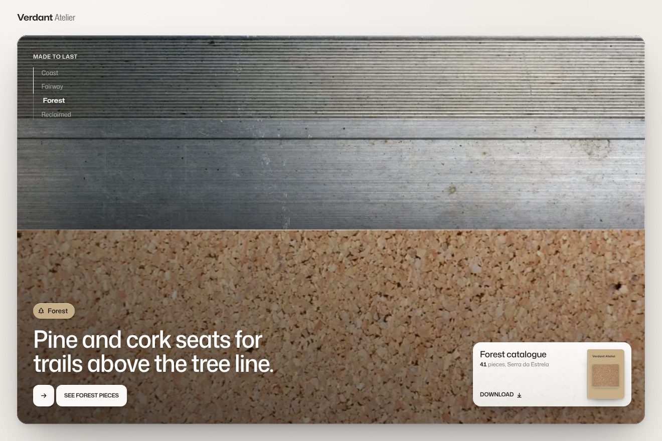
In our demo there are four collections, Coast, Fairway, Forest and Reclaimed, each with its colour taken from the site’s and a real photo of its material: wooden slats greyed by the salt with their bolts, brushed steel panels with their seams, granular cork, colourful plastic caps collected for recycling. From the site come the section (n + 1) times 150 vh tall with the fixed stage, the single ScrollTrigger with scrub, each collection’s stretch widened by 0.15 on each side, the blind in clip-path: inset() written in a variable, the photo underneath rising 180 pixels and growing by 3 per cent, the text leaving in 0.25 seconds, the title word by word from 20 per cent in 0.8 seconds two hundredths apart, the button from 35 per cent in 0.4 and the catalogue card in 0.3, the badge born as a circle that stretches into a pill, and the button made of two tiles that move apart on hover. Instead of the numbers 01, 02, 03, on the left there are the names of the collections, with a line that fills as you scroll, and you can click them. Ours are the thread of light and the shadow on the edge of the blind, the piece count rolling to the new number, the catalogue cover with the collection’s material, which settles with a bounce and tilts on hover, and the last blind closed all the way: with the site’s rule, the last one would stop at 88 per cent. With reduced motion the collections fade into each other, with no smooth scroll and nothing moving.
The options drawer and the favourites
On a product page, «Options» opens a drawer from the right with the sizes, the frame and the colours, while the rest of the page darkens. Choosing to save the product, the drawer closes, a notice appears at the bottom with a bar that empties, and in the top bar the favourites button is born from nothing, with the count and its pictogram that animates.
The drawer comes in two beats: the dark backdrop in 0.7 seconds, the panel 0.2 later, from xPercent 110 to zero and from half to full opacity, in 0.9 seconds with expo.inOut, the curve that starts slow, runs and settles. It leaves in 0.6 seconds with the same curve, and it also closes with Esc. Inside the drawer a second Lenis runs, while the page’s one stops. The notice rises by 10 to 12 pixels in 0.55 seconds with cubic-bezier(.19, 1, .22, 1), and its bar empties in 5 seconds, with a linear CSS animation: it is the only rule on the site that checks reduced motion. The favourites button, when it goes from zero to one product, grows in width from zero and in scale from zero to one in 0.3 seconds; when it goes back to zero it leaves in 0.2. The pictogram is a Rive file that plays at every addition, and the favourites preview rebuilds a small grid of photos with four different layouts, from one to four: with three, two on the left and one tall on the right.
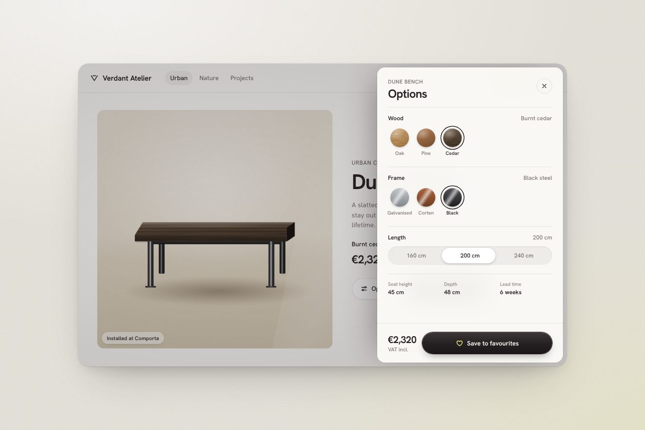
In our demo the product is the Dune Bench by Verdant Atelier, a bench drawn in CSS, with grained oak slats and the gaps between them, brushed steel legs with a thread of light and its shadow on the sand. From the site come the backdrop darkening in 0.7 seconds, the drawer leaving 0.2 seconds later from xPercent 110 and half opacity, in 0.9 seconds with expo.inOut, and going away in 0.6, closing with Esc and with a tap on the backdrop, the notice rising about a dozen pixels in 0.55 seconds with its bar emptying in 5, the favourites button born from zero width and scale in 0.3 seconds and leaving in 0.2, and the small favourites grid with its layouts from one to four photos. Ours is the flight: on saving, a copy of the bench flies in an arc to the favourites button, where on the site only the Rive animation plays; the heart that fills with a thin ring widening, the rolling count, the wood and steel samples with their grain and their sheen, the ring jumping onto the chosen sample, the bench changing wood, steel and length under a passing light, and the price rolling to the total. Hovering the notice pauses its timer. When nobody touches it, the demo runs the whole round on its own, saves, opens the drawer, picks burnt cedar, black steel and two metres and saves again; at the first real touch it steps aside.
The other details
The home page opens on a WebGL photo tunnel: some forty images set in a spiral with the golden angle, which come in at speed 300 and brake to 10 in 1.1 seconds, while the scroll adds up to 40 and an ivory fog, #F3EFEA, makes them vanish in the distance. Behind the section headings there are leaf shadows: a plane whose vertices sway slowly, a texture of branches with noise over it, and the pointer that moves the shadow with a spring, like a branch pushed by the wind. The collections, on hover, flip through their photos one every 0.14 seconds, like a small flipbook, and go back to the first when you leave. The comparison of the same terrace in winter and in summer, on entering the screen, moves by itself, to 30, to 60 and back to 50 per cent, to show that the line can be dragged; the real drag starts only after 6 pixels, so a tap is not mistaken for it. The buttons are made of two tiles, the icon and the label, which move 16 pixels apart on hover with a small bounce, and have their touch area widened by 5 pixels on each side. The circle showing the progress of the materials computes its real circumference from the screen, not from the drawing. In the page transition the old page drops in 0.625 seconds with expo.in and the new one comes from above in 1.25 with expo.inOut, and halfway the menu changes theme.
Where it stumbles
The weight. The home page requests 148 files for 18.8 megabytes, and 14.4 of those are four audio tracks of 3.6 megabytes each, which serve the story and sustainability pages but download on every page, even though the sound only starts at the first touch. three.js is inside the main bundle and again inside every worker, about a megabyte each: on the home page there are at least three copies. The typeface is a 394 kilobyte TTF, not compressed to woff2. Reduced motion is almost ignored: only three CSS rules look at it, the notice bar, the arrow inviting you to scroll and the collections transition, while Lenis, SplitText, the tunnel, the shadows and the page transition always run. In the console there are Vue hydration errors on the home and About pages, two GSAP warnings about missing targets, a file that does not exist and test messages at every page change. And in the collections stack the numbers 01, 02, 03 act as graphics, where the collection name would be enough: in our demo there is the name.
What we take away
Floema sells benches and signs, and its site could be a catalogue. Instead it is full of small gestures that ask to be touched: a bar of droplets that come apart, collections that cover each other like blinds, a drawer that comes in two beats, a button that is born when it is needed. None of these tricks is hard, a curve that overshoots, a clip-path written in a variable, a delay of 0.2 seconds. The care lies in putting them all on the same ivory, with the same yellow wherever the page wants to be touched, and in keeping the 3D, the heaviest part, on a thread of its own so the rest does not stumble.
The effects
- Liquid bridge nav barThe main menu of Verdant Atelier, street furniture in wood and steel: six pills of dark lacquer on a grainy ivory, held together by liquid bridges computed in SVG. Under the pointer an item moves away on a spring, the bridges stretch, thin out and snap, leaving a tear of liquid hanging from the pill that bounces and is soaked back up; inside the liquid a yellow light follows the pointer. On the press the pill squeezes, then turns yellow and stays apart. Premium style, ivory, black lacquer and one yellow-green.Free
- Blind collections revealThe collections section of a made-up maker of park and beach furniture, Verdant Atelier: one big card holds four collections stacked, each with a real photo of its own material (salt-weathered wooden slats with bolts, brushed steel panels, granulated cork, colourful plastic caps collected for recycling). As you scroll, a blind rises from the bottom edge and uncovers the next collection while the one underneath lifts and grows a little; then the colour tag unrolls, the line comes in word by word, and the button, the catalogue and the count of pieces change. Premium Dribbble style, ivory, near-black and one colour per collection.Free
- Finishes drawerThe product page of Verdant Atelier, a made-up maker of street furniture: “Options” opens a drawer of finishes from the right (wood chips with their grain and brushed steel ones, the length, the price rolling) and the “Dune Bench” changes colour under a passing light. “Save to favourites” sends it flying in an arc into the bar, where the favourites button is born from nothing, counts and shows a small grid of what you saved, while a notice at the bottom empties its timer in five seconds. Premium Dribbble style, warm paper, near black and one yellow-green.Free