Hayler, by Clapat
Hayler, how it’s made: one gesture for the whole site
Clapat’s template for creative studios opens the site, changes page and moves from light to dark with the same move: columns falling like a staircase. We take it apart effect by effect, with demos rebuilt from scratch.
The palette
- #F7F7F7page background
- #000000text and black interludes
- #0C0C0Cmenu and footer
- #B880FFloader and transition lilac
- #FFFFFFtext on black
Tap a colour to copy its code.
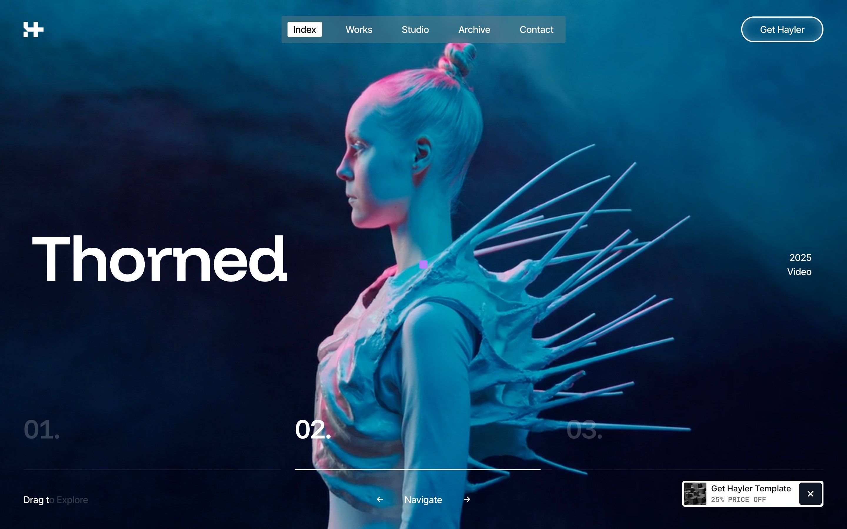
Hayler is an HTML template that Clapat sells to creative studios. At first glance it looks like many agency sites: light pages, a big tight grotesk, a few black interludes, and a single bright colour that shows up almost only at moments of transition.
What sets it apart is not an effect nobody has seen before. It is discipline: the same move opens the site, takes you from one page to the next and carries you from light sections to dark ones. After two clicks you recognise it, and the site feels like one object instead of a collection of pages.
Here we take it apart one piece at a time. Every effect comes with a demo rebuilt from scratch with our own graphics: from the original we took the idea and the rhythm, never the code or the images.
One gesture: the staircase columns
On load the screen is full of colour, split into four columns of different widths: two narrow, one wide, one narrow. When the page is ready the columns pull away, but not in a row. The third one goes first, the widest, then the first, then the fourth, then the second. For a moment the edge turns into an uneven staircase, and that step is what gives the whole site its character.
Each column takes about a second on an expo curve in and out: it starts slowly, speeds up, brakes hard. The delay between columns is tiny, five hundredths of a second, enough to see the order but not enough to feel a wait.
When you click a link the same thing happens in reverse: the columns fall, the new page loads underneath, the columns pull away. And while scrolling, before the black sections, stripes in the colour of the previous section retreat step by step, tied to the scroll. It is always the same idea, in three different places.
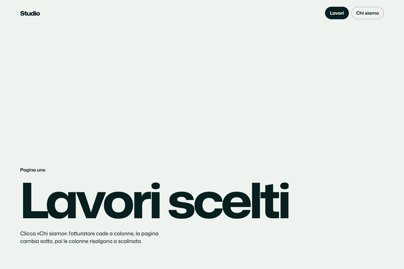
Our version comes down from the top and, to open, keeps travelling downwards instead of going back up: it looks like film running through a projector. Two details matter more than anything else. The widths must differ, or it looks like a curtain. And the order should be written by hand in an array, because a random order changes on every visit and stops being a signature.
The rolling list
In the services section the list stops on screen and the items roll vertically, like the drum of a machine. Only the one crossing the central band is solid; the others stay at fifteen percent and fade out completely at the edges, thanks to a mask with a transparent gradient above and below.
It is an elegant way to read a long list without showing a long list: the eye stays still in the middle and the items come to it.
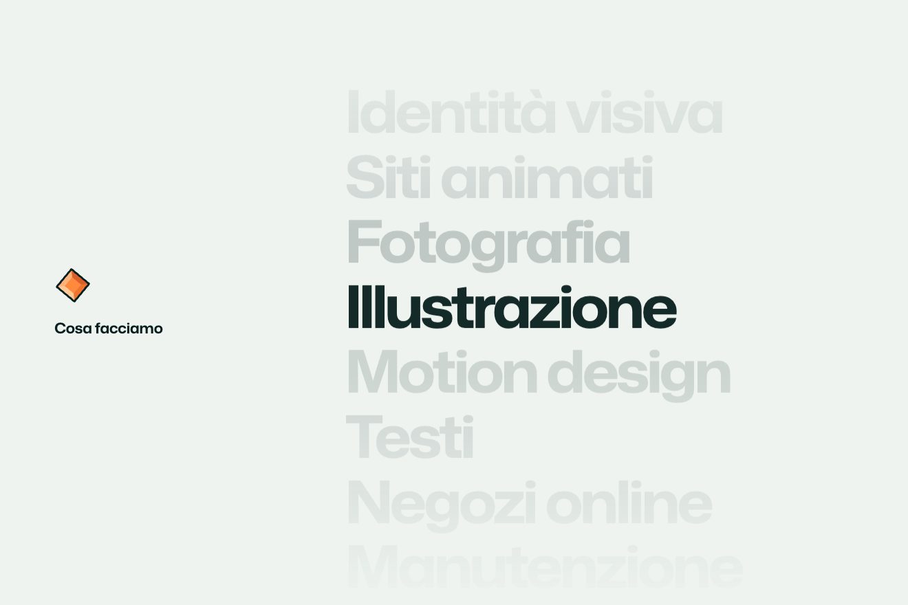
In our version the opacity does not jump from one item to the next: it depends on the distance from the centre, so the light slides. Next to the title we added a diamond that turns a quarter of a turn for every item, a small signal that says “you are moving on” without any numbers.
The ribbon that feels your speed
Between two dark sections runs a ribbon of big words separated by a star. On its own it moves slowly. When you scroll the page it speeds up, up to twelve times, then goes back to its pace with a soft brake. You can grab it with the mouse and throw it; hovering over it slows it down to a stop.
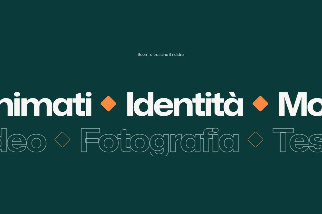
Our version adds a tilt: the faster you go, the more the ribbon leans in the direction of travel, as if it had weight. The trick that makes it endless is simple. The position grows forever and is “wrapped” over the width of one piece of the ribbon: when it jumps back, an identical copy is sitting there and the jump cannot be seen.
Blinds over the thumbnails
Project images do not fade in. When they enter the screen they are covered by three slats in the page colour, two narrow and one wide, which pull back upwards in random order. At the same time the image underneath eases from zoomed-in to normal, a little more slowly.
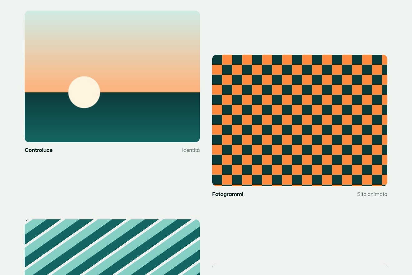
We made the slats proportional to the image width: from two to five, always with the last one wider. That way a grid of photos never opens the same way. Mind the colour: it must match the real background, or you will see rectangles before the animation.
Words that melt
Among the template’s tools there is one the home page does not use, and it is the most poetic: hovering over a word melts it into another. Underneath there is a two-step SVG filter. The first step blurs the letters, the second cuts the transparency sharply. Two blurred shapes close together become a single drop, and for an instant the two words are one.
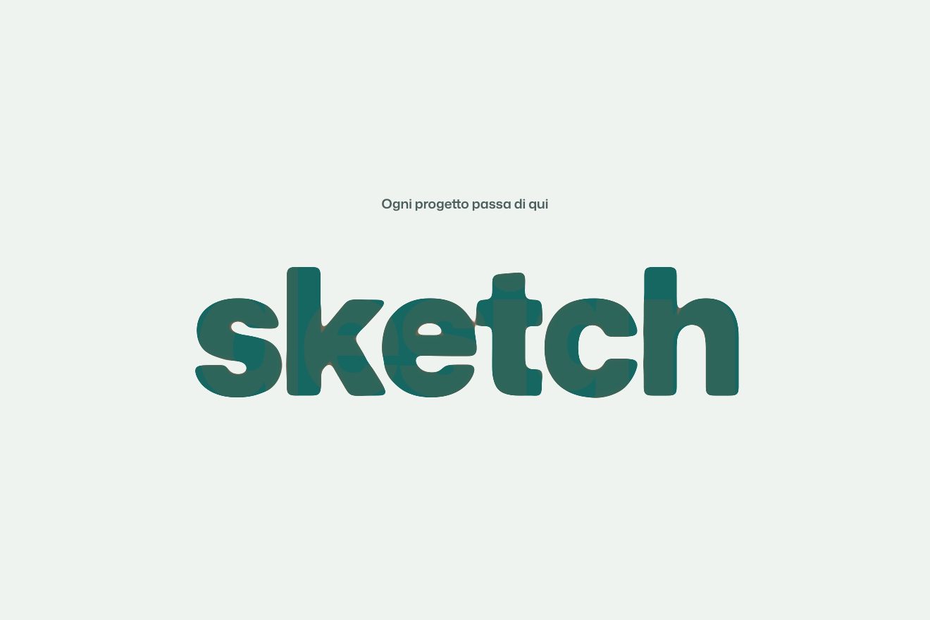
In our version the melt follows the scroll and chains from one word to the next, while the font width slides from one to the other. The filter switches off when the letters are still: on Safari, keeping it on at rest is expensive.
Where it stumbles
The browser’s Back button reloads the whole page. You see the loader again from the start, more than five seconds, and you land in the middle of the page. It is the weak spot of many sites with hand-made transitions: all the care goes into the way there, and the way back is forgotten.
The loader also has a three-second minimum on every visit. The first time it is an introduction, the tenth time it is a wait. On our site the loading screen appears once per session; after that only the transitions remain, which last under a second, and going back the shutter opens right away.
What we take away
One gesture, used everywhere, is worth more than ten different effects. Motion in Hayler is punctuation: it marks changes of page and section, then steps aside and lets you read. And the micro-interactions are many but short, almost all under half a second, except for the big transitions, which get the time they need to be seen.
The effects
- Column shutterFour columns of different widths drop like a staircase, the page changes underneath, then it is revealed. One gesture for loading and page changes.Free
- Rolling list drumA list rolling through a fixed band: the item in the middle is solid, the others fade, and a diamond turns a quarter at every item.Lifetime
- Marquee that speeds up with scrollAn endless ribbon of words: scrolling speeds it up and tilts it in the direction of travel, and you can grab it and throw it.Lifetime
- Blinds over imagesImages open like window blinds: slats in the page colour pull back in a scattered order while the photo zooms out.Lifetime
- Words that melt into each otherAs you scroll, each word melts into the next: the outlines stick together like drops while the font width slides from one to the other.Free