EDDY-OS, by Eddy Naboulet
EDDY-OS, how it’s made: a portfolio inside an old television
Eddy Naboulet’s portfolio is an invented operating system seen through a cathode-ray tube: a portrait made of thousands of dashes in relief, a glass that flickers and switches off like an old TV, a dome of floppy disks. We take it apart with three demos rebuilt from scratch.
The palette
- #14100Athe unlit glass
- #3A2A14rules and fills
- #8C2A18rust: the dim labels
- #E0501Eember: numbers and hot letters
- #FFA02Eink: text and borders
- #FFE2B0cream: the titles
Tap a colour to copy its code.
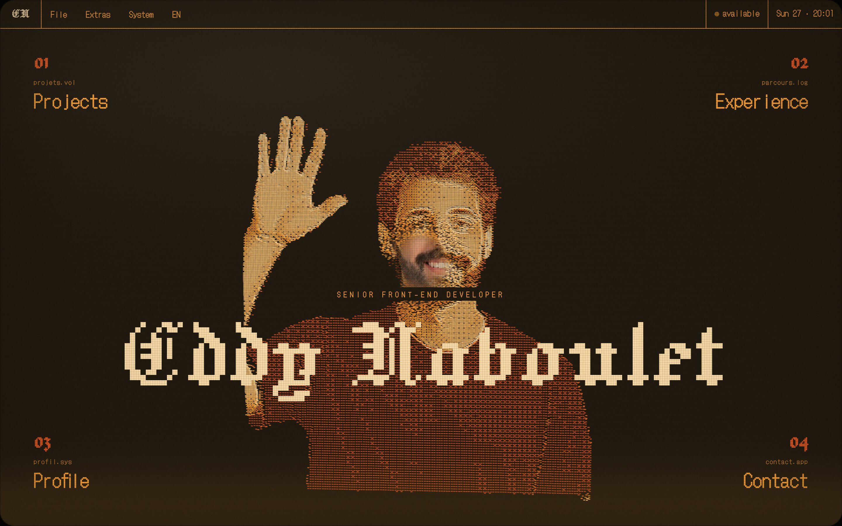
EDDY-OS is the portfolio of Eddy Naboulet, who works in front-end in Bordeaux and trained as a designer. It does not look like a portfolio: it is an invented operating system, version 2.6, seen through the screen of a tube television. You enter from a boot screen that writes its own log, and inside there is a menu bar like on old Macs, windows, a palette of 36 commands opened with ⌘K, keyboard shortcuts, a Doom cartridge, a spaceship game on the error page and a printable CV. Graphics, code and drawings are all by the same hand.
The colours are those of an amber phosphor: an almost black background, then rust, ember, orange and cream. There are six themes and each one redefines the same six colours; the same colours generate the ramp that tints every WebGL particle, so changing theme recolours everything, from the portrait to the cursors. Titles are set in Jacquard 12, a pixel blackletter, the rest in DotGothic16. And one idea holds it all together: interface elements move in steps, thirty times a second, while the particles flow smoothly.
Underneath there is Astro, with GSAP 3.15 (quickTo, Observer, Draggable, CustomEase and ScrollTrigger for a single pinned section), Lenis and Three.js with hand-written shaders. The television glass uses, where available, an experimental API that draws the real page inside a canvas, so the shader can distort it; elsewhere a veil over the page. Every sound is synthesised with the Web Audio API. Here we take it apart in three moments, with a demo rebuilt from scratch for each: drawings, texts, colours and code are our own. From the site we took the idea and the timing.
The dash relief
After the boot, a waving portrait appears in the middle of the screen, made of about a hundred thousand horizontal dashes, like an engraving. It is not flat: the light parts sit closer, and dragging it shows it is a bas-relief as thin as a sheet. Hovering the four corners, the portrait breaks into a cloud of dust and comes back together as another drawing.
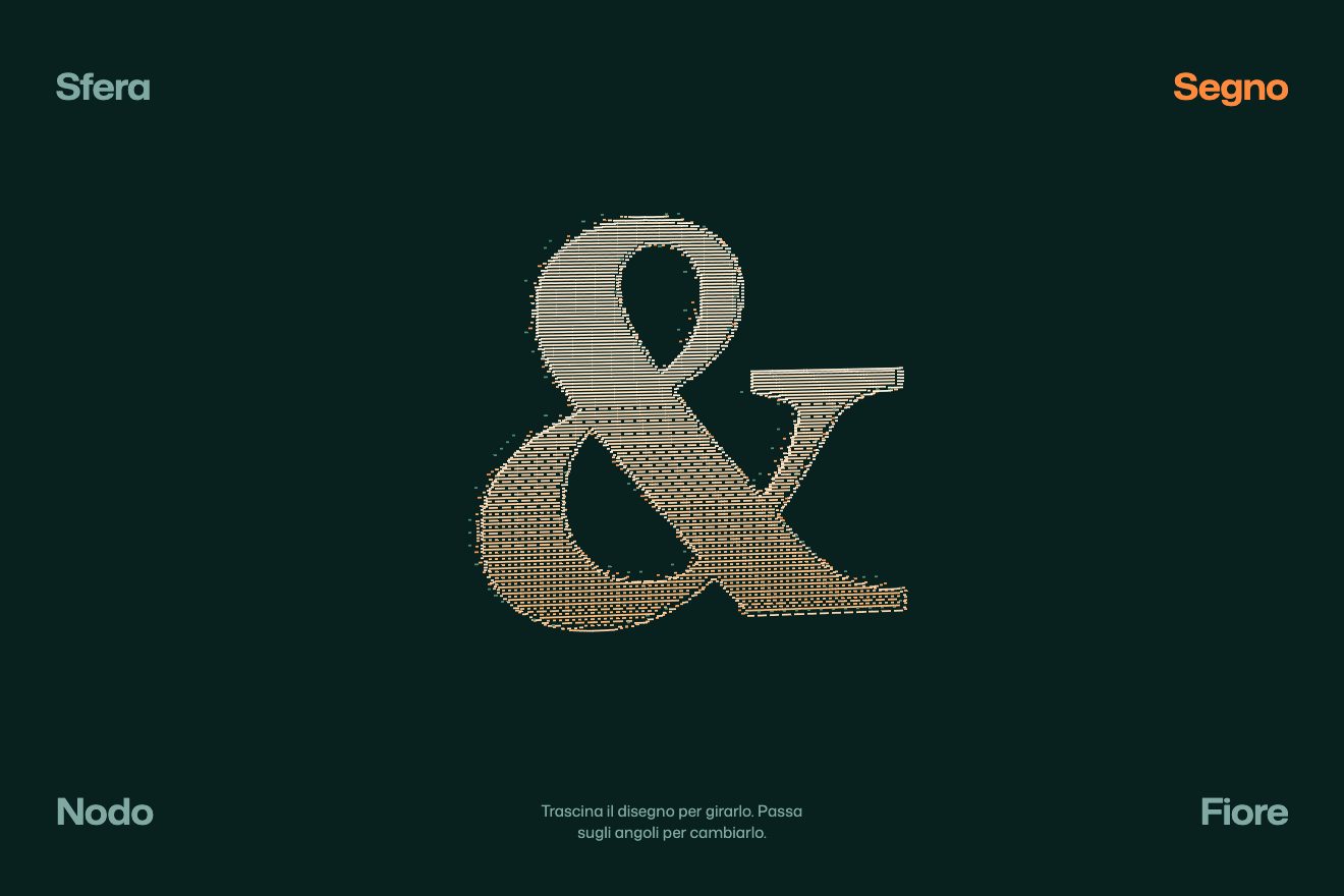
The image goes through an ordered dither, the 4 x 4 Bayer matrix: wherever a point’s value beats its cell’s threshold a dash is born, and depth comes from the same value. Each dash is a copy of one quad drawn by the graphics card. The shape change lasts 1.15 seconds, but every dash starts offset by its own random number and bends along an arc, sin(π t), which is why halfway through the drawing is a cloud. Dragging turns it by 0.0075 radians per pixel, on release the rotation brakes with e^(−2.6 × dt), and the faster it turns the more the relief puffs up. In our demo there is no portrait: a sphere, an ampersand, a knot and a flower drawn on the spot, and no 3D library, just WebGL2.
The cathode-ray tube
The whole site sits behind a glass: lines every three pixels, a vertical grille every four, a band of light descending about every nine seconds, grain, a slight flicker, the vignette and a round-cornered frame. Changing theme switches the television off the old way, the picture squashes into a line and then a dot, and comes back on with a widening blade of light.
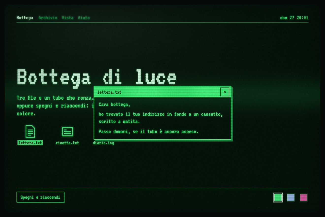
Switching off lasts 0.44 seconds, switching on 0.78, on a curve that overshoots a little and settles. Under the glass the text types in steps: the title reveals its letters with the newest two brighter, the lines appear behind a block cursor thanks to two mask-image layers, and a window announces itself with three empty rectangles growing one behind the other from its centre to its full size, like on eighties computers, before appearing through a dither screen. On the site the new theme arrives by reloading the page during the dark; in our demo it changes in place, the rectangles start from the icon being opened, and the glass is a transparent canvas over the page that lets clicks through.
The card room
The projects are seventeen floppy disks with a clipped corner, arranged on a dome around the viewer. The wheel and dragging turn the dome with a small click for every card passing the front, like the dial of a safe. Two more buttons switch the view: a list with huge names, or a diagonal row where the far cards crumble into dust.
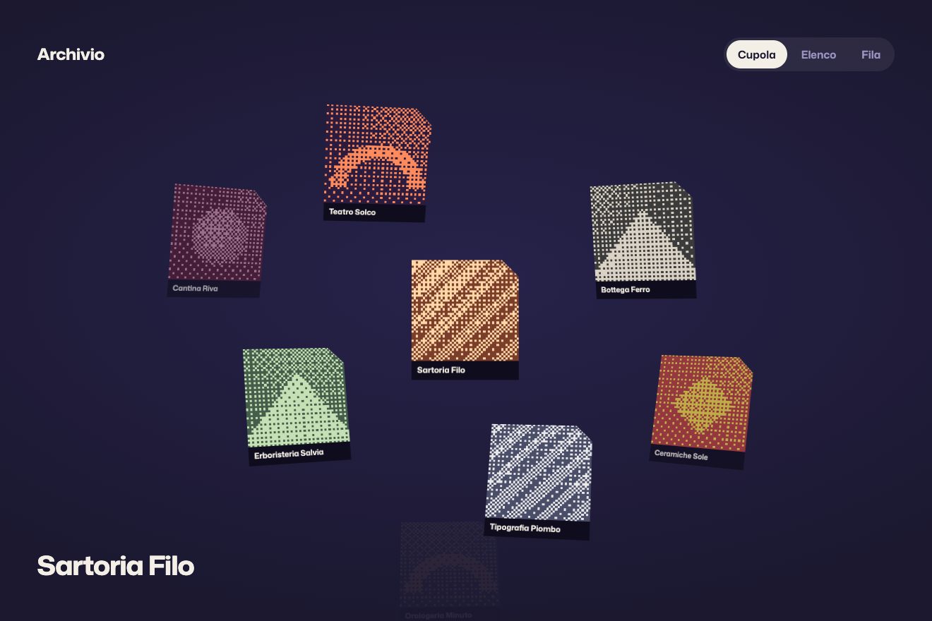
The cards sit on a Fibonacci spiral and the angle from the view is squeezed, so the sphere looks like a dome. The rotation follows the gesture with gsap.quickTo, one second on power2, and accumulates in a quaternion. The view switch lasts 1.6 seconds with no easing, but each card uses only half of it, starting in order, so the cards peel away one after the other. On the site they are Three.js textures with the dust in the shader; in our demo they are sixteen real buttons in CSS 3D, with dithered covers and a Bayer mask instead of the dust.
The other details
The boot log lights a line every 130 milliseconds, then asks for a key: a line of light sweeps down and the name types itself with an orange head, while the dust gathers into the portrait. The CV is a row of panels drawn like the git log graph, with a subway map for the parallel branches and a commit hash that decodes itself. The profile title is assembled from particles that turn pale after landing, and as you scroll those particles cross the page like a comet, from one figure to the next. There is an isometric diagram that builds itself as you scroll, lettered in a single-stroke vector font. The cursors are pixel art drawn on the spot in the theme colours, and every gesture has its synthesised beep: the S key turns them off.
Where it stumbles
Before seeing anything you must press a key or tap the screen: the boot screen is a gate.
The project dome stays empty for about two and a half seconds, on computers and phones, while the seventeen covers are turned into dashes on the main thread. Meanwhile several WebGL contexts run together, one per scene plus the glass.
Readability suffers: pixel blackletter titles under scanlines and vignette are hard to read, captions are 10 and 11 pixels, and the rust red on the background has a contrast of 2.22 to 1. Flicker and the band of light are on from the start. On phones the portrait’s four drawings are never seen, because tapping a corner goes straight into the section.
Credit where it is due: reduced motion is respected everywhere (the particles’ journey disappears, and with it flicker and band), there are hidden headings for screen readers, a text list behind every WebGL scene and a CV designed for print.
What we take away
A motion rule can be an identity: here the interface moves in steps and the material flows smoothly, and that contrast is enough to make a computer that does not exist feel real. Particles do not have to be dots: dashes in relief turn an image into an object.
The effects
- The dash reliefA drawing made of thousands of dashes, like an engraving but in relief: it changes shape by flying through a cloud of dust, spins when you drag it and puffs up when you throw it.Lifetime
- The cathode-ray tubeAn old computer desktop behind a television glass: scanlines, a band of light, flicker, text that types in steps and a switch that turns the tube off into a line and back on with another phosphor.Free
- The card roomSixteen cards and three views: a dome that turns around you, a list where each card becomes the thumbnail of its name, a diagonal row that crumbles the far cards. Switching view, the cards set off one after the other.Lifetime