Why Zero, by Sindhur Dutta, Zero
Why Zero, how it’s made: the frosted glass that opens when you draw a zero, the stage ruler and the words that light up out of the fog
Zero University’s site tells, on a single page, why a degree is not enough to get hired, and it does so without a line of text in the page: a frosted pane to wipe with a finger, a zero to draw to get in, a ruler counting the years before Zero and sentences that light up out of a fog of noise. We take it apart with three demos rebuilt from scratch.
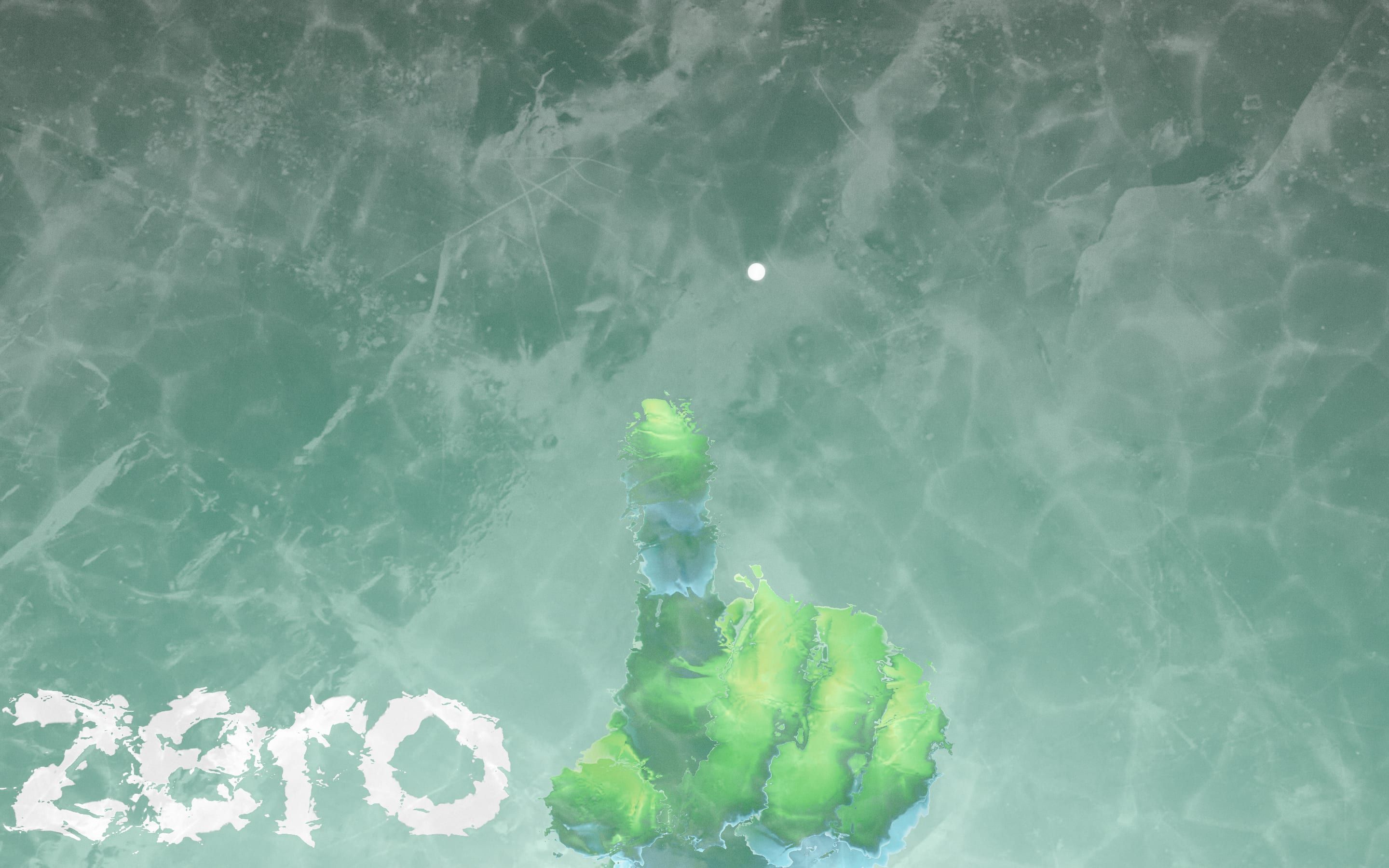
The palette
- #1C4839the forest green of the starting ground and the edge of the loader
- #70AF9Cthe sea green in the middle of the loader gradient
- #D4F6EBthe palest mint at the foot of the gradient, where the light starts
- #C5FFCBthe ice green of the frost front as it forms
- #7BE88Athe bright green of text selection
- #1F1D1Ethe near black of the titles on the light cards
Tap a colour to copy its code.
Why Zero is the page Zero University uses to explain why it exists. Zero is a school that hands out no diplomas: it promises real projects for real companies, the tools teams use every day and, at the end, a job. The page tells it as a story in five stages, in a tone that pulls no punches: «You Believed College would land You a JOB», then «But,», then «That’s Bullsh*t». The colour is almost all green: it starts from a forest green, #1C4839, that opens in a gradient towards a sea green, #70AF9C, and the palest mint, #D4F6EB; the forming ice has an ice-green edge, #C5FFCB, and even selected text turns bright green, #7BE88A. The light cards at the end carry near-black titles, #1F1D1E. It was Site of the Day on Awwwards on 7 September 2026, with 7.73 from the jury, and it won the developer award, 7.26, with 8.4 for animations. The credits on the award page are Sindhur Dutta and Zero; in the browser console the site signs itself «designed by Zero University and developed by BUNQ LABS».
Underneath there is Vite, with no interface framework at all: the page elements are built by hand in JavaScript. The 3D is three.js r160, with the hands, the glass, the tunnel and the clouds loaded from GLB files and GPU-compressed textures. There is GSAP 3.15.0, with SplitText and CustomEase, but no ScrollTrigger; and there is no Lenis. Scrolling is their own: the page does not really scroll, the site listens to the wheel and the finger, multiplies wheel movement by 35 and touch movement by 80, and chases the target every frame with a 7.5% step, corrected for the frame length. The audio is Howler, with four ambient beds and ten sounds, from the glass breaking to the points going up. And there is one choice that explains everything else: the story’s sentences are not text. They are drawn into a single image, a 3072 by 3072 pixel atlas compressed for the graphics card, and every word is a rectangle of that image placed in the 3D scene.
The page is made of one gesture at a time, each one worked down to the number. We take it apart in three moments, with a demo rebuilt from scratch for each. The text, the brands and the code are ours; from the site we took the ideas and, where we say so, the numbers.
The frosted glass that opens when you draw a zero
You get in through a pane of glass. While the page loads, the green ground frosts over from the top down, and at the bottom left a counter goes from 99 to 0, three at a time. Then the number slides away, the brand arrives, and in the middle a hand with a raised finger appears with a line, «DRAW A ZERO». Running a finger or the mouse over the glass wipes it clear, and the frost slowly comes back where you passed. Draw a circle, and the ice melts from the centre and you are in.
The frost is a full-screen pass on top of the 3D scene: an ice image with its relief map, nudging what lies behind it a little, like real glass. The finger’s trail is drawn into an image a quarter of the screen’s size, refreshed every frame: each time what was there is multiplied by 0.97, the head of the trail by 0.95, and a disc 7% of the screen wide is added on top, corrected for the aspect ratio. The disc does not wipe evenly, though: its strength is multiplied by the ice’s contrast at that spot, so the edge of the clear area is ragged like a hand on a misted window, and it lights up white. The ice that forms at the start follows the ice too: each point freezes when progress passes a value made 60% of its height and 40% of the image’s brightness, and the ragged front is ice green.
Recognising the zero is a small piece of geometry. It keeps the gesture’s points, from 20 to 2000, and works out their centre and mean radius. The circle counts if the radius is not tiny, if every point strays from the mean radius by 35% at most, if the gesture has turned around the centre by at least 5.76 radians, that is 330 degrees, and if the end has come back near the start, within one radius. At 90% of the turn the site already knows and gets the opening ready. The guide circle next to the hand has no WebGL in it: a ring 40 units of screen height tall, drawn with a conic gradient masked into a band, with a dot that goes round in 2 seconds on a sine.inOut curve and rests for another 2, and behind it a comet tail worked out from the positions of the last two seconds.
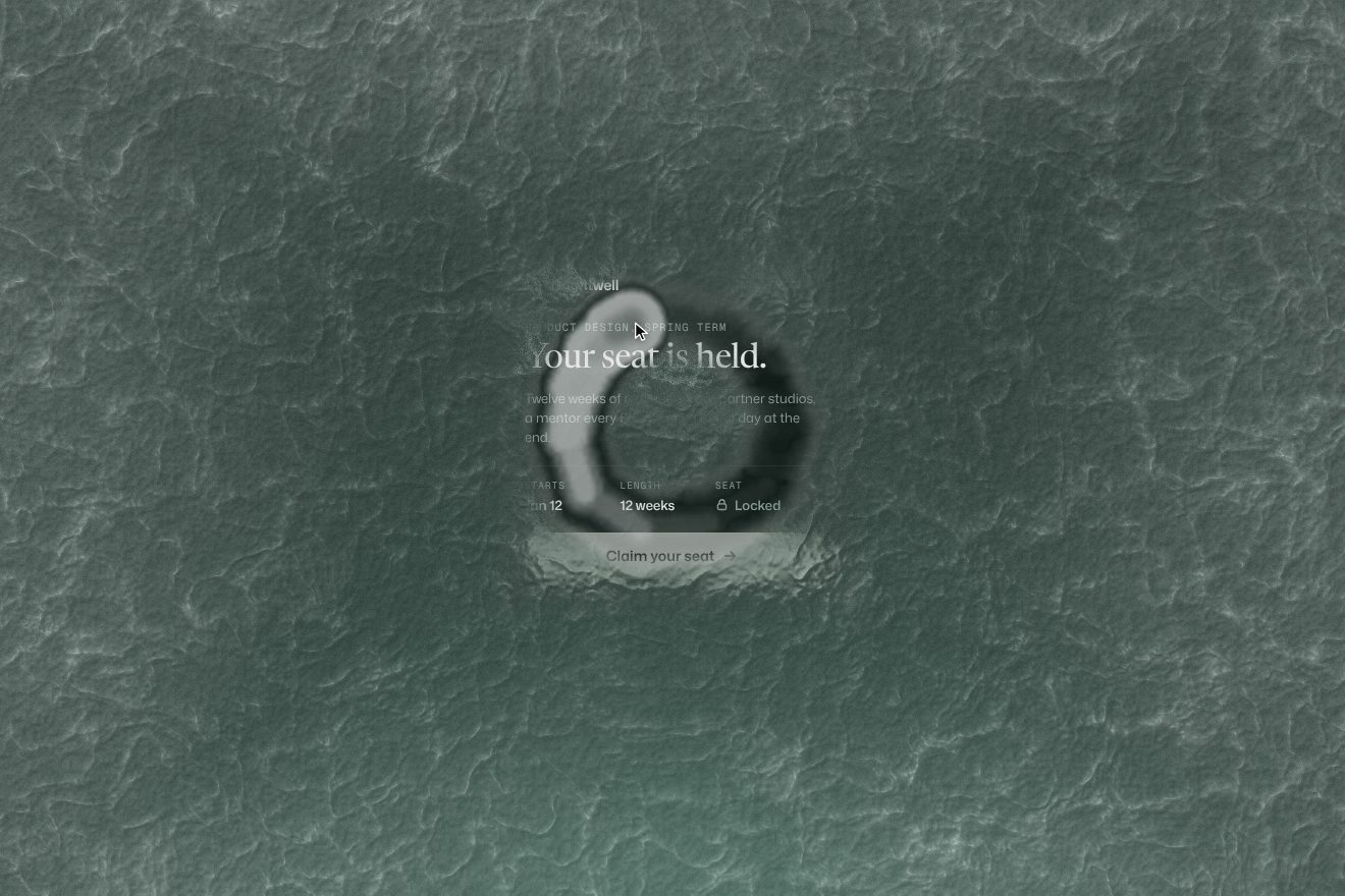
In our demo behind the glass there is the invitation of a made-up school, Brightwell, to a twelve-week product design course: «Your seat is held.», the dates, a padlock and a dimmed «Claim your seat» button. The glass is hand-written WebGL on a single plane, without three.js, and the frost is not a photo but computed noise, with its relief map derived from the noise itself. From the site come the quarter-resolution trail closing by 0.97 a frame, with the head at 0.95 and the 7% radius modulated by the frost’s contrast, the white edge of the clear area, the freezing front made of 60% height and 40% light in the ice green #C5FFCB, the circle thresholds, 20 points, 35%, 330 degrees and closing within one radius, the melt from the centre in 3.5 seconds on power2.inOut, and the comet guide with its 2 seconds of turn and 2 of rest. Ours are the card painted on a canvas so it can bend and blur behind the ice, the capsule trail that follows the movement without gaps, the ring of light around the pointer instead of the solid disc, the padlock that opens and the button that wakes up when the glass goes, with its hover and press states, and «Frost it again», which brings the frost back from the top. Left alone, a pointer draws the circle by itself; there is also a button to open it from the keyboard, the one the site lacks. Without WebGL the glass is a backdrop-filter; with reduced motion the invitation is already open.
The stage ruler
Inside the story, at the top centre, there is a ruler. It does not mark centimetres but years: the story starts at «-100 BZ» and reaches «0 BZ», where BZ means before Zero, and there are five stages. As you scroll, the ticks pass under a marker fixed in the middle, and those near the marker grow longer, as if under a lens. On the right, a glass pill keeps the points: every new stage is worth a hundred, and the pill lights up gold as they rise.
The ruler is 300 pixels wide and 60 tall, faded at the sides with a mask that is solid from 8% to 92%. The small ticks come one every 10 units of screen height of scrolling, 12 pixels apart, and the big ones fall on the stages, labelled in PP Supply Mono. It is the track that moves under the marker, which stays still, 2 pixels wide and 18 tall. The lens is a single smoothstep: ticks within three steps of the centre grow from 9 to 18 pixels according to their distance, and the height is rounded to a tenth, so the site does not rewrite every tick’s style on every frame. On mouse-over the track fades out in a quarter of a second and five buttons take its place, one per stage, 26 pixels apart, with a line underneath that stretches from 28 to 40 pixels and turns 2 pixels thick on the active one; while a stage loads, a small spinner turns. The points rise over 2 seconds on a power2.out curve, written into a single text node so the page is not laid out again, and the pill’s border lights up for 1.8 seconds.
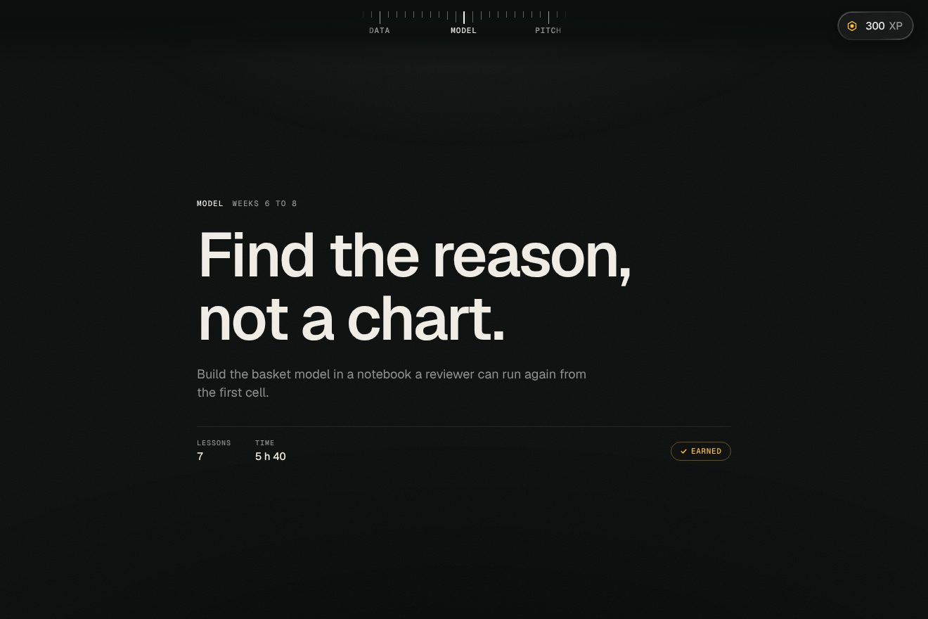
In our demo the story is a made-up course, Keelson Analyst Track, which takes you in five chapters from the first brief to the job offer: Brief, Data, Model, Pitch, Offer, each with a large title, one line, the lessons and the hours, on a near-black ground. Scrolling is Lenis with ScrollTrigger, and at the top the ruler carries the chapter names instead of years. From the site come the ruler’s size, 300 by 60, the mask from 8% to 92%, a tick every 10 units of screen height and 12 pixels between them, the still 2 by 18 needle, the lens within three steps from 9 to 18 pixels rounded to a tenth, the buttons arriving in a quarter of a second with the line from 28 to 40 pixels, and the points, a hundred per chapter, rising over 2 seconds on power2.out with the 1.8-second gold ring. Ours are the needle that bends with scroll speed and gives a little knock at every chapter, the chapter tick turning gold, the «+100» rising from the pill while the pill takes a one-pixel knock, the token at the end of each chapter turning into «Earned» with a tick that draws itself, and the titles rising out of a slit. On phones the ruler stays, and a tap opens and closes the buttons. With reduced motion the lens stays still and the points change without counting.
The words that light up out of the fog
The story’s sentences all arrive the same way: they do not slide or rise, they light up. Each word appears from left to right, but with a cloudy front, blurred, with a brighter flash of colour on the advancing edge, and it turns sharp behind it. The big words are set in a very high-contrast face, the linking ones in a flourished script, sea green with a pale halo.
Every word is a rectangle with its own shader. Progress runs from 0 to 1 and in the shader it is multiplied by 1.3, so the tail of the front really leaves the word. The front is a mask made half of horizontal position and half of noise, with a different seed for each word: that is why no two words light up the same way. Where the mask is below the progress the word is visible, with a four-tenths-wide feather; further back there is the blur, driven by the same mask and melting behind the front, made of seven reads of the image, the centre one counting double and six around it on a hexagon. On the front there is the flash: another band of the mask that multiplies saturation by four and brightens by 25%, and fades out as progress goes from 0.8 to 1. Scrolling only decides when: each word has a point where it lights up and one where it goes out, backwards too. Time decides how: the entrance lasts 4 seconds on an exponential ease-out, the exit 0.3.
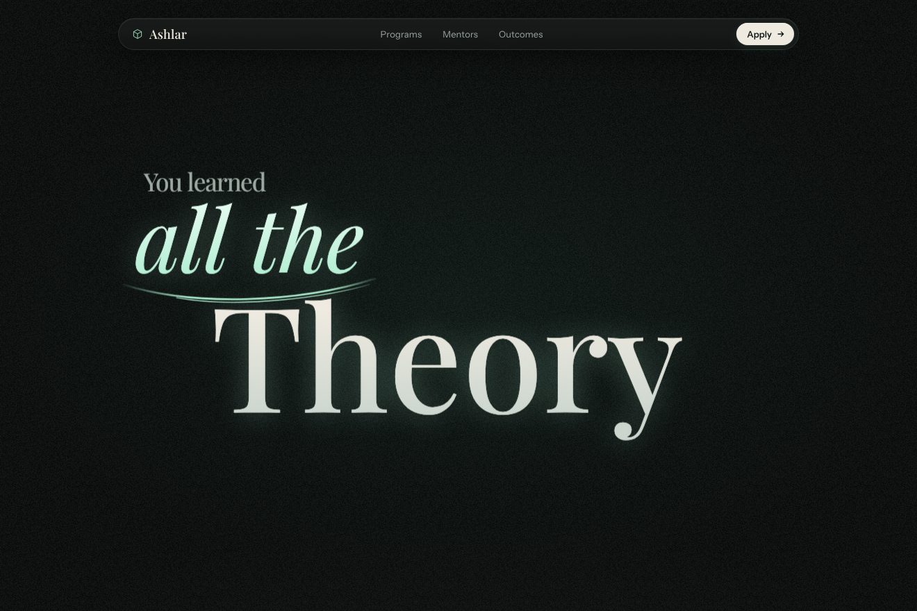
In our demo the story belongs to a made-up school, Ashlar School of Practice, in five sentences: it starts with «You learned all the Theory» and ends with «and you leave Hired, with work to show», on a near-black ground that shifts tone slightly from one sentence to the next. Each block of words is drawn on a 2D canvas, in Playfair Display for the big words and its italic for the linking ones, and handed as an image to a hand-written WebGL plane, without three.js. From the site comes the whole shader: progress times 1.3, the mask made half of position and half of noise with a seed per word, the alpha feather, the seven-read blur that melts behind the front, the flash that multiplies saturation by four, brightens by 25% and fades out between 0.8 and 1, the 4-second exponential entrance and the 0.3-second exit, and scrolling that only decides when, backwards too. Ours are the blur hexagon turning a little from pixel to pixel, so the blur becomes fog instead of ghost copies, the flourish that draws itself under the italic words, a veil of grain, the word that breathes by a pixel after it arrives, the top bar with an Apply button that answers to hover and press and catches a passing light when the last sentence arrives, and the four course figures at the bottom. Unlike the site, the sentences are also real text in the page, for screen reader users. Without WebGL the words arrive with a CSS fade and blur; with reduced motion, with the fade alone.
The other details
The button to move to the next stage has to be held down: an 88-pixel disc with two waves spreading from 0.85 to 3 times its size in 2.8 seconds, the second offset by 1.4, and a ring that fills in 3 seconds, 1.5 in the third stage. Let go and press again within half a second, and the ring does not start from zero but from where it was, minus what it lost meanwhile; and the button’s sound is played at just the speed that makes it end with the ring. In the first stage eight coins with company logos come out one after another on a spring tabulated in 128 values and circle faster the faster you scroll. The banknotes of the third stage burn in from the edge with a shader of embers and char, and the volume of the fire follows a bell curve over the burn’s progress. The pill menu opens in 0.65 seconds on a curve of their own, osmoNav, while the two lines of the hamburger turn into an X with a small bounce. The story ends on a map of the world to explore with a joystick or the keys, with the project cards, and whoever signs up gets an invite card to share, generated in the browser as an image and as a video. Come back within half an hour and you pick up from the stage you were at, without the loader.
Where it stumbles
The story is not in the page: the sentences live inside an image and the canvas only carries a label, «ZERO interactive 3D experience». A screen reader or a search engine reads nothing of it. To get in you have to draw a circle with the pointer, and the code has no keyboard alternative; even afterwards, the arrow keys, the space bar and the page keys do not move the story on. Zoom is blocked on phones. Reduced motion is read in one place only, to stop the wave of the audio button: hands, glass, tunnel and words move all the same. Before you have even drawn the zero the page has downloaded about 8.4 megabytes in 67 requests, including the 3.15 megabyte world map, and one of the fonts requested from Google Fonts, Caveat, is used nowhere. Left in production are an axes helper in the fourth stage’s 3D scene and the debug panel that opens when you add #debug to the address. And since the page does not really scroll, Google Analytics records a 90% scroll as soon as the page opens.
What we take away
Why Zero is a page you have to touch to read: you wipe a pane, draw a zero, hold a button, scroll to let the years pass. Every gesture has its numbers, and they are small, precise numbers: a trail that closes by 3% a frame, a circle that counts if it turns 330 degrees, a lens that stops at three ticks, a noise front with one seed per word. The most useful lesson for any site is the ruler: a 300-pixel piece of interface that tells you where you are, how much is left and what you have already earned, and that turns into the menu when the mouse comes over it.
The effects
- Frosted glass circleThe invitation of a made-up school that leads to a job, Brightwell, held behind a pane of frost drawn in hand-written WebGL. The frost grows from the top with a jagged mint front and bends and blurs the card behind it; the pointer wipes it in a trail that closes again slowly, its edge lighting up white. Draw a circle (at least 20 points, 330 degrees, closed) and the glass melts from the circle’s centre behind a white ring, and the invitation comes alive: the lock opens, the button wakes up. Premium minimal style.Free
- Chapter rulerThe scrolling page of a made-up course, the Keelson Analyst Track, five chapters from the first brief to a job offer. Fixed at the top there is a short 300 pixel ruler: a small tick every 10vh of scroll, a tall named tick at every chapter, the track sliding under a still needle and a lens that lifts the nearby ticks from 9 to 18 pixels. Under the mouse the ruler turns into five buttons that take you to a chapter. On the right a glass pill keeps the points: +100 the first time you reach each chapter, the number counting for 2 seconds and the edge lighting up gold.Free
- Words out of the fogThe scrolling story of the page of a made-up school that teaches by working on real projects, Ashlar School of Practice: five short sentences composed like a poster, one big Playfair Display word, one mint italic with a thin flourish and two or three small words set off to the side. Each sentence is drawn on a canvas and handed to a hand-written WebGL plane with the shader of the Why Zero site: a cloudy noise front runs from left to right, the letters come out of a blur and get sharp, and right on the front the colour flares, more saturated and brighter. The scroll decides when a sentence lights up or goes out, backwards too; time decides how: 4 seconds on outExpo to come in, 0.3 to go.Free