Marimba, by Myranda Wicks
Marimba, how it’s made: a portfolio in afternoon light
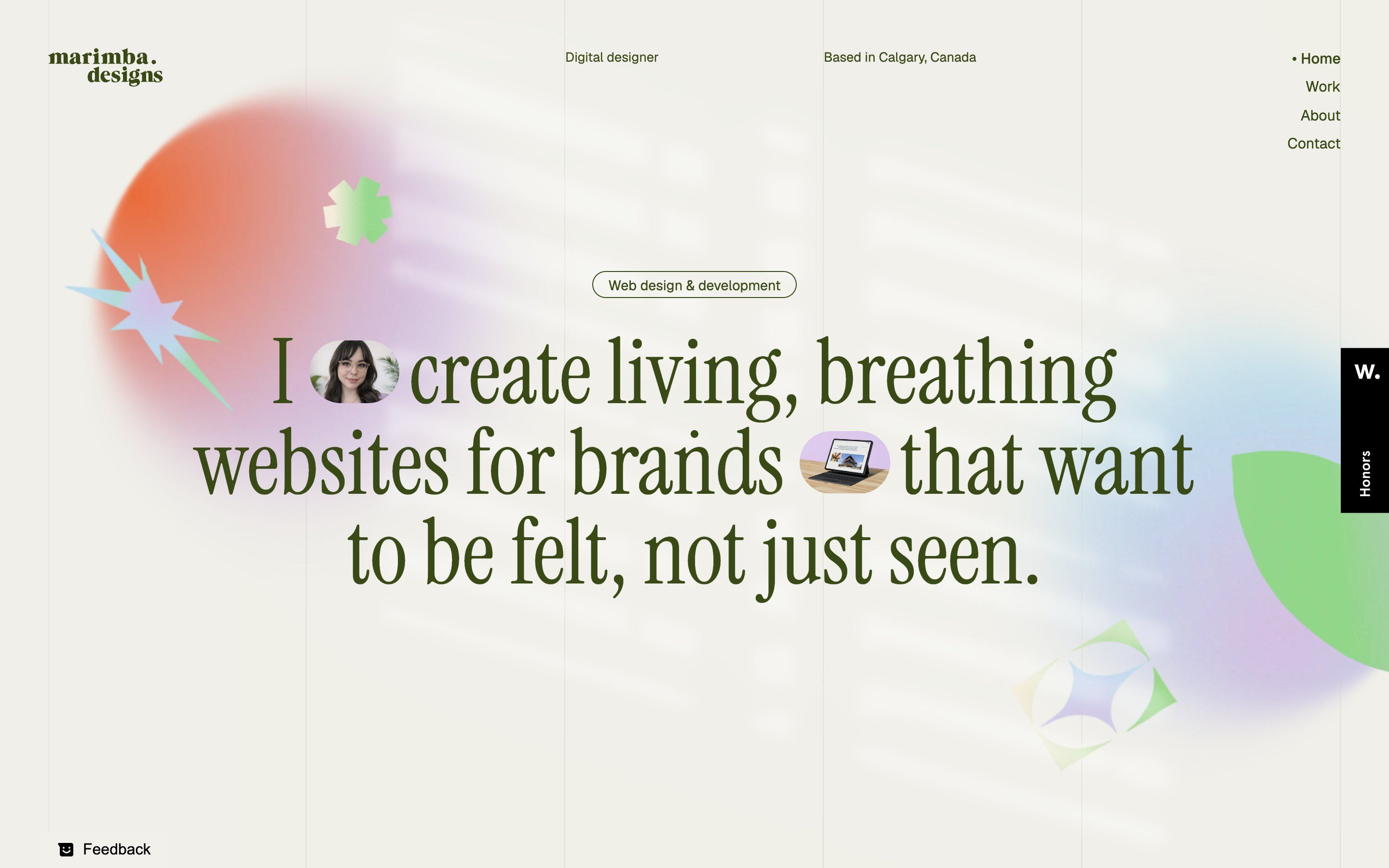
The light of a window blind falls over Myranda Wicks’s portfolio, and at the bottom of the page evening comes. In between, three spheres swing until they close into a ring, and the headline opens to make room for two photos. We take it apart with three demos rebuilt from scratch.
The palette
- #F0EFE9paper
- #3A4A16olive ink
- #212E02transition curtain
- #F46732coral
- #DAC6EBlilac
- #C1E4F7sky
- #93DD89leaf
Tap a colour to copy its code.
Marimba is the portfolio of Myranda Wicks, a digital designer in Calgary: a home page that scrolls like a story, a work page, an about page and project case studies. The tone is sunny and soft: cream paper, an olive ink, large and light headings in Instrument Serif, thin Geist text, and around them pastel 3D objects, blurred and iridescent: a glass starburst, a leaf, an asterisk, three glowing spheres.
Underneath there is little: hand-written HTML and CSS, GSAP 3.12.5 with ScrollTrigger, the browser’s normal scrolling, no WebGL. The JavaScript is a single 2,887-line file, unminified, and it reads like a notebook: the values we quote here come from it. We take it apart in three moments, with a demo rebuilt from scratch for each: spheres, drawings, texts, colours and code are our own. From the site we took the idea and the timing.
The ring of spheres
It is the scene that signs the site. Three glowing spheres sit around the home page headline; at the first scroll the headline melts into blur, and the spheres swing together along an arc until they close into a thin ring, with the words “My design practice” at its centre. Each carries its name, always upright. If you stop scrolling, the ring keeps turning by itself.
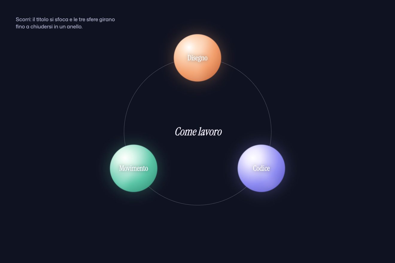
On the site the first screen’s background stays still while the next section rises, almost three screens tall, and a timeline tied to scrolling with scrub 1 moves everything. In the first fifth the headline goes to blur(20px), drops 100 pixels and disappears. The spheres are three 600-pixel webp images, moved by a plain object holding four numbers, t, r, s and cy, animated with power2.inOut: on every update the script works out an angle and a radius for each. At the start each sphere takes the shortest way to its place, while the group turns six tenths of a revolution, the radius tightens to the ring’s and the scale drops to 0.6. The spheres also spin on themselves, by 300, 270 and 140 degrees, and the labels turn back by the same amount to stay upright. The names appear at 70% of the scene, the ring at 80%. When the scene ends an endless orbit starts, one turn every 50 seconds; scrolling back up, the angle rewinds in three tenths of a second.
In our demo the spheres are drawn in CSS, with a radial gradient and a sheen turning inside: only the sheen turns, and the names stay upright with no counter-rotation. And the path changes shape: each sphere runs on an ellipse as big as the screen, which tightens into the ring’s circle, so none leaves the edges, not even on a phone. On phones the site gives up the scene and puts a looping video of the same ring in its place: a clever idea, which keeps the image without making the script work.
Pills in the headline
The home page headline is a sentence, and between its words there are two pill-shaped links holding a photo, a self-portrait and a website. Once loading is over the pills, zero wide, open and the line reopens to make room for the photo. Passing over them, the photo lightens to pastel and the place the link leads to appears.
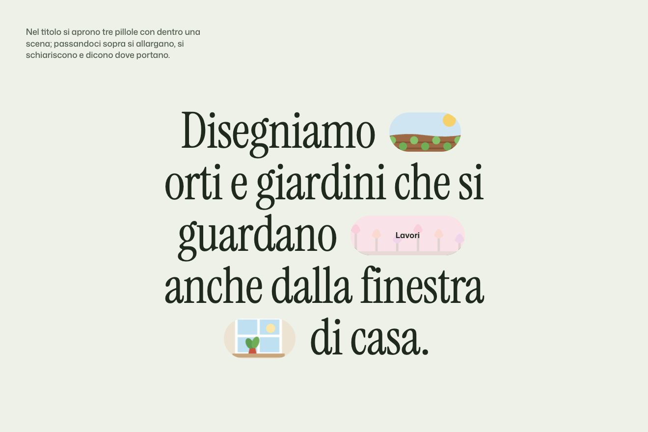
It is all CSS: a keyframe animation takes width and margins from zero to 6.5vw and 0.7vw in 1.2 seconds, with a 3.5-second delay to wait for the end of loading. On mouse over the pill takes a fixed width of 85 pixels and a light blue background in mix-blend-mode: lighten, which washes out the photo, and in three tenths of a second a label appears, About me or Work. They are real links, to the about page and to the work.
In our demo there are three pills, holding drawn scenes, and they are measured in em: they follow the headline at any size. They open as soon as the font has loaded, one after the other, and on mouse over they widen further and push the words; the veil lets the scene show through, and inside the pill the scene slowly drifts. With a finger they light up on touch.
Light through the blinds
The thing you remember most is not an animation. Over the whole site, text and objects included, falls the shadow of a window blind: diagonal stripes of light, as in a room in the afternoon. And at the bottom of the home page, at the contacts, the page turns olive night, and the stripes of light stay there, on the dark.
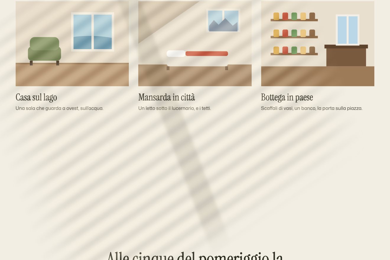
On the site the light is a photograph, in a fixed div over the page, with mix-blend-mode: overlay, opacity 0.4 and pointer-events: none. It does not move: the page scrolls under it. The evening, instead, is tied to scrolling: as the contacts reach the middle of the screen, the background goes from paper to night green, and text and borders go to cream.
In our demo the light is drawn with two gradients, with no photograph and no blending, and it moves: from the top to the bottom of the page it turns, leans and lengthens, like a lowering sun. The evening changes five CSS variables, and that is all.
The other details
On opening there is a dark green screen with an empty logo: inside the logo, which acts as a mask, a bar of lilac and cream light grows from left to right in 1.2 seconds, then the screen lifts like a blind. Behind it, seven 3D objects come in from off-screen spinning on themselves, in between two and a half and five seconds, with power4.out; if you start scrolling they arrive at once. The first screen’s asterisk turns one way and its texture the other, 360 degrees in 30 seconds: the silhouette rotates, the texture stays still.
Further down a laptop opens: 73 preloaded frames, swapped one after the other in 1.2 seconds, then a looping video appears on the screen, tilted in perspective to sit on the display’s plane. Four discs in perspective, filled with turning conic gradients, stack like plates while the section holds still. The pointer is an eight-pixel olive dot chasing the mouse; over the work it grows fourteen times and becomes a disc that reads View work.
Between pages there is no reload: a green curtain rises, the script downloads the new page, swaps its content in, and the new heading comes out of blur. On the work page the heading starts almost three times larger and shrinks, and the projects take turns with a curtain rising from the bottom and an alternating zoom. On the menu links there is no animated line: the opacity drops to 0.7, and that is it.
Where it stumbles
The evening is expensive: to change the colours the script animates the colour and border of every element on the page, one by one, gathered with querySelectorAll(‘*’). A few CSS variables would do the same job.
On iPhone Safari the blinds light is switched off, because there a fixed element with mix-blend-mode misbehaves: right on the phone the site loses the thing that makes it itself. Drawn with transparent colours, without blending, the light would have stayed.
The work scene ends at “+=4800vh”, but at that point ScrollTrigger does not know the vh unit and reads 4,800 pixels: it works, but by chance. And with the Back button the home-made transitions give up and reload the whole page.
What we take away
A single fixed light over the page gives a whole site its time of day, and if the light stays when evening comes, a colour change becomes a sunset. And three spheres closing into a ring tell how someone works better than a list.
The effects
- The ring of spheresThree glowing spheres scattered around a title: as you scroll the title blurs and the spheres swing together until they close into a ring, their names always upright; then the ring keeps turning by itself.Lifetime
- Pills in the headlineA large headline with three pills between its words: they open one after the other pushing the text apart, and passing over them they widen further, lighten and show where they lead.Free
- Light through the blindsThe light of a window with blinds falls over the whole page: as you scroll it turns and lengthens like an afternoon sun, and at the bottom the page turns to evening while the stripes of light stay on the dark.Lifetime