ART+TECH Report, by MoreSleep
ART+TECH Report, how it’s made: a data report that assembles itself
The digital-art collecting report designed by the studio MoreSleep is electric blue, made of thin-bordered cells that move with the mouse, titles that come into focus and charts that draw themselves as you scroll. We take it apart with three demos rebuilt from scratch.
The palette
- #2F23F2electric blue
- #FEFEFEchapter background
- #171717text and menu curtain
- #2FFEC9data mint
- #FF7358data coral
- #BB94FFdata lilac
- #FAED26menu yellow
Tap a colour to copy its code.
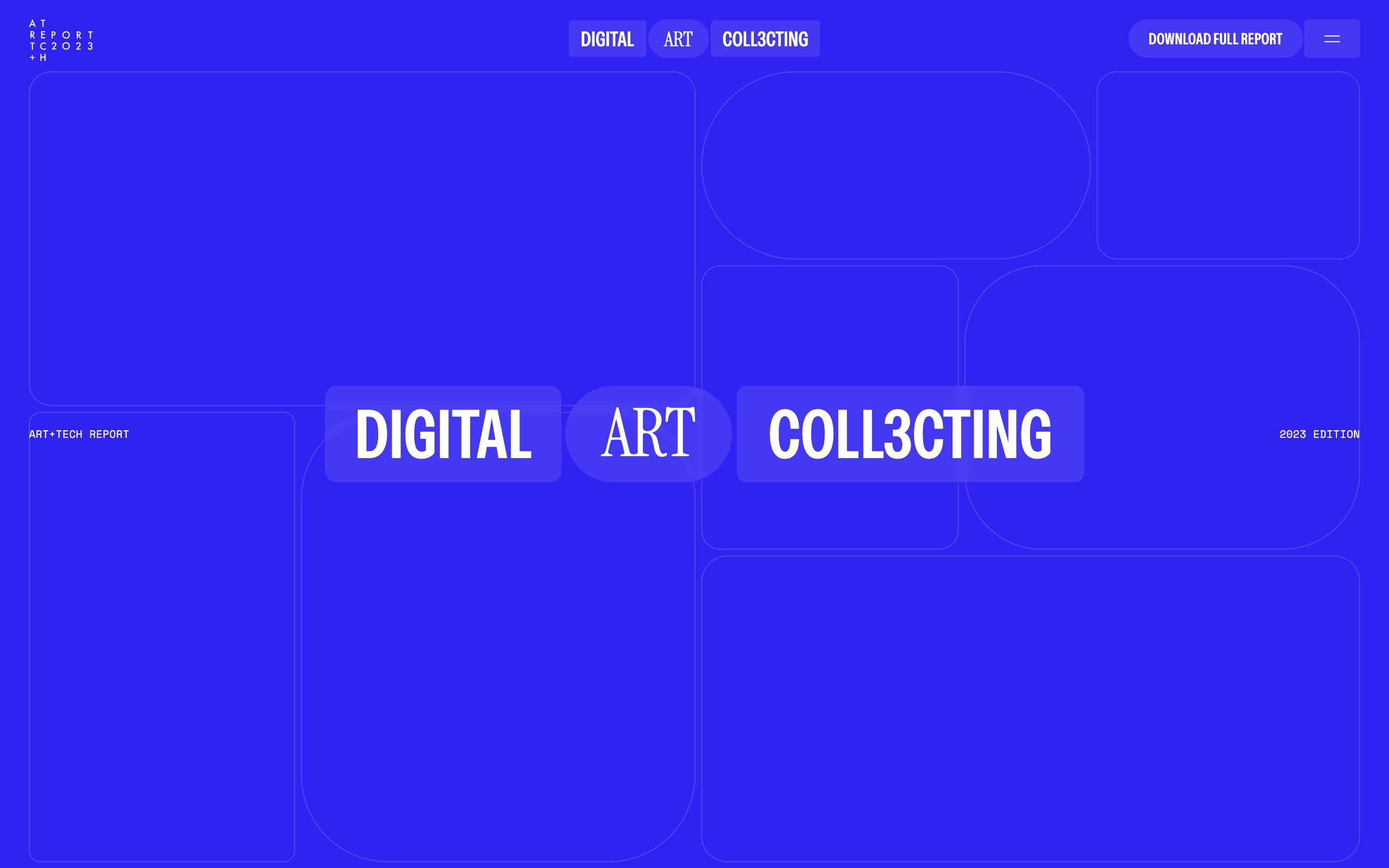
ART+TECH Report is a survey on digital art collecting, the 2023 edition titled «Digital Art Coll3cting». Instead of a PDF there is a website you read by scrolling: introduction, method, who answered, then nine chapters of findings with charts and quotes, and at the end the form to download the full report. The site and the charts are by the studio MoreSleep.
It looks like a data magazine: an electric ultramarine blue with hairline cells whose corners are rounded in different ways, then white chapters with data in mint, coral and lilac. Titles are set in a narrow uppercase grotesque, numbers and quotes in an elegant serif, labels in a tiny monospace.
There is no GSAP underneath: everything is built with Webflow interactions, with Lenis for smooth scrolling and Lottie for the charts. Here we take it apart in three moments. For each one there is a demo rebuilt from scratch with our own graphics: from the site we took the idea and the rhythm, never the code or the images.
The grid that moves with the mouse
The opening is a blue screen divided into empty cells, outlines only. On arrival the grid breathes from 0.85 to full size in a second and a half, with a very long brake. In the middle the logo assembles, three pills: DIGITAL, ART, COLL3CTING. They start empty and small, appear one after the other, then after a second they snap open to their word’s width on a curve that stays almost still and then jumps. The words arrive last, coming out of a five-pixel blur.
Then you move the mouse, and it is the best thing on the site. The grid re-proportions: the pointer’s X widens the left column from 36 to 60 vw and shifts the inner cells, the Y raises and lowers the rows. Everything chases the pointer with a long lag, and the cells feel liquid.
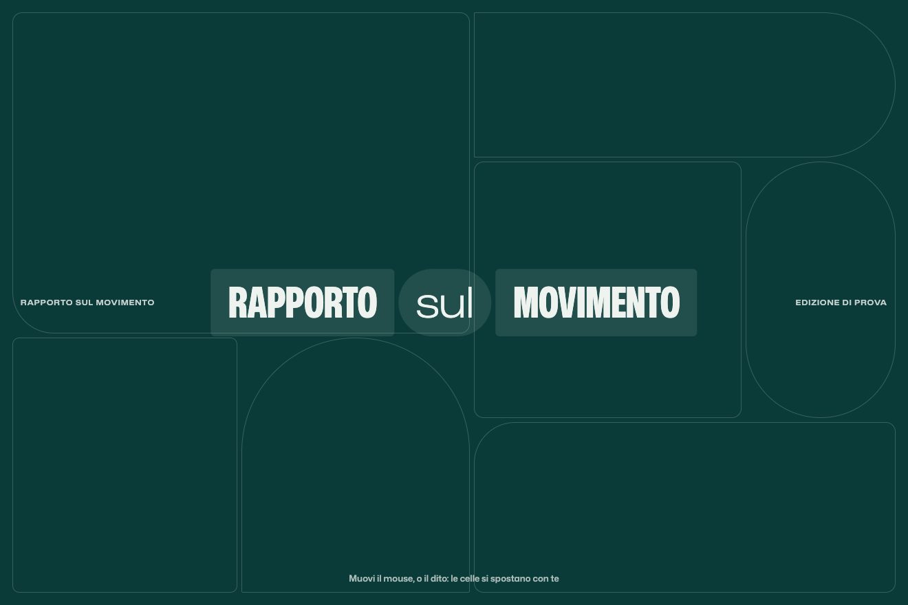
We put the sizes in CSS variables inside nested grids: the pointer moves a handful of numbers, and the numbers become grid-template-columns and grid-template-rows. With a finger the grid follows the touch, and if nobody moves it, it wanders on its own along a slow curve.
The titles that come into focus
Sections open with huge titles tied to scrolling. When they enter they are blurred by 14 pixels and semi-transparent; a quarter of the way through their run they are sharp. Then the title rises slowly while the subtitle rises much faster, five times as far, and overtakes it. The quotes between chapters, in a large serif, do the same focusing from eight pixels and settle sharp a third of the way through.

It is parallax without images: two texts at two speeds. In our version each chapter has a single scrubbed timeline, and inside it durations are fractions of the run, so focusing and rising keep the same ratio on any screen.
The charts that draw themselves
Each chapter has a chart on a very light grey card: bars, donuts, networks of pills, dot grids. They are Lottie animations, and the best ones are tied to scrolling: the chart draws as you scroll and comes apart if you scroll back. The others play once when they enter. Meanwhile the card slides by a few percent, for depth.
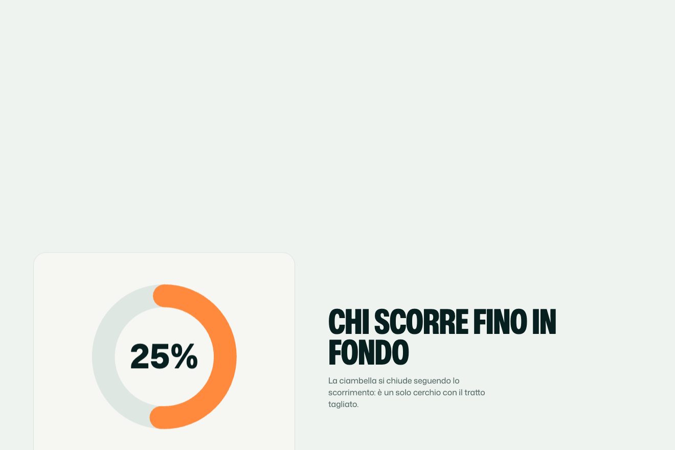
We made ours in hand-written SVG, without Lottie: bars growing from the bottom, a donut closing its arc, a hundred dots lighting up one at a time. Numbers count in the same timeline as the drawing, so the figure and the shape arrive together. The demo values are samples.
The other details
The menu is a curtain of nine dark columns falling from the top in steps, thirty milliseconds apart; the items are huge, and on hover a yellow bar fills the row while the words roll upwards. In the findings index the tiles blush coral and the chapter title slides up from below. Chapter titles rise from their mask with a two-degree rotation, like sheets placed at an angle.
Where it stumbles
Scrolling is heavy on purpose: Lenis halves the wheel, and in our tests 450 pixels of wheel input moved the page by 228. On a page sixteen thousand pixels tall that means twice the effort to reach the end. It conveys slow reading, but whoever is looking for a specific figure gets tired quickly.
The opening cells are outlines only: beautiful, but they contain nothing, and on phones they become stacked cards without the mouse play. And the edition name written with a three instead of an e, «COLL3CTING», is fun to look at and awkward to read aloud.
What we take away
A data report can have the rhythm of a magazine: every chapter has the same structure (a title coming into focus, a chart drawing itself, a quote), and the repetition becomes a guide for the reader. And an empty grid can become the main character, if it reacts to the pointer with enough lag to feel like it is made of water.
The effects
- The liquid gridA full-screen grid of cells that re-proportions under the pointer with a long lag, and a pill-shaped logo that snaps open.Lifetime
- Titles coming into focusAs you scroll, each title arrives blurred and comes into focus in the first quarter of its run; then it rises slowly while the subtitle overtakes it faster.Free
- Charts that draw themselvesBars, a donut and a dot grid draw along with scrolling, with numbers counting; scrolling back takes them apart.Lifetime