Noho, by Eugene Morev, Alex Ivanov
Noho, how it’s made: the chair that became a screensaver
A furniture site redone for fun, in memory of a New Zealand chair brand: a sentence whose photos take turns between the words, a footer that colours itself under the hand and, if you stop touching everything for a minute, a chair that bounces around the dark like the DVD logo. We take it apart with three demos rebuilt from scratch.
The palette
- #F1EEE9the page
- #E7E2DAthe panels and cards
- #CDC0B0the sand-coloured footer
- #3C3C3Ctext and buttons
- #2E241Cthe screensaver’s quiet layer
- #C7644Dthe terracotta of the footer letters
- #B2A1D8the lilac of the footer letters
- #FFE500the yellow of the bouncing chair
Tap a colour to copy its code.
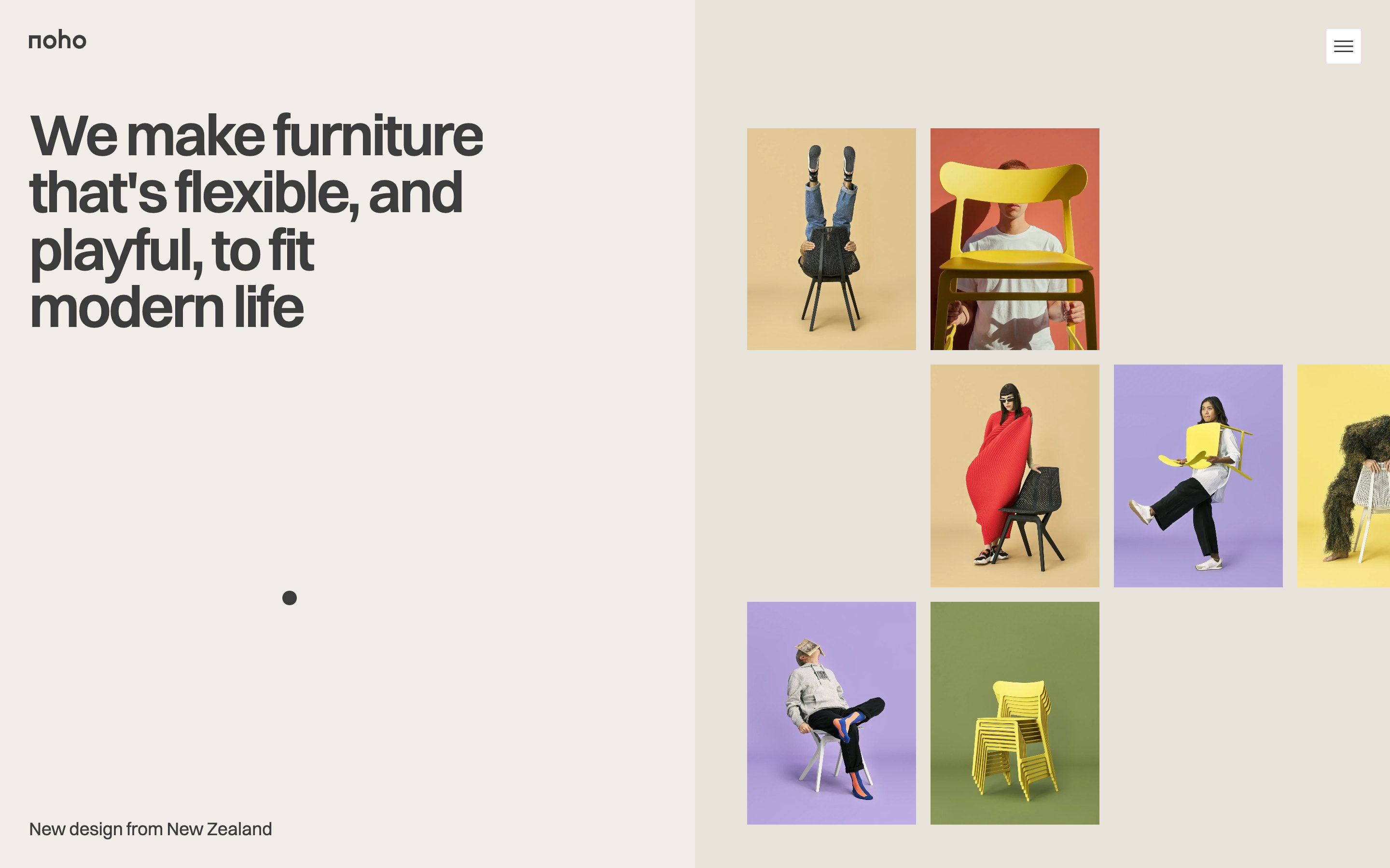
noho.ink is a project with no client: the site of Noho, a New Zealand brand of chairs for the home, redone from scratch for its authors’ portfolio. It says so as soon as you try to buy: the «Buy» button opens a notice, titled «A good goodbuy», that presents the site as a tribute and sends you to the real brand. Noho does exist, its chairs are called Move and Lightly, and in March 2025 it closed its online store in the United States; the article about it is still among the site’s stories. The design is by Eugene Morev, the code by Alex Ivanov. The page is paper-coloured, #F1EEE9, with slightly darker panels and a sand-coloured footer; the text is charcoal grey, in a single typeface, Switzer, semibold and very tight in the headings. The colour comes from the photos: people sitting in odd ways on yellow, black and white chairs, against flat yellow, lilac, terracotta and olive backgrounds.
Underneath there is Webflow, exported and served from its own domain, with jQuery, GSAP 3 with ScrollTrigger, CustomEase and SplitText, Lenis for scrolling, Embla for the carousels and Google’s model-viewer for the 3D chairs. The code written for the site lives in two files: one of 86 KB that runs the entrance, and one of 244 KB that arrives only afterwards, once the entrance is over. In between there is a work queue that decides what to prepare first, depending on what is about to appear on screen. The first load weighs about 4 MB, and more than half of it is the 3D chair.
There are three awards: FWA of the Day on 25 July 2026 with 83 out of 100, Website of the Day for CSS Design Awards on 31 July with 8.22, Site of the Day for Awwwards on 18 September with 7.34 and a Developer Award of 7. We take it apart in three moments, with a demo rebuilt from scratch for each, for three invented brands: drawings, text and code are ours. From the site we took the ideas and, where we say so, the numbers.
The chair that became a screensaver
Leave the page alone for a minute, without moving the mouse or touching a key, and a very dark brown layer comes down over the site while a yellow chair starts crossing it, bouncing off the edges and changing colour at every wall. At the first move the dark goes away, but the chair does not: it stays in flight over the page, and you can catch it and throw it.
On the site the chair is a real photo, cut out and repainted in five colours: yellow, grey, white, light blue and almost black. Each pixel takes the colour in proportion to its brightness, from 22% for the darkest to 100% for the lightest, so folds and shadows survive. On a copy 160 pixels wide the script measures where the photo is solid, and those edges, not the box’s, are the ones that touch the walls. The flight costs the JavaScript nothing: for each straight stretch the script works out when the chair will reach the wall and hands the browser a linear animation that ends exactly there, with Web Animations; at the wall it works out the next one. The speed is 205 pixels per second, and at every bounce the direction bends at random by up to 0.35 radians, or the path would repeat itself forever. The layer is not just scenery: as soon as it is full, the page underneath is hidden altogether, Lenis and the animations stop, and the browser has nothing left to repaint. It fits the rest of the site, which has a whole menu about saving energy.
When the mouse moves, the layer turns transparent in a third of a second and the chair carries on over the page. Caught, it follows the hand on a spring, a little late and with a slight sway; thrown, it leaves with the speed of the pointer’s last 40 milliseconds, between 90 and 520 pixels per second, and loses 14% at every wall until it is back to its own pace. Brought gently near an edge, the cursor reads «Release»: let go there, it disappears. There is also a function in the code that leaves coloured copies of the chair scattered in the dark, but it is switched off.
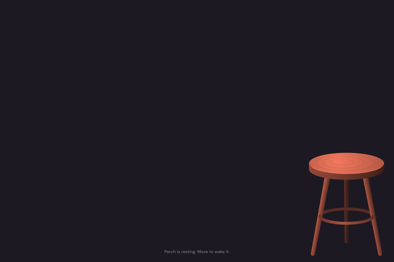
In our demo the shop sells stools and is called Perch. The stool is drawn on a canvas, in greys, and repainted with the same brightness rule; the numbers for the speed, the swerves, the throw and the spring are the site’s. The screensaver starts after four seconds instead of a minute, with a countdown at the bottom, and the stool does not appear out of nowhere: it leaves its shop window, which stays empty with its shadow, and when you put it away it slides out through the edge and goes back there. The flight is computed frame by frame rather than in stretches, so it stops and slows down together with the rest of the page, and it also works with a finger. We added one thing: if the stool hits two walls almost at once, in a corner, a copy of it stays printed in the dark. Anyone who grew up in front of a DVD player knows why.
Pictures between the words
Just below the opening there is a big centred sentence: Noho’s furniture is made from castor beans, old carpets and recycled fishing nets. After some of the words there is a small photo as tall as the letters, and the photos do not sit still: every so often one closes, the sentence rearranges itself, and another one opens further along.
On the site there are four windows and three are open. Each window is a box with hidden overflow, and the only thing that moves is its width: the photo inside stays whole and gets cropped, not squashed. The round is written by hand in three steps: the third closes and the fourth opens, then the first closes and the third opens again, then the fourth closes and the first opens again, and over. The second window never closes. A second and a half passes between changes, and closing or opening takes half a second, on a curve that starts firmly and lands softly. The round stops when the sentence leaves the screen and when animations are reduced.
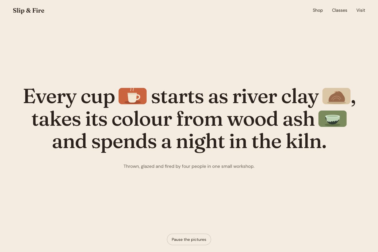
In our demo the sentence belongs to a pottery workshop, Slip & Fire, and the pictures are four real photos: a terracotta cup, a lump of clay in two hands, a dark glazed bowl, the wood fire in the oven. The round works itself out and sends every window round: the one open for longest always closes and the one closed for longest opens, so the gap travels through the sentence and after four changes it is back at the start. While a window closes, the photo inside grows slightly, like a door being pulled to; the sentence comes in with the windows closed and opens them one after the other; and there is a button to stop everything, because text that moves by itself for more than five seconds must be possible to stop. Widths and margins are in em, so they follow the font size even when it changes.
The footer that lets itself be touched
At the bottom of the page the last section slides away and uncovers the footer, which looks as if it had always been there. Below the links there is the motto «happy modern», as wide as the screen, and its letters rise one after the other as the footer opens. Then they notice the hand.
On the site the footer sits in a mask as tall as itself, and is pushed up by its own height; as the mask enters the screen, ScrollTrigger brings it back down exactly as far as the page goes up, so on screen it does not move. The letters rise with a paused timeline that follows the same progress, 0.04 seconds apart. At 95% the line opens and the letters may leave it; it closes again only under 88%, so it does not flicker at the edge. From then on the letter under the pointer moves towards it by a quarter of the vertical distance, its two neighbours by an eighth, and all three take their colour, always the same for each letter: olive, lilac, sand, terracotta, butter. The letters go down only when they are all in line, and while the page scrolls fast the game switches off and comes back when it slows down.
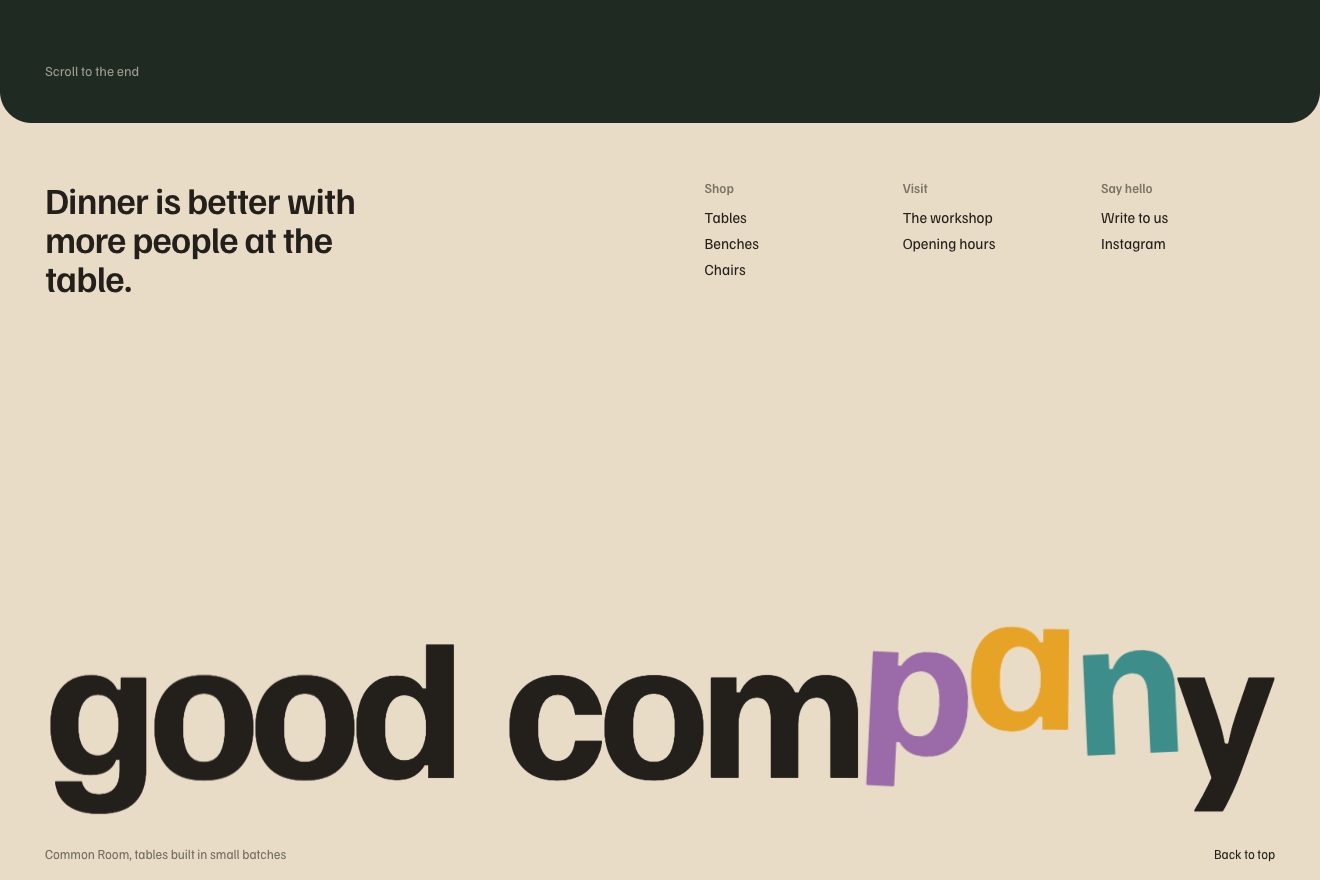
In our demo the brand sells tables, the motto is «good company» and the scrolling is the page’s ordinary one, without Lenis. The footer, the rising letters and the game’s numbers are the site’s. We added the lean: the letters that are reached tilt a few degrees towards the hand, and the scene feels more alive. When nobody moves the pointer for two and a half seconds, an invisible hand runs back and forth along the motto, and the motto can be touched with a finger. One technical detail cost us a test: as soon as GSAP takes hold of an element, it reads the CSS translate and rotate properties, folds them into its own transform and sets them to none. To keep the rise and the game apart, each letter is made of two elements.
The other details
The entrance is a dark grey band that rises from the bottom in a second and a half, on a curve drawn by hand. Behind it the home page comes up in two steps: in half a second it gets to a third of the way from its place, in the following second it reaches it, while the lines of the headline come out one after the other.
Scrolling with Lenis has a duration of 3 seconds: one turn of the wheel sends the page gliding for a long time, softly, even after the wheel has stopped.
The gallery halfway down follows the mouse: the row of photos slides sideways with a three-second lag, the photo under the pointer grows by about a third, and a click makes it three times bigger, over the headline.
In the top menu there is «Energy usage», with three levels and two switches: dark theme and reduced animation. The blog’s stories open in a side panel, the quiz for choosing a chair has its own small animations, and the two chairs turn in 3D with model-viewer.
Where it stumbles
The big headline on the home page is not a heading: it is a paragraph that looks like one. The only h1 on the page is «Privacy Policy», inside a hidden panel. To a screen reader and to a search engine, the home page does not say what it is about.
The system setting that asks for less motion is not read. The site has a switch of its own, which remembers the choice, but with the preference turned on in the operating system the entrance, the gallery and the footer move as usual, until you find the switch in the menu.
The «Energy usage» level measures nothing: it is the count of the switches turned on, high with none, medium with one, low with both. The sentence next to it promises about 35% of battery saved, but the page does not say where the number comes from.
What we take away
A screensaver on a web page is usually a nuisance. Here it works because it hands control back at the first move and leaves a toy lying around instead of locking the page; and because it has a reason beyond the game, the page that stops consuming. A still sentence comes alive without changing a word, if the shape of its lines changes. And the footer, the last thing almost nobody looks at, is the right place for a present: whoever got that far has time to spare.
The effects
- The screensaver stoolLeft alone for a few seconds, the page goes dark under a quiet layer and the stool from the shop window bounces from edge to edge like the old DVD logo, changing colour at every wall. At the first move the dark lifts but the stool keeps flying over the page: catch it, throw it, and let go of it gently by an edge to send it back to its window.Free
- Pictures between the wordsA big sentence with small real photos tucked after some of its words. A few are open; one at a time they close and others open somewhere else: the words after them slide back to close the gap or step aside, and the lines keep changing shape.Free
- Letters within reachThe last section of the page slides away and uncovers the footer, still underneath as if it had always been there, while the letters of the motto rise one after the other out of their line. Once it is open, the letter under the pointer reaches for it, up or down, its two neighbours follow half as far, and all three take a colour and lean towards the hand.Free