Thorgal, by Caracal, REEPLE Studio
Thorgal, how it’s made: the brush strokes with the title inside, the worlds that dissolve into noise and the footer that bends towards the next page
The site of a Franco-Belgian comic saga, designed by Caracal and built by REEPLE Studio, is five worlds behind five doors, a brush that covers and uncovers the screen and a page that ends by bending. Underneath there is no GSAP but Motion, OGL and Lenis. We take it apart with three demos rebuilt from scratch.
The palette
- #22201Dthe warm black of the text and the cards
- #EFEEEDthe paper white of the headings over the scenes
- #B8A88Athe gold of the lines and the percentage while loading
- #D3BEA9the light bronze of the sheen on the logo
- #1A1A1Athe black of the menu panel
- #838383the grey of the inactive menu items
Tap a colour to copy its code.
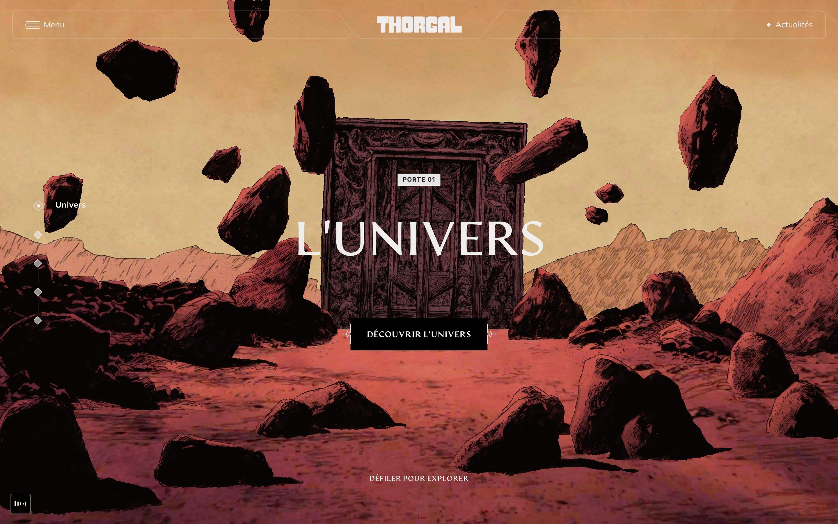
Thorgal is the online home of the comic saga by Jean Van Hamme and Grzegorz Rosiński, born in 1977 and published by Le Lombard: the story of a son of the stars raised among the Vikings, who belongs fully to neither world. The site is not a catalogue but a journey: the home page is five doors, L’univers, Les albums, Les personnages, Les auteurs and La communauté, and each one opens onto a world drawn in ink and set in three dimensions, a desert with floating rocks, the ocean, the jungle, the Scottish hills, the snow, each with its own sound. Outside the scenes the site has few colours: a warm black, #22201D, a paper white, #EFEEED, and a muted gold, #B8A88A, for the lines and numbers of the loader. Headings are set in Artifex Hand CF, a typeface that keeps the mark of the hand, body text in Mulish. The design is by Caracal, the agency that also signs the page; the build, as a message in the browser console says, by REEPLE Studio. On Awwwards it was Site of the Day on 19 May 2026, with 7.31 from the jury, where the highest mark is creativity, 7.48, and the developer award, 7.25, where the animations got an 8.
Underneath there is Astro 6.1.8, and every part of the page is a home-made HTML element, c-loader, c-canvas, c-text-reveal, c-thorgal-button. The animations are not GSAP: they are Motion, the motion.dev library in its version without React, with animate, inView, scroll and stagger, and its usual curves, easeInOut, that is cubic-bezier(.42, 0, .58, 1), and easeOut, (0, 0, .58, 1). The text is split into letters, words and lines by the Motion+ splitter. The smooth scroll is Lenis 1.3.23 on its default settings, driven by Motion’s frame loop. The 3D is not three.js but OGL, a much smaller library: ten GLB models compressed with Draco and Basis, decoded in Web Workers, and a quality that adapts to the graphics card with detect-gpu 5.0.70, which picks one of three tiers and renders at 100, 75 or 50 per cent. Page changes are Taxi.js, the CSS is Tailwind 4, the images come from a WordPress.
We take it apart in three moments, with a demo rebuilt from scratch for each, for a made-up saga, Emberfell, in five books, from a made-up publisher, Quire Press: the copy, the marks and the code are ours, and where the drawn worlds were there is paper, ink and a thread of gold. We leave the 3D to the site: from its scenes we take the gestures, not the objects. From the site we took the ideas and, where we say so, the numbers.
The brush strokes with the title inside
Before letting you in, the site loads everything: on a dark background, the logo with its golden sheen and, above and below, two thin vertical lines that fill up while the percentage slides along them. At a hundred, a single button appears, «Découvrir». On click the screen fills with diagonal black brush strokes, from left to right; inside the ink, and only there, the logo appears in white; then the strokes leave in the same direction and underneath is the first door, with the camera settling into place.
The brush is a black and white video, 1728 by 1116 pixels at 60 frames a second, 3.85 seconds long, that is never seen: it is a mask in WebGL. The first 2.12 seconds cover, the rest uncovers. The shader takes the darkest channel of each pixel of the video and where it drops below 0.1 it paints solid ink, elsewhere nothing. The logo is a second layer: the logo SVG is cloned, filled with white and drawn into a texture eight times larger, and the shader shows it only where the video’s luminance is below 0.05, fading out by 0.15. It is 140 pixels tall like the logo on the page and never wider than 75 per cent of the screen. While the brush uncovers, the home camera comes down from five units higher and two further back, in 1.73 seconds: exactly 3.85 minus 2.12, the length of the uncovering. The loader lasts at least two seconds even when everything is already cached, the sheen on the logo is a gradient sliding from minus 600 to 660 in one second, and the letters of the authors’ names come in 50 milliseconds apart. The button draws itself: the two ornaments on its sides with stroke-dashoffset, the label opening from the bottom with a clip-path, in 0.4 seconds, a tenth of a second apart.
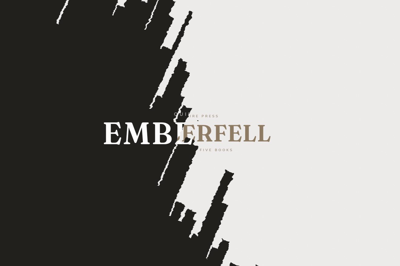
In our demo the logo is Emberfell’s, on warm white paper, and in place of the video there is a brush we drew in SVG: eleven diagonal strokes, each made of twelve bristles that start and finish at different times, with a dry edge and a few spatters ahead of it. From the site come the loader with its two gold lines filling up and the percentage at their tip, lasting at least two seconds, the title rising 20 pixels in 0.6 seconds with the lines above and below arriving from minus and plus 10 pixels, 50 milliseconds apart, the sheen passing in one second, the button with its two ornaments drawing themselves and the label opening from the bottom in 0.4 seconds, a tenth apart, the covering in 2.12 seconds and the uncovering in 1.73, the title white only inside the ink, 140 pixels tall and never over 75 per cent of the width, laid exactly over the one on the waiting screen, so it changes colour letter by letter as the brush passes, and the page beneath settling in the same time as the uncovering; reduced motion skips the brush, as on the site. Ours are the bristle brush, the gold line that draws itself under the title when the ink is full, the title drawing back a breath as the ink leaves, the spring of the button when pressed, and the first page of the book, The Ash Road, with its title rising and thinning. The site’s camera, coming down from higher up, is for us the page rising 4 vh and growing from 0.97.
The worlds that dissolve into noise
On the home page the page does not scroll: the body is fixed, and a single nudge of the wheel, as soon as it passes 10, or a 50-pixel swipe of the finger, changes door. The new scene does not slide in or fade: it eats the old one in patches, like paper burning, while the title leaves letter by letter and comes back with the name of the new world. On the left, five small diamonds keep count.
The two scenes are drawn into two off-screen images and joined by a shader of a few lines. The noise is an FBM, four octaves of Perlin noise, read at uv times 2.5 and mixed one quarter with a precomputed texture. The edge is 0.08: the threshold is the progress times 1 plus a fifth of the edge, minus the edge, and around the threshold the mask passes from one scene to the other with a smoothstep two edges wide. That soft margin is what separates any old crossfade from a page being consumed. The progress goes from zero to one in 2.4 seconds, easeInOut. At 1000 milliseconds, when the text is out, the active door changes: a CSS variable on the html, and the text column jumps by a screen height with no transition, because no one sees it. The headings rise away and come back up from below letter by letter, from 115 per cent of their height to zero, in 0.8 seconds and a hundredth of a second apart. Meanwhile the old camera pulls away in 1.5 seconds, the new one starts at 720 milliseconds, and the sound of the new world rises to a volume of 0.35 in 0.8 seconds while the old one fades. The navigation diamonds are small squares rotated by 45 degrees; the active one goes hollow and grows to 1.25, and its name rises letter by letter in 0.3 seconds.
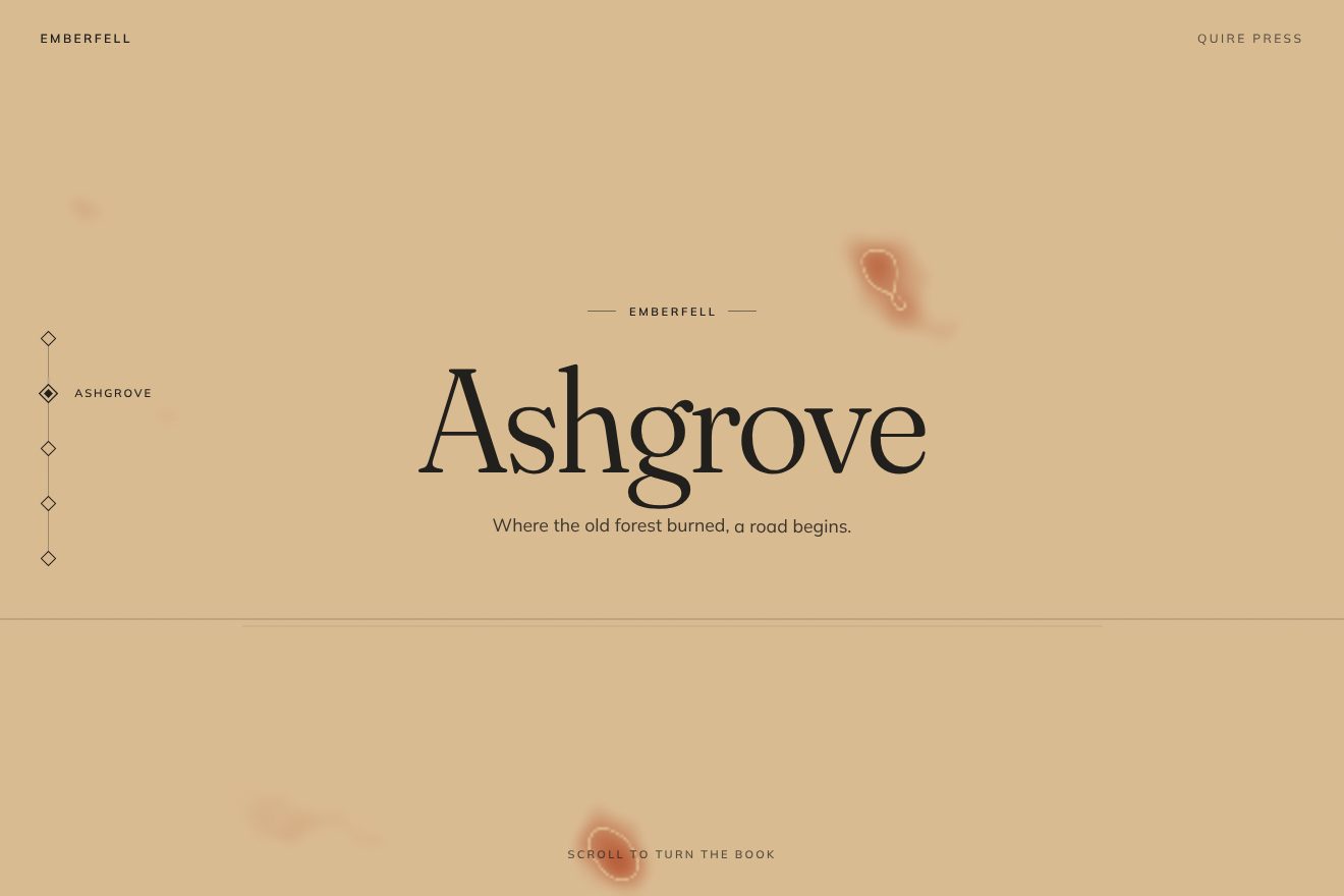
In our demo the doors are the five books of Emberfell, Kindling, Ashgrove, The Thaw, Saltwind and Last Ember, each a solid field of colour, from ember red to sand, ivory and warm black, with its name set large, one line, and a thin horizon. From the site come the wheel nudge above 10 and the finger above 50 pixels, the five books in a loop, the four-octave FBM noise mask at uv times 2.5, mixed one quarter with a slowly drifting noise, the 0.08 edge, the site’s threshold and smoothstep, the 2.4 seconds on Motion’s easeInOut curve written by hand, the book changing at 1000 milliseconds with the text column jumping while the words are out, the headings from 115 per cent in 0.8 seconds a hundredth apart, the diamonds at 45 degrees with the active one at 1.25 and the names rising in 0.3 seconds, and the wave through the letters of the invitation every four seconds. Ours are the background painted in a 2D canvas, with no WebGL, so it holds up even without a graphics card, with round patches measured on the height; the thin gold thread running exactly along the threshold of the noise; the gold segment travelling down from one diamond to the next; the letters gaining weight as they come in and settling by a pixel; the arrow keys, which the site does not have; and the self-running loop when nobody touches it. With reduced motion the books swap with a plain fade, no zoom and nothing moving: the thing the site is missing.
The footer that bends towards the next page
The inner pages of the site are in a row, L’univers, Les albums, Les personnages, Les auteurs, La communauté, and then round again. At the bottom of each, the footer already shows the world of the next page. At the end, if you keep turning the wheel, the top edge of the footer curves upwards, like a sail catching the wind; if you stop it comes back down, if you insist you move on to the next page, and the footer rises to become the header.
The arch is a parabola, 4 times x times 1 minus x, zero at both sides and one in the middle, 0.05 of the screen tall for each unit of arch, and the shader bends the footer’s picture too. When you are less than 50 pixels from the bottom, each turn of the wheel adds its movement times a thousandth, multiplied by 1 minus the arch divided by 1.5: the tauter the arch already is, the less it gives. The maximum is 1.5, the threshold is 0.7, and on phones, below 768 pixels, only 0.3. Once the threshold is reached, the site clicks the footer link by itself. If no more wheel arrives for six frames, the arch goes back to zero with a spring, stiffness 300, damping 25, mass 0.8, starting from the speed it had. The change to the next page takes 0.7 seconds, easeInOut: the arch follows the sine of the progress times pi, times 1.5, so it swells and goes flat again, and a painted white brush stroke, a 56-kilobyte image, rises from below the screen with translateY from 100 per cent to zero.
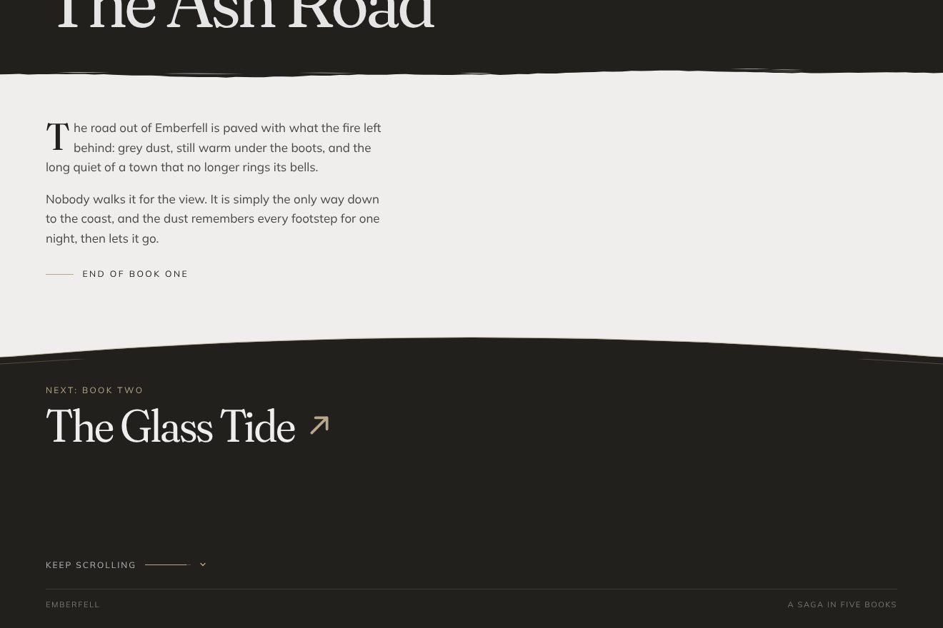
In our demo the pages are the five books of Emberfell, from The Ash Road to The Last Ember, each with two lines of story on warm white paper and at the bottom a warm black footer announcing the next book. From the site come the 4x(1−x) parabola, 0.05 of the screen tall per unit of arch, the wheel rule within 50 pixels of the bottom, with the resistance growing up to the maximum of 1.5, the threshold of 0.7 and of 0.3 below 768 pixels, the return after six still frames with the 300, 25 and 0.8 spring, which we integrate by hand, the 0.7-second passage on Motion’s easeInOut curve, the arch following the sine times 1.5 and the brush stroke rising from 100 per cent to zero, and the 6-pixel wave every four seconds through the letters of the invitation to keep going. Ours are the SVG edge with its gold thread and a fainter second thread that follows it on a softer spring, the line that fills up to the threshold, the vector brush stroke that matches the torn edge of the header, the book title flying from the footer into the header, the finger and the keys, and the arch that in the passage starts from where the hand left it instead of starting flat again. When nobody touches it, the demo scrolls down by itself, tries once without reaching the threshold, springs back and then goes through.
The other details
The site has only one way of making things appear: from below, inside a window. The words and letters of the headings rise from under their line, which has 0.15 em of extra room so the descenders are not cut, the «Porte 01» badge is uncovered with a clip-path in half a second, the buttons open their label from the bottom. Under the heading, the words «Défiler pour explorer» send a 6-pixel wave through their letters every four seconds, in 0.4 seconds, 30 milliseconds apart. The sound button is five bars a pixel and a half wide that rise and fall in 0.9 seconds, with delays of 0, 0.1, 0.2, 0.3 and 0.1 seconds again, so they never look in line. The header hides when you scroll down fast, above a speed of 50, moving up 80 pixels in a quarter of a second, and comes back as soon as you scroll up; past 100 pixels it fills in. In the menu the letters of the items rise 35 milliseconds apart, while the panel slides in from the left in 700 milliseconds. The scenes hold little lives that serve no purpose and are convincing for that very reason: the floating rocks, six fireflies per group that pulse and now and then flare, the trembling torches, the flowers in the wind. The cards on the inner pages tilt towards the pointer by up to 15 degrees. And pressing Shift and G shows the grid the page is drawn on, left there for whoever works on it.
Where it stumbles
Weight, first of all. Before letting you in, the loader downloads all ten models, 33.1 megabytes on the highest tier, plus 2.5 megabytes of sound and the brush video: anyone who just wants the list of albums waits for everything else. The home page HTML weighs 700 kilobytes because the logo drawing, an SVG of about 300 kilobytes, is written twice; the CSS too contains Tailwind’s output twice. The universe page has 165 images with no smaller sizes for small screens. Reduced motion is half respected: every part of the page reads it and the brush is skipped, but the WebGL scene does not, and the door change always takes 2.4 seconds, with the camera zooming and still drifting. You can only get in with a click, and the same click turns on the sound. On the home page the doors change with the wheel, a finger or the diamonds, whose names disappear below 1024 pixels, but not with the arrow keys; the page has no main heading, and the menu does not close with Esc. The code is ready for French, English and Polish, but only French is online. And detect-gpu, on the first visit, fetches its data from unpkg.com: if that site is slow, so is Thorgal.
What we take away
Thorgal shows that a heavy site can feel light if every passage has a gesture of its own and that gesture comes from the material of the story. A comic is ink, and the site comes in with a brush, changes world like paper being consumed and moves to the next page by bending its edge like a sheet. None of the three tricks is complicated: a black and white video used as a mask, a threshold on noise, a parabola with a spring. The care is in the numbers that tie them together: the camera coming down in exactly the time the brush takes to uncover, the heading changing precisely when no one can see it, the arch giving less and less the harder you pull.
The effects
- Brush-stroke transitionThe gate of a made-up comic saga, Emberfell: two thin gold lines fill up with the percentage running along them, then a “Discover” button draws itself. On the click, diagonal dry-brush strokes cover the screen from left to right, the title shows white only where the ink is, and the strokes leave the same way, uncovering the page of the first book as it settles into place. Minimal style, warm paper, warm black and one gold.Free
- Five books in noiseThe five covers of a made-up comic saga, Emberfell: each book is a warm field of colour with a thin horizon and its name set large. A tick of the wheel, a swipe, an arrow key or a diamond on the left turns the book: the new field eats the old one through a mask of fractal noise with a soft edge, with a gold thread where the threshold runs, and the title leaves and comes back letter by letter. Minimal style, warm paper, ink and a single gold.Free
- Bending footerThe chapter of a made-up comic saga, Emberfell, that ends in a warm black footer: “Next: Book Two”. Once at the end, as you keep turning the wheel the top edge of the footer bends up like a sail, with a thin gold line on it, and the more it bends the harder it pushes back. Stop, and it falls back on a spring; insist past the threshold, and the footer rises to become the header of the next book while a paper brush stroke climbs from below. Minimal style, warm paper, warm black and gold.Free