Aupale Vodka, by Locomotive
Aupale Vodka, how it’s made: the headline that slides in askew, the chapters that swap on scroll and the arch that opens from the centre
The site Locomotive made for a Canadian vodka is light paper, sage and a serif with its words in italics. Underneath there is no GSAP but anime.js 4, with a single spring and a single way of bringing things in: askew, then straight. We take it apart with three demos rebuilt from scratch.
The palette
- #0D1015the blue black of the text, the night and the opening
- #FFFFFFthe white of the headings on the video and the product cards
- #D0DED7the light sage of the map, the arch and the narrow bar
- #929C99the dark sage of the lines that stay behind
- #A9E5A9the green of one of the seltzers
- #FFCABDthe peach pink of another
Tap a colour to copy its code.
Aupale Vodka is the site of a vodka born in the northern valleys of Canada, with its seltzers and its alcohol-free drinks. It is one long page that tells a story before it sells anything: the opening on a dark film, the philosophy, the bottle, the vodka, the seltzers, the people behind it. The colours are few and cool: a blue black, #0D1015, white, and a light sage, #D0DED7, that serves as paper for the map, the arch and the narrow bar; only the drinks bring their own colour, green, peach, pink. Headings are set in Instrument Serif, with one word in italics in almost every sentence, the navigation and captions in Martha, an uppercase monospace, and a few lines in Helvetica Now Display. The first screen, before the site itself, asks whether you are of drinking age: answer no and you land on Google. It was made by Locomotive, the Montréal studio that gave its name to Locomotive Scroll; on Awwwards it was Site of the Day on 17 March 2026, with 7.5 from the jury, where the highest mark is design, 7.75, and the developer award, 7.39, where the highest mark is animations, 7.8.
Underneath there is Astro 5.15.9, and every part of the page is a home-made HTML element, c-hero, c-story, c-rail, registered by a small manager. The smooth scroll is Locomotive Scroll 5, with Lenis 1.1.9 inside, syncTouch switched on for phones too and a syncTouchLerp of 0.05. Text comes from Storyblok, video from Mux with hls.js, page changes are Swup 4.8.2, the CSS is Tailwind 4. And the animations are not GSAP: they are anime.js 4.2.2, with its timelines, its scroll hooks and its splitText. There is no WebGL. The curves live in the CSS as variables: the main one is cubic-bezier(.645, .045, .355, 1), and next to it sit a spring written as a linear() curve that peaks at 1.0254 and an S curve used only for the logo. In the JavaScript there is a single spring, createSpring with bounce at 0.214 and 700 milliseconds, and it drives almost every line of text on the site.
We take it apart in three moments, with a demo rebuilt from scratch for each, for a made-up brand, Stillmere, a high-mountain spring water: the copy, the images and the code are ours, and where there was vodka there is water. From the site we took the ideas and, where we say so, the numbers.
The headline that slides in askew over the film
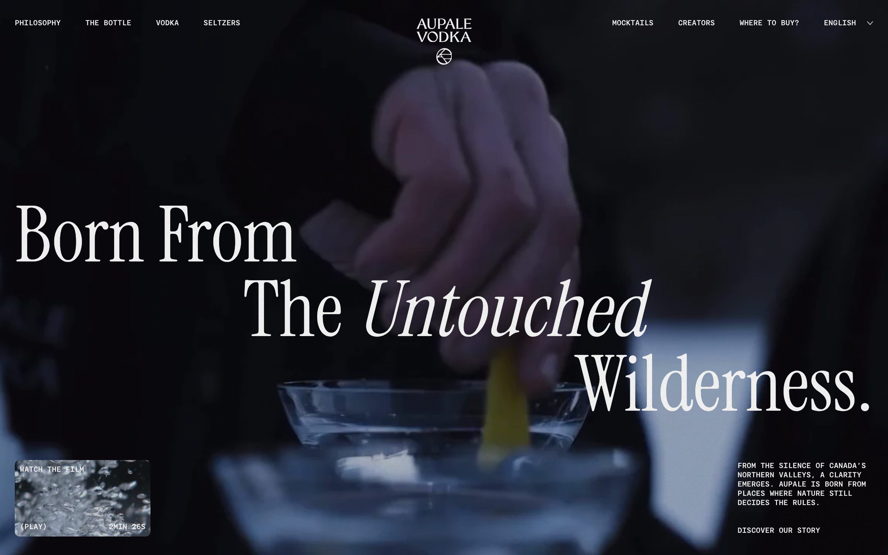
Once past the age question, the page opens on a dark film, a glass and a twist of lemon, with a huge headline in three lines staggered from one edge to the other, the logo at the top centre, the uppercase navigation on either side and, bottom left, a small box, “Watch the film”, with its own video. Nothing arrives straight: the film grows out of nothing leaning on two axes, the headline rises askew and straightens up, and the whole scene goes from blurred to sharp.
It is an anime.js timeline that only starts once the age question is closed: the page watches the classes on the html element and waits. The wrapper goes from blur(15px) to sharp in 2.5 seconds with outExpo, and at the same moment the background film does the block reveal the site uses everywhere: from scale zero, skewed 12 degrees horizontally and 10 vertically, transparent and clipped by an inset(100% 0 0 0) with 16 pixel rounded corners, to scale one, straight, fully uncovered, in 800 milliseconds with outExpo; when the reveal is over, the corner radius goes to zero too. The logo comes in 100 milliseconds before the film has finished, the headline 200 milliseconds before the logo, its lines 100 milliseconds apart, and each line makes the move the site gives to all its text: from below, at 100 per cent of its height, skewed 10 degrees and at 1.04 of its size, to rest, with a spring, createSpring with bounce at 0.214 and 700 milliseconds. Last comes the caption, split into lines by splitText and staggered by 100 milliseconds as well. Heading lines get 0.2 em of extra room below, taken back with a negative margin: that way descenders and italics are not cut off as they rise.
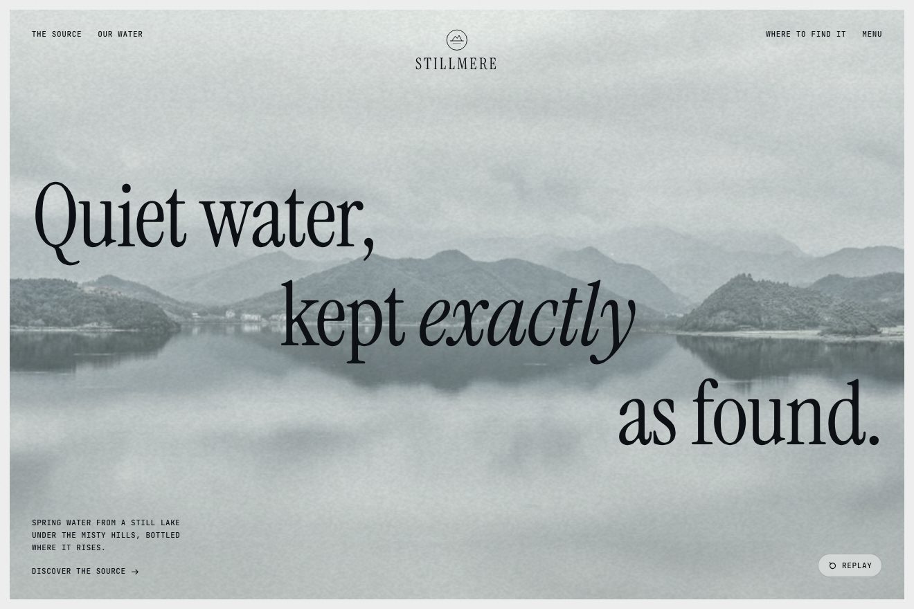
In our demo the opening belongs to Stillmere, and instead of the film there is a real, royalty-free photo of a still lake, with the mountains and their reflection. From the site come the scene going from 15 pixels of blur to sharp in 2.5 seconds, the film growing from scale zero skewed 12 and 10 degrees inside a clip with 16 pixel corners, in 800 milliseconds with outExpo, and the corners then turning square, the logo 100 milliseconds before the end and the headline 200 before the logo, the lines from 100 per cent, 10 degrees and 1.04 with the spring at 0.214 and 700 milliseconds, which we rebuild by hand as a curve and which overshoots by about 1.8 per cent, the caption staggered by 100 milliseconds and the 0.2 em of room under the lines. The headline, “Quiet water, kept exactly as found.”, is ours, as are the logo, the breathing reflection on the lake and the streaks of light crossing the water, the grain of the paper, the film leaning towards the pointer and giving way when pressed, the Replay that only appears once the entrance is over, and the exit: after a few seconds the lines rise away skewed the other way, the film closes from below and it all starts again.
The chapters that swap askew
After the opening comes the philosophy, told in chapters. The section is six screens tall, but inside the page it stays put: you scroll and the stage stays, and at each stretch of scroll the headline in the middle changes sentence, while on either side two rounded, tilted boxes, a photo and a film of ice, water and snow, swap with those of the new chapter. The old words don’t vanish: they rise away skewed backwards, and the new ones arrive from below skewed forwards.
The chapter to show is a simple sum: the progress of the section, from zero to one, cut into as many stretches as there are chapters, each 300 svh tall. The change does not follow the scroll step by step: past the threshold, the old chapter plays its whole exit and the new one its entrance, with a 100 millisecond delay. The exit is the same for every line of text on the site: each line goes from zero to minus 104 per cent of its height, skews to minus 12 degrees, drops to 0.96 of its size and stays at 20 per cent opacity, with the lines 50 milliseconds apart. The entrance is its mirror: from below, skewed 10 degrees forwards, at 1.04, with the site’s spring. The boxes leave and arrive with the block reveal, 100 milliseconds apart. And as you scroll within a chapter, everything drifts slowly: the CSS adds the progress of the story to the progress of the chapter and multiplies it by minus 2.5 lvh.
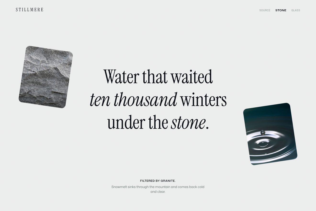
In our demo the story is Stillmere’s, in three chapters, Source, Stone and Glass, on warm white paper with its grain. From the site come the threshold instead of a scrub, the chapter picked from the progress times the number of chapters, the lines leaving at minus 104 per cent, minus 12 degrees, 0.96 and 0.2 opacity, arriving from 100 per cent, 10 degrees and 1.04 with the spring at 0.214 and 700 milliseconds, rebuilt by hand from the anime.js formula, the lines 50 milliseconds apart and the boxes 100, the 100 millisecond delay of the incoming chapter, and the drift of minus 2.5 lvh. Ours are the six photos, real and free of rights, the lake ice, the ridge in the clouds, the granite, the drop on dark water, the glass bottle and the lake shore, breathing slowly, with the glint crossing the ice and the light running down the glass; the boxes that tilt and slide the opposite way to the headline and change side at every chapter; the one and a half pixel settle when they land; the chapter names at the top, which light up and jump to their chapter on a click; and the closing with the brand name.
The arch that opens from the centre
Further down, between two columns of photos with their captions, there is the triptych: in the middle a tall, narrow sage shape, a capsule rounded at both ends, with dashed contour lines on it and a short sentence inside. As you scroll, the capsule doesn’t come in from a side: it is born in the centre, tiny, and grows to its full size while the sentence rises line by line.
It is the simplest thing on the site, and the loveliest to watch in slow motion. The shape is a box with a ratio of 454 by 829 and fully rounded corners, which anime.js takes from a tenth of its size to one, with the outExpo curve. It is not an animation that starts and ends: it is tied to the scroll, from when the bottom of the triptych is 200 pixels above the top of the screen to when its top reaches 20 per cent, but with sync at 0.5, meaning the shape follows the scroll half a step behind and, when you stop, carries on a little further, as if it had weight. The lines of the sentence do the same with a shorter lag, sync at 0.25, and their askew entrance takes 550 milliseconds. Each line gets 0.15 em of extra room below and to the right, taken back with a negative margin, so that italics and ascenders are not clipped by the mask. On Safari and on phones the dashed contours lose their dashes and drop to 35 per cent opacity.
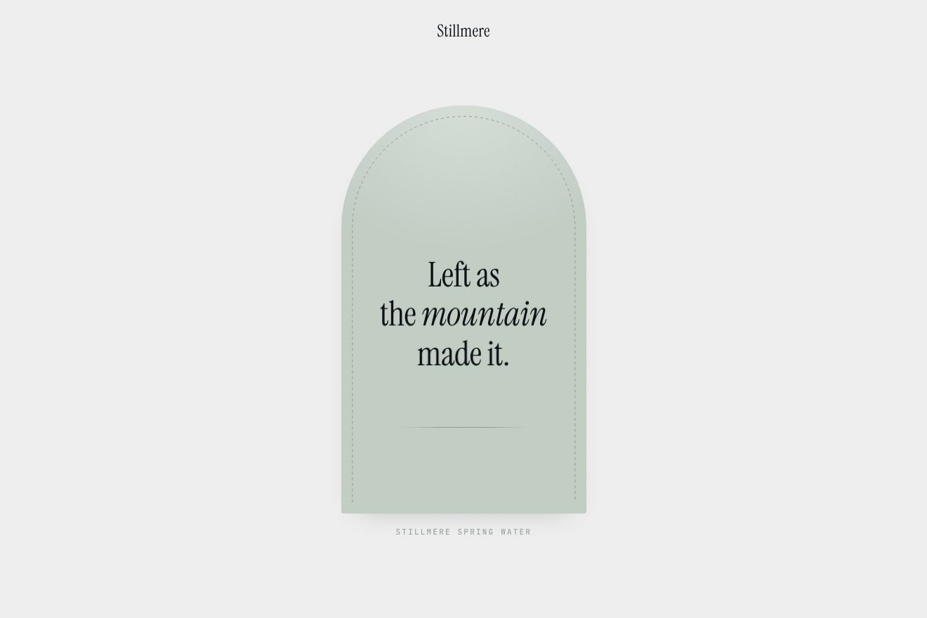
In our demo, on warm white paper with a very fine grain, there is a sage arch as small as a seed. From the site come the shape growing from the centre from a tenth of its size to one with outExpo, tied to the scroll half a step behind, the lines of the sentence tied with a shorter lag, the 550 millisecond askew entrance and the 0.15 em of room below and to the right of the lines; we do it with ScrollTrigger and a half-second scrub. Ours are the arch instead of the capsule, with its half circle on top, the stage that stays put as you scroll, the sentence, “Left as the mountain made it.”, the dashed border drawn along the inner edge instead of the contour lines, the still line of the lake opening from the centre, the caption, the white light running once along the edge on arrival, and the arch going one pixel past its size and settling.
The other details
The bottle has a section all to itself: a film in a box with rounded corners, an 80 pixel radius, which grows from 0.9 to 1 as you scroll while the radius goes to zero, until the box becomes the page. Here too anime.js doesn’t touch the box: it writes two CSS variables, --bottle-media-scale and --bottle-media-clip-path-modifier, tied to the scroll, and the CSS does the rest with scale and a clip-path: inset(0 round …) that multiplies the radius by the second. The ribbon scrolling sideways is a hand-written loop: each frame it moves by one plus the scroll velocity times 0.5, and it runs against the direction you scroll; the copies needed to fill the screen are hidden from screen readers. At the top there are two bars: the wide one with the links and, past 100 pixels of scroll, a narrow sage pill, “Where to buy”, the logo and “Menu”, swapping in 650 milliseconds. The menu opens by growing to its height with the browser’s own animations, and the items come in from 0.9 of their size to one, 15 milliseconds apart; on closing they leave in reverse, from the last. Button icons redraw themselves on hover: each stroke is erased in 200 milliseconds and rewritten in 500, 20 milliseconds apart starting from the last. And the product cards, with the mouse or the keyboard, make two opposite moves: the card shrinks to 0.98 while the photo inside grows to 1.1, over one second with the CSS spring, as a dark veil rises to half.
Where it stumbles
The site reads reduced motion in one place only, and two parts use it: the ribbon stops and the paragraphs split into lines never get the class that brings them in. The CSS has no rule for those who ask for it, and everything else, the blur of the opening, the askew text, the chapters, the bottle and the smooth scroll, moves for everyone. The 54 images on the page have empty alt text, and nine headings hidden for screen readers still read the template’s two placeholders, title and flavor in curly brackets: the product name and flavour never made it there. The public site also loads Storyblok’s preview code, text editor included, almost 850 kilobytes only useful to whoever writes the content; and two debugger statements were left in the page-change code. The page holds nine Mux videos, and on a computer without a graphics card the blur and frosted glass make it slow. On phones the contour map is switched off entirely, and on phones and Safari its dashed lines become solid and lighter: a sensible choice for speed, but phones lose one of the loveliest drawings on the site.
What we take away
Aupale proves that a site is recognised by the way it moves more than by its shapes. Everything comes in the same way, askew and a little larger, and straightens up with the same spring: whether it is the headline, a photo, the caption or the arch, the gesture is one, and that is why the page feels written by a single hand. And text leaves the way it came in, but backwards, upwards and skewed the other way: a small detail that makes every change feel like a page being turned.
The effects
- Askew hero titleThe opening of a made-up spring water, Stillmere: the scene starts out of focus and sharpens slowly, the film, a real photo of a still lake among misty hills, grows out of nothing leaning on two axes and opening from the bottom inside rounded corners, which then go square; the mark arrives just before, the three lines of the headline rise one after the other at a slant with a short spring that passes its place by a pixel, then the caption line by line. Minimal style, warm white paper, sage and blue-black ink.Free
- Askew chaptersThe story of a made-up spring water, Stillmere, in three chapters on a stage that stays put while you scroll: past each chapter’s threshold the old headline’s lines leave upwards leaning back and the new ones rise from below leaning forward, settling on a short spring; the two pictures beside it fold askew into their bottom edge and the new ones open out of it. Within a chapter the pictures tilt and drift as you scroll. Minimal style, warm white paper, sage and blue-black ink.Free
- Centre arch revealThe page of a made-up spring water, Stillmere: scrolling down, a sage arch grows from the centre, from a tenth of its size to its full size, a little behind the scroll, and inside it the three lines of the sentence rise one after the other, straightening out on a small spring. Then a thin dashed line draws itself along the inner edge, a light runs along it once and the arch settles by a pixel. Minimal style, white paper, sage and blue-black ink.Free