Plnty
Plnty, how it’s made: a home page that behaves like a shared canvas
The home page of Plnty, a design tool with more than 150 tools on an infinite canvas: a cursor with a name, letters that turn into symbols when it passes over them, a floor of tiles that rise and cards that the mouse throws. We take it apart with three demos rebuilt from scratch.
The palette
- #F8F8F8the page
- #1A1A19text and the activity bar
- #E5E3DEthe floor tiles
- #E6E3DCthe tool pills
- #76C1F5the blue button
- #A68AFFthe purple button
- #744CF6the symbols’ purple
- #FF5004the symbols’ orange
Tap a colour to copy its code.
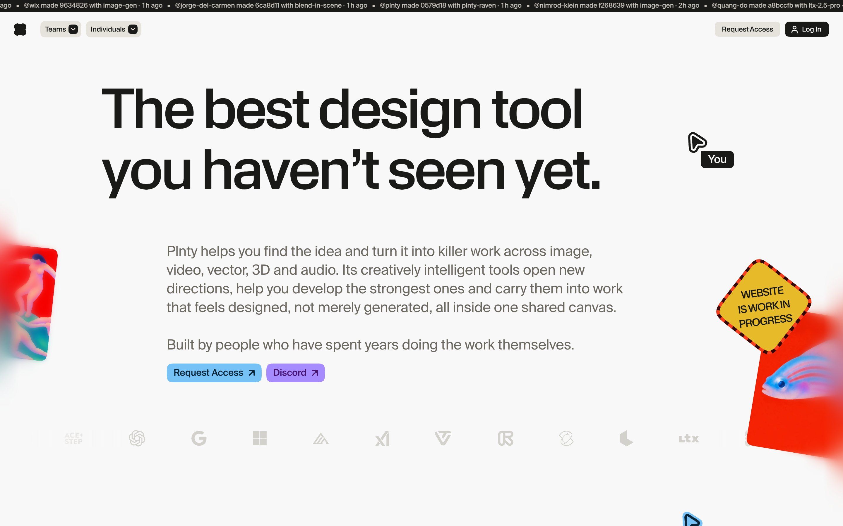
plnty.app is the home page of Plnty, a design tool made by a small team in Israel: more than 150 tools and more than 50 models for image, video, 3D, vector and sound, all on a single infinite, shared canvas. For now you get in through a waitlist, which opens to new users every month. The Awwwards entry says that brand, product, interface and site are all designed and coded in house. The page is almost white, #F8F8F8, with charcoal text in Suisse Intl, a few italics in Suisse Works and the labels in KMR Apparat; the colour comes from the pictures made with the tool and from two buttons, one light blue and one violet. Across the top runs a black strip with the real activity of the people using it: who made what, with which tool, how many minutes ago, read from a database every minute. And the cursor is not the system one: it is an arrow with a «You» tag, as in a shared document.
Underneath there is Astro, with its router for the transitions between pages, and GSAP 3.15 with ScrollSmoother for the smooth scrolling, ScrollTrigger, InertiaPlugin and Flip; MotionPathPlugin and CustomEase only arrive when they are needed. The illustrated scenes are videos with transparency, kept in time with Lottie animations. Every piece of the home page is a component with its own script, and the heaviest, the cursor’s, stays under 10 KB. The first load is 3 MB in 165 requests, and scrolling to the bottom takes it to 3.8. Almost every effect checks the reduced motion setting and, if it is on, switches itself off.
The site has an Awwwards Honorable Mention from 6 September 2026. The award page shows 15 of the 49 community votes, but no jury votes: for once we do not report a score. We take it apart in three moments, with a demo rebuilt from scratch for each, for three invented brands: drawings, copy and code are ours. From the site we took the ideas and, where we say so, the numbers.
Letters that turn into symbols
The headline, «The best design tool you haven’t seen yet.», and after it the heading of every section react to the cursor: the letters around it turn for a moment into coloured symbols, exclamation marks, at signs, hashes, dollars, and go back to being letters as soon as the cursor leaves.
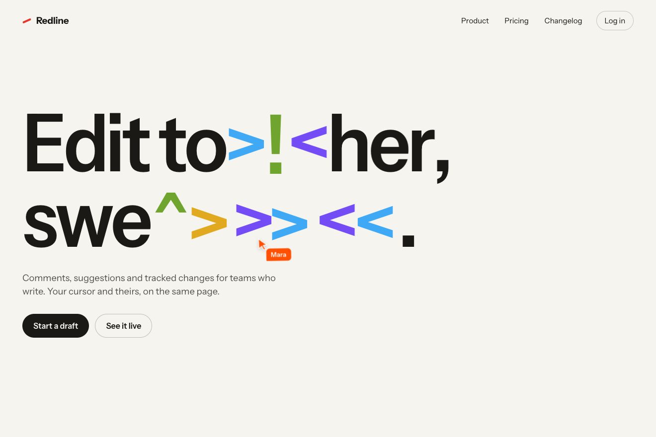
On the site every letter becomes a box with its character inside, hidden from screen readers, and the heading keeps the whole text in an aria-label. On every movement the script checks whether the cursor has entered an oval around a letter, with semi-axes of 0.6 and 0.55 times the font size; if so, every letter inside a larger oval, 1.7 by 1.3, changes. There are ten symbols, !@#$%^&*><, and they are not picked at random: once the typeface has loaded, a script measures on a canvas the width of every letter and every symbol, and for each letter it lines up the symbols from the most similar to the most different. Usually it draws one of the nearest six, favouring the most similar, so the line barely moves; 22% of the time it deliberately takes a more different one, up to 60 pixels of difference measured on a 100-pixel character. Two neighbouring letters never get the same symbol or the same colour. Each letter waits up to 70 milliseconds before changing and up to 150 before coming back, so they never snap all together; every 16 pixels the cursor travels the symbols are reshuffled, and the new one rises into place from a little below, at most 0.09 times the font size, in 280 milliseconds. When a wide symbol shifts the line, the letters after it do not jump: on every frame the script compares their position with the one before and makes them slide, covering 24% of the remaining distance each frame. The cursor has its own physics too, on two springs: it leans with the horizontal speed, up to 7.2 degrees, and when it runs it rises by up to 1.9 pixels. All of this exists only with a mouse: the script checks that the pointer is precise and can hover, otherwise it does not start.
In our demo the headline belongs to an invented app for writing and editing in a group, Redline: «Edit together, swear less.». With those symbols the game becomes a comic-strip curse. The numbers of the two ovals, the delays, the hop and the slide are the site’s, and so is the way symbols and colours are chosen. We added a second cursor, Mara’s, which comes in from the right, orange, and runs over the headline in a figure of eight: it changes the letters too, so the effect shows even without a mouse, on the phone and in the previews. A finger resting on the headline acts as a cursor, and with reduced motion Mara stays at home and the letters change in place, without hopping or sliding.
The floor that rises
Further down the canvas becomes a chequered floor seen at three quarters, and the objects of a project settle on it one at a time. Moving the mouse over it, the tiles under the pointer lift.
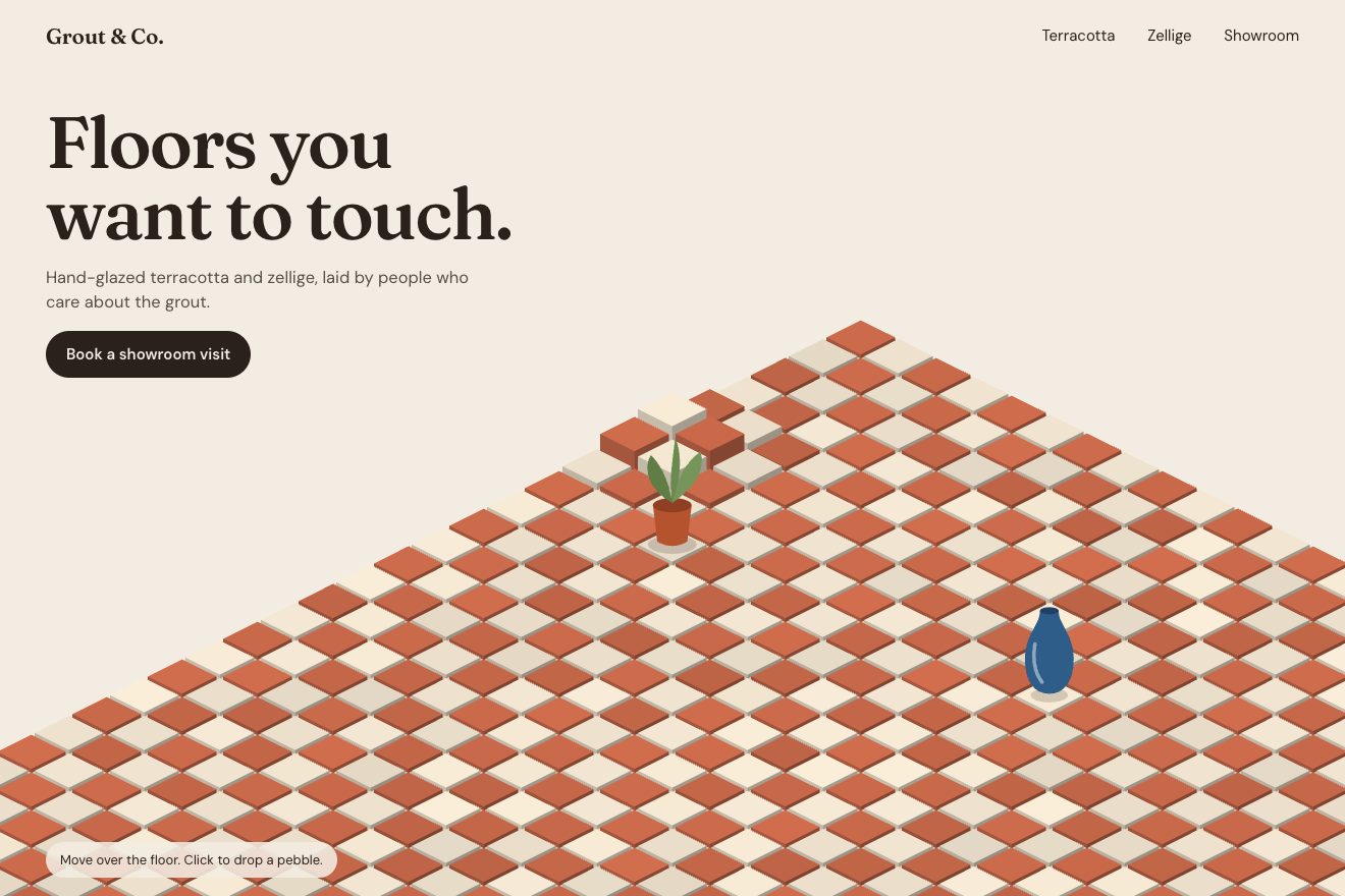
On the site the floor is an SVG of 85 light grey rhombuses with rounded corners: only the squares of one colour are drawn, touching at their tips, and those of the other are the white of the page. Under the pointer each tile rises by (1 − d/160)² times 32 pixels, where d is the distance from the pointer in SVG units, and the movement is a CSS transition of 0.22 seconds on a curve that overshoots and comes back, cubic-bezier(.34, 1.9, .5, 1). The objects arrive like stickers: each starts a little higher, turned by five or six degrees, scaled up by 10% and with a shadow, and settles in 0.4 seconds; some drawings instead trace themselves, with Lottie. It all starts when the scene above lands, a video with transparency and two Lottie animations kept in time with the video frame by frame: on Safari the video is a transparent HEVC, in the other browsers every frame is redrawn on a WebGL canvas. The same floor comes back at the bottom of the page, under the waitlist form, a little bigger: radius 196 and height 39.
In our demo the floor belongs to an invented tile shop, Grout & Co., terracotta and cream, with a plant in a clay pot and a blue vase standing on it. Every tile is drawn with its two sides, so rising it becomes a little column, and the distance from the pointer is measured on the floor and not on the screen: the raised area is a circle on the tiles, which perspective turns into an ellipse. The height curve is the site’s, but instead of the CSS transition every tile rides its own spring, running on the page’s clock. A click drops a pebble and a ring of raised tiles runs away from it; the objects go up with their tile, on the phone the tiles follow a resting finger, and with no pointer around an invisible one takes a walk.
Tossed cards
The pictures scattered over the canvas do not stay still under the mouse: brushing past one pushes it the way the pointer was going, and it comes back to its place with a wobble.
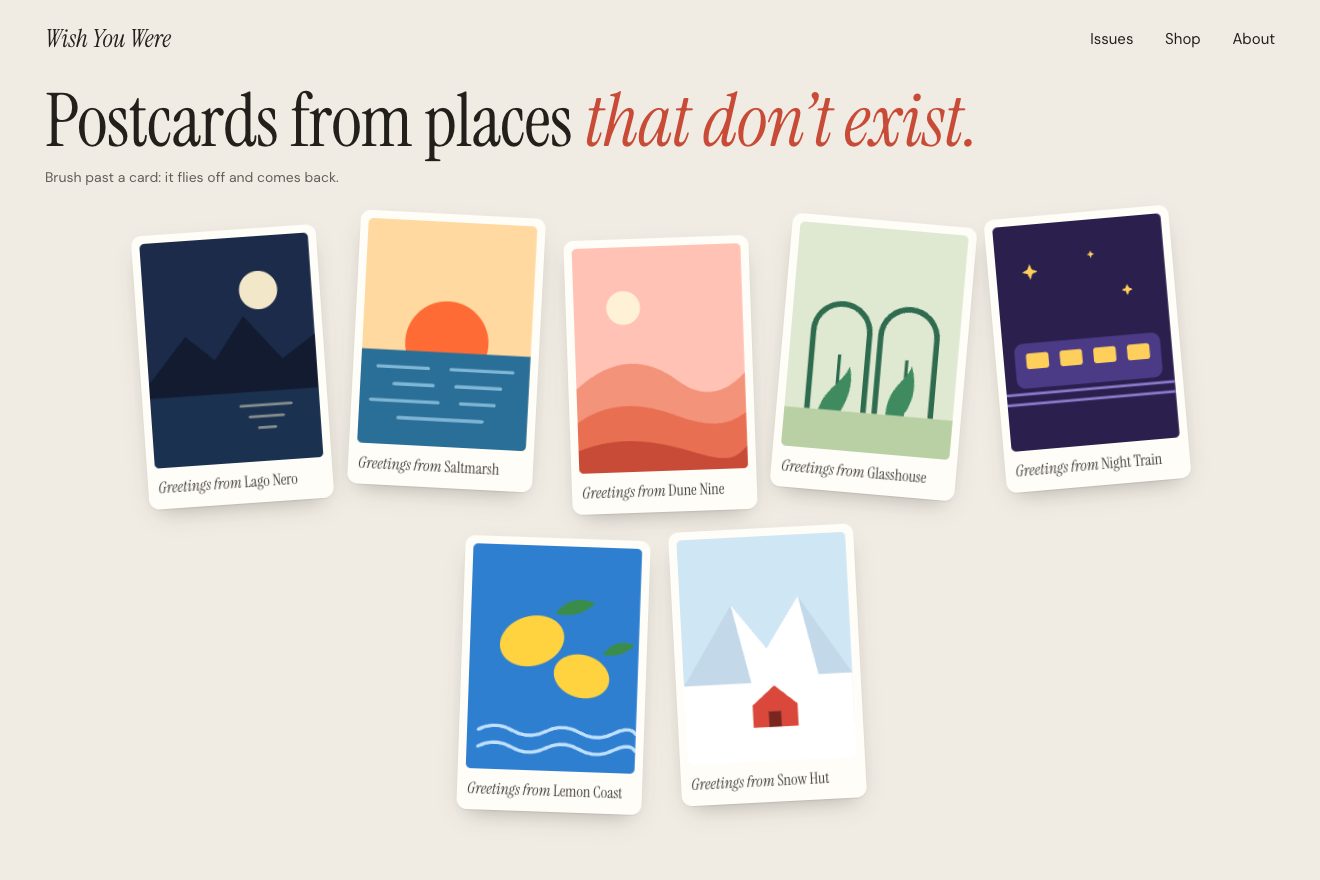
On the site, when the mouse enters a card, the script takes the pointer’s last movement, multiplies it by 14, keeps it within 900 pixels per second and hands it to InertiaPlugin as the starting speed, with an end of 0: the picture leaves, slows down and lands exactly where it was. At the same time a random twist starts, up to 15 degrees either way, going out and back in 0.4 seconds, and everything plays 1.2 times faster than the timing the plugin works out. Every card can have its own scale, which multiplies push and twist.
In our demo the cards are the postcards of an invented zine, Wish You Were, from places that do not exist. The numbers of the throw and the twist are the site’s. The card to throw is not chosen by listening for the pointer entering each one, but by checking on every movement which postcard the pointer is in; every postcard has its own weight, the postcards are dealt onto the board as the page opens, and on the phone a tap throws the postcard in a random direction.
The other details
Each of the five tools on show, antagonist, time-machine, variations, video-restyler and plnty-fx, has its own little act: a fake cursor moves along drawn paths, lifts a card, opens a menu. When you switch from one tool to the next, the panel slides away in 0.55 seconds and its pieces follow one after the other, starting from the ones in the middle, with a back.in that first pulls them back; the pieces of the new one come in the same way with back.out.
The gallery is a canvas you drag in every direction, repeating forever: let go, it glides for a stretch proportional to the speed, up to a limit, and hovering a picture brings up the card of the person who made it, with their handle and their trade.
In the waitlist, where you claim your username, a cursor comes in along a curved path and draws the underline under the field by hand, then leaves; three and a half seconds later a second one arrives, shaped like a hand, wandering around and stopping here and there, on a speed curve built from its stops.
The activity strip at the top asks for news every minute, but new names only come in when the strip’s animation starts its loop again, so nothing jumps under your eyes; the minutes ago, on the other hand, update every second, digit by digit.
Where it stumbles
The site’s content security policy lists the domains the page may connect to, and pagead2.googlesyndication.com is not among them, although the Google Ads tag the site itself loads tries to call it on every visit. The result is three console errors on every load, and a measurement that never arrives.
On the phone, then, the three effects we rebuilt are not there, or nearly: the headline and the cursor ask for a mouse, and the script checks for it explicitly; the tiles listen to the pointer’s movement, which under a finger becomes scrolling; the cards leave with the mouse’s speed, which a tap does not have. It is a choice consistent with a product used only on a computer, but the home page is read on phones too, and there it is much stiller.
What we take away
A cursor with a name changes the tone of a page: it is no longer a sheet to read, it is a place where someone is, and a second cursor going round on its own is enough to make it feel lived in. Measuring the width of the characters before swapping them is the detail that turns a game into something you can put on a headline without the line wobbling. And writing every effect as a small component, with its numbers at the top, makes the page readable even for whoever takes it apart.
The effects
- Symbols under the cursorA big headline whose letters, near a cursor, turn for a moment into the symbols of a comic-strip curse, each in a colour of its own, and turn back into letters once the cursor has gone. The symbol is picked among those almost as wide as the letter, and the letters next door slide instead of jumping. Two cursors with name tags share the page: yours, and a colleague’s that wanders by itself.Free
- Tiles that riseA tiled floor seen from above at an angle, drawn tile by tile in SVG. Under the pointer the tiles rise like little columns, the one underneath most and the others less and less, each on a spring. A click drops a pebble and a ring of raised tiles runs away from it; the two pieces standing on the floor go up and down with their tile.Free
- Tossed cardsA board of postcards. Brush past one with the pointer and its picture is thrown the way the pointer was going, as fast as it was going, twists a little and comes back to its place. The faster the brush, the further it flies; on a phone a tap throws it in a random direction.Free