Polpharma Biologics, by Widelab
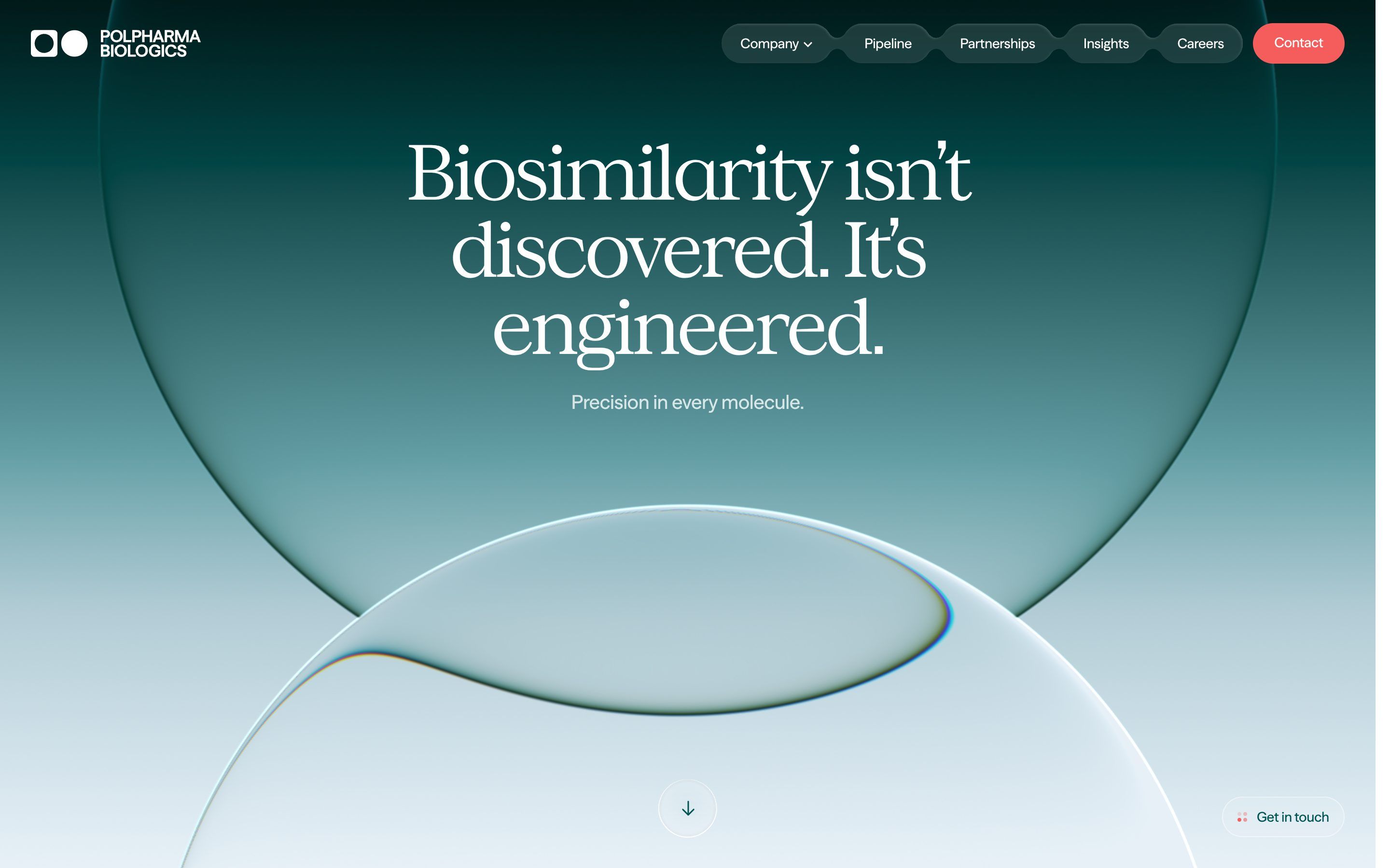
Polpharma Biologics, how it’s made: the two glass lenses on the gradient, the title that flies into the label and the page that rises like a sheet
The site of Polpharma Biologics, a company that develops and makes biosimilar medicines, opens on two large glass bubbles bending a deep teal gradient, and then tells its work entirely on scroll. We take it apart with three demos rebuilt from scratch.
The palette
- #005453the deep teal of the brand: headlines on light grounds, dark grounds and the word that lights up
- #16ABA9the vibrant green of the ring drawing itself around the pillars diamond
- #C6ECEBthe light green of the «Join» section and the soft grounds
- #E6EFEFthe mist: the words not yet lit and the panel rising behind «We know»
- #F55D5Dthe red, the only warm accent: the Contact button and the dots of the small labels
- #161517the near black of the text
Tap a colour to copy its code.
How others rated it
CSSDAWebsite of the Day, 3 November 20268.52/10the jury scorePolpharma Biologics is a company that makes only biosimilars: biological medicines that copy, molecule by molecule, a medicine already on the market once its patent runs out, and bring it to patients at a lower price. The site says it in its first sentence, large above two glass bubbles: «Biosimilarity isn’t discovered. It’s engineered». The colours are few and all of them laboratory colours: the deep teal of the brand, #005453, for headlines and dark grounds; a green mist close to white, #E6EFEF; a light green, #C6ECEB, for the soft sections; a vibrant green, #16ABA9, which appears only in one ring; and a single warm accent, the red #F55D5D of the Contact button. The headlines are set in Concrette M, a typeface with soft serifs and letters tightened by four hundredths of an em; the text in Season Sans. The whole site is measured in rem, and a small script grows the base size with the window, from 16 to 19 pixels between 1440 and 1889 wide. It was Website of the Day on CSS Design Awards on 3 November 2026, with 8.52 from the jury. It is signed, at the foot of the page and in a comment in the code, by the studio Widelab.
Underneath there is Webflow, with jQuery 3.5.1. The animations are GSAP 3.15.1 with CustomEase, ScrollTrigger, SplitText and Flip; pages change without reloading through Barba 2.10.3; smooth scrolling is Lenis 1.0.23, the version from the old Studio Freight package, with a lerp of 0.05, half the usual, and the wheel multiplied by 1.2. The glass backgrounds are Unicorn Studio 2.2.8 scenes, and the carousels are Swiper 12.2.0. All the animation code sits in a single file, served from a cdn.odyn.dev address, and at the end of the file there is the source map, with the original code and its comments: that is where we read the numbers. There are two curves, created once for the whole site: «osmo», 0.625, 0.05, 0, 1, the curve of every animation that says nothing else, in 0.6 seconds; and «parallax», 0.7, 0.05, 0.13, 1, for page changes.
It is a long page, almost twenty nine screens on a computer, and nearly everything happens while you scroll: a diamond opening onto a video, a headline getting smaller, a ring drawing itself, two glass shapes moving apart. We take it apart in three moments, with a demo rebuilt from scratch for each. The copy, the brands and the code are ours; from the site we took the ideas and, where we say so, the numbers.
The two glass lenses on the gradient
The opening is a vertical gradient running from an almost black green at the top to an almost white blue at the bottom. In front of it there are two large bubbles of clear glass: one hangs from the top, past the edge of the screen, and the other rises from the bottom. Where they overlap they bend each other, and the curve between them becomes a drop. Along the edges runs a thin line in the colours of the rainbow, as in a real lens. The gradient moves, but so slowly that you only see it after watching for a while.
There is nothing in 3D. The Unicorn Studio scene has three layers, all drawn by a shader on a plane. The first is the gradient, with five stops: #011919, #024546 at 0.19, #639EA5 at 0.52, #B1CBD4 at 0.70 and #E7F0F7 at the bottom. The colours are not mixed in RGB but in OKLab, a colour space built on human sight, which does not pass through grey between a green and a blue; the shader also gives saturation a small push halfway, of 0.025, and adds noise of half a colour step to remove the banding. The gradient slides by 0.01 a second, and goes back on every other cycle. The other two layers are the lenses: two circles described by a distance function, with a radius of 0.4, one scaled down by 1.7 and the other by 1.55. Each lens reads the layer below shifted towards its edge, more and more the closer it gets to the edge; and it reads it three times, once for red, once for green and once for blue, with slightly different steps. That difference, of a tenth, is what makes the rainbow line. The edge is blurred over 0.0025 and every point is the average of five nearby reads, so there are no steps. The second lens reads the image already bent by the first: that is why, where they touch, they do not add up but distort each other. The first lens comes in from the top in two seconds; the whole background comes in from a scale of 1.15 in two and a half seconds, and on scroll it moves down more slowly than the page, to 40% of its height.
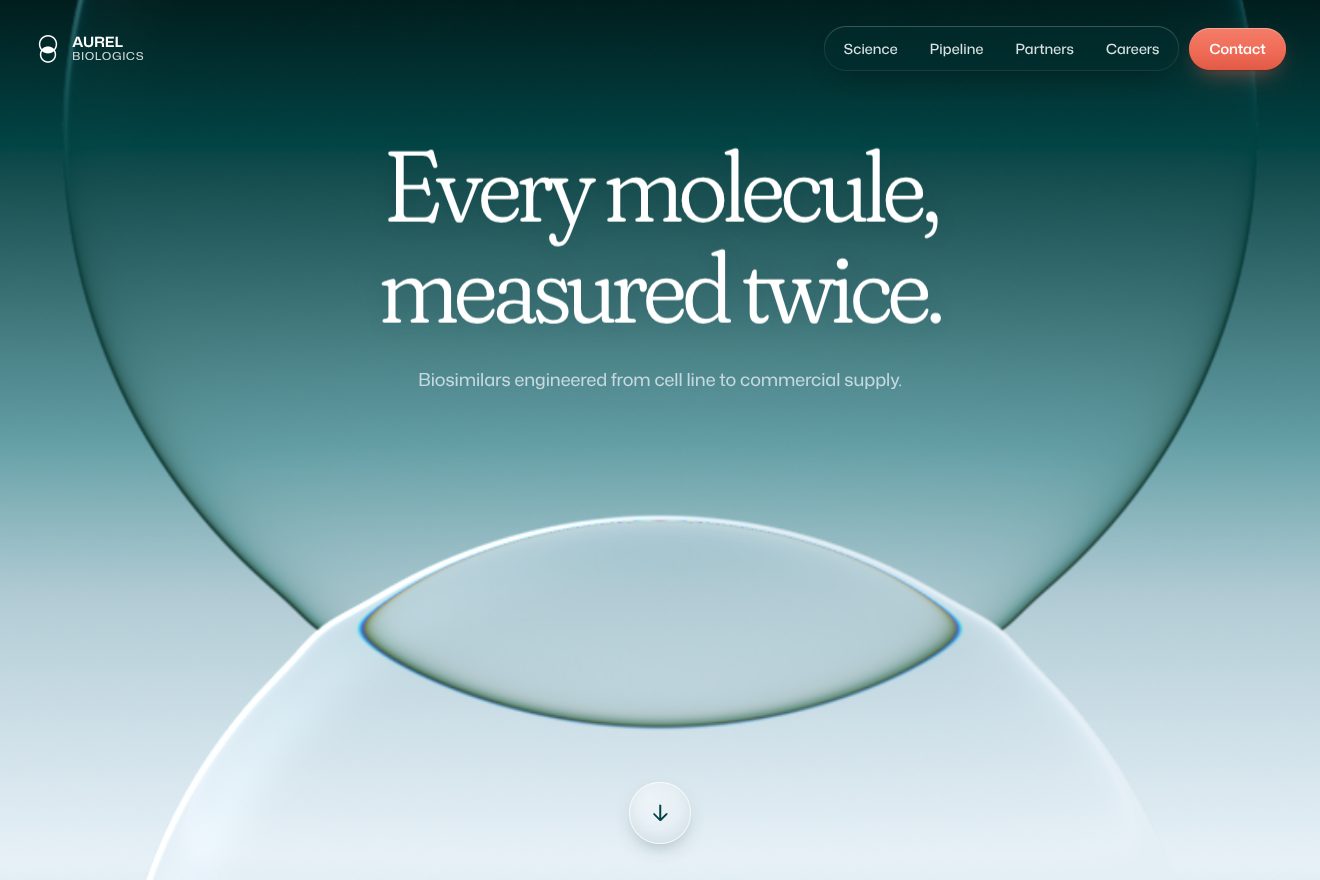
In our demo the company is made up, Aurel Biologics, and the opening has its own headline, «Every molecule, measured twice.», a line of text, the menu in a pill and the round button with the arrow pointing down. It is hand written WebGL2, without Unicorn Studio, in three passes: the gradient, the first lens, the second lens on the image of the first, as on the site. From the site come the five stops, the OKLab mix with the 0.025 push, the 0.01 slide back and forth, the noise against banding, the 0.4 radius circles with the 1.7 and 1.55 scales, the shift towards the edge, the three red, green and blue steps with the same strengths, the 0.0025 edge, the five samples, the positions of both lenses on computer and phone, the first lens coming in over two seconds and the background from 1.15 over two and a half. Ours are the lenses that follow the pointer on a spring, in opposite directions, and breathe slowly; the edges that swell towards each other where they cross; a thin highlight at the top left; the lenses swelling a little on press, and the button swelling the lower one; the light gliding inside the menu pill under the link; and the button’s arrow leaving at the bottom while another comes back from the top. Left alone, a pointer moves over the lenses and the menu. Without WebGL2 the OKLab gradient stays, drawn by CSS with two circles; with reduced motion everything stands still in its final pose.
The title that flies into the label
A little further down, on white, comes «We know», huge. The two lines rise from behind a mask. Then, as you scroll, the headline gets small and flies to the top left, where it becomes the label of the section; meanwhile the paragraph rises, and its words light up one after the other, from mist grey to deep teal, as if someone were reading them aloud. At some point the paragraph drops away, the small diamond beside it makes a quarter turn with a bounce, and «Our goal» arrives in its place, with the new paragraph. Behind, a mist coloured panel rises, and on the right four medicine bottles straighten up and fan out.
The whole section depends on a single ScrollTrigger, from the moment the section reaches the top of the screen to its end, with scrub; everything else reads how far you have got, from 0 to 1. At 2% the headline lines, split by SplitText, rise from 115% in 0.8 seconds, 0.1 apart, with an exponential ease out: this one is timed, not tied to scroll. Between 10 and 35% Flip carries the headline onto its label, tied to scroll and with no curve, and the paragraph rises from 125%. Between 15 and 37.5% the words change colour, from #E6EFEF to #005453, with a «head» moving forward: every word has its number, and lights up in proportion to how far the head has passed it, so the colour flows continuously instead of jumping. At 55% comes the turn, and it is the only point where the site stops following the scroll and starts timed animations: the lines leave downwards in 0.4 seconds, 0.05 apart; the diamond turns 90 degrees in half a second with an elastic return; and the new block rises in one second, 0.1 between lines, after 0.15. Scrolling back, everything rewinds in 0.4 seconds. The panel behind is uncovered from the bottom between 50 and 75%. The bottles fan out with four scales, 1.40, 1.15, 0.90 and 0.70, the largest in front.
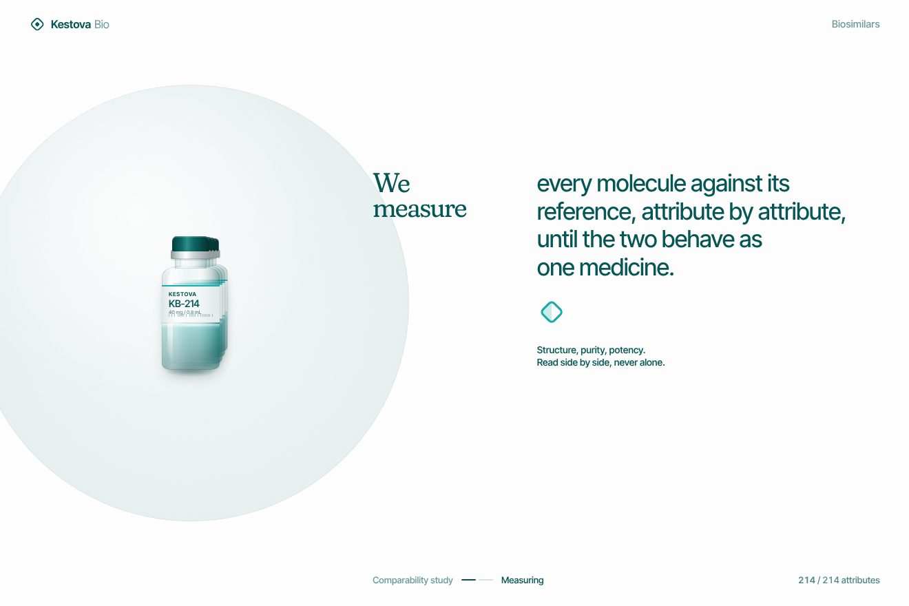
In our demo the company is made up, Kestova Bio, and the headline says «We measure». Scrolling is Lenis 1.3.26 with the same 0.05 lerp and the same wheel times 1.2 as the site, and the section is held on screen while you scroll. From the site come all the points of the section: the lines from 115% at 2%, in 0.8 seconds, 0.1 apart; the Flip flight between 10 and 35%, with the paragraph from 125%; the words from #E6EFEF to #005453 between 15 and 37.5%, with the same head; the turn at 55%, with the lines leaving in 0.4 seconds 0.05 apart, the 90 degree diamond in half a second and the new block in one second, 0.1 apart, after 0.15; the 0.4 second return; the panel between 50 and 75%; the fan with the four scales; and the line masks extended by a quarter of an em, which the site uses so the «g» and the «p» are not clipped. Ours are the four vials drawn in CSS instead of the photographs, with the glass, the liquid with its meniscus, the aluminium crimp and the label, and a glint crossing them as they open; the vial that lifts on a spring under the pointer and gives way when pressed; every word that, as it lights up, rises by a tenth of an em and goes one pixel too far; the status line at the bottom, with «Measuring» turning into «Matched» and the count of attributes following the head; a half filled diamond, so the quarter turn shows. The headline and Flip are measured again when the window changes, which does not happen on the site. With reduced motion the headline is already in the label and the words are already lit.
The page that rises like a sheet
Click a menu link and the page does not reload or fade: the new one rises from below, like a sheet laid over the other, while the old one slides up a little and darkens. The same gesture opens the «Get in touch» form, with one difference: the right column, the one with the form, arrives a moment after the panel, as if it were further away.
The page change is Barba, in sync mode: for one point two seconds the two pages live together. The new one, fixed at the top and above everything, rises from 100vh to zero; the old one, underneath, rises by a quarter of the screen, to -25vh, and a dark veil passes in front of it up to 80%. All of it in 1.2 seconds on the «parallax» curve, 0.7, 0.05, 0.13, 1, which starts slowly, accelerates hard and settles very slowly. Then the old page is removed, its ScrollTriggers, scenes and glass are switched off, and the menu updates to the new page. The modal makes the same gesture, with the panel from 100vh to zero and the veil at 80%; the right column starts 25vh lower and arrives in 1.45 seconds, a quarter of a second later. The glass scene inside the modal comes in from a scale of 1.1 over one second, but only once it has really drawn a frame: the code waits for the first paint, because Unicorn Studio measures the canvas at start up and inside a still hidden modal would make it one pixel by one. With reduced motion the change is instant.
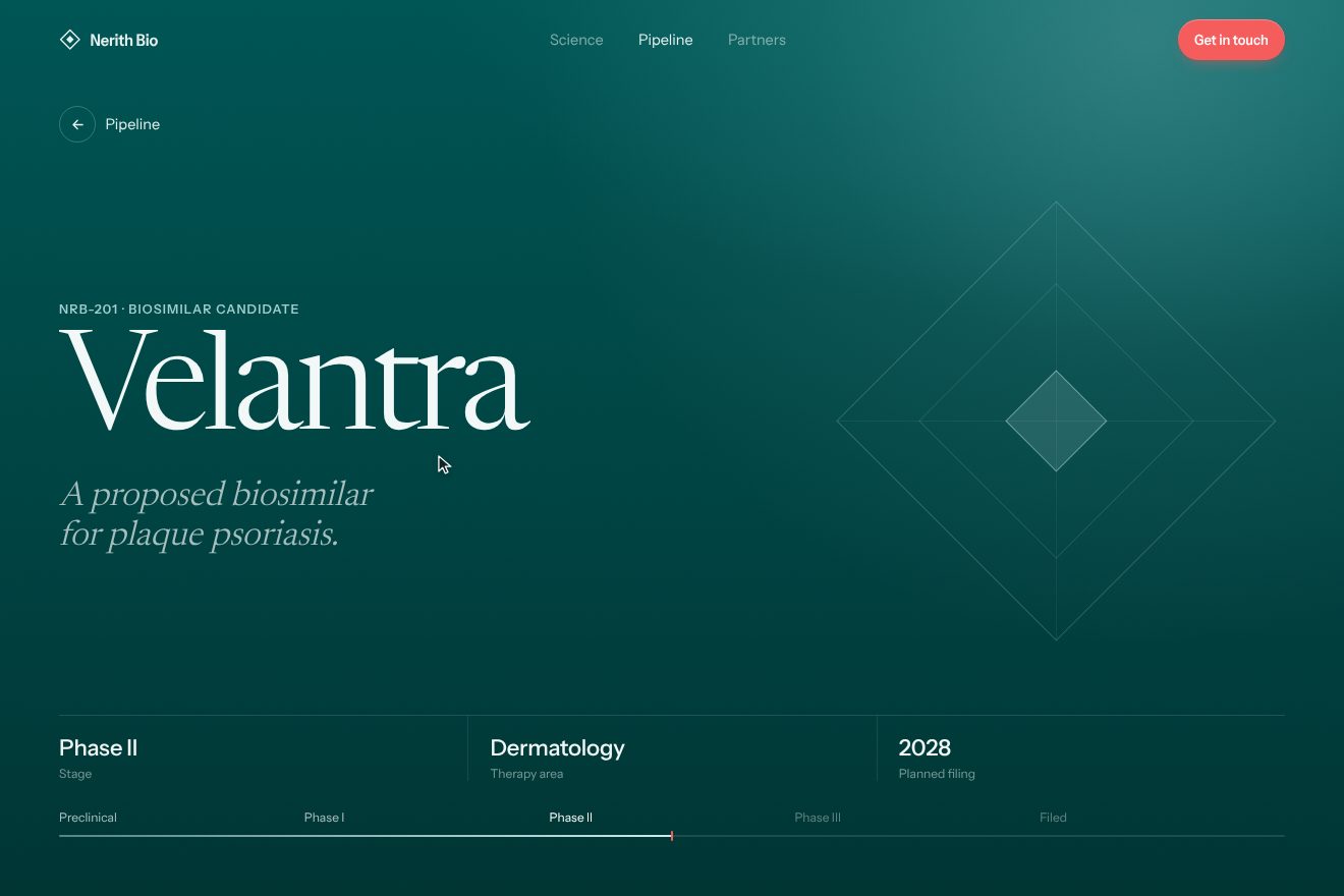
In our demo the company is made up, Nerith Bio, and there are two pages: the list of products in development, four rows with code, disease and phase, and the page of one product, deep teal, with the large name and its road to filing. From the site come the two pages together, the new one from 100vh above everything, the old one to -25vh under the veil at 80%, the one point two seconds on the «parallax» curve, the modal with the right column from 25vh and the quarter of a second of delay, the modal scene from 1.1 over one second, the colours of the scene taken from the opening gradient, and the headlines rising in lines from 110% in 0.8 seconds, 0.1 apart. Ours are the edge of the sheet, with three soft shadows and a one pixel line of light, and the 28 pixel rounded top corners that straighten only at the very end of the ride; the product facts arriving after the headline and the phase line filling up to the coral tick; the large thin line diamond turning in; the way back with the gesture reversed and the row you came from lighting up for a moment; the menu turning light as the edge of the sheet passes under it; the row that becomes a card under the pointer and gives one pixel when pressed. The modal is a real dialog, which takes focus and closes with Esc. Left alone, it opens a product, goes back to the list, opens the modal and closes it.
The other details
Below the opening a diamond with rounded corners rises from the bottom and grows as you scroll, from a size between 35% of the width and 55% of the height up to 2.4 times the sum of the two, and inside it runs a video that never plays: its time follows the scroll, between 4 and 65% of the section. Further on another diamond holds a helix of vials, and around it a vibrant green ring draws itself with the scroll, with the stroke as long as the circle and shifted by what is missing; at every quarter the headline beside it changes. Two glass shapes, a circle and a square with a round hole, move apart in one and a half seconds when the section is fully on screen: if the computer can take it, on top there is real glass in three.js, with settings a comment says were «tuned by the designer» on 21 October, and if frames drop below thirty the site goes back to the CSS shapes and remembers it for thirty days. Headlines rise in lines from behind a mask extended by a quarter of an em, so letters with tails are not clipped. The footer sits under the page and is uncovered, and before it a bottle uncorks: sixteen images swapped like frames, together with a video, matched in colour by an SVG filter. The menu is a single SVG shape in which the five links are pills joined by narrow necks, like touching drops, and it changes colour depending on the section underneath.
Where it stumbles
The public site uses the test build: the code comes from a /staging/ path, and its first lines open a live connection to the development server and reload the page on every change, for every visitor. The same file carries the whole source map, 364 kilobytes out of 513, with the internal comments; Barba is left in debug mode, with a comment saying to turn it off before going live, and there is still a block marked to be removed before handover. One function is called but does not exist: no page uses it today, but the day it is needed it will stop every animation after it. A second smooth scrolling library is loaded on every page and never used, and Unicorn Studio is started three times. The scroll driven videos, 5.6 and 6.6 megabytes, are downloaded straight away. Reduced motion is respected in the page change and the modal, but not in the scroll driven animations, which are nearly all of them, and Lenis stays on. On the home page 35 images out of 36 have no description, and the «Get in touch» buttons cannot be reached with the keyboard.
What we take away
Polpharma Biologics sells something hard to show: a molecule identical to another. The site does not explain it, it shows it with glass. Two lenses bending the same light, a headline that becomes a label, a page laid over another like a sheet on a desk: precise, measured gestures that feel made in a laboratory. The most useful lesson is the «parallax» curve: a page change in a single gesture, but with the old page moving up a quarter and darkening, so you feel two sheets and not two screens.
The effects
- Two glass lenses backgroundThe first screen of Aurel Biologics, a made-up biotech company. Behind the title a WebGL2 shader written by hand: a vertical gradient of five colours mixed in OKLab that slides slowly back and forth, and over it two big glass lenses, one hanging from the top and one rising from the bottom. They bend the light with a thin rainbow on the rim, and the second bends the picture already bent by the first: where they touch they deform each other. They follow the pointer a little on a spring and catch a thin highlight top left; the title rises line by line from behind a mask and the round arrow button answers the pointer.Free
- Title into the labelA scroll section for Kestova Bio, a made-up biosimilars company, on white. The stage stays put and everything follows the scroll: the huge headline «We measure» rises line by line behind a mask, then Flip shrinks it and flies it into the small label on the left; meanwhile the paragraph rises and lights up word by word, from mist grey to deep teal, with a «head» that moves on without steps. At the turning point the lines fall away, the little diamond makes a quarter turn with a bounce and the second block, «Our goal», comes in; behind it a mist panel rises and four drawn glass vials fan out. Timings and colours taken from the site of a biosimilars company; premium minimal style.Free
- Sheet over pipelineTwo pages of Nerith Bio, a made-up biotech company: the pipeline list with four medicines and the page of one product. A click on a row and the new page rises from below like a sheet, with a soft shadow on its edge, a line of light and corners that straighten as it lands, while the old one slides up a quarter and darkens under a veil; all in 1.2 s on the site’s «parallax» curve, then the title rises line by line. Going back plays the gesture the other way, and the «Get in touch» modal rises the same way, its right column landing 0.25 s later.Free