Neon Rated, by 27b
Neon Rated, how it’s made: the film slider with the image sliding the other way, the poster that turns into the trailer and the menu bar that stretches open
The site of NEON, the distributor of Parasite and Anora, is a film shop: posters, trailers, tickets and T-shirts, all black and white until a film lends its colour to the page. Underneath there is no WebGL and no GSAP, just React and framer-motion used with a watchmaker’s precision. We take it apart with three demos rebuilt from scratch.
The palette
- #FFFFFFthe white of the background and the bar
- #000000the black of the text, the tickets strip and the player
- #F3F3F3the grey behind the posters and the shop cards
- #AEFF00the acid green of the palette
- #EC71DAthe pink of the Anora page
- #D50000the red of the errors
Tap a colour to copy its code.
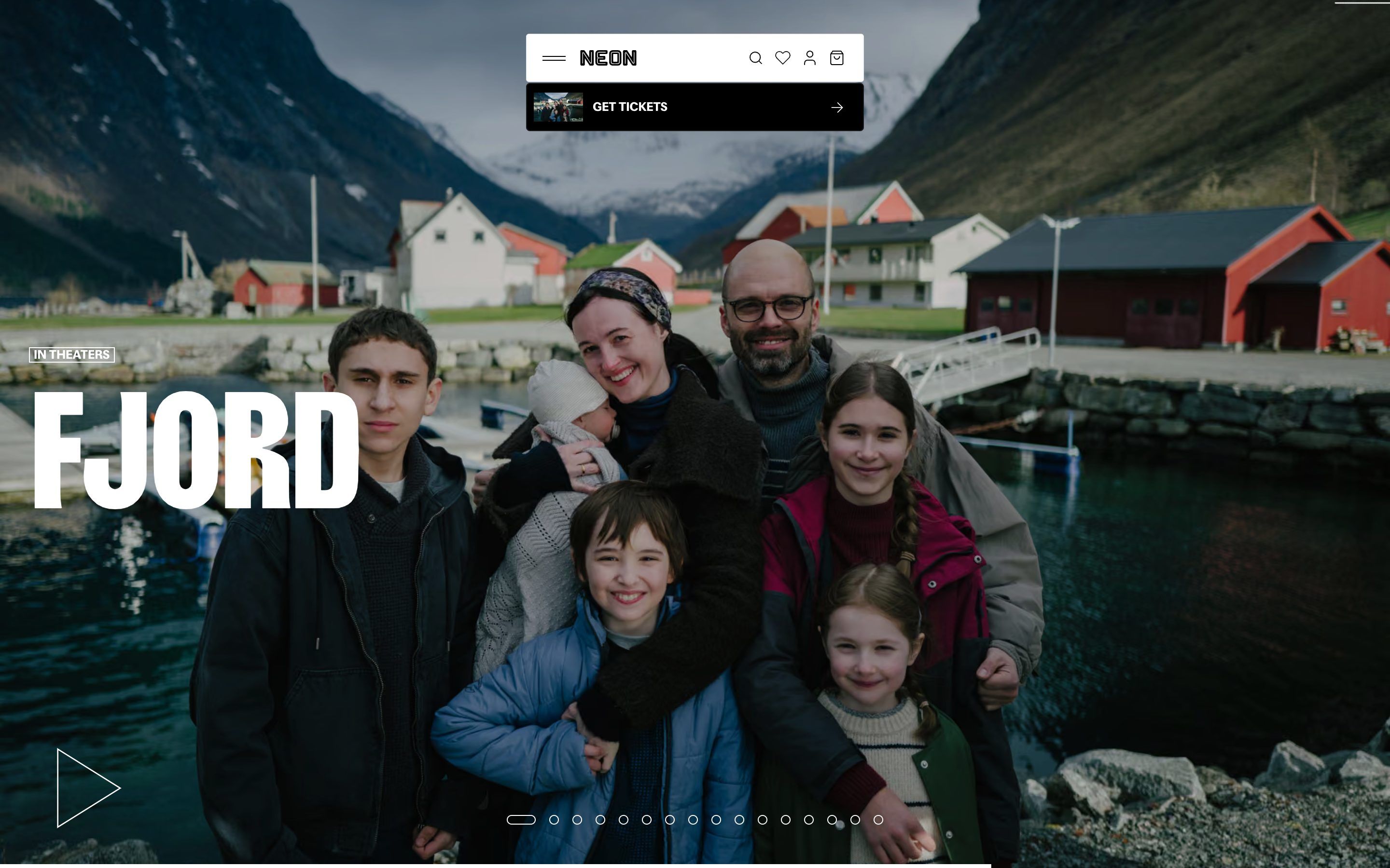
Neon Rated is the site of NEON, the American distribution company that brought Parasite, Anora, Longlegs and Sentimental Value to cinemas. It is not a studio showcase but a shop: at the top the films in theaters, then the ones to watch at home, tickets, merchandise, printed screenplays, the newsletter. The page is white, #FFFFFF, with the text in black, #000000, and the posters on a very light grey, #F3F3F3; colour comes only from the films. Each film has its own, and while you look at it the top bar and the cursor take it on: the Anora page, for example, turns entirely pink, #EC71DA. The headings are in Girott, a narrow, heavy sans set in capitals with the line height at 80 per cent, the text in Focal. It is signed by 27b; on Awwwards it was Site of the Day on 28 February 2026, with 7.3 from the jury, where the highest mark is content, 7.77, and the developer award, 7.44, where the highest marks are animations, speed and mobile, 7.6 each.
Underneath there is Next.js 15.1.11 with React, Shopify for the shop and DatoCMS for the text. The animation is all framer-motion 11.18.1, the smooth scrolling is Lenis 1.3.8, with lerp at 0.2 and its loop hooked to framer’s, and the videos come from Mux through hls.js. There is no GSAP, no three.js, not a single shader: everything that moves is an element of the page. The curves have names and live in one place: IN_OUT_QUART, cubic-bezier(.77, 0, .175, 1), for the big things that cross the screen, and OUT_SNAPPY, cubic-bezier(.19, 1, .22, 1), for the small ones that must arrive at once and settle gently. In the CSS there is also a spring written as a linear() curve with a hundred points, which rises to 1.0428 at 40 per cent and then settles.
We take it apart in three moments, with a demo rebuilt from scratch for each, for an invented distributor, Kestrel Pictures, with its three films, Low Tide, Paper Moons and The Glasshouse: the titles, the shots, the drawings and the code are ours. From the site we took the ideas and, where we say so, the numbers.
The film slider with the image sliding the other way
At the top of the home page there is one film at a time, full screen, with a huge title at the bottom left and the play button. Every ten seconds the next one arrives: the new frame comes in from the side, but the picture inside does not follow it, it moves more slowly and the other way, as if the frame were a window sliding over a still landscape. Over the slider the cursor is a thin arrow that points left or right depending on the half of the screen it is in.
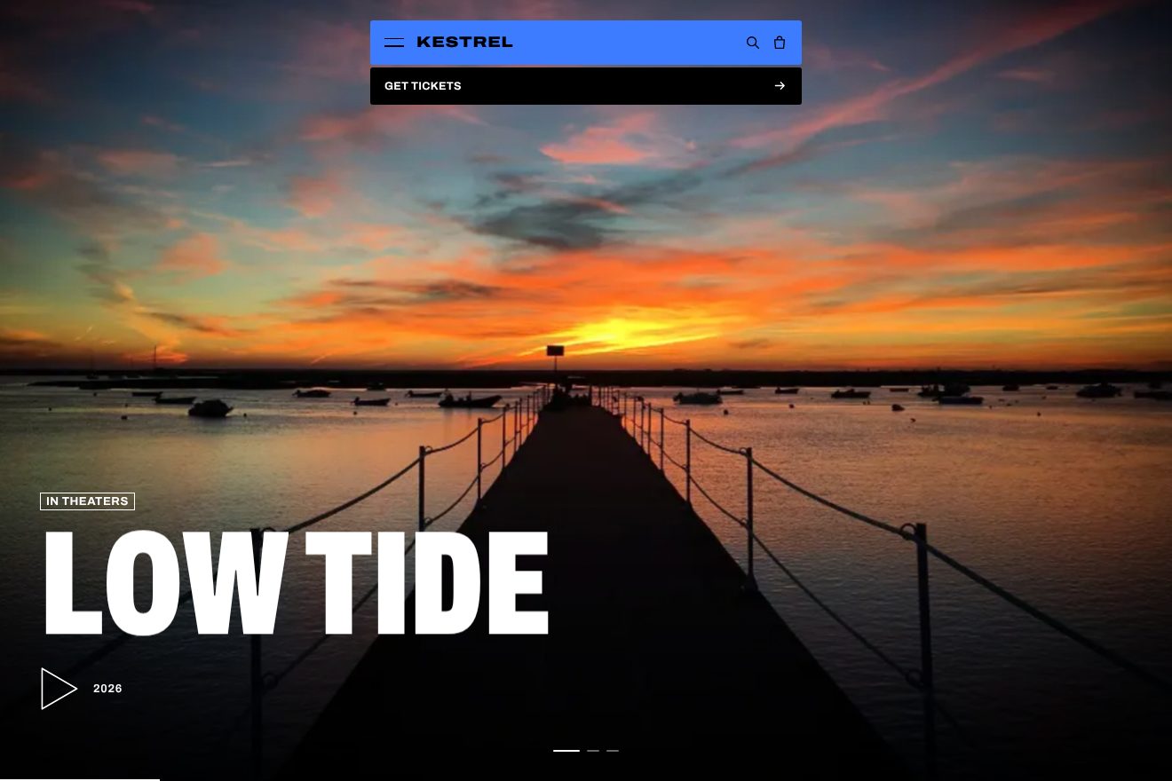
The change is two movements in the same sequence, with the same duration, 0.95 seconds, and the same curve, IN_OUT_QUART: the frame goes from a full width away, right or left depending on the direction, to zero, and the picture inside goes from half a width the opposite way to zero. The outgoing frame does the same in reverse. That is why the change has depth without any 3D: the frame travels twice as far as the picture. The automatic cycle is a ten-second interval, and the bar at the bottom is a line growing from nothing to full with scaleX, linear, over the same ten seconds; it stops when the browser tab is hidden or the slider has left the screen. As you scroll, the picture moves in parallax: 150 pixels up and down on the computer, 50 on the phone. When the film reaches the bar, within 50 pixels, the bar takes on its colour in half a second. The cursor follows the mouse with no delay at all, but turns calmly: to minus 135 degrees on the left half, to 45 on the right, in three tenths with a tenth of delay and the OUT_SNAPPY curve. With reduced motion the change becomes a four-tenths fade.
In our demo the slider belongs to Kestrel Pictures, on black, with its three films drawn as vectors: a low sun over the sea and a pier for Low Tide, paper lanterns over the rooftops for Paper Moons, a greenhouse lit up in the fog for The Glasshouse. From the site come the frame entering from a full width while the picture inside starts half a width the opposite way, together, in 0.95 seconds with cubic-bezier(.77, 0, .175, 1), the line at the bottom filling linearly until the change, the top bar and the cursor taking on the film’s colour in half a second, and the arrow following the pointer with no delay and turning to minus 135 or 45 degrees in three tenths with a tenth of delay. The site waits ten seconds, we wait six, because the demo is watched in a box. Ours are the title arriving letter by letter only once the frame has covered two thirds of the way, while the old one has already risen away, the small breath of the bar as it changes colour, the film markers made of dashes that stretch on a spring instead of dots, the line that thickens just before the change, the arrow that tightens on click, the two halves of the screen working as real buttons, arrow keys included, and the life inside the shots: the ripples, the gull, the swaying lanterns, the fog.
The poster that turns into the trailer
On each film’s page, after the title, there is the poster, vertical, still in the middle while the synopsis and the credits scroll beside it. Halfway through the section the poster does not leave: it widens, changes shape and becomes a landscape frame of the trailer, with the play button. Scrolling back up, the frame closes back into the poster.
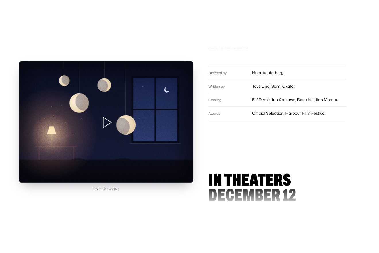
Here framer-motion does what it does best. The poster and the frame are two different elements with the same layoutId, «poster»: when the section’s scroll passes the middle, progress above 0.5, the page removes the first and puts in the second, and framer animates the difference in position and size between them by itself, in 0.75 seconds with OUT_SNAPPY. The ratio goes from the poster’s to 1.4375, a wide cinema format. The trick that makes it soft is inside: the frame’s picture starts four times larger and comes back to one while the outline widens, so in the first instants you see a detail and then the whole shot; the poster’s picture, on the way back, starts from 1.5. The play button arrives a quarter of a second later. Here reduced motion is respected: framer gets reducedMotion: "user" and skips the animation.
In our demo the film is Paper Moons: the poster is pink, with three paper moons hanging on threads, and the trailer frame is a dark room with the same moons, a lamp switched on and the real moon in the window. From the site come the threshold halfway through the section, the box going from the poster’s format to 1.4375 in 0.75 seconds with cubic-bezier(.19, 1, .22, 1), the frame arriving from four times closer, the poster coming back from one and a half times and the play button appearing after a quarter of a second. We do it with GSAP, measuring the two shapes and recalculating them when the window changes. Ours are the column of text scrolling beside the still poster, the caption changing from «Poster» to «Trailer» without the two words ever showing together, the shadow breathing while the box changes shape, the moons swaying each to its own rhythm, the dust in the lamplight, the film grain, and the play button that bounces and becomes a pause with a line running along the bottom. On the site the effect exists only from 1024 pixels up; ours works on the phone too, with the poster above and the text below.
The menu bar that stretches open
The bar at the top is a white pill, 5 rem tall, with the logo, search, favourites, account and cart; underneath, a black strip with tickets for the film of the moment. On load the bar drops in from above. On clicking the menu no new panel opens: it is the bar itself that stretches downwards and becomes the menu, with big items separated by thin rules.
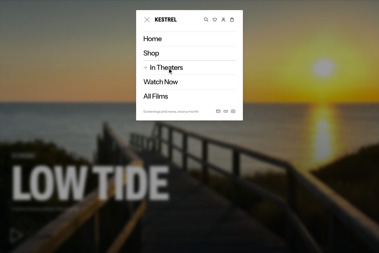
The entrance is a y from minus 85 pixels to zero in 0.8 seconds with IN_OUT_QUART. For the opening, the bar and the panel share a layoutId, with layout: "size": framer measures the closed height and the open one and animates the difference, without anyone writing a height in the code. Behind it, a black veil rises to 40 per cent in half a second and goes back in three tenths, faster when closing. The items come in from transparent, at 97.5 per cent of their size and blurred by one pixel, one after another two hundredths apart: close enough to look like a single movement, far enough apart not to arrive all at once. Hovering an item brings in an arrow, and the label makes room for it by sliding sideways, in three tenths with OUT_SNAPPY, with a tenth of delay on the way back. The hamburger is the most hidden detail: the two lines become an X, but not with a rotation; each of the eight numbers that draw them, the two coordinates of each end, has its own spring, stiffness 500, damping 30, mass 0.5, and so the two lines cross with the faintest elasticity.
In our demo the bar belongs to Kestrel Pictures, over a shot from Low Tide, and a drawn pointer opens it, hovers two items and closes it again by itself, until you touch it. From the site come the entrance from minus 85 pixels in 0.8 seconds with cubic-bezier(.77, 0, .175, 1), the veil at 40 per cent in half a second and down in three tenths, the 5 rem items with a thin rule above each, coming in from transparent, at 97.5 per cent and blurred by one pixel two hundredths apart, the arrow appearing 75 thousandths later and pushing the label in three tenths with a tenth of waiting on the way back, and the hamburger with the eight springs at 500, 30 and 0.5, where the ends of the second line swap sides and the X twists as it forms. The spring of the stretching bar is ours, stiffness 550 and damping 30: Neon’s code leaves the measuring to framer, and we wrote it by hand. Also ours are the letters of the logo rising one after another, the icons dropping and passing the mark by one pixel, the tickets strip covered by the stretching bar, the rules between the items drawing from the left, the arrow going one pixel too far and back, the page behind blurring by five pixels, the button sinking when pressed, Esc and a click on the veil closing it, and a visible keyboard focus.
The other details
The smallest entrances, those of the cards and the rows, are not even JavaScript: a class uses CSS @starting-style, with opacity over four tenths and movement over 0.75 seconds with the snappy curve, staggered by a --delay variable. Film titles underline under the mouse with a band widening from nothing to full in 0.7 seconds, from 0.4 to 0.8 rem thick depending on the screen size. On the film page the cursor points down, at 135 degrees. The rows of posters and products can be dragged with the mouse: on every frame the push loses a quarter, the position chases the target by a quarter of the distance, a drag beyond ten pixels cancels the click, and after half a second without hands the row snaps to the nearest card. The trailer player fills the whole screen, hides its controls after three still seconds and can shrink into a 38 by 20 rem window to drag into a corner, thrown with real inertia and bouncing off the edges; from the player you pull up a drawer with the film’s merchandise, and past half its travel the grid goes from one column to two.
Where it stumbles
The home page weighs more than six megabytes of HTML: inside there is the whole shop catalogue, 154 products with their full descriptions and thousands of image addresses, including ones the page never shows. The CSS declares a --motion variable, which becomes zero with reduced motion, but no rule and no script reads it: reduced motion applies only to the slider and the poster, while the parallax, the cursor rotation and the draggable rows move for everyone. The slider cycles by itself every ten seconds with no button to stop it, and its markers at the bottom are small to tap. The menu items remove the focus ring, so with the keyboard you cannot see where you are. And the snapping of the rows relies on a half-second setTimeout instead of the real end of the inertia. On Awwwards accessibility has the lowest mark, 7. One thing does not follow the rules we set ourselves: the slider markers are sixteen dots.
What we take away
Neon Rated is proof that you do not need shaders to make a site people remember. Everything is white, black and Girott, and every movement has its curve and its measure: big things cross the screen in under a second with a curve that starts and lands gently, small ones arrive at once and settle. The films bring the colour; the page just makes room for them. And the most beautiful piece is the simplest: a frame that travels twice as far as the picture it holds.
The effects
- Film sliderThe home page slider of a made-up film distributor, minimal on black, with three real photographs as stills: the new film slides in across the whole screen while the picture inside its frame slides the other way for half the distance, a thin bar fills along the bottom before the change, the bar at the top and the arrow cursor take the colour of the film and the title arrives letter by letter only once the frame has landed.Free
- Poster to trailerThe page of a made-up film, Paper Moons, from a made-up distributor, Kestrel Pictures: the poster stays still in the middle while the synopsis and credits scroll by, and halfway through the section the same frame stretches from the shape of the poster into a wide still of the trailer, which lands from four times closer; a quarter of a second later the play button appears. Scrolling back, it closes into the poster. Minimal style, black and white with the film’s pink.Free
- Stretching nav panelThe menu of a made-up film distributor, minimal: the white bar drops in from the top over the film still, a real photo of a wooden boardwalk running down to the sea at sunset, and pressing its two lines makes the same bar stretch down into the menu panel, on a spring. The two lines cross into an X on eight springs, one for each end, the page behind darkens and blurs, the links arrive out of a one-pixel blur and, on hover, an arrow slides in and pushes the word aside.Free