ESR Bespoke, by Nightjar
ESR Bespoke, how it’s made: the gallery where the next photo follows the mouse, the menu that types itself in steps and the marques that light up as you scroll
ESR Bespoke is the Sydney body shop that repairs luxury cars, from Porsche to Rolls-Royce, and its site is only black and white, with the photos of the cars bringing the colour. The type lights up letter by letter in steps, like a teleprinter; in the gallery the next photo chases the mouse and opens full screen on click, the menu rises like a white sheet, and the twelve marques light up one at a time as you scroll. We take it apart with three demos rebuilt from scratch.
The palette
- #000000the black of the loader, the curtain between pages and the «Next» label following the mouse
- #191919the near-black grey of the dark pages and the ground behind the videos
- #2B2B2Bthe grey of the Contact button
- #F0F0F0the lightest grey of the light sections, like the brand list
- #E6E6E6the light grey of the panels
- #FFFFFFthe white of the full-screen menu and the type over the photos
Tap a colour to copy its code.
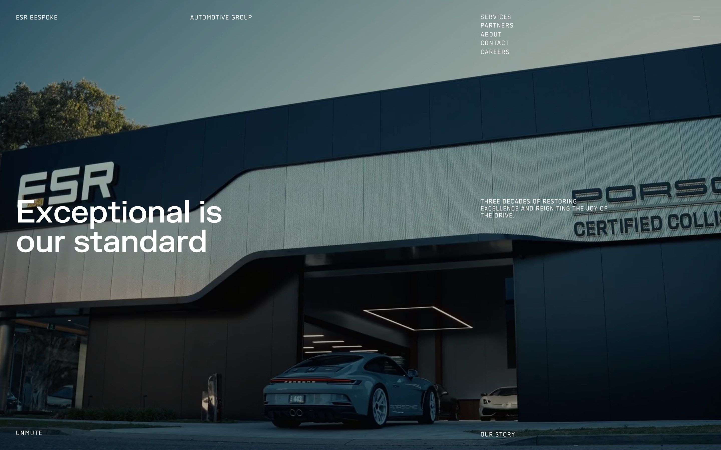
ESR Bespoke is a body shop in Sydney, though on its site it calls itself an «Automotive Group», and the word that matters is the second one in its name: made to measure. It repairs and restores luxury and performance cars after an accident, from Porsche to Rolls-Royce, from Ferrari to Maserati: twelve marques in all, listed on a single page. Derek Bell founded it in 1989, in a small workshop in Earlwood; since 2011 its headquarters have been in Campsie, 3,600 square metres, and in 2025 it opened a studio in Alexandria designed for the most expensive cars. It is a Porsche Certified Collision Centre, «one of only a select few in Australia», a flagship site for Glasurit paints, and it gives a lifetime warranty on every repair. The site is only black and white, with no accent colour: the #000 black of the curtain between pages, the near-black #191919 of the dark pages, the lightest grey #F0F0F0 of the light sections and the white of the menu; the colour comes from the photos and videos, and states are shown only with opacity, at 100, 50, 15 or 10%. There are two typefaces: FK Grotesk from Florian Karsten’s foundry for text and headlines, and a mono by Norm, Binnenland’s «Regular», only for the small labels, uppercase and spaced at 0.09 em. It was made by the studio Nightjar, which signs it in a comment in the code. It was Site of the Day on Awwwards on 23 October 2026, with 7.31 from the jury and 7.26 from the developers.
Underneath there’s Next.js 14.2.35 with React 18.3.1, and the content comes from Sanity. The motion is all GSAP 3.15.0, with ScrollTrigger, SplitText, CustomEase, TextPlugin, DrawSVG and Observer, and the smooth scroll is Lenis 1.0.42, with a duration of 0.6 seconds, driven by GSAP’s ticker together with the ScrollTriggers. There’s no WebGL and no three.js: the only canvas on the site is a 2D one, and it’s the best piece. Almost all the animation code sits in a single file, and it repeats the same idea everywhere: text doesn’t fade in, it lights up letter by letter, abruptly, like on a teleprinter.
We take it apart in three moments, with a demo rebuilt from scratch for each. The text, the brands and the code are ours; from the site we took the ideas and, where we say so, the numbers.
The gallery that shows you the next photo
Further down the home page, between the text sections, there’s a section as tall as the screen with a single full-screen photo. Moving the mouse over it, a square with the next photo appears next to the pointer, with a black label, «Next», and the square chases the pointer with a slight delay, as if tied to it with elastic. One click, and the square expands from wherever it is until it covers the whole screen: the photo that was a preview becomes the big photo, and next to the pointer the thumbnail of the one after is already growing.
These aren’t images in the document but a 2D canvas as large as the section, redrawn every frame, the only canvas on the site. The background photo is drawn to cover everything while respecting the point of interest chosen in Sanity, so the subject never gets cropped. The thumbnail is a 214 pixel square, and its corner closes 25% of the distance to the pointer every frame: fast when it’s far away, very slow when it’s close. If the thumbnail would leave the canvas, it shrinks toward a 64 pixel square. The «Next» label opens from the left with a clip-path, from inset(0 100% 0 0) to zero, in 0.3 seconds with expo.out, and near the right edge it slides sideways more slowly, at 7% per frame. On click the thumbnail’s rectangle becomes the whole canvas in one second, with a CustomEase curve the code calls CursorCarousel, 0.4,0.4,0,1, which starts steady and brakes long; 0.2 seconds later the new thumbnail grows from zero in 0.8 seconds with the same curve. On the phone the thumbnail stays put, 80 by 96 pixels, on the right halfway down.
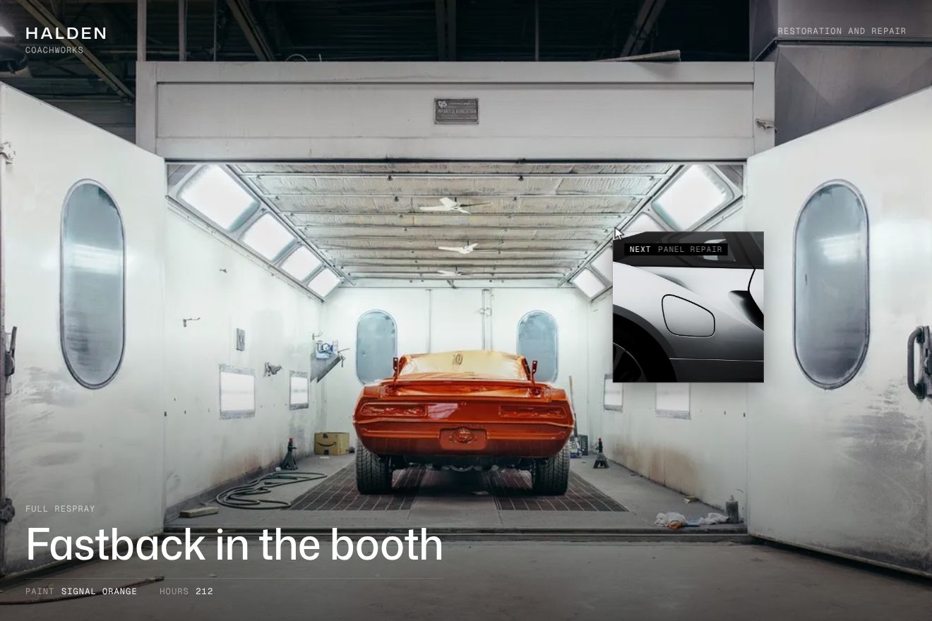
In our demo the gallery belongs to a made-up body shop, Halden Coachworks, with five jobs and five real royalty-free photos: an orange muscle car in a paint booth, the silver flank of a sports car, a tail light, the cream bonnet of a classic car and two saloons in a yellow garage. Instead of numbers the jobs carry their type, «Full respray», «Panel repair», «Paint correction», and under the title two facts, the paint and the hours. From the site come the full-screen 2D canvas with the photos drawn around their point of interest, the 214 pixel thumbnail of the next photo chasing the pointer at 25% per frame and shrinking to 64 pixels when it would leave, the black mono label opening in 0.3 seconds with expo.out and easing back from the edge at 7%, the full-screen expansion in one second with the 0.4,0.4,0,1 curve and the new thumbnail growing in 0.8 seconds after 0.2, the fixed thumbnail on the phone and the caption letters lighting up in steps, 0.03 seconds apart. Ours are the old photo sliding a little the other way and darkening as the new one covers it, the soft shadow and the line of light on the thumbnail, which shrinks when pressed, the name of the next job beside «Next», retyping itself in steps, the moving grain, the arrow keys and a real button for anyone not using a mouse. Our chase accounts for the real time of each frame, so it runs the same on 120 Hz screens too. Left alone, the gallery runs by itself: a drawn arrow does the rounds and changes photo every 3.4 seconds. With reduced motion the thumbnail stays still and the photos crossfade.
The menu that types itself in steps
Top right, always, there’s a small menu of five links in uppercase mono, and as you pass over it a 0.4 rem black square slides next to the link: it moves in 0.6 seconds with expo.out, and when the mouse leaves it goes back to the page you’re on. But the real menu is the hamburger’s, two one-pixel lines that move closer and turn 90 degrees on hover. On click a white sheet rises from the bottom to cover everything, the page underneath escapes upward and darkens, and the big links come up from below typing themselves one letter at a time, in steps.
The sheet goes from y: 105% to zero in one second, with a CustomEase curve, .19,1,.22,1, that starts strong and glides for a long time; meanwhile the page rises by 30vh and a black veil reaches 0.8 in half a second. The five links rise 80 pixels in one second with expo.out, 0.15 seconds apart, and each one types itself with the function the site uses everywhere: SplitText splits the letters, and each letter goes from opacity 0 to 1 in 0.3 seconds with steps(1), that is all at once, 0.025 seconds after the previous one. Passing over a link, the others drop to 15% and the portrait photo beside them changes, with no fade: they’re all stacked and only the visible one changes. At the bottom the ESR logo repeats the loader’s roll, from 0.6 seconds. Closing doesn’t go backwards: the sheet carries on upward to -105% in 1.3 seconds, the page comes back in from 30vh and the veil leaves in 0.7 seconds. Esc closes it.
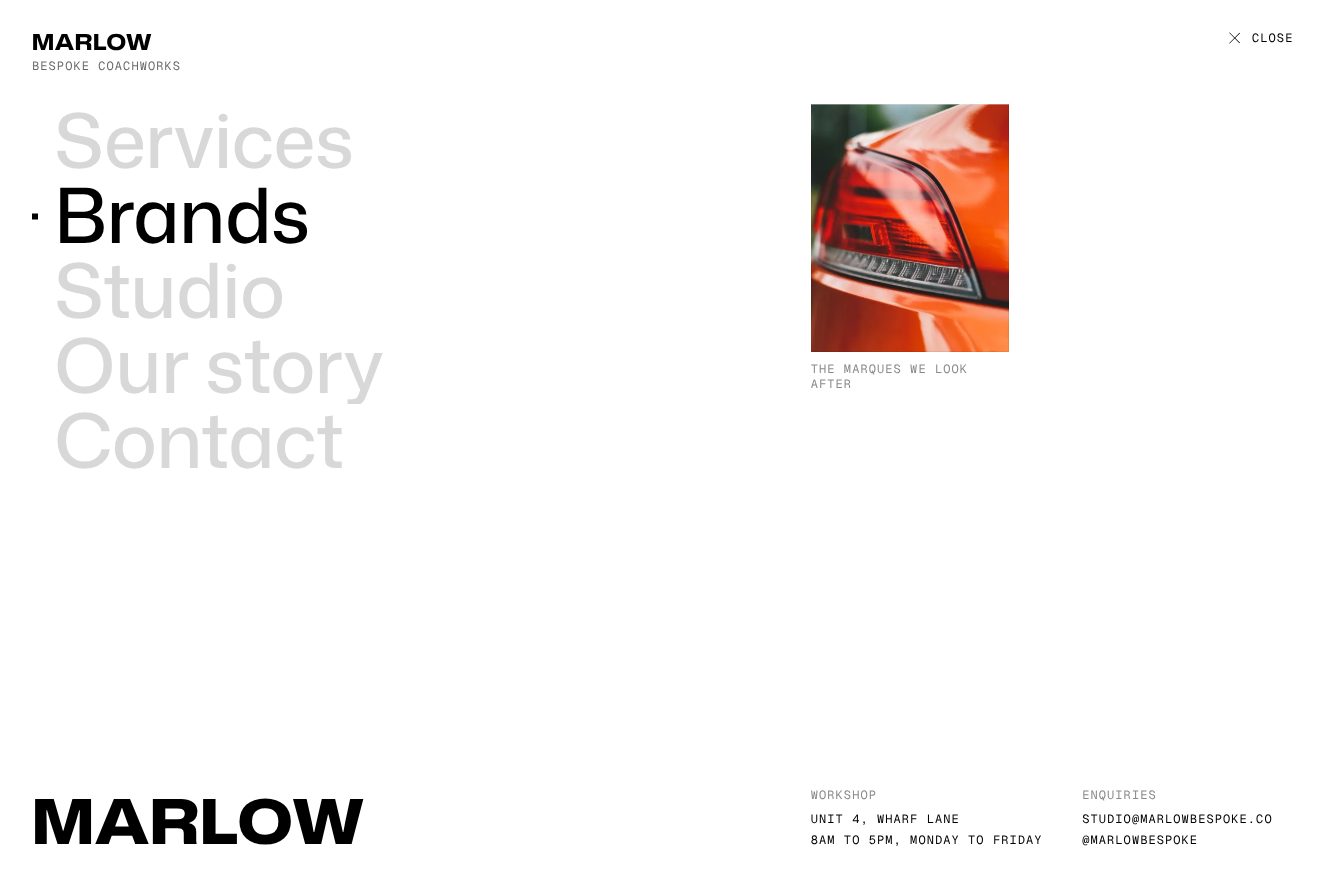
In our demo the menu belongs to a made-up body shop, Marlow Bespoke, over a first page with a real royalty-free photo of a gull-wing car in a showroom, in black and white. From the site come the white sheet rising from 105% in one second with its curve, the page moving up 30vh and the veil at 0.8, the close carrying on upward in 1.3 seconds with the veil leaving in 0.7; the links rising 80 pixels 0.15 seconds apart and typing themselves in steps with steps(1) 0.025 seconds between letters; the other links at 15% on hover and the photo changing without a fade; the 0.4 rem square sliding in 0.6 seconds with expo.out and returning to the active page; the logo at the bottom rolling up and the hamburger turning into an X; Esc. Ours are «Menu» switching off from its last letter while «Close» lights up in steps, the soft shadow of the sheet’s edge falling on the page, the page photo sinking a little as the page rises, the veil passing over the link’s photo and the caption retyping itself, the square stretching with its travel and landing with a pixel of overshoot, the brand at the top changing colour exactly when the sheet’s edge passes under it, and keyboard focus moving the square. Choosing a link makes it the page you’re on. With reduced motion the menu appears and disappears without moving.
The marques that light up as you scroll
On the home page there’s a light section with twelve marques, from Porsche to Maserati, written large one under the other: 92 pixels on desktop, with the lines nearly touching. As you scroll, the marque passing the middle of the screen lights up at 100% and all the others stay at 10%, almost invisible; on the right a square stays still halfway down the screen and shows the photo of the lit marque. Hovering with the mouse, the marque under the pointer wins over the scroll.
It’s one of the simplest pieces on the site, and it’s good precisely because of that. For each name there’s a ScrollTrigger.create that starts when its line touches the middle of the screen, top center, and ends when the middle leaves it, bottom center: the name whose trigger is active is the lit one. The opacity changes in CSS, in 100 milliseconds. The square is a black aspect-square in position: sticky, held at calc(50vh - 20%) from the top, and inside are all the photos stacked: only the lit marque’s shows, and it changes abruptly. Above the list, the «Marques» heading stays pinned until the list arrives, but only from 1024 pixels up.
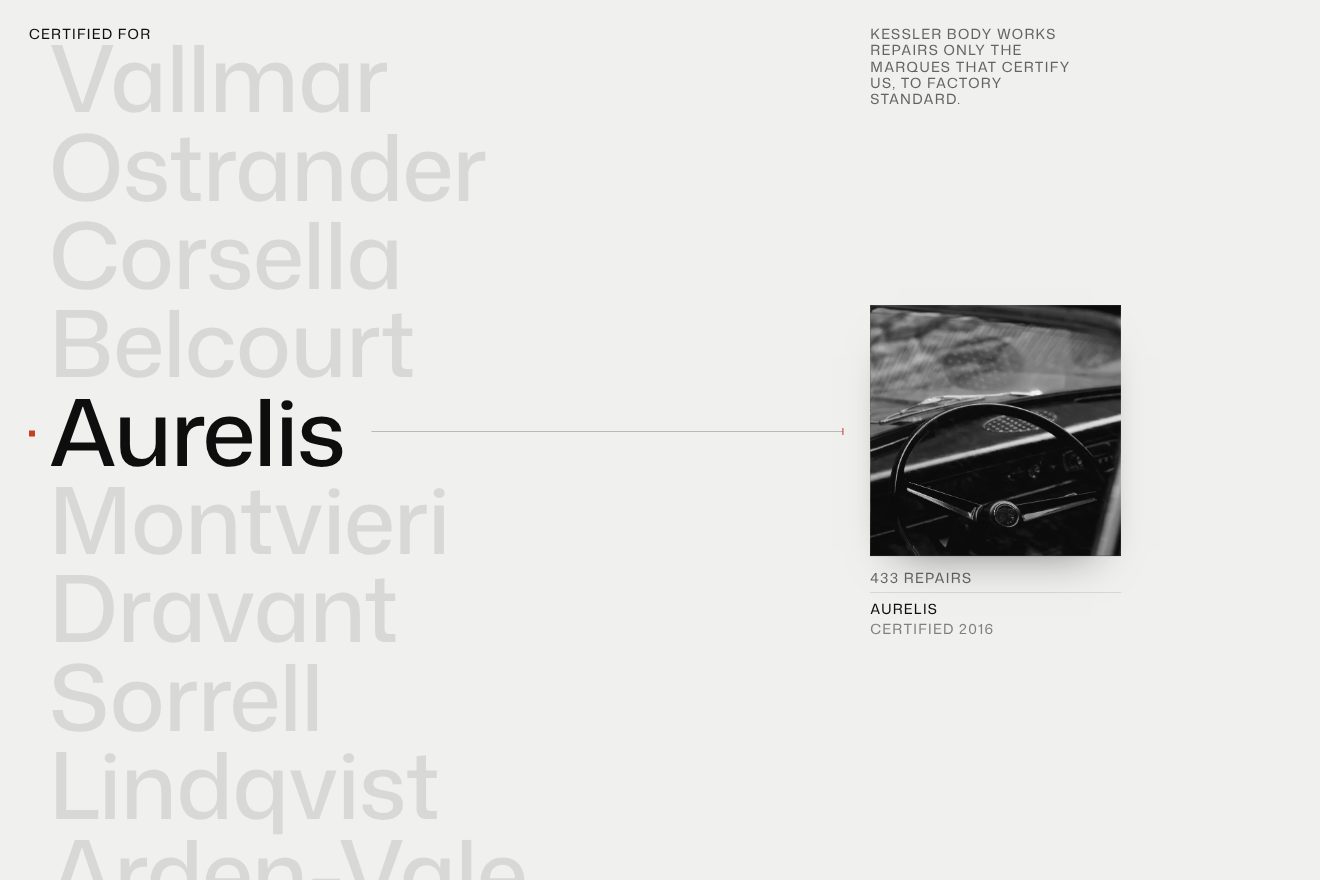
In our demo the marques are ten made-up car makers, from Vallmar to Arden-Vale, for a made-up body shop, Kessler Body Works, and the photos are real and royalty-free: headlights, wheels, steering wheels, dashboards, in black and white. From the site come the large names with lines at 0.95 em and spacing at -0.01 em, the lit name at 100% and the others at 10% with the change in 100 milliseconds, one ScrollTrigger per name from top center to bottom center, the mouse winning over the scroll, the square held at calc(50vh - 20%) with the photos stacked, and Lenis’s smooth scroll driven by GSAP’s ticker with a duration of 0.6 seconds. The 0.4 rem square beside the name comes from another list in the site’s code, the one the small menu and another brands section use. Ours are the photo change with a wipe in the direction of the scroll, in 0.7 seconds, with the new photo sliding down a little and tightening from 1.08 to 1 and the old one pushed the other way; the caption under the photo, with the name, the year the marque certified the workshop and the number of repairs running up to its value; the lit name widening a touch on the typeface’s width axis; the thin line from the name to the photo with an orange notch landing with a small bounce; and the click on a name, which brings it to the middle. On the phone the photo sits at the top, smaller, and the names scroll under it. The code also picks the name closest to the middle when the scroll stops, because stopping exactly on the border between two lines no trigger would be active. With reduced motion the photo crossfades.
The other details
The loader is the ESR logo rolling up. The logo isn’t a typeface but a drawing, and each letter is drawn twice, one under the other: the letter rises from 170 to -106 in 1.2 seconds with expo.out, 0.05 seconds after the previous one, the first copy passes and the second stops in place, like the digits of an odometer. At second 2 the logo flies up by 60vh while the page rises from below, all together in one second with expo.inOut, and the hamburger’s two lines are uncovered from the right. The same roll comes back in the big footer logo, when you reach it, and in the menu’s.
Between one page and the next a black curtain passes, lighting up in 0.3 seconds with sine.out; then the new page rises from 101vh to zero in 1.2 seconds with a CustomEase curve, .9,0,.1,1, which starts slow, races and brakes late. Meanwhile at the top the subtitle «Automotive Group» escapes upward and «Since 1989» rises in its place, until the page has arrived. Each page remembers its position, and going back more than a screen down there is no rise. The home page opening has a workshop video at 80% on a near-black ground, with «Unmute» starting a second video with sound; the code already has slides that change with a wipe while the photo inside moves the other way, the container from 100% and the image from -70%, and thumbnails with a square that draws itself in 10 seconds, but today the home page has a single slide and they don’t show. The footer is a curtain in reverse: it sits still underneath, with a clip-path, and the rising page uncovers it, while the newsletter line draws itself from the left. Scrolling past 200 pixels, the hamburger and the Contact button slide away, in 0.6 seconds.
Where it stumbles
Reduced motion isn’t catered for anywhere: with the setting on, the logo rolls up, the text lights up in steps and the scroll stays as smooth as before. Of the 83 images on the six pages none has alternative text: the code would ask Sanity for it, but the field there is empty. On the home page the marque names are links that a screen reader calls «Services», all of them, and three aren’t links at all; on the services page the Ferrari row points to a #test anchor that doesn’t exist. The closed menu is only moved off screen, and with the Tab key you land on links you can’t see; the gallery of the first demo works only with the mouse. The h1 headings are used as a style, four of them on the services page. The home page downloads almost 60 MB in fifteen seconds, 57.7 of it video, including the one with sound that stays paused; the console shows six GSAP warnings for elements it can’t find. And on the phone the gallery thumbnail sits still on the right without its «Next» label, so it isn’t clear it should be tapped.
What we take away
ESR Bespoke sells work that, when it’s done well, can’t be seen: a rebuilt flank has to look like the one that left the factory. The site does the same. No colours, no WebGL, no pulsing cursors: black, white, the photos of the cars, and a single gesture repeated everywhere, letters lighting up all at once one after another, which is how the site speaks. The rest is done by three carefully chosen curves, the gliding one of the menu, the late-braking one of the pages and the gallery’s zoom, and a handful of numbers: 25% per frame, 10% for the unlit marques, 15% for the menu links. To look like luxury, sometimes taking away is enough.
The effects
- Next cursor galleryThe work gallery of Halden Coachworks, a made-up luxury body shop: one real photo full screen, and a small square with the next photo that follows the pointer with a black «Next» tag. On click the square grows to fill the screen while the old photo slides away, and the caption rewrites itself letter by letter. From the cursor gallery of the ESR Bespoke site, Awwwards Site of the Day on 23/10/2026.Free
- Stepped letter menuThe full screen menu of Marlow Bespoke, a made-up luxury coachbuilder: the white panel comes up from below while the page with the vintage car lifts by 30vh under a black veil, the big links rise by 80 pixels and light up letter by letter, each letter switching on at once, like a teleprinter. On hover the other links drop to 15%, the photo beside them swaps at once and a small square slides onto the link; when the pointer leaves it goes back to the page you are on. Minimal style, in black and white. From the menu of the ESR Bespoke site, Awwwards Site of the Day on 23/10/2026.Free
- Sticky marque listThe list of car makers a made-up body shop, Kessler Body Works, is certified for: ten big names in a column, the one crossing the middle of the screen in full black and the others at 10%; a small orange square slides to the name, a hairline joins it to the black and white photo pasted in a square that stays in the middle of the screen, which changes with a short vertical wipe while the caption rolls to the marque and its year and the count of repairs runs to the new number. A pointer over a name wins over the scroll. Minimal style. From the brand list of the ESR Bespoke site, Awwwards Site of the Day on 23/10/2026.Free