1minus1
1minus1, how it’s made: the headline that arrives in pixels, the trail of pixels and the cards that straighten up
The site of 1minus1, a creative agency for video games, opens with two giant words in a pixel typeface that grow out of the middle while their letters drop in, one from above and one from below, and behind the mouse the page lights up in squares. We take it apart with three demos rebuilt from scratch, in the minimal style.
The palette
- #140128the almost black purple of the ground
- #CAFF60the neon green of the pixel headings
- #9860FFthe purple of the trail and the buttons
- #2A004Dthe dark purple of the cards
- #EFEDF0the lilac grey of the light sections
- #FFFFFFthe white of the text and the cards
Tap a colour to copy its code.
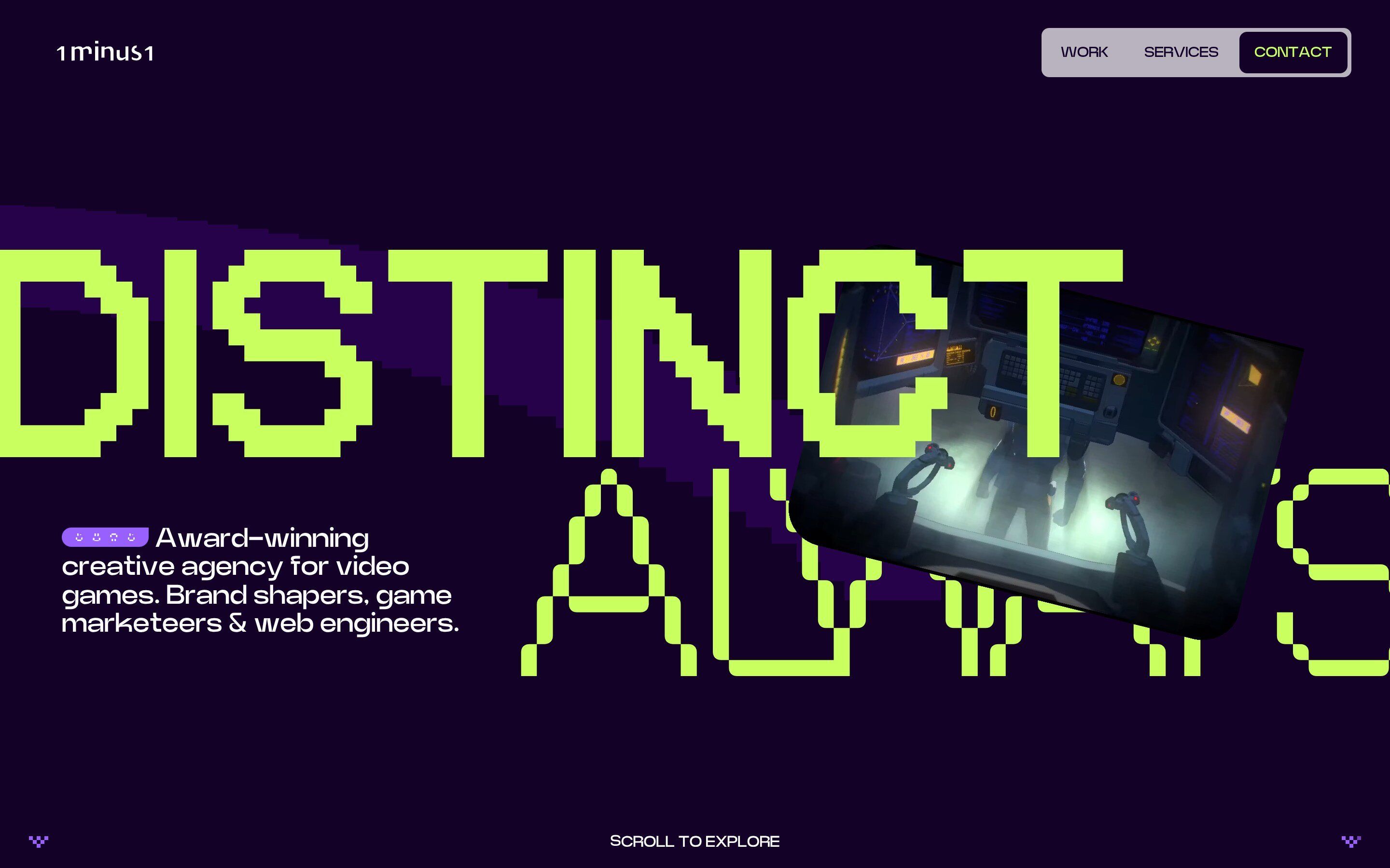
1minus1.com is the site of 1minus1, a creative agency that works only on video games: brands, sites and campaigns for studios and games such as Riot Games, Hell Let Loose, Lords of the Fallen II, Forza, Dispatch and Temtem. It introduces itself with two words, Distinct Always, in a pixel typeface almost half a screen tall, and with a small tilted video that grows to fill the page as you scroll. Then the services on three large cards, the work, client testimonials to drag, the contact form and a 404 page that is a game. The colours are an almost black purple, #140128, a neon green, #CAFF60, and a bright purple, #9860FF; the headings are in OffBit, a pixel typeface, and in its outlined variant, OffBit 101, the rest in Nohemi and Neue Power. On Awwwards it has been a nominee since 17 October 2026, with the voting still open; according to the award page it is designed and built in-house.
It is built with Nuxt, that is Vue 3.5, and served through Cloudflare. The animations are GSAP 3.13, with ScrollTrigger, SplitText, Flip and CustomEase; smooth scrolling is Lenis 1.3, kept short: half a second on a braking curve. The background, the mouse trail and the opening video are drawn in WebGL with Three.js r179, only on screens at least 1024 pixels wide; the 404 page uses Rapier, a physics engine in WebAssembly.
We take it apart in three moments, with a demo rebuilt from scratch for each, in the minimal style, for a made-up games studio, Pixmoor: the words, the cards and the code are ours. From the site we took the ideas and, where we say so, the numbers.
The headline that arrives in pixels
On opening, the two words grow from a tenth of their size while their letters drop into place: one from above, the next from below, in a scattered order. Then the video comes in from the lower right, on an elastic, and settles at a tilt over the second word.
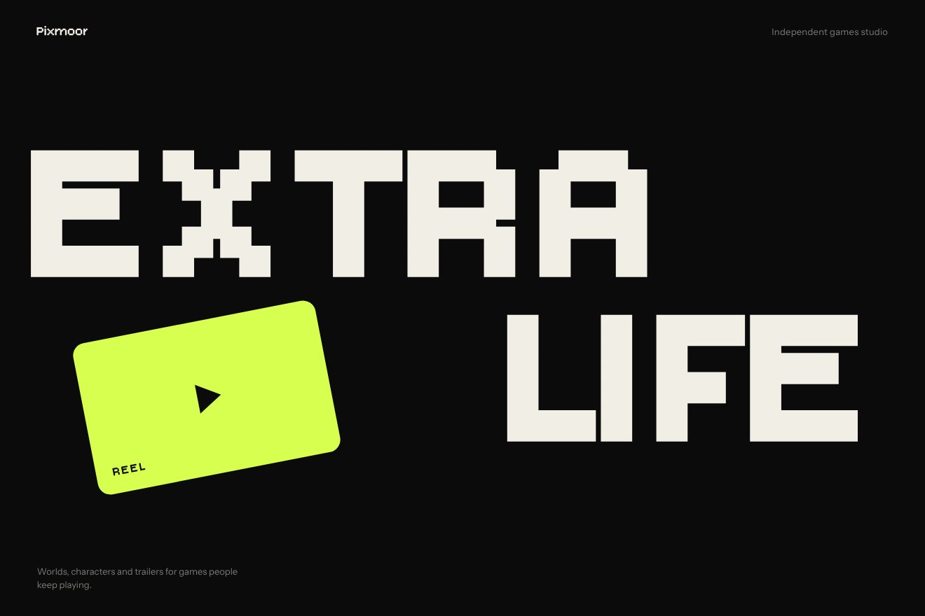
It is a single GSAP timeline. Each word starts at scale 0.1 and reaches 1 in one second, on a curve made with CustomEase, 0.5, 0, 0, 1, that starts firmly and settles slowly; the origin is not the middle of the word but the middle of the screen, worked out on every resize, so the words open out towards the edges. SplitText splits the words into letters: the even ones start at -100 per cent of their height, the odd ones at 100, and come back to zero in 0.7 seconds on the curve 0, 0, 0, 1, all brake, one every 0.03 seconds in a random order. The video starts 600 pixels to the right and 150 down and arrives with elastic.out(1, 1) in a second and a half, while it fades in over one second. Once the entrance is over Lenis starts again, since until then the scroll is held, and the mouse moves the two words with quickTo in opposite directions, by a few pixels. The loader does the same with the words Almost Ready and Hold Tight and a three digit counter: letters coming in from above and below in 0.3 seconds and leaving on an accelerating curve, 1, 0, 1, 1.
In our demo the words are Extra Life, in Bitcount, a variable pixel typeface: the letters fall made of thin round dots and land as solid square pixels, in the same scattered order as the fall. The growth from 0.1 with the middle of the screen as origin, the curves, the letters alternating from -100 and 100 per cent in 0.7 seconds with a gap of 0.03, the card arriving from 600 and 150 pixels with elastic.out(1, 1) in 1.5 seconds and the mouse pulling the words apart are the site’s.
The trail of pixels
On the background and on the coloured cards the mouse leaves a trail that is not soft: it is made of squares that switch on and off at once, like the pixels of an old screen. In the opening, purple stepped bands cross the page behind the headline, in turn, with three seconds of pause between one and the next.
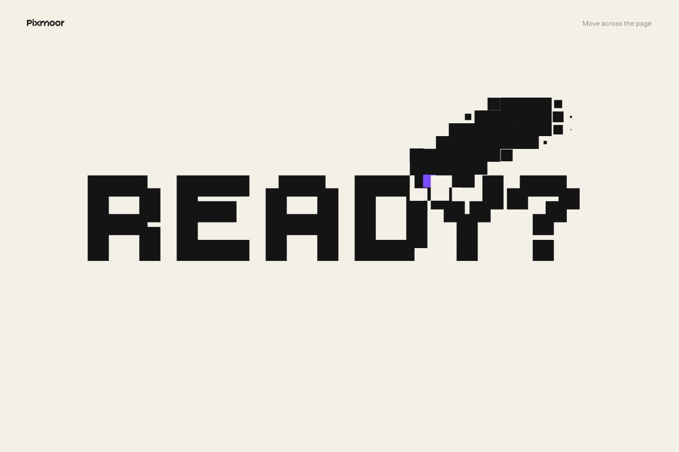
The mouse draws in a separate Three.js scene: at every move of at least one pixel it lays down a square with a soft brush, 125 pixels wide, that fades in 0.7 seconds; there are 150 of them, reused in turn. That scene becomes a small texture, 50 points wide, which the background shader reads in 25 pixel cells: each cell takes the value at its centre, and with step(0.2) it is either on or off, nothing in between. Where it is on, the colour of the card switches to the colour of the trail. The bands of the opening use the same grid of cells: they are a hundred 100 pixel squares laid along an SVG path, appearing one every 0.01 seconds, in 0.4, and then vanishing one after the other.
In our demo the page is light, the lit squares are black and the word reads in negative inside them; the one under the pointer is violet. The 25 pixel squares, the 125 pixel brush that lives 0.7 seconds, the 150 stamps and the 0.2 threshold that switches a square on all at once are the site’s; on top of that the squares switch off by shrinking, so the trail evaporates.
The cards that straighten up
The services are three large cards, Websites & Platforms, Branding & Creative and Marketing & Campaigns, one neon green, one dark purple and one purple, overlapping a little. As you scroll, each card comes up crooked and pushed to one side, the next one to the other, and straightens as it reaches the top; then, as the next card covers it, it tips over the other way and slides off.
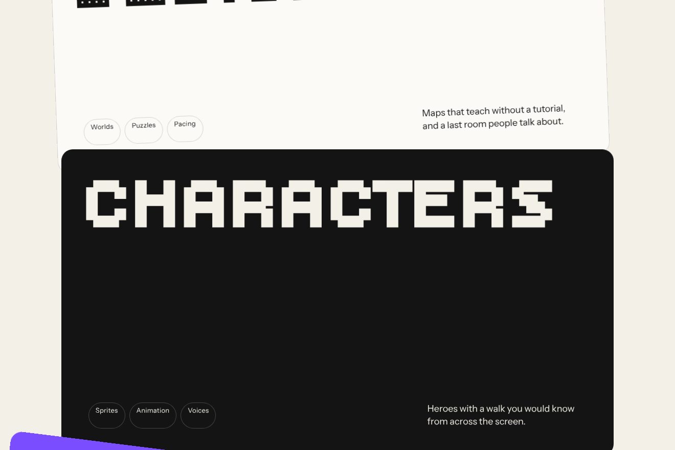
Each card has two timelines tied to the scroll, with scrub. The first runs from when the card’s top edge comes in at the bottom of the screen to when it reaches 20 per cent: the card starts turned by 8 degrees and pushed a tenth of its width, the even cards to the left and the odd ones to the right, and comes back straight with power1.out. The second runs from 20 per cent to when the card leaves at the top and moves only the inside: it turns it 8 degrees the other way and pushes it another tenth, with power1.in. On a phone the angles and shifts are halved, 4 degrees and a twentieth. The cards overlap with a negative margin of 50 pixels, and the three colours repeat in turn.
In our demo the cards are a light one, a black one and a violet one, and the title of each card follows the scroll: made of thin rings while the card is crooked, in solid square pixels once it is straight. The 8 degrees and the tenth of the width on alternate sides, the 20 per cent point, power1.out coming in and power1.in going out on the inside, the halving on a phone and Lenis’s half second scroll are the site’s.
The other details
Scrolling down from the opening, the video, tilted by 14 degrees, 320 pixels wide (480 on large screens), with corners rounded at 40 and a sharp top right one, grows into the full screen frame waiting further down: a timeline with half a second of scrub takes away its rotation and its corners, while the two words move apart by three quarters of their width, one to the left and the other to the right. The real video is drawn in WebGL on a plane that follows the HTML element, which stays invisible.
In the work section, moving the mouse over the Our Work heading drops stickers with the clients’ logos: one for every sixth of the width travelled, growing from half size to full in 0.2 seconds, turned at random by up to 22.5 degrees and pushed at most 20 pixels the way the mouse is going; on arrival, three burst out on their own. The client testimonials can be dragged, with a small map that shows where you are. The 404 page is a game: the digits 4, 0 and 4 are 3D models made of little cubes, which fall with a gravity of a thousand and bounce off the cursor, which in Rapier’s physics is a body too; every collision makes a sound.
Where it stumbles
Reduced motion is there almost everywhere: with prefers-reduced-motion the headline entrance, the bands, the crooked cards and the stickers do not start. But Lenis’s smooth scroll stays for everyone, and for the whole entrance Lenis is stopped, so the page does not move.
The opening video weighs 8.5 MB for six seconds on a loop, at 2850 by 1602, and has an audio track even though it plays muted. The main code weighs 1.46 MB, 425 KB compressed, with Three.js inside it even where the WebGL background is not used. Three of the four typefaces are TTF files, up to 90 KB each, instead of the lighter WOFF2, and the published code still holds the Tweakpane control panel and the performance monitor, which switch on when #debug is added to the address.
What we take away
One idea, the pixel, kept in every piece: the typeface of the headings, the trail that does not fade but lights up in squares, the stepped bands, even the 404 made of little cubes. And the rule of growing things from the middle of the screen rather than from their own: two words opening out towards the edges seem to come towards whoever is looking.
The effects
- Pixel headlineThe opening of a games studio, in the minimal style: two words in a pixel typeface grow out of the middle of the screen while the letters drop into place, one from above and the next from below, in a scattered order. Each letter falls made of thin round dots and lands as solid square pixels. Then the reel card swings in on an elastic and settles at a tilt.Free
- The trail of pixelsA light page with a single word, in the minimal style: where the pointer passes the page turns into a grid of square pixels that switch on in black, with the word in negative inside them, and a moment later switch off by shrinking. The pixel under the pointer is the only one in colour.Free
- The cards that straighten upA studio’s services on three overlapping cards, in the minimal style: each card comes up crooked and pushed to one side, the next one to the other, and straightens as it reaches the top, tied to the scroll. The title follows it: thin round dots while it is crooked, solid square pixels once it is straight.Free