Welcome Gustavo
Welcome Gustavo, how it’s made: the frame that becomes the page
The New York Philharmonic’s page for the arrival of Gustavo Dudamel: a yellow poster with the conductor coming out of a black frame, headings that open in two as you scroll, quote marks pushed away by a photo. We take it apart with three demos rebuilt from scratch.
The palette
- #FFDD00the yellow of the hero and of «Building bridges»
- #000000the page, the frame and text on colour
- #02C0FFthe blue of «Gustavo’s story»
- #FF4DC3the pink of «Conducting change»
- #1DE5CBthe teal of «What’s next»
- #FFFFFFtext on black
Tap a colour to copy its code.
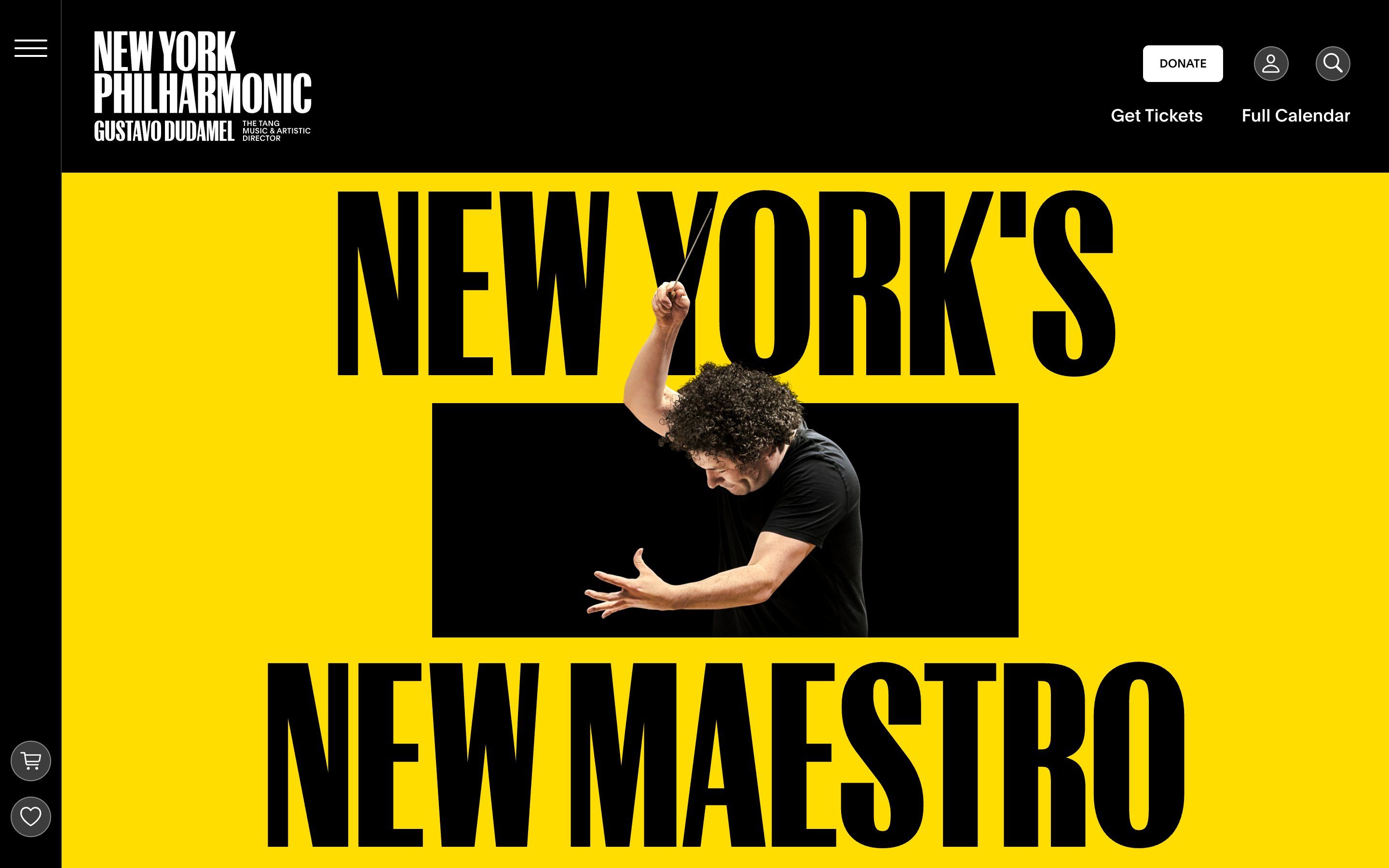
Welcome Gustavo is the page with which the New York Philharmonic introduces Gustavo Dudamel, its new music and artistic director since 1 September 2026. It opens on a solid yellow, #FFDD00, with «New York’s» above and «New Maestro» below, in a very narrow typeface; between the two lines there is a black rectangle, and out of it rises Dudamel with his arm up and the baton, coming out of the frame and passing in front of the letters. Then the page splits into four chapters, each with its own colour on black: Gustavo’s story in blue, #02C0FF, Building bridges in yellow, Conducting change in pink, #FF4DC3, What’s next in teal, #1DE5CB. The headings are set in Control Compressed, in the version drawn for the Philharmonic, the text in Items, a serif, the labels in Plain.
The page lives inside the Philharmonic’s site, but the whole experience sits in a single element, gustavo-experience, a component made with Svelte 5: 865 KB of JavaScript, holding GSAP 3.15 (ScrollTrigger, Flip, SplitText, Observer), Lenis for smooth scrolling, Embla for the carousel of years and pretext, a small library by Cheng Lou that measures how tall a text will be without putting it on the page. Who made it, the page doesn’t say: images and videos sit in a folder called jkr-assets. We take it apart in three moments, with one demo rebuilt from scratch for each, for an invented orchestra we called the Lanterna Philharmonic: texts, drawings, colours and code are ours. From the site we took the idea and, where we say so, the timings and the sizes.
The frame that becomes the page
The first screen is a poster: the yellow, the two lines and the black frame between them. The page is still, and stays still until someone scrolls.
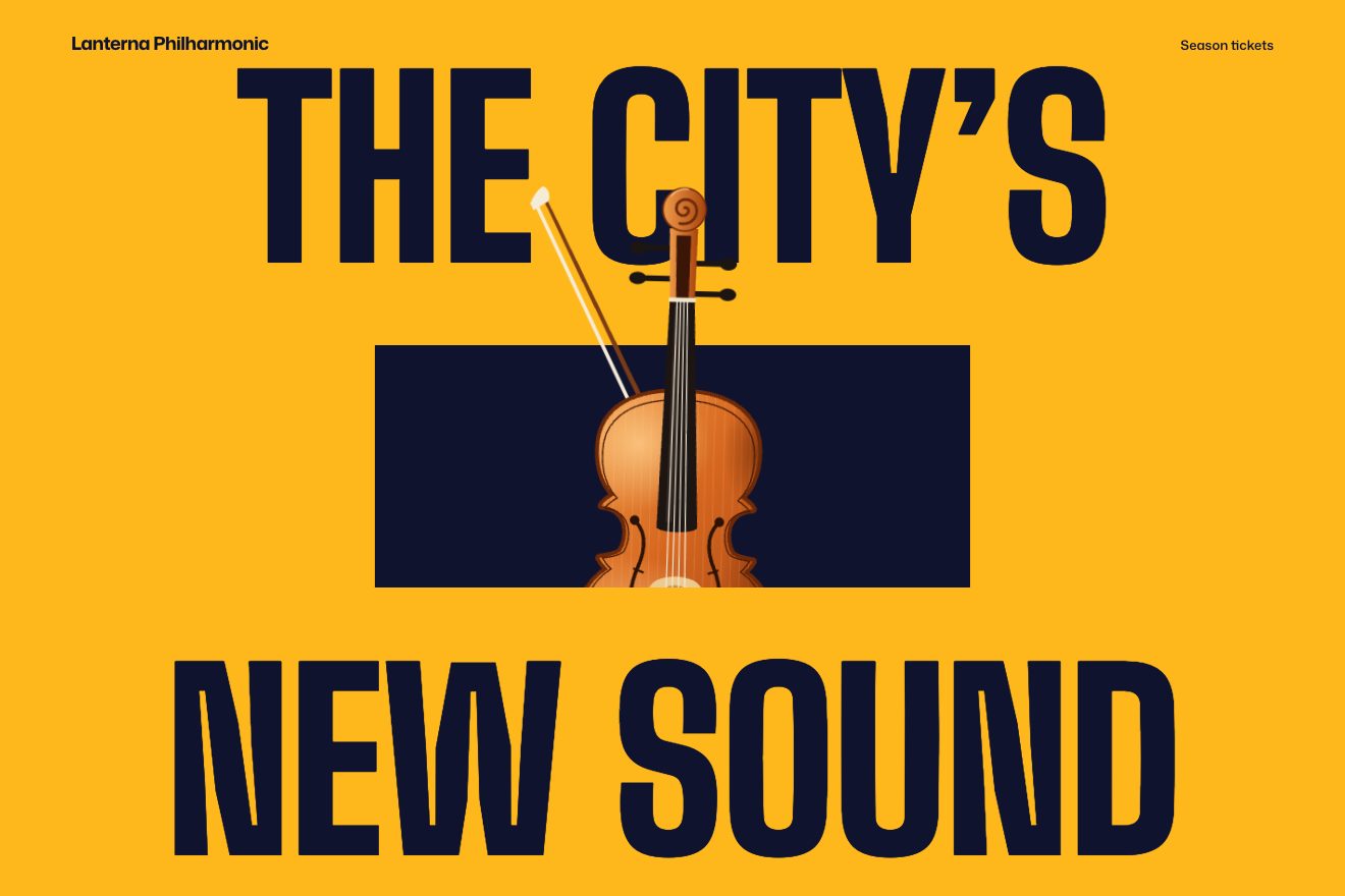
On the site the first line appears at 0.63 seconds, the second at 1.26, and at 1.89 the rectangle opens sideways over 1.76 seconds, with an expo curve that starts fast and settles; meanwhile the portrait, a cut-out image of 1340 by 2560 pixels, rises from 55% of its height further down. The rectangle is at most 27% of the screen tall and two and a half times as wide; its container has an inset clip-path with negative values on three sides and zero at the bottom, so it cuts only along the lower edge: the portrait comes out at the top and passes in front of the first line, while the second line passes in front of it. Wheel, finger, arrows and space are caught, and the first gesture down makes the rectangle grow from its centre until it covers everything plus 8 pixels, over 1.2 seconds: the page turns black. The portrait grows to 74% of the width, moves right and turns by 20° over 1.4 seconds, and at 0.77 seconds «Welcome Gustavo» comes up, from 180 pixels lower and from scale 0.8. Only then does the page scroll, and as it scrolls the portrait turns up to 30°. Back at the top, a gesture up rewinds it all and the page is held still again.
In our demo the poster is amber, the lines say «The city’s» and «New sound», and a violin with its bow, drawn in SVG, rises out of the frame. The timings are the site’s, and so is the cut only at the bottom; on the 0.63-second beat the lines give a small scale knock. In the CSS the violin already has the place and size it will have in the night: in the poster it is shrunk, and the flight brings it back to scale 1, so at the end it is sharp. On top of that it always sways a little and, when it lands, its strings ring. The night’s title and text have a timeline of their own, which hurries on the way back: rewinding the whole flight, for almost a second all you saw was the tail of the words, nearly still.
The heading that opens
Each chapter starts with a two-line heading that fills the screen: «Gustavo» and «Dudamel», «One world» and «One orchestra», «New York» and «In rhythm».
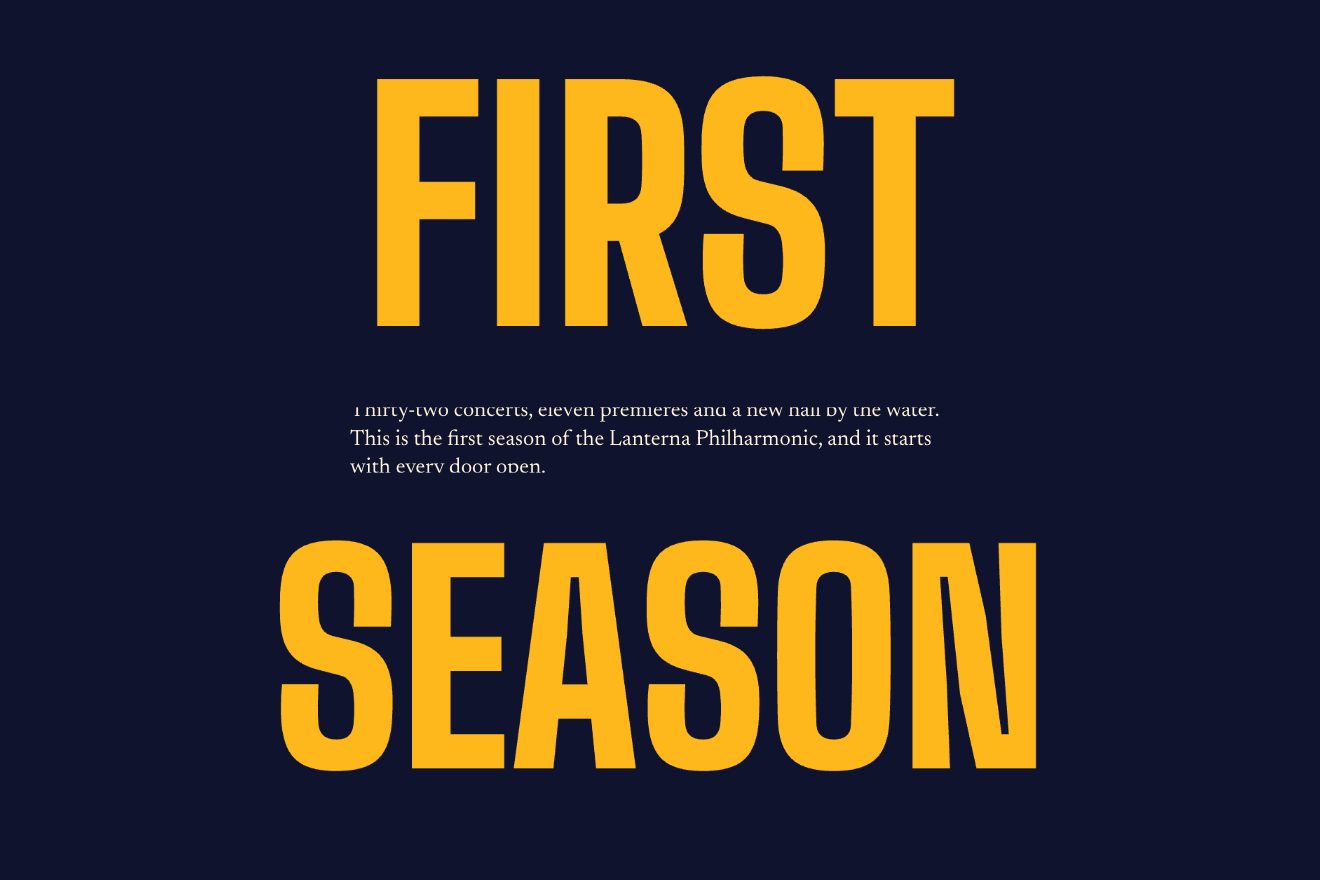
On the site the section is three screens tall and its stage stays put; it is a grid of two halves, and the two headings touch on the middle line. As you scroll, the halves go down to scale 0.82, or less if needed for each to fit in a quarter of the screen, and move apart by half the paragraph plus 54 pixels, the top one shrinking towards its lower edge and the bottom one towards the top; the paragraph opens from the middle line. How tall the paragraph is, pretext works out before it is drawn, measuring the words on a canvas. The headings, on the other hand, fill the width without JavaScript: next to the text there is a hidden copy of it, a box takes the rest of the line, and a property registered as a length turns 100cqi into pixels where it is written. In the box it is the line, in the heading it is the line minus the text, and tan(atan2(a, b)), which is a divided by b, says how much to enlarge: CSS can’t divide one length by another, but the tangent of an angle can.
In our demo there are three chapters, night blue, amber and sky blue, and the fit is the same, in CSS; the paragraph’s height we read from the page, where it already is. We gave the headings a limit, the height of their half, because a short word enlarged to the whole line spilled off the stage, and half a second of lag on the scroll, which without Lenis followed the wheel in jumps.
The quote marks that make room
In Building bridges, after the two headings that slide in together with the videos, comes a sentence by Dudamel about music uniting people across borders, between two pairs of huge quote marks.
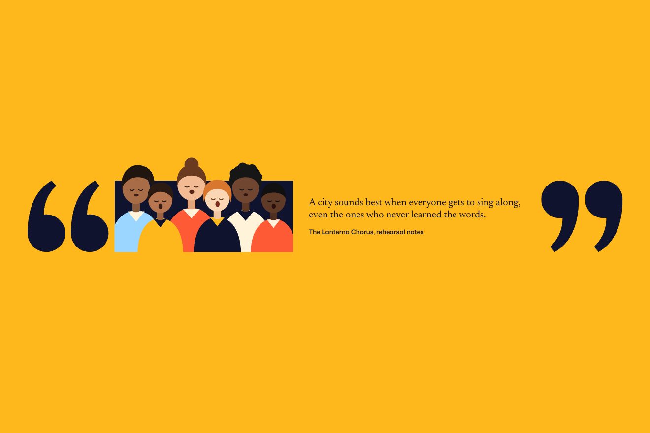
On the site the section overlaps the one before by four screens, and its yellow stage rises over it from the bottom, tied to the scroll. On the yellow, marks and frame are 11% of the screen’s width tall; the marks are a single SVG shaped like a squared drop, and the closing ones are the same turned by 180°. The frame starts narrowed to 10% with both pairs of marks resting against its sides; halfway through the yellow it widens over 0.7 and pushes them away, then the photo rises, Dudamel with his arms open, cut only at the bottom. Meanwhile the closing marks stop right after the frame: they carry a yellow block as wide as the screen, which lies on the quote like a curtain, and at the end they slide to their place and uncover it. On phones there is no pushing: the frame opens from the centre and the rest fades in.
In our demo the wipe is amber and covers a night-blue «Sing along», which drifts up a little meanwhile; the marks are a ball with a tail, and a choir of six drawn singers rises into the frame, their mouths opening and closing, each at its own pace. Timings and sizes are the site’s. The cut is not: widened at the sides as on the site, it let the robes out over the marks and the credit, and a polygon cuts on the edges at the frame’s height and lets only the heads out, above.
The other details
The blue chapter opens with «From Barquisimeto» and «To the Big Apple» and a video in between: the panel rises from the bottom over 1.4 seconds, and whoever reaches it before it has finished finds the scroll stopped, waiting for it; then, scrolling on, the content shrinks towards the centre and the panel withdraws upwards; tapped, the video goes full screen with Flip, over 1.5 seconds, and the two halves of the heading move aside. In Building bridges headings and videos arrive from two sides and lock together, the videos uncovered from the right and from the left. The ten projects of the yellow chapter are an accordion: opening one, Flip animates the heading’s font size too, which grows. The years of the career run in a carousel, the concerts in a table that appears when a pink panel withdraws, and the cursor is a circle with a word inside, «Expand» or «Full Screen». In browsers that understand them the colours are written in oklch, and on wide-gamut screens they come out brighter.
Where it stumbles
The page stops by itself: the hero until you scroll, and then twice more, if you reach a coloured panel before it has finished its second and a half, the scroll waits for it. Whoever scrolls fast notices.
For a single page it is heavy: 865 KB of JavaScript for the experience, plus the site’s shell, with jQuery, Vue for the ticket timer, ShareThis and New Relic.
And the component that lifts paragraphs line by line writes the duration and the curve, 0.6 seconds expo.out, in the starting values of the fromTo, where GSAP doesn’t read them: the lines rise with the default values, half a second of power1.out.
What we take away
A frame can become the page: grow it from its centre by the right distance and cut only its lower edge, so what sits inside can come out of it. And today CSS can divide one length by another: with a registered property and a tangent, a heading fills the line without a line of JavaScript.
The effects
- Frame into pageAn amber poster: two lines on the beat, a dark frame between them and a violin coming out of it, cut only at the bottom. The first scroll widens the frame until it becomes the night of the whole page, and the violin flies to its place and tilts.Free
- The heading that opensA heading in two halves fills the screen; as you scroll the halves shrink and move apart, and the paragraph opens between them. The headings fit the width with CSS alone.Free
- Room-making quote marksA coloured wipe rises over the page; between two pairs of quote marks a black frame as thin as a line opens and pushes them apart, a choir rises into the frame and the closing marks slide to their place, uncovering the quote.Free