Meer Mohsin
Meer Mohsin, how it’s made: a portfolio shot like a film
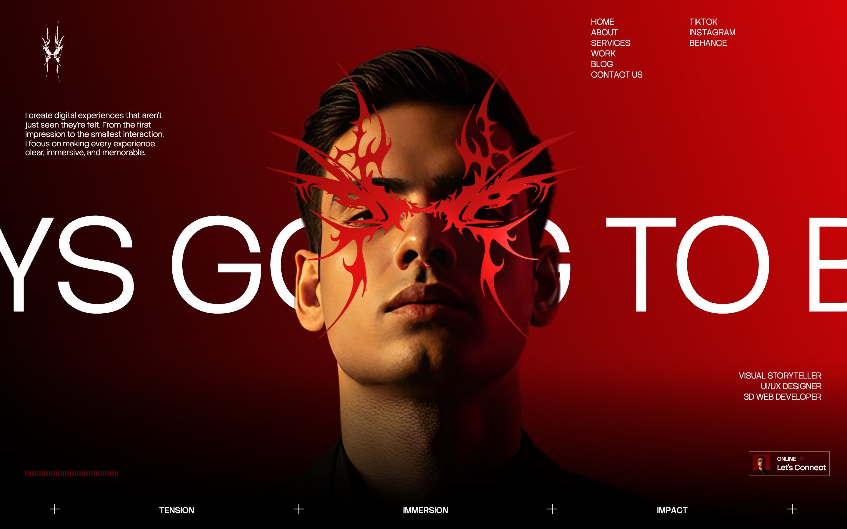
Meer Mohsin’s portfolio, a front-end and 3D developer, is all red and black: a count in script, a veil that dissolves into a glow, a statue turning as you scroll, the work going by in a row. We take it apart with three demos rebuilt from scratch.
The palette
- #990000loader red
- #D60407bright red
- #000000black
- #0D0D0Dscene background
- #F5F5F5light text
Tap a colour to copy its code.
Meer Mohsin is a front-end developer, interface designer and 3D developer working from Pakistan. His portfolio does not look like a portfolio: it looks like the opening titles of a film. Red and black, a calligraphic script for numbers and big words, and at the bottom of the screen three words that work as a programme: tension, immersion, impact.
Underneath there is a hand-written project bundled with Vite: Three.js for the 3D scenes, GSAP with ScrollTrigger for everything that moves, Lenis for smooth scrolling and a small library that splits texts into lines, words and letters.
Here we take it apart in three moments. For each one there is a demo rebuilt from scratch with our own graphics: from the site we took the idea and the rhythm, never the code or the images.
A count in script and a veil that burns
On the first visit the screen is red and in the middle a number in script counts from zero to a hundred. Then the most memorable thing on the site starts. A black front rises from the bottom, ragged like burning paper, its edge lit red, and eats the screen in three seconds. It is a WebGL plane: the shader dissolves it with glowing edges, and adds thin old-screen lines and a little grain.
The loader only runs when you arrive from outside: if you reload the page, or have already seen it in the same session, the site skips it.
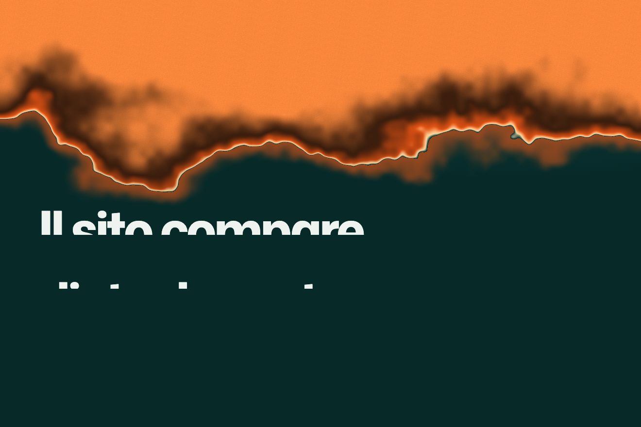
Our version has an orange veil and the number in a very wide, light Mona Sans. The fire is a hand-written shader, with no Three.js: a single triangle covering the screen and a fractal noise that bends the front line. Just before the edge the veil darkens like burnt paper, on the edge there are flickering embers, in the middle an almost white thread, and below an orange glow settles on the freshly uncovered page.
The work in a row, with a ring
The work section stops on screen for as many heights as there are projects. The current project is large; the previous one goes up, small and faded, the next one waits below. With every change the blurred background takes the new project’s image, the name and description are rewritten word by word, and a ring fills up as you approach the next one, with the project number in the middle.
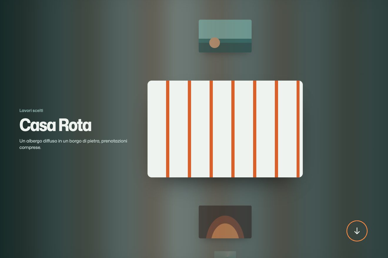
On the site the cards move by changing the top property, and every scroll event starts an animation for every card. We move them with transforms, which do not force the browser to recalculate the page, and start animations only when the project really changes. Our ring has no numbers: it tells you how much is left, not where you are in the list.
Words that light up in scattered order
One gesture comes back in almost every text on the site: elements do not enter in a row but in scattered order. The words of the manifesto paragraph each rise fifty pixels out of a haze of blur, over three seconds and each at a random moment. The letters of the big title do the same, growing from half their height, and so do the digits of the numbers. The result is a page that seems to put itself together, a piece here and a piece there.
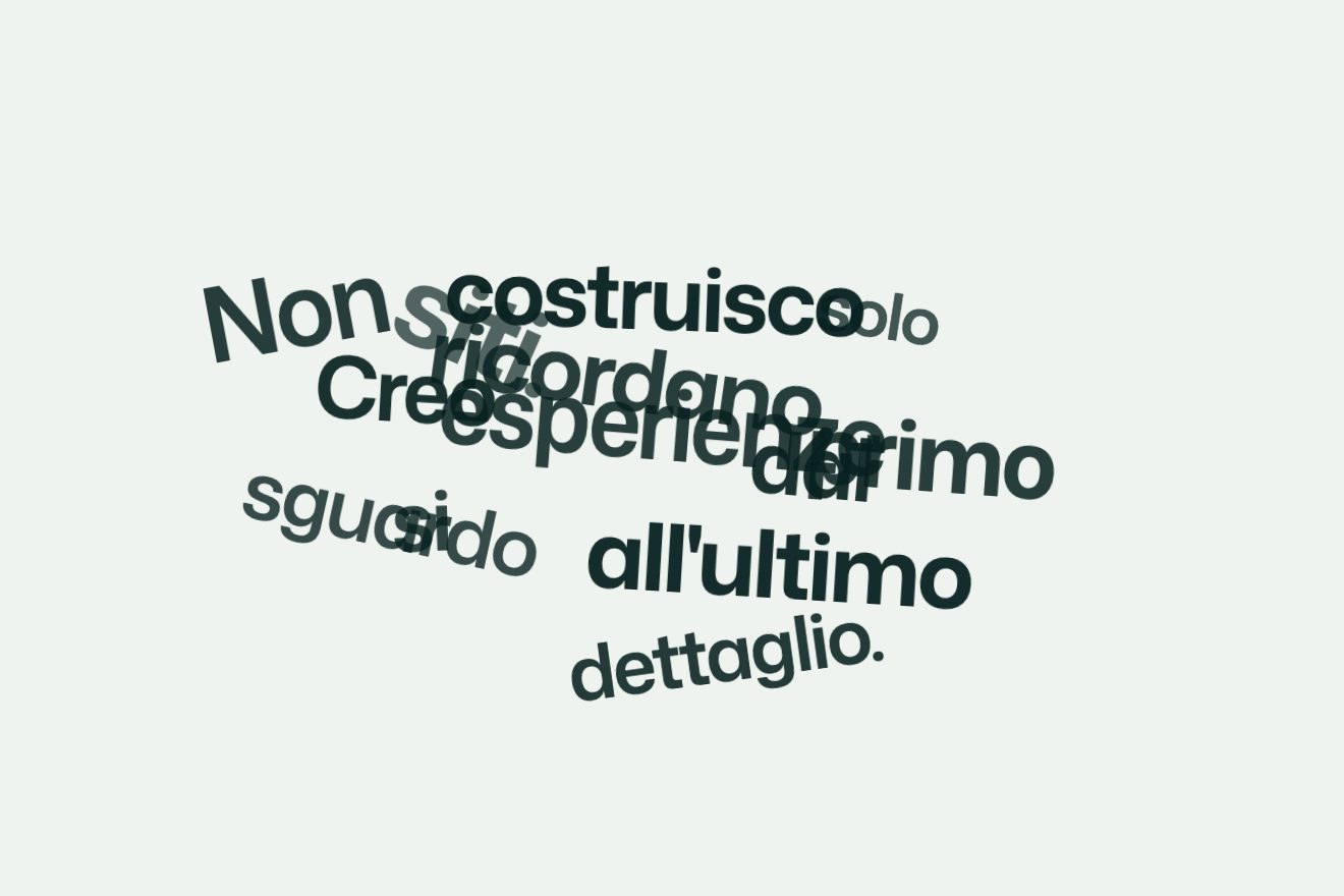
Here we pushed the idea one step further. The words of our sentence do not just start in scattered order, but from scattered points on the screen: moved, rotated, some large and some small, each with its own width and weight of the variable font. As you scroll they go back to their places and the sentence reads. The disorder comes from a number, the seed, so it is always the same.
The other details
The rest of the site is one scene after another. A classical statue in 3D appears in two copies, one more matte and one glossier arriving from the right to stand beside it, lit by red lights, one of which follows the mouse; as you scroll the statue spins and at the bottom of the page it comes back, with a sound. The cursor drags a trail of fluid behind it, computed by a full-screen WebGL simulation. Between sections the page tears like paper, and the button to write to him is magnetic: it moves towards the mouse and slides away sideways when you scroll down.
Where it stumbles
On the first visit the menu appears after eight and a half seconds and the contact button after nine: they are delays written into the code to make room for the entrance. For someone who only wants an email address it is a lot.
The page is more than twenty-eight thousand pixels tall on a desktop screen and, besides the opening veil, keeps several WebGL scenes running: the fluid, the statue, the awards showcase. It is a lot to run, especially on a phone. And many small texts are red on black: beautiful to look at, tiring to read.
What we take away
A very tight palette holds very different effects together: with only red and black, a fluid, a statue and a fire feel like the same film. Scattered order used everywhere becomes a signature, as long as it stays short. And a loader can be a material, burning paper, instead of a bar filling up.
The effects
- The burning veilAn orange veil covers the page while the number climbs to a hundred, then it catches fire from the bottom: a ragged front with embers on the edge, drawn by a shader.Free
- Projects in a row with a ringA pinned scene where projects go by one at a time: the current one big in the centre, its neighbours small above and below, and a ring filling towards the next.Lifetime
- The sentence that comes togetherThe words start scattered, rotated and each with its own weight and width; as you scroll they go back to their places and the sentence reads.Lifetime