Funtown Studio
Funtown Studio, how it’s made: a unicorn in the headline
The site of a design studio for startups: a unicorn in sunglasses in a circle inside the headline, shapes that light up near the pointer, a surprise party, services taking turns over a bar of pills and columns of projects moving opposite ways. We take it apart with three demos rebuilt from scratch.
The palette
- #EEEEF0the page
- #1B1D22the dark sections and the circle
- #0A0B0Dthe text
- #F66C40the orange of the button and the reviews
- #8EAEEDthe blue of the shapes
- #F4B3E7the pink of the unicorn’s muzzle
- #02C2B5the turquoise mane
- #F2D83Bthe yellow of the horn
Tap a colour to copy its code.
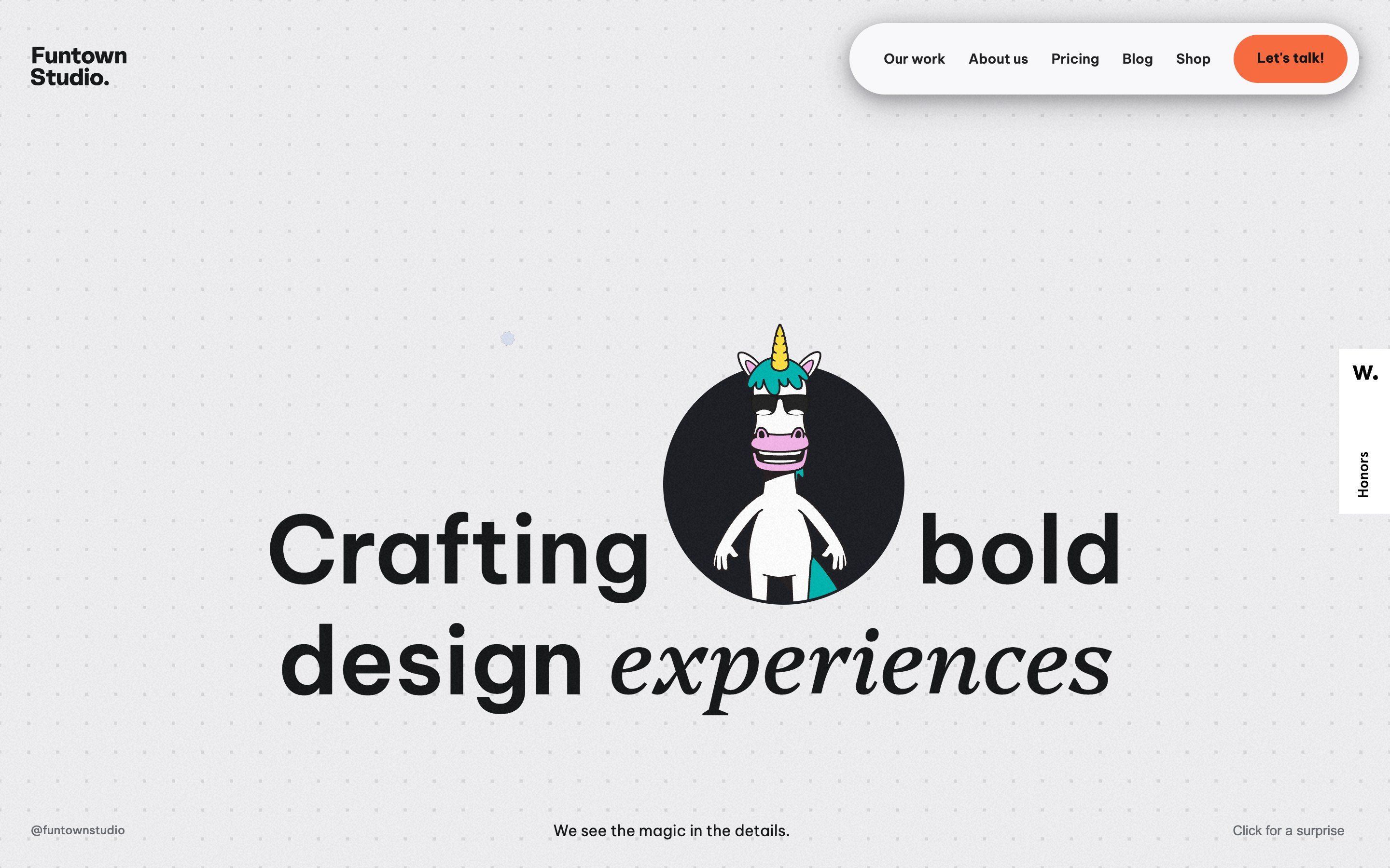
funtownstudio.com is the site of Funtown Studio, a design studio that presents itself as a partner for tech startups: brands, interfaces and websites, with the promise of not taking a brief and disappearing, but of getting inside the product and staying there. It opens on a very light grey, #EEEEF0, with a grid of small dots and a light grain over everything. The headline says «Crafting bold design experiences», in Be Vietnam Pro with the last word in Platypi italic, and between «Crafting» and «bold» there is a big dark circle: inside it, a white unicorn with a turquoise mane, a yellow horn and sunglasses, its head poking out over the edge. The menu is a floating white pill and the one real colour is the orange of the button, #F66C40.
It is a Webflow site: almost all the movement lives in Webflow interactions, forty-seven on the home page alone, and the rest in a few hand-written scripts, with jQuery, GSAP 3.12, Lenis and Matter.js. The unicorn is a Rive animation, a state machine with its own commands (the sunglasses, the wave, the finger guns and several dances) that the interactions switch on and off: on arrival it waves, then shoots finger guns, and meanwhile the other words of the headline appear. The first load is 12.1 MB in about a hundred requests.
The site has an Awwwards Honorable Mention from 7 December 2025, but the award page shows only community votes and none from the jury: no score to report. We take it apart in three moments, with a demo rebuilt from scratch for each, for three invented brands: drawings, copy and code are ours. From the site we took the ideas and, where we say so, the numbers.
The surprise party
Around the headline hide twenty small shapes of three kinds: scalloped blue badges, pairs of orange half moons and small black four-pointed stars. You do not see them until the pointer passes close by: then they grow while turning, make two turns and vanish. Bottom right there is a grey line of text, «Click for a surprise».
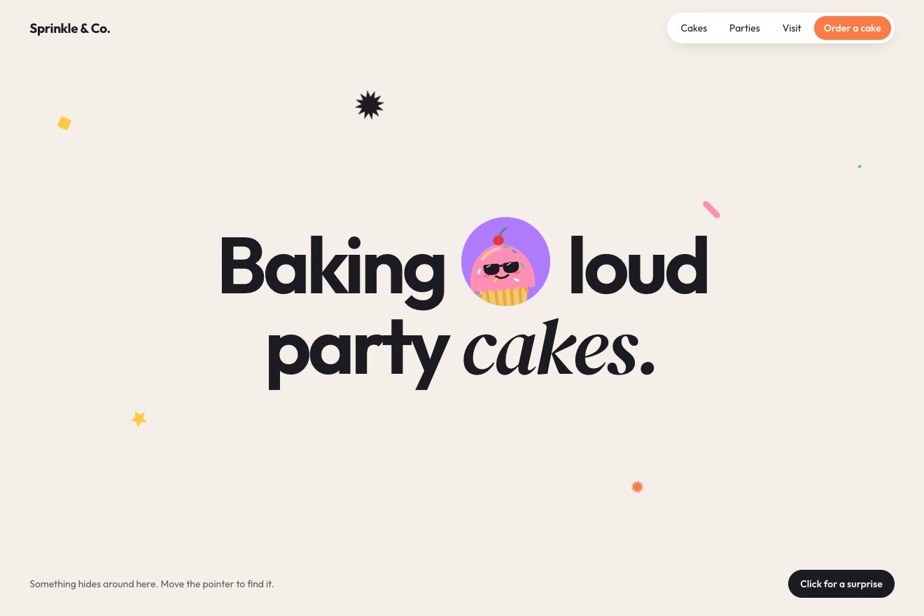
On the site every shape is an image at scale 0. When the pointer comes within 100 pixels of its centre, the shape gets a two-second CSS animation: it grows to full size while making half a turn, completes the turn, and then shrinks away while making another full one; every other shape turns the opposite way. At two seconds it becomes transparent, and half a second later it can wake again. On screens up to 986 pixels the shapes wake by themselves every two and a half seconds, each 0.3 seconds after the one before, and below 992 the button is not there.
The surprise makes the unicorn dance and runs the circle’s background through nine colours, one second each: blue, emerald, fuchsia, lime, pink, purple, red, teal and yellow, before it turns dark again. Meanwhile the shapes, in a shuffled order, are called three times: the i-th after 0.3 seconds times i, and each round two seconds after the one before. But a wake-up lasts two and a half seconds, so the second call finds the shape still lit and is lost: each one lights up twice.
In our demo the page belongs to an invented bakery, Sprinkle & Co., and in the circle of the headline there is a cupcake we drew in SVG, with a body, arms, eyes and glasses that GSAP moves one by one: it rises from the bottom, puts its glasses on and waves. There are eighteen shapes, of seven kinds, with the site’s rules: the 100 pixels, the two turns in two seconds with the same stages, the half second of rest, the rhythm without a pointer. The party is quicker, nine colours in four seconds, and the dance is built beat by beat. The rounds of the surprise are two and a half seconds apart, so every shape really lights up three times, and the button stays on phones too. Everything runs on GSAP’s clock and not on the browser’s timers, so it can be paused and recorded. Over the circle the cupcake winks and points, like the unicorn that shoots finger guns on arrival.
The pill steps
Further down, after the projects, the studio’s services arrive one at a time while the section holds still: Brand Identity, Customer Experience, User Interface Design, Frontend Development. At every service the unicorn does a different dance, two shapes spin and a bar of pills marks where you are.
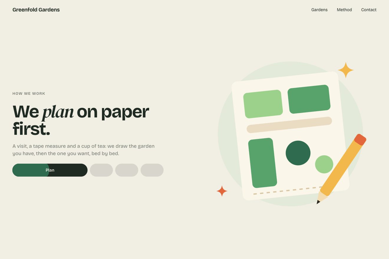
On the site everything is tied to the scroll with a keyframed Webflow interaction: every service takes a sixth of the section’s journey, and the change happens within one or two hundredths of it. The service’s unicorn appears in place and leaves sliding 400 pixels to the right while it vanishes; meanwhile two shapes, an empty one and a filled one, turn 1080 degrees, three full turns, and the filled one lights up. There are four pills: the current service’s one stretches to 49% of the bar and the others shrink to 15%, in half a second with an exponential acceleration. And inside every pill a bar fills while you scroll through its service.
In our demo the steps belong to an invented garden design studio, Greenfold Gardens: Plan, Plant, Tend, Harvest, with a drawing each in place of the unicorn. The distances, the turns, the pills and the filling bar have the site’s numbers, but the change is made of tweens that start when you pass from one step to the next, instead of following the scroll frame by frame: even when you scroll fast, every change shows in full. The new drawing comes from the right as well, and the pills can be pressed to go to their step.
The columns going opposite ways
After the three featured projects, a wall of images in three columns: while it crosses the screen, the side ones rise and the middle one sinks, and the images slide past each other.
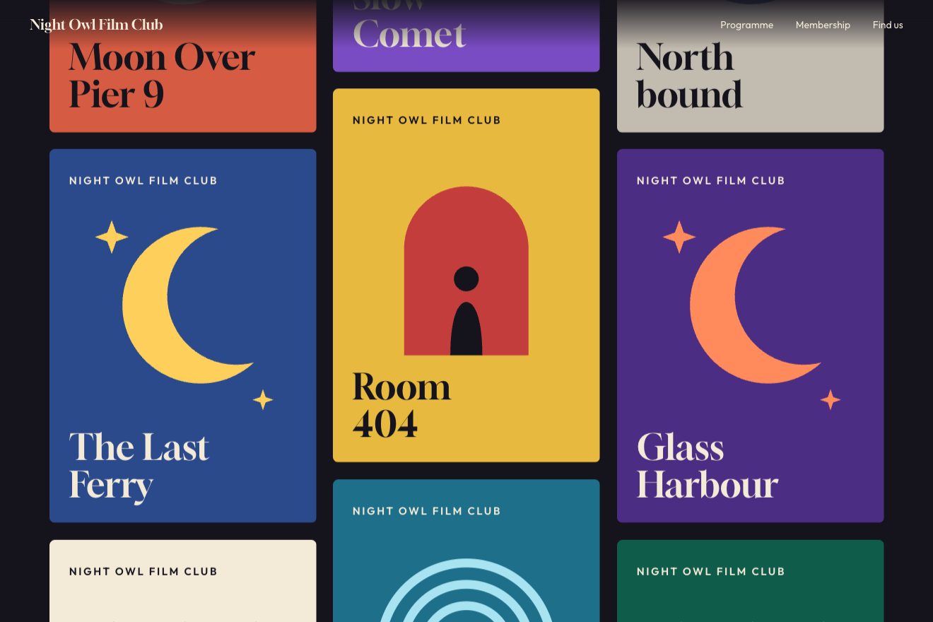
On the site it is another Webflow interaction, tied to each column’s passage through the window, from when its top comes in at the bottom to when its base leaves at the top. The movement has six stops: 100 pixels at a tenth of the way, 200 at a fifth, then 100 more every fifth, up to 600. Before the first stop Webflow holds that stop’s value, so for the first tenth the columns stand still at 100 pixels, between a tenth and a fifth they move at twice the speed and then they slow down. On phones there are two columns and the stops are five times shorter, up to 120 pixels.
In our demo the wall is the programme of an invented film club, Night Owl Film Club: twelve posters drawn by the script, in three columns, with the site’s stops. The middle column starts higher by the whole distance, so while it sinks it never leaves a gap, and at the top and bottom the wall fades out. Pointing at a poster pops out a ticket with the time, with the numbers of the image the site pops up over its featured projects: after 0.1 seconds it grows to 1.1 while tilting 5 degrees in 0.2, then settles at 1 and 10 degrees in 0.1.
The other details
The circle does not stay in the headline: in the first hundredth of the scroll of the whole page the unicorn sinks 218 pixels and vanishes, and between 1 and 5% the circle grows to 20 times its size, until the screen is all dark and the work section comes in. There the two headings arrive from 300 pixels away, one from the left and one from the right.
On the list of blog posts, hovering a title shows its image, 250 pixels to the right of the pointer and 63 below: it follows it, and pops out growing to 1.1 before it settles, in 0.3 seconds. The reviews run in a strip that moves a pixel and a half every frame, one on phones, and stops when you hover it. And here and there, as they come into view, hand-drawn underlines and circles draw themselves.
Where it stumbles
The weight, first of all: 12.1 MB on the first load. The twelve images of the wall are PNGs from 110 KB to 1.2 MB, 5.3 MB in all, the three featured covers are videos from 0.6 to 1.2 MB, 3 MB in all, and the Rive engine weighs 743 KB. The unicorn arrives in two near-identical files, unicorn.riv and testing.riv (the footer one), 645 KB each and 3 bytes apart. The font loader also downloads ten styles of Lato, which the CSS uses in only two rules, and the home page carries Stripe and three Google tags.
Then the headline waits. Three words out of four start invisible, and they are switched on by an interaction that fires only when the browser has finished loading the page, plus 1.3 seconds: on a slow connection, for a long while all that is left of the headline is «experiences».
There is also code working for elements that are not there. The click on the surprise downloads Matter.js a second time, in another version (0.17.1, after the 0.18 already loaded), to drop the shapes with physics: but the simulation’s container does not exist, and the function stops right there. The same goes for a scroll that should turn very slow over a packages section, for two different scripts that move a custom cursor and for a loader with a bar and a percentage on fixed timings, 6.3 seconds whatever the network is doing: on the home page and on the pricing page none of their elements exists.
The reduced motion setting is never checked, neither by the CSS nor by the scripts: shapes, unicorn and columns move anyway. And on every visit the console shows the same Rive error seven times, unable to find a view model linked to the unicorn’s artboard.
What we take away
A character inside the headline gives it a face, and a button that makes it dance is all it takes to invite people to play. Shapes that light up only near the pointer reward whoever explores without bothering whoever reads. A bar of pills that fills up tells you where you are better than any number. And the timings have to add up: three calls two seconds apart, for a wake-up that lasts two and a half, make two wake-ups.
The effects
- The surprise partyA headline with a round window in the middle of a line, and a mascot inside it. Little shapes hide all over the page: near the pointer they grow, turn twice and vanish. The «Click for a surprise» button starts the party: the window changes colour nine times, the mascot dances with its glasses on and every shape wakes three times.Free
- Pill stepsA method in four steps in a section that holds still while you scroll: at every step the text changes, the drawing leaves to the right and the new one comes in from there, two stars spin three turns, and in the bar of pills the one of the current step stretches to half the bar and fills up as you scroll.Free
- Columns going opposite waysA wall of posters in three columns: as it crosses the window the two outer ones rise and the middle one sinks, so the posters slide past each other. Pointing at a poster pops a ticket with the time, which grows past its size while tilting and settles more tilted.Free