Butter, by ToyFight
Butter, how it’s made: an editor made of blocks
The site of Butter, ToyFight’s video editor and an Awwwards Site of the Day: tiles that drop from a sentence into the timeline, a word that tries effects on, headings that light up like neon. We take it apart with three demos rebuilt from scratch.
The palette
- #F7F7F7the page
- #1E1E1Etext and buttons
- #D6D6D6the grey at the top of the hero
- #EDEDEDthe grey cards
- #0A0909the panel of effect tiles
- #4CC7F0the blue glow of the headings
Tap a colour to copy its code.
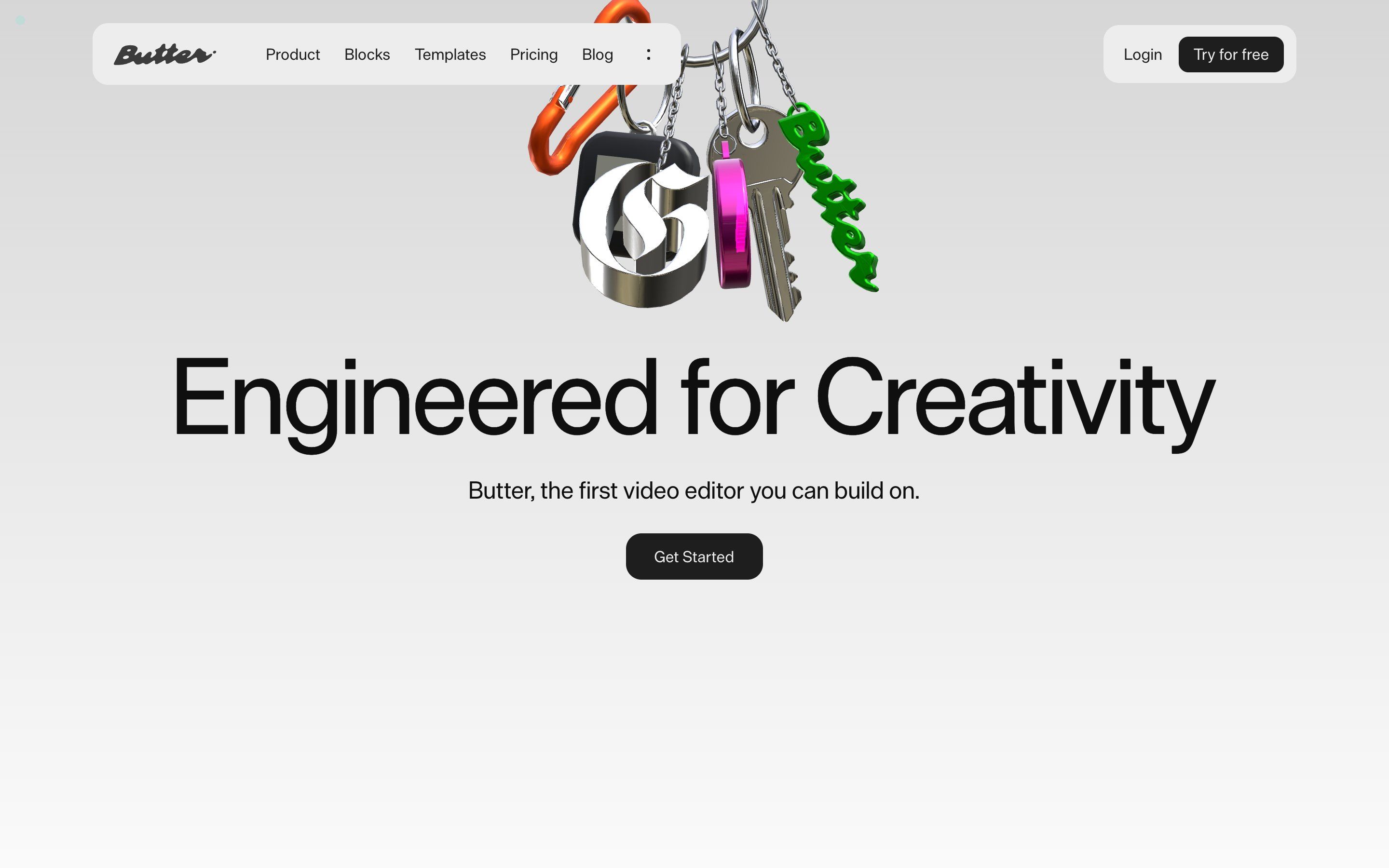
Butter is a video editor in the browser, and the site that presents it was made by ToyFight: on Awwwards it is the Site of the Day for 28 September 2026. The home opens on a grey that lightens towards the bottom, from #D6D6D6 to #FAFAFA white, and a 3D keychain with the brand’s charms hangs from the top: an orange carabiner, a key, a chrome G, the word Butter in green. Below it, huge, «Engineered for Creativity», and the line «Butter, the first video editor you can build on.». The headings are set in DieGrotesk, the text in ABC Diatype, the small labels in a monospaced face; the black is #1E1E1E, and the code holds a small palette of signal colours, red, blue, green, yellow and pink.
Underneath there is Next.js with content from Prismic and styles in styled-components. The animations are GSAP, with ScrollTrigger, SplitText and CustomEase, and Lenis keeps the clock: GSAP’s own loop is removed and the smooth scroll drives it, on every one of its frames. The curves have names, in, out, inOut and outFast, and they are the same in CSS and in JavaScript. The keychain is a Three.js scene loaded separately, and a few places use Rive animations. We take it apart in three moments, with one demo rebuilt from scratch for each, for an invented editor we called Spool: texts, drawings, numbers and code are ours. From the site we took the idea and, where we say so, the timings.
The sentence and the timeline
After the client logos comes a sentence: «Butter is the first video editor where creatives can build and remix custom design tools right on timeline.». Between the words sit five tiles, as small as letters, and below them the timeline of an editor.
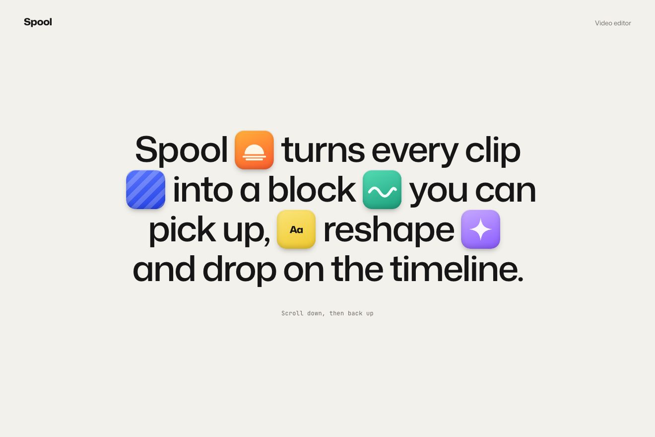
On the site the tiles really live in the timeline: the sentence only holds five empty squares of 1 em, with margins of 0.1 and 0.2 em, 1.15 em from tablets up. A function measures the square and the place in the timeline and carries the tile into the sentence with a scale, one width divided by the other, and a shift between the two centres. Then the direction decides: while the timeline is on screen, scrolling down makes the tiles fly into it, scrolling up sends them back to the sentence. Each tile flies for 1.5 seconds of power2.inOut, 0.1 seconds after the previous one towards the timeline and 0.05 towards the sentence, and meanwhile it tilts to a random ±15° and straightens again, 0.75 seconds each half. When the sentence arrives, the first tile’s content falls from 300 px higher up with 15° of rotation, over 2 seconds. The timeline behind is a picture, 1576 px wide.
In our demo the tiles are drawn in CSS and SVG, a rising sun, blue stripes, a wave, «Aa» and a star, and the timeline is made by hand: the project’s name, a seconds ruler, empty places and an audio track. The mechanism is the same, with the site’s timings. We added the playhead, which runs along the timeline with the scroll while the timecode counts the frames, and something the site does not do: if the timeline comes on screen after a jump, by a key or a link, the tiles follow the last direction seen instead of staying put.
The word that tries effects on
Further down, the sentence «Browse curated blocks for motion graphics, kinetic type, 3D, shader effects, and beyond.» sits next to the dark panel of a library, «Library | Text Blocks», with four tiles: Inflate, Glow, Focus and Halftone.
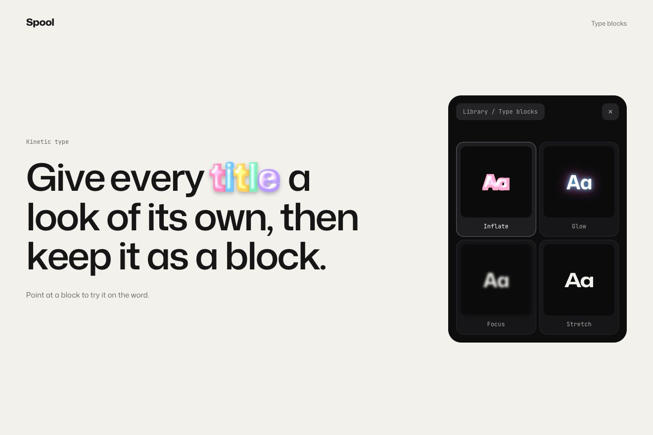
On the site, pointing at or tapping a tile changes the word «blocks», and the effect stays until another one is chosen. With Inflate the word fades and six inflated letters grow in its place, six pictures, from scale 0 with back.out(1) over 0.8 seconds, 0.02 seconds apart and from a random ±20° tilt, while the word before and the word after step aside by 0.15 em. With Glow a glow behind the word goes from scale 1 to 1.35. With Focus the sentence blurs letter by letter, in bands, up to 8 px, and only the stretch around the word stays sharp. With Halftone a white copy appears over the sentence in lighten mode, with a halftone video behind it.
In our demo the sentence is «Give every title a look of its own, then keep it as a block.» and the word is «title». The inflated letters are real letters with an SVG filter, which fattens them, turns them into a height map and lights a highlight on it; their timings and tilts are the site’s. Instead of Halftone there is Stretch: the word widens with a bounce along Mona Sans’s width axis, and the rest of the sentence narrows.
The headings that light up
Almost every heading on the site comes in the same way: word by word, first as a glow and then as text.
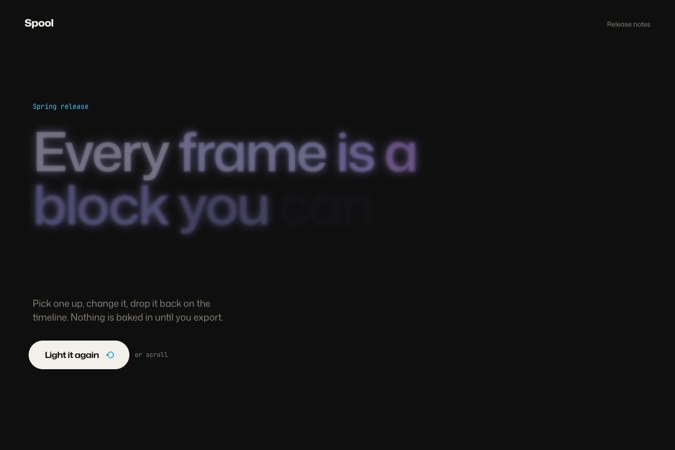
On the site the headings are split into words with SplitText. The words start with a transparent colour and a blue shadow, 5 px of #4CC7F0: only the light shows. The hue-rotate filter turns by 160° in a second, and from 0.3 seconds each word takes its colour over two thirds of a second, 0.05 seconds after the previous one (the last three a little further apart), while the shadow moves towards a transparent red. Headings without the glow rise by 60% instead, on the outFast curve; with reduced motion they simply appear.
In our demo the page is dark, because neon shows better there, and the headings are Spool’s release notes. On a warm white, though, 160° of hue turn into a green: that is why each word has its own colour turn, which goes back to zero while the word fills in, so the white comes out clean. A heading lights up again every time it comes back up from below.
The other details
The ticker of client logos runs under the hero; the sentence «Make blocks your own with intuitive dials, sliders, prompts, and even with code.» has small icons inside the text. The editor’s features sit on four cards, Import, Edit, Enhance and Ship, and in three tabs, Remix, Describe and Code. The template gallery pins and slides sideways by its whole width minus the screen, tied to the scroll; a video card grows from 0.8 to full size as it rises. In one frame the same ad switches from one language to another, RYGGSÄCK, リュックサック, and at the end the brand stories carry a big stretched «Bold Visions» in pink and blue.
Where it stumbles
For a presentation page it is heavy: about 4 MB of scripts in 49 files, between React, Three.js for the keychain, Rive and GSAP.
In the Awwwards developer vote, accessibility is the lowest mark, 6.6 out of 10, against 8.2 for the animations.
And on a first visit the cookie banner, dark and with five switches, covers the bottom of the screen just as the animations begin.
What we take away
A thing can live in one place and show up in another: measure the two places and move it with a transform, without touching the HTML. And the direction of the scroll is information: letting things decide where to be depending on whether you go down or up gives a page a gesture that feels like a choice.
The effects
- The sentence and the timelineFive coloured tiles sit in the squares of a sentence; once the timeline is on screen, scrolling down drops them into it one after another, and scrolling back up sends them back into the sentence, tilting as they fly.Free
- Effect-switching wordA sentence and a panel of type blocks: point at a block and one word of the sentence tries that effect on (inflated letters, a glow, the rest out of focus, the word widening) and keeps it until another one is chosen.Free
- Neon headingsHeadings appear word by word as a blue glow with no letters, turning round the colour wheel; then they fill in with their colour while the glow fades.Free