bleibtgleich, by Maksym Bleibtgleich
bleibtgleich, how it’s made: its name means «stays the same» and it never keeps still
Maksym Bleibtgleich’s portfolio, a designer and developer from Kyiv, is white, black and almost only type. Yet every piece moves: the logo is born from a rectangle, lines come out of the ink, the work spins on a globe. We take it apart with three demos rebuilt from scratch.
The palette
- #FFFFFFbackground
- #000000text and logo
- #FF633Done of the themes: orange
- #D5312Fone of the themes: red
- #919E44one of the themes: olive
- #BEC1CAone of the themes: grey
Tap a colour to copy its code.
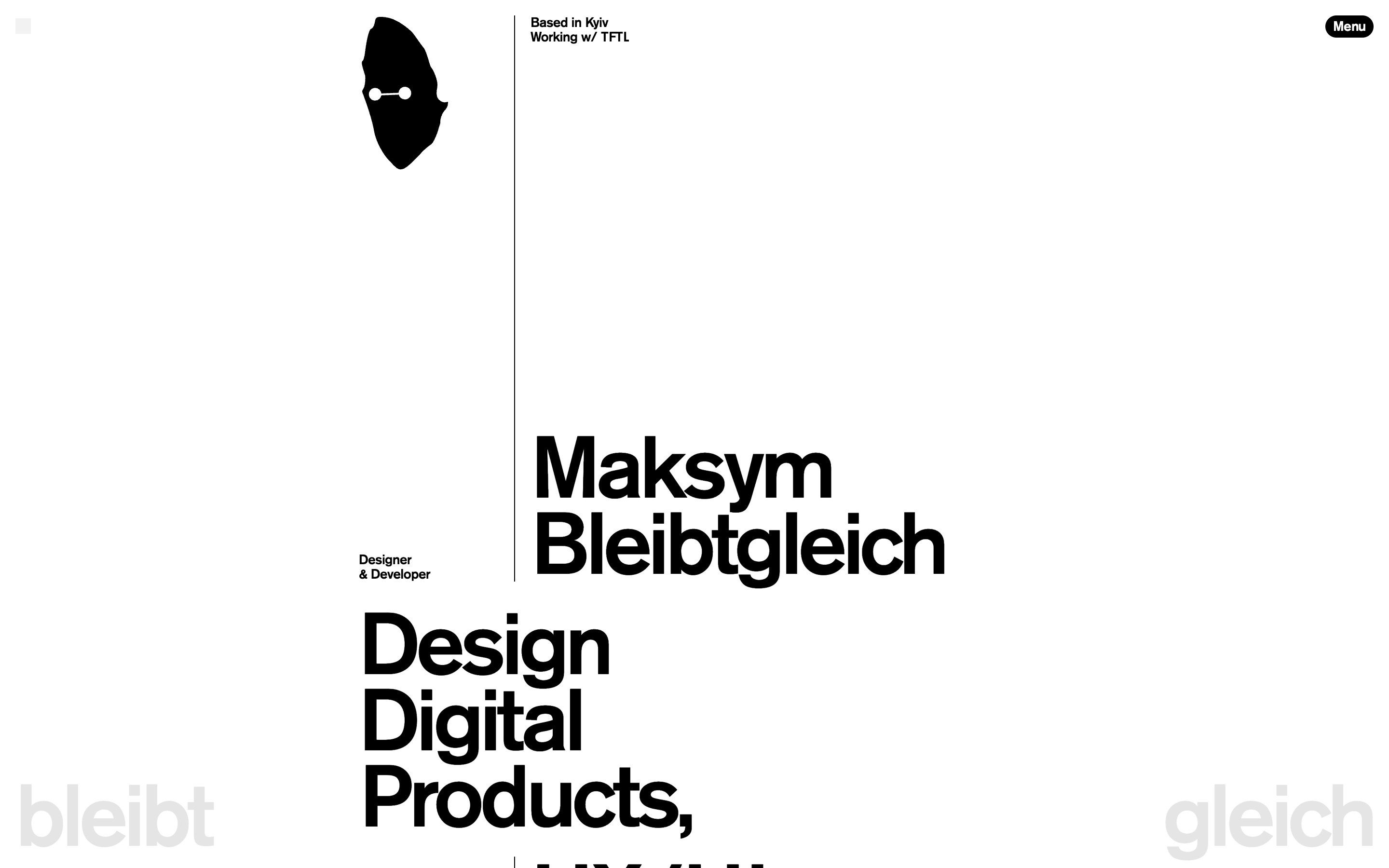
bleibtgleich is the portfolio of Maksym Bleibtgleich, an interface designer and creative developer working from Kyiv. In German the name means «stays the same», and it is a nice irony: the page is white, the text is black, there is a single typeface, Akzidenz-Grotesk, and yet not one element arrives standing still.
It is the fourth version of the site, released at the end of July 2026. Underneath there is Webflow, with GSAP and six of its plugins, Lenis for smooth scrolling, Barba for page transitions, Three.js for the 3D and even a WebSocket connection, which we get to later. In the browser console the author thanks the people whose snippets were the starting point for some effects: a rare and fair gesture.
Here we take it apart in three moments. For each one there is a demo rebuilt from scratch with our own graphics: from the site we took the idea and the rhythm, never the code or the images.
The loader that becomes a logo
The page starts grey and empty. At the bottom left a number climbs from zero to a hundred, while a thin rule comes down from the top and splits the screen into two columns. The number takes two seconds, the rule four: they arrive staggered, with the same soft curve in and out.
At a hundred the number leaves and three things happen together. The two corner buttons, the grid and the menu, arrive diagonally from off screen. The logo is born: first it is a black 95 by 160 rectangle revealed from the top, then the rectangle bends into the silhouette of a head. And the lines of the name and the headline appear as blurry black blots that tighten until they become letters.
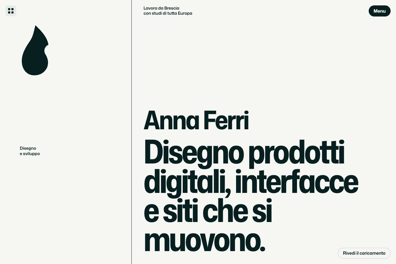
Our version keeps the sequence and changes the material. The logo is a sprout we drew. The lines come out of the ink through one SVG filter per line: a strong blur followed by a threshold on transparency. With the blur high the line disappears completely, then sharp blots appear and tighten into letters. Starting from a rectangle is not a detail: a morph only reads if you understand where it starts.
The title that opens onto the globe
Further down there is the title of the work section, two words close to the centre of the screen. As you scroll, the title widens to the edges of the column and a globe made of the project images appears in the space between the words, laid out on a sphere. When the passage is over the title closes again and links take the place of the words.
The globe is in Three.js and the images sit on the sphere along a Fibonacci spiral: each point is turned by the golden angle from the previous one, so the sphere fills evenly with no rows and no crowded poles.
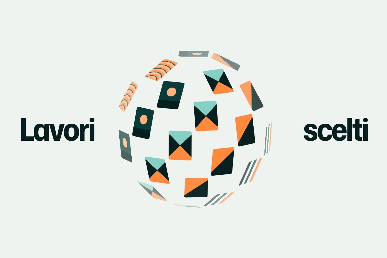
We rebuilt it without WebGL: they are covers in CSS 3D, each with its own rotateY, rotateX and translateZ. To give depth we compute on every frame how much each cover faces us and fade it as it slides towards the edge. And instead of widening the title we move the two words: it is lighter, because it does not force the browser to recalculate the page at every step.
The awards that stack up
The awards table is the most sober thing on the site: year, project, award, category. Hovering a row brings up its certificate. It opens from the bottom with a clip-path and grows from 0.9 to 1; leaving the row closes it upwards. Every certificate that opens gets a higher z-index than the previous ones, so if you sweep quickly over the table the sheets overlap for a moment, like papers thrown on a desk.
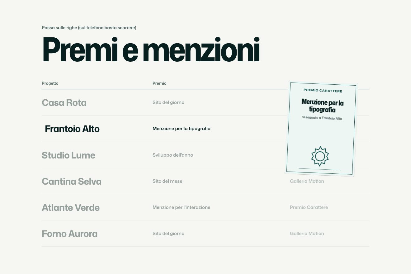
We pushed the metaphor a little: each of our certificates is slightly askew, each in its own way, and the stack shows better. And we added phones, where hover does not exist: there the certificate of the row crossing the middle of the screen opens.
The other details
The rest of the site is full of small things done with care. There are five colour themes and they also change the icon in the browser tab; when you pick one, a little totem spins around twice. Near the end there is a sentence containing the viewer’s time, hours and minutes on either side of a small image, updated every second. The author’s name stays pinned to the two bottom corners for the whole page and at the very end it tightens to the centre, leaving room for the closing notes.
Then there is the most unexpected idea. On desktop you see the cursors of the other visitors moving on the same page, and pressing the / key you can write a message that appears next to your cursor for a few seconds. It needs a server always on to pass the positions around: that is the WebSocket we mentioned.
Where it stumbles
The loader asks for about five seconds on the first visit before you can read. The site shows it once per visit, and after that page transitions are quick, but for someone arriving from a link it is a wait.
The most spectacular piece, the globe, does not exist on phones: below 991 pixels wide the code does not even create it and shows a list sliding sideways instead. It is a sensible choice for the battery, but whoever looks at the site on a phone misses the best moment.
And the certificates only respond to the mouse: on a touch screen the table stays a table. Finally the weight: jQuery, Webflow, GSAP with six plugins, Barba, Lenis, Three.js and the WebSocket library, for a home page made almost only of words.
What we take away
An all-type site can be very rich in motion, as long as the motion is consistent: here almost everything comes from a rectangle, a mask or a blur, and by the third time you recognise it. Two ideas we keep close. A morph should start from a simple shape, so you see the transformation. And an entrance can be a material, ink coming into focus, rather than a direction.
The effects
- The loader that becomes a logoA count up to a hundred, a rule that grows, then a rectangle that is revealed and turns into the logo while the lines emerge from the ink.Free
- The globe of coversAs you scroll, the two words of the title open towards the edges and a spinning globe of covers grows between them, made with CSS 3D only.Lifetime
- Stacking certificatesA list of awards: hovering the rows, each certificate opens from the bottom and lands on top of the previous one, slightly askew, like papers on a desk.Lifetime