Grids S03, by Obys
Grids S03, how it’s made: a course on grids that assembles before your eyes
The site of the third season of Obys’s course on grids: the word GRIDS made of rectangles, bending under a lens, photos that turn into squared paper, columns that assemble as you scroll. We take it apart with three demos rebuilt from scratch.
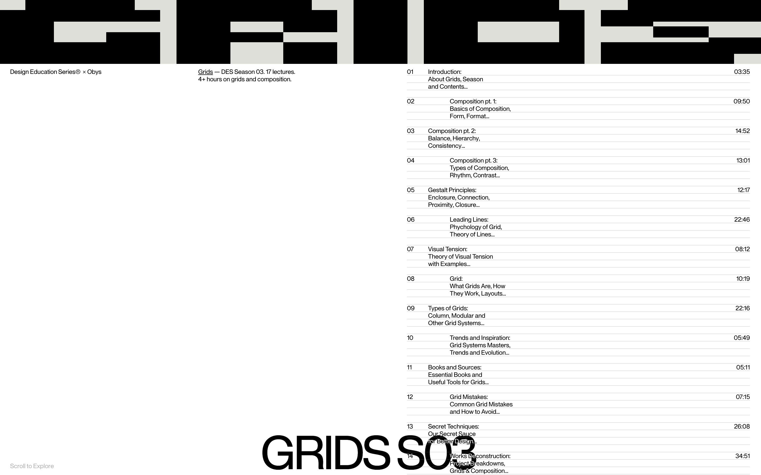
The palette
- #FFFFFFpage
- #000000ink
- #DEDFD9column grey
- #E1E1E1sheet ruling
Tap a colour to copy its code.
Grids S03 is the site of the third season of Obys’s Design Education Series, a paid course on grids and composition: seventeen lectures, more than four hours. The first Grids came out in 2021 and, the site says, more than 600,000 designers visited it; this one continues it, and does what it teaches.
The page is white, the ink black, and there is a single warm grey, #DEDFD9; hairline rules, black-and-white fashion and architecture photographs, one typeface, the house Obys Sans, always in plain regular. Underneath: Vite, GSAP with ScrollTrigger, Lenis with lerp 0.1, and OGL for WebGL. Every measurement is written in pixels on a 1440-wide design and scaled with the window’s width, and the shaders are full of long comments explaining every choice, like a notebook. We take it apart in three moments, with a demo rebuilt from scratch for each: letters, pictures, texts, colours and code are our own. From the site we took the idea and the timing.
The modular word
On opening the screen fills with black rectangles on a grey ground, and after a moment you realise they are the letters of GRIDS. An invisible lens tours the corners and deforms them: some widen, others squeeze, the rows bend. Then the word slides up and becomes a band; scrolling, the band narrows into a vertical strip on the left edge.
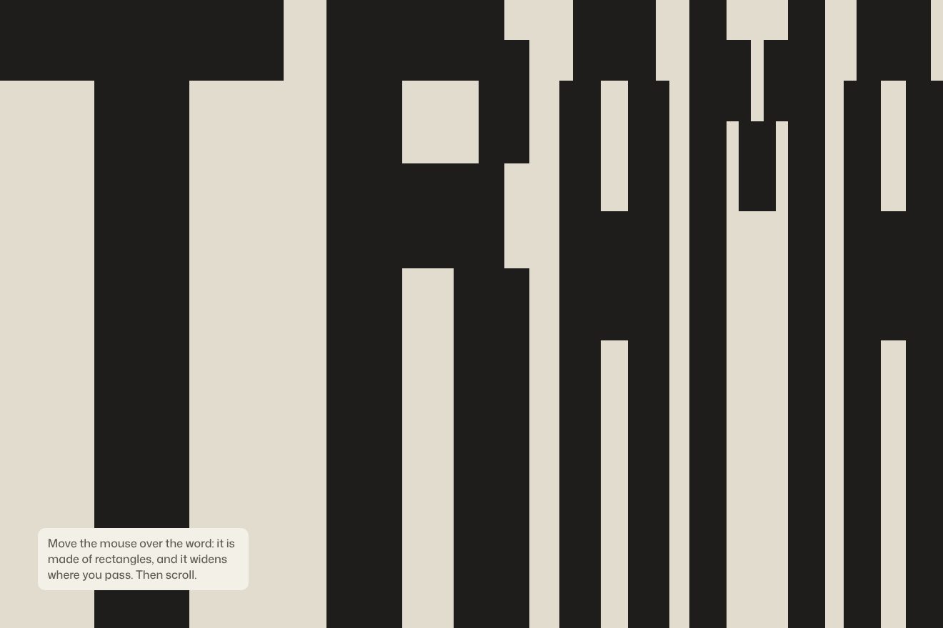
The alphabet is drawn by hand: GRIDS is twenty-three rectangles in a 1296 by 273 box, with stems 92 wide and bars 43 or 49 tall. While loading, the top edge of every letter rises from the bottom of the screen to the top in 1.1 seconds, with power2.out; meanwhile a focus tours three corners, in 0.84-second legs. On every frame each letter takes its design width multiplied by a factor, never below 0.15, that grows with the distance from the focus: far letters widen and near ones squeeze. The rows bend along a power curve around the focus’s height. Finally the word retreats into a band 121 pixels tall on the 1440 design, in 1.2 seconds with power3.inOut. Scrolling, with scrub 0.6, the band goes from full width to 90 pixels and from short to full screen: the rectangles line up again in the new size, and the words GRIDS and S03 move to the two top corners.
In our demo the alphabet is ours, the word is TRAMA (weave), on ten rows, with stems three wide and bars two tall. The lens follows the pointer and does the opposite of the site: it widens what is near it. The rows bend along a curve that adds up a bell of density around the pointer, so they never cross; scrolling, the band retreats into a header at the same speed as the page. On a phone the lens tours by itself.
Squared paper under the photo
The photographs sit on a grid of blocks, each with its number, the title and the length of a lecture. Passing over them, under the hand the photo opens in a window with a trembling edge, and underneath there is a white sheet ruled with the page’s grid; around it the photo ripples like water.
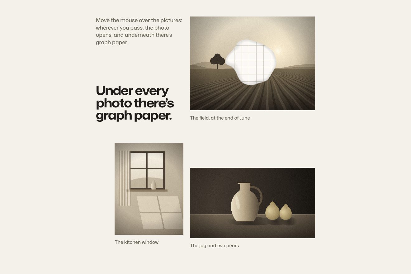
On the site there is a single canvas as big as the screen, and every photo is an OGL plane placed where the image sits in the page and moved with Lenis’s scrolling; the real image loses its src. A photo nobody touches costs a single texture read. With the pointer on it, in 0.3 seconds with power2.out, sixteen drops come into play: the one under the hand, 96 by 0.62 pixels across, and a trail that leaves one every 10 pixels, which swells in 0.22 seconds and fades in 1.5. They all add up into a field cut at 1, after warping the coordinates with two turns of noise 105 pixels wide that move the edge by up to 44. Inside the cut there is the sheet: white, with #E1E1E1 rules on whole squares, the ones closest to 20 pixels, worked out for each of the two axes. Outside, every drop sends a ring riding out at 300 pixels per second, bending the photo by up to 26 pixels.
Our demo shows three pictures drawn by us on a canvas, each in a small WebGL of its own, with 24-pixel squares and a thread of shadow just inside the cut, which puts the sheet under the photo. The water is a wave inside a bell running at 260 pixels per second. With a finger, a tap opens a hole that closes by itself.
A grid that assembles itself
Further on the course becomes a scene: four columns start as a black strip at the top, come down to the bottom, separate and squeeze, while at the bottom the captions “4-Column Grid”, “10 px Gutter”, “20 px Margin” go by. At the top left a list of steps marks where you are.
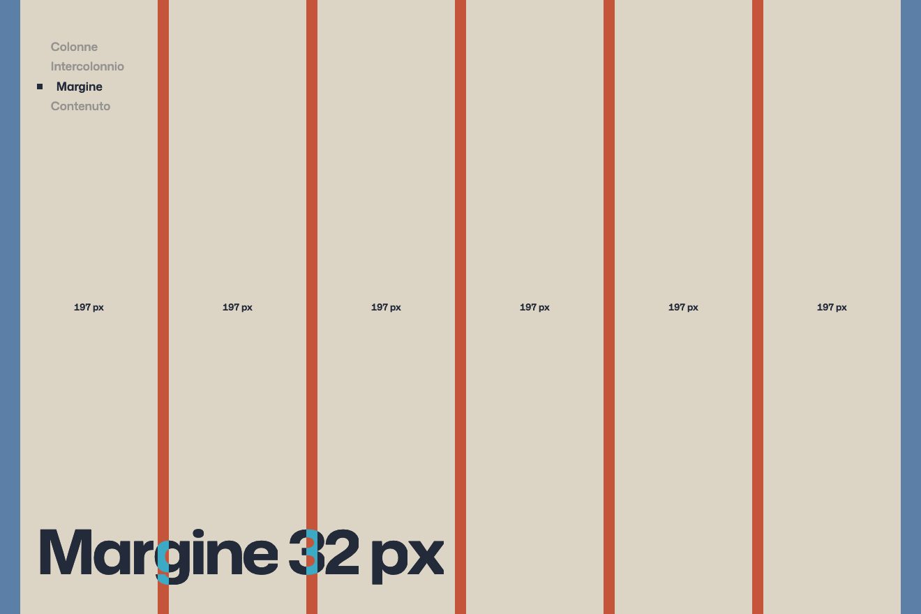
The section is 5.35 screens tall and the stage holds still. The columns are 320 pixels wide and sit at 110 plus 330 times their index, on the 1440 design; as they grow they go from black to the ground’s grey. The steps’ dot slides from one to the next in 0.7 seconds with power2.inOut, the 90-pixel captions rise letter by letter out of their mask, and the columns carry the numbers 01 to 04.
In our demo there are six columns, with a 16-pixel gutter and a 32-pixel margin; on a phone four, 12 and 16. Each column shows its width, which drops as the grid assembles, and the labels are white in difference, so they read on black and on light. And there is a fourth move: the columns fade into guides and a title, a picture and two text blocks fall into them.
The other details
The first screen is the course index: seventeen lectures with a number, a three-line title and the length, on a table ruled every 14 pixels, with odd and even rows indented differently; every line rises out of its mask, and hovering a row lights it up. The block photos open from their centre, from a 22% crop on every side down to zero, in 2.2 seconds with expo.out, and inside the frame they move slower than the page. Then an interlude writes GRIDS ARE JUST TOOLS and, further down, POWERFUL, with black squares that fall, push, roll and grow, and letters thrown with hand-picked speeds and spins, under gravity. At the end the word fills the screen again, with the lens following the pointer. And scroll restoration is turned off before the first paint, so a reload starts from the top without a flash.
Where it stumbles
Below 1200 pixels wide, or on a touch screen, the site stops and says it is designed for desktop: no phones, no tablets, no narrow windows.
The reason is in how it is built: every measurement is in pixels on a 1440 design, the columns sit at 110, 440, 770 and 1100, and everything is scaled. The composition is perfect, but it does not reflow: a little odd for a site that teaches grids, which exist precisely to adapt.
Whoever asked the system to reduce motion sees everything the same: the loader, the lens and the interlude ignore it. And without JavaScript the page is empty, because the scripts build the content.
What we take away
An alphabet made of rectangles can be stretched any way you like and stays readable: it is the simplest way to have a word that moves without loading a typeface. And a lesson can become a scene: columns assembling before your eyes explain a grid better than any diagram.
The effects
- The modular wordA word drawn with twenty rectangles and stretched to fill the screen: a lens follows the pointer and where it passes the letters widen and the rows grow taller. Scrolling, the word retreats into a header.Free
- Squared paper under the photoThree real photos in WebGL: where the pointer passes the photo opens in a hole with a trembling edge, underneath there is white squared paper, and around it the photo ripples like water.Free
- A grid that assembles itselfAs you scroll, six columns come down from the top, separate, squeeze inside the margins and at the end a title, a picture and text fall into them; each column shows its width, which changes as the grid assembles.Free