dkton, by Studio Barry
dkton, how it’s made: a site to play, even with the sound off
The portfolio of Dominik Kostolnik, who does sound for film, designed by Studio Barry: a headline that lights up as if under a torch, services set like mixer faders, a footer you pluck like a harp. We take it apart with three demos rebuilt from scratch.
The palette
- #000000background
- #FFFFFFtext
- #FFB800brand amber
- #FF9500capsule orange
- #F7DDB3cream
- #A67EFFmixer violet
- #FF4337mixer red
Tap a colour to copy its code.
dkton is the site of Dominik Kostolnik, who records location sound, designs sound and mixes for film, advertising and animation in Austria. It is a single page in German, split into Intro, Leistungen, Projekte and FAQ, designed by Studio Barry.
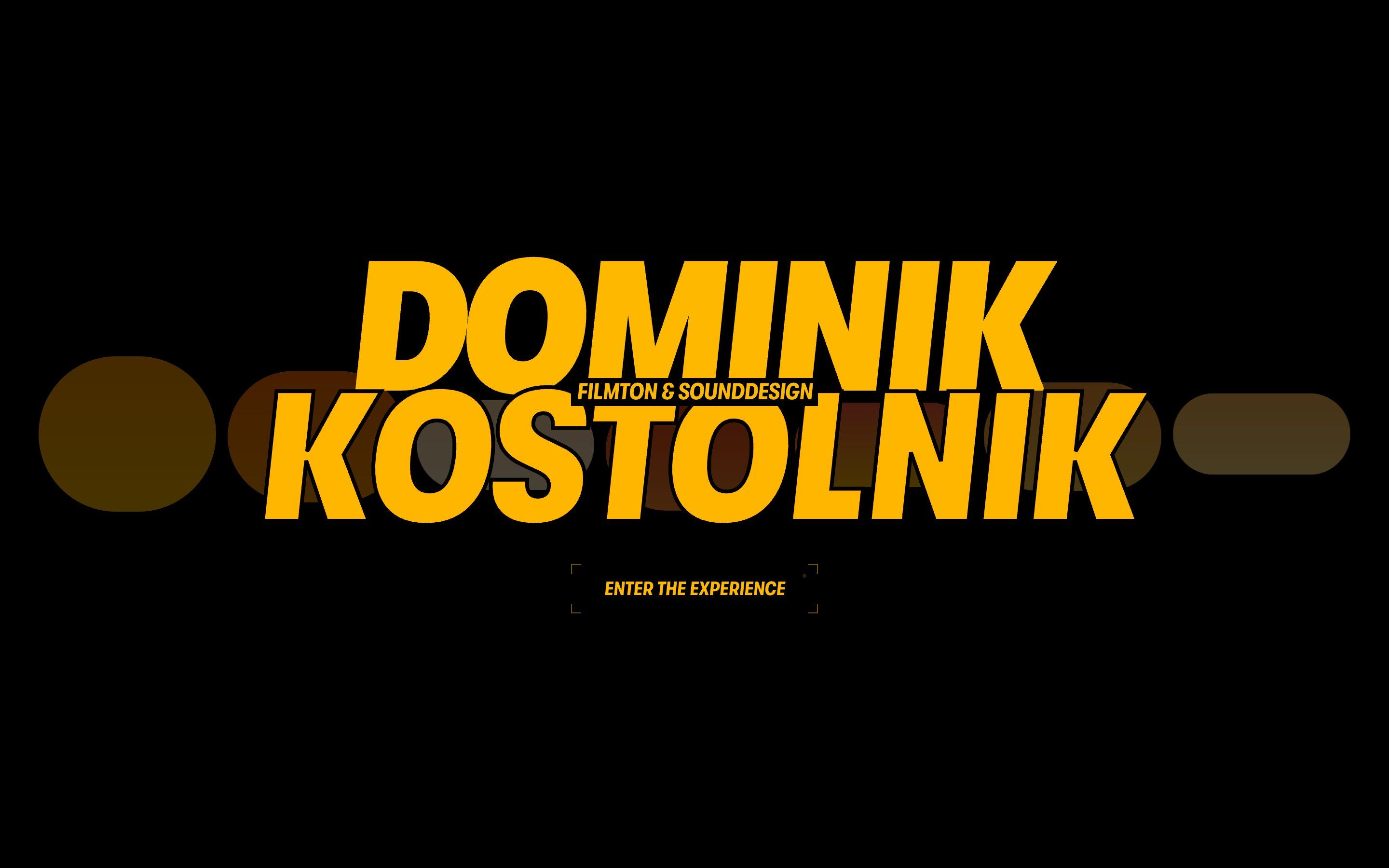
It feels like a cinema at night: solid black, an amber, #FFB800, with warm gradients, and white. Headlines are set in GT Walsheim Condensed Black, oblique and uppercase, stretched to fill the width; labels are in Geist Mono, between square brackets. And every piece of the page is a sound metaphor you can play: the first screen is a spectrum analyser, the headline lights up under a torch, the services are mixer faders, the showreel is seen through a level meter, and at the bottom there is a harp.
At the entrance a screen asks whether to come in with sound or without. With sound almost everything plays, through Howler, an analyser and a WebAudio synth; without, every effect still works, and that is how we studied it. Underneath there is Webflow with jQuery and twenty-six hand-written modules served by Slater, GSAP 3.15 with ScrollTrigger, SplitText and CustomEase, and Lenis 1.3 tied to GSAP’s ticker. Howler and the Vimeo player arrive only at the first chance, and a small manager never lets more than two videos decode at once. No WebGL: DOM, CSS with @property, SVG clipPath, canvas 2D and Web Animations. We take it apart in three moments, with a demo rebuilt from scratch for each: texts, colours, formulas and code are our own, and none of them makes a sound. From the site we took the idea and the timing.
A torch on the headline
The first screen’s headline is large, grey and readable. As soon as the mouse passes over it, it falls into shade except around the pointer, as if under a torch; the nearest letter turns amber and takes a moment to go out, so a trail of lit letters stays behind the light. With sound, every letter is a note.
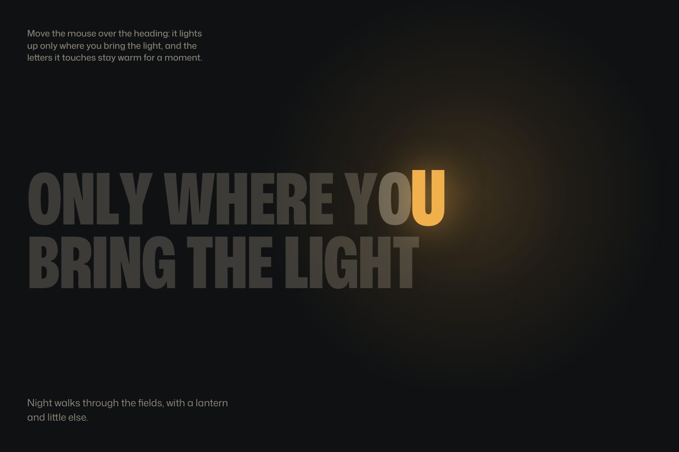
On the site the thirty-three letters are split one by one and on every frame each works out how close it is: 1 minus the distance over a 1.3 em radius, to the power of 1.7, with the vertical distance weighted 1.35 times. Brightness is the larger of 1 − 0.7 × (1 − d) × lit and the letter’s warmth; lit rises towards 1 by 0.18 per frame when the pointer is inside and goes back to 0 by 0.045 when it leaves. The nearest letter takes warmth 1, which drops by 2.6 per second: the colour moves towards amber, the scale reaches 1.12 and an amber text-shadow appears. On a phone a fake pointer crosses the first line during the first half of the section’s scroll and the second line during the second.
In our demo the headline sits on a night background with a lantern light, and behind it a pool of light follows the same path. The radius is 1.5 em, letters in the dark stay at 20%, warmth drops by 2.2 per second. On a phone the section is taller than the screen and scrolling carries the light over every line, one after the other, jumping at each line break.
Dose faders
In the services section the three disciplines, Originalton, Sounddesign and Mischung, are three full-width rows, and each one is a fader: a coloured band, violet, red and amber, stretches from the left, and inside the band the same word is dark, so the lettering inverts right at the edge.
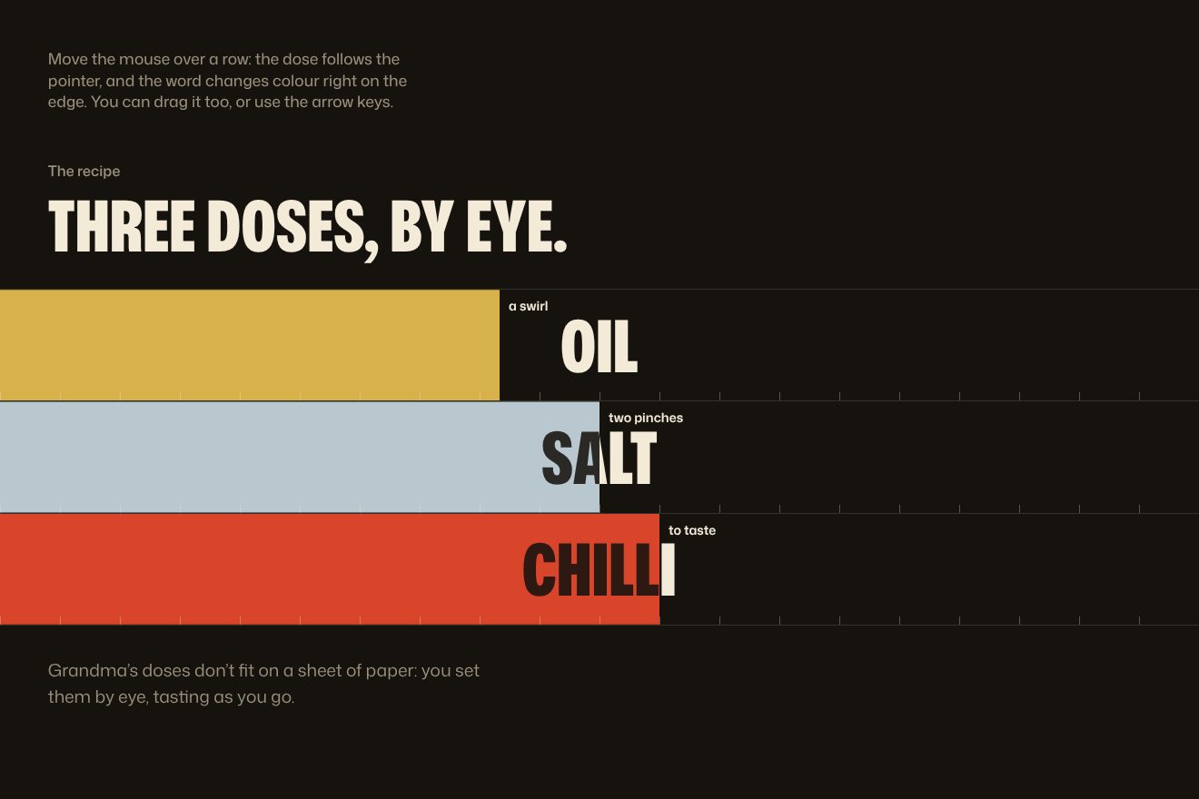
The band is cut with clip-path, inset from the right by whatever the level is missing, and inside it there is a copy of the title in black at 82%. When the list is 45% visible, each level rises from 0 to its rest, 0.62, 0.52 and 0.58, along a damped spring written in closed form, with damping 0.62 and just over one oscillation in 1.7 seconds, one row every 0.26 seconds; the dark copy slides sideways with the same spring. With the mouse on it the level follows the pointer, with an interpolation of 0.09 per frame, and passes through twenty-two detents, each with its click. The title turns into a ticker that runs faster the higher the level, and while dragging the pointer becomes a ring with two marks at its sides, which light up on the side you are moving towards.
Our demo is a recipe: oil, salt and chilli. The spring is a real simulation, soft on entry and stiff when following the pointer; at the edge the dose is written in words, from “un filo” (a drizzle) to “troppo” (too much), and at the foot of each row there is a twenty-notch scale. It can be dragged with a finger, and every row is a slider for the keyboard and for screen readers.
Strings to pluck
At the bottom of the page, behind the huge name and the links, there is an instrument: a row of thin vertical strings. Crossing them with the pointer makes them vibrate, they lean towards the hand and an amber trail stays behind. Above it, a line invites you to click and play.
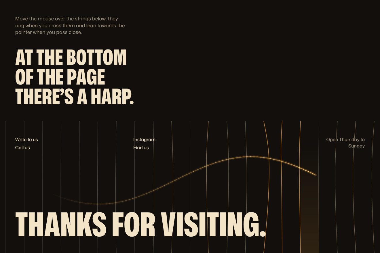
On the site it is a 2D canvas: one string per note cell, at 20% opacity. Crossing one plucks it, with an amplitude of up to 26 pixels and a frequency of 5 plus 0.85 times its index, in Hz, and the string is drawn as a sine arc. Strings near the pointer lean towards it along a bell 140 pixels wide. The trail is a blurred amber line that leaves prints for fourteen seconds, the cell under the pointer lights up from below, a click opens a ring that grows from 6 to 96 pixels, and after a second and a half a fake pointer shows the gesture. With sound, two oscillators and some noise go through a filter and a reverb.
In our demo the strings take the height of the point where you cross them and a strength that depends on speed, measured on the events’ times; each vibrates at its own frequency and fades slowly. The trail lasts a second and a half, and if nobody touches them an invisible hand brushes them now and then. On a phone they are plucked by dragging a finger sideways or with a tap.
The other details
The entrance gate is already a scene: seven capsules start as a line and rise from the centre outwards, with a kick that overshoots and settles, like a meter waking up; once you choose, they light up and glide into the first screen while the headline rises line by line. There, at rest, the capsules breathe at random levels, and hovering one tints the background with its colour. The manifesto lights up word by word with a crest of light running over the letters, thanks to a variable registered with @property, and small video windows open inside the sentence. The showreel is a section 3.4 screens tall: seven bars rise from the centre as windows onto the film and then merge into a full picture. Project cards develop like film, from desaturated and contrasty to normal, behind an edge of amber light. The amber full stop after “PROJEKTE.” and “FAQS.” jumps onto headings along a parabola, bounces and squashes. A label follows the pointer, the navigation bar draws the progress along its edge, and the pointer itself is redrawn in SVG for every state.
Where it stumbles
Before you see anything you have to choose between sound and silence: for a site about sound it makes sense, but it is a door between whoever arrives and the site, and until you choose the page stays still.
There is a lot underneath: Webflow with jQuery, twenty-six modules fetched from an external service, an analyser, a synth. For a single page that is a lot of code, and if that service slows down, so does the site.
On a phone the most playful part goes away: the faders cannot be dragged, the footer instrument disappears leaving the links and the name, and sound only plays on a computer.
What we take away
When every piece of the page is a metaphor for the same craft, the page is remembered: here sound becomes light, faders and strings. And every effect works with the volume at zero: the game is visual before it is aural.
The effects
- A torch on the headlineA headline in the dark: it lights up only around the pointer, and the nearest letter warms to lantern colour and takes half a second to cool, so a trail stays behind the light.Free
- Dose fadersThree rows like mixer faders: a coloured band stretches and inside it the same word is dark, so the word changes colour right at the edge. The doses spring up and can be set with the mouse, a finger or the keys.Free
- Strings to pluckA footer with a row of strings drawn on a canvas: crossing them with the pointer makes them vibrate, each at its own pace, they lean towards the hand and a fading trail stays behind.Free