Hearst Exhibit 2026, by OSMOS, HearstCC, Edoardo Lunardi, Daniel Velasquez, Marjoe Bacus
Hearst Exhibit 2026, how it’s made: the photo that folds like paper, the gallery that becomes a row of pages and the signature that writes itself
The site of the ELLE and Esquire photography exhibition treats every picture like a real print: as the mouse passes the paper lifts, on click it folds from the corner and flies to the middle turning like a page, and when the grid becomes a row every photo arrives turning over. Before all that, the title comes in piece by piece and the word «and» writes itself by hand. We take it apart with three demos rebuilt from scratch.
The palette
- #000000the black of the loader and of the menu with the two covers
- #252525the graphite of the ELLE gallery
- #7D7676the warm grey of the large logo and of «Scroll to explore» on ELLE
- #E3E3E3the paper grey of the Esquire gallery
- #707070the grey of the buttons on Esquire
- #FFFFFFthe white of the grid and of the text on black
Tap a colour to copy its code.
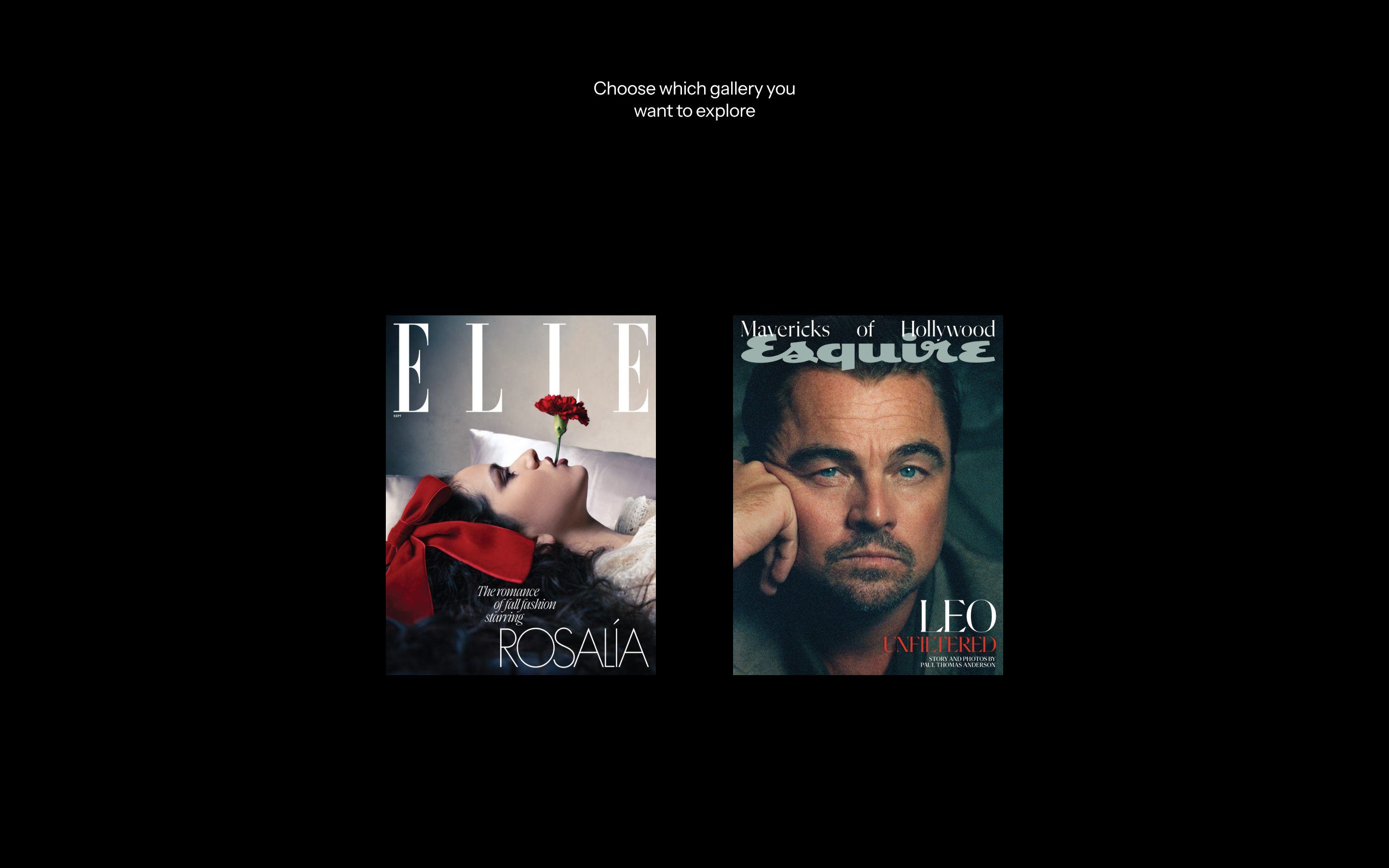
Hearst Exhibit 2026 is the online version of a photography exhibition by Hearst Galleries: two shows in one, «ELLE: The New Hollywood» and «Esquire Goes to Hollywood», with Hollywood photographs from the archives of two magazines from the same publisher, and forty years of ELLE to celebrate. It opens on a black screen, with a title in a hairline serif arriving one piece at a time, «The Elle and Esquire Hollywood», and the word «and» doesn’t come in like the others: it writes itself, by hand, like a signature. Then twenty-one photographs spiral out of the centre, turning like sheets, and make way for two covers: you choose which magazine to enter. Each magazine has its own colour. ELLE is graphite, #252525, with the large logo in a warm grey, #7D7676; Esquire is paper grey, #E3E3E3, with buttons in #707070. The loader and the menu are black, the grid white. The large titles are set in Ivy Presto Headline Thin, with an Ivy Presto Display italic for words like «The New», the headings in Safira March, the text in ABC Arizona and the buttons in Instrument Sans. At the bottom of the choice, a line says where the show can be seen for real: «As seen in the Hearst Tower, located in New York City». It was Site of the Day on Awwwards on 2 August 2026, with 7.21 from the jury, and took the developer award, 7.46, with 8 for animations; the award page credits OSMOS, HearstCC, Edoardo Lunardi, Daniel Velasquez and Marjoe Bacus. The site itself signs nothing: it has no footer and no credits page.
Underneath there is Next.js 16.1.4 built with Turbopack and React 19.3 in a canary version, with the React Compiler on. The moving photographs are three.js r182 written with React Three Fiber 9.5.0, in a single full-screen canvas into which every component of the page sends its shapes through a «tunnel» (the tunnel-rat library). GSAP 3.14.2 is there, but does little: it splits the text with SplitText and moves a few numbers in the shaders. Almost all the movement on the page is done with Motion, the library once called Framer Motion, with its layout animations and exits that wait to finish before the new thing comes in. Scrolling is not Lenis: the page is locked to the height of the screen and a small hand-written engine follows the wheel with a factor of 0.1, touch with twice the force. The house curves are three, written as numbers: quart, [.77, 0, .18, 1], which starts slow, runs and arrives slow; sine, [.45, .05, .55, .95]; and cubic, [.65, .05, .36, 1]. There is also a switch that builds a second version of the site, «simple», without WebGL and all in Helvetica; the full one is the one online.
The photographs here are not pictures to look at but prints to touch. We take it apart in three moments, with a demo rebuilt from scratch for each. The text, the brands, the photos and the code are ours; from the site we took the ideas and, where we say so, the numbers.
The photo that lifts like paper and flies to the middle
In the gallery, when the mouse enters a photograph, the photograph becomes a sheet. Under the pointer the paper rises a little, with a ripple circling around it, and the faster the mouse goes the more the paper moves; when the mouse leaves, the sheet goes flat again. On click the photo comes off the grid and flies to the middle, where the large view opens, and on the way it folds: a wave starts from the bottom left corner, crosses the sheet diagonally, and the whole sheet turns like the page of a book, arriving upright on the other side.
The real photo stays an img on the page. When the mouse enters it, a plane of 60 by 60 segments is laid exactly over it in the fixed canvas above the gallery, measured with getBoundingClientRect, and that plane is the paper. On hover the pointer is followed with a factor of 0.05, and its speed becomes a force from 0 to 1, eased in with 0.18 and let go with 0.12. In the vertex shader the paper rises around the pointer with smoothstep(0.6, 0.0, distance) raised to 1.8, a wave sin(distance · 12 + time · 3) at 20% and a ripple with a radius of 0.35. Small photos bend less: the force is multiplied by the photo’s short side divided by the screen’s, times 2.2, kept between 0.4 and 1. The plane disappears 240 milliseconds after the mouse leaves. On click the journey starts, lasting 1.6 seconds on the quart curve: the fold advances with a sine from 0 to 1, the fold line runs diagonally up to 2.2 times the side, 0.85 wide, and behind it three ripples settle, 0.18, 0.12 and 0.08 high. The amplitude rises in the first 40% of the journey and falls in the last 40%. And on top of everything the sheet makes half a turn, but each column starts a little after the one to its left, smoothstep(uv.x · 0.3, 0.8 + uv.x · 0.2, fold): the left edge rises before the right and the sheet curls. On the back the image coordinates are flipped, so the photo lands the right way round.
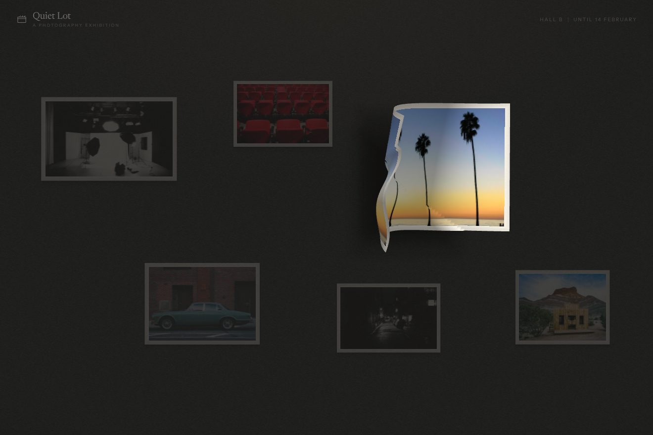
In our demo the wall belongs to an invented exhibition, Quiet Lot: six real prints with an ivory paper border, hung loosely on a warm graphite with grain, each with its wall label, a photo studio with umbrellas, the red seats of a cinema, palms at sunset, a green sedan in front of a warehouse, a wet alley at night and the false fronts of an old set in the desert. It is hand-written WebGL, with no libraries, with a plane of 60 by 60 segments for each print. From the site come the plane laid over the photo, the lift with the smoothstep from 0.6, the power of 1.8, the wave and the ripple with a radius of 0.35, the 0.05 follow and the force taken from the pointer speed with 0.18 and 0.12, small photos bending less, the 1.6 second journey on the quart curve, the fold from the corner with the three ripples of 0.18, 0.12 and 0.08, the 40% envelope, the page turn with the staggered columns and the flipped back, and the #252525 ground. One thing we changed: the lift on hover is two and a half times the site’s, because at its size it couldn’t be seen on the paper of a demo. Ours are the light computed on the fold, with a warm highlight where the paper rises instead of the 1% band, the two soft shadows spreading under the sheet, the print squashing for a moment on click, the room darkening and the other prints almost disappearing, the caption of the open print rising line by line out of a blur like the text of the site’s introductions, and the Close button with letters that shiver like their buttons. The halftone the site computes and throws away isn’t in ours. A drawn pointer passes over one print and opens another until the real one arrives. With reduced motion there are no folds and no flights: the print opens with a fade.
The grid that becomes a row of pages
Each magazine’s gallery is an eight-column grid, but only filled in places: the photos sit in some of the cells following a pattern that repeats every so often, and look as if they were dropped on a table. Next to each one is its number in square brackets, at a different corner. Two buttons, plus and minus, change the zoom across three levels, and the «View» switch at the top goes from the grid to a horizontal row, to be scrolled sideways. The change is the best moment of the site: the grid photos leave one after another, blurring, and the row photos arrive turning over, each like a page turning towards you.
There is no GSAP Flip here. The zoom is a Motion layout animation, 1.2 seconds on the quart curve: the photos move to their new place by themselves. The photos coming in go from blur(6px) to sharp in 0.6 seconds, one every 0.08 seconds. The view change uses an exit that waits: first all the visible photos leave, with the blur and the same stagger, and only then the row is mounted, in 2 seconds. Each photo in the row has a 16 by 16 segment WebGL plane underneath with the same fold shader, turned the other way and pushed back by 10 units: GSAP takes the fold from 0 to 1 in 1.6 seconds on sine.out, the photo comes from behind and turns over, and its transparency follows the fold, so it appears as it turns. The switch is made of four 4 pixel squares in a two by two grid: in the row view they line up in 0.8 seconds, and on hover they turn 90 degrees one after the other, 0.05 seconds apart. And the grid feels speed: scrolling fast it shrinks down to 0.96, 1 − 0.04 · min(speed / 80, 1), and at rest it returns to 1.
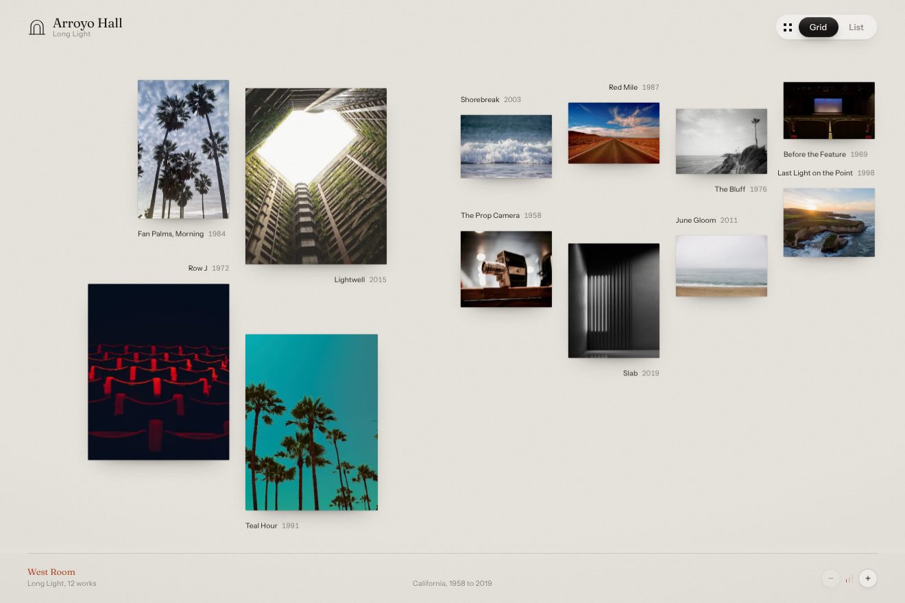
In our demo the gallery is an invented room, the West Room of Arroyo Hall, with a show about California light, «Long Light»: twelve real photos, palms, a desert road, a courtyard seen from below, waves, cliffs, an old film camera, the seats and screen of an empty cinema. The page turn here is done without WebGL, in CSS with perspective. From the site come the eight-column grid with the scattered pattern (four on phones), the three zooms rearranging in 1.2 seconds on the quart curve, photos leaving and entering with the 6 pixel blur in 0.6 seconds, 0.08 apart, the row with every photo arriving like a page turning from behind in 1.6 seconds on sine.out and appearing as it turns, the room shrinking to 0.96 when scrolling fast, and the four squares lining up in 0.8 seconds and turning 90 degrees on hover, 0.05 seconds apart. Ours are the two-sided sheet, with a paper back and the gallery stamp, the dark veil on the fold and the floor shadow that follow the page angle, the Grid and List switch as a glass pill with the dark part sliding on a spring and squashing, the grid picking the emptiest column near the one in the pattern, so it stays scattered without bunching up, the captions with title and year at a different corner for each photo instead of the bracketed number, the photo tilting on hover with a light sliding over it, and the three size notches at the bottom. While nobody touches it, the gallery changes view by itself and comes back. With reduced motion everything arrives with a fade.
The title that signs itself and the photo that only shows around the mouse
The home page loader begins with the title, one piece at a time. «The», «Elle», «Esquire», «Hollywood» appear in a serif so thin it looks engraved, and in the middle «and» writes itself stroke by stroke, like the signature at the end of a letter. A little later, on the introduction pages of each magazine, the text appears letter by letter out of a small haze, next to the signature of the magazine’s editor, and behind the words there are two cut-out photographs you cannot see: they only appear in a circle around the mouse, as if you were holding a light over a print in the dark.
Each piece of the title comes in with an opacity from 0 to 1 in 0.8 seconds on the cubic curve, one second after opening plus three tenths for each piece. The signature is an SVG drawing animated with the browser’s own animation engine: each stroke has its length, its stroke-dashoffset goes from the length to zero, and the duration is the length times 0.006 seconds, so long strokes last longer and the hand looks real; it starts at 1.6 seconds. The introduction text is split into letters, and each goes from transparent and blurred by 6 pixels to sharp in 0.2 seconds, with 0.02 seconds of delay per letter. The reveal is a single WebGL plane: the pointer is followed with 0.08, the light comes in with 0.1, and the circle has a radius of 0.28 with a 0.08 feather for ELLE and a radius of 0.1 with a 0.2 feather for Esquire, its edge made irregular by noise, about two hundredths either way. The buttons are made the same way: on hover the label is split into letters with SplitText and each letter blurs by 4 pixels, dims to 0.6 and shrinks to 0.9 before snapping back, in 0.6 seconds, 0.02 seconds apart. It is a shiver running across the word.
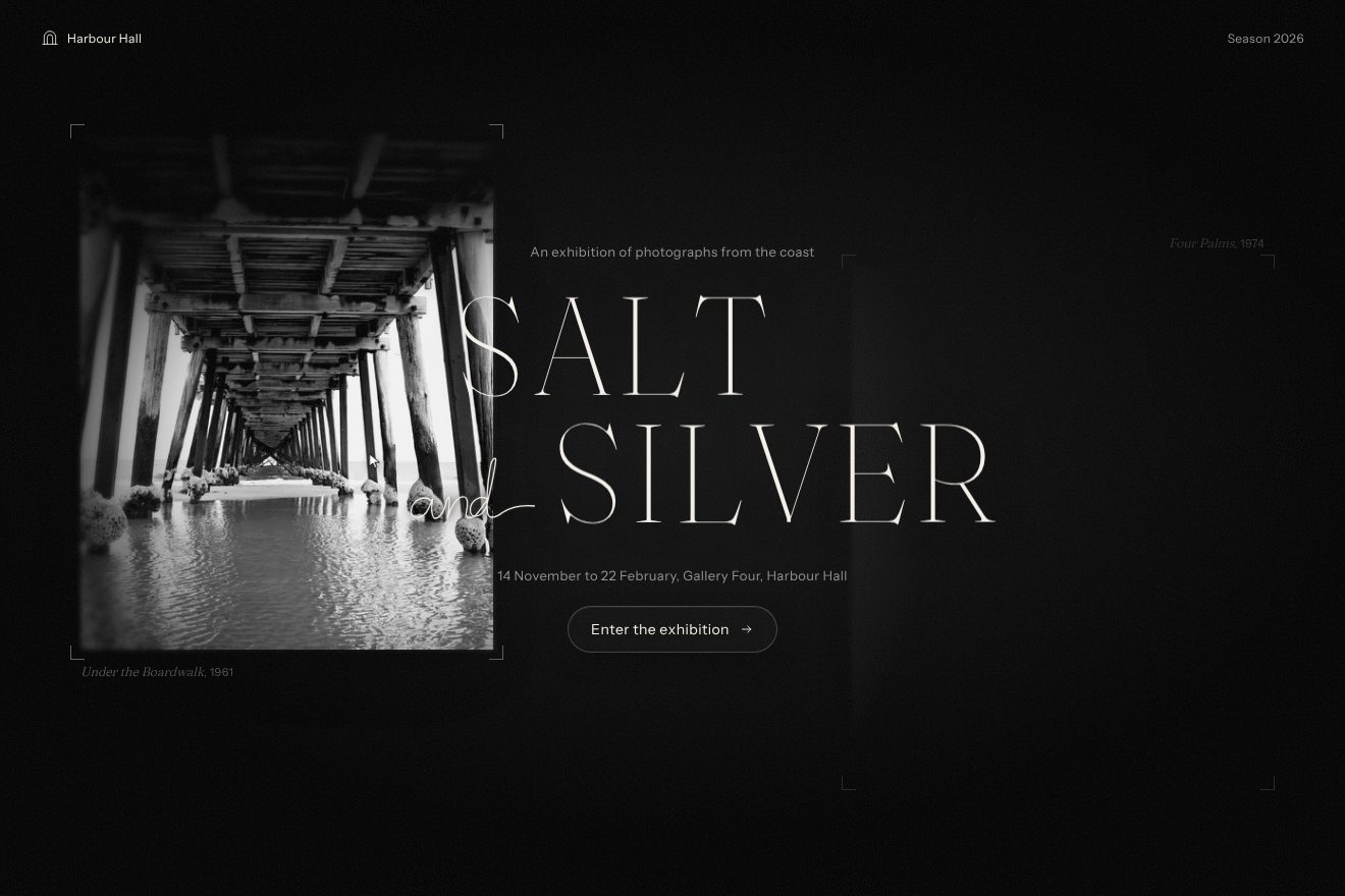
In our demo the show is «Salt and Silver», at Harbour Hall, an invented museum by the sea: the title is in Fraunces at its thinnest weight and largest optical size, the closest thing to Ivy Presto Headline Thin among free typefaces, «and» is a single italic stroke, and behind, in the dark, there are two real black and white prints, the underside of a pier and four palms, of which you only see the crop marks at the corners and the captions. From the site come the pieces of the title three tenths apart, the text arriving letter by letter out of a 6 pixel blur in 0.2 seconds, one every 0.02, the signature lasting its length times 0.006 seconds, the photos that only show in a circle around the pointer with a wide halo, the pointer followed with 0.1, the shiver of the button letters with the 4 pixel blur, the 0.6 and the 0.9 in 0.6 seconds, the black and the Instrument Sans. Ours are the pen slowing down in the curves, the weight of the title letters dropping from 300 to 100 as they come in, the crop marks lighting up when the circle passes near, the circle widening 1.7 times when you press and coming back with a small bounce, and the prints shifting a few pixels against the pointer, as if seen through glass. The circle is a CSS mask instead of the shader, and the follow is computed on real time, so it doesn’t run faster on 120 Hz screens. A drawn pointer roams the scene, presses on the pier, then on the palms and passes over the button, and the sequence starts again. With reduced motion the title and the signature are already in place and the photos arrive with a light fade.
The other details
After the title, the spiral: twenty-one photographs in WebGL, planes of 1.6 by 2 with 20 by 20 segments, each rotating along its stretch of the spiral in 6 seconds on sine.inOut, two tenths apart; at the same time it turns over, in 7 seconds, and flattens out from a strong curve, in 2 seconds, while the camera moves closer. Where the paper is lifted the shader darkens it slightly, which is the shadow the curve would cast on its own. At 4.7 seconds the choice arrives: the two covers open like pages in 1.4 seconds on sine.inOut, in opposite directions, the second four tenths after the first. Hovering a cover grows it to 1.1, the other shrinks to 0.8 and dims to 20%, and the screen background takes the magazine’s colour in 0.6 seconds. In the gallery, the header with the large logo shrinks by 40%, blurs up to 8 pixels and fades as you scroll, and «Scroll to explore» arrives on a soft spring after 1.6 seconds. In the photo view, moving from one photo to the next is a 1.6 second slide sideways on the quart curve; the other pages change with a 0.6 second fade. The cursor is a 9 pixel white dot in difference mode with a 40 pixel ring following it in 0.4 seconds, with grain inside changing every 0.15 seconds; over the photos the dot vanishes and the ring grows two and a half times.
Where it stumbles
In the paper’s fragment shader there is a complete halftone screen, 6.5 pixel dots rotated by 0.35 radians, larger where the photo is dark, revealed in a noisy circle around the pointer. It is computed for every pixel of every frame and then thrown away: the very next line puts the original colour back, and the halftone is never seen. All that remains is a diagonal band of light at 1%. Reduced motion isn’t considered anywhere: those who ask for it see the spiral, the folds, the blurs and the fake scrolling like everyone else. The home page loads 19 JavaScript files, 2.36 megabytes, 645 kilobytes compressed, and three.js with React Three Fiber alone account for 890; of the preloaded fonts, Haigrast and Ivy Presto Text, about 200 kilobytes, no component uses them. The time of the waves grows by a fixed amount every frame, so on a 120 Hz screen the paper ripples twice as fast. The sitemap and the file for search engines point to localhost:3000, the address of the developer’s own computer, and in production the console prints «rendering list» on every render of the row. And before you can choose a magazine there are about nine seconds of title and spiral, with no way to skip them. The rest holds up well: the photos are real img elements with their names, the split titles carry the whole aria-label, and the WebGL canvas is only a dress over the page, which stays usable without a mouse.
What we take away
A printed photograph has weight, thickness, a back: Hearst Exhibit tries to give them back. There is nothing fake to look at, no 3D object, only the photos as they are, but every time you touch them they behave like paper: they lift, they fold, they turn over. The trick behind it is always the same, a plane laid over a real image and bent by a shader for the length of the gesture, then removed. And the smallest lesson is in the signature: make each stroke last as long as it is, and a line drawn by a machine looks written by a hand.
The effects
- Paper fold photoA made-up photography exhibition, Quiet Lot: six real prints of film sets after everyone has gone home (an empty studio with its lights, the red seats of a cinema, palms at dusk, the false front of a western, a vintage green saloon, a wet street at night) hung on a warm #252525 wall with grain. Every print is a WebGL sheet of 60 by 60 segments: under the pointer the paper lifts and ripples, with a force that grows with the pointer's speed, a soft shadow that widens and a glint of light on the slope. A click folds the print from its corner along a diagonal with three small ripples, turns it over like a page and flies it to the middle in 1.6 s, where it opens large with its caption and a Close button; going back it makes the same journey in reverse.Free
- Exhibition galleryThe West Room of a made-up Los Angeles gallery, Arroyo Hall, showing the photography show Long Light: twelve real photographs of California (palms, bluffs, waves, desert roads, the seats and screen of a cinema, concrete, a prop camera) hung in a sparse eight-column grid on a warm white wall with grain. At the top a Grid / List pill switch, its dark thumb sliding on a spring and four small squares lining up. On the switch the photos in view leave blurring, one every 0.08 s, and in the row each one comes back turning like a page around its left edge, from behind, in 1.6 s, with the shadow of the page moving under it. Three sizes that rearrange in 1.2 s; drag or wheel to move through the room and, going fast, it shrinks to 0.96 and settles back.Free
- Exhibition openingThe masthead of a made-up photography exhibition, Salt and Silver, at a made-up museum, Harbour Hall. In a dark room with grain the title in a hairline serif comes in piece by piece, every letter from blurred to sharp while its stroke thins down, and "and" writes itself by hand like a signature, the pen slowing in the curves. Two black and white prints hang in the dark: only their crop marks and captions show, and the real photos (the underside of a pier, four palm trees) appear only inside a soft circle around the pointer, which chases it with a lag and opens wider while you press. The Enter the exhibition button shivers with blurred letters on hover.Free