Unbelievably Crap, by Liubomyr Ulytskyi
Unbelievably Crap, how it’s made: a portfolio that tears
Liubomyr Ulytskyi’s portfolio: a field of characters the pointer tears away, a gallery of photos hanging on a 3D knot, a button that refuses twice. We take it apart with three demos rebuilt from scratch.
The palette
- #E8271Cthe red of the gallery, the footer and the phone door
- #000000the home and loader background
- #FFFFFFthe second block, and text on black
- #1A1A1Athe ink of the character field
- #393939the bottom bar and text on light
- #C8C8C8the grey of the About text
Tap a colour to copy its code.
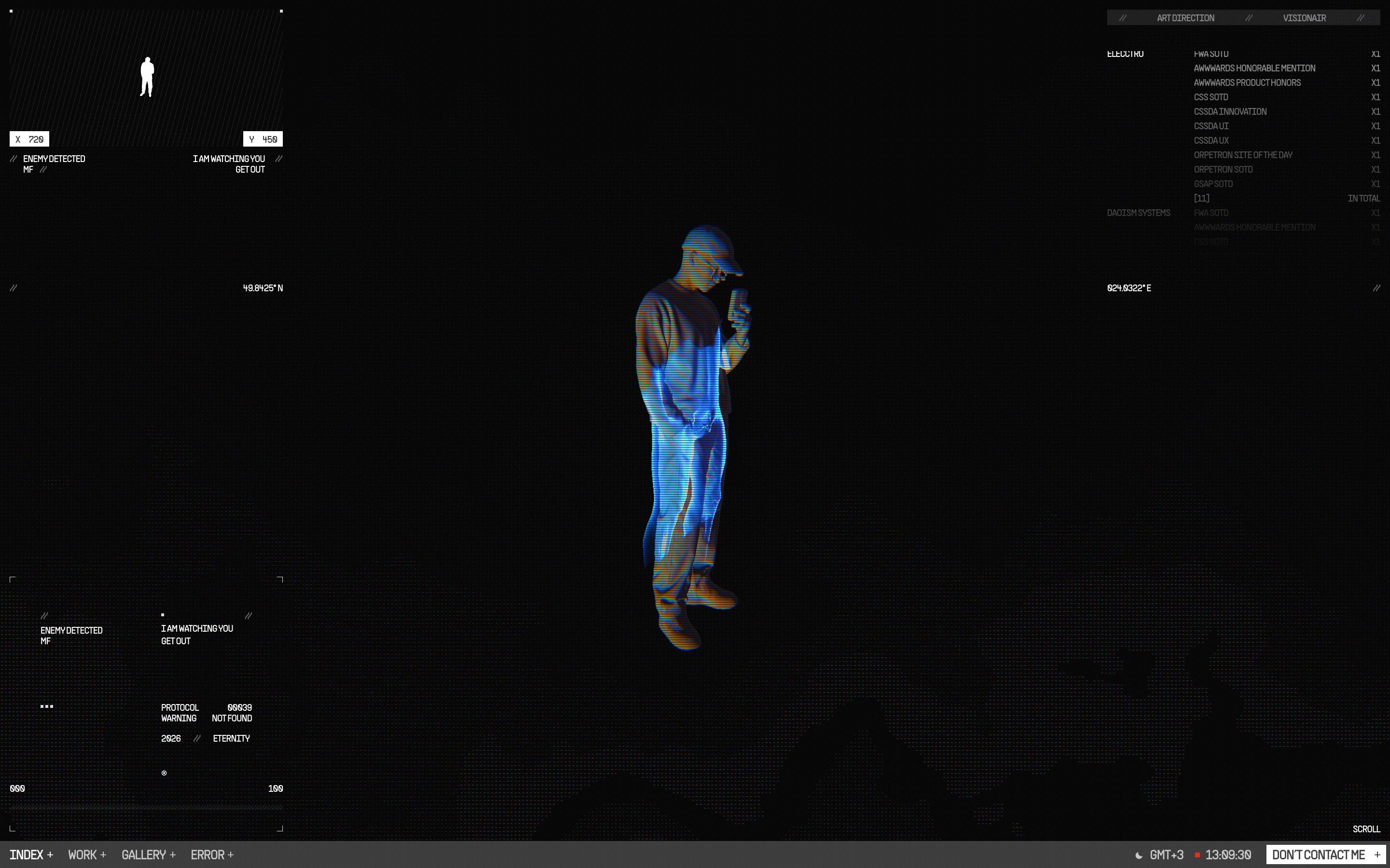
Unbelievably Crap is the portfolio of Liubomyr Ulytskyi, digital designer and art director. The name is already a statement, and the site keeps it: a black home with a scanned figure that turns as you scroll, a flat red, #E8271C, that takes over the gallery and the footer, and everywhere a video game dashboard, with a minimap where a small red square follows the pointer, its coordinates in pixels, a ticker of awards and a clock fixed on GMT+3. The typefaces are PP Supply Sans and PP Supply Mono. On a phone there is none of this: a red door says the experience is meant for a desktop, and underneath, sorry, not sorry.
Underneath there is a hand-written static site, one module per effect, and every module opens with a long comment explaining why the numbers are what they are and what was tried first. There is GSAP 3.12.5 with CustomEase and Barba for page transitions; Three.js is only used for the figure’s X-ray, which is otherwise hand-written WebGL. No scrolling library: wheel, drag and keys fill accumulators, and the real page never scrolls. We take it apart in three moments, with a demo rebuilt from scratch for each: texts, photos, colours, numbers and code are our own. From the site we took the idea and the timing.
The character field
Under the work page, under the home’s second block, in the gallery, on the error page and on the phone door there is always the same thing: a field of characters gathering into islands, like the contour lines of a map, crawling slowly. Where the pointer passes, the characters are torn away.
On the site the cells are 4 device pixels and the ramp runs through ten characters from the space to the at sign, in a near-black grey, #1A1A1A. The density is a level of 0.67, denser at the bottom by 0.23, plus a crawling noise that moves it by 0.21, with a contrast of 4 that closes it into islands. Under the pointer there is a blob 0.075 screen heights across, lumpy (2.4 lobes, halfway between a circle and a square), and behind it a trace: up to 23 marks living 0.4 seconds, one every 0.28 radii of travel and never more often than 30 ms, ending at 55% of their size. Where they pass the density goes to zero. The edge tears because a five-octave noise is added to the distance from the mark before the threshold, the same one as the transition between the home’s two blocks, multiplied by 0.7 and wider. A comment explains why the resolution is never lowered: it is a dither, and taking pixels away takes away tones, not sharpness.
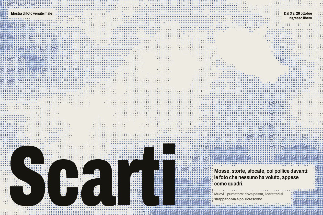
In our demo the field is the background of the poster for an invented exhibition, Scarti (Rejects), and it is blue on paper. The cells are 9 px, so the characters read as characters: dots, dashes, crosses, hashes, at signs. The field is computed in a texture with one pixel per cell and then drawn by taking glyphs from an atlas; the tear uses a noise whose high octaves weigh more, which breaks the edge into shards. Around the small text the field thins out, and until someone moves the pointer a ghost draws the trail by itself.
The gallery on a knot
In the gallery, on a red background, hundreds of photos hang in space and the camera walks among them. The near ones grow and pass by on the side, the far ones are small and grey.
On the site the path is a closed Catmull-Rom curve, an idea taken from a Codrops article: it is both the camera’s track and the images’ spine. No 3D engine: the camera is a view matrix written by hand into a matrix3d. The code has four shapes, a ring that rises and falls, a helix, an eight and a trefoil knot, but the arrows at the bottom rotate only two, helix and knot. The eight was dropped because it crosses itself in the middle, and twice a lap it took the camera into the thickest cluster of photos just as it was moving fastest; the ring because from inside it always shows the same arc. With two paths, back and next lead to the same place, and the comment admits it. The switch lasts 1.35 seconds: the camera speeds up on its current track and at 43% of the run, close to top speed, the track becomes the other one. There are 250 planes, 280 px, scattered in a ring around the path and never closer than 960 px, always facing the camera; the fog runs from 2600 to 5000 px. Colour is a distance: full within 900 px, entirely grey beyond 5200. While you scroll the corners round off up to 50% and straighten again in 0.35 seconds at rest, driven by the wheel rather than by speed, because the camera also walks by itself. The pointer moves only the camera, 90 by 55 px at the edge multiplied by 8: near photos slide more than far ones. The code still holds a four-walled corridor with photos on its walls, but it is no longer on the page.
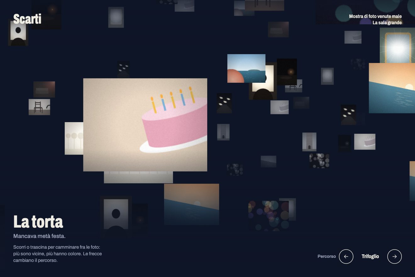
In our demo the room is dark and the photos are twelve real, copyright-free pictures that the script spoils in a canvas and repeats: a thumb in front of the sea, a blurred street lamp, a crooked horizon, a flash on a shop window. The path is a formula measured along its length instead of a curve through points, and each photo is placed in front of the eye with a translate3d inside a container with perspective, which sorts them by depth. Grey changes in steps of a tenth, and the arrows rotate between three knots that never cross themselves, the trefoil, the figure-eight knot and a coil closed into a ring, with a 1.8 second run-up that switches path halfway.
The reluctant button
At the bottom of every page there is a button saying don’t contact me. Clicking it is not enough: you have to insist.
On the site the first click answers are you sure?, the second i’m serious, the third you win. copied., and only on the third does the address go to the clipboard: the comment at the top says it plainly, that is the whole joke, and the old handler that copied on the first click was removed for exactly this reason. The text is not swapped, it decodes: each character starts between 0 and 12 frames in, ends 6 to 20 frames later and in between cycles through block glyphs, changing them with a 0.28 probability, because a new glyph on every frame at 120 Hz would just be fog. Spaces are never scrambled, the button is as wide as its longest sentence, the last sentence stays 2.4 seconds. The same decode, without the joke, comes back when the pointer passes over the button and over the LinkedIn link next to it.
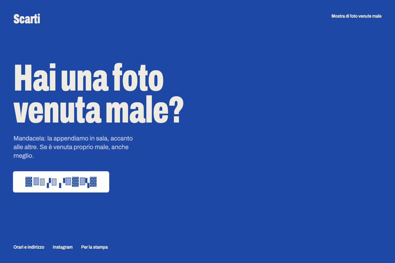
In our demo it is the button for sending a photo to the exhibition, with our own sentences in Italian. The timings are in seconds rather than frames, the clipboard is touched only when the click comes from a person, and every refusal gets a bodily reaction: at the first the button shrinks back, at the second it shakes sideways, at the third it sighs.
The other details
The loader brings the copy in blurred, counts the percentage, and meanwhile a red line grows as the copy crosses the screen; at a hundred the 3 px line floods upwards and white arrives on top. Between pages there are four different transitions, pixel, liquid (with its own curve, 1 − (1 − t^1.74)^3.92), iris and torn sheet. On the home the black block tears into the white one with the same edge as the character field, a head spins once when clicked, and the footer turns red as you scroll, with a line inviting you to find the way out. The code comments are worth the visit on their own: they tell every failed attempt, so nobody tries it again.
Where it stumbles
On a phone the site is not there: the red door is honest and well made, but whoever arrives from a link on a phone only sees that.
Scrolling is entirely simulated. It is what makes the turning figure and the travelling gallery possible, but the page has no scrollbar, and the browser’s habits, like searching for a word or going back to a spot, do not apply here.
And it is heavy: eleven canvases on the home, long modules, and a gallery that took several rounds to stop flickering. The comments tell the story: smaller thumbnails, then a shorter fog that keeps about forty planes alive instead of a hundred and seventeen.
What we take away
A single gesture, the edge torn by a noise added before the threshold, repeated in three different places, is enough to give a site its handwriting. And a comment explaining why a number is that number is worth as much as the code that uses it.
The effects
- Torn charactersA WebGL field of characters, gathered into islands like a map, that the pointer tears away: it leaves a trail of ragged holes that close up by themselves.Free
- The gallery on a knotA hundred and twenty real photos hanging along a closed knot and a camera walking through it: twelve badly taken shots, spoiled by the script in a canvas; near ones have colour, far ones turn grey in the fog, and while you scroll the corners round off.Free
- The reluctant buttonA button that says no twice before copying the address, and every time the sentence decodes letter by letter out of block glyphs.Free