Creative Reference Library, by Josh Bendall, S•BJ
Creative Reference Library, how it’s made: letters that break into blocks, the polaroid wheel and the letter that becomes the curtain
CRL® is a curated library of creative references, records, films, books and writing, and its site is stone grey, black and white, with three giant letters scrolling behind everything. Under the pointer they break into blocks, in the library twenty photos turn on a huge wheel, and to go in, a letter grows until it covers the screen. We take it apart with three demos rebuilt from scratch.
The palette
- #A1A098the warm stone grey: the ground of the home, the «brand» theme and the resources sections
- #000000the black of the giant letters in the ribbon, of the curtain and of the library’s dark theme
- #FFFFFFthe white of the WebGL-drawn headlines, the polaroid frames and the light theme of About
- #C6FB50the lime, the only accent: only when hovering links on the dark theme
- #D9D9D9the light grey of the arrow buttons on the quote sliders
Tap a colour to copy its code.
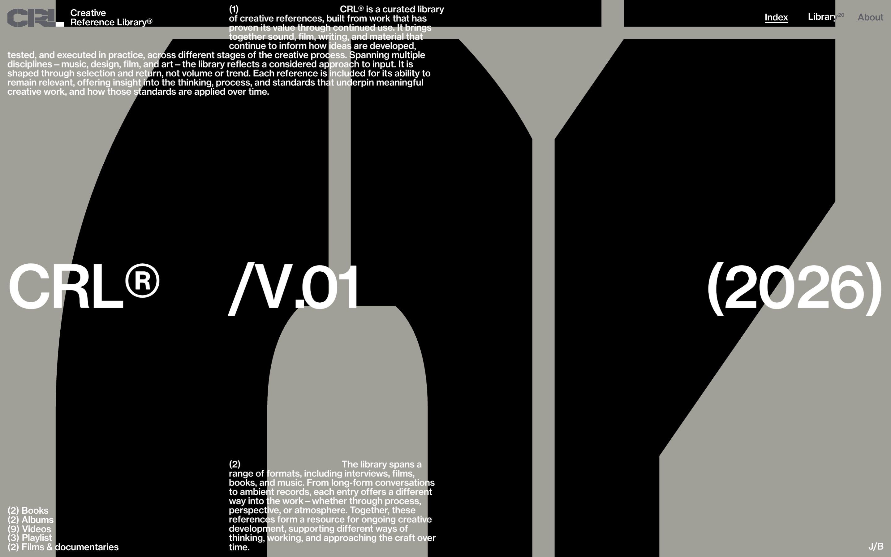
Creative Reference Library, CRL® to its friends, is a curated library of creative references: records, films, books, interviews and writing that, in the words of its introduction, have proven their value by being picked up again and again. It is not large, twenty entries in all, and proud of it: «selection and return, not volume or trend». The site has three colours and a half. A warm stone grey for the home, black for the library, white for the about page, and a lime green that only appears when you hover a link on the dark theme. There is one typeface, Neue Haas Grotesk Text Pro, in one weight, Medium. Behind everything, on every page, the three letters of the brand scroll by, C, R and L, so big that only a piece of them fits on the screen at a time. The site is signed by Josh Bendall and S•BJ, with a «DES / DEV» switch in the footer that leads to one or the other; on Awwwards the credits go to Bimo Tri and Josh Bendall. It was Site of the Day on Awwwards on 10 November 2026, with 7.44 from the jury and 7.57 from the developers.
Underneath is Webflow, but only for the pages: there is not a single Webflow interaction. All the motion lives in one 897 KB JavaScript file served from Vercel, split into fourteen modules that hook onto the pages through a data-component attribute. Inside are GSAP 3.14.2 with ScrollTrigger, SplitText and CustomEase (seven hand-made curves, with names like heading, card and panelInfo), Lenis 1.3.25 for smooth scrolling, Taxi for page changes, Matter.js 0.20.0 for the letters falling in the footer and three.js r180, with hand-written shaders and a small computation running on the graphics card. The real text of the home is in the document, but transparent: what you see is redrawn in WebGL, letter by letter.
We take it apart in three moments, with a demo rebuilt from scratch for each. The text, the brands and the code are ours; from the site we took the ideas and, where we say so, the numbers.
Letters that break into blocks
The home is a single page that does not scroll. In the middle sit three huge white headlines, «CRL®», «/V.01» and «(2026)», above and below them two paragraphs explaining the library, bottom left the shelves with how many entries each one holds, and behind it all the ribbon: the brand’s black letters, one above the other, rising slowly and never ending. Move the pointer and the ribbon breaks. It does not ripple like water, as nearly every effect of this kind does: it splits into sharp rectangles that slide sideways and then return to their place. And the headlines in front break with the ribbon, at the same spot.
The secret is the resolution. The displacement is computed on the graphics card, but on a grid of just 5 by 5 cells, read without blending the values between one cell and the next (the Nearest filter): so each cell moves as a whole, and the edges between cells stay sharp. On every frame the pointer’s movement, multiplied by 10, is added to the nearby cells, with a weight that fades out at 22 hundredths of the page, and then everything is damped by 3.5% (c.rg *= 0.965), so the blocks go back on their own when the pointer stops. The same displacement is passed to the ribbon, with a strength of 0.03, and to the texts redrawn in WebGL, which is why they break together with the letters. The ribbon rises at 0.02 of its height per second; turn the wheel, on a page that does not scroll, and it speeds up, the push fading with an exponential curve (1 - exp(-12·dt)).
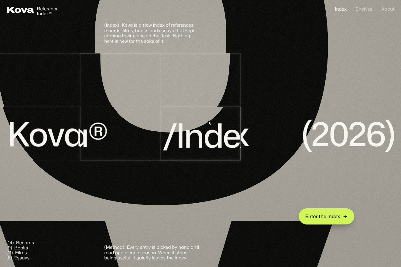
In our demo the library is made up, Kova Index, and the giant letters are its own, K, O, V and A, in a very wide black grotesque. From the site come the endless vertical ribbon with its speed of 0.02 and the letters spaced by 0.025, the zoom at 0.9 that pushes them past the sides, the 5 by 5 grid read without blending, the pointer movement multiplied by 10, the radius of 0.22, the damping of 0.965 and the strength of 0.03, the wheel that speeds up the ribbon with the same curve, the texts breaking together with the background, and the three colours. The WebGL is hand-written, without three.js: we compute the grid in JavaScript and hand it to the shader as a tiny image on every frame, with two bytes per value, because with one the blocks went back in steps. Also ours are the edges of the blocks, which pick up a slightly lighter line and shadow, the spring settle when the pointer stops, one pixel past before landing, the page arriving already broken and coming back together, and the «Enter the index» button, which follows the pointer as on the site (0.6 seconds, power3.out), swells when pressed and sends a wave through the blocks on release. On a phone you drag the ribbon with a finger. Left alone, a drawn pointer crosses the page. With reduced motion, or without WebGL, a still drawing of the ribbon remains and the texts fade in.
The polaroid wheel
The library is black, and in the middle there is a wheel: twenty photos in white polaroid frames, laid on a circle so large that only its top shows, three or four cards at a time, tilted like spokes. You turn it with the mouse wheel, by dragging or with a finger. Above, large, is the entry at the top of the wheel, with its number, author, title and year; below, in grey, the one that comes next. Arriving on the page, the wheel makes a full turn backwards before stopping on the first entry.
It is all WebGL: twenty planes, each 78 hundredths of its height wide, with the frame drawn by the shader. The radius of the circle is 1.8 times the window height and the centre sits below the screen; the cards are a twentieth of a turn apart, and each rotates by 1.2 times its angle, a little more than the radius, so they fan out. The wheel chases the requested position with a factor of 0.08 per frame and snaps to the nearest card. Speed becomes shape: a variable chases it at 15% per frame, capped at 1.2, bends the cards into a curve and adds a ten-sample blur in the direction of the turn. The entrance is a turn from -20 to 0 in three seconds with back.inOut(.54), and each card lights up in four tenths of a second as it crosses the threshold. The best part is the text: it has no animation of its own. The lines, split by SplitText inside a mask, move according to the fractional part of the wheel’s position: the outgoing one rises by 110% times how far the wheel has gone, the incoming one starts at 110% and reaches zero together with the card. So the text does not chase the wheel: it is the wheel, read another way.
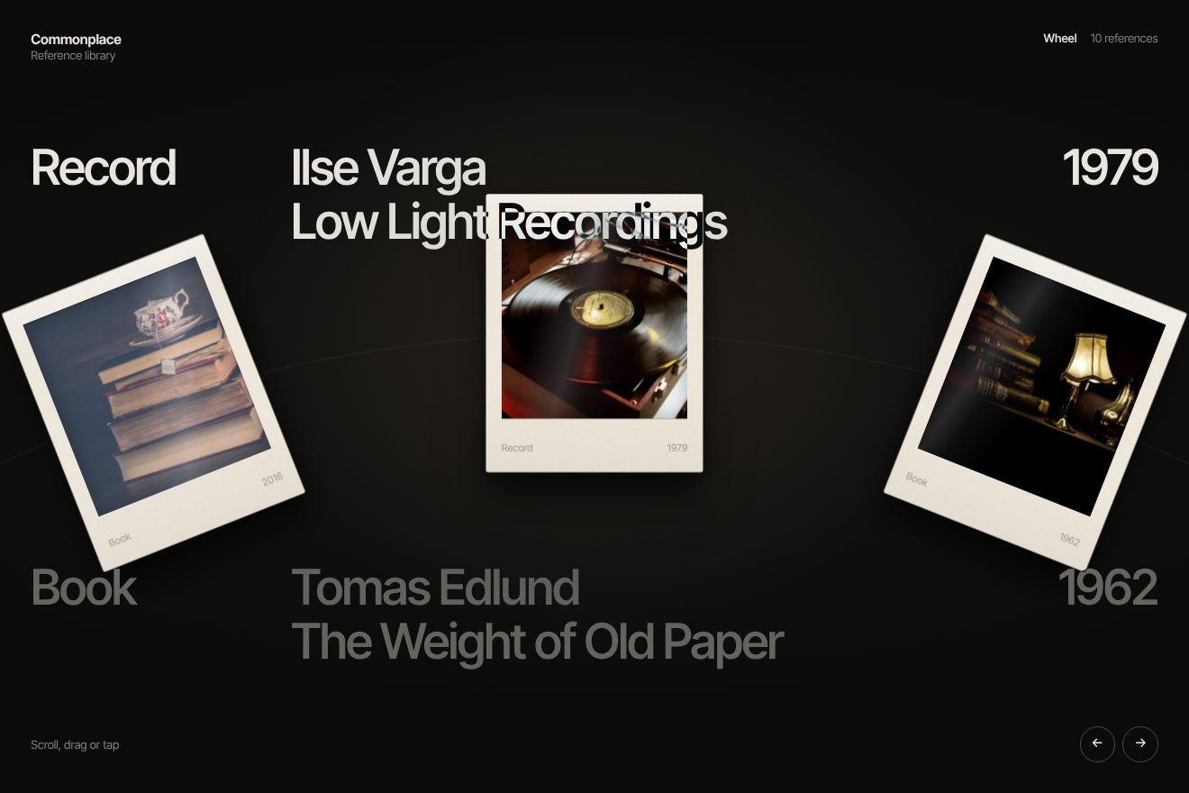
In our demo the library is made up, Commonplace, and so are its ten entries, each twice on the wheel: records, books, films, notebooks, with our own authors, titles and years; instead of the number there is the format, Record, Book, Film, Essay. The photos are real and free of rights: a record player, a stack of old books, a film camera, a reel, a typewriter, piano keys, a painter’s studio painted by Louis-Léopold Boilly around 1800. From the site come the radius of 1.8 heights with the centre below the screen, the twenty slots, the rotation of 1.2 times the angle, the 0.08 chase with the snap, the speed capped at 1.2 and chased at 15%, the full-turn entrance in three seconds with back.inOut(.54), the cards lighting up in four tenths of a second, and the text following the wheel’s fraction with lines at -110 and 110%, with the next entry in grey. We build the wheel without WebGL, with CSS transforms: instead of the bend, with speed the cards tilt, the shadow lags behind and stretches, and the photo leaves a soft copy and a horizontal blur behind it. Ours are the warm, grainy paper of the frame, with a small note written on it, the layered shadows, the highlight sliding with the angle, the thin circle with a tick for every slot, the snap going a pixel past and back, the words turning black as they pass over a white card, the two round buttons and the keyboard arrows. Left alone, after the entrance the wheel moves on one card every 2.2 seconds, and stops as soon as you touch it. With reduced motion the wheel does not turn: the cards are already in place, and at each change wheel and words fade out and come back on the new card.
The letter that becomes the curtain
You do not get from the home to the library with a fade. You press «Enter Library», the button that follows the pointer, and the ribbon of letters that sat behind the headlines comes in front of everything; the texts vanish, and one letter starts to grow, faster and faster, until a solid piece of it covers the whole screen in black. Then, out of the black, the library opens. The letter acts as a curtain.
In the code it is called exactly that, curtain, and the ribbon itself does it: the canvas moves above the page (z-index: 20), the WebGL texts disappear in a tenth of a second, and the ribbon’s zoom goes from 0.9 to 14 in six tenths of a second with power2.in, accelerating; from two tenths of a second a black cover rises in 0.35 seconds and closes whatever is left. When the new page is ready, the black fades away in six tenths of a second with power2.out, while the zoom drops to 70%, from 14 to 9.8, as if the camera took a step back; the library comes in after 0.85 seconds, in two tenths. Meanwhile the page colours, background, text and borders, go from grey to black in six tenths of a second, on a curve that starts quick and lands softly (cubic-bezier(.4,0,0,1)), and the library wheel waits another 0.45 seconds before it starts.
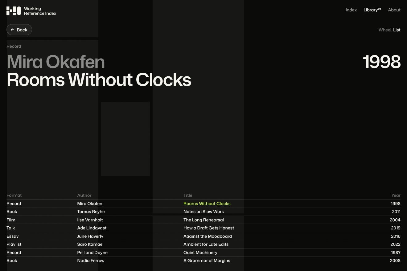
In our demo the brand is made up, Hold, an index of creative references, and the giant letters behind the home are its own, drawn in SVG with stencil cuts. From the site come the letter moving in front of everything, the texts vanishing in a tenth of a second, the zoom up to 14 in six tenths with power2.in, the cover rising from 0.2 seconds in 0.35, the black opening in six tenths with power2.out while the scale goes back to 70%, the colour change in six tenths on the same curve, the button following the pointer (0.6 seconds, power3.out) and the rows of the library list rising from 110% in 0.87 seconds with power2.out, staggered; and the stone grey, the black and the lime. Ours are the dive towards the point of the click, with the scale worked out from the size of the screen, so the solid stem of the H always covers everything, even on a narrow, tall phone; the letter lifting off by a pixel and taking a shadow before it leaves; the theme changing only under the black, because changed earlier it hid the dive; the large reference at the top of the library changing as you pass over the rows; and the way back: «Back» makes the journey in reverse, the huge letter shrinks to its place, lands a pixel past, the shadow fades and the button is reborn. Left alone, the demo goes there and back. With reduced motion there is no dive: the home fades, the colours turn dark and the library appears already still.
The other details
The first time you open the home, the three letters arrive lying on their side, very far apart and almost transparent: a ghost at 15%. A line fills them with black from the bottom in a second and a half, then they close in, rotate and take their place in the ribbon, with an expo.inOut and five hundredths of a second between letters; only then do the headlines rise, character by character. If WebGL does not answer within four seconds, the page appears anyway, without effects.
The about page has two quote sliders, with a bar that fills in seven and a half seconds (seven in the other) and the lines leaving upwards, 25 thousandths of a second apart, while the new ones rise from below; the photos change in WebGL, the new one opening from the centre while the old one grows. There is a row of black cards to drag that bend with speed, with the word «Drag» following the pointer, and at the bottom, in the footer, a black box where fifty pieces of letters fall, one every tenth of a second, bouncing and running from the pointer. Changing page, the colours do not jump: background, text and borders go from grey to white or black in six tenths of a second, and even the text drawn in WebGL rereads its colour from the CSS for three quarters of a second to keep up.
And the site looks after people who prefer less motion: nearly every module checks prefers-reduced-motion, and then the loading is skipped, the secondary WebGL is switched off and the changes become instant.
Where it stumbles
The full-screen canvas redraws on every frame even when nothing moves; the secondary sliders only do it when something changes, and it could have done the same. Two scroll animations ask for a curve, revealEase, that does not exist among the site’s seven, and a section of the about page uses data-anim="fade", which the code does not know (it knows fade-in): the animations with that curve are not used on the pages, and that section simply does not animate. The numbers do not match from one page to the next: the home counts two albums, the about page four; and the about page reads «Flims & Documentaries», «CRL© is used» with © in place of ®, and the 404 page still has the placeholder «(XXXX)». Every heading is an h1, seven on the home, twenty-three on the about page and forty-one in the library, and every image has empty alt text. The single 897 KB file carries the whole of three.js and Matter.js, and Oswald is downloaded too, a typeface used by one class that never appears on the pages.
The effects
- Letter ribbon backgroundThe background of the home of Kova Index, a made-up reference library, taken from a moment of the Creative Reference Library site: behind the stone grey page the giant letters of the brand run upwards on an endless ribbon, and where the pointer passes the ribbon and the type in front break together into sharp rectangular blocks, then slowly settle back. The wheel or a finger speeds the ribbon up; the button follows the pointer and swells when you press it.Free
- Polaroid wheelThe reference library of Commonplace, a made-up studio: polaroids with photos of the things that inspire it (a record player, old books under a lamp, a film camera, a typewriter at night, a notebook, piano keys) ride on a great wheel whose centre sits below the screen. Wheel, drag, tap and arrow keys: the wheel chases your hand, passes the card by one pixel and settles; with the speed the cards lean and leave a smear. The title above has no motion of its own: its lines slide in their masks exactly as far as the wheel has turned. The moment comes from the library of the Creative Reference Library site; brand, words and code are ours.Free
- Letter into black transitionThe page transition from the Creative Reference Library site, rebuilt in SVG with a made-up brand, Hold, an index of creative references: on the stone grey home the giant letters of the brand sit in black behind the type, and the Enter the library button follows the pointer. On click the H lifts off by one pixel and takes a shadow, comes in front of the type and dives towards the click point, faster and faster, until its full stem covers everything in black; from the black the dark library opens, with the rows of the list rising in their masks. Back makes the trip the other way round.Free