PSP Production, by Lynksen, Ross Burylo
PSP Production, how it’s made: the film that opens from the centre with a colour grade, the list items that feel which side you come from and the three-wave curtain menu
PSP Production runs film, series and commercial shoots in Portugal and Spain, and its site is a magenta pink that moves like a lava lamp, with the black of the brands and a single mint green. On the first screen the works play by themselves and each new film opens from the centre with a flash of film-stock colour; the list items light up from the side the mouse comes in, and on the phone the menu drops like a curtain in three waves. We take it apart with three demos rebuilt from scratch.
The palette
- #FF0063the brand’s magenta pink: the five bands between pages and the ground while the home loads
- #FF0080the bright pink of the lava lamp, the ground of the loader and of About
- #A3003Fthe wine red of the dark blobs drifting on the ground
- #CF005Dthe raspberry of the About section
- #3FFBBFthe mint green, the only accent: the block uncovering the loader lines and the film’s colour grade
- #000000the black of the brands section and the credits box
- #FFFFFFthe white of the headlines, the progress bars in difference and the phone menu
Tap a colour to copy its code.
PSP Production is a production company working in Portugal and Spain, from Lisbon and Barcelona: it doesn’t shoot its own films, it makes them possible for others. «We partner with agencies, brands, and filmmakers», says the home page, followed by the list of what it does: locations, casting, logistics, on-set coordination. Among the works are commercials for Porsche, Honda, Samsung and El Corte Inglés, and series like «FBI: Internacional» and the fifth season of «Money Heist». The tone is that of someone promising calm: «Senior-led. Fast. Seamless», and in the loader a sentence about happiness coming from clarity, calm and clever problem-solving, «that’s something you’ll feel on set». The site is a magenta pink in many shades, from the brand’s #ff0063 to the #a3003f of the dark blobs, with the black of the brands section, white text and a single accent, a mint green, #3FFBBF. Headlines are in Neue Haas Grotesk Display bold, uppercase and tight, and inside every headline there’s a single word in PP Eiko, a light italic: it’s the site’s signature. The code credits nobody; on Awwwards the credits go to Lynksen and Ross Burylo. It was Site of the Day on Awwwards on 18 November 2026, with 7.33 from the jury and 7.56 from the developers, who gave the animations 8.6.
Underneath there’s Webflow, but almost none of its interactions: the home page doesn’t have a single attribute of Webflow’s animations, and the motion is written by hand in 32 scripts and 25 style blocks inside the page. There’s GSAP 3.15.0 with SplitText, ScrollTrigger and CustomEase, served by Webflow, Lenis 1.2.3 with a lerp of 0.085, and jQuery. But the site also leans a lot on the browser itself: the video change is done with the Web Animations API, the colour grade with an SVG filter, and on the phone the home panels scroll with CSS scroll-driven animations, with no JavaScript. The clients page has a logo grid in three.js, the 404 a hand-written WebGL.
We take it apart in three moments, with a demo rebuilt from scratch for each. The texts, brands and code are ours; from the site we took the ideas and, where we say so, the numbers.
The film that opens from the centre
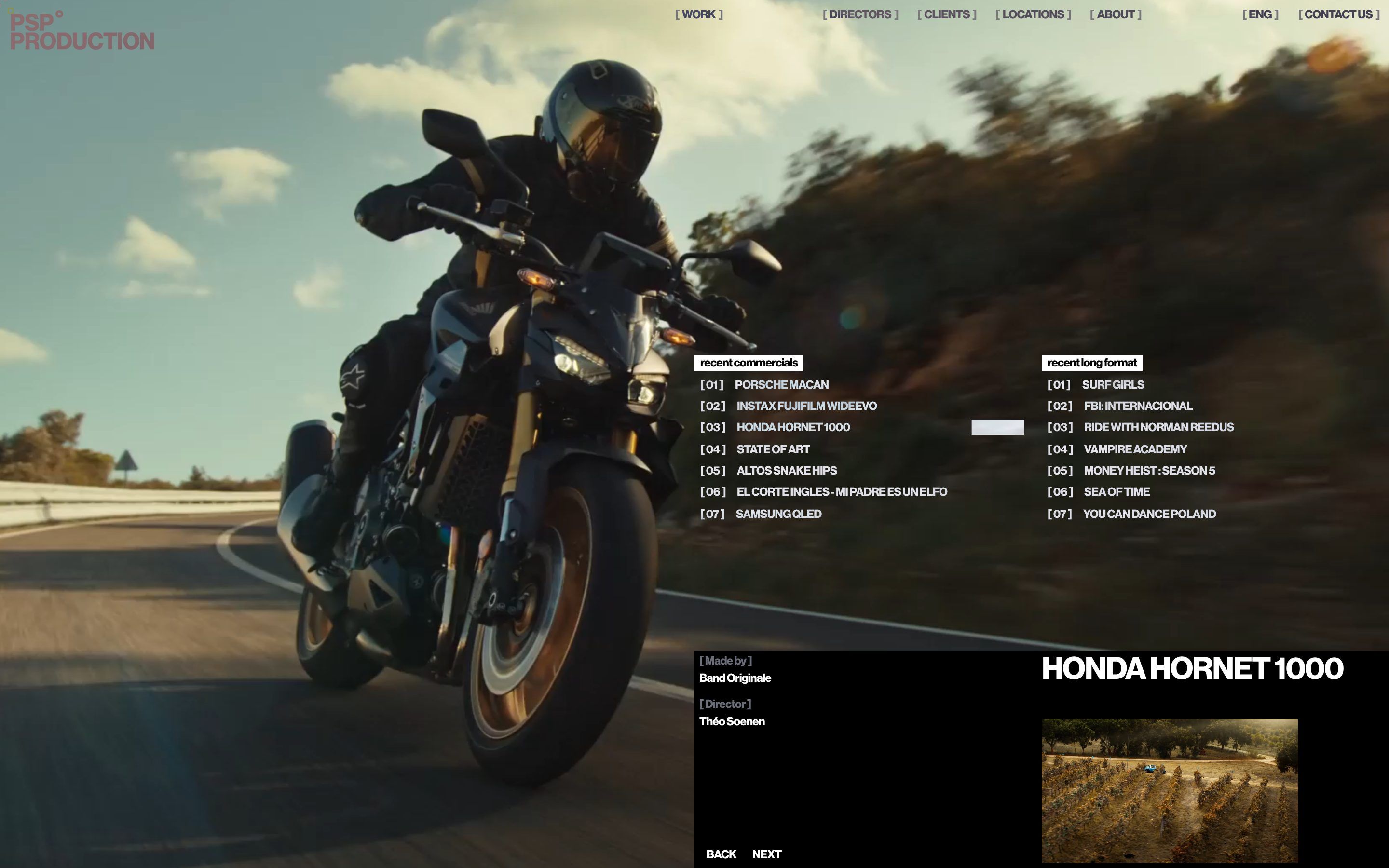
The first screen is a full-screen film, and over it two columns of titles: recent commercials on the left, series on the right. At the bottom, in a black box, who made it, who directed it and the work’s title in large type. The item of the film that is playing has a white bar that wears down with the video’s time, and when the video ends the next one starts by itself. The beauty is in the change: the new film doesn’t slide in or fade in, it opens from the centre, like a rectangle widening to the edges, and as it opens it lights up in wrong colours, violet and yellow, then mint and magenta, for a moment, like badly developed film stock, before coming back to normal.
It isn’t GSAP but the browser’s Web Animations API. The opening is a clip-path going from inset(50% 50%), a zero-width rectangle in the centre, to inset(0%), in 900 milliseconds with the curve cubic-bezier(0.65, 0, 0.35, 1); meanwhile the film inside shrinks from twice its size to its size, with a different curve, cubic-bezier(0.33, 1, 0.68, 1), that brakes earlier. The colour comes from an SVG filter applied to the whole stage: an feFlood as large as the opening part, two feComposite, one in and one out, to separate inside from outside, and an feColorMatrix that, only inside, changes matrix every frame. There are five stops, named in the code: violet and citron at the start, citron and violet at 28%, mint and magenta at 48%, violet and citron again at 66% and the matrix that changes nothing at 78%. Between stops the change is smoothed, and on top there’s extra contrast rising and falling on a sine. And the change starts 900 milliseconds before the video ends, so the old film never stops on black: the next one is already loaded, paused, behind it. The bar on the item is a white stroke in mix-blend-mode: difference that shortens, tied to a CSS variable updated every frame.
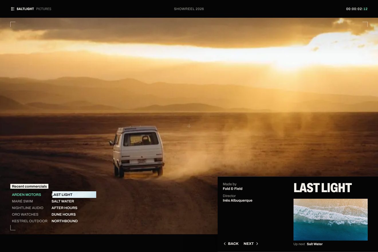
In our demo the showreel belongs to a made-up production company, Saltlight Pictures, with five made-up works for made-up clients, and in place of the videos five real, copyright-free photos, each with a slow camera move in its own direction: a van on a dirt road at sunset, waves seen from above, a wet city at night, dunes with two hikers, a forest in the fog. From the site come the opening from inset(50% 50%) to inset(0%) in 900 milliseconds with its curve, the scale from 2 to 1 with the other curve, the opacity staying at zero up to 20% and full at 90%, the SVG filter with the feFlood as large as the opening, the two feComposite and the feColorMatrix, the five stops at 28, 48, 66 and 78% blended the same way, the extra contrast on a sine, the change starting 0.9 seconds before the end, the white bar in difference on the item, the box texts leaving 12 pixels up and coming back from 12 pixels below, the title measured in advance on every title so the box never jumps, and the veil coming in from the pointer’s side. We computed the grade matrices ourselves, two-tone on luminance: violet and citron, citron and violet, magenta and mint. Also ours are the black bars above and below, the timecode running at 24 frames per second with the frames in mint, the thin viewfinder tightening by a breath at each change, the moving grain, the new bar filling in half a second and the «Up next» frame of the following film, which turns grey when hovered. A click on an item, on Back and Next or on the frame goes to that film. With reduced motion the film changes with a fade, with no opening and no grade.
The items that feel which side you come from
The two columns of works are also how you choose the film. Hovering, a white veil stretches behind the item, and it stretches from the side the mouse came in: from the left if you come from the left, from the right if you come from the right. Meanwhile the item follows the pointer a little, as if drawn by a magnet, the other items dim by half, and the title widens by a breath.
The side is decided by one line: if the entry point is in the left half of the item, the --psp-hover-origin variable is left, otherwise right, and the veil, a gradient from 20% white to 8% white at 62% and then transparent, grows with scaleX from that side in 700 milliseconds with cubic-bezier(0.16, 1, 0.3, 1). The magnet has two speeds: the pointer’s offset inside the item, at most 12% of its width and no more than 18 pixels horizontally, 35% of its height and no more than 9 vertically, moves the title by 0.62 and 0.22 times, and the number the opposite way, by 0.28 and 0.16 times. So title and number drift apart, and the item seems to have depth. The title takes letter-spacing: 0.025em, the other items drop to 0.52 opacity with a :has() selector. The items can also be used from the keyboard, with Enter and space, but the site only makes them reachable when there’s a mouse.
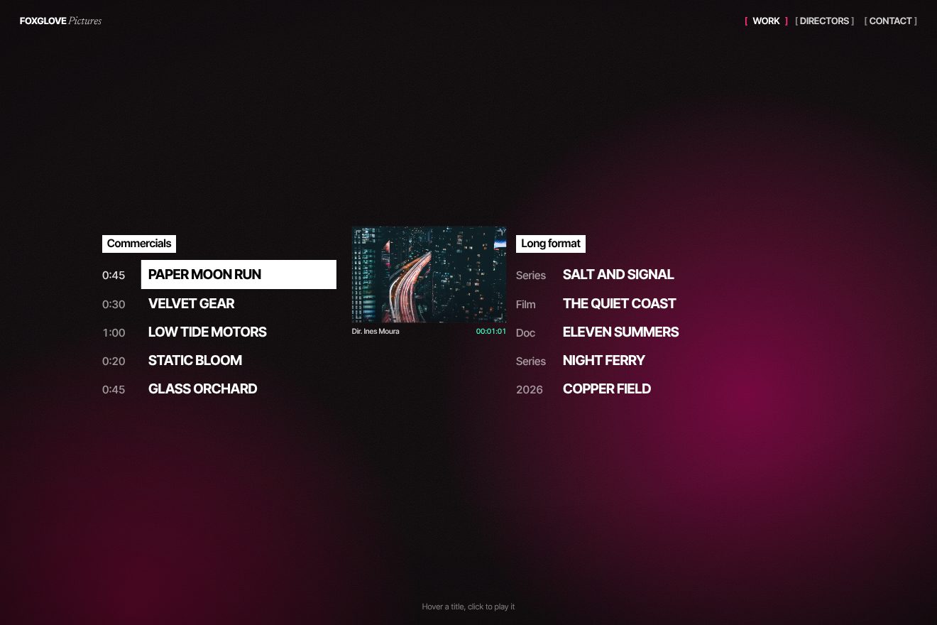
In our demo the list belongs to another made-up production company, Foxglove Pictures, on an almost black ground warmed by two pink and wine clouds drifting slowly, the site’s colours. Two columns, «Commercials» and «Long format», with five made-up titles each, and in front of each title, in place of the bracketed number, the spot’s length or the kind of work: series, film, documentary. From the site come the white veil with its three stops, growing from the side the pointer enters in 700 milliseconds with its curve, the two-speed magnet with all its numbers, the title widening by 0.025 em, the other items at 0.52, the white bar in difference on the chosen title, the pink brackets of the menu moving 0.34 em apart, and on opening the white block passing over the lines, as on the site’s first screen. In ours the veil leaves from the side the pointer exits, with two edges each moving on its own, so it never jumps halfway. Ours are the frame with a real photo sliding next to the chosen line while bending by a degree and a half, with four viewfinder corners, the director’s name and a mint timecode, the photo change with a moment of colour grade and a passing glint, the line tightening when pressed, the keyboard with arrows between lines and columns, and touch on the phone, where the veil comes in from the finger’s side. Left alone, each title stays chosen for five and a half seconds and then passes to the next. With reduced motion only the fades remain, with no magnet.
The three-wave curtain menu
Below 991 pixels wide the navigation becomes «[ MENU ]», and the menu is a full-screen white sheet coming down from the top like a curtain. Before the curtain is fully down the items, in large uppercase, rise from their little windows one after another, and last come «Close», the language and «Contact Us». On closing, the items don’t go back down: they escape upwards, and the curtain rises.
A comment in the code says it in one line: three overlapping waves, the curtain, then the links, then the footer. The curtain is a clip-path from inset(0% 0% 100% 0%) to inset(0%) in 0.7 seconds, with a curve made with CustomEase, 0.45, 0, 0.15, 1; the items rise by yPercent from 110 to 0 in 0.85 seconds, 0.05 seconds apart, with another curve, 0.165, 0.84, 0.44, 1, starting at 0.25 seconds, when the curtain is barely halfway; the controls at the top arrive from 12 pixels lower in 0.6 seconds, and «Contact Us» from 0.55. Closing is shorter all round: the controls disappear in 0.2 seconds, the items rise to yPercent -110 in 0.45 with an accelerating curve, 0.55, 0.055, 0.675, 0.19, and the curtain goes back up in 0.6. Another comment explains the choice of curves: softer than the reference ones, so the menu reacts at once and settles gently. Esc closes it, when closed it’s inert, and smooth scrolling stops while it’s open; with reduced motion every duration becomes zero.
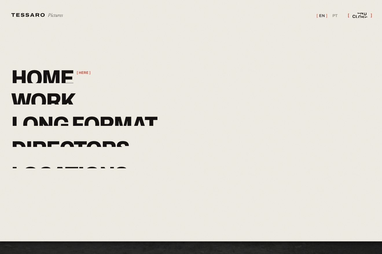
In our demo the menu belongs to a made-up production company, Tessaro Pictures, over a front page with a real, copyright-free photo of a crew shooting a western, the camera on its tripod, horses and a parasol, and the headline «Calm crews, clever shoots.». From the site come the three waves with all their numbers: the curtain from inset(0% 0% 100% 0%) to inset(0%) in 0.7 seconds with the curve 0.45, 0, 0.15, 1, the items rising from 110 to 0 in 0.85 seconds, 0.05 apart, from 0.25, the controls from 12 pixels lower in 0.6, the footer from 0.55; closing with the controls gone in 0.2, the items escaping upwards to -110 in 0.45 and the curtain up in 0.6; Esc, inert and durations at zero with reduced motion. From the site also come the brackets of «[ Menu ]» moving 0.34 em apart and changing colour, and the brand’s letters hopping 3.8 pixels while turning 5 degrees, in a wave from left to right. Ours are the curtain’s edge, a one-pixel line with a soft shadow on the photo, driven by the same tween as the clip; the photo underneath sinking, darkening and on its return overshooting by one pixel before settling; the menu settling by one pixel when the curtain lands; the letters of «Menu» rolling into «Close» while the brackets close in on the new word; and the item hover, where each item rolls into its red italic twin while on the right a strip of film with its perforations slides to that item’s frame. With reduced motion the menu appears and disappears without moving.
The other details
The home loader lasts 5.2 seconds and is a little film. On a pink ground where five blurred blobs drift like in a lava lamp, two columns of work titles rise on the sides, and in the centre the sentence about calm is uncovered line by line: a mint block grows from the right, the text appears, the block withdraws to the left. Then the headline is redrawn on a canvas, the text becomes a hole, and the camera flies into the word «you», the italic one, with a zoom reaching 1200 times, 800 on the phone. On the phone the loader stops earlier and waits for a tap on «[ Tap to roll the camera ]»: the comment explains that on iPhone, in Low Power Mode, videos don’t start until the page is touched.
The cursor is a camera viewfinder, four pink corners and a small white cross, in difference; over a link it becomes a horizontal frame of 52 by 32 pixels, and the label that goes with it, «see more» or «play next», chases the pointer with a little delay, with odd letters entering from above and even ones from below. Hovering the preview of the next film, the preview turns into a black-and-white halftone drawn on a half-resolution canvas, and the big film behind loses its colours in a second. The navigation items have square brackets that move apart and turn pink, and the logo’s letters jump one after another like a wave.
Scrolling down, the home is a single stage, pinned for 6900 pixels of scroll: the About section rises from below and covers the film, its headline is uncovered in white blocks, then all the text escapes to the left while the black brands section comes in from the right, and finally the footer rises with its video shrinking. In the About section a small film follows the pointer and bends with the speed, up to 12 degrees, like a sheet being dragged. Between pages five pink bands pass in a staircase, from bottom to top, and the 404 is a television with no signal: an italic «404» with red and blue fringes, a halftone and a lens swelling under the mouse, in WebGL.
The home stage is rebuilt for the phone with rare care: no pinned ScrollTrigger but a fixed stage 100lvh tall, separate measurements of the two screen heights with and without the browser bar, and the panels moved by scroll-driven CSS, except on iPhone, where the comment says the browser claims it can but the panels stay put. Before the loader finishes, a script catches every video as the page arrives and strips its source, so no video downloads too early.
Where it stumbles
The contact page loads a script from http://127.0.0.1:5500, that is from the computer of whoever developed the site: for visitors it doesn’t exist. On the first screen, under «Made by» of the first work, you read «TBC», and the initial HTML still holds «Project title that can be very long» and «Value», which the script rewrites. The footer addresses and the ones written for Google don’t match, and the Barcelona one has a six-digit postcode. The home has no main heading, the menu and the work items are plain blocks that become buttons only with a mouse, and the logo link has no name for screen reader users. Reduced motion is respected almost everywhere, but not by the lava lamp nor by the bands between pages, which make even the links to Instagram and Facebook wait 850 milliseconds. The same 32 scripts are written inside every page and aren’t cached; the loader lists ask for a typeface, Lato, that the site doesn’t load. And in the code you find numbers in square brackets used as graphics, from [01] to [79].
The effects
- Color-graded reelThe showreel of Saltlight Pictures, a made-up production company: a film full screen with a slow camera move, the list of works with a white bar in difference that wears away with the film, and the black slate with Made by, Director and the big title. Just before the end the next film opens from the middle as it shrinks, and only inside the opening a film colour grade runs through. From the video change in the hero of the PSP Production site, Awwwards Site of the Day on 18/11/2026.Free
- Magnetic work listThe work list of Foxglove Pictures, a made-up production company, in two columns, commercials and long format: under the title beneath the pointer a white gradient grows from the side you come in and leaves toward the side you go out, the title and the running time follow the pointer at two speeds, in opposite directions. A click plays the title: a white bar in difference wears down across it and next to it a small frame opens with the still. From the hover of the project titles on the PSP Production site, Awwwards Site of the Day on 18/11/2026.Free
- Three-wave curtain menuThe full screen menu of Tessaro Pictures, a made-up production company: «[ Menu ]» drops a paper curtain over the page in three overlapping waves, the curtain, then the big uppercase links rising from their little windows, then the controls and the «Contact us» bar. On hover each link rolls to its italic twin and a small strip of film advances to the link's frame. From the phone menu of the PSP Production site, Awwwards Site of the Day on 18/11/2026.Free