Le Mans Classic, by Magnetism
Le Mans Classic, how it’s made: a reportage that runs like a roll of film
Richard Mille’s microsite for Le Mans Classic 2025, made by the studio Magnetism, is a black and white photo story split into hours: a small window flipping through pictures, clocks counting the minutes, a strip moving sideways. We take it apart with three demos rebuilt from scratch.
The palette
- #FFE500title yellow
- #161616ink
- #FFFFFFwhite
- #101010loader background
- #7D7D7Dphoto greys
Tap a colour to copy its code.
Le Mans Classic «Below the Line» is the microsite Richard Mille dedicated to Le Mans Classic 2025, the historic car race on the Sarthe circuit. It does not tell the race: it tells everything happening around it, the mechanics, the pits, the nights, the volunteers. The site is by the studio Magnetism, the photographs by Ludovic Myers, the texts by Abdesslam Oulahbib.
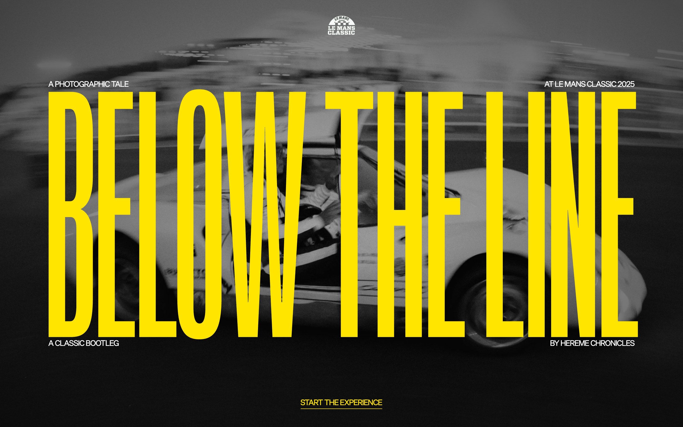
It is a black and white reportage in twelve chapters, and each chapter is an hour: it starts at half past six on the first day and ends on the morning of the third. Each chapter is a horizontal strip of photos, short videos and huge words. There are three colours, an acid yellow, an ink black and white; titles are set in an extremely narrow, extremely black grotesque that fills the screen from edge to edge.
Underneath there is Nuxt, with GSAP (ScrollTrigger and the new SplitText), Lenis for smooth scrolling and the Web Audio API for sound. No WebGL: the whole effect comes from clipping, editing cuts and rhythm. Here we take it apart in three moments, with a demo rebuilt from scratch for each: the photos are our own drawings, and so are the texts and the code. From the site we took the idea and the timing.
The projector and the title that rises
You arrive on a dark screen with a postcard-sized window in the middle. Inside it, photos drop one after another, three tenths of a second each, and each covers the previous one: it looks like a slide projector. Four captions rise at the sides. Then the last photo grows past the edges of the screen while the window itself opens, and a yellow line appears in the middle. It is the title, squashed: in half a second it stands up to its full height, and the captions move apart to frame it above and below. A burst of photos behind the letters closes it.
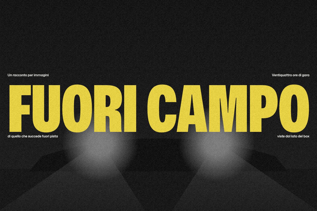
The two movements of the burst go together: the image grows on a long curve while the window’s cut opens on a shorter one, starting a moment later. The starting cut must be computed in pixels, because a clip-path written with calc() does not animate well. The title is measured at a hundred pixels and scaled to fill the width; the captions sit on the midline and move by half the title’s height through a CSS variable.
The clock that counts the minutes
Every chapter opens with a black card sliding in from the side. At first there is only the chapter’s name, cut in at once, as wide as the screen. After two seconds the name disappears and in its place a huge clock counts from the previous chapter’s time to the new one, a minute at a time, with a typewriter tick at every minute and a blinking colon. Below, the day and a sentence rise. Then the chapter’s page arrives from the side and covers the card.
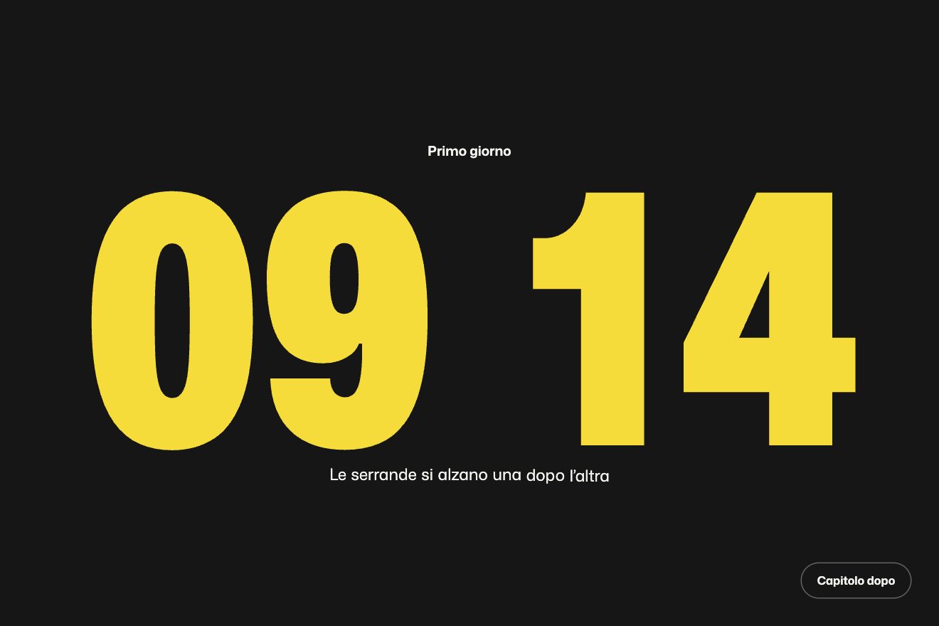
The count is a single number, the total minutes, going from one time to the other in a second: that way the clock crosses hours and even midnight. The digits are rewritten only when the minute changes. Instead of the sound we made them jump a hair, and each one sits in a fixed-width box, otherwise the clock wobbles while it counts.
The strip that moves sideways
Inside a chapter you scroll down and move sideways. The screen stays still and inside it slides a strip more than twelve thousand pixels long, one pixel sideways for every pixel of wheel. Every other effect hooks onto that strip: photos slide inside their frames, twenty per cent wider, and now and then a yellow panel arrives with a huge time. The slide in front of it does not leave: it stays still on screen, shrinks and fades while the panel slides over it, and the digits rise one at a time.
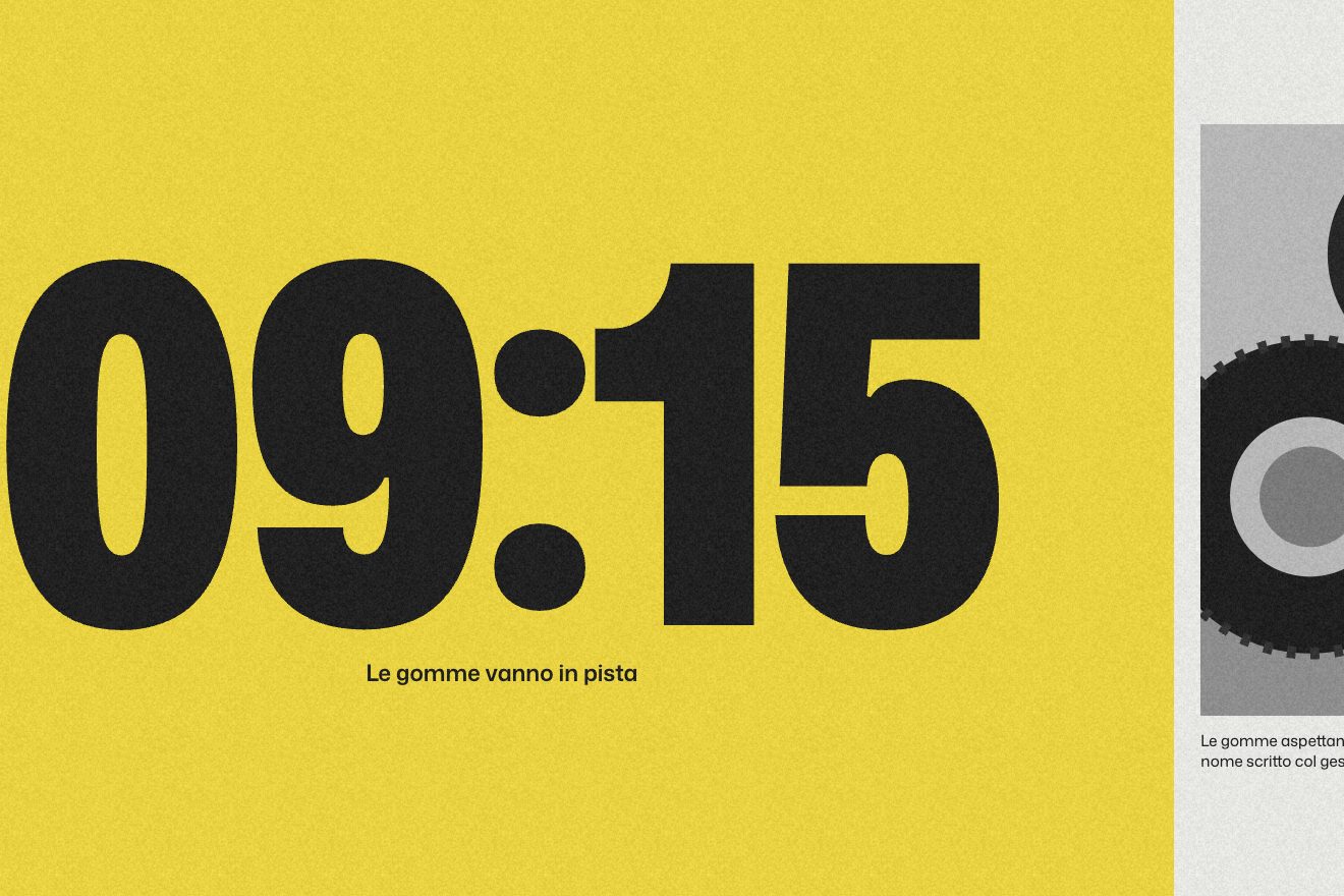
The trick of the still slide is simple: while the panel crosses the screen, the slide is pushed right by as much as the strip carries it left. Every effect uses the strip as its containerAnimation, and that is why its movement has to be linear. The section’s height must be recomputed on every resize, because it depends on how long the strip is.
The other details
At the end of a chapter you can keep scrolling: the wheel drags the next chapter’s card across the screen, and if you scroll back the card retreats. The header items change colour one at a time, each according to the slide underneath it, so the boundary between yellow and black sweeps across the header item by item. The chapters menu is a timetable: each row has the time and the title, and on hover the chapter’s image is revealed from the top in a frame in the middle. In one chapter the title leans with scroll speed, in another a cross turns twice as you pass it.
Where it stumbles
To get in you have to press «Start the experience». It unlocks the audio, but it is a gate in front of a story that could start on its own, with the sound off.
On phones the loader stays black for a few seconds before the photos appear (about five in our tests). Then the horizontal strip gives way to a column: on phones you lose exactly the best effect.
Moving to the next chapter by dragging past the end is the site’s best idea, but nobody would guess it: there is no button to move on, and whoever does not try scrolling further has to go through the menu. And the burst after the title is ten photos in a second: keeping it that short makes it striking, but it is not kind to people sensitive to flashing lights.
What we take away
A photo story can have the rhythm of a film edit: hard cuts, a clock working as a title, a strip that stops to let the hour pass. And the loader can already be the first scene, if it shows photographs instead of a filling bar.
The effects
- The title that rises from a lineA small window flips through frames like a projector, then bursts to full screen while the title, squashed until it looks like a line, stands up to its full height.Lifetime
- The clock that counts the minutesBetween one chapter and the next a dark card slides in: the name cuts in, then a huge clock counts the minutes up to the chapter's time and the new page arrives from the side.Free
- The hour that covers the photoScroll down and the strip moves sideways; when a panel with the time arrives, the slide before it stays still and shrinks while the panel covers it.Lifetime