Breakthrough Energy, by Resn
Breakthrough Energy, how it’s made: the two-colour headline over the video, the words split by the photo’s edge and the yellow curtain
The site of the platform that invests in clean energy technology, built by Resn, is a single scene almost twenty-seven screens long: a headline written twice and clipped to the video, words that change colour as they cross a photo, a yellow curtain with edges faded in thirteen steps. We take it apart with three demos rebuilt from scratch.
The palette
- #DFFF5Cthe acid yellow of the brand: the loader, the menu and the curtain between pages
- #FAFBF8the almost-white cream of the pages and of the headline over the video
- #12110Ethe warm black of the text, the footer and the company curtain
- #DDD9D4the beige of the inner page backgrounds
- #C3BDB8the warm grey, the second neutral next to the beige
- #808080the grey of the people and perspectives pages
Tap a colour to copy its code.
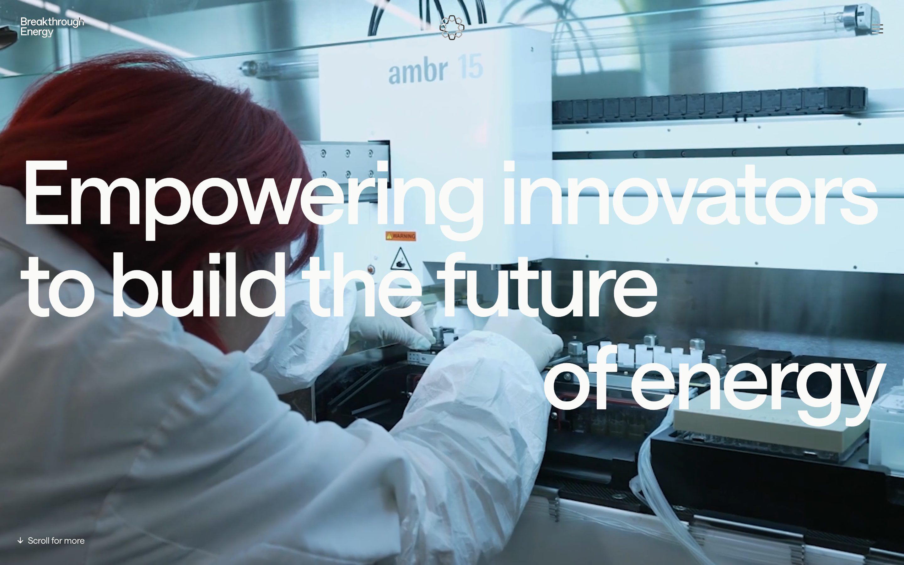
Breakthrough Energy is the platform founded by Bill Gates to speed up clean energy technology: it invests in companies, backs them and works across the five sectors that make the world’s emissions, manufacturing, electricity, agriculture, transportation and buildings. The site says it in one sentence, «Empowering innovators to build the future of energy», written huge over a lab video. The colours are few and bold: an almost-white cream, #FAFBF8, for the pages, a warm black, #12110E, for the text and the footer, and an acid yellow, #DFFF5C, that is the brand colour: the page background while it loads, the menu, the curtain between one page and the next. Around them, a beige and a warm grey for the inner pages. There are two typefaces: Saans by Displaay, regular and medium, for the tightly spaced headings and the body, and Items by Schick Toikka, in capitals, for eyebrows like «THE OPPORTUNITY AHEAD». The site is by the studio Resn, which doesn’t sign it in the code: the credit comes from the award page. On Awwwards it was Site of the Day on 15 January 2026, with 7.38 from the jury, and won the Developer Award, 7.94, where animations scored 8.8.
Underneath there is Vue 3.5.17, rendered on the server, with vue-router, Pinia and vue-i18n; the content comes from Kontent.ai. The animation is GSAP 3.13.0: seven plugins are registered at startup, but the site’s code really uses two, CustomEase and SplitText, and the default ease is set to "linear". Smooth scrolling is Lenis 1.1.20, with a 0.8 second duration and an exponential curve; the award page says Locomotive Scroll, but there is no trace of it in today’s code. The Discover, Develop, Deploy section is a Rive animation on a canvas; the rest is MP4 video. No WebGL and no three.js.
The most interesting thing is how the home page is built: it’s a single stage. A container 2670lvh tall, almost twenty-seven screen heights, with a sticky layer one screen tall inside, and every section stacked on top of each other with absolute positioning. ScrollTrigger is registered but drives nothing: each section reads Lenis’s scroll measured in screen heights and moves the progress of its own paused GSAP timeline by hand. The moments are written in one place: the swirl ends at 5.6 screens, the graph starts at 5.45, the image stack at 7.6, the quote at 10.1, the sectors at 11.1, the approach at 20.9.
We take it apart in three moments, with a demo rebuilt from scratch for each, for a made-up brand, Ignite Fund, a fund that invests in climate technology: the copy, the data, the images and the code are ours. From the site we took the ideas and, where we say so, the numbers.
The two-colour headline over the video
When the home page opens, the three lines of the headline slide in from the right while the words appear one after another, like beats. As you scroll, the words leave one by one, and the full-screen video shrinks into a rectangle that swings up to the left and takes its place in a swirl of photos. The headline is white where it sits over the video and black where it sits on the cream, and the border between the two colours follows the edge of the rectangle as it moves.
The trick is that the headline is written twice: a black copy underneath, a white one on top, and the white one is cut with a clip-path: inset() recalculated every frame from the difference between the video’s rectangle and the headline’s, both read with getBoundingClientRect(). The lines arrive from 100 pixels to the right in 0.6 seconds with circ.out, one every 0.6 seconds; the words of each line, split by SplitText, switch on at once, in a thousandth of a second, spread over 80% of the line’s time. The whole entrance takes 3.4 seconds with sine.out and is driven by time; the words leaving, one every tenth of a second, are driven by scroll between 0.3 and one screen height. The video’s rectangle is computed in polar coordinates: a paused timeline animates the scale, from 1 to 0.21, and the angle, from half a turn to three quarters, with power2.inOut between 0.2 and 2.5 screens of scroll, and the x is multiplied by the screen’s width-to-height ratio, so the orbit is an ellipse as wide as the window. Position and scale are written to the individual CSS properties translate and scale, not to transform.
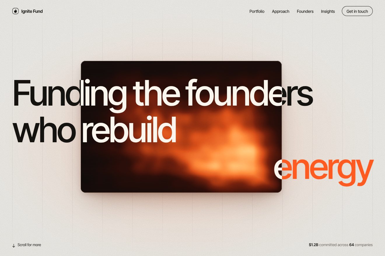
In our demo the video is a thermal camera, drawn on a canvas, aimed at one of Ignite Fund’s heat storage test cells: an ember with scan lines, grain, the viewfinder corners and a scale from 400 to 1,300 degrees, with a crosshair that chases the hottest point and reads its temperature. Over it sits the headline «Funding the founders who rebuild energy», with the last line on the right as on the site. From the site come the two copies of the headline with the clip-path: inset() recalculated every frame from the video’s rectangle, the lines arriving from 100 pixels in 0.6 seconds with circ.out, 0.6 seconds apart, the words switching on at once over 80% of the line’s time, the 3.4 second entrance with sine.out, and the rectangle driven by a paused timeline with the same values, the scale to 0.3 and to 0.7, the turn from a half to three quarters, the radius to 1.02, all power2.inOut, between 0.2 and 2.5 screens of scroll, on the ellipse stretched to the width of the window. Ours are the thermal camera, the frame that instead of joining the swirl stops small above the headline, with a warm layered shadow, a one-pixel border that catches the light and an orange glow on the cream paper with its twelve thin columns, the bar and the footer also written twice, so they change colour with the headline, and the last word, «energy», which turns orange outside the video. With reduced motion the headline is already in place and the camera is still.
The words split by the photo’s edge
Further down, after the graph of electricity demand doubling, there is a tall frame with a photo. On the left the words stack up from the bottom, one at a time, Affordable, Reliable, Clean, and on the right there is «Energy». The part of each word that falls inside the photo is white, «Energy» in there is yellow, and outside everything is black. With each new word the column moves up a line and a new photo appears over the old one and slowly grows.
Again, two copies of the text: a black one outside and one inside the frame, cut by overflow: clip, moving with the same tween, so the photo’s edge splits the letters into two colours. The frame is at least 300 pixels or 58.4% of the screen height wide, 65% tall, and it’s a CSS container: the words are 15.2% of its width, in cqw units, aligned on its centre line. The step is the measured height of a word; the column starts three steps lower and rises one step per word in 0.95 seconds with a hand-made curve, M0,0 C0,0.023 0,0.229 0,0.248 0,0.699 0.493,1 1,1, that covers a quarter of the way in a snap and then brakes for a long time, like a pulled spring. Each new photo appears in a tenth of a second and grows from 1 to 1.1 in 0.95 seconds with another curve, M0,0 C0.36,0.521 0.624,1 1,1, a soft ease-out. The whole sequence takes 1.9 screens of scroll. In the code there is also a red guide line for aligning the words, which only shows if you add debug-vertical to the address.
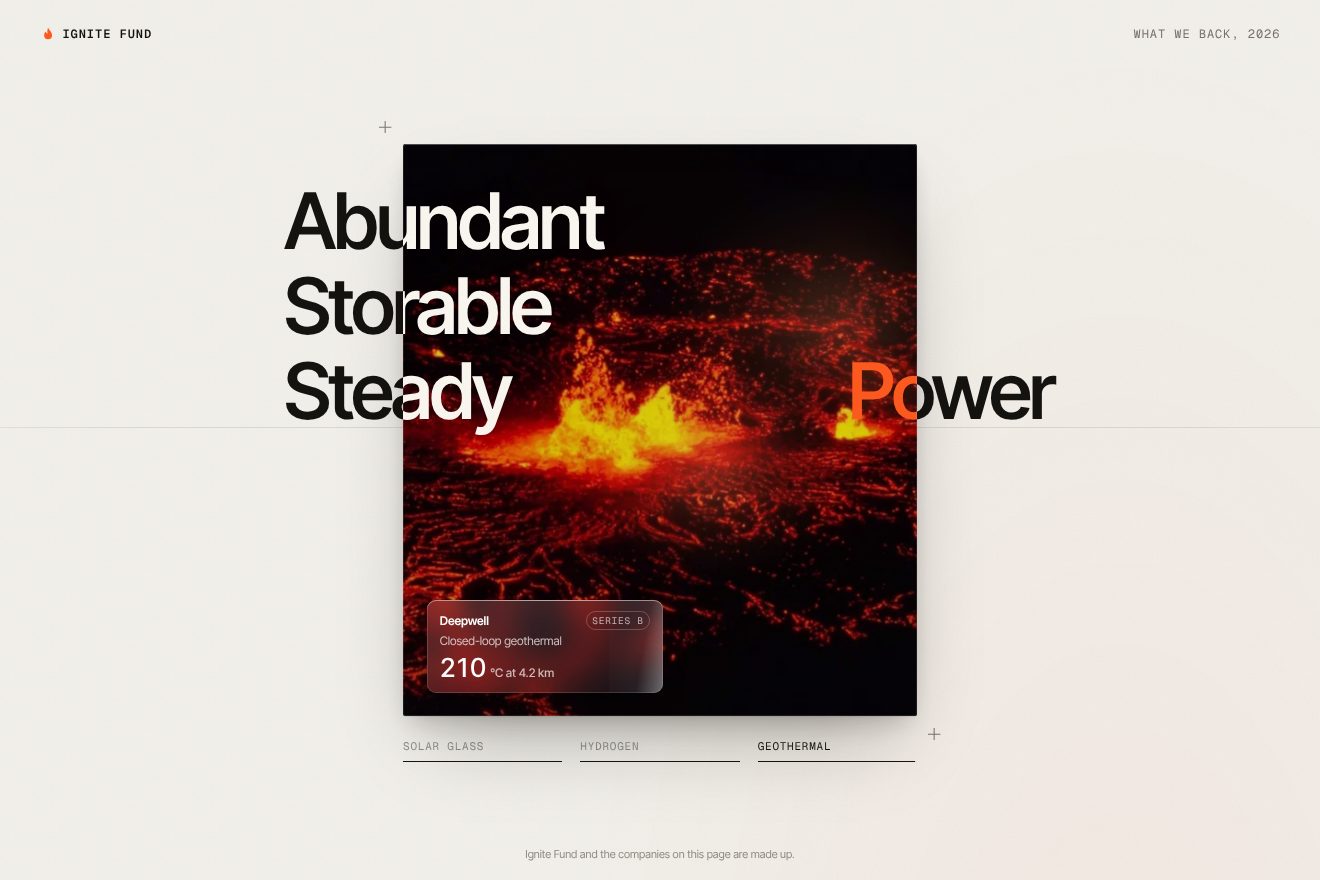
In our demo the words are Ignite Fund’s, «Abundant», «Storable», «Steady» on the left and «Power» on the right, and the images are three real photos of materials, one for each technology the fund invests in: the glass of a solar panel with the sun low on it, the steel cylinders of hydrogen, volcanic rock at night with the glowing veins of the earth’s heat. From the site come the two copies of the text with the inner one cut by overflow: clip, the frame as wide as 58.4 per cent of the screen height and 65 per cent tall, the words at 15.2 cqw resting on the centre line, with the columns at −23.2 and −26.5 cqw, the two hand-made curves, the words starting at 0.01, 1.5 and 2.5 seconds and the right-hand one at 0.2, the 0.95 second durations, the photo appearing in a tenth and growing from 1 to 1.1, and the whole sequence over 1.9 screens of scroll. Ours are the materials, the frosted glass label of each made-up startup, with its name and a rolling number, the panel’s efficiency, the tank’s pressure, the well’s temperature, the row of the three technologies under the frame that fills up, the crosses at the corners and the ember orange in place of the yellow. With reduced motion the words are already in place and the images change with a fade.
The stepped yellow curtain
Click a link and a yellow veil comes in from the right with soft edges, covers the page, the logo rebuilds itself from its rings in the middle and the page name appears; then the curtain carries on to the left and reveals the new page while the rings shrink. On the page of a portfolio company the curtain is black and comes down from the top. It is also the loader: on the first visit the curtain is already sitting on the screen and only opens when the home page’s six sections say they’re ready.
The curtain is a row of three pieces: 75vw of gradient, 100vw of solid yellow and another 75vw of gradient. The gradient isn’t linear: it’s a thirteen-step linear-gradient, with opacity dropping fast at first and slowly at the end, so the edge never reads as a line. Leaving a page, the curtain goes from 100vw to −75vw in one second with Power2.easeInOut; the title appears in half a second after 0.66, and the logo’s four rings grow in 1.32 seconds with a fast curve, M0,0 C0.16,0.74 0.3,1 1,1, 0.2 seconds apart. Entering the new page the curtain reaches −250vw in 0.8 seconds and the rings drop to a hundredth of their size in 0.4 seconds with a slow curve, M0,0 C0.66,0 0.7,0.33 1,1. Meanwhile the rings keep turning, one turn every 7 seconds. At the end the html background goes back to cream in half a second, and the same colour goes into theme-color, so even the browser bar on a phone follows the curtain.
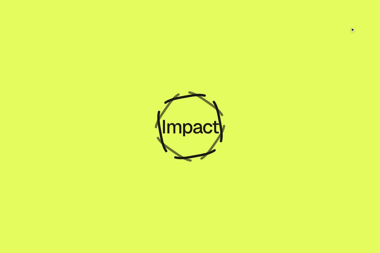
In our demo there are three pages, Ignite Fund’s: the portfolio with the cards of four made-up companies, each with a real photo of its material (battery cells, bubbles in water, concrete, the layers of a canyon), a company’s dark page with its gigawatt-hours rising and the yellow line of the chart drawing itself, and the impact report with the tonnes of CO₂ and five bars growing. A drawn pointer goes round on its own, but you can really click the cards and the menu. From the site come the row of 75vw of gradient, 100vw of solid and 75vw of gradient with the same thirteen transparencies, the way out from 100vw to −75vw in one second and the way back to −250vw in 0.8 seconds, both Power2.easeInOut, the two ring curves with their 0.2 second stagger, the solid rings giving way to the cut ones, the second at 0.62 opacity, the 7 second turn, the page name in the middle, the black curtain coming down from the top for a company page and the theme-color following the curtain. Ours are the mark of rounded rings, born from a superellipse, the pill menu with its tab sliding on a spring, the photos of the materials in the cards, with one-pixel borders and a sheen on hover, the three pages and their numbers; and the rings turning only while the curtain moves. With reduced motion the page change is a fade.
The other details
The opening swirl is fifteen photos turning around the logo, with no library at all: a paused timeline animates the scale, the radius and the rotation, two turns, and each photo has its own drift made of sines and cosines over time, with a variation taken from the function fract(sin(x × 43758.5453)), the classic shader random number. The top bar is drawn four times on top of itself, with four different blend modes, difference, overlay, saturation and color, so the logo and the menu read on any background, cream, yellow, video or black. The menu is a yellow panel that opens from the right in 0.6 seconds with the items coming in 0.09 seconds apart. In the sectors, the «29 Manufacturing Companies» button changes word by word, the old ones rise and the new ones come up from below, and the pill widens to fit the label, plus 56 pixels, in 0.3 seconds. The graph’s border is an SVG rectangle drawn with two strokes growing from the same point, playing with stroke-dasharray. On a phone the home page is another set of components, rearranged vertically, and turning the phone switches set.
Where it stumbles
There is no reduced motion: not one line of JavaScript or CSS checks prefers-reduced-motion, and the whole scroll scene, the swirl and the curtain stay the same for people who ask for less movement. The headline for screen readers is there, in a hidden h1, but the whole home page has only two aria-labels. The page is heavy: the HTML is 918 kilobytes, and 733 of them are the CMS state written into the page, including the list of every portfolio company; inside the inline styles the same three font declarations are repeated until there are 192 of them. The videos are MP4s from 10 to 19 megabytes, with preload="auto", and scrolling to the bottom the home page makes more than 240 requests. And since the curtain waits for every section to be ready, on a slow connection the screen stays yellow for a few seconds: at least five in our test. Finally, two menu addresses, People and Programs, answer with the same page as the home, and the router mounts the right page afterwards.
What we take away
Breakthrough Energy talks about something big and far away, the energy of 2050, and its site holds it with a few repeated gestures: a text written twice and cut by an edge, whether it belongs to a video or a photo, and a yellow that comes in from one side with soft edges. The two-copy trick is simple and works everywhere, because the colour of the text isn’t decided by the text but by what passes underneath it. And building the whole home page as a single stage, with the moments written in screen heights in one place, is a tidy way to hold together a piece of direction almost twenty-seven screens long.
The effects
- Colour-shifting hero titleA scroll animation for the opening (hero) of a page: Ignite Fund, a made-up fund investing in climate technology. The full screen ‘video’ is the thermal camera of a heat storage test cell, and the headline is written twice: a dark copy on the cream paper and a light copy cut with a clip-path exactly on the video's frame. On arrival the lines slide in from 100 pixels and the words pop in one by one like beats; scrolling, the frame shrinks travelling along an ellipse and the headline changes colour wherever the frame passes.Free
- Two-colour split wordsA scroll animation for the section of a fund that invests in climate tech, Ignite Fund: one tall frame of real material and four words around it, three on the left and ‘Power’ on the right. The words are written twice, dark on the page and light inside the frame, which clips them: the edge of the image splits every word in two colours. As you scroll the column climbs one line per word on a long spring and a new material grows in over the last one, from 1 to 1.1: three real photos: the glass of a solar panel with the sun low on it, the steel of the hydrogen cylinders, the glowing volcanic rock of the earth's heat, each with the frosted tag of its startup catching the light.Free
- Stepped yellow curtainA premium page transition on the site of Ignite Fund, a fund that backs climate technology: a click on a portfolio card, each with a real photo of its material, or on a menu item draws a yellow curtain with soft edges across the page, made of a 13 step fade three quarters of the screen wide, a full block and another fade. In the middle our mark of rounded rings grows ring after ring, always turning, and the name of the page fades in; under the curtain the page changes, then the curtain moves on and uncovers it while the rings shrink. Towards a company's page the curtain is near black and falls from the top.Free