Chāmpo, by BAO
Chāmpo, how it’s made: a shop that moves little, and well
The Chāmpo shop sells Ayurvedic haircare and animates very little: buttons with an ink slab running through the text, three colour columns from which portraits emerge, coloured chapters that stay still while the page scrolls. We take it apart with three demos rebuilt from scratch.
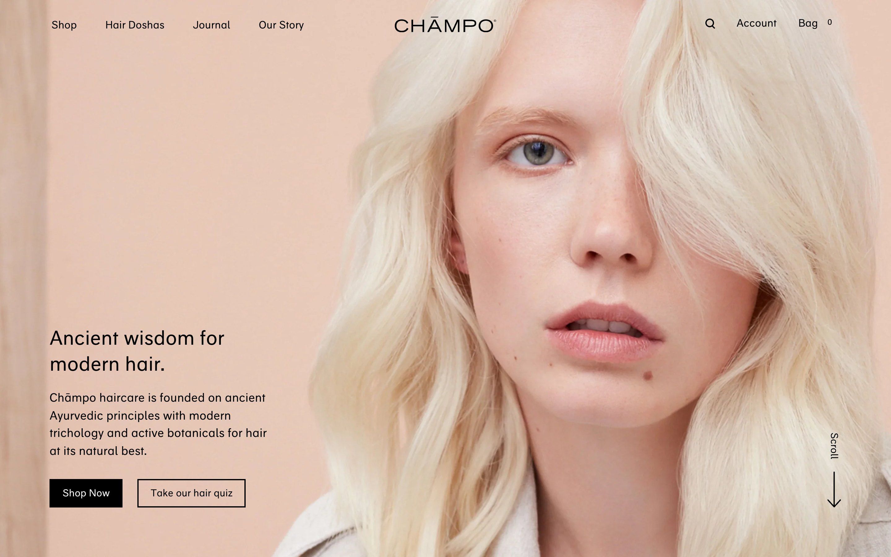
The palette
- #EADECEsand
- #E2C7B7peach
- #FEF6F4blush
- #C6C8CBVata, stone grey
- #D8907FPitta, terracotta
- #CE4E00Kapha, burnt orange
- #000000text
Tap a colour to copy its code.
Chāmpo is a British haircare brand drawing on Ayurveda, and its site is first of all a shop. It was made by the agency BAO, on Shopify, with a purpose-built theme. The products are split into three families, the three Ayurvedic doshas, Vata, Pitta and Kapha, and each has a colour: stone grey, blush terracotta and burnt orange.
The tone is warm and quiet: sand, peach and blush backgrounds, black text and black rectangles, portraits on pastel fields and photographs of bottles in the sun, with long, hard shadows. There is a single typeface, a humanist grotesque made for the brand, in roman and italic; the italic goes on the word that smells nice or stirs something, the product name, hydration, shine.
The most interesting thing is how little it moves. There is no GSAP, no WebGL, no smooth scrolling: there are CSS transitions, a few keyframe animations, some scroll listeners and a very light parallax with Rellax. The page feels like an open magazine, not a shop. Here we take it apart in three moments, with a demo rebuilt from scratch for each: herbs, drawings, texts, colours and code are our own. From the site we took the idea and the timing.
Ink on the button
The gesture you remember is small. Every button is a square with a two-pixel black border, and behind the label there is a black slab. Passing over it, in the filled button the slab leaves to the right and the text turns black; in the empty one the slab enters from the left and the text turns white. Halfway through, the word is half white and half black.
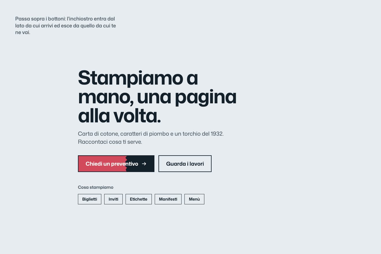
On the site the slab is a pseudo-element behind the text, sliding in 0.5 seconds with ease-in-out, while the text colour changes in 0.2. In our demo the text splits right on the edge: on top of the base there is a second, already inked copy of the button, cut by a clip-path. The edge is ragged like a brush’s, and the brushstroke enters from the side the pointer comes from and leaves towards the side it goes; if you come back while it is leaving, it changes its mind and turns back.
The colour columns
The home page’s most recognisable screen introduces the three doshas: three columns as tall as the screen, stone grey, terracotta and orange, each with a single black calligraphic brush mark, a title, a line and two buttons. Passing over a column, a full-height portrait emerges from the colour, and the mark and the text stay on top.
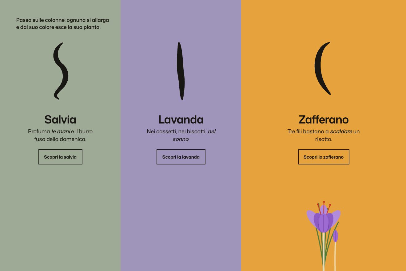
The portrait sits between the colour and the text and goes from opacity 0 to 1 in 0.75 seconds; moving from one column to the next, the two photos cross, and it looks as if the person steps out of the colour. On phones the columns stack and the portrait is always visible. In our demo three drawn herbs replace the portraits, sage, lavender and saffron; the calligraphic marks draw themselves on opening, and the active column widens while the others dim slightly.
The colour chapters
The page explaining the doshas is the site’s only real scroll scene. It is split into three chapters: on the right a third of the screen stays still, in the chapter’s colour, with its large brush mark, a sentence and a button; on the left, customer portraits, texts and product photographs scroll by, slightly slower than the text. When the next chapter arrives, its panel pushes the previous one away: grey, then terracotta, then orange.
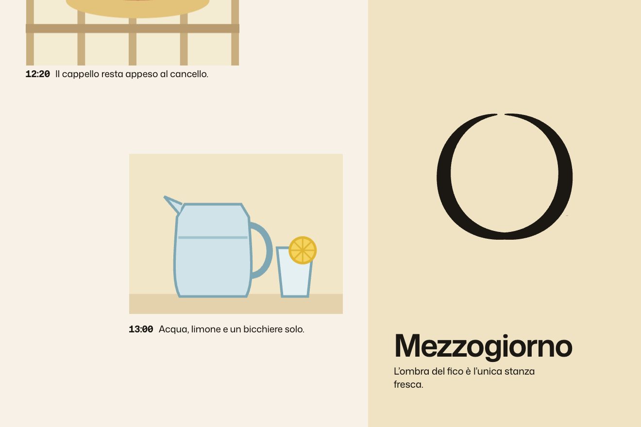
It is built with position: sticky and Rellax: the photos move at speed −1, that is they lag by about 7% of the scroll, and the items rise 30 pixels as they enter. On phones the panel disappears and a fixed bar slides down at the top instead, with the chapter’s colour, name and a small mark: a simple, successful indicator. In our demo the chapters are the hours of a day in the kitchen garden, the panel changes colour continuously instead of being pushed away, and each chapter’s mark is written and erased with a brush as you scroll.
The other details
The header leaves when you scroll down and comes back only after you have scrolled up at least 250 pixels, and over the first image it is transparent, then turns white. In the menu, hovering one item drops the others to an opacity of 0.4. At the bottom right of the first screen the word «Scroll» is set vertically with a long arrow; it disappears as soon as you scroll, and clicking it moves the page down with an easeInOutQuint curve of at most 0.8 seconds. On the product cards the photo rises 20 pixels on mouse over. On the product pages a before-and-after comparison has a handle that, when it enters the screen, wobbles by itself like a spring settling, inviting you to drag it. And the stylesheet still holds an unused loader: two black bands retracting in 3.1 seconds while the image shrinks for twenty seconds.
Where it stumbles
After a thousand pixels of scrolling a newsletter sign-up window appears, on top of everything, just as you start reading.
For a site that moves almost only with CSS transitions, the code is heavy: a 335 KB JavaScript file, jQuery included, and a 395 KB stylesheet, which still carries the loader the home page no longer uses.
The parallax is so light, about ten pixels each way, that it is barely visible; and below 900 pixels of width it disappears altogether; on phones the portraits’ appearance is lost too, as they stay always visible. Between award badges on the bottles, Trustpilot stars and currency selectors, the shop part breaks the magazine’s calm a little.
And the liveliest thing on the site does not move: the light in the photographs, the hard sun, the long shadows, the drops of oil. The products are never animated.
What we take away
A shop can make itself remembered with three fields of colour and a single well-made gesture on the buttons, repeated everywhere. And a sticky panel that changes colour, with a bar in its place on phones, tells chapters almost for free.
The effects
- Ink on the buttonSquare buttons where a brushstroke of ink enters from the side you come from and leaves by the side you go, and the text changes colour right on the brushstroke’s edge.Free
- The colour columnsThree full-height columns, each the colour of a herb, with a brush mark that draws itself. Passing over one, the column widens and its drawn plant rises out of the colour.Lifetime
- The colour chaptersA page in chapters with a pinned panel that changes colour as you scroll and writes each chapter’s mark with a brush, while beside it the moments scroll by, the drawings slightly slower than the text.Lifetime