Henrietta Said, by Tattoo Digital
Henrietta Said, how it’s made: flavours that spin on scroll, the review that becomes the page and the badge that goes round
The site of Henrietta Said, peanuts spiced like hot chicken wings, is blush pink, huge and a little cheeky: the bags fly off spinning, the reviews flip over into the next section, the round buttons turn once and a quarter. We take it apart with three demos rebuilt from scratch.
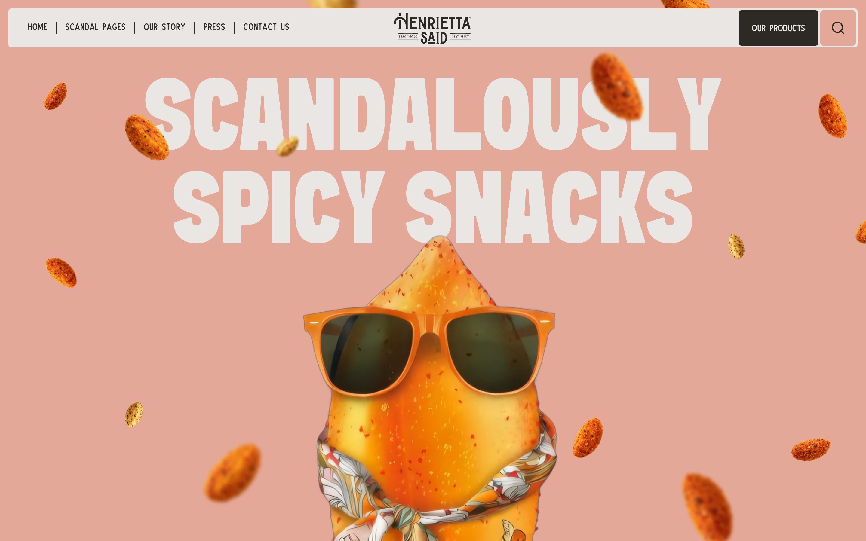
The palette
- #E3A898the brand’s blush pink: the ground of the hero, the loader, the reviews and the footer
- #D32929the red of the Ancho Kimchi flavour, the first in the flavour slider
- #8B231Athe dark red of Nashville Hot Chicken, also the colour of the curved text
- #F45016the orange of Original Buffalo
- #EFC415the yellow of Lemon Pepper
- #EAE6E3the light paper of the headlines on colour, the header and the panels
- #2D2A26the warm near-black of the text, the links and the “censored” band
Tap a colour to copy its code.
How others rated it
CSSDAWebsite of the Day, 13 November 20268.52/10the jury scoreHenrietta Said is a brand of jumbo roasted, seasoned peanuts, in four flavours borrowed from chicken wings and American hot cooking: Ancho Kimchi, Nashville Hot Chicken, Original Buffalo and Lemon Pepper. The motto is «Scandalously spicy», and the site takes it literally: it opens on a blush pink ground with «SCANDALOUSLY SPICY SNACKS» in enormous letters, almost a fifth of the window tall, fifteen peanuts floating and running away from the pointer, and in the middle, in a video with transparency, a peanut wearing sunglasses and a scarf. Every flavour has its colour, and the colours are the food’s: the red of kimchi, the dark red of Nashville chicken, the orange of buffalo sauce, the yellow of lemon, plus a light paper and a warm near-black for the text. There are two typefaces and both have character: Sink, a condensed, very heavy sans, for the giant headlines, and TheDodgerInky, narrower and lighter, for everything else. The brand belongs to TrulyGood Foods, as the footer says; whoever made the site does not sign it, but it lives at Tattoo Digital’s address. It was Website of the Day on CSS Design Awards on 13 November 2026, with 8.52 from the jury.
Underneath there is Webflow, with its new generation of interactions (IX3), which are GSAP timelines described in JSON. GSAP is 3.15.0, served by Webflow itself, with SplitText, ScrollTrigger, CustomEase, CustomWiggle and EasePack; smooth scrolling is Lenis 1.1.14, tied to GSAP’s ticker. The rest is done by scripts written by hand inside the page: the loader, the floating peanuts, the pack drawn frame by frame on a canvas, the text running along a curve. Between pages there is no library: the change is the browser’s View Transitions, written in CSS.
We take it apart in three moments, with a demo rebuilt from scratch for each. The text, the brands and the code are ours; from the site we took the ideas and, where we say so, the numbers.
Flavours that spin on scroll
Right below the opening starts the best part of the site. The screen holds still, and as you scroll the four flavours pass one after the other: a big bag in the middle, behind it the flavour’s name in letters 28 hundredths of the window’s width, above it the full name on strips of colour, beside it the description («Jumbo roasted peanuts with a fusion of flavorfully fun ancho kimchi seasonings») and a round button. At every change the bag flies off spinning, the new one arrives from the other side spinning the other way, the giant word swaps letter by letter and the ground takes the colour of the new flavour.
It is a single Webflow interaction, tied to a section six screens tall with the stage held in CSS (position: sticky), with scrub at 1.4: scrolling drives the timeline, but the timeline catches up with almost a second and a half of soft delay. In the first change, from Kimchi to Chicken, the strips and the button close to scale 0 in 0.32 seconds; the word «kimchi», split into letters by SplitText with a mask, drops out at the bottom (y to 101%) in 1.56 seconds with back.inOut(1.7) and half a second between letters, while «chicken» falls in from above. The Kimchi bag leaves downwards, by a whole screen height, and to the right, by three tenths of the width, turning -180 degrees, in 2 seconds of sine.out; the Chicken bag comes in from the top left turning 180, at the same moment. The ground goes from #d32929 to #8b231a in 2 linear seconds, the description changes line by line behind a mask. Under the bag there is a shadow: an oval blurred by 5 pixels, 18 hundredths of the window’s width wide and three thousandths tall, which goes out when the bag leaves and comes back to 40% only once the new one has landed. The other two changes repeat the pattern, towards the orange #f45016 and the yellow #efc415.
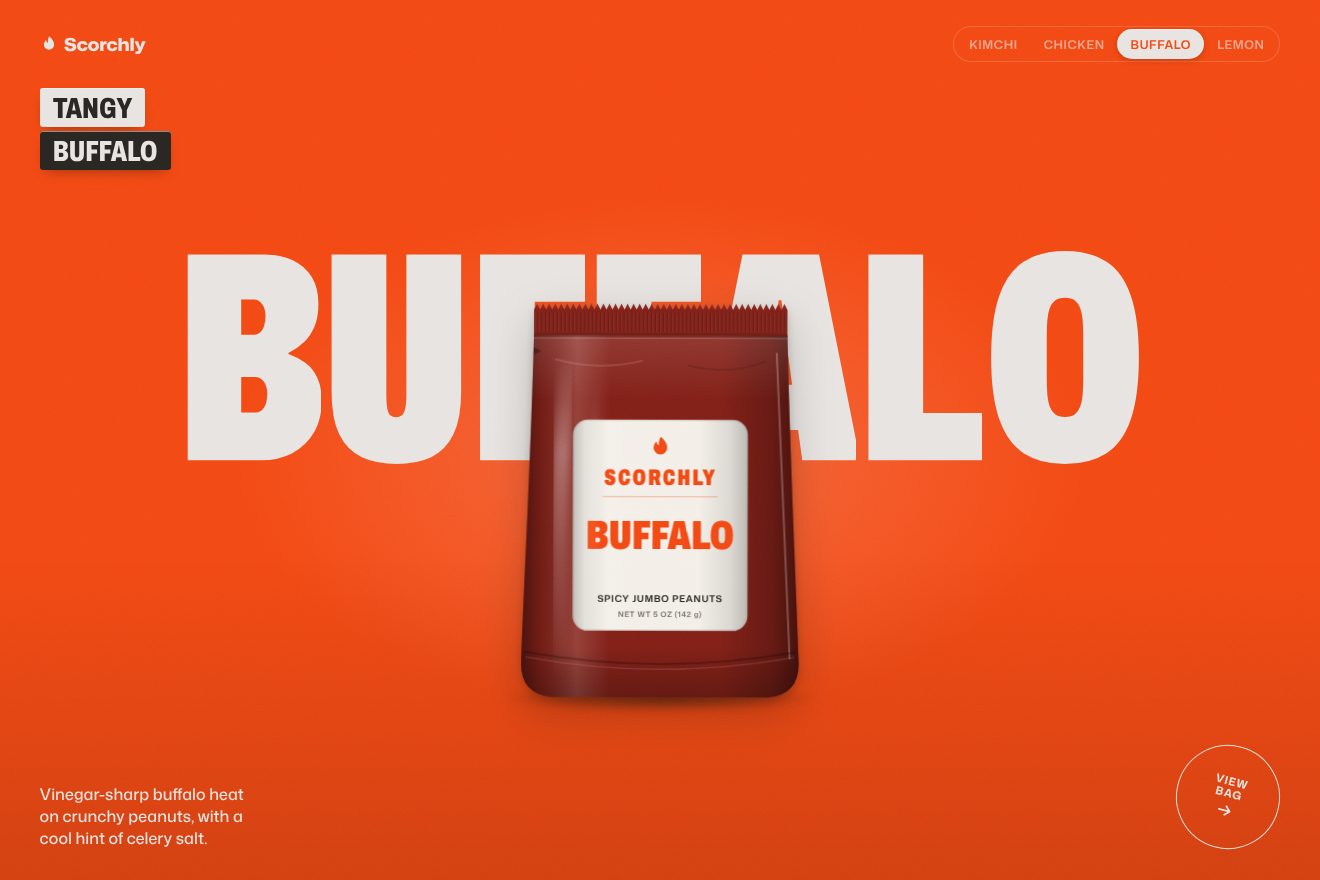
In our demo the brand is invented, Scorchly, spicy almonds and peanuts in the same four flavours, and the bags are not photos: we draw them in SVG, like a product just shot in a studio, with the serrated, ridged seal at the top, the tear notch, the shading on the sides, a soft reflection, a thread of light on the edge, the gusset at the bottom and the label with the flavour and the weight. From the site come the stage held over a long section, the 1.4 scrub, the giant word leaving letter by letter behind the mask while the new one falls from above, the bag leaving by a full height and three tenths of the width turning 180 degrees and the new one entering from the opposite side, the site’s four colours for the four grounds, the oval shadow going out and coming back, the description lines behind the mask and the round button tilted 15 degrees. The landing is ours: the bag arrives one pixel past its place and sways three times, less each time, on a pivot at the bottom, while the shadow spreads to 1.16 and comes back to 1; and the bag leaves with a sine.in, so it speeds up on the way out instead of braking. At the top a row with the flavour names slides a pill onto the current flavour, and a click takes you to that flavour. There is a soft light in the middle and a light grain, and on the lemon yellow the text turns dark to stay readable. Left alone, the page scrolls to the end. With reduced motion the flavours swap with a fade, without flying.
The review that flips into the page
Further down, after the text running on the curve, come the reviews: «Don’t Just Take Our Word for It». As you scroll three coloured cards rise, a yellow one, a red one and a brown one, each tilted a different way, with the name of the person who wrote it, the city and the line. Then they straighten, the others disappear, and the last one turns over like a playing card: on the back is already the next section, «scandal pages», which grows until it fills the screen.
Here too it is a Webflow timeline on a section five screens tall, with scrub at 1.4. The cards rise from twice their height (y at 200%) while turning, the first from -10 to 5 degrees, the second from 10 to -5, the third from -12 to 7, at 0.5, 1.2 and 1.9 seconds of timeline, with a back.out(0.5) that lets them land just past and come back. At 2.43 they all straighten in two tenths of a second, at 2.61 the others vanish at once, and at 2.63 the brown card turns 180 degrees on its vertical axis with back.inOut(1.7), inside a 2000 pixel perspective. The back is a second panel already turned 180 degrees, with its rear face hidden (backface-visibility: hidden), which during the turn goes from scale 0.4 to 1 and becomes as tall as the window; at 3.54 its rounded corners are removed, and everything rises by a quarter of the height. So the review does not lead to another section: it becomes it.
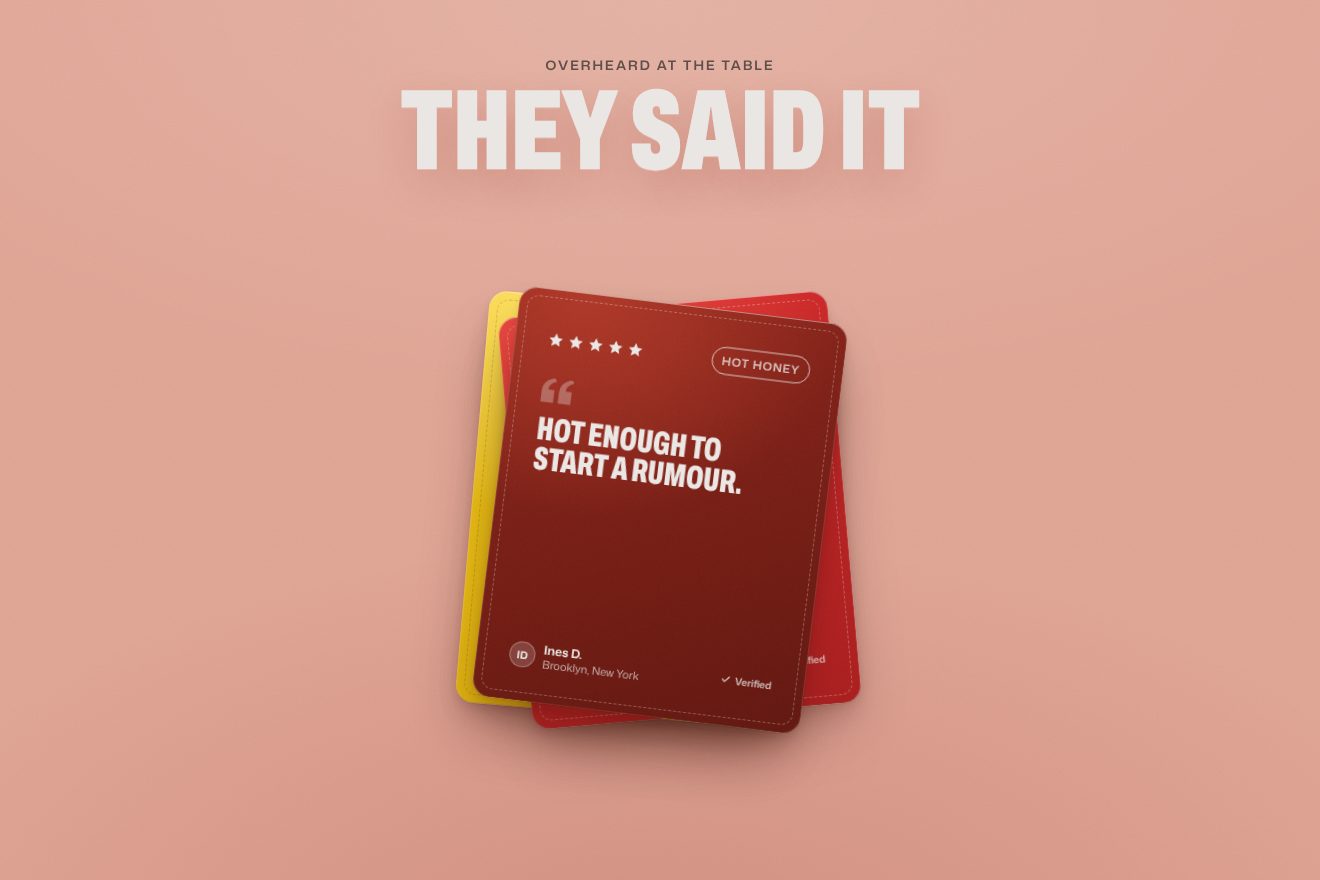
In our demo the club is invented, Scorch Club, and so are the reviews: name, city, flavour, five drawn stars lighting up one after another when the card lands, and the «Verified» tick. From the site come the long section with the 1.4 scrub, the three yellow, red and brown cards rising from twice their height with the same turns, -10 to 5, 10 to -5 and -12 to 7 degrees, the back.out(0.5), the straightening together, the last card’s 180 degree turn with back.inOut(1.7) in a 2000 pixel perspective, the hidden back growing from 0.4 to 1 until it fills the page and loses its corners, and the site’s colours. The material and the light are ours: the cards have a dashed stitch, grain and an edge that catches the light; the shadow is separate from the card, starts low and far, comes closer when the card lands and during the turn narrows to a line and widens again; in the turn the face darkens as it goes over and a band of light passes across both faces. The back is our press room, «In the press», with a magazine quote and three articles coming in line by line behind a mask, with the rules drawing in from the left; the panel is page-sized from the start and grows by scale, so the text never reflows while the card widens. Left alone, the page scrolls to the end. With reduced motion the cards and the page arrive with a fade.
The badge that goes round
Every flavour has its «view product» button, and it is not a pill: it is a circle 7 hundredths of the window’s width, with a 2 pixel border and the words inside, turned 15 degrees like a stamp put on crooked. When the pointer passes over it, it makes a full turn and a bit more, and meanwhile fills with the colour of its flavour.
The Webflow interaction takes the circle to 375 degrees in half a second, with back.inOut(2.5): first it pulls back a little, then it turns, overshoots and comes back, and stops tilted 15 degrees again, as it started. The fill takes the flavour colour (--kimchi-red, --brown-chicken, --orange, --lemon) and the text turns light; on leaving, the same timeline plays backwards. The same gesture, a full turn with back.inOut, is made by the social buttons, and the «buy now» on the flavour pages turns on its own, slowly, once every eight seconds, and squeezes to 90% when you hover it. Around them, the site adds two things that make the buttons feel physical: many elements are magnetic, following the pointer by a fraction of the distance in 0.4 seconds and going back to their place with an elastic.out(1, 0.4); and in the products dropdown each flavour’s peanut, under the pointer, shakes by 7 degrees with CustomWiggle, five oscillations dying away.
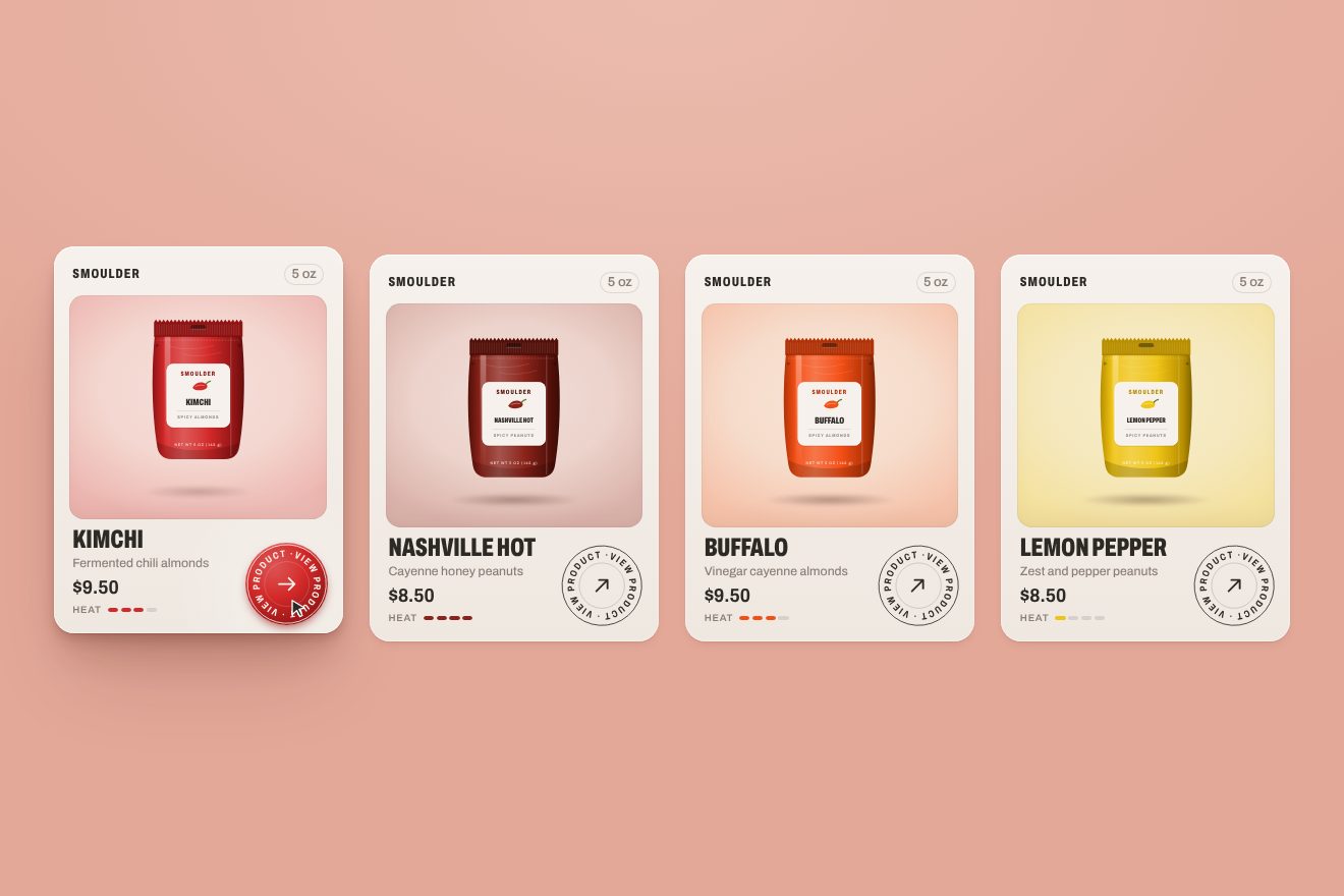
In our demo the brand is invented, Smoulder, and the page is a row of four cream product cards, one per flavour, each with the bag we draw in SVG (the serrated seam, the hang hole, the tear notches, the glossy reflection and the label with the chilli), the name, the price, the weight and the heat marks. From the site come the round «view product» button with its thin border, tilted 15 degrees, which on hover goes to 375 degrees in half a second with back.inOut(2.5) and fills with its flavour colour as the text turns light, the timeline playing backwards on leaving, the magnet with its elastic.out(1, 0.4) return, the bag shaking with CustomWiggle and the «buy now» press to 0.9. Everything else is ours: the words «VIEW PRODUCT» run around the circle, exactly as long as the circumference, so you see the turn (a plain circle that spins goes unnoticed); the colour grows from the centre like a disc, with back.out(1.5); the arrow in the middle does not turn with the ring and meanwhile rotates 45 degrees to the right; the magnet weakens with distance and never pulls the button more than a tenth of the card; pressed, the button squeezes to 0.9 and springs back. The card lifts with a four-layer shadow, a light follows the pointer, a flash crosses the bag and its shadow on the ground tightens, and the heat marks fill. On the phone the cards sit in a two by two grid. Left alone, a pointer passes over the four cards and presses each button. With reduced motion the colour fades in and nothing turns.
The other details
The loader plays its part: a counter goes from 0 to 100% in four steps of random length and size, with three pauses in between taking a fifth of the time, while four peanuts come in from the sides with a back.inOut(2.2) that makes them back up before they start. On the second visit of the session the counter starts again from 53, and if you arrive from an internal link there is no loader at all. Then the light container shrinks to the height of the header, 65 pixels, and the page is revealed.
Below the flavours, six panels with the benefits (seven grams of protein, two of fibre, wing flavoured, vegan ingredients, keto friendly, extra large Virginia peanuts) come in from the right and open like the tabs of a binder, one every half second of timeline, each stopping at a different distance from the edge. The Lemon Pepper bag then turns on scroll in 120 frames drawn on a canvas, chased with a factor of 0.08 per frame so the turn never jumps. The text «SCANDALOUSLY SPICY» runs along a curve only while you scroll: every turn of the wheel gives it speed, which then drops by 4% every frame. And the last section is a joke: a giant peanut covered by a dark band tilted 5 degrees, saying «CENSORED» and, below, «image too spicy!».
The header links have a copy of themselves underneath, made with a text shadow shifted by 0.9 em: on hover the letters rise one after another, a hundredth of a second apart, and the copy takes their place. The full-screen menu drops its six links from different distances, the lowest from six times its own height, so they all arrive together but at different speeds. The page change shrinks the old page to 90% and darkens it, while the new one rises from the bottom with a clip-path in 0.95 seconds; the header has its own transition name and stays still.
Where it stumbles
ScrollTrigger is loaded twice: Webflow’s 3.15.0 and, just before the pack script, a 3.12.5 from another CDN, which replaces the first in the global variable. The curved text script waits for a typeface, Anton, that is declared nowhere, and may measure the length of the text before the real one has arrived. On every arrival on a page (at the pagereveal event) the same script is copied and run again, with another loop and more wheel listeners. The opening video comes in two formats, and one is a 3.5 MB ProRes 4444; the pack’s 120 frames all start loading together; the opening peanuts ask the browser for their position on every frame, forever. The home page has 30 h1 headings, including the customers’ initials in the reviews, and the curved text has no readable alternative. Reduced motion is considered nowhere: not in the scripts, not in the CSS, not in the Webflow interactions, which could handle it. And on the brand story page, among the pills falling with physics, the template’s words are still there: «CAPTIVATE CUSTOMERS», «ADVANCE LEADERSHIP».
The effects
- Flavour swap scrollThe flavour slider of Scorchly, a made-up brand of spicy almonds and peanuts, in the premium style of the product pieces: the stage stays still and, as you scroll, the four flavours take turns. The giant word of the flavour drops out of its mask letter by letter while the new one falls from above, the bag spins away and the new one comes in from the other side, lands one pixel too far with a small sway, the shadow underneath goes out and spreads again, the ground takes the colour of the flavour and the name strips and the round button pop back from nothing.Free
- Tilted review cardsThe reviews section of Scorch Club, a made-up brand of spicy almonds, in the premium style of a Dribbble shot: on a pink paper-grain ground, as you scroll, three review cards (lemon yellow, kimchi red, hot honey brown) climb from below the page one after the other, tilted one way and landing tilted the other, with a soft spring, a light running over the face and the shadow coming closer as they land. They straighten, the first two vanish and the last one turns over like a playing card: its back is the next page, the press room, which grows to fill the screen, loses its rounded corners and lets its articles in row by row.Free
- Flavour product cardsA row of four product cards from Smoulder, a made-up brand of spicy almonds and peanuts, on a warm pink background: each has the pouch drawn like a render, the flavour name in a condensed grotesque, the price, the heat and a round «view product» badge in a thin line. Hovering the card, the badge turns past a full circle and settles, fills from the centre with the flavour colour and follows the pointer like a magnet; the pouch wiggles, the card rises on a soft layered shadow. Pressed, the badge squashes and springs back. A premium, Dribbble-shot style.Free