Ulvin, by Ulvin Omarov
Ulvin, how it’s made: a portfolio inside a design tool
Ulvin Omarov’s portfolio, built in Framer: the page looks like the canvas of a design tool, with a ruler that follows the mouse, the name in a selection frame, colleagues’ cursors that step aside and project folders that pile up. We take it apart with three demos rebuilt from scratch.
The palette
- #FFFFFFthe page, with a squared grid
- #111212text, borders and the black folder
- #36C5F0the blue: selection frames, menu, contact plate
- #ECB22Ethe yellow: a cursor, a folder, the stripes at the bottom
- #2EB67Dthe green: the first folder and the shape with eyes
- #E01E5Athe red: the other cursor and the last folder
Tap a colour to copy its code.
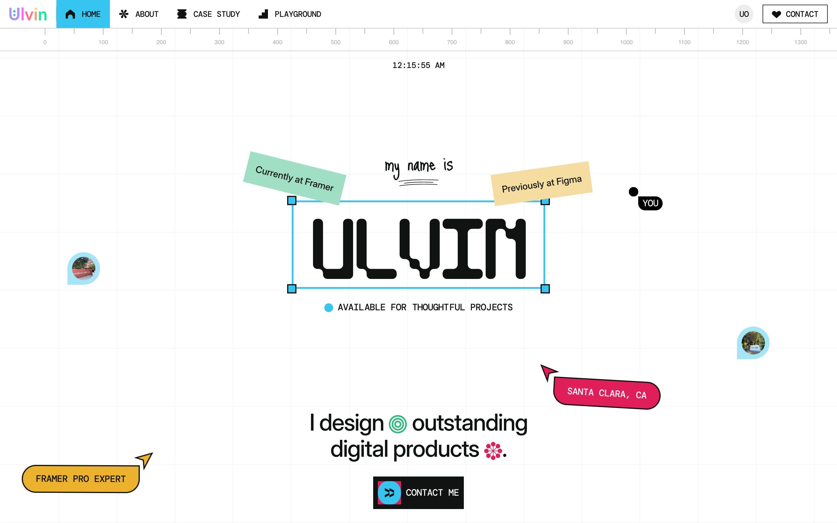
Ulvin is the portfolio of Ulvin Omarov, a product designer presented on the site as a Framer Pro Expert in Santa Clara, California; it is also the demo of the portfolio template sold under the same name. Open the page and it feels like looking at the canvas of a design tool: a white squared background, a ruler with numbers along the top, the time in California with its seconds. In the middle is «ULVIN» in a modular face, square with round corners, closed in a blue selection frame with its four handles; around it two tilted notes, «Currently at Framer» and «Previously at Figma», two cursors with a label, the kind you see when several people work on the same file, and two comment pins with a photo inside. There are four colours, blue #36C5F0, yellow #ECB22E, green #2EB67D and red #E01E5A, the same as Slack’s logo, on white and on a near black, #111212. Headings are set in Flux, text in Inter Display, labels in DM Mono and Fragment Mono, the handwritten bits in Just Me Again Down Here.
The site is built with Framer, which brings React and Framer Motion along. But there are also hand-written components in it that use GSAP with ScrollTrigger, SplitType to split text into letters and lines, and Lenis 1.3.23 for smooth scrolling: 28 modules in all, 2.2 MB before compression. This portfolio is not on Awwwards; two of the projects it shows are, as sites of their own: L’OISEAU DÉ, with an Honorable Mention, and INNOSTART. We take it apart in three moments, with one demo rebuilt from scratch for each, for an invented studio we called Offcut: texts, drawings, colours and code are ours. From the site we took the idea and, where we say so, the timings and sizes.
The name in the frame
The page opens white, with a blue label in the middle, the kind that in design tools hangs from a colleague’s cursor: «Helloooo» is typed into it, with a waving hand.
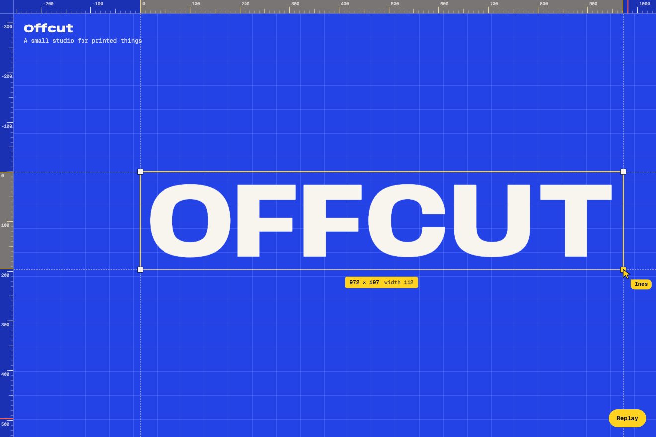
On the site the label is a component that splits the sentence into characters with SplitType and shows them one at a time: the whole sentence in one second. The text cursor is a bar 3 pixels wide that blinks in steps, every half second; once the sentence is done two tenths go by, then the characters disappear backwards, a little faster than they came. Meanwhile the white layer covering the page leaves: it waits 2 seconds and fades over another 2. The name is already there underneath, and its five letters come in one after the other, 0.03 seconds apart, each from 40 pixels to the right and from scale 0.9, on a spring with stiffness 400, damping 40 and mass 4: they go a little past their place and come back. The selection frame is a drawing, four lines and four small squares that cannot be grabbed. The ruler has a tick every 50 pixels and a number every 100, and at every movement of the mouse it slides sideways, up to 150 pixels each way, in 0.2 seconds.
In our demo the label belongs to a colleague, Ines, and types «hello, we are»; the letters of OFFCUT arrive with the site’s timings and its spring. Then the frame does what it promises: the handles can be grabbed, and pulling a corner sets the word again to fill it. The height decides the type size; the width is covered by the wdth axis of Anybody, a variable font that goes from 50 to 150, and where the axis cannot reach, a stretch does the rest. The rulers do not slide: they count from the frame’s corner, a yellow band marks its width and height and a red line follows the pointer. Once the opening is over, Ines takes a corner and pulls it, to show how.
The cursors that run away
Around the name there are two cursors with a label, a yellow one, «Framer Pro Expert», and a red one, «Santa Clara, CA». They move around by themselves, and when the mouse comes close they step aside. The visitor’s mouse is one of the site’s cursors too: a dot with the label «You».
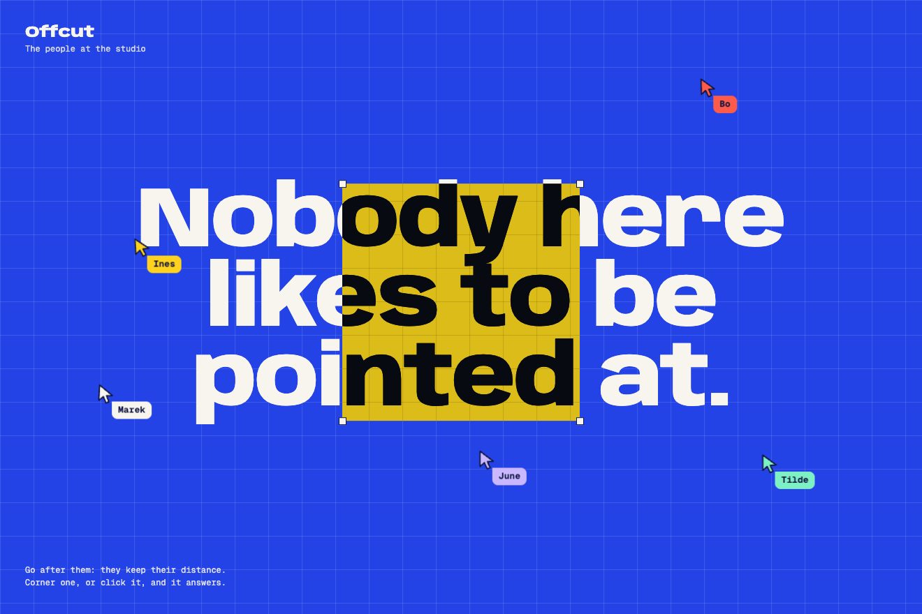
On the site the two cursors go back and forth between two points: the yellow one 150 pixels right and 130 up while turning by 18 degrees, in 2.5 seconds; the red one 59 left and 110 up, as far as 30 degrees, in 4. What moves them aside is a component from Framer University, Hover Force, set to «repel» with an area of 300 pixels: the shift is the distance between pointer and label, turned the other way and multiplied by how much is left to the edge of the area. That means that at 150 pixels the label shifts by 75, the most it ever does, and that with the pointer right on it, it does not shift at all. The visitor’s cursor is in mix-blend-mode: difference, so it changes colour with what is under it, and over the name it widens in 0.4 seconds into a 350-pixel square, with four small squares at its corners, that inverts everything: the black letters turn white on black, the blue of the frame orange. The pins, with the mouse on them, stretch into a pill and show the message, «Hey guysss».
In our demo there are five cursors, the people at the studio, and they really run: the push grows to 190 pixels when you are right on them, it is measured from where the cursor is at that moment and it goes through a spring, so chasing them does little. Against an edge, though, they have nowhere to go: caught, or clicked from close by, they stop and type an answer in their bubble, one letter at a time like the site’s label. Over the headline the cursor becomes the square that inverts, and on our blue, white in difference gives yellow. If nobody moves the mouse, and on a phone until it is touched, a hand goes round by itself and every now and then catches one.
The project folders
The projects are four coloured folders, green, black, yellow and red, with a tab at the top: «Project 01», «Project 02». As you scroll they pile up.
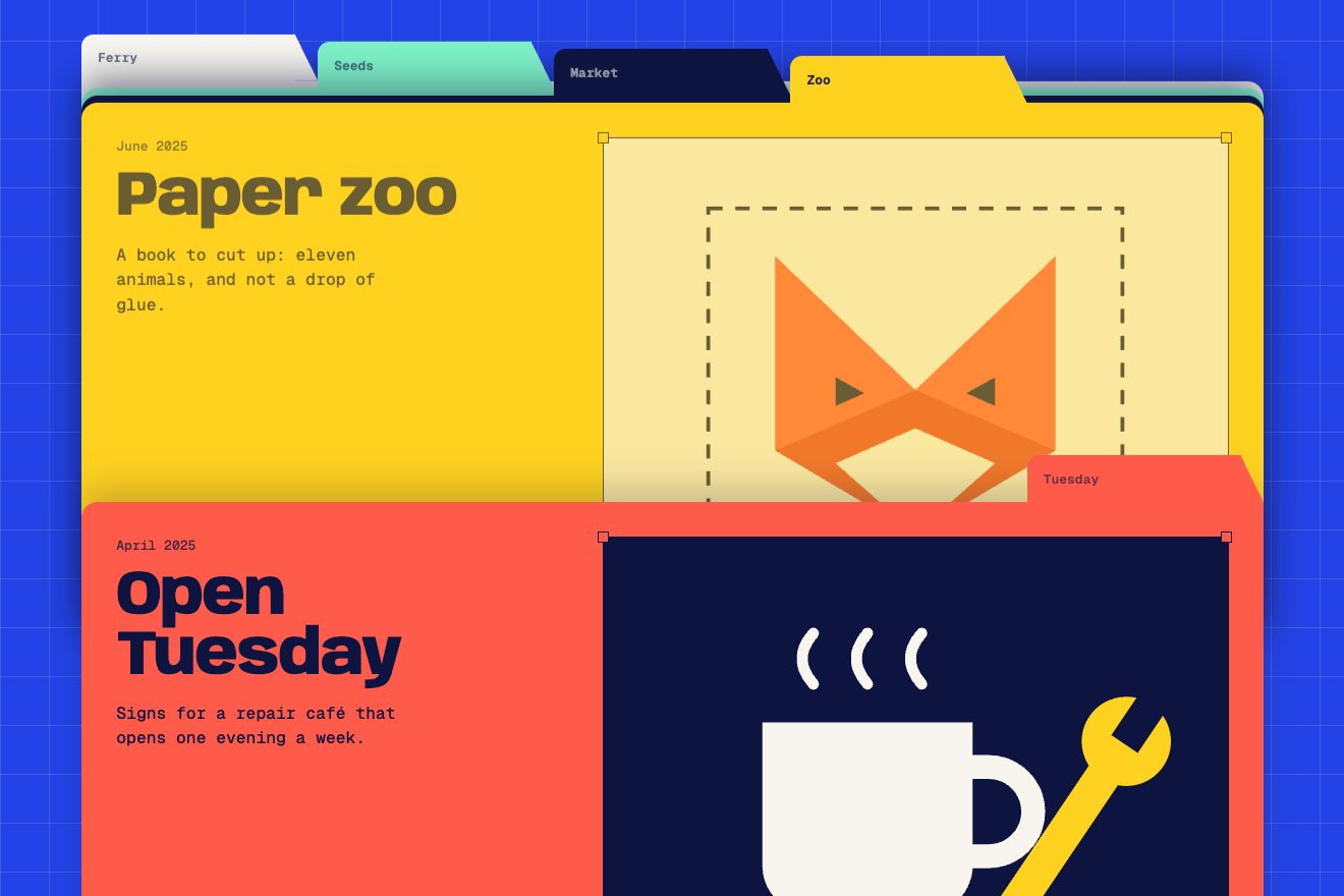
On the site every folder has position: sticky with top at zero and 80 pixels of space above: once at the top it stops, and the next one slides over it. On a 1440-pixel screen they are 1000 wide and 585 tall. The tab sits in a row of its own, with an empty space in front of it of 190, 430 and 670 pixels: about a quarter of a folder more each time, so that, piled up, the four tabs stay side by side. Inside are the date, the title, one line, «View project», two labels shaped like small folders and a screenshot of the project in a selection frame. The text of the folder being covered disappears: it is one of Framer’s scroll effects, tied to the arrival of the next folder, on a spring with stiffness 500 and damping 60.
In our demo there are five folders, and the tabs carry the name of the job instead of a number. The pile is CSS, as on the site; the script adds a single number, tied to the scroll: how many folders have landed. From it, every covered folder rises 7 pixels for each folder on top of it, and the edges of the older ones show in steps behind the new one; the one that lands makes its tab jump. And the tabs are buttons: they take the page back to their folder.
The other details
The large text, «I design outstanding digital products», has two drawings between the words: a component puts them wherever the sentence has a pair of square brackets, as tall as a letter, and makes them turn, here by a full turn in 5 seconds, back and forth; the lines rise one at a time from behind a mask, 0.7 seconds each. The handwritten underlines and the curved line between sections draw themselves: the stroke starts fully hidden and uncovers when it comes on screen. The «Contact me» button has an icon that takes a run-up every four seconds: 15 degrees backwards, a full turn, 7 degrees too far and back. In the tiles next to the coloured labels four elements grow and shrink one after the other, a tenth of a second apart. Towards the bottom, next to «Let’s talk», a green four-lobed shape spins and has two eyes: they follow the mouse, moving by four hundredths of the distance, and every two, three or four seconds they blink in 0.3. The contact panel, in yellow and brown stripes, has a blue plate with arrows that run when you hover it.
Where it stumbles
The clock at the top is expensive: to write the time in California the component brings along moment and the time zones of the whole world, 841 KB of the home module’s 1,030.
The smooth scroll has a setting, «intensity», which the page sets to 5; but the component does not pass it on to Lenis, and the scroll stays the default one.
Hover Force measures the centre of the label only once, on load, in screen coordinates. As you scroll, the label goes up with the page and the field stays where it was; and meanwhile the label goes on its round, up to 200 pixels from there. The mouse reaches it without it moving, and sees it step aside while passing where there is nothing. Of its two numbers, besides, only the area counts in this mode: the movement, 300, never enters the sum.
And on every visit there are two to four seconds of greeting before the page can be seen, with clicks blocked for the first two. On a phone, finally, almost everything that answers the mouse is gone: cursors, pins, eyes.
What we take away
The interface of a tool is a good outfit for a page, if the people looking at it use that tool every day: here ruler, frame, cursors and folders say who the person is before the text does. And it pays to go all the way: a frame with handles makes you want to pull them.
The effects
- The word with handlesA word inside a selection frame, like a layer in a design tool: the four handles work, and pulling a corner sets the word again to fill the frame, using the font’s width axis.Free
- The cursors that run awayThe colleagues are cursors with a name: they drift around the board and move away when the pointer comes close; cornered or clicked, they stop and answer. Over the headline your cursor becomes a square that inverts the colours.Free
- The tabbed foldersFive folders that pile up as you scroll: each one stops at the same height, and the tabs, each one place further along, stay in a row like the dividers of a file drawer. Click a tab to go back to its folder.Free