Huy Phan
Huy Phan, how it’s made: the panel pushed by hand, pages lined up in space and the index that comes into focus
Huy Phan’s portfolio opens with a drawn boy who pushes the black away and uncovers the name, shows the projects as thin pages lined up in space that bend with the speed, and keeps an index at the side that blurs and comes back into focus at every change. We take it apart with three demos rebuilt from scratch.
The palette
- #EDEDEDthe light grey of the pages
- #1E1E1Ethe black of the text
- #FF4949the red of the name in the loader
- #000000the black the character pushes away
- #FFFFFFthe white panel of the loader
Tap a colour to copy its code.
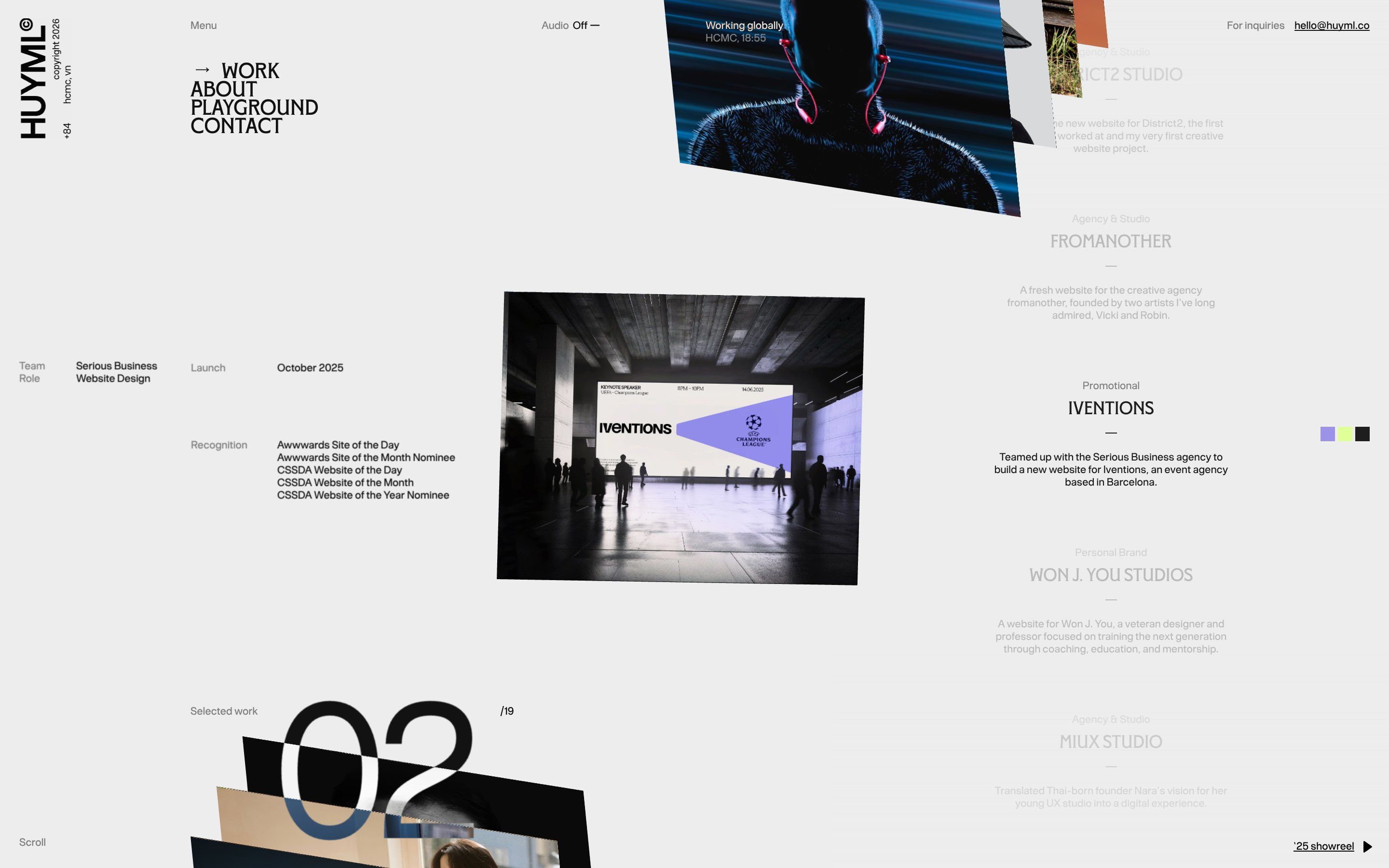
huyml.co is the portfolio of Huy Phan, a designer and art director from Ho Chi Minh City who signs as Huyml: the sites he has designed, one at a time, with the role, the year and the awards of each. On Awwwards it is Huy Phan Vol.2, and next to his name the credits also list Chien Pham, without saying in what role. The site is made almost only of a light grey, #EDEDED, and a soft black, #1E1E1E; colour comes from the project photos and from a red, #FF4949, that only shows in the loader.
It is built with Framer, but the moving parts are hand-written components loaded into Framer: a single module, about one megabyte before compression, that carries Three.js 0.179, GSAP 3.13, lottie-web 5.12 and React. In the code the components have clear names: PushLoaderReveal for the loader, WebGLMagazineFramer for the projects, ProjectTextSwitcher and ProjectCounterReel for the changing texts. They talk to each other with browser events: when the loader ends it sends push-loader:complete, the 3D page starts a quarter of a second later, and every time the project in the middle changes it sends webgl-magazine:center-change to the texts. On 14 October 2026 the site is Awwwards Site of the Day, with 7.67, and it scored 7.37 in the developers’ vote.
We take it apart in three moments, with a demo rebuilt from scratch for each, for a made-up designer, Kai Vero: the character, the covers, the projects and the code are ours. From the site we took the ideas and, where we say so, the numbers.
The panel pushed by hand
At the opening the screen is black. From the left comes a boy in a cap and a flowered shirt, leaning forward, with his hands against the edge of the black, pushing it away like a wardrobe. Behind him a white panel is left with the name, HUY PHAN, in red. Then the white slides down and the site is underneath.
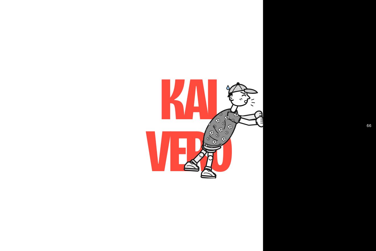
The boy is a Lottie animation, but it does not run on time: the frame you see depends on how far the push has gone, multiplied by the length of the animation and by 1.08. So when the push stops, he stops too. The push is a single number, as a share of the screen width, that a GSAP timeline takes to 0.3 in 0.65 seconds, then to 0.6 in 0.72 and finally to 1.28 in 1.46, with power2.inOut and the last stop with power3.in, which starts slowly and ends in a rush off the screen. Between stops there are two rests, of 0.16 and 0.2 seconds, and at the end half a second of full white. The black never goes past 1.12 of the width.
The name never moves. It stays still underneath, and on top there is a black sheet whose left edge follows the push: the white with the name uncovers itself. To leave, 0.6 seconds after the end the panel goes down by one screen height in 1.33 seconds, and the name, which sits inside the panel, goes up by the same amount: on the screen it stays still, and the edge of the panel wipes it away from the top. The component also has a percentage counter, which goes to 30, 60 and 100 with the three pushes and is shoved out by the black edge when it reaches it, but on the site its font size is zero pixels and it cannot be seen. On a phone the first and the last push take three tenths longer and the last one goes to 1.4.
In our demo the character is a little figure we drew in SVG, in a dotted cap, a flowered shirt and trainers, in two line weights. Its legs are two pieces each, thigh and shin, and the script turns them every frame, always tied to the push; the shoes turn back to stay flat. We left the counter on. The timings, the stops, the rests and the exit are the site’s.
Pages lined up in space
The projects are thin pages standing up, in a long row that crosses the screen diagonally, like magazines on a shelf seen from the side. The wheel, a finger or a drag move the row, which never ends. While it runs, the pages bend in a soft curve; the one in the middle steps out of the row and turns towards the viewer.
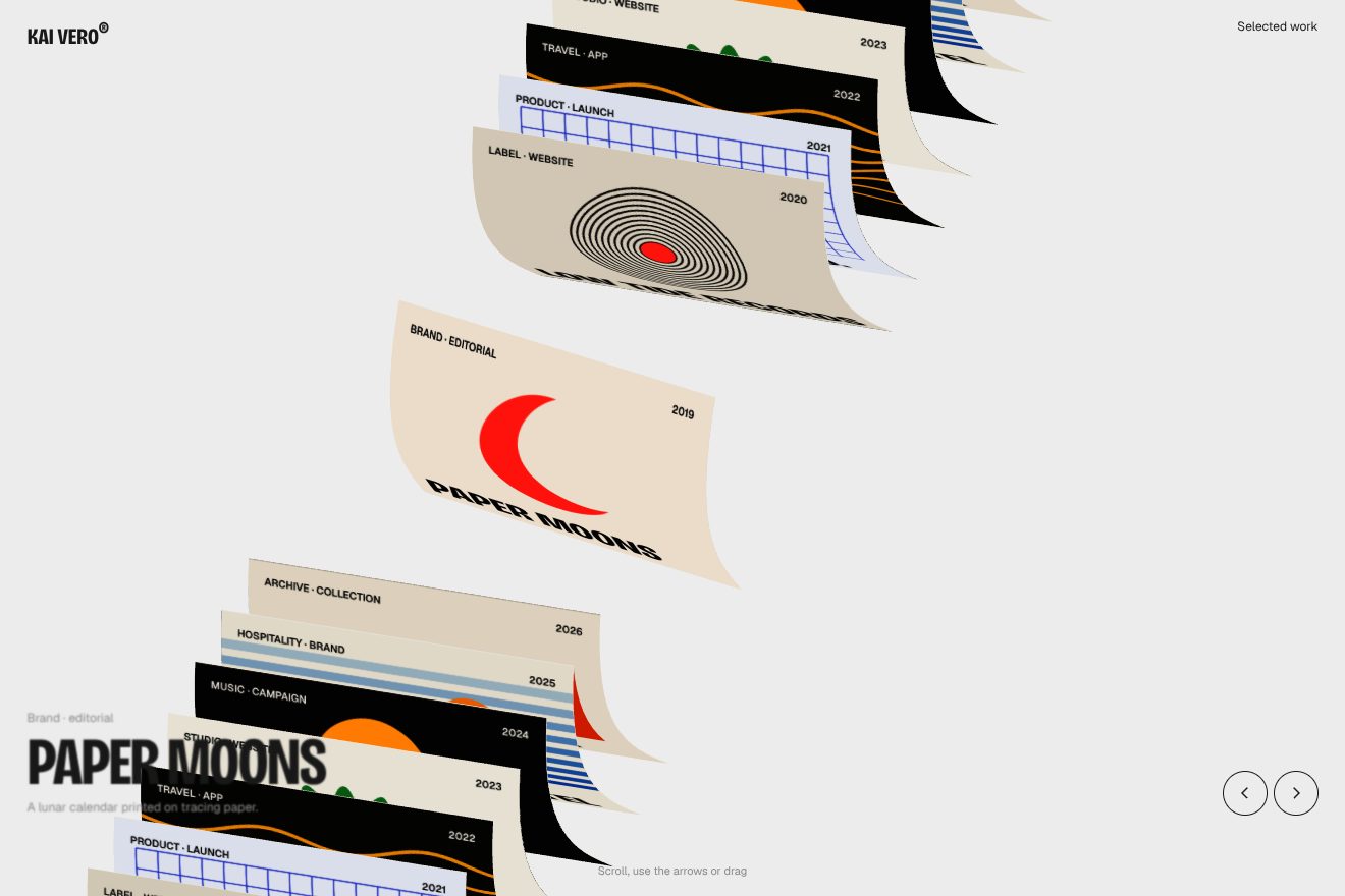
It is a single Three.js mesh: a box 4.492 wide, 3.658 tall and a hundredth thick, split into many little squares so it can bend, repeated at least thirty times. The projects repeat to get there: with nineteen projects, there are thirty-eight pages. All the photos sit in one image, and each copy only knows its number and where its photo is. The vertex shader does the rest. The place of each page in the row is its number minus the scroll, brought back with a modulo inside the length of the row, so what leaves on one side comes back on the other. Pages near the middle are pushed away by 5.3 spacings, with a smoothstep, and the middle one has room around it. The bend is a wave along the height, the sine of twice the height times 0.4, multiplied by the speed and by 2.25; every frame the speed loses some of itself and keeps 0.829, so the pages straighten by themselves.
The middle page turns by 0.067, -0.363 and -0.513 radians on the three axes, in proportion to how close it is to the centre. On arrival the row moves forward for two seconds, braking hard, and after 1.06 seconds the middle page steps out and turns in 1.1 seconds with power2.out. The camera is orthographic, with no perspective: it sees 10.8 units from top to bottom, sits high on the right and looks down at the row, which is turned too, and the whole row turns slightly towards the mouse. The page under the pointer rises in one second with power4.out; if it is the middle one, the photo zooms in by 0.156. To know which page is under the mouse the site draws the scene a second time, every three frames, with each page in a different colour, and reads the colour of the pixel. When the page changes a small sound can play, if you switch the audio on at the top.
In our demo there are thirty-two pages, with eight covers we drew on a canvas. For the mouse we redo the shader’s sums on the processor and project the four corners of each page, instead of drawing the scene in colours. The measures, the push, the bend, the turns, the camera and the timings are the site’s; on top of that the row also moves with the arrow keys and moves on by itself if nobody touches it.
The index that comes into focus
Next to the pages, on the right, there is the list of projects in a column: the kind, the name, a short rule and a line. The project in the middle is black and the others are pale. On the left are the team, the role, the launch and the awards, and below them the project’s colours in three little squares. At every change these words blur and come back into focus.
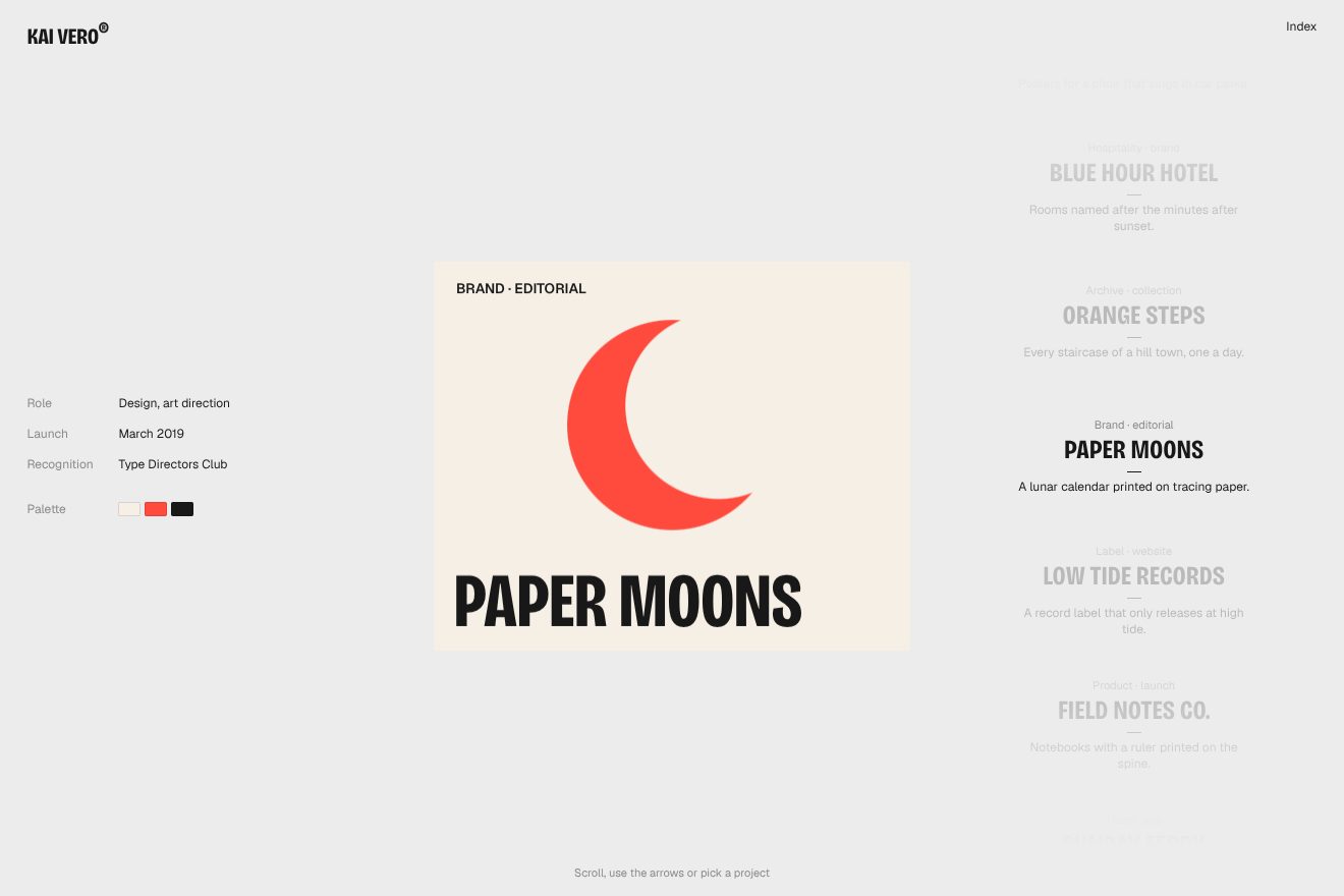
The column chases the project in the middle: every frame it covers 0.22 of the way left, the short way round, and the project in the middle is full while the others sit at 0.24. When the project changes, the texts go to a blur of 8 pixels in 0.2 seconds with power2.out, and after 140 milliseconds, when nothing can be read any more, they change and come back into focus in 0.85. It is the trick of the whole site: the words change while they are blurred, so you never see the jump. The project’s big number at the bottom does the same, with 10 pixels. On arrival the list appears in 0.62 seconds, the cards come in over 0.44 one every 0.07 starting from the middle one, and the colours one every 0.05. On a phone the column does not slide: only the card changes, with the same blur a little faster.
In our demo the index is a page of its own, with the cover in the middle drawn by the script, and it moves with the wheel, the arrows, a finger or a click on a project. The opacity goes down with the distance instead of all at once, and there is no big project number: in its place are the year and the award. The timings of the chase, the blur and the arrival are the site’s.
The other details
At the top left the HUYML logo is written vertically, and next to it there is a clock with the time in Ho Chi Minh City. The site has audio that starts off: switched on, every page that goes by makes a small sound, at volume 23 out of 100, and a menu item has another when you move over it. Switching it on takes a click or a key, because the browser does not let a page play sound before someone touches it.
Scrolling with fingers is tuned separately: on a phone a drag is worth less than on a touch computer, and it is kept within a fifth of a page for every movement of the finger, so the row does not run away. The column of projects on the right can be dragged too, and then the row brakes harder: the speed keeps 0.72 of itself every frame, instead of 0.829.
Where it stumbles
There is no reduced motion. The hand-written components never check the preference, and we tried it in Chromium: with the request for less motion the boy pushes the panel and the pages bend as always.
The row does not move with the keyboard. The component listens to the wheel and to fingers, but the only key it hears is the one that unlocks the audio: the arrows do not move the pages, and someone who does not use a mouse only sees the first project.
The loader plays on every visit: the push takes almost four seconds, the 3D part waits for its end signal before starting, and the panel finishes sliding down after more than five. The counter the component can draw is hidden on the site with a zero-pixel font: it is there, it counts, it gets shoved out by the edge, but nobody sees it.
What we take away
The loader is a small idea done well: instead of a bar filling up, someone struggling to push, and the effort shows because his steps are tied to the progress. And the row of pages shows how much a single repeated mesh can do: the endless row, the room around the middle page, the bend and the turn are all a few lines in the vertex shader, tied to a handful of numbers.
The effects
- The panel pushed by handThe opening of a portfolio: a drawn little figure walks onto the black screen pushing a white panel in three pushes and uncovers the name in red; then the white slides down and the name stays still while it is wiped away.Free
- Pages in spaceProjects as thin pages lined up in space, seen from the side: the wheel, the arrows or a finger move the row, the pages bend with the speed and the one in the middle steps out of the row and turns towards you.Free
- Focusing indexThe project index of a portfolio: a column that slides and keeps the current project in the middle, dark, while the others fade; at every change the facts, the palette and the cover blur out and come back in focus.Free