Neutomni
Neutomni, how it’s made: the wheel that rounds off, the diamond that becomes a circle and the logo cut along the line
The site of a Polish design and Webflow studio, red on white, where every shape starts out all corners and ends up round: a square wheel rolling on catenary arches, a diamond thrown into a circle by the mouse, a loader cut open with scissors. We take it apart with three demos rebuilt from scratch.
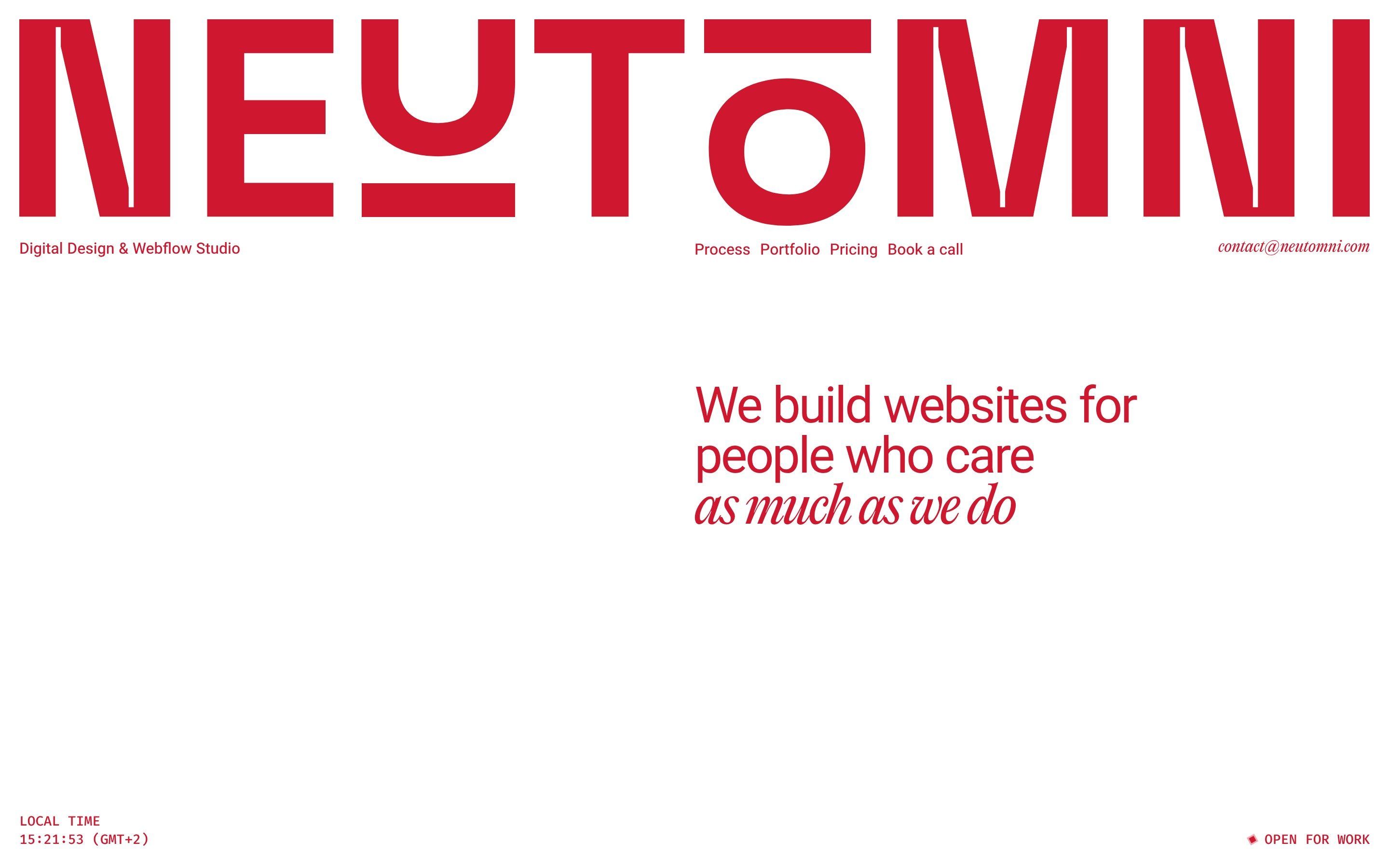
The palette
- #CF1830the red of the whole site
- #FFFFFFthe white of the page and the tickets
- #6DB1F0the site’s blue
- #89C1F4the blue the tickets flip in
- #A7D6FFthe pale blue where the tickets land
- #F8F4F4the warm grey
- #3072D7the sky of the desktop
- #6B8027the grass of the desktop
Tap a colour to copy its code.
Neutomni is the site of a design and Webflow studio, «Digital Design & Webflow Studio», based in Poland: one of the FAQ answers says so, «We are based in Poland and work in the CET/CEST timezone», and the clock in the opening shows the time in Warsaw. It is a single page: the opening with the showreel, the process, three selected projects (Pomio, rsb-ac and Matematica), the pricing, a fake desktop with windows to drag around, and the contact. The team is written on the site, in the desktop windows: Natalia Matys, for Webflow and motion, Andrii Chernysh, for design and strategy, and Zefir, «Office Manager», who is the studio cat. The three packages start at $2,500, $5,000 and $8,000, and the studio works only in Webflow: «No, we specialize exclusively in Webflow».
The idea holding it all together is a shape losing its corners. «Design + Webflow + Strategy = Full Circle», the site says, and then «We map the angles before we smooth them out» and «The road can get bumpy. We keep you rolling regardless». Every major animation starts from a polygon and ends in a circle: the process wheel, the contact diamond, the O of the logo at the bottom of the page, the five shapes of the loader, whose files are called Wheel. There is one colour, the red #CF1830, on white, with a light blue, #6DB1F0, for a few backgrounds. The titles pair two typefaces: Vazirmatn by Saber Rastikerdar for the upright part and PP Editorial New Italic by Pangram Pangram for the italic half, as in «as much as we do»; the capital, terminal-style labels are in Fira Code.
Underneath there is Webflow with its interactions, 102 events and 48 action lists. Next to it, GSAP 3.15.0 served by Webflow, with ScrollTrigger, SplitText and MorphSVG; smooth scrolling by Lenis 1.3.21, with a lerp of 0.07 on a computer and 0.3 up to 768 pixels; CircleType for a line of text set in a circle, Lottie for a barcode and two modules loaded from Slater. The process wheel is a hand-written 2D canvas, about 280 commented lines; there is no WebGL. The site is the Awwwards Site of the Day for 13 October 2026, with 7.38, and scored 7.12 in the developers’ vote; the award credits the studio itself.
We take it apart in three moments, with a demo rebuilt from scratch for each, for three invented workshops: drawings, copy and code are ours. From the site we took the ideas and, where we say so, the numbers.
The wheel that rounds off
In the process section the page stops and you scroll on the spot. At the bottom four red columns, Discovery & Strategy, Design Iterations, Webflow Build and Post-launch Support, rise one after another. Above them, drawn in a thin white line, a square rolls in from the left over a road of humps; on the way it gains sides, five, six, up to twelve, then swells into a circle and the road flattens into a straight line. The drawing is white on a transparent canvas: you only see it where it passes over the red columns.
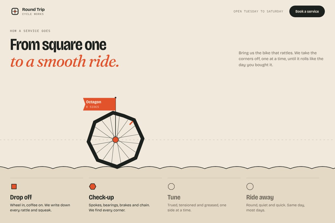
It is the real square wheel, the one from the maths books. The road is made of upside-down catenary arches, y = a·cosh(x/a) − a, where a is the polygon’s apothem, the distance from the centre to the middle of a side: on arches like these a regular polygon rolls without slipping and its centre always stays at the same height, on the dashed line, 5 pixels on and 10 off. The radius is 13% of the short side of the screen, 15.6% on phones; the lines are 1.5 pixels, the hub 3. On a computer the first quarter of the section does not count; then the scroll gives a progress and the drawing chases it, covering 20% of the remaining distance every frame. Below 0.0005 it stops, and the frame loop switches off until you scroll again.
The transformation begins once the wheel is fully in. In the first 30% the sides go from 4 to 12; in the remaining 70% the corners move out from the centre until the shape is a circle and the road flattens, all on a smoothstep curve. The fractional sides are the neatest trick: for 5.4 sides the script takes the pentagon, adds a corner halfway along its first side and moves every corner towards the hexagon by that 0.4. So each new side is born gently, without a jump, and side length and apothem also slide smoothly from one polygon to the next. The outline is a path of 360 points, 90 on phones.
In our demo it is the “how a service goes” page of a made-up bike workshop, Round Trip Cycle Works: the wheel has a tyre, spokes, a hub and a valve, and below it the four steps of a service light up as the wheel reaches them. Radius, sides, phases and chasing are the site’s; we made the maths exact. On the site every hump is as wide as one side of the polygon; for the corners to touch the bottom of the dips it should be a little narrower, 2a·asinh(tan(π/n)), which for the square is 88% of a side: with the site’s width, at 1440 by 900, the corner stays about ten pixels above the bottom. We work the road out from the shape of the moment, in-between shapes included, and add up the rotation frame by frame; our chasing is the same at 60 and at 120 Hz, while the site’s, fixed per frame, runs faster on a 120 Hz screen. Also ours: the springy flag that names the shape, the dust in the dips and the title that softens through the typeface’s SOFT axis. With reduced motion the wheel waits still at each step and the drawing changes with a fade.
The diamond that becomes a circle
At the bottom of the page, under «Ready to get your business in shape?», a dashed line runs across the whole screen with a solid red diamond on it that reads «[ Let’s talk ]» and leads to the calendar to book a call. Move the mouse from left to right and the diamond follows it along the line, turning and gaining sides: hexagon, octagon, dodecagon, sixteen sides and then a circle. Every shape it passes leaves its empty outline behind, slowly fading.
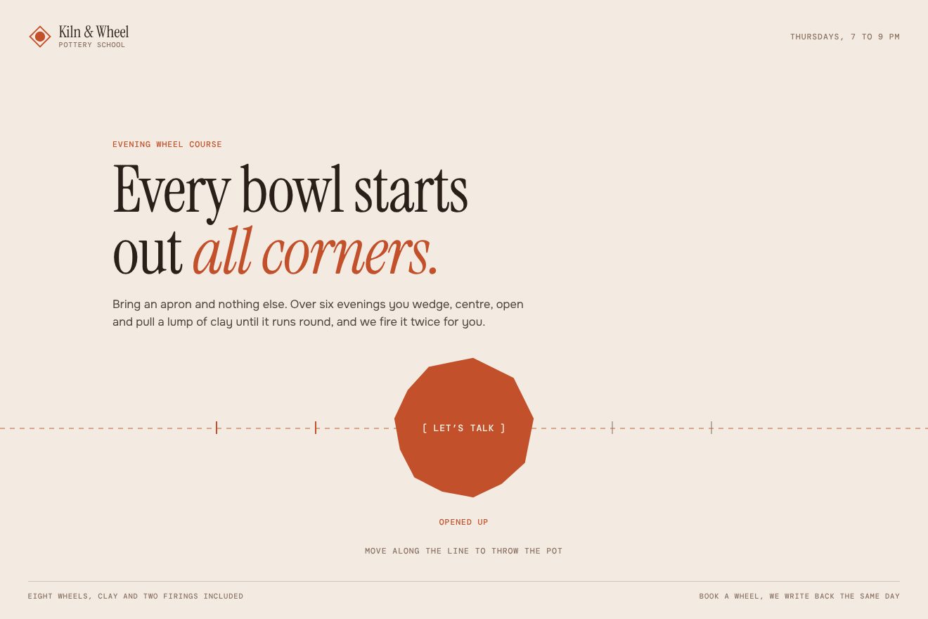
The drawing is a 220 by 220 SVG with six paths: only the first one, the diamond, is visible; the other five are transparent and serve as targets. One paused GSAP timeline holds the whole journey: for each leg a MorphSVG tween of the rotational type, which takes the shape to the next and turns it 90 degrees, up to 450, all of the same length and linear, with the stops at 0, 0.2, 0.4, 0.6, 0.8 and 1. Above 991 pixels the mouse counts anywhere in the section: its x, minus half the shape, divided by the width minus the shape, gives a number from 0 to 1 that is both the point of the timeline and the point on the line, which the shape reaches with a 0.1-second tween.
When that number passes a stop, with a margin of one thousandth, a copy of the path is born, outline only, 1 pixel thick, standing there with its rotation: it fades in 0.3 seconds plus 0.4 for every outline still on the line, with power2.out. Going slowly you get one at a time; a quick sweep leaves a row of them, lasting longer. Between 768 and 991 pixels you drag the shape; below that, the drawing is 120 pixels and there are four stops, up to the dodecagon. The same game plays by itself in the red footer: the O of the NEUTOMNI logo goes through seven shapes, one second each with power2.inOut, turning 60 degrees at every step, and when the timeline ends a new one is built, forever.
In our demo it is the booking corner of a made-up pottery school, Kiln & Wheel, and the diamond is a terracotta lump of clay thrown into a bowl. The shapes, the 90 degrees, the margin and the timing of the trails are the site’s; the lump follows the mouse in 0.2 seconds instead of 0.1. Ours: pulled fast, the lump leans like soft clay and straightens with a small bounce; marks under the line show the stops and a word says how far the pot has got, from «A lump of clay» to «A round bowl»; a click squeezes it and answers «See you at the wheel». On a phone the shapes stay six and you can also tap the line; on the keyboard the arrows move the lump from stop to stop; with reduced motion the lump fades out and back in already in the right shape, with no turning and no trails.
The logo cut along the line
The loader is a red screen cut in two by a dashed line, with a pair of scissors and the words «CUT ALONG LINE». The letters of the logo fall from above, the middle ones first; the scissors run along the line leaving a solid cut behind; a counter climbs to 100; five white shapes, from the diamond to the gear by way of the circle, come in from the left and bunch up. Then the two pieces withdraw towards the edges and the page appears through the cut.
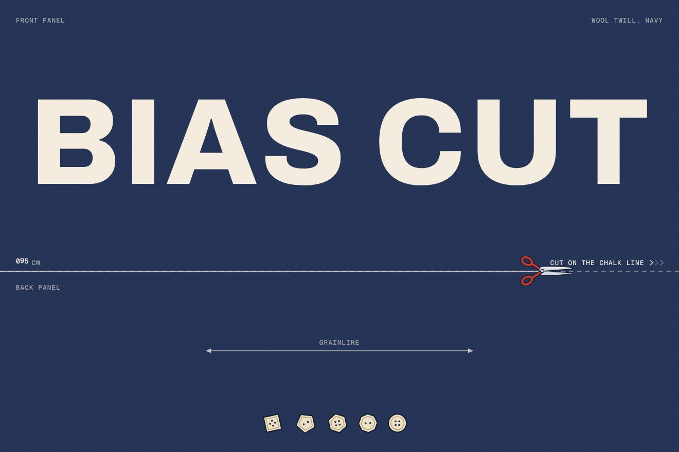
The upper piece is 60% of the screen tall and holds the logo, the lower one 40%. The logo is an SVG: each of its paths starts 300 pixels higher and drops into place in 2 seconds with power1.out, one every 0.05 seconds starting from the centre. The rest is a Webflow interaction in groups that start one after another. At first the scissors sit at 7% of the line, the cut reaches 9% and the shapes are 80 hundredths of the width off to the left. Then the shapes arrive in 2.8, 2.7, 2.6, 2.5 and 2.4 seconds with inOutCubic, so the last one catches up with the others, and after 0.4 seconds the scissors run to 100% in 3 seconds with inOutQuad, the cut following them to 102.5%. At about 3.4 seconds the shapes set off to the right and the two pieces shrink to zero height in 1.5 seconds with cubic-bezier(0.55, 0.055, 0.675, 0.19), a curve that starts slow and speeds up, like a sheet peeling off.
The counter is made of three strips of digits 20 pixels tall, hundreds, tens and units, that climb together in 3 seconds with power2.inOut; the units strip holds only 0 and 5, so the count goes up in fives. Afterwards the home title comes out line by line from a 10-pixel blur, in 0.6 seconds and 0.1 apart: it waits for the fonts and then 4.5 seconds on a computer, one on phones.
In our demo it is the arrival of a made-up tailor’s shop, Bias Cut: the two pieces are midnight-blue wool with a diagonal twill, «Front panel» and «Back panel», the line is chalk, «Cut on the chalk line», and the five shapes are buttons, from a diamond to a round one, that really roll in. Proportions, timings and curves are the site’s. Ours: the drawn tailor’s shears, opening and closing their blades as they run; the letters that fall a little crooked and straighten as they land; the counter in centimetres, turning like an odometer; the grainline on the lower piece; the slit that springs open and shows the teeth of pinking shears; a soft shadow on the page and a needle sewing a seam under the logo. After a few seconds the cloth closes again and it all starts over, and the name can be swapped for a picture. With reduced motion the cloth is shown already cut and gives way to the page with a fade.
The other details
In the pricing section the page stops for ten screen heights. The background moves from white to two light blues, #89C1F4 and #A7D6FF, and the three tickets, Essentials, Growth and Enterprise, rise from 860 pixels lower turned 180 degrees, red back showing, and flip over as they reach their place. On hover the stub at the bottom of a ticket drops 16 pixels and turns 5 degrees in half a second, on a curve that overshoots and comes back, cubic-bezier(0.579, 0.423, 0.17, 1.452): it looks almost torn off. Meanwhile a Lottie barcode draws itself and a «Schedule Free Call» button appears.
At 70% of the section the pricing page shrinks to 0.45 and becomes a window, «Pricing.html», on a desktop with green hills in the background, a menu bar with the date and time and the file icons: FAQ.md, Testimonials, Natalia.png, Andrii.png and Zefir.png. The windows open from their icons, drag by their title bars, and the one you touch comes to the front. Then the whole screen shrinks to 0.3 and turns out to be the screen of a CRT monitor, which tilts by 6 degrees. The trick is a full-screen wallpaper that vanishes at once as the zoom starts, leaving the picture of the monitor, its screen in the same spot.
In the selected work the column stays put and each picture is revealed by a clip-path that starts from a point in the bottom right corner and opens to the full rectangle in 0.9 seconds, with power2.inOut. There is a custom snap with Lenis: 90 milliseconds after you stop, the page glides on its own to the right picture. Text is revealed line by line from a 10-pixel blur, in 0.4 seconds and 0.12 apart, when it reaches 85% of the screen; and «Design + Webflow + Strategy = Full Circle» stretches from 28% to the full width as you scroll.
Where it stumbles
The opening video, the studio’s showreel, weighs 46.9 MB: 38.5 seconds at 2880 by 1600 pixels and 60 frames per second, playing by itself on a loop. There is no lighter version: phones, at 390 pixels, ask for the same file too. On its own it is almost the whole weight of the page, which on a computer is 24 screens long.
Reduced motion is almost ignored. The Webflow interactions respect it only if the body has the data-wf-ix-vacation attribute, which is not there; the GSAP scripts do not check it. The only part that reads it is the wheel canvas, and it skips only the chasing: the wheel rolls all the same. Loader, flipping tickets, the zoom into the monitor and the shape-shifting logo play the same for everyone.
The desktop clock shows hours and minutes, but it updates every 60 milliseconds: setInterval(updateDateTime, 60), sixteen times a second for the whole visit, when once a minute would do. In the HTML, before the script fills it in, it reads «Mon Jum 22». And the structured data for Google, which describes the studio as a ProfessionalService, is missing a comma between the LinkedIn link and the Clutch one: so it is not valid JSON and cannot be read. These are small slips, the kind anyone makes, but they remind us that the parts nobody sees deserve the same care as the ones everybody does.
What we take away
A single idea, well told, can carry a whole site: here it is the shape that loses its corners, and it comes back in the loader, the process, the contact and the logo, each time through a different tool, a Webflow interaction, a canvas, a morph. And the square wheel shows that a little real maths, a catenary and a polygon with fractional sides, makes a scroll animation more convincing than any curve picked by eye; and it is cheap, a 2D canvas that stops drawing when you stop scrolling.
The effects
- The wheel that rounds offAs you scroll, a square wheel rolls along a road of humps: they are catenary arches, the real maths of the square wheel, and its hub never leaves the dashed line. On the way it gains sides one at a time, from four to twelve, then swells into a circle and the road flattens out beneath it.Free
- Diamond into circleA diamond-shaped button, “[ Let’s talk ]”, sits on a dashed line and follows the mouse: as it goes it turns 90 degrees at each step and takes more sides, six, eight, twelve, sixteen, until it becomes a circle. Every shape it leaves behind stays for a moment as an empty outline that fades. On a phone you drag it with a finger.Free
- Cut-out logoA logo intro for a tailor’s shop: the screen is covered by two pieces of wool with a chalk line between them. The letters fall from the middle, the shears cut along the line, a counter climbs in steps of five, the buttons roll in; then the cut opens and the two pieces lift off towards the edges, and the page is underneath. In the Playground you type your own name or upload your own logo.Free