Pensatori Irrazionali
Pensatori Irrazionali, how it’s made: white plaster that wakes up as you pass
The Pensatori Irrazionali site alternates a black lab and a gallery of white plaster: a bas-relief that raking light wakes only where the pointer passes, a word that repeats itself in steps and loses its I, a menu of news that falls like paper. We take it apart with three demos rebuilt from scratch.
The palette
- #F5F5F5the page, and the plates behind the echo
- #434343ink: headlines, BUILD, buttons
- #5E5E5Esoft ink: labels and footer
- #111111the loader background
- #1E1E1Ethe menu panel and the news cards
- #0A0A0Athe background of the work universe
- #51FD01the loader status lights
- #F669E4the websites colour
- #FF0066the gaming colour
Tap a colour to copy its code.
Pensatori Irrazionali (Italian for “irrational thinkers”) is the site of a creative studio that presents itself as a European house working worldwide (the address at the bottom of the page is in Dubai) and has worked for names such as Vodafone, Cadillac, FaZe Clan and Neymar Jr. The studio built it in-house: the credit on Awwwards is its own, and it was Site of the Day on 20 September 2026.
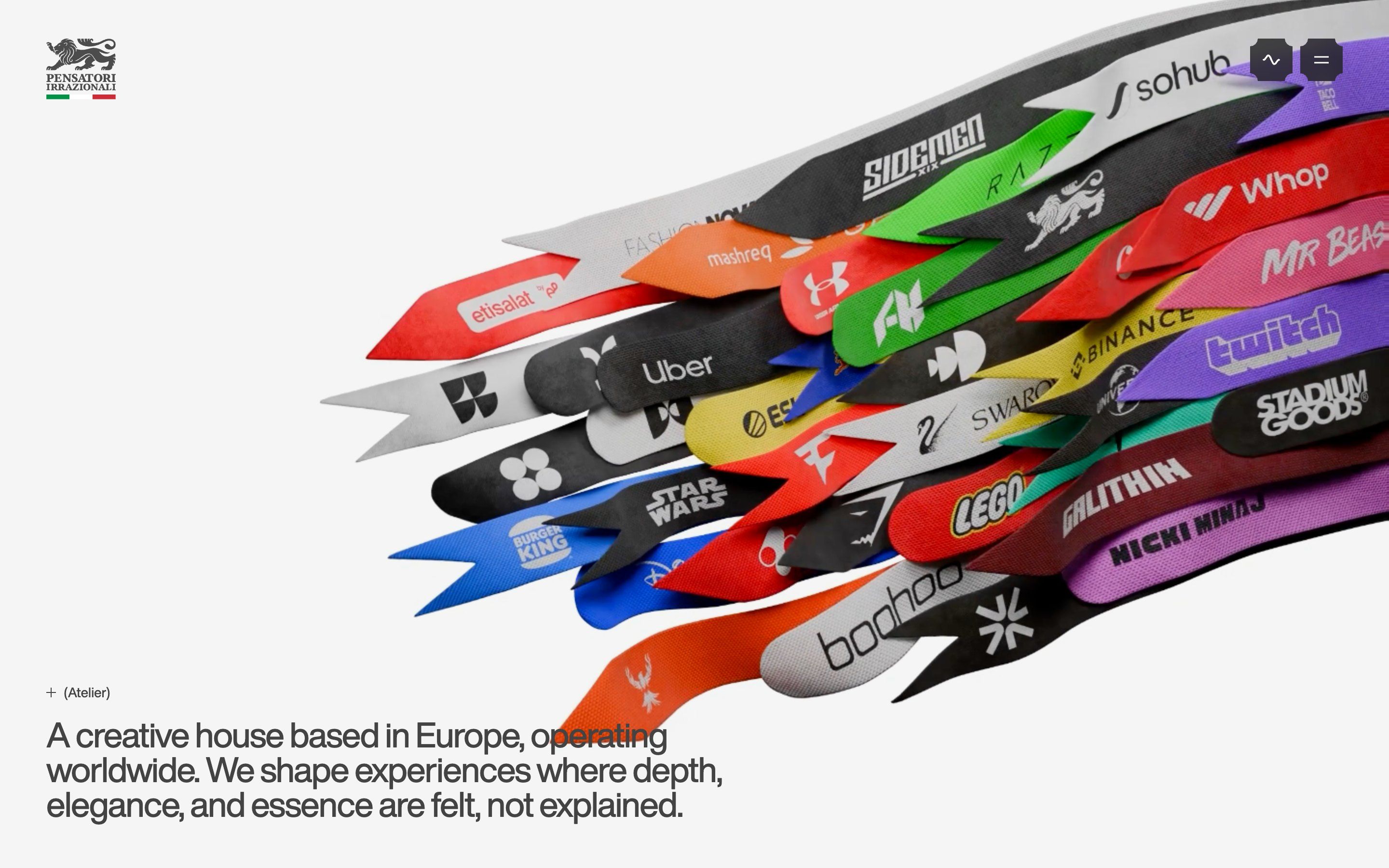
The whole thing alternates two worlds. The loader is a black lab, with bordered panels, text that decodes itself, green status lights switching on one after the other and a white globe swelling out of a point, surrounded by orbits that draw themselves. Then white blinds cover everything, a heraldic lion appears over an Italian tricolour that grows bar by bar, and the whole page lifts like a card to make way for a bouquet of coloured ribbons, each carrying a client’s logo. From there the site is a light grey gallery: huge titles in a copperplate script, Ballet, text in Helvetica Now, etched angels, white plaster, and a bright colour for each service.
Underneath there is Next.js 16 with Sanity for the content, GSAP 3.14 (ScrollTrigger, SplitText, Flip, ScrambleText, DrawSVG and CustomEase), Lenis for scrolling and Three.js with the WebGPURenderer and materials written in TSL. Moving between pages uses the View Transitions API. Here we take it apart in three moments, with a demo rebuilt from scratch for each: drawings, texts, colours and code are our own. From the site we took the idea and the timing.
Raking light
Halfway down the home page, behind the map with the coastlines of Los Angeles and Tokyo, there is a white area that looks empty. Pass the mouse over it and two plaster bas-reliefs appear, two angels: the feathers stand out with deep shadows wherever the pointer passes, and after a couple of seconds they go back to white on white. It is the best moment on the site, and you cannot see it until you touch it.
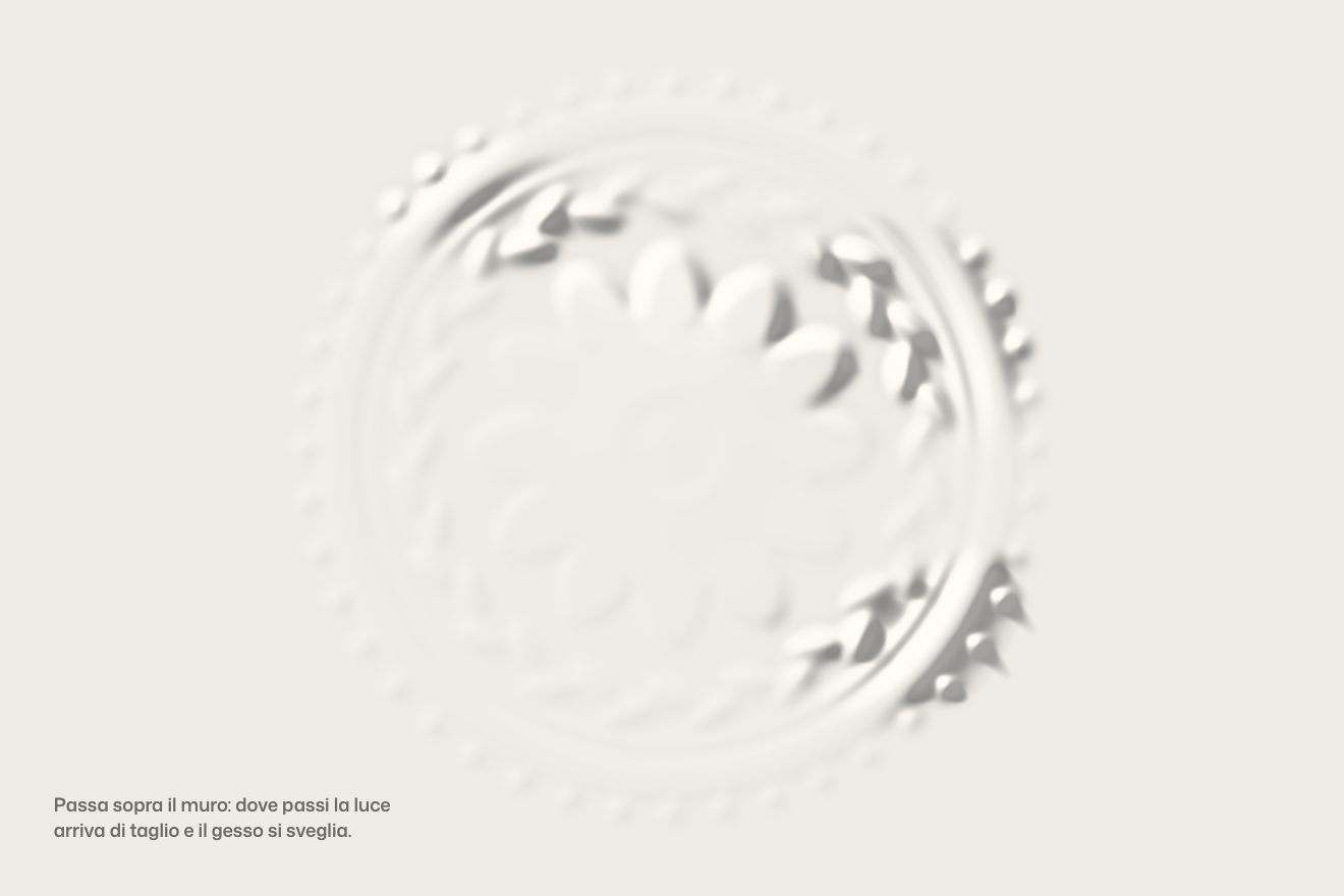
Each relief is the same image prepared in advance under six lights, from the flattest to the most raking, packed into a single 1440 × 1440 KTX2 texture. The pointer paints a trail that fades by itself on a 216-pixel canvas, inside a web worker with an OffscreenCanvas: 200 points at most, each a soft stamp that dies out in two seconds, plus two wandering points that stamp on their own, so the plaster breathes even when nobody touches it. The shader blurs the trail with five samples and uses that value to choose, blending, among the six lights. It draws 44 times a second, less on slow machines, and the loop stops when it is not needed. In our demo there are no angels and no six images: a rosette drawn by the script as a height map, and the light computed by the shader on every frame, with cast shadows that lengthen as the light drops. That way the demo weighs a few kilobytes, and changing the drawing only takes a canvas.
The falling letter
Near the end of the page there is the word BUILD, full width. As you scroll it repeats itself in steps: six copies on top of each other, each on a plate the colour of the background, smaller and lower each time, so only the tops of the copies behind remain. Then the I tips over, falls under the word and turns out to be a button: CONTACT US, which writes itself by shuffling letters.
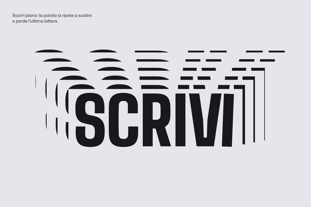
The copies are SVGs, and scrolling takes copy number i to scale 1 − i/13 while moving it down by 2i% of its height (on phones 1 − i/12 and 10i%). The I of the front copy is a real link, which turns and falls with the scroll; when it lands, ScrambleText writes its name. In our demo the word is SCRIVI (“write”) and its I becomes SCRIVICI (“write to us”), the scene holds still while everything happens, and the landing has its own little timed bounce, not tied to scrolling. As it falls, the bar widens to a thickness comfortable for a finger.
The paper-slip menu
The menu lives in a 44-pixel ticket-shaped button, its corners bitten by an 8-pixel quarter circle. Opening it, the button itself grows and becomes the panel, the items drop into place and beside them the studio’s news arrives, slightly askew, and straightens up. Closing it, the news does not vanish: it falls like dropped sheets of paper.
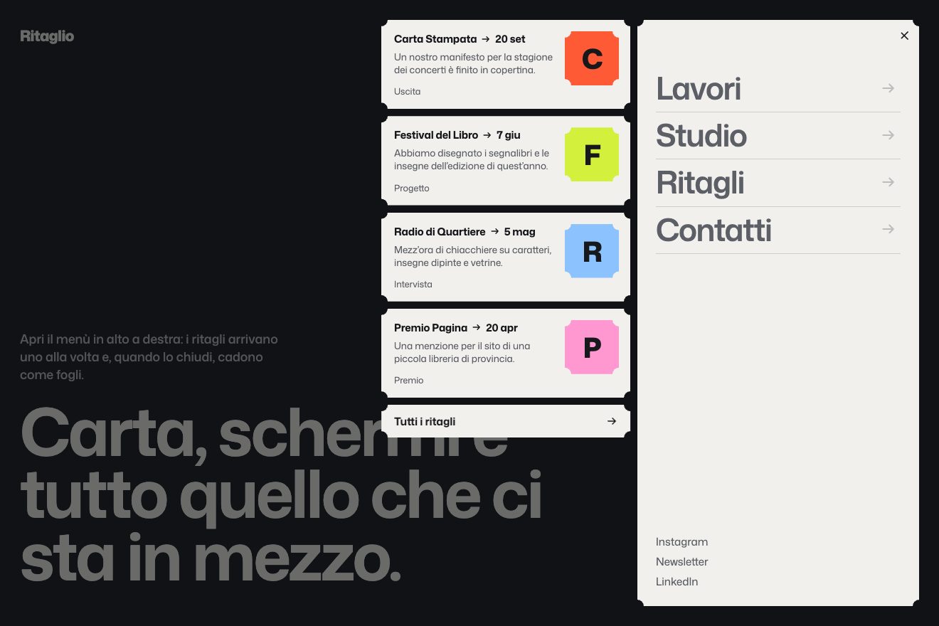
On the site the panel and the news are dark glass, at 80% with a blur behind. The news arrives from 8rem to the right and 2rem above, with a random rotation between −7° and 7°, in 0.55 seconds. The fall lasts 0.8 seconds with power2.in: each card moves sideways at random and turns up to 58° around a different point of its surface, in scattered order. In our demo the news items are paper clippings on a graphite page, the fall also tilts in depth, and each sheet uses the same random delay for falling and for turning, so the path sways instead of coming apart.
The other details
Moving between pages shrinks the old page to 85% and sends it flying up in 1.2 seconds, while the new one rises from below in 1.8, with a very decisive curve, cubic-bezier(0.86, 0, 0.07, 1). Project titles shuffle in lowercase on mouse over, and clicking a row widens its column until it becomes the project header, which opens with the same layout: it looks like the same element, but it is a new page. The coordinates of Los Angeles and Tokyo roll like an odometer, the letters H and D of a Warhol quote now and then flip like the flaps of a departure board, and at the end of every project a bar in the next project’s colour fills as you scroll and moves on by itself. There is an endless universe of work seen through a fisheye lens with the colours slightly split at the edges, and on the error page a pixel lion that runs and collects pizzas and wine. Sounds accompany almost every gesture, and the Konami code has its surprise. Before all this, a script rates the machine (memory, processors, graphics card) and decides how much to draw.
Where it stumbles
Weight. The home page preloads two 16.6 MB textures for the reliefs; the menu preloads six more at 10.9 MB each for a plaster hand, about 65 MB, and the browser itself warns that they are not used straight away. With the showreel video (19.1 MB), the flags video (5 MB) and more than a megabyte of HTML, one visit can go past 120 MB.
Time. Loader, blinds and transition take almost seven seconds before the content, on every full load, even arriving from a direct link, for example to the universe or the error page; and meanwhile the page does not scroll.
Reading. Menu items at rest are grey on dark grey, with a contrast of 2.45 to 1, and the 12-pixel loader text reaches 2.9. The main heading is a 16-pixel line with the brand name, a marquee repeats the same sentence six times and 21 images out of 70 have no alternative text: no surprise that the developer jury’s lowest mark is for semantics and SEO, 6.6.
Phones. On the home page the relief is simply not there on phones, so the best effect is left to mouse users; the fixed logo at the top runs over the text, and the page reports a React hydration error.
Credit where it is due: reduced motion is respected almost everywhere (the loader shrinks to an instant, the reliefs do not start, the marquees stop), the drawing loops sleep when they are not needed, and WebGL context loss is handled.
What we take away
A hidden effect is a reward for exploring, but it should also be there for people without a pointer: a light that passes by itself now and then is enough, or a finger that drags it. And a button can be born from a letter: if the word is the right one, the invitation to write is already written on the page.
The effects
- Raking lightA white plaster rosette on a white wall: at rest you can hardly see it. Where the pointer passes the light comes in low, every leaf and petal casts its shadow, and after a couple of seconds the plaster falls back asleep.Lifetime
- The falling letterAs you scroll, a huge word repeats itself in steps and loses its last letter: the I tips over, falls under the word and, as it touches the ground, becomes the button to write.Free
- The paper-slip menuA ticket-shaped button that grows into the menu panel, with news clippings arriving one at a time. On closing, the clippings fall like dropped sheets of paper.Lifetime