Explore Primland, by Outpost, Ingamana, Robbin Cenijn, Robert Borghesi, arpeegee, Matyas Sochor
Explore Primland, how it’s made: the season change in patches, the map points that turn into a lens and the pill-shaped area menu
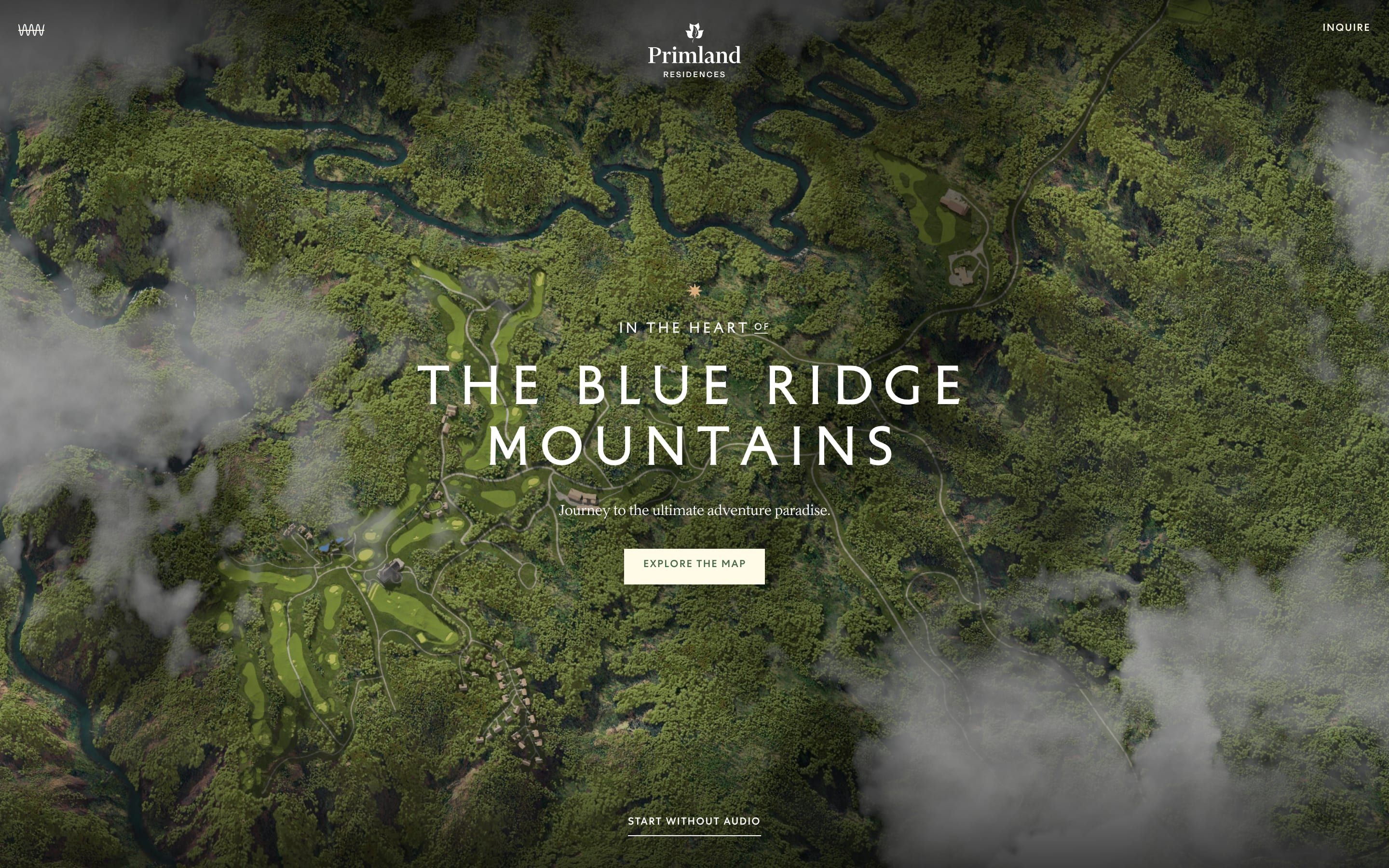
The site of the Primland residences isn’t scrolled: it’s explored. It is a map of the Blue Ridge Mountains seen from above, with clouds drifting by and the resort’s places to click. On top of the scene there is a switch that changes the season in patches, from the centre, with a glowing line on the front, points that turn into a lens on the ground, and a pill that opens the area menu and carries you from one to the next behind a curtain. We take it apart with three demos rebuilt from scratch, all in two dimensions.
The palette
- #456A4Bthe forest green of the loader, the map points and the brand
- #FFFBE7the cream of the text, the buttons and the menu pill
- #A8611Athe copper of the brand star and the accents
- #798D73the sage the site calls black, in text on light grounds
- #EAB279the bright beige of the small labels and the progress bars
Tap a colour to copy its code.
Explore Primland is not a site you scroll: it is a map. It opens on a view from above of the Blue Ridge Mountains, thick woods, a winding river, golf courses, pale roads, the roofs of the houses, with clouds passing overhead and their shadows passing underneath. It is the site of the Primland residences, a luxury mountain resort («Primland Luxury Blue Ridge Mountain Resort», says the page title), and it does one thing: it lets you wander the land before you ask for information. You drag, you zoom with the wheel or two fingers, you click the points of the four areas, The Lodge, Auberge Residences, Pool & Fitness and Stables Saloon, and in the bottom right corner a switch changes the season from Summer to Fall. The green is forest green #456a4b, the cream #fffbe7, the copper #a8611a; and the colour the site calls «black» is in fact a sage, #798d73. Headlines are set in Centra, a spaced sans in capitals, the text in Inferi, a serif with an old-style drawing. The award page credits Outpost, Ingamana, Robbin Cenijn, Robert Borghesi, arpeegee and Matyas Sochor. It was Site of the Day on Awwwards on 4 February 2026, with 7.35 from the jury, and took the developer award, 7.05, with 7.8 for the animations.
Underneath there is Nuxt 3.20.2 with Vue 3.5.26, Pinia for the state and the text from DatoCMS. The map is three.js r179 written as Vue components with TresJS 4.3.1, the camera and light moves are directed with Theatre.js 0.7.2, the models are compressed with Draco and meshopt and the textures are KTX2, the format the graphics card reads while still compressed. The interface over the map is HTML, moved by GSAP 3.14.2 with CustomEase, Observer, ScrollTrigger and MorphSVG, plus SplitText and DrawSVG left at 3.12.5, and Lenis 1.3.17. The site has four curves of its own, registered with CustomEase in a Nuxt plugin: mask, snappy, expo-hard and unmask, the one that lifts almost all the text, M0,0 C0.16,1 0.3,1 1,1: it starts with a jolt and arrives very slowly. Two registered effects, textSplit and fade, use it for every line that comes in: from 4.5 rem lower, in 1.5 seconds, one line every tenth of a second.
We don’t rebuild the 3D map: our demos are all in two dimensions. But almost everything that happens on the map can be told flat, and we take it apart in three moments, with a demo rebuilt from scratch for each. The text, the brands, the photos and the code are ours; from the site we took the ideas and, where we say so, the numbers.
The summer turning into autumn in patches
In the bottom right corner there is a small white square with a thumbnail of the season. Hover it and the other season rises from the stack, in 0.3 seconds on quart.inOut, and next to it a cream label arrives with the name, Summer or Fall, sliding in from a tenth of its width in 0.85 seconds. Click Fall and the map doesn’t change all at once, nor in a clean circle: autumn is born at the centre of the view and spreads in uneven patches, with a glowing line where the front passes, until the whole wood is copper.
A function of the scene store does it, setChangeSeason. First it checks whether a change is already running, and if so it does nothing: a second click waits for the first to finish. Then it takes a number from 0 to 1 with power3.inOut on a timeline stretched to 4.5 seconds, and at the end it records the new season. Everything else is done by the terrain shader. The centre is the point the camera is looking at, and the measure is the longer side of the view divided by 1.8. The mask is a soft front, 1 − smoothstep, six times as wide as its radius, with a push in the last two tenths of the progress that fills whatever is left. Then a noise texture, turbolence.jpg, bites into the mask, mask −= 2 · noise · (1 − mask), and a smoothstep(0.3, 0.7) tightens it: those are the patches. The glowing edge is the mask minus its full part, mask − smoothstep(0.9, 1.0, mask). Underneath, the two seasons are two whole terrain textures, plus the trees, which are cards with one image per season. The lighting code also has a winter, but the switch shows two.
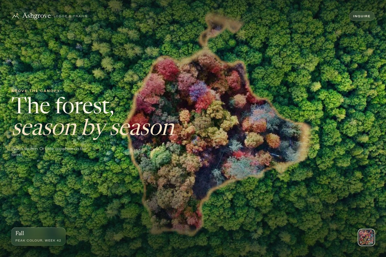
In our demo the map is the forest of a made-up lodge, Ashgrove Lodge, seen from above in two real photos, one in summer and one in autumn, on a 2D canvas instead of the 3D scene. From the site come the change locked until the first one is done, the 4.5 seconds on power3.inOut, the mask made of a soft front, the noise biting into it times two and tightening it, the final push, the glowing edge as the difference between the mask and its full part, and the switch as a stack of squares with the other season rising in 0.3 seconds and the label arriving in 0.85; the headline comes up from below on the unmask curve and the scene settles from larger in 3 seconds. Ours are the change that can also start from the point you click on the forest, with a small ring marking it, the amber line of light drawn twice, one wide and one narrow, the cloud shadows passing over the treetops, the plate in the bottom left with the season’s name rolling, the edge of the small square filling like a bar as the change goes on, and the little jolt if you click during a change. The mask is computed on a small grid and stretched by the browser, so the front stays soft and the phone doesn’t struggle. While nobody touches it, the seasons turn by themselves. With reduced motion the change is a 0.8 second crossfade.
The point on the map that becomes a lens
On the map the places are white discs with a small green dot in the middle. They arrive one after another with a little bounce; on hover the disc grows a bit, the dot widens and a white label appears beside it with the name and a small arrow. On click the disc swells further and its inside becomes a lens: inside a thin white ring you see the ground beneath, blurred and a little dulled, and the dot turns white. On the right the place’s sidebar opens, with photos, text and details to expand.
The discs are not page elements but small planes in the 3D scene, drawn by a shader. The scales are three numbers: 1 at rest, 1.2 on hover, 1.55 when the place is selected. Each change is a one second tween on power2.out, but sped up three times with timeScale(3): it lasts about a third of a second. The entrance is back.out(1.5), with a delay of 0.2 seconds plus 0.12 for each point. The lens is not a copy of the map: the shader reads the image of the scene already drawn and samples it at a smaller level, 2.4 steps below the original, which amounts to blurring it, then mixes it 20% with a grey. The lens radius is 95% of the disc’s, multiplied by the progress of the activation, and the remaining 5% is the white ring. The dot measures a tenth of the disc plus two hundredths on hover and goes from green to white. On top of everything, even inside the lens, the shadows of three layers of clouds drift by. The label follows the pointer with quickSetter, comes in in a quarter of a second and, if its right edge leaves the screen, moves to the other side. The sidebar opens like the menu, with two layers moving in opposite directions, 100% and minus 100%, in 0.75 seconds on power3.inOut; inside, each accordion detail grows to its height in one second on quart.inOut, and the text appears in 0.6 seconds after two tenths.
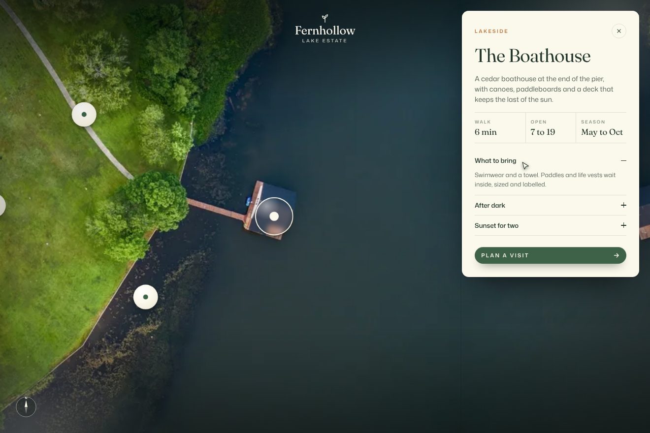
In our demo the map is a real aerial photo, a meadow with oaks, a path and a boathouse on the lake, and the places belong to a made-up estate, Fernhollow Lake Estate: five points, from the boathouse to the garden. From the site come the white discs with the green dot, the scales 1, 1.2 and 1.55, the one second changes on power2.out sped up three times, the back.out(1.5) entrance with the delays of 0.2 plus 0.12 seconds, the lens with the blurred ground and 20% grey inside the 5% ring, the dot that widens and turns white, the label that comes in in a quarter of a second and switches side near the edge, the cloud shadows passing over the points too, the double-mask card in 0.75 seconds on power3.inOut (on the phone it rises from the bottom, as on the site), the accordion in one second on quart.inOut with the text after two tenths, and the map coming in from 1.25 to 1 in 3 seconds. Ours are the lens made in 2D, with a blurred copy of the photo enlarged around the place so it stays aligned while the disc grows, the halo, the glass highlight and the three-layer shadow of the discs, the map bringing the chosen place to the middle of the free space beside the card, the drag with resistance at the edge, the haze, the compass with its needle swinging, the three figures on the card, walk, opening hours and season, and the «Plan a visit» button with its sliding label. A drawn pointer visits the places by itself until the real one arrives. With reduced motion the points are already in place and everything arrives as a fade.
The area menu and the curtain from one to the next
At the bottom centre of the map there is a cream pill with the name of the place you are in, «Explore Primland», and a small arrow. On hover the arrow leaves upwards and an identical copy comes in from below, in 300 milliseconds. On click the pill opens into a cream panel upwards, and the four areas appear one after another from the bottom, with a green mark next to the one you are in or the one under the pointer. Pick an area and a green curtain covers the screen from the left, with the loader’s circle spinning in the middle, and while it is closed the new area gets ready underneath; then the curtain leaves to the right.
The panel opens with two elements sliding in opposite directions: the window starts 100% higher and its content 100% lower, and both reach zero together in 1.25 seconds on power3.inOut. One cancels the other, and the content seems to stand still while the window opens around it. The items arrive 0.4 seconds later, half a second each, a tenth of a second apart, starting from the lowest. Closing runs the two slides backwards in 0.75 seconds, and the items leave in two tenths. The arrow is two icons in a row, sliding their whole height. The curtain is a full-screen green veil cut with clip-path: inset(): it comes in from inset(0 100% 0 0) to zero in one second on expo.inOut, after a three tenths wait, stays half a second and, when the new area is ready, leaves towards inset(0 0 0 100%) on the same curve. Inside is the same circle with the comet as the loader: an arc with a fading tail and a small ball at its head, turning once a second.
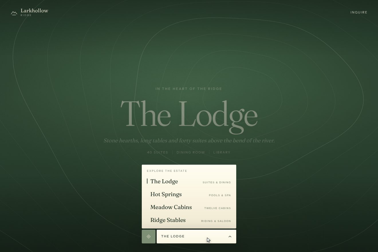
In our demo the areas are those of a made-up resort, Larkhollow Ridge: The Lodge, Hot Springs, Meadow Cabins and Ridge Stables, each with its own colour and its huge serif name. From the site come the two halves of the panel sliding in opposite directions in 1.25 seconds on power3.inOut, the items arriving from the bottom 0.4 seconds later, half a second each and a tenth of a second apart, the closing in 0.75 seconds, the arrow leaving upwards and coming back from below in 300 milliseconds, the curtain cut with inset() coming in from the left in one second on expo.inOut after three tenths, staying half a second and leaving to the right, the comet turning once a second and then growing one and a half times and fading, and the new area’s headline rising letter by letter from its words in 2 seconds, one every 75 milliseconds, on the unmask curve. One thing we turned around: in ours the window starts from the bottom and the content from the top, so the panel uncovers itself rising out of the pill. Ours are each area’s background, thin contour lines drawn on a canvas and moving slowly, one in four stronger, with grain and a light following the pointer, the curtain in the colour of the arriving area with its name under the comet, the small line jumping to the item under the pointer and stretching before it settles, the page darkening and the headline stepping back while the menu is open, the pill squashing on click and the name rising when it changes. A drawn pointer tours the areas by itself until the real one arrives. With reduced motion the panel, the curtain and the headline arrive as fades.
The other details
The loader is a 360 pixel circle around the leaf of the brand, on solid green: an arc with a fading tail, two paths with a gradient from cream to transparent, and a 3 pixel ball at its head, turning with Tailwind’s spin animation, once a second. Its timeline lasts one second and at the end checks whether the scene is ready: if not, it starts over, so the loader repeats in one second laps as long as needed. When the scene is there, the circle grows one and a half times and fades in 1.5 seconds, the green veil goes away and the headline letters rise out of their words, one every 75 milliseconds, in 2 seconds on the unmask curve, while the map underneath settles from 1.25 to 1 in 3 seconds. On click on «Explore the map» the headline does the opposite: it swells to 1.75 times and vanishes towards the viewer in 1.25 seconds, the button drops 5 rem and 60% of the clouds dissolve in 3 seconds. Then the instructions arrive, «Drag to move»: a thin ellipse run through by a comet, a quarter of its lap, with a round head that blinks, and a glove dragging sideways; on desktop a small zoom bar with a little hand, on the phone a hand that pinches, two shapes of the same hand swapped with MorphSVG. They disappear at the first gesture on the map. The cream button has a double label: on hover it rises its whole height and the copy arrives from below in half a second. The «Start without audio» link has two lines under it: the first withdraws to the right, the second redraws from the left half a second later. Four flocks of birds circle over the map, one lap every 120 seconds, and the clouds slow down as you zoom in. The textures arrive in waves, first the current season and then the others, and go up to the graphics card one at a time, whenever the browser has nothing else to do.
Where it stumbles
The site is heavy. The home page downloads about 34.5 megabytes in 107 requests: the two terrain textures, one per season, account for 20.7 megabytes on their own, 10.2 for summer and 10.5 for autumn, and the autumn one arrives even if nobody ever touches the switch. A metalness texture weighs another 2.7 megabytes. The site’s JavaScript is about 2.3 megabytes in three files, plus about 3 of third-party scripts, with reCAPTCHA downloaded twice. Reduced motion is read once, into a variable of the device plugin, and then nobody uses it: whoever asks for less motion sees everything the same, the spinning arc, the clouds, the season change. The experience lives entirely in the canvas: the points of interest are not page elements but objects hit with the mouse in the scene, so they can’t be reached with the keyboard or a screen reader, and the home page prepared on the server has an empty article. It is the lowest mark of the award, 6 for semantics and SEO. On a phone held sideways, under 500 pixels of height, there is only the message asking you to turn it. And in production the console tells everything: every texture loaded, every click, every change of state, the latter in orange.
The effects
- Season change patchesThe map of a made-up mountain lodge, Ashgrove Lodge, seen from above its forest: a real photo of the canopy in summer. In the bottom right corner the season switch is a stack of small squares with thumbnails: hover it and the hidden season rises out of the stack with its name on a cream label; pick it and the forest turns from summer to fall, or back, not in a clean circle but as a soft front eaten by noise into uneven patches, from the middle or from the point you click, with a warm line of light running on the edge. The change takes 4.5 seconds on power3.inOut and a second change waits for the first to end, as on the Explore Primland site.Free
- Resort map lensThe map of a made-up lakeside resort, Fernhollow, seen from above in a real photo: white discs with a green dot mark the places of the estate and pop in one after the other with a small bounce. Under the pointer a point grows and a label with its name comes in beside it; on a click it swells further and its inside becomes a lens showing the ground below, blurred and a little grey, inside a white ring. Meanwhile the side panel opens with two masks sliding in opposite directions, the place's numbers and its details as an accordion; the map glides to bring the place into view, drags, leans with the pointer, and the shadows of clouds drift over it.Free
- Resort areas menuThe four areas of a made-up mountain resort, Larkhollow Ridge: The Lodge, Hot Springs, Meadow Cabins and Ridge Stables, each with its own ground (forest green, copper, sage, saddle leather), fine contour lines drifting slowly, grain and a soft light. At the bottom a cream pill says where you are; on hover its chevron leaves upwards while a copy comes in from below. A click opens the panel upwards, its window and its contents sliding in opposite ways, the areas come in one by one from the bottom and a thin line follows the one under the pointer. Choose an area and a curtain crosses the screen from the left with a comet turning around a ring, holds half a second, leaves to the right, and the name of the new area rises letter by letter.Free