Terminal Industries, by Rejouice, Propagande
Terminal Industries, how it’s made: the truck driving into the yard, the notched cards and the savings calculator
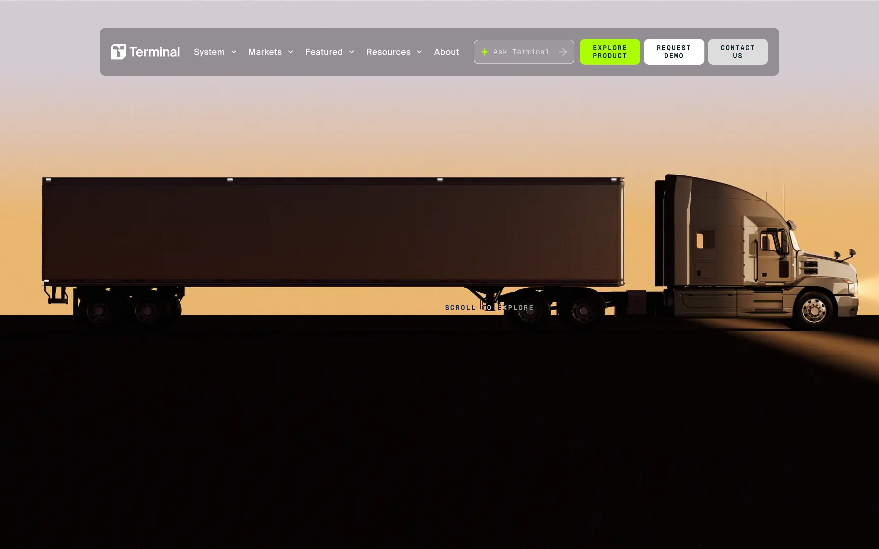
The site of a company that makes software for warehouse yards, built by Rejouice, opens with a semi truck at sunset that turns into a line drawing as you scroll: 410 frames on a canvas. Around it, a rounded notch bites the edge of every section and a lime glow lights up the letters. We take it apart with three demos rebuilt from scratch.
The palette
- #052424the near-black petrol green of the text, the footer and the dark backgrounds
- #ABFF02the lime of the button, the letters that light up and the light trails
- #FFFFFFthe white of the section backgrounds
- #DDDDDDthe palest grey of the text before it lights up
- #C2C2C2the grey of the lines and dividers
- #000000the black behind the opening frames
Tap a colour to copy its code.
Terminal Industries sells software for the yard, the space between a warehouse’s gate and its loading dock, where trucks wait, move and back in. It calls it the Terminal Yard Operating System: cameras and computer vision that check every truck in at the gate, know where it is and follow it «gate to dock», with an AI that reassigns the tasks as they happen. The site is almost entirely two colours: a petrol green so dark it reads as black, #052424, for the text, the footer and the dark backgrounds, and an acid lime, #ABFF02, that only shows up where something lights up. The rest is white, with two greys for the lines and for text that hasn’t lit up yet. The typefaces are SuisseIntl, in four weights, for wide, tightly tracked headings, and Geist Mono for labels and buttons, uppercase and widely spaced, like a terminal. The site is by the studio Rejouice, which signs it in the footer, and the award page also credits Propagande. On Awwwards it was Site of the Day on 3 September 2025, with 7.68 from the jury, and won the Developer Award, 7.89, where animations scored 8.8.
Underneath there is Nuxt 3.17.2 with Vue 3.5.13, the content comes from Storyblok and the styling from Tailwind 3.4.19. The animation is GSAP 3.13.0, with ScrollTrigger, SplitText, CustomEase, Flip, DrawSVG, MorphSVG and MotionPath all registered together at startup, and three hand-made curves: one is called custom.fastInOut, cubic-bezier(.52, 0, 0, 1), another easeCustomNotch, cubic-bezier(.67, .05, .43, 1), named after the shape we’ll meet below. Smooth scrolling is Lenis 1.3.1 with the default settings, driven by the same frame loop that runs every damping on the site. There is no three.js: the truck you see at the top is not a 3D scene, it’s a film.
We take it apart in three moments, with a demo rebuilt from scratch for each, for a made-up brand, Yardline, in the same line of work: the copy, the data, the models and the code are ours. The first demo was born before this article: an Animorio visitor asked for it, having seen this site, wanting a home page where, as you scroll, a truck drives into the yard and goes all the way to unloading the goods. From the site we took the ideas and, where we say so, the numbers.
The truck that drives into the yard
When the home page opens, a semi truck with its trailer passes in profile against the sunset, in silhouette. As you scroll it turns into a drawing of blue lines and particles on black, the camera rises and the aerial views of the yard appear below. Three sentences run over it, one for each third of the scroll: «We have reinvented the future of logistics through the yard», then the technology linking the gate to the dock, then «into one connected, automated system».
None of it is computed: these are 410 pre-rendered frames, 1920 by 1080 WebP images on desktop, 23.6 megabytes in all, and 409 portrait ones at 810 by 1440 on phones, 12.5 megabytes, which the site draws on a canvas. A Web Worker downloads them as raw files, with a clever twist: first frame zero, then one frame in every eight, then another one in eight from those left, one batch every 50 milliseconds, 34 batches in all. After the very first batch the animation already exists from start to finish, only choppy, and each batch makes it smoother: whoever scrolls straight away never hits a gap. The container is 300svh tall, with a one-screen sticky background inside, so the run is two screens long; a ScrollTrigger without scrub copies the progress into a number, the frame is floor(progress × (loaded − 1)), and it only draws when the number changes, in «cover» mode, with the canvas multiplied by the screen’s pixel density. The three sentences are split into letters by SplitText: each takes a third of the run, the letters come in one after another in the first half of their third, lime while arriving and white once they’ve landed, hold for a tenth and leave at double speed.
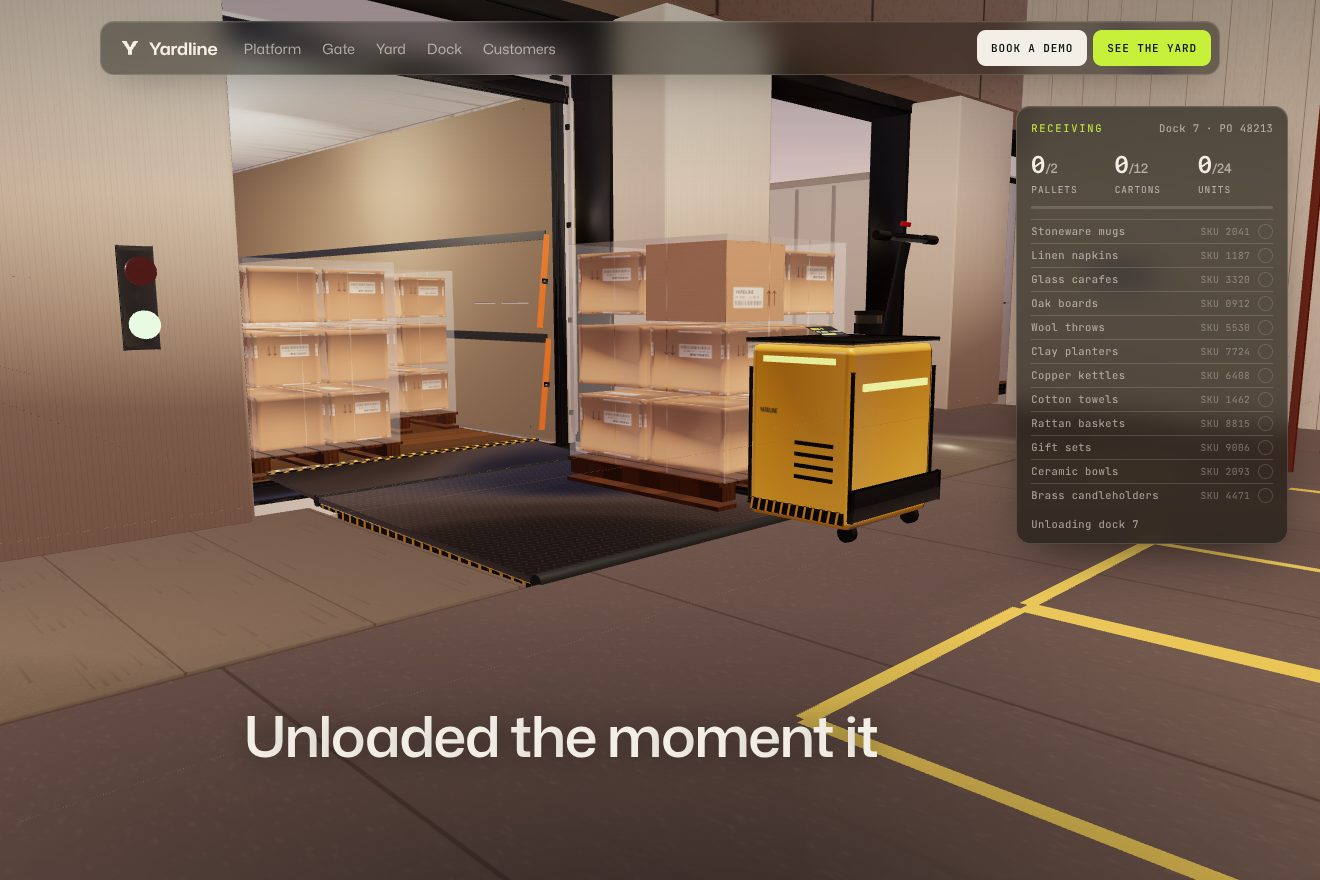
Our demo does the opposite: no film, a three.js scene computed live, held behind the page as you scroll through fourteen screens, with the scroll moving a single number the scene chases with a slight delay. The Yardline truck arrives at sunset on the desert road with its headlights on, kicking up dust, the camera rises and the warehouse with thirteen docks appears behind the fence. From the site come the truck in profile against the sunset, the camera rising over the yard, the sentences written letter by letter in lime, and the switch to a line drawing: ours is a lime blade that sweeps through the truck under the scanner arch at the gate and draws it in lines only where it passes, while its card fills in at the top. The rest is ours, because the request wanted to go all the way to the goods: the truck turning and backing up to dock seven with the trailer first and the tractor pushed behind, like a real rig, the rear doors swinging open and bouncing off their stops, the dock door rolling up, the dock plate running out its lip, the driverless pallet jack bringing out two pallets, the cut film peeling off in strips, the cartons lined up under the gantry that reads their labels while the receiving list ticks them off, down to the last carton opening. With reduced motion the story moves in still chapters, with a fade between each. This demo lives only here, in the article: it was a request, and it doesn’t go in the library.
The cards that expand with a notch
Halfway down the home page the product features are a row of tall, narrow cards, each a colour: lime, grey, dark green, and round again. Hover a closed card and the notch opens in its right edge, then follows the pointer up and down. Click it and the card widens, its content rises in and the row scrolls to centre it.
The notch is the same outline as everywhere else on the site, a clipPath recomputed every frame: on hover its depth goes from zero to 20 pixels in half a second with power2.out, and its position chases the pointer’s height with exponential damping, lambda 6, so it never jumps; it takes three tenths of the card’s height and keeps a 0.12 margin from the corners, so it never leaves the card. The widening isn’t GSAP: it’s a CSS transition on width, 0.6 seconds with cubic-bezier(.19, 1, .22, 1), the curve that sets off fast and lands long. The content comes in from 30 pixels lower in 0.9 seconds with expo.out, one piece every 0.12 seconds, after a 0.15-second wait, the time it takes the card to start opening.
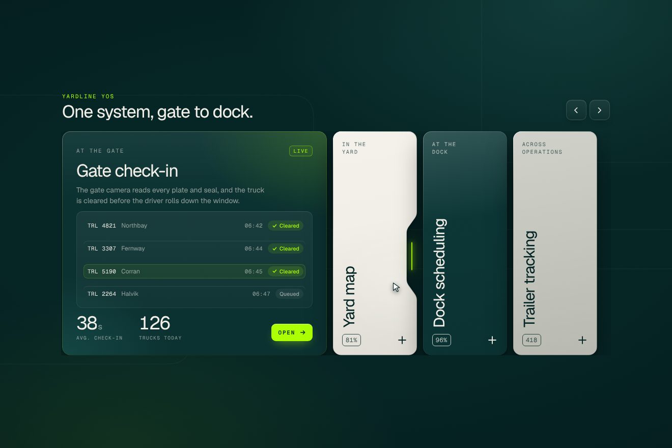
In our demo the cards are the four features of Yardline’s system, each with a working piece of interface: Gate check-in with the arrivals list, where «Scanning» becomes «Cleared» with a tick that draws itself; Yard map with the lanes of slots and a lime route from the gate to slot C-07; Dock scheduling with the door bars growing under the time line; Trailer tracking with the gate, yard, dock line filling up and the badge turning into «Door 14». From the site come the notch in the right edge opening from zero to 20 pixels in half a second with power2.out and following the pointer with lambda 6, within three tenths of the height and 0.12 from the corners, the width growing in CSS in 0.6 seconds with cubic-bezier(.19, 1, .22, 1), the content rising 30 pixels in 0.9 seconds with expo.out, 0.12 seconds apart after 0.15, the row scrolling to centre the card, the colours repeating lime, grey and dark green, and the uppercase, widely spaced labels. Ours are the notch corners computed as true arcs, the one-pixel rim drawn from the same outline with a light running along it, the lime glow inside the notch, the glow following the pointer on closed cards, the vertical titles, the numbers rolling like a counter, the press with an elastic return, the grain and the faded lanes in the background. When nobody touches it, a drawn pointer moves over the cards and opens them one after another; on phones the row scrolls sideways and the notch follows the finger.
The savings calculator
Further down there’s the return-on-investment calculator: you move the sliders for your own yard and a dark panel answers with how much you’d save a year, in dollars, the percentage and the savings by category. Below it, like everywhere on the site, the button types itself out like a terminal.
Each slider colours its track with a linear-gradient recomputed on every move: solid dark green up to the thumb, the same green at 20 percent after it. The numbers don’t jump: a GSAP tween takes the value from the old one to the new in 0.6 seconds with power2.out, rewriting it at each step with US-style toLocaleString, thousands commas included. The code also holds a rolling counter, written and never used. The results panel has its own notch, two of them on desktop, one at the top and one on the side, 30 pixels deep; on phones just one, of 20. The button is the most curious part: the letters, split one by one, appear 0.05 seconds apart, and the even ones first light up as a solid block, a terminal cursor, then after a random delay of 0.1 to 0.6 seconds print in the right colour in two hundredths. On hover the even ones flash as blocks again, 0.025 seconds apart, for 0.2 seconds; on the way out the odd ones do it.
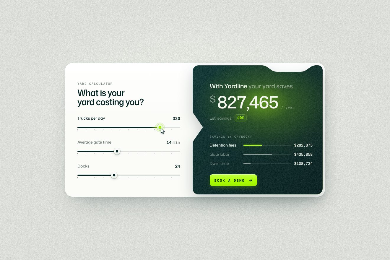
In our demo the calculator belongs to Yardline, with three sliders, trucks per day, minutes at the gate and docks, and three savings lines, detention fees, gate labour and dwell time, with formulas and prices we made up. From the site come the track coloured with the gradient computed up to the thumb, the value rising in 0.6 seconds with power2.out and the US-style commas, the dark panel with the notch drawn by a recomputed clipPath, the notch chasing with lambda 6 as in the cards, the site’s two curves, easeCustomNotch and custom.fastInOut, and the «Book a demo» button with letters arriving 0.05 seconds apart, the even ones as blocks printing in 0.02 after a 0.1 to 0.6 delay, the hover flicker at 0.025 for 0.2 seconds and the exit on the odd ones. Ours are the notch sliding along the panel’s side to point at the slider that’s moving, and getting 7 pixels deeper when you press it, the one-pixel rim catching the light, the lime glow lighting up on the total in proportion to the jump, the percentage with rolling digits, which is the rolling counter the site never uses, the bar of the touched line lighting up, the tick marks under the tracks, the thumbs that pinch when pressed and settle with a small spring, the grain and the layered shadows. When nobody touches it, a drawn pointer drags the sliders one after another and presses the button; with reduced motion the numbers change with a fade.
The other details
The notch, the rounded shape that bites the edge of the sections like the outline of a loading dock, is the site’s signature and it comes back everywhere. It’s an SVG clipPath recomputed in code, with five measures: how wide it is relative to the section, where it sits, how deep it goes, how round the corners are and how slanted the sides. At the end of the black opening the notch is 40 pixels deep on desktop and 20 on phones, and as the section crosses the screen it goes from −40 to +40: the edge first sticks out, then cuts in. The first-visit loader, about three seconds, is made of two halves, top and bottom, with the logo and a background of lane lines that comes in turning from 20 degrees to zero and shrinking from two to one in two seconds; then the halves open in 1.2 seconds with expo.inOut, their content in counter-parallax, while the two notches in the middle widen and flip, like warehouse doors sliding apart. The same opening doubles as the page transition. The footer’s lanes draw themselves in three seconds with DrawSVG, and along each one runs a blurred lime comet, feGaussianBlur at 17, following the line with MotionPath; the comets’ clock only runs while the footer is in view. In the headings the key words turn lime and then dark green, letter by letter, five hundredths of a second apart. In the product steps the numbers roll like a counter and the text writes itself with the scroll, each letter 0.014 seconds after the last, from light grey to lime to green. At the top the «Scroll to explore» label follows the pointer in difference, and on phones it becomes a 12-pixel lime bar running up and down a track.
Where it stumbles
Weight, first of all. Without touching the wheel the home page downloads about 35 megabytes: the 410 frames, 23.6, always all of them, even if nobody scrolls, plus four videos for the product steps, 9.8 megabytes, loaded straight away. The batch trick makes the sequence smooth quickly, but it doesn’t make it lighter. The 1920-pixel frames are drawn on a 2880-pixel canvas on a Retina screen, and they look a little soft. Reduced motion isn’t there: no animation in the code checks it, and the sequence, the loader, the flickers and the comets run for everyone; Awwwards, too, gives accessibility its lowest score, 7. The logo wall has a small, instructive bug: the 2.4-second duration and the expo.out curve are written on the timeline instead of in its defaults, so the animations inside use GSAP’s defaults, half a second. On phones the sales chat bubble covers the lower corner of the opening. And the site loads three analytics tools without any cookie notice.
What we take away
Terminal Industries sells software, something you can’t see, and its site shows it with a truck. The technical choice is the simplest possible, a film drawn frame by frame, and all the care is around it: the batches that fill the sequence a piece at a time so there’s never a gap, the sentences written in lime, and one single shape, the dock notch, that returns on the edges, in the cards, in the loader and in the footer until it becomes the brand. Two colours, a terminal typeface and one outline are enough to give identity to a page sixteen thousand pixels long.
The effects
- Truck into the yardThe home page of a made-up logistics company, Yardline, all in 3D: as you scroll, a semi truck at sunset drives along a desert road with its headlights on, kicking up dust, the camera rises and the yard appears behind it. The truck turns in at the gate, the barrier lifts, it goes under the scanner arch, which draws it in lime lines and writes its card, crosses the yard and backs in on a curve to dock seven, trailer first and tractor behind like a real rig. Five metres from the wall it stops: the lock rods turn, the rear doors swing open and bounce off their stops, the dock door rolls up, the truck docks, the dock plate rises, runs its lip out and settles on the trailer, the straps drop. A driverless electric pallet jack brings out two pallets, one at a time; the film is cut and peels off in strips, the cartons line up in rows, a gantry reads their labels one by one while the receiving list ticks them off, and the last carton opens on the goods.Free
- Notched feature cardsA hover animation on a real product piece: the four features of Yardline's yard logistics system in a row of tall narrow cards, on a deep petrol page. Hovering a closed card opens a rounded notch in its right edge, like the edge of a loading dock, that follows the pointer up and down with a damped lag and holds a lime light. On click the card widens, its contents rise from below one line after the other, the numbers roll, its piece of interface comes alive and the row scrolls to centre it.Free
- Yard savings calculatorThe ROI calculator of a software for logistics yards, Yardline: three sliders on the left, each track coloured up to its thumb, and on the right the dark results panel, with a rounded notch cut into its edge that slides to the slider being moved. The yearly savings rise in dollars with a tween of the value, a lime glow follows them, the percentage rolls its digits and the three savings lines grow their bars. At the bottom ‘Book a demo’ prints itself like a terminal, one letter after the other, the even ones lighting up first as a block.Free