Paul Kalkbrenner, by Holographik, Ilja van Eck
Paul Kalkbrenner, how it’s made: the name that opens around the photo, the record you spin with your finger and the sliding grid
The site of Paul Kalkbrenner, the Berlin electronic musician, opens with his name on a single line and a photo shrinking down between the two words, lets the album records spin under your hand and slides a huge sentence along a grid of lines. We take it apart with three demos rebuilt from scratch.

The palette
- #FFFFFFthe white of the home page and the hero
- #000000the black of the text, the lines and the video section
- #C5C5C5the grey of the albums and the gallery
- #A7FF9Cthe light green of the tour dates
- #FF6831the orange of the newsletter
Tap a colour to copy its code.
Paul Kalkbrenner is the official site of the German electronic musician, whom the site describes as starting out in the Berlin scene and going on to more than twenty years of records and concerts around the world. The pages are those of a touring artist, the music, the dates, the story, the gallery, the news, the store, and the home page lines them up as sections of different colours: white for the opening, grey #C5C5C5 for the albums and the gallery, a light green, #A7FF9C, for the tour dates, black for the videos, orange, #FF6831, for the newsletter. There is a single typeface, ABC Diatype Plus, a grotesque in its variable version, used huge for the headlines, with the letters tightened by five hundredths and the line height at 0.8, and small for everything else. On Awwwards it was Site of the Day on 2 September 2026, with 7.47 from the jury and the developer award, 7.41, where the highest marks are animations and speed, 7.6. It is signed by the studio Holographik and Ilja van Eck.
It is a Webflow site, with jQuery 3.5 inside like every Webflow site, and the animation is GSAP 3.15, loaded by Webflow itself with seven plugins: ScrollTrigger, SplitText, CustomEase, Inertia, Draggable, Observer and Flip. Page changes are Barba, smooth scrolling is Lenis 1.3.23. All the code written for the site sits in a single file, served from odyn.dev, which starts by registering one curve for everything: it is called osmo, it is cubic-bezier(0.625, 0.05, 0, 1), and it becomes GSAP’s default ease, with six tenths of a second as the default duration. The values we quote come from that file, put back in order.
We take it apart in three moments, with a demo rebuilt from scratch for each, for an invented musician, Kasimir Tessmar, with his albums: the name, the records, the covers, the drawn photos and the code are ours. From the site we took the ideas and, where we say so, the numbers.
The name that opens around the photo
The home page opens on a single line, Paul Kalkbrenner, as wide as the page, and between the two words there is a small photo, three quarters of a capital letter wide. But on arrival it is the other way round: the photo fills the screen, then shrinks down into that gap, while the two words come in from the sides and close in on it. Inside the frame the photos change every second. At the bottom, a seven-bar equalizer, the track that is playing and the Sound OFF button.

The headline is an h1 with two words and, in between, a frame 0.75 em wide with a ratio of one and a half, so 0.5 em tall: inside are six photos stacked on top of each other. The entrance is a GSAP timeline that starts after six tenths of a second: the frame begins at 105% of the window’s width and 105% of its height, shifted by minus 30 vw and minus 44 vh, and in 1.4 seconds it shrinks to its size, but not yet to its place, because it stays shifted by 15 vw. Two tenths after the frame starts shrinking, the first word arrives from minus 180% of its width to 78%, the second from 120% to 30%, in 1.2 seconds: for a moment the name is wide, with the photo off to the right. Then, in one second, the words and the frame go back to zero together, while the menu bar comes down from the top, from minus 200%. On a phone the same steps start further out: the frame from 120 vw by 100 vh and minus 40 vw, the words from minus 200 and 200%. All with the osmo curve, which starts slow, rushes and settles without a bounce.
The photos in the frame take turns through an attribute that says every how many seconds, here 1: the new one appears in three tenths, and the old one stays underneath and leaves four tenths later, so between one photo and the next you never see white. The seven bars of the equalizer are seven tweens that call themselves again: each takes its bar to a random height between 0.1 and 1, in a random time between 0.12 and 0.4 seconds, and as soon as it gets there it picks another. The sound button has two labels, one above the other, and when the music starts the CSS moves them up by 140%.
In our demo the name is Kasimir Tessmar, and the photos in the frame are four, drawn by us with grain: stage light beams, a speaker, the knobs of a synthesizer, a corridor of lights. From the site come the 0.75 em frame with its ratio, the start as big as the page, the timings of 0.6, 1.4, 1.2 and one second, the words arriving from minus 180 and from 120%, the bar coming down, the photo change every second with its three and four tenths, the equalizer with its numbers and the two sliding labels of the button. We changed one thing: the words stop at 30 and 42%, not 78 and 30, because with the site’s numbers, on our name, they overlapped, and the frame’s start is computed from its real position rather than fixed sizes. Now playing does not blink: with the sound off it says Paused, and the bars stay still at their last beat. Also ours are the pixel by which the words lean towards the photo before going back, the letters tightening a little as they close, the photo that stops zooming and ends with a thin light line around it, and the button that squashes and switches the equalizer on, with the bars falling one after another when it goes off.
The record you spin with your finger
Further down, on grey, is Recordings, the albums. On the left a large record, with the cover inside a thin-edged circle and a grey dot in the middle, like a vinyl’s hole; on the right the years of the last three albums, 2025, 2018 and 2015, the title, the formats, two lines of introduction and two buttons. The record turns slowly by itself. If you grab it with the mouse it follows your hand, and when you let go it carries on by inertia before going back to its slow spin.
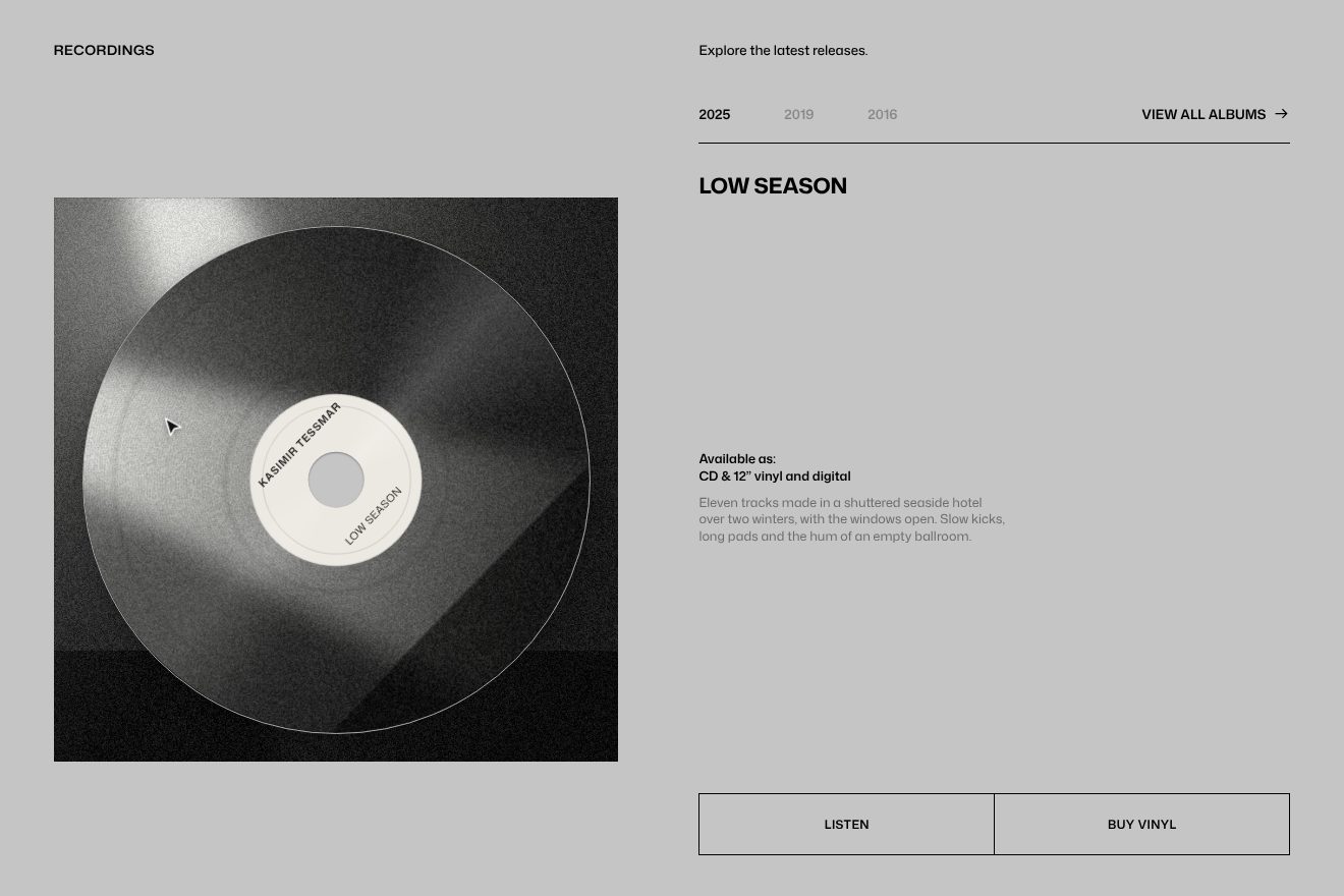
The slow spin is a GSAP tween adding 360 degrees in 15 seconds, with no ease and forever, and it only runs while the section is in the window. To grab it the site uses Observer, the plugin that listens to the pointer: on press it computes with atan2 the angle between the pointer and the record’s centre, on every move it computes it again and turns the record by the difference, correcting it when it jumps from 180 to minus 180 degrees. Meanwhile InertiaPlugin keeps track of the rotation speed. On release that speed, capped at 720 degrees a second, becomes an inertia tween with resistance 400; and as soon as the record drops below 36 degrees a second the site stops the inertia and picks up the slow spin again, so the handover does not show. The cursor becomes a grabbing hand.
Changing year is a small timeline with power3.inOut. The lines of text, split by SplitText with a mask, rise and disappear to minus 110% four hundredths apart, in half a second; the old record fades out in half a second and the new one fades in fifteen hundredths later; then the new lines rise from below, 110%, in six tenths. The years not chosen sit at 30%.
In our demo the albums are three by Kasimir Tessmar, Low Season from 2025, Static Bloom from 2019 and Night Freight from 2016, with covers drawn by us: a beam of light in the fog, a green speaker seen up close, orange light trails. From the site come the record at 90% with its thin edge, the image at 111.5%, the 360 degree spin in 15 seconds, the drag with the atan2 angle, the inertia capped at 720 degrees a second with resistance 400 and the spin picking up again below 36, and the album change with its timings. The record can also be grabbed with a finger, on a phone. Ours are the fine grooves with two rings between tracks, the light label with the name and the title, a highlight that stays still while the record turns underneath it, the record dipping slightly when you grab it and coming back up with a small bounce, and the new one settling from a little larger and starting from standstill, picking up speed like a real platter.
The sentence on the grid
Between the headline and the albums there is a section made of type alone: Experience the, Pulse of, Electronic Music, three lines of huge words, each in a different cell of a grid of thin black lines, like a score or a table. As you scroll down, the whole grid slides to the left and the words follow, a little late.
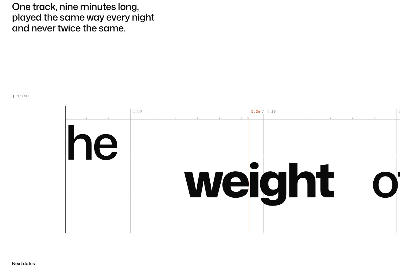
The grid is made of ten columns 35 em wide, each with its own one-pixel vertical line, and three rows 10 em tall, with a border on top; the words are 12.5 em headlines, and each row has its own empty columns before its word, so the sentence steps down. A single ScrollTrigger with scrub, from the section entering at the bottom to it leaving at the top, moves columns and rows together by 4.75 column widths to the left, with no ease; on a phone by 6. At the same time the headlines start shifted 0.75 em to the right and reach zero three hundredths apart, within the first 85 hundredths of the way: that is what makes them look slower than the grid. On the left a white cover, with its own border, hides the start of the rows. On a tablet the whole block drops to 0.4 of its size, on a phone to 0.3.
In our demo the sentence belongs to Kasimir Tessmar, Feel the, weight of, every low note, and the grid becomes the timeline of a track: each column is half a minute, with the minute written at the top instead of the site’s numbers 01 to 08, and four ticks between one column and the next. From the site come the sizes of the grid, the rows and the words, the shift of 4.75 columns, 6 on a phone, with no ease, and the words arriving from 0.75 em three hundredths apart; ours is the slightly shorter run, so the demo fits whole in a box. We removed the black dots in front of the words. Also ours are the lines drawing themselves from the top as the grid comes in, a still orange playhead that writes the minute passing under it, the word under the playhead getting bolder and a little wider, and the words tilting a few degrees if you scroll in a hurry and straightening up with a small bounce.
The other details
Page changes are Barba, and the nicest is the generic one: the page that leaves stays where it was, inside a fixed container with a 100 em perspective, shrinks to 80% and fades a little, then slides half its width to the left and tilts by 5 degrees, while the new one comes in from the right, tilted by 5 degrees and at 85%, and straightens up in eight tenths, pivoting at the bottom centre. From the gallery to a photo, instead, the images fly to their new place with Flip, four hundredths apart.
Under a large photo the grey albums section arrives in squares: twenty-five columns by four rows on a computer, six on a phone, which switch on as you scroll in a computed order, from the bottom up, with a little chance and a sine wave across the columns. The count of videos and photos, like 01/08, rolls like an odometer, digit by digit, two turns in two seconds. The home page gallery is a stack of photos in perspective: the first can be dragged, and past 20% of its size it drops down while the others move forward; before that threshold it springs back into place. The buttons have letters rising one after the other, two hundredths apart, with their copy underneath, made with a text shadow; the menu hides when you scroll down past 50 pixels and comes back when you scroll up, and the mark in the footer spins on itself in twelve seconds. Lenis scrolls with lerp 0.165 and the wheel multiplied by 1.25: smooth but close to your finger.
Where it stumbles
On Awwwards the lowest mark is accessibility, 6.8, and some of the reasons show. The album record can only be dragged with a mouse: the site switches Observer on only where there is a fine pointer, so on a phone, where most people listening to music arrive, the home page’s nicest gesture is not there. At the bottom left Now playing blinks forever, once a second, even when the sound is off and nothing is playing.
The code also shows a few signs of haste. The Webflow files are still called paul-kalkbrenner-staging, the test project; Barba comes from jsDelivr with only the major version, @2, which can change under the site’s feet, and Lenis from unpkg, a third service. In the list of functions to start there is one, for click-to-zoom on photos, that does not exist in the file: today no page has the attribute that calls it, but on the first one that did, the script would stop right there, and with it the functions that come after it in the list, the equalizer among them.
What we take away
Paul Kalkbrenner’s site does with the name what a record does with its sleeve: it puts it in the middle, huge, and lets a photo pass through it. The rest is the same discipline over many sections: one typeface, one curve, flat colours changing with each section like the lights on a stage. And the detail that stays with you is the simplest one: a record turning slowly that you can spin harder with your hand, as on a real turntable.
The effects
- Name around the photoThe opening of an electronic musician’s site: the photo frame starts as big as the page and shrinks into its slot between the two words of the name, which come in from both sides, stop a little apart and then close up around the photo. Inside, four real black and white photos (stage lights in the haze, a speaker, the knobs of a synthesizer, a microphone) change every second; underneath, an equalizer that only plays with the sound on and a Sound OFF / Sound ON button whose two words trade places.Free
- Spinnable album recordThe albums section of an electronic musician’s site, on grey: the record of the chosen album turns slowly inside its square sleeve, and you can grab it with a finger or the mouse, turn it and throw it: it runs, slows down with friction and goes back to its slow turn. The years at the top change the album: the lines of text leave upwards one after the other, the new record settles and the new lines rise from their masks.Free
- Words on a sliding gridA phrase in huge words, set like a staircase on the cells of a grid of thin lines: every column is half a minute of a track. Scrolling, the grid slides to the left like a timeline under a still orange playhead that reads the minute, the words follow a little slower, each a little after the one before, and the one passing under the playhead gets fuller. Minimal style, black and white with a single accent.Free