Tresmares Capital, by Dgrees
Tresmares Capital, how it’s made: the sea of clouds that parts, the red emblem that refolds and the odometer year
The site of the Madrid private credit fund manager, built by Dgrees, opens on a three.js sea of clouds that parts around the pointer, tells its four strategies with a red emblem drawn by a hand-written morphing engine and its history with a year that turns like an odometer. We take it apart with three demos rebuilt from scratch.
The palette
- #E41613the brand red: the figures, the strategy emblems, the cursor and the offices on the map
- #2B2B2Bthe graphite of the text, the portal button and the dark strategy background
- #D5D5D5the mid grey behind the strategies
- #F2F2F2the palest grey of the sections and the tiles
- #FFFFFFthe white of the pages and the clouds
Tap a colour to copy its code.
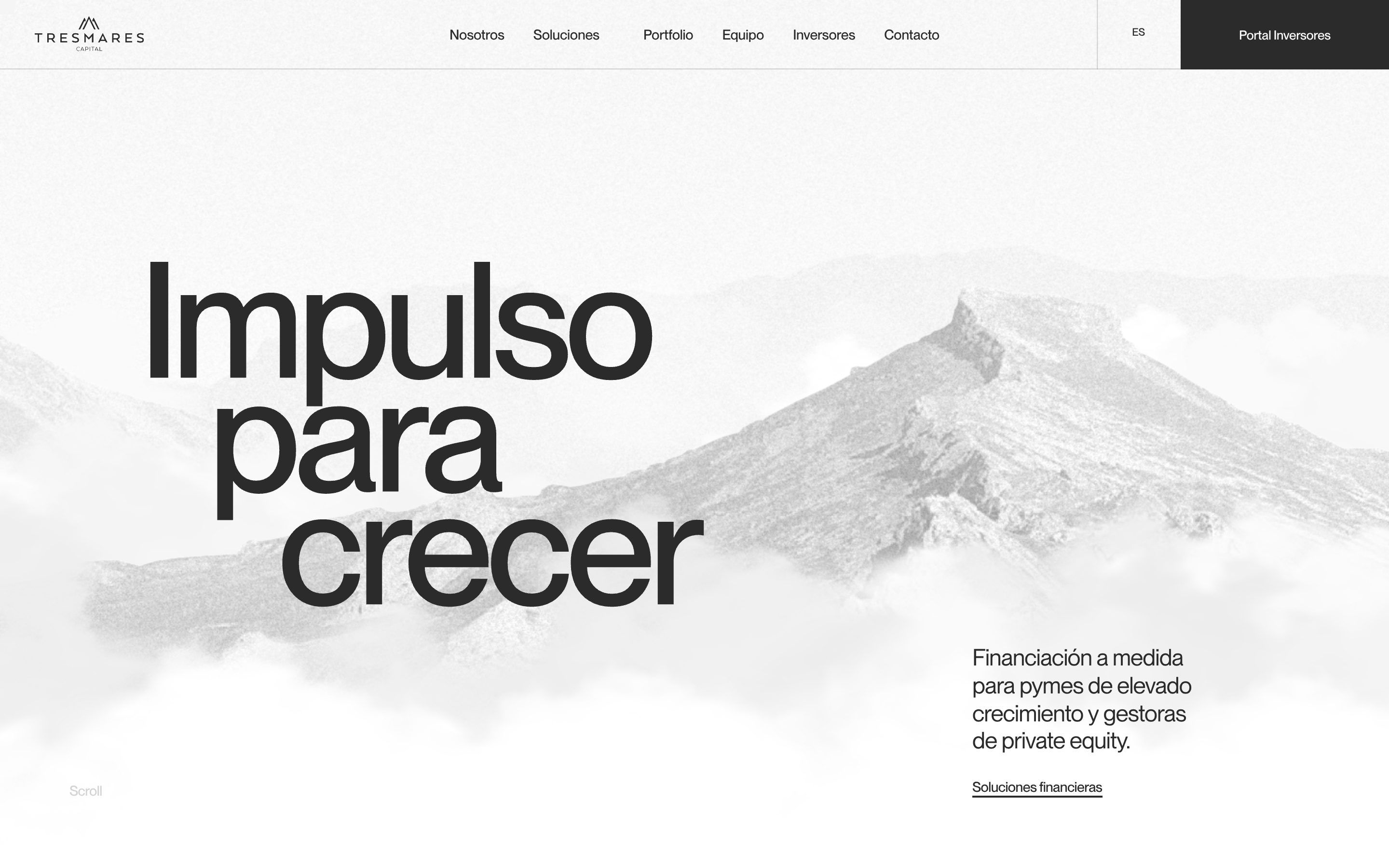
Tresmares Capital is a Madrid fund manager that lends to and invests in fast-growing small and mid-sized companies and private equity managers: direct lending, funds of funds, fund financing. The site says it in three huge words, «Impulso para crecer», over a sea of clouds with the peaks of a mountain rising out of it. It is a light site, almost without colour: white, a very pale grey, #F2F2F2, for the sections and tiles, a mid grey, #D5D5D5, behind the strategies, and a graphite, #2B2B2B, for the text and for the investor portal button. The only colour is a full red, #E41613, used sparingly: the figures, the strategy emblems, the cursor, the offices on the map. There are two typefaces, both by Pangram Pangram: PP Neue Montreal, regular, medium and bold, for all the text and the enormous, tightly spaced headings, and PP Fragment Serif only for the red figures. The site is by the studio Dgrees, which doesn’t sign it in the code: the credit comes from the award page. On Awwwards it was Site of the Day on 12 June 2026, with 7.25 from the jury, and won the Developer Award, 7.36, where animations scored 8.2.
Underneath there is WordPress 7.1.4, with WPML for Spanish and English and WP Rocket delaying the scripts. The theme is an app written in classes and bundled with webpack: every section of the page has a data-component attribute and a class of its own, and navigation between pages is taxi.js. The animation is GSAP 3.14.2, with ScrollTrigger, Observer, SplitText, Draggable and TextPlugin; next to it, pasted in separately, is a much older InertiaPlugin, 3.6.1. Smooth scrolling is Lenis 1.3.15, with its Snap module, wired to ScrollTrigger. The opening is three.js r180, and the emblems are SVG drawn with SVG.js. Every measurement in the JavaScript sits on a 2400 pixel grid: a px function turns design pixels into screen pixels, t / 2400 × width, and on phones a twin, pxm, does the same on 360.
We take it apart in three moments, with a demo rebuilt from scratch for each, for a made-up fund, Cumbre Credit, a private credit manager in Madrid: the text, the data, the images and the code are ours. From the site we took the ideas and, where we say so, the numbers.
The sea of clouds that parts
Opening the home page you are inside a black and white landscape: three planes of mountains, a rocky peak up front, and clouds drifting past at different speeds. Moving the mouse shifts the mountains slightly, as if you turned your head, and where the cursor passes the clouds dissolve and leave a hole that then closes again. Meanwhile the headline opens in steps: each line slides right a little further than the one above.
It is a three.js scene. The mountains are three photographs on three planes at different depths, 0.2, 0.5 and 0.8, and the front one fakes relief: a shader moves every point of the photo according to a height map and the mouse position, vUv + (height − 0.5) × mouse / 20, so the rock seems to turn. The clouds are the same image, cloud.png, repeated over five layers: 15 white clouds in front of everything, then 7, 7, 20 and 25 further and further away, each with its own height, scale, grey and speed, faster the closer they are; when one leaves on the right it comes back on the left. The blow is simple: if the cursor gets within 200 units of a cloud, the cloud vanishes in one second, growing by 30%, waits a second and comes back. One second after start the site blows by itself on ten points along the bottom, to show that you can. The mouse is smoothed by one hundredth per frame, which is why the mountains move so slowly. Scrolling down, ScrollTrigger brings the scene closer from 1.1 to 1.4 and, after 40% of the way, lifts it by 0.9 screen heights; then drawing stops. The headline is split into lines by SplitText and each line moves right by px(120 × i), that is 5vw per line, in 2.2 seconds with expo.out, while scrolling stays locked for 3 seconds.
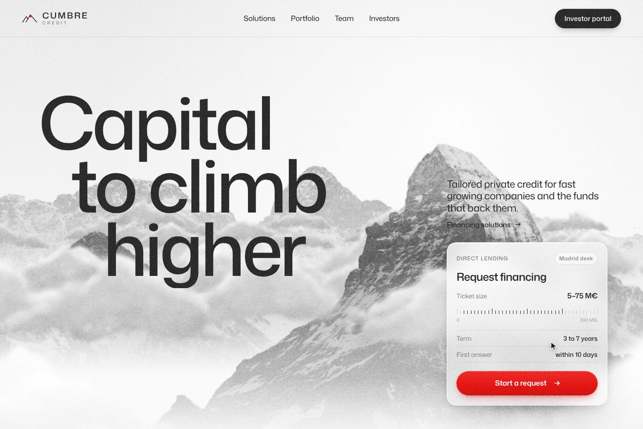
In our demo the opening is Cumbre Credit’s, «Capital to climb higher», and it is entirely two-dimensional, on a canvas, without three.js: three mountain ranges in real, royalty free black and white photographs, a rock pyramid in front and two ridges behind, with the haze, the mist and the grain. From the site come the five cloud layers, 15, 7, 7, 20 and 25, moving faster the closer they are and coming back from the left, the blow that makes a cloud near the cursor vanish in one second, swelling it by 30%, and brings it back a second later, the fake blow along the bottom one second after start, the mouse smoothed by one hundredth per frame, and the stepped headline, 5vw per line in 2.2 seconds with expo.out. Ours are the choice of photos, the drawn clouds, the spring that pushes the clouds sideways as they fade and the trail of mist they leave, and the frosted glass «Request financing» card that drops and bounces by seven pixels and then one and a half, with its shadow tightening, the ticket ruler lighting up from 5 to 75 million as the figures count, and the elastic red pill confirming the request. A drawn cursor does the tour by itself and stops as soon as a real pointer arrives. With reduced motion the mountains and clouds stand still and the headline and card are already in place.
The strategies and the emblem that refolds
Further down the fund’s four strategies, Private Equity, Direct Lending, Fund of Funds and Fund Financing, pass one after another on a pinned stage. Each has a black and white photo of a plant, the name in huge type, two lines of description and the figures: how much it manages, how much it lends, to whom. In the middle a red emblem changes shape: two mirrored tablets that stretch out of a square, step apart, become a circle.
The section is four screens tall, one per strategy, with a sticky layer inside. One timeline with scrub runs from top top to bottom bottom: the new strategy comes in with a curtain, clip-path: inset(100% 0 0 0) opening to inset(0), with the photo rising from 20% and the text from 30%, while the old one leaves upwards; the entries are staggered by a third of their duration. Lenis Snap latches onto each strategy when you get within a third of the height. The emblem is the most curious part: it is not an animated file but a hand-written morphing engine. Every shape is a list of points with their Bézier handles, and every state is a new position for those points; going from one state to another is a tween with expo.inOut. In the first strategy two shapes, one turned 180 degrees, start from a 130 by 130 square, become rectangles stretching to 335 and slide apart into two parallelograms. To turn a square into a circle the code uses 0.5523, the number you need to draw a quarter circle with a Bézier curve. The stage scroll is split into eight parts: one eighth for the entrance, six for the body, one eighth for the exit. And the emblem is in mix-blend-mode: darken, so the black leaves of the plant pass over it.
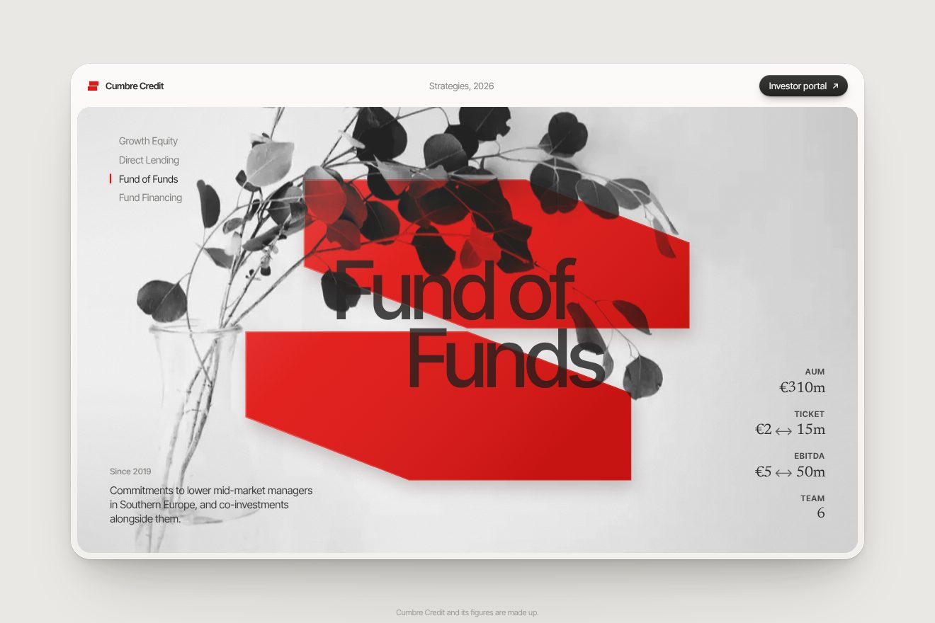
In our demo the strategies are Cumbre Credit’s, Growth Equity, Direct Lending, Fund of Funds and Fund Financing, inside a card of light paper with the mark and the dark «Investor portal» button. The plants are real, royalty free black and white photographs: dried flowers, wild oats, a eucalyptus branch in a carafe and a fern frond unrolling, lifted towards the grey of the stage so the red stays red. From the site come the four-screen stage with the sticky layer, the single scrub timeline, the curtain from inset(100% 0 0 0) to inset(0) with the photo from 20% and the text from 30%, the snap when you are a third of a screen from the stop, the red emblem made of two mirrored shapes, one turned 180 degrees, with eight points and their handles, the 130 square becoming two bars 335 long, then the stepped parallelograms and the circle with handles at 0.5523, always with expo.inOut, the emblem forming from nothing in two seconds after half a second, as in the site’s page headers, and the darken blend that lets the plant and the title pass over the red. Ours are the choice of photos and the numbers, the AuM, Ticket, EBITDA and Team figures rolling one column after another, the red index bar that slides down and stretches halfway, the emblem’s blurred shadow spreading as it refolds, the three-degree tilt, the veil of light and the pink edge breathing on the red. Clicking an entry in the index takes you to its strategy. With reduced motion the strategies change with a fade, without snapping.
The odometer year
On the Nosotros page the fund’s history, from 2014 to Banco Santander becoming its majority shareholder, is a row of years under a video. Click a year and its four digits turn like an odometer’s, and the video runs forwards or backwards to its point, as if history were rewinding.
The 4K video opens on arrival from clip-path: inset(50%) to inset(20%) in 1.4 seconds with expo.out, then widens to the edge as you scroll. Each digit of the year is a column holding the numbers 0 to 9, and changing year means moving each column by −100 × digit percent, in 1.4 seconds with expo.out. The video has no chapters: the site divides its duration by the number of years and takes currentTime to the right point with a GSAP tween, the same duration and curve as the digits, so number and image arrive together. On phones the row becomes a carousel dragged with Draggable, and each step does the same.
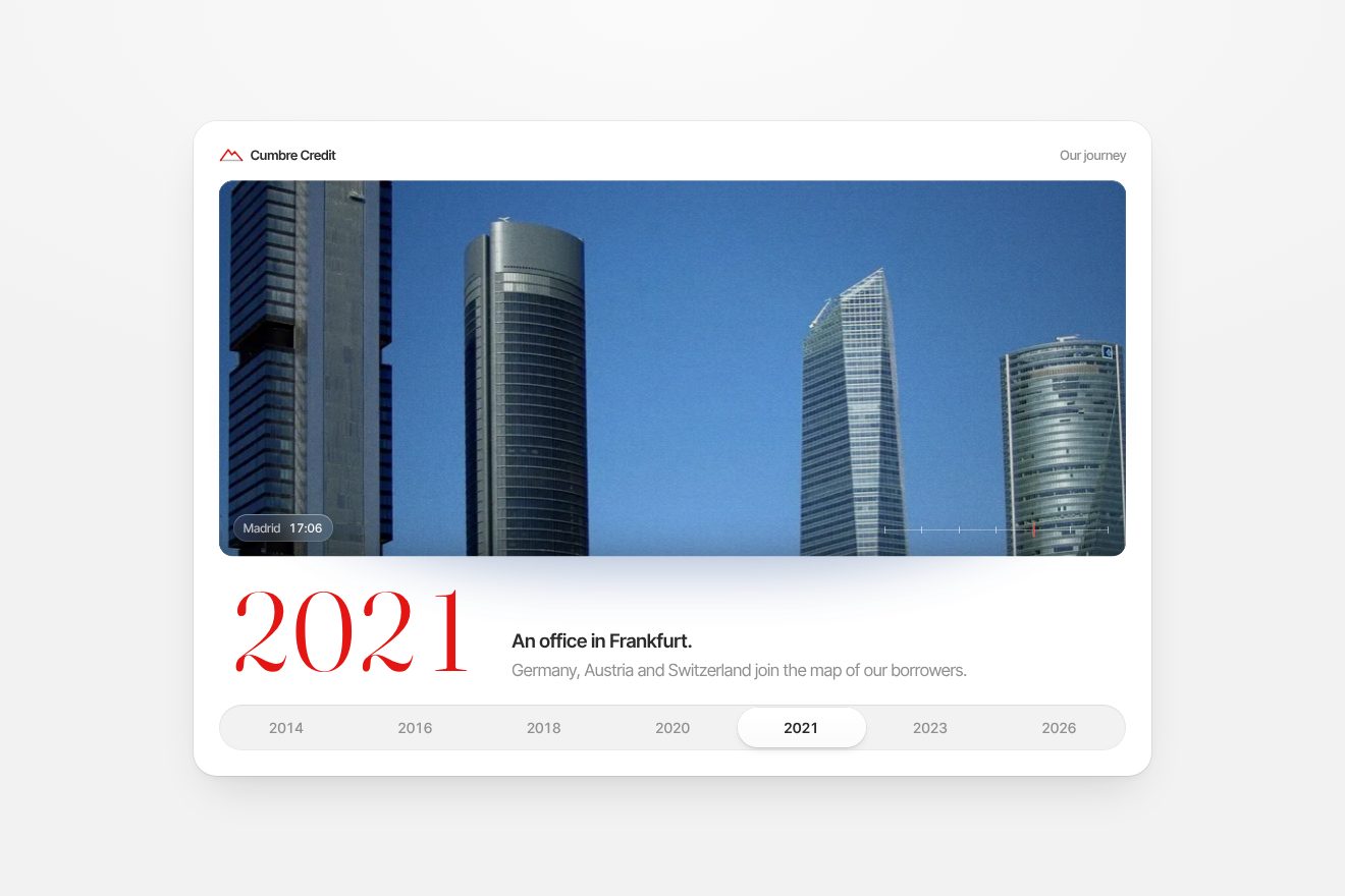
In our demo the history is Cumbre Credit’s, seven milestones from 2014 to 2026, in a white «Our journey» card on a very pale grey. Instead of the video there is a film made of four real, royalty free photographs of Madrid at four hours of one day, the sun over the roofs at dawn, the tower under the morning clouds, the towers in the afternoon blue and the night with every window lit, dissolving into each other with a slow push-in and grain; at the bottom a glass tag gives the film’s time and a ruler with seven ticks shows where you are. From the site come the window opening from inset(50%) to inset(20%) in 1.4 seconds with expo.out and then widening, the digit columns from 0 to 9 moved by −100 × digit percent in 1.4 seconds with expo.out, the film taken to its point, the duration divided by the years, with the same curve and duration, and the two lines of the milestone rising word by word in one second with expo.out, a hundredth apart. Ours are the choice of photos and the film, the year in a free serif, Fraunces, with a touch of vertical motion blur and a two-pixel settle, the row of years as pills with the puck sliding on a spring, the reflection crossing the glass at every change and the shadow under the window breathing and taking on the colour of the sky. The years choose themselves, but you can click them. With reduced motion the digits and the film change with a fade.
The other details
The section headings light up letter by letter as you scroll: they start at 0.05 opacity and reach 1 with two hundredths of a second between letters, from when the heading is at 90% of the screen to when its end is at 60%. Paragraphs rise word by word from behind a mask, in one second with expo.out. The number tiles come in with a delay that depends on where they are, 0.00025 seconds for every pixel from the left edge: the cascade follows the shape of the grid, not the order of the code. And in the number grid the second column scrolls 20vw more than the first, so the tiles slide over each other. Further down, sixteen photos of countries sit on a wheel that turns almost a full circle as you scroll, above an SVG map of Europe with the three offices, Madrid, London and Frankfurt. The cursor is a red dot that follows the mouse in one second and swells over photos into a disc reading «Ver» or «Drag».
Where it stumbles
There is no reduced motion: no line of the code looks at prefers-reduced-motion, and the clouds, the stepped headline, the emblems and the wheel always run the same; on top of that the opening locks scrolling for three seconds. The main heading only exists on desktop, because it has the data-desktop attribute, and 36 images out of 40 have no useful description. The page is heavy: the home page HTML is 3.3 megabytes, almost all of it two maps of Europe drawn in SVG inside the page, one for desktop and one for phones, sent to everyone; the photographs of the three.js scene are about 4.3 megabytes, the library bundle one megabyte, and the history video 8.9. The building-site tools stayed in production: 26 console.log calls, the WebGL scene with its debug helpers on, the dat.gui panel in the bundle and Google Tag Manager with the placeholder id, GTM-XXXXXXXXXX.
What we take away
Tresmares does a job that isn’t very photogenic, lending money to companies, and its site makes it light with a single image, the mountain above the clouds, and a single colour, red. The best ideas are small and precise: a blow that opens a hole in the clouds and closes it, an emblem that changes shape instead of changing photo, a year that turns like a counter while the film runs at the same pace. And one detail worth copying: every measurement written on a 2400 pixel grid and converted by a single function, so the design and the screen speak the same language.
The effects
- Cloud hero backgroundThe first screen of Cumbre Credit, a private credit fund from Madrid: behind the headline a canvas lays three mountain ranges, real black and white photographs with the sky cut away, and five layers of clouds drifting at different speeds, 15, 7, 7, 20 and 25 clouds. Where the cursor passes, a cloud fades, swells by 30 % and slides aside on a soft spring leaving a trail of mist, waits a second and comes back. The headline ‘Capital / to climb / higher’ steps down to the right and a frosted glass card to request financing lands with a bounce.Free
- Fund strategies emblemA scroll animation for the strategies page of a private credit fund in Madrid, Cumbre Credit: a card with a pinned grey stage and four strategies, each with a real black and white photo of a plant (dried flowers, wild oats, eucalyptus, fern), the big name, two lines and four figures. In the middle a red emblem made of two mirrored shapes, one turned by 180 degrees, folds into a new form at every strategy by moving its points and curve handles: a square cut in two, two bars that stretch, two stepped parallelograms, a split circle. The new strategy rises like a curtain, the figures roll like an odometer and the scroll stops on each one.Free
- Fund timelineThe ‘Our journey’ section of a private credit fund from Madrid, Cumbre Credit: a white card with a wide window that opens from its middle and plays a film made of four real photographs of Madrid at four hours of one day, the sun over the roofs at dawn, the tower under the morning clouds, the towers in the blue afternoon sky, the night with every window lit, dissolving into each other with a slow push-in and grain. Below, seven years as pills with a puck that slides on a spring. Picking a year runs the film forward or back to its hour, the four red serif digits roll like an odometer with a thread of vertical motion blur and two lines of milestone come in word by word from below.Free