Champions for Good Club, by Double Play
Champions for Good Club, how it’s made: the fanned plan cards, the sounds that follow the scroll and the three circles between pages
The site of the German club that brings athletes, founders and investors together looks like a sports poster: huge narrow headlines, four colour pairs, little figures running about. Underneath there is a deck of plan cards that drags all at once, a Sounds switch that gives every sport its own sound and turns it up and down with the scroll, and three circles that swell on every change of page. We take it apart with three demos rebuilt from scratch.
The palette
- #23002Bthe night purple of the home page and of the button text
- #E894FFthe brand lilac: the headlines, the photo borders, the Join button
- #002629the petrol of the green sections and of the FAQ page
- #94FFE4the mint of the text and lines on petrol
- #291900the brown of the archer section and of the events page
- #FFAC47the orange of the archer and of the Booster cards
- #FBFBFBthe warm white of the light sections
Tap a colour to copy its code.
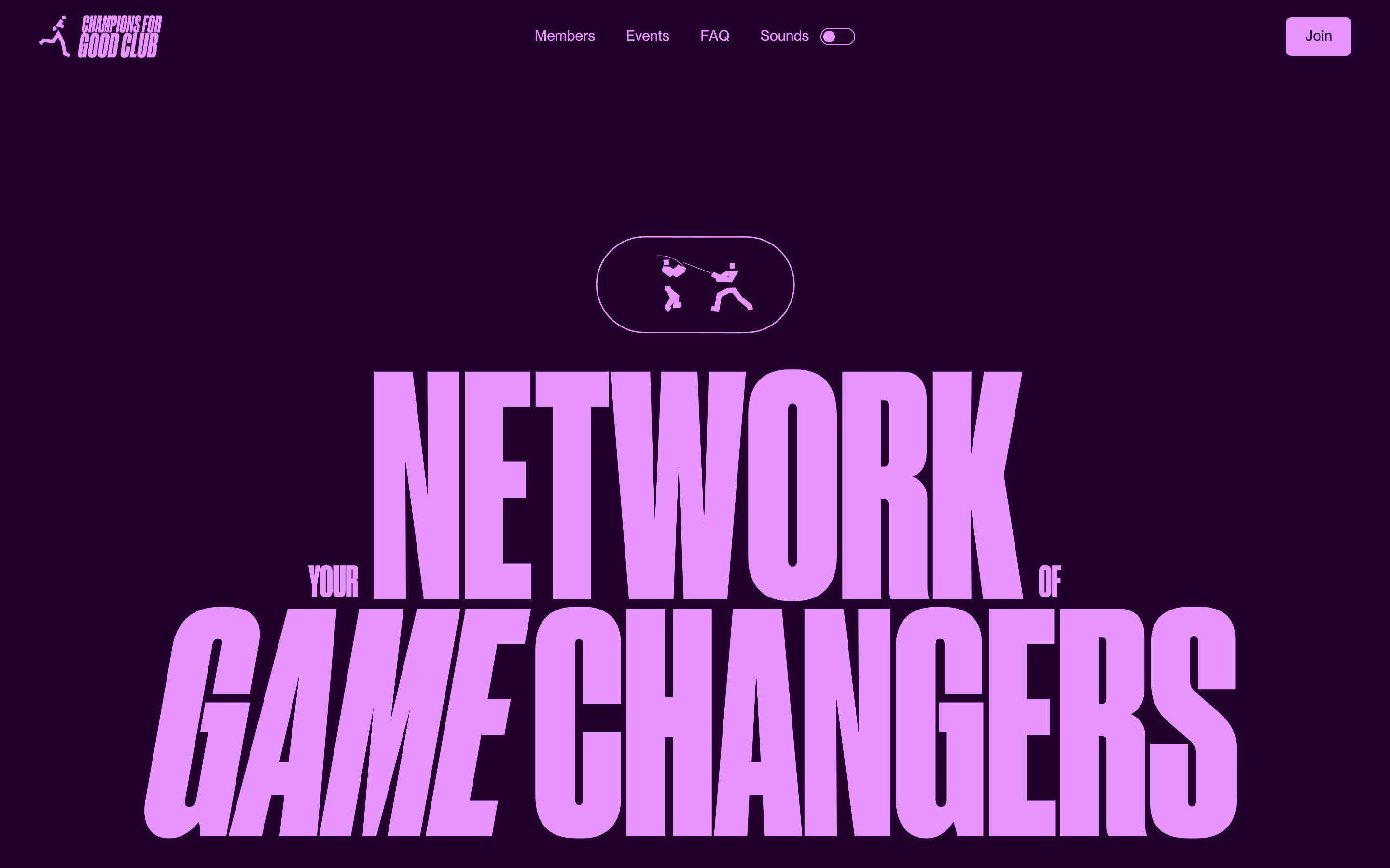
Champions for Good Club is a German club that puts top athletes, founders and investors in the same room: sports events instead of the usual networking evenings («No boring networking», says the home page), and for the athletes a way towards sponsors and work. Athletes join for free; companies pay a yearly fee, from 1,020 euros for the Booster plan to 3,960 for Corporate. The site looks like a sports poster. It opens with a headline that fills the screen, «YOUR NETWORK OF GAME CHANGERS», with YOUR and OF small, NETWORK huge and GAME in italics, under a pill where two fencers cross blades. The background is night purple, #23002b, and the ink is lilac, #e894ff; then the sections move through three more pairs of the same kind: petrol #002629 and mint #94ffe4, brown #291900 and orange #ffac47, warm white #fbfbfb and black #121212. Headlines are set in Druk Condensed Super, Commercial Type’s extremely narrow capitals, with its italic; the text in PP Neue Montreal, from Light to SemiBold. Little sports figures in Lottie run everywhere, seventeen on the home page alone: tennis, basketball, volleyball, an archer, a bike, a horse, golf, the runner of the logo. The site is by Double Play, a brand and web studio that also appears among the club’s partners. It was Site of the Day on Awwwards on 6 April 2026, with 7.69 from the jury, and took the developer award, 7.25, with 8.4 for the animations.
Underneath there is Webflow, but the real code lives elsewhere: a single file, app.js, served from Vercel, 302 kilobytes. Inside are GSAP 3.13.0 with ScrollTrigger, SplitText, CustomEase and Draggable, Lenis 1.3.11 with lerp at 0.18, and Swiper. The HTML also holds tags for GSAP, Lenis 1.0.34 and Swiper 8 from the CDNs, but they sit inside a comment: about two hundred lines of an older version, shipped on every visit and never run. Everything is switched on by attributes, data-flick-cards, data-sound-section, data-sticker, data-transition-link, and two functions start the modules: one as soon as the page is there, the other once the fonts have arrived, because the headlines are split into letters only when Druk is in place. Until then the page cannot be touched: the CSS sets pointer-events: none and the waiting cursor. The sounds are fifteen mp3 files in plain audio tags, with no library.
We take it apart in three moments, with a demo rebuilt from scratch for each. The text, the brands, the sounds and the code are ours; from the site we took the ideas and, where we say so, the numbers.
The fanned plan cards
The club’s plans are tall dark cards in a fan: the chosen one stands straight in the middle, the two next to it turned and shrunk at the sides, the other two further behind and more tilted. Drag with a finger or the mouse and it is not one card that moves: the whole deck turns together, in real time, and when you let go every card snaps into place with a small bounce and the rustle of a card.
The positions are four rows of numbers. The middle card sits at zero; the first neighbours are 35% of their width to the side and 4% lower, turned 10 degrees and scaled to 0.925; the second ones at 60% and 10%, at 18 degrees and 0.85; the rest disappear behind, at 55%, 20 degrees and 0.6. Over each card lies an invisible layer that Draggable moves only sideways, with edgeResistance at 0.8 and no inertia. While it is pulled, the site works out how far the deck is towards the next position, from 0 to 1, and with gsap.set takes every card to that point between its current place and the next one: that is why the whole deck moves with the finger. On release, pulling more than 10% of the width is enough to change card; then every card goes home in 0.6 seconds with elastic.out(1, 1). A gesture under 4 pixels is not a drag but a click, and the site switches the layer off for two frames and passes the click to the button beneath. The loop is endless, which takes at least seven cards: with five plans the site puts in ten, the deck copied twice, and with fewer it writes «Not minimum of 7 cards» to the console. The Join button of the new card comes in squashed and tilted by 5 degrees and straightens in 0.55 seconds.
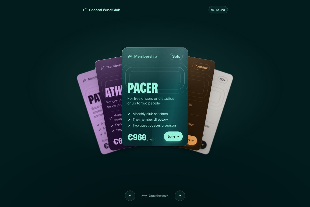
In our demo the deck holds the memberships of a made-up club, Second Wind Club: five cards, Athlete, Pacer, Team, League and Patron, from zero euros to «from» 6,000 a year, each with its own background and ink pair, purple and lilac, petrol and mint, brown and orange, chalk and black. From the site come the fan positions, 35% and 4% at 10 degrees and 0.925, 60% and 10% at 18 degrees and 0.85, the whole deck blending with the drag in proportion to the width, the resistance past halfway, the change past 10%, the release with elastic.out(1, 1) in 0.6 seconds, the 4 pixels that turn a gesture into a click and the Join button coming in squashed and tilted by 5 degrees and straightening in 0.55 seconds. Ours are the paper grain, the one-pixel rim that catches the light and changes side with the tilt, the shadow sliding towards the side the card leans, the sheen crossing it as it travels, the lanes of a running track drawn thin inside each card, the price rolling digit by digit from the old one to the new, the perks rising in a cascade, the page background taking the colour of the middle card and blending it while you drag, the arrows and keys, and a paper rustle synthesised in the browser, which plays only after a real gesture and with the switch on. With five cards rather than seven: halfway round the loop there is a hidden slot where a card fades, leaves on one side and comes back on the other. Until someone touches it, the deck leafs through by itself. With reduced motion the fan stays still and every change is a fade.
The sounds that rise and fall with the scroll
In the menu, next to the links, there is a switch labelled Sounds. It is off when you arrive; on, every sports section of the page starts playing on its own: the spinning bike, the tennis ball, golf, the bowstring, the bobsleigh, the fencers’ blades in the opening. They never start or stop at once: each sound rises as its section comes into view and fades as it leaves, as if you were walking past different playing fields.
Each section has a ScrollTrigger running from the moment its top edge touches the bottom of the screen to the moment its bottom edge leaves the top. The volume is a triangle on that progress, 1 − |2p − 1|: zero coming in, full halfway, zero again going out. Where a section holds several sports, the mission with running, basketball and the gym, or volleyball turning into riding, the progress is cut into thirds or halves and the sounds hand over with an 18% ramp. The volume never jumps: a GSAP quickTo carries it in 0.2 seconds with power2. The switch’s ball slides in 0.5 seconds on a soft curve, and the button tells its state with aria-pressed. The footer adds a touch: the runner of the logo runs harder, that is sounds louder, the closer the mouse gets, within a radius of 0.65 times the longer side of the screen. All of it only above 992 pixels and with a real mouse.
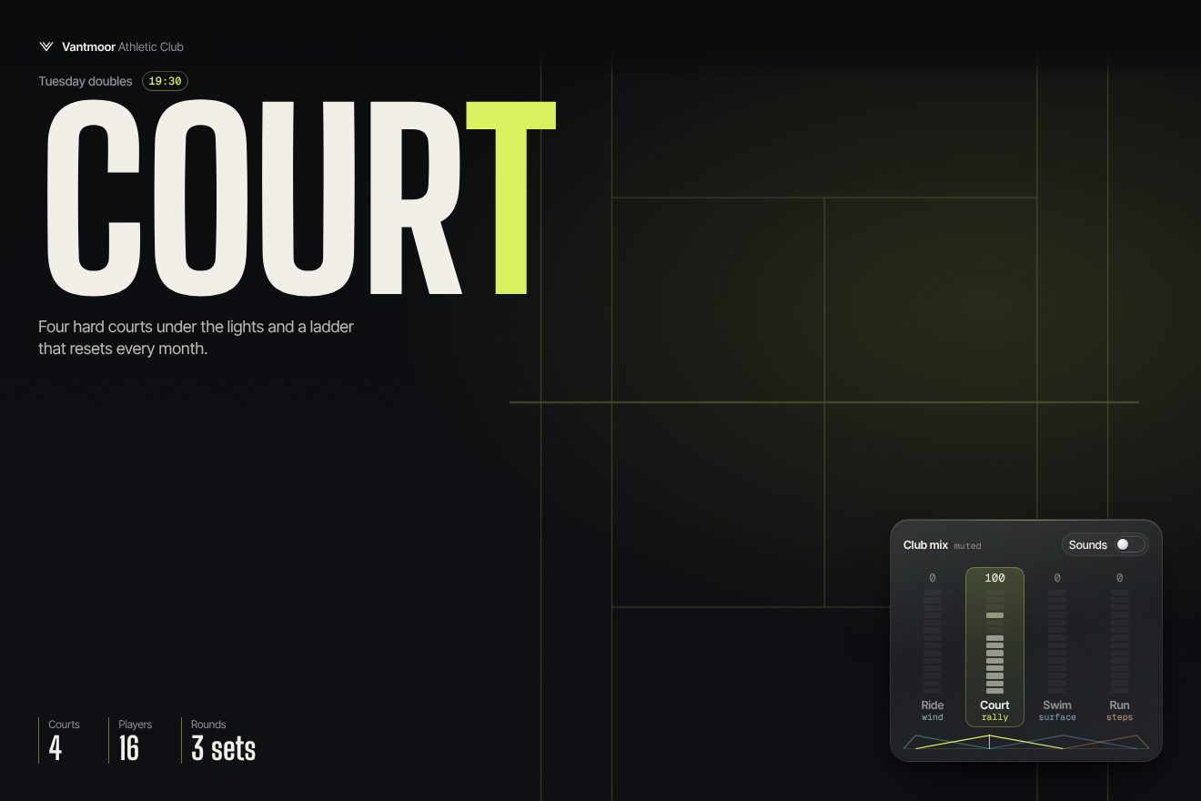
In our demo the page belongs to a made-up club, Vantmoor Athletic Club, with four sections one screen tall, Ride, Court, Swim and Run, each in its own colour and with thin lines behind it, a wheel, a court, the lanes, the track, that turn or slide with the scroll. In one corner, fixed, sits the interface piece: a small frosted-glass mixer with the Sounds switch and one strip per section, with the volume figure, a fourteen-segment bar and peaks that hold for a moment and then fall slowly. From the site come the triangle volume 1 − |2p − 1| on the section’s progress, from when it enters at the bottom to when it leaves at the top, the 18% ramp between two sounds of the same section, the 0.2-second quickTo with power2, the switch that starts off with aria-pressed and the ball that slides in 0.5 seconds on the same soft curve, and the label that runs off leaning on hover while a copy comes in. Ours are the mixer, visible even with the sound off, only fainter, the loudest section lighting up, the small map at the bottom with the four triangles and the line that tells where you are, the ball that stretches as it starts and overshoots by a pixel, and above all the sounds: no files, all synthesised in the browser, the wind and freewheel of the bike, the tennis rally, the strokes that turn into underwater bubbles halfway down the pool, the steps on gravel. They start only after the switch is clicked, and with the sound on the bars read each channel’s real level. Unlike the site, the sounds work on phones too. With reduced motion the lines stay still and only the fades remain; the volumes work the same.
The three circles between pages
Click a menu link and the page does not change right away. Three circles swell from the middle, one behind the other, each one and a half times as wide as the screen, and the last already has the colour of the page that is coming: purple for the members, brown for the events, petrol for the questions, white for the legal pages.
It is nearly all CSS. The JavaScript stops the click, puts on the transition container the class of the arriving colour, read from the link’s data-transition-link attribute, and the class is-animating; then it waits 1.5 seconds with gsap.delayedCall and changes page with location.href, a real new page, with no Barba or the like. The three circles are three divs with aspect-ratio: 1, 150% wide, going from scale 0 to 1 in three animations of 1.75 seconds on the same curve, cubic-bezier(.4, .15, 0, 1), but each starts later: the first at once, the second at 4% and the third at 18%. The colours change with the destination: for the members mint, lilac and purple; for the questions lilac, mint and petrol; for the events lilac, orange and brown. While the circles grow, a rule with :has() takes clicks away from the whole page. Going back in the browser, the pageshow event reloads the page, so it is never left covered by the circles.
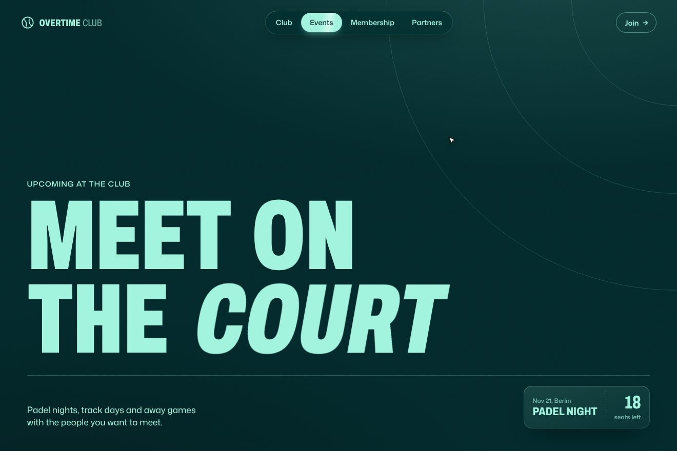
In our demo the three circles live in the site of a made-up club, Overtime Club, with four pages, Club, Events, Membership and Partners, each with its own background and ink pair on the site’s idea: purple and lilac, petrol and mint, brown and orange, warm white and black. From the site come the three circles from scale 0 to 1 starting at 0, 4 and 18% of 1.75 seconds on the curve cubic-bezier(.4, .15, 0, 1), the last in the arriving colour and the first two in the other pairs, the page that cannot be touched while they grow, and the headline letters arriving from 80 pixels to the right, skewed by 14 degrees, two hundredths of a second apart. Ours are the circles starting from the point of the click instead of the middle, with the radius measured to the farthest corner, the slightly lighter rim and a soft shadow, the old headline bending away from the click, and above all the exit, which the site does not have: when the last circle covers everything, the new page is already underneath, the circle becomes its background and the huge headline comes in letter by letter, each one wider and then narrowed on the width axis, while the label, the line and the card rise in a cascade. The menu is a glass pill: the active link slides on a spring, a second, fainter pill follows the pointer, and during the transition the links dim to half. A drawn pointer tours the pages on its own until the real one arrives. With reduced motion the colour and the new page simply fade in.
The other details
Over some headlines the cursor turns into a sticker, a small drawn word that takes the section’s colours, and every click pastes a real sticker on the headline, a circle, a pill, a star: it arrives turned 40 degrees in depth and 1.35 times too big, and in 0.4 seconds it settles flat and crooked, at a random angle of up to 40 degrees; after 3 seconds it peels off by itself. Headlines come in at a slant: each letter arrives from 80 pixels to the right, skewed by 14 degrees and slightly squashed, and straightens two hundredths of a second after the one before. Buttons do the same with their label, which runs off to the left leaning over while a copy comes in from the right, and in the buttons with a ball a little ball drops after the last word and bounces into place. On phones the opening is a stack of athlete photos with a lilac border, turned at 6 and minus 6 degrees: pull the top one aside and, past 1.15 times its width, it goes to the bottom of the deck and the rotations swap. The archer and the volleyball are two Lottie animations that advance with the scroll, frame by frame, through Webflow’s interactions.
Where it stumbles
The site weighs more than it looks. All fifteen sounds have preload="auto" and download on every visit, about 1.75 megabytes, even with the sound off and even on phones, where the switch does not exist; with the Lottie files it comes to about 2.3 megabytes of animations and sounds alone. The main file includes Observer and MorphSVG, never used, and the HTML carries the old commented code. Reduced motion is respected only in four modules and in the button hovers: the headline entrance, the page change, the card decks, the stickers and the Lottie animations always run. The page change costs a fixed second and a half and stops every click, even with Cmd or Ctrl: a link will not open in a new tab. The plan cards can only be dragged, with no keys. The site is in German only, and in the headlines the umlauts are spelled out by hand, «fuer», «GespraEch»: the site’s Druk, it seems, does not have them. And every answer in the FAQ shows «No items found.», an empty Webflow list left in view.
What we take away
Champions for Good takes sport seriously even in the way it moves: the cards are pulled like a deck, the page sounds like a playing field, the change of page is a burst of colour. Two ideas are worth copying. The first is the deck that moves all at once: you do not animate one card, you work out a fraction between two layouts and apply it to all of them, so the finger feels the weight of the whole fan. The second is the triangle volume: one line of maths, 1 − |2p − 1|, is enough to keep the sound always where you are looking.
The effects
- Fanned pricing plansThe five memberships of a made-up sports club, Second Wind Club, fanned out like a deck of cards: the middle one straight and sharp, the others smaller and leaning on both sides. Drag the deck with a finger or the mouse and every card follows it live; let go past a tenth of the width and the next card takes the middle on an elastic spring, otherwise the deck springs back. Each card has its own pair of colours and the page takes the pair of the card in the middle; the price rolls digit by digit, the edge catches the light, the shadow follows the lean and a synthesised paper swipe goes with every change.Free
- Sound mixer toggleThe page of a made-up sports club, Vantmoor Athletic Club, with four sections, ride, court, swim and run, and in a corner a frosted glass mixer with the Sounds switch. Every section has its own sound, synthesised live with WebAudio, and its volume rises as it comes in and falls as it leaves on a triangle, 1 − |2p − 1|, while you scroll. The segmented bars, the peaks falling slowly, the volume as a number and the loudest section lit show even with the sounds off, fainter; on a click the ball slides on its spring and the mixer comes alive.Free
- Three-circle transitionThe website of a made-up club for sport and business, Overtime Club, with four pages, each with its own pair of background and ink: purple and lilac, petrol and mint, brown and orange, warm white and black. On a click on a menu item three circles swell one after the other from the point of the click, the first two in the colours of the other pages, the last one in the colour of the page that is coming; the pill of the active item slides on a spring and the menu stays locked until the transition is over. Then the part the original site does not have, the way out: the last circle becomes the background, a thin wave leaves from the click and the huge condensed title comes in letter by letter from the right, slanted, and tightens on the width axis.Free