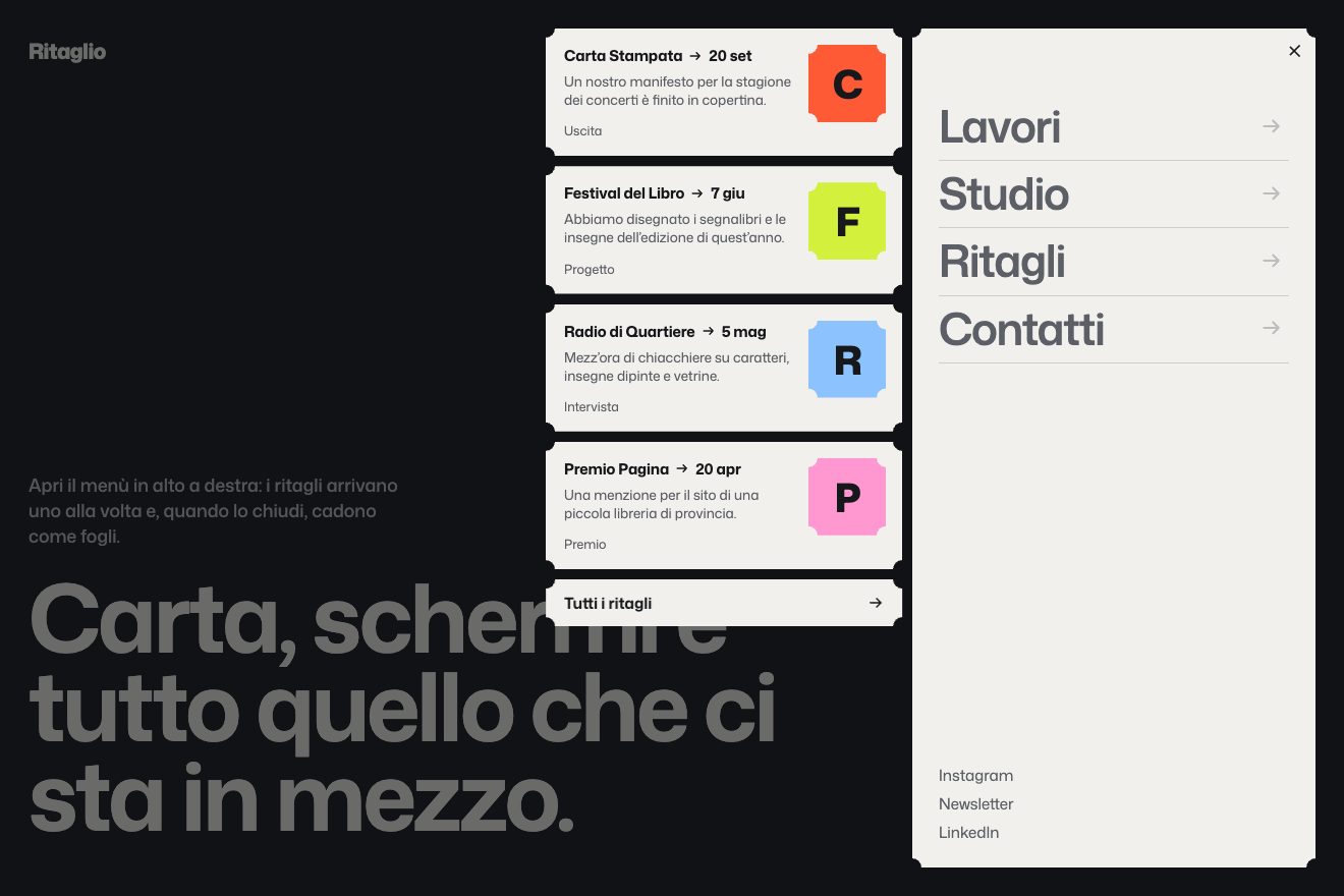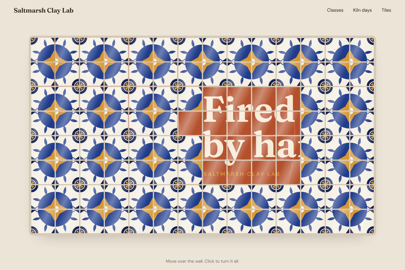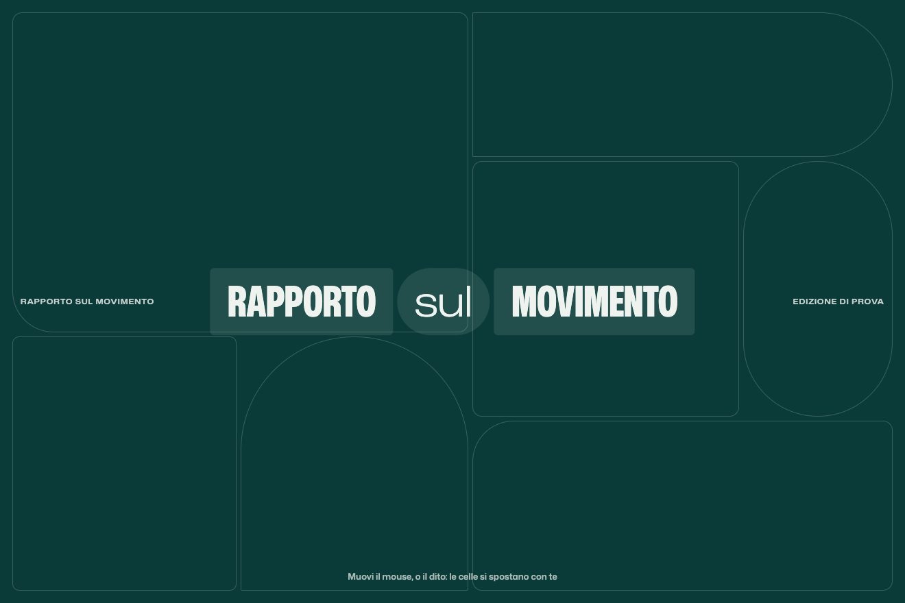
The liquid grid
Hover, Transitions
The website of a made-up club for sport and business, Overtime Club, with four pages, each with its own pair of background and ink: purple and lilac, petrol and mint, brown and orange, warm white and black. On a click on a menu item three circles swell one after the other from the point of the click, the first two in the colours of the other pages, the last one in the colour of the page that is coming; the pill of the active item slides on a spring and the menu stays locked until the transition is over. Then the part the original site does not have, the way out: the last circle becomes the background, a thin wave leaves from the click and the huge condensed title comes in letter by letter from the right, slanted, and tightens on the width axis.
Rebuilt from scratch studying champions4good.club by Double Play: the idea is theirs; code, copy and images are ours. Read how it’s made
A folder that runs on its own: index.html, style.css, script.js and the libraries from a CDN. The React and Vue tabs hold the same demo as a ready component, which switches its animations off when it leaves the page.
<!doctype html>
<!--
"Three-circle transition" from Animorio · https://animorio.com
License: free on your own sites and your clients’ sites, paid work included.
Not for resale, redistribution, templates or code collections · https://animorio.com/en/license/
-->
<html lang="en">
<head>
<meta charset="utf-8">
<meta name="viewport" content="width=device-width, initial-scale=1">
<title>The page transition with three circles in the colour of the next page</title>
<link rel="stylesheet" href="https://cdn.jsdelivr.net/npm/@fontsource-variable/archivo@5.3.0/wdth.css">
<link rel="stylesheet" href="https://cdn.jsdelivr.net/npm/@fontsource-variable/mona-sans@5.3.0/wdth.css">
<link rel="stylesheet" href="style.css">
</head>
<body>
<main class="stage" data-stage>
<!-- the four pages of a made-up members' club for sport and business, Overtime Club. Every page has its own pair of
background and ink. A click on the menu swells three circles from the point of the click, one after the other:
the first two in the colours of the other pages, the last one in the colour of the page that is coming. That last
circle stays and becomes the background, while the new title comes in letter by letter and tightens -->
<header class="top">
<a href="#" class="brand" data-go="club" aria-label="Overtime Club, home">
<svg class="brand__mark" viewBox="0 0 24 24" aria-hidden="true">
<circle cx="12" cy="12" r="9.2"></circle>
<path d="M5.2 6.4c3.6 2.3 5.2 6.7 4.3 11.6M18.8 17.6c-3.6-2.3-5.2-6.7-4.3-11.6"></path>
</svg>
<span class="brand__name">Overtime<em>Club</em></span>
</a>
<nav class="nav" data-nav aria-label="Main">
<span class="nav__hover" data-hover aria-hidden="true"></span>
<span class="nav__pill" data-pill aria-hidden="true"><span class="nav__shine"></span></span>
<a href="#" class="nav__item is-here" data-go="club" aria-current="page"><span>Club</span></a>
<a href="#" class="nav__item" data-go="events"><span>Events</span></a>
<a href="#" class="nav__item" data-go="membership"><span>Membership</span></a>
<a href="#" class="nav__item" data-go="partners"><span>Partners</span></a>
</nav>
<a href="#" class="join" data-go="membership"><span>Join</span>
<svg viewBox="0 0 16 16" aria-hidden="true"><path d="M3.5 8h8.5M8.6 4.4 12.2 8l-3.6 3.6"></path></svg>
</a>
</header>
<!-- three thin rings in the empty corner, the quiet memory of the three circles: they draw again on every page -->
<svg class="rings" data-rings viewBox="0 0 400 400" aria-hidden="true">
<circle cx="400" cy="0" r="120" pathLength="1"></circle>
<circle cx="400" cy="0" r="220" pathLength="1"></circle>
<circle cx="400" cy="0" r="330" pathLength="1"></circle>
</svg>
<div class="pages">
<section class="page is-on" data-page="club" aria-label="Club">
<p class="eyebrow" data-in>The members' club for sport and business</p>
<h1 class="title" data-title><span class="line">Play</span><span class="line">for <i>more</i></span></h1>
<div class="foot">
<p class="text" data-in>Athletes, founders and investors in one room. Real games, real people, no boring networking.</p>
<div class="card" data-in>
<span class="faces" aria-hidden="true"><b>LM</b><b>AK</b><b>JR</b><b>SN</b></span>
<span class="card__col"><span class="card__big">412</span><span class="card__small">members this season</span></span>
</div>
</div>
</section>
<section class="page" data-page="events" aria-label="Events" hidden>
<p class="eyebrow" data-in>Upcoming at the club</p>
<h1 class="title" data-title><span class="line">Meet on</span><span class="line">the <i>court</i></span></h1>
<div class="foot">
<p class="text" data-in>Padel nights, track days and away games with the people you want to meet.</p>
<div class="card card--ticket" data-in>
<span class="card__col"><span class="card__small">Nov 21, Berlin</span><span class="card__mid">Padel Night</span></span>
<span class="card__cut" aria-hidden="true"></span>
<span class="card__col card__col--end"><span class="card__big">18</span><span class="card__small">seats left</span></span>
</div>
</div>
</section>
<section class="page" data-page="membership" aria-label="Membership" hidden>
<p class="eyebrow" data-in>Membership</p>
<h1 class="title" data-title><span class="line">Join the</span><span class="line"><i>squad</i></span></h1>
<div class="foot">
<p class="text" data-in>One year, every event, a curated network. Athletes join for free.</p>
<div class="card" data-in>
<span class="card__col"><span class="card__small">Booster</span><span class="card__big">€85<small>/ month</small></span></span>
<span class="card__tag">Billed yearly</span>
</div>
</div>
</section>
<section class="page" data-page="partners" aria-label="Partners" hidden>
<p class="eyebrow" data-in>Partners and friends</p>
<h1 class="title" data-title><span class="line">Backed</span><span class="line">by the <i>best</i></span></h1>
<div class="foot">
<p class="text" data-in>Hotels, studios and law firms who play with us all season long.</p>
<div class="card card--marks" data-in>
<span class="mark mark--a">Northwind</span>
<span class="mark mark--b">KESTREL</span>
<span class="mark mark--c">Halden&Co</span>
</div>
</div>
</section>
</div>
<div class="wipe" data-wipe aria-hidden="true">
<span class="ball" data-ball></span>
<span class="ball" data-ball></span>
<span class="ball" data-ball></span>
<span class="echo" data-echo></span>
</div>
<div class="grain" aria-hidden="true"></div>
<svg class="ghost" data-ghost viewBox="0 0 24 24" aria-hidden="true"><path d="M5 3.5l13 7.2-5.6 1.4-2.8 5.4z"></path></svg>
<p class="sr" aria-live="polite" data-live></p>
</main>
<script src="https://cdn.jsdelivr.net/npm/gsap@3.15.0/dist/gsap.min.js"></script>
<script src="https://cdn.jsdelivr.net/npm/gsap@3.15.0/dist/CustomEase.min.js"></script>
<script src="script.js"></script>
</body>
</html>Change values, colours and text with the controls and watch the animation respond live. Or write in the code yourself. Then download the folder with your changes.
64 values to change
With the Animorio connector, Claude Code, ChatGPT, Cursor or VS Code take it from here, guide included, and fit it into your project. Paste this request:
Take “Three-circle transition” from Animorio and fit it into my siteAs on the site, three circles grow from zero to their full size in 1.75 s on the cubic-bezier(.4,.15,0,1) curve (slow at first, very fast in the middle, soft at the end): the first starts at once, the second at 4 % and the third at 18 % of the duration, and they all end together. The site puts them in the middle, 150 % of the screen wide; here they start from the point of the click and the radius is worked out to the farthest corner from that point, times 1.15, again at every frame so it holds even if the window changes size halfway.
Every page has its pair of background and ink in :root. The first two circles take the colours of the other pairs and the last one is the background of the page that is coming, the same logic as the site's is-dark-purple, is-dark-green, is-brown and is-white classes: for Events lilac, mint, petrol; for Membership lilac, orange, brown.
At the end the site really changes page with location.href after 1.5 s. Here, as soon as the last circle covers the farthest corner, the new page is put underneath, the --bg and --ink variables change and the circle, in the same colour, becomes the background without being seen; then a thin wave leaves from the click and the content comes in.
The titles are split into letters by hand (words stay together). Every letter uses the numbers of the site's data-title: x 80, scaleY 0.95, skewX −14, opacity 0, then keyframes 40 % opacity, 90 % place, 100 % upright, expo.out over 1 s, 22 ms apart. On top of that a --w variable per letter takes Archivo's wdth axis from 84 to 62: the letters narrow and close up against each other as they land.
The pill of the active item takes the item's place and width with elastic.out(1, 0.8), squashes in height and a highlight passes over it. During the transition the menu has pointer-events: none and the page cursor turns into the waiting one, like html:has(.transition.is-animating) on the site.
| Name | File | Default | What it changes |
|---|---|---|---|
DURATION | script.js | 1.75 | The seconds of the three circles, as on the site: they all end together. |
START_2 | script.js | 0.04 | When the second circle starts, as a share of the duration (the site: 4 %). |
START_3 | script.js | 0.18 | When the third starts, the one in the colour of the next page (the site: 18 %). |
SIZE | script.js | 1.15 | How far past the corner farthest from the click the circles go (1 means they just touch it). |
LETTER_STAGGER | script.js | 0.022 | The seconds between one letter and the next as the title comes in. |
LETTER_SHIFT | script.js | 80 | How many pixels from the right the letters arrive from. |
LETTER_SKEW | script.js | -14 | The slant of the arriving letters, in degrees. |
START_WIDTH | script.js | 84 | The width (wdth axis) of the letters as they arrive. |
END_WIDTH | script.js | 62 | The final width of the condensed title. |
ECHO | script.js | 1 | The thin wave that leaves from the click as the new page shows (1 on, 0 off). |
HOVER_WIDTH | script.js | 18 | How much the title letters near the pointer widen. |
For the website of a club, an event, a sports brand or a studio with a few pages, each in its own colour: when the page change should say at once where you are going, with the colour arriving before the content, and start from the gesture of the person who clicks.
The same transition with adapted sizes: the club name and the Join button hide, the menu items narrow with the width of the screen, the title is sized on width and height, the line and the card stack (in the short preview box only the card stays). The circles start from the point touched with the finger; no letters widening on hover.
No growing circles and no flying letters: the colour of the new page fades in over 0.35 s, the content fades in; the pill jumps to its place.
GSAP 3.15.0, CustomEase 3.15.0, Archivo (font variabile) 5.3.0, Mona Sans (font variabile) 5.3.0.
Compressed with gzip, the three demo files weigh 10 KB; the libraries: GSAP + CustomEase 31 KB.
Tested on 7 November 2026
Use it in your own projects and in your clients’ projects. Do not resell it or redistribute it as is. GSAP stays under its own Standard license. Full license.
Support Animorio
Animorio stays free thanks to the people who support it. If you like, buy us a coffee: it helps us make the next animations.
You asked for
We made it for you: it’s in the library, with the preview, the Playground and the code to copy.
An animation you can’t find, or a site to take apart in the journal: tell us which. We pick the next ones from here.
With your account’s email and password.
or with your email
You’re signed in as .
With your account, you can download the zip of every animation and every pack, for free.