Stanzza, by ADELT Agency
Stanzza, how it’s made: the strip of rooms, the frames of the apartment and the figures that light up
The site of Stanzza, a Barcelona interior studio, opens with a strip of photos that folds into a little square and becomes the room of the home page, shows its apartments inside frames that grow as you scroll and tells the studio in four figures that light up one at a time. We take it apart with three demos rebuilt from scratch.
The palette
- #F4F3EBthe cream of the pages
- #EFEEE6the background of the loader
- #1E1E1Ethe black of the text
- #525C2Fthe green of the apartments
- #7A8452the light green at the foot of the gradient
- #030B24the night blue of the approach section
Tap a colour to copy its code.
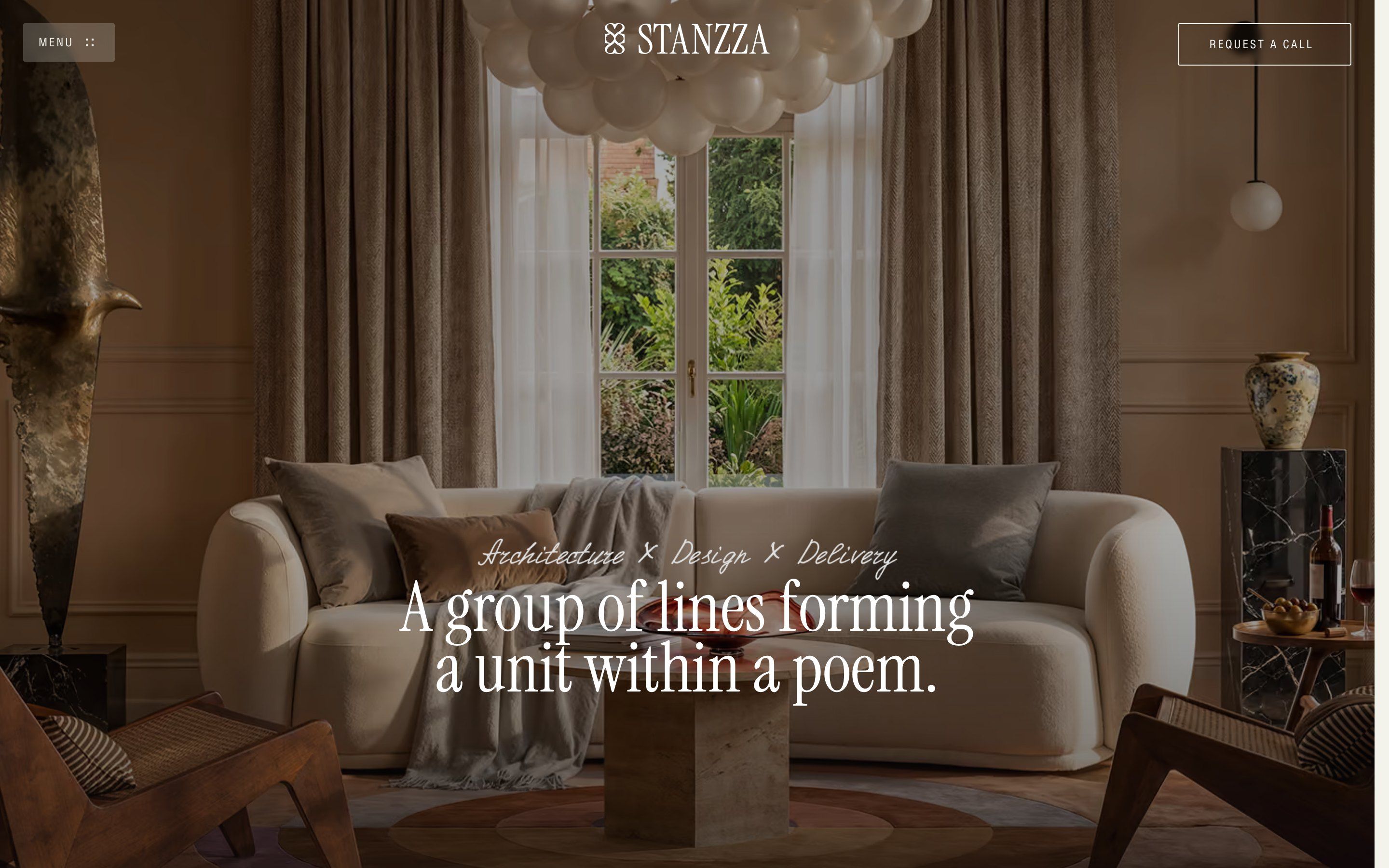
stanzza.design/awards is the page Stanzza, an interior architecture studio in Barcelona, presented to Awwwards: the projects, the method, the studio in figures, the blog, the questions clients ask. ADELT Agency designed and built it. The tone is that of an interiors magazine: a warm cream, #F4F3EB, a soft black, #1E1E1E, and two full colours for the important sections, the green of the apartments, from #525C2F to #7A8452, and a night blue, from #030B24 to #2C3C66. The headings are in Instrument Serif, the text in Helioscond, a narrow sans, and under the logo there is a handwritten line, «Architecture × Design × Delivery».
Underneath there is Webflow, with its interactions, which are now made with GSAP: the page loads GSAP 3.15 from Webflow’s server with ScrollTrigger, SplitText and Flip, plus Lenis 1.0.33 for smooth scrolling, Swiper 11 for the carousels and jQuery. Part of the movement is drawn in the Webflow panel and arrives as a list of timelines in its script; another part is written by hand, in blocks at the bottom of the page. One of them says so in a comment: it is the apartments section, copied out of Webflow’s file so it runs on every home and not only the first. The site has an Awwwards Honorable Mention from 14 September 2026, but the award page shows only community votes and none from the jury: no score to report.
We take it apart in three moments, with a demo rebuilt from scratch for each, for a made-up studio, Lumbre: the rooms of the first two are real photos with a free licence (CC0), those of the third our own SVG drawings; the texts and the code are ours. From the site we took the ideas and, where we say so, the numbers.
The strip of rooms that opens
At the opening, on a cream ground with vertical bands, fourteen tiny photos of interiors sit in two staggered rows, like the squares of a chessboard. The two rows meet and become a strip, the strip folds towards the middle, and the little square left in the middle opens into a picture and then into the whole screen: it is the photo of the home page, the living room with the white sofa.
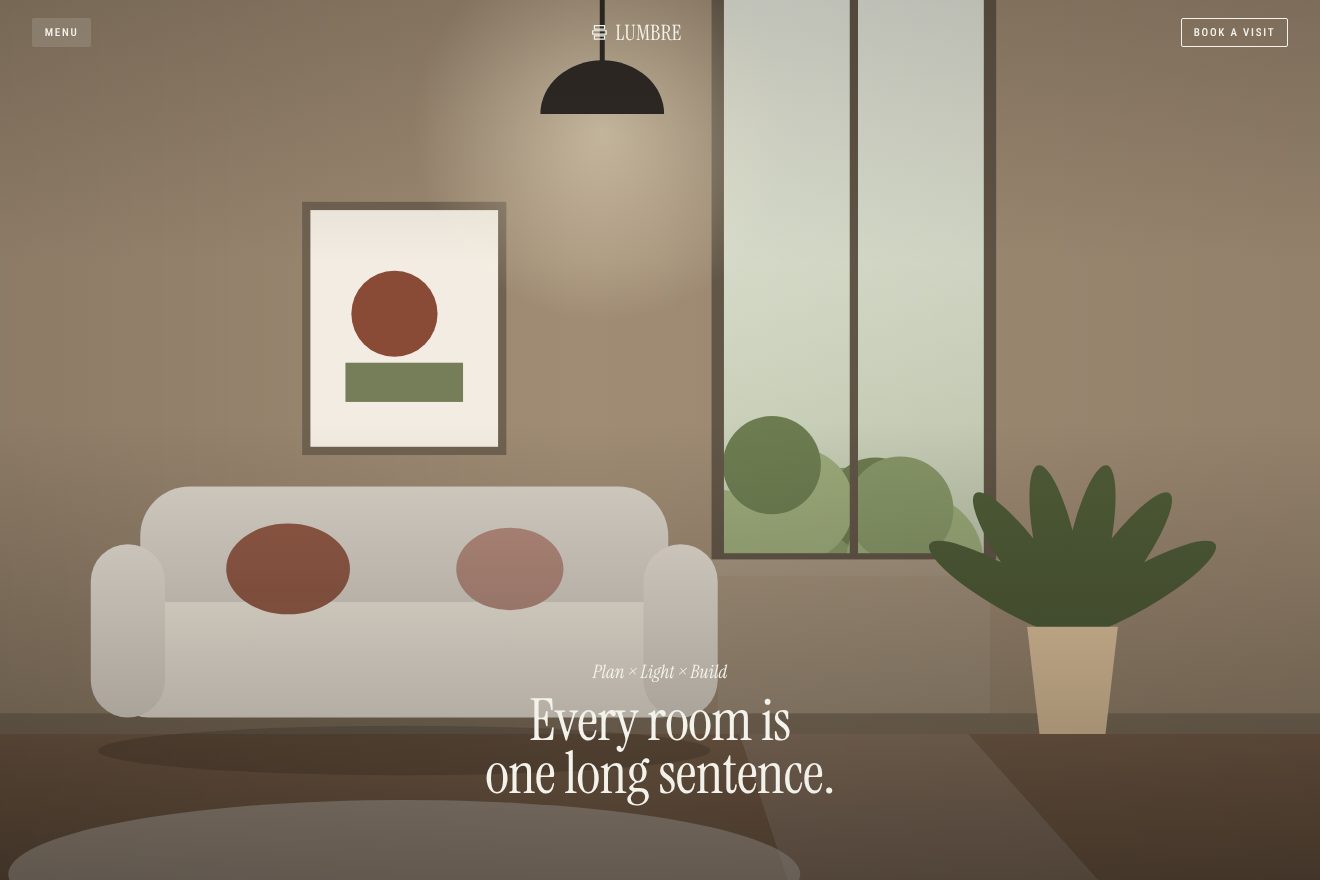
It is a grid of fifteen columns and two rows, with squares 4 hundredths of the screen width wide and 0.4 of space between them: the step is 4.4. The middle square is not a loader photo but the photo of the home page, already in place and 4 by 4. A GSAP timeline waits one second, then moves the two rows by 2.2 hundredths each in 0.608 seconds with power2.out, the second 0.07 later, and makes them meet. At 1.05 the fold starts: each photo moves towards the middle by a multiple of 4.4, from 30.8 to 4.4, in 0.52 seconds, one every 0.02 starting from the outermost pair, and the two outermost pairs fade meanwhile. At 1.9 the ground turns transparent, the little square widens to 42 by 28 in 0.77 seconds, the photo inside goes to 1.25 of its size in 1.55 seconds, and at 2.68 the frame reaches the whole screen in 0.76.
Meanwhile the loader line, «Composed residential interiors.», rises letter by letter, split by SplitText: each letter starts transparent and a fifth lower, in 1.5 seconds with power2.out, one every 0.03. At 1.53 it leaves the other way, from the last letter. At 2.76 the home page title rises the same way, and at 3.76 the header comes back. All the while Lenis is stopped, so the page cannot be scrolled. On a phone the numbers change: the squares are 12 hundredths and three show on each side, the rows move by 6.25, the intermediate picture is 60 by 45 and the curves become power2.inOut.
The handwritten line is not a font or an SVG drawing itself: it is a video with transparency, in two versions, one in ProRes 4444 for Safari and one in WebM for the other browsers. A script checks which of the two formats the browser can read before starting it, and the same video appears four times on the page.
In our demo the rooms are fourteen real photos of interiors with a free licence, living rooms, bedrooms, kitchens and dining rooms, and the room of the page is a wooden living room open on a garden. The italic line uncovers itself from the left instead of being a video, and the opening starts again by itself after a few seconds. The timings, the measures and the order of the fold are the site’s.
The frames of the apartment
The projects section is green. As it arrives, cream bars pull back from its top edge, some long and some short. Then the screen stops, and as you scroll the photo of an apartment, Pau Claris Apartment, grows to the whole screen, while behind it two green panels grow faster: for a while you see the home inside a frame inside another frame.
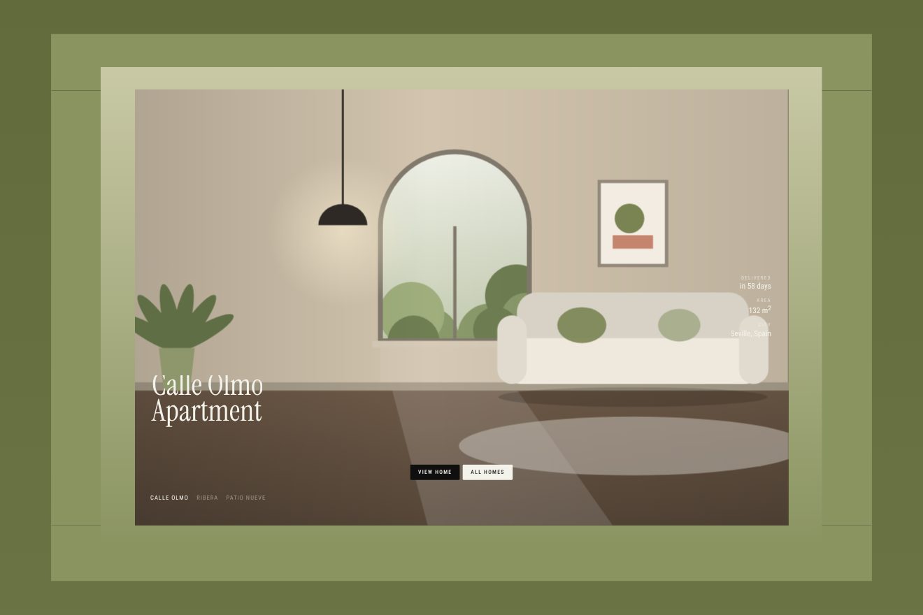
The bars are two groups: some start 65 hundredths of the screen tall, the others 25, and they go to zero with power2.inOut while the section rises from the bottom of the screen to 35%, with a scrub of 0.8. The rest is a second timeline, which starts when the top of the section is half a screen above the screen and ends at the bottom of the section. The three pieces all start at 0.65 and grow over three beats with power2.inOut: the farthest panel to 1.5, the near one to 1.25 a tenth later, the photo to 1 two tenths later. That is all: three different scales on the same scroll, and the frames show up by themselves.
At half a beat the name of the home drops from above, from -120% of its height, and the figures, days of work, square metres and city, arrive from -85% and from one side. At 1 the home counter, the arrows and the buttons appear at once, the buttons dropping by 3 rem over two beats, and at 1.5 the dark veil on the photo. When the scroll passes 1.5 out of 3.12 of the timeline, the script unlocks the carousel: Swiper starts looping, changes home every 5 seconds and takes 0.6 to do it. Scroll back up below that point and the carousel goes back to the first home and switches off. On a phone the photo starts as a low card at the bottom of the screen, 95% wide and 35% tall, and widens until it fills it over two and a half beats; the carousel unlocks at 40%.
In our demo there are three homes, Calle Olmo, Ribera and Patio Nueve, with their names at the bottom instead of a counter. The name and each figure sit in a mask, so they cannot be seen before they arrive, and the new home comes in from the right with a clip-path. The measures, timings, curves, the unlocking and the return to the first home are the site’s; on a phone we keep the frames too.
The figures that light up
In the «About us» section there are four cards in a row, cream-coloured, each with a figure in a large italic: years in Spain, years in practice, projects in Spain, projects worldwide. The figures count up from zero as they arrive. Then the scroll lights the cards one at a time: the pale veil lifts, there is a photo underneath, and the words turn white.
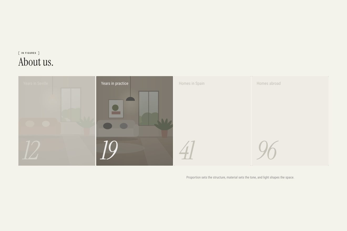
Each card has three layers over the photo: a half black veil, a cream veil, #EEECE4, and the words, in a warm grey, #C4C2B7. The lighting is a Webflow interaction: from the top of the container 20% of a screen above the screen to its end, with scrub 0.8, the cream veil of card one goes to zero over one beat and its words to white, with power2.out; over the next beat they go back while the second lights up, and so on to the fourth, which stays lit. The counting is a separate script: when a fifth of the card is on screen, the figure goes from zero to its value in one second, on a curve that slows at the end, 1 minus the square of what is left. On a phone the cards are three quarters of the screen wide and the row slides sideways with the scroll, on the smallest phones by more than two screen widths.
In our demo the studio has twelve years in Seville and the cards have drawn rooms. The numbers of the lighting and the counting are the site’s; on a phone the sideways move stops on each card as it lights up, instead of going straight from the first to the last.
The other details
The headings split into letters with SplitText and rise from a fifth of their height in 1.5 seconds, one letter every 0.03, when they are a fifth of a screen from the bottom; long texts do the same by words. The images start transparent and blurred by 12 pixels and come into focus in 0.65 seconds as they enter the screen. The header hides when you scroll down and comes back when you scroll up, and turns dark over the dark sections.
In the «A home is a composition» section the row of project photos slides sideways as you scroll down, each photo rises inside its card by 12 or 24% of its height, and when you move the mouse over a card the image inside follows the pointer, closing 0.12 of the distance every frame; that only happens with a real mouse. In the method section, the blue one, three cards with notched corners arrive diagonally, from small to full, and then slide sideways, while their headings assemble letter by letter. The smooth scrolling is Lenis at 0.1.
Where it stumbles
Reduced motion counts for one thing only. The only animation that checks it is the lighting of the «About us» cards, which Webflow does not start if the system asks for less motion. In the stylesheet and in the hand-written scripts there is no check at all: the loader, the frames, the rising letters and the photos coming into focus move as always.
The loader plays on every visit. A script at the top of the page should skip it from the second time on, but it looks in the browser’s storage for an entry called «1» that no part of the site writes; the only «1» saved is the cookie banner’s, under another name. So on every arrival the page stays still for about six seconds, with Lenis off: one of waiting and then the opening, which ends only when the last letter of the title has risen.
Three loader curves, called wf4, wf5 and wf6, are read from an object that does not contain them: GSAP receives an empty value and uses its usual curve, power1.out. The loader works anyway, but not with the curves someone had chosen.
The apartments carousel cannot be moved with a finger: the script creates it with allowTouchMove set to false, on purpose, and on a phone only the arrows and the automatic change are left. The same script watches the whole page with a MutationObserver and, a tenth of a second after every batch of changes, looks for all the carousels again: even when a counter figure changes or SplitText splits a heading.
What we take away
The fold of the loader is a clever idea: the photo of the home page is already there, small, in the middle of the strip, so the loader does not end, it widens. And the apartment frames show how much a single scale used three times can do: three equal pieces growing at different speeds on the same scroll, and the depth comes for free.
The effects
- Room strip loaderThe opening of an interior studio: fourteen real photos of rooms in two staggered rows join in a strip, the strip folds pair by pair into the little square in the middle, and that square becomes the living room open on a garden that fills the screen.Free
- The frames of the apartmentAs you scroll, a row of cream bars pulls back like the teeth of a comb, then the photo of a real home grows to the whole screen while two green frames grow faster around it; halfway through, the homes (an apartment, a loft, a house on its garden) start changing on their own.Free
- The figures that light upFour pale cards with a figure each, which counts up from zero as it arrives. Then the scroll lights them one at a time: the pale veil lifts off a room, the words turn white and the card before goes back to sleep.Free