Vero, by Rodéo studio, plutot.cool
Vero, how it’s made: the sentence that opens into a window, the logo that inks itself from its thickest strokes and the coin that parts the quote
The site of a New York studio that turns wedding dresses into sculptures tells everything with very few things and a lot of care: a sentence that steps aside to make room for a window onto the video, four letters that grow from their bones in WebGL, and a silver coin that falls on scroll, opening every line of a quote. We take it apart with three demos rebuilt from scratch.
The palette
- #F3F0EDthe light beige behind every page and the loader
- #E6D8CCthe warmer beige of the secondary sections
- #181615the near black of the headlines and the text
- #979696the grey of the captions and of the lines not yet lit
- #E97E00the orange, the only accent
Tap a colour to copy its code.
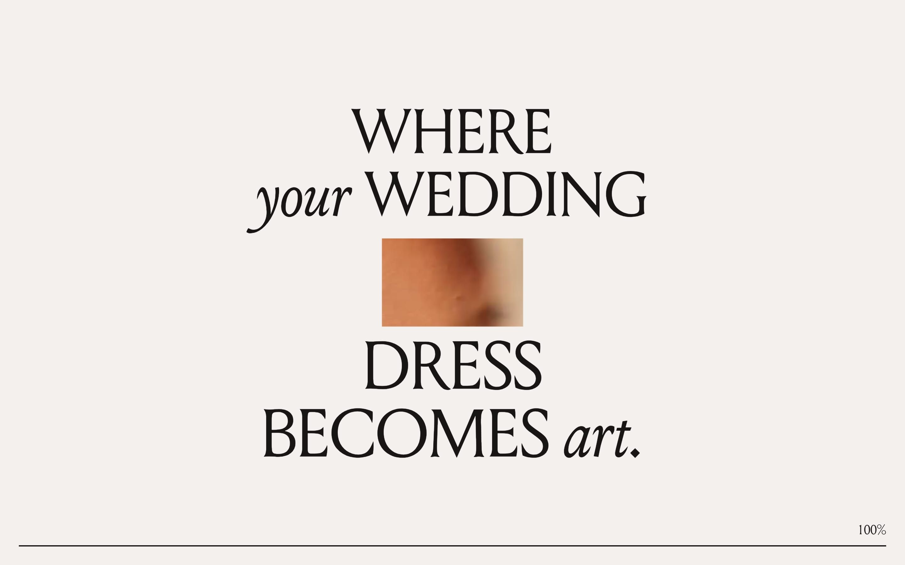
Vero is a New York studio that does one thing: it takes someone’s wedding dress and turns it into a sculpture, small, white, to keep at home. The site says so while it is still loading, with a sentence on four lines, «WHERE your WEDDING DRESS BECOMES art.», and the rest of the home page is the story of that change: the dress becoming data, the data becoming a sculpture, the sculpture that stays. The background is a light beige, #f3f0ed, with a warmer beige for secondary sections, #e6d8cc; the text is near black, #181615, the captions grey, #979696, and there is a single accent, an orange, #e97e00. The rest of the colour comes from the photos and videos. Headlines are set in Louize Display, with a game that returns on every page: the important words in upright capitals, the linking ones in lowercase italic, «Custom SCULPTURE of your WEDDING DRESS.»; body text is Beausite Classic. It was Site of the Day on Awwwards on 8 August 2026, with 7.21 from the jury, and took the developer award, 7.37, with 7.6 for animations; the award page credits Rodéo studio and plutot.cool, and the code carries only the signature of plutot.cool, written in the browser console.
Underneath there is Next.js 16.2.6 built with Turbopack, React 19.3 in a canary version, Sanity for content and Vercel for hosting. The curious part is what is missing: no GSAP, no Lenis, no Motion. Movement is done with Anime.js 4.3.6, its timelines and its splitText, and with a lot of patiently written CSS; scrolling is the browser’s own, read by a small hand-written hook. The 3D is OGL, a WebGL library far lighter than three.js, with a physical material written by the team, soft shadows and five scenes loaded only when needed: the logo, the turning dress, the gallery of dresses, the coin and the demo. The house curves are CSS variables: an ease-in-out-quint, cubic-bezier(.83, 0, .17, 1), that starts and lands very slowly, a quart, an exit expo and an entry quint.
The site has few ideas, and each one is polished to the end. We take it apart in three moments, with a demo rebuilt from scratch for each. The text, the brands, the photos and the code are ours; from the site we took the ideas and, where we say so, the numbers.
The sentence that opens into a window
The first screen is a sentence on four lines, in a grey so light you can barely read it. In the middle a small rectangle opens, and inside you see the home page video: the two halves of the sentence move apart to make room for it, up and down, and as they move they turn black. At the bottom a thin line fills and the percentage follows it. At a hundred, the window grows to fill the screen and the sentence flees, the top half upwards and the bottom half downwards. You are inside the video, that is, inside the site.
The hole is not an image laid over the background: it is the background itself, pierced. The beige veil has two identical masks composited with mask-composite: exclude, and the animation changes only the size of the first, from zero to the size of the hole, in 1.4 seconds after half a second of waiting, on the ease-in-out-quint curve. The hole has the proportions of the screen: it is 15.6% of the width wide and as tall as the same measure times the ratio between height and width, a number the JavaScript rewrites on every resize. The two halves of the sentence move by half a hole, with the same duration, delay and curve, the lower one by ten pixels more. The lines first arrive at 14% opacity, in 1.5 seconds, one every tenth of a second, and only later light up fully. The percentage, on the other hand, measures nothing: it is the time elapsed over 2.3 seconds, bent with a Gaussian curve so it runs in the middle and slows at the end, and the veil lifts only after 2.9 seconds and only if the page is ready. The exit is the same mask becoming the whole screen, in 0.7 seconds, while the lines leave by a quarter of their height on the entry quint curve.
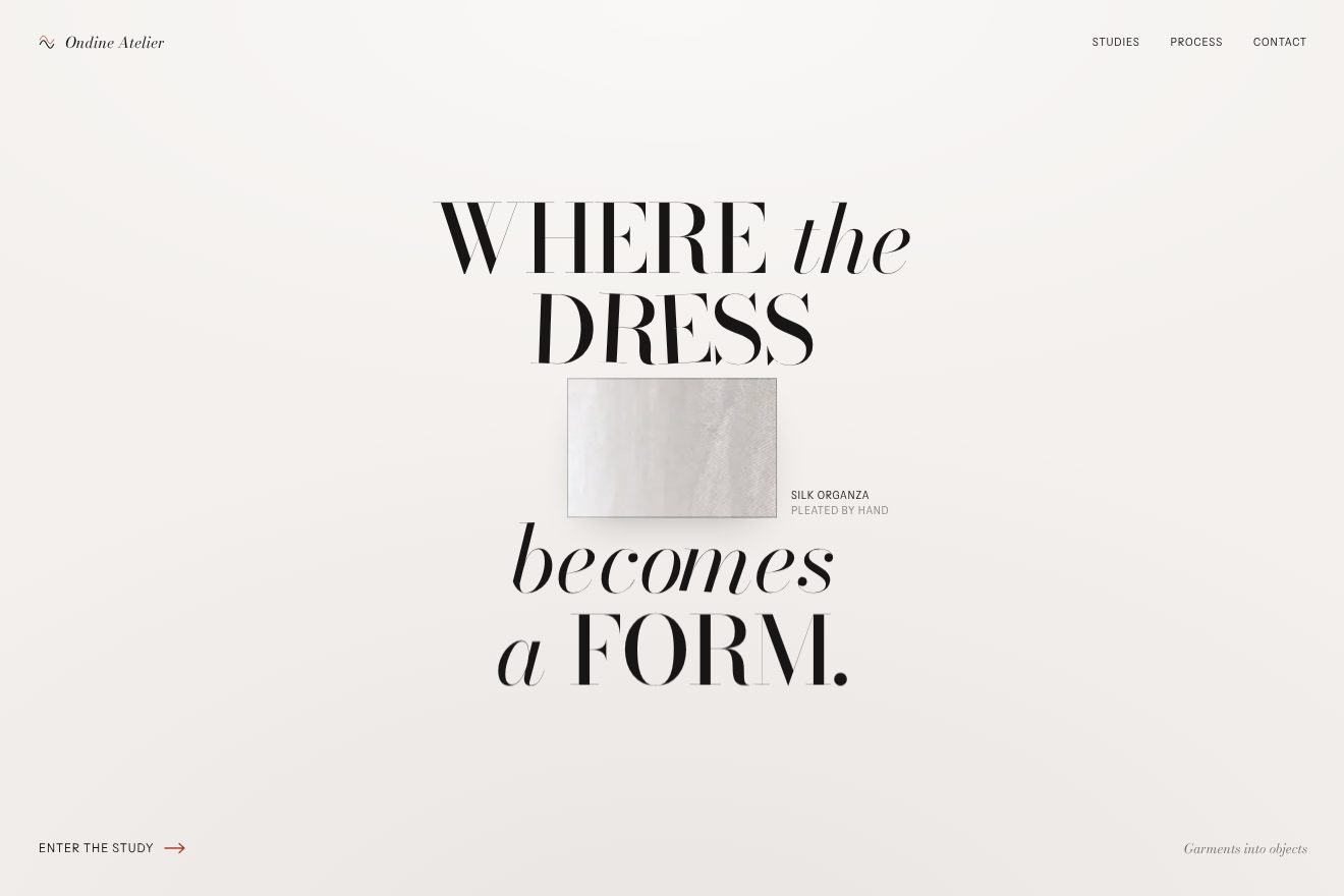
In our demo it is not a loader but a transition between two pages, those of a made-up atelier, Ondine Atelier, that makes forms out of garments: the sentence is «WHERE the DRESS becomes a FORM.», in Bodoni Moda with upright capitals and lowercase italic alternating, and in the window there is a real CC0 photo, a white silk curtain against the light, instead of the video. From the site come the hole 15.6% of the screen wide with its proportions (34% on a phone), the halves moving apart by half a hole in 1.4 seconds on a symmetric quint curve, the lower one ten pixels more, the lines arriving at 14% and then lighting up, and the exit with the sentence fleeing a quarter up and down while the window becomes the whole screen in 0.7 seconds, 0.15 later, on the quart curve. The gesture starts from a click on «Enter the study» or on a menu item, and the Back button plays it in reverse. Ours are the thin rule and soft shadow of the window, the silk inside doing a slow zoom out with a passing highlight, the caption rising beside it, the letters near the hole bending by three degrees a beat later, the halves overshooting by a pixel and settling, both ways, and the glass pill of the Back button. The fake percentage is gone: a transition should not pretend to load. With reduced motion only the fades remain.
The logo that inks itself from its thickest strokes
Inside the video, the first thing to arrive is the logo, four capital letters, VERO. They do not fade in and they do not slide up: they grow. Of each letter you first see only the thickest strokes, like bones, then the ink spreads towards the edges until the letter has its true shape, and the edge stays sharp the whole time. The letters start one after the other, from the left.
The letters are four quads in a single WebGL mesh, and each quad takes its glyph from an MSDF atlas, an image in which every pixel stores not the colour of the letter but its distance from the edge, written in three channels. In the shader the median of the three channels gives that distance, and the letter is drawn only where the distance exceeds a threshold. The whole trick is there: the threshold starts at 0.8, where only the points farthest from the edge pass, that is the middle of the thick strokes, and drops to 0, where the letter is whole. Each letter has its number, and its threshold starts 0.15 seconds later for each one, lasts 0.7 seconds and falls on the cubic out curve, 1 − (1 − t)³. The V starts at once, the O at 0.45 seconds, and it is all over by 1.15. The edge stays one pixel wide at every size because the blur is computed with fwidth, that is with how much the distance changes from one pixel to the next. Under the logo the headline arrives word by word, in 1.4 seconds on the expo curve, a tenth of a second per word after a 0.55 wait; the italic words fade in.
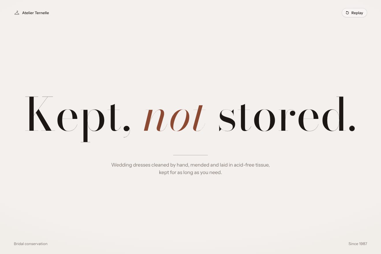
In our demo it is not a logo but the headline of a page, that of a made-up atelier that cleans and keeps wedding dresses, Atelier Ternelle: «Kept, not stored.», in Bodoni Moda, with «not» in a burnt sienna italic. It is hand-written WebGL, with no MSDF atlas: the headline is drawn on a 2D canvas, the distance field is computed in the browser with an exact algorithm, and a second image stores for every pixel the number of its letter and the thickness of its thickest stroke, so the threshold of each letter drops from 0.8 to 0 of that stroke. From the site come the idea of the threshold dropping on the distance field, the 0.15 seconds between letters, the 0.7 seconds of each letter on the cubic out curve, the edge one pixel wide at every size, and the line below arriving word by word after the headline. Ours are the ink going one pixel past at the end of each letter and coming back, the edge born darker and glossy, as if wet, drying in 1.6 seconds, the letters near the pointer thinning and breathing, the press that spreads the ink and lets it spring back, and the Replay button that takes everything back to the bones before writing it again. Without WebGL the letters come in from a blur on the same rhythm; with reduced motion the headline is already whole.
The coin that parts the quote
Towards the end of the home page there is a giant quote, in capitals, on six lines that fill the screen. As you scroll, a silver coin with the logo engraved falls down the middle, spinning on itself, and every line splits in two like a curtain to let it pass, the left half to the left and the right to the right, closing again behind it. The line nearest the coin opens most, those above and below less and less.
Scrolling is the browser’s own, and on each scroll event a single frame of work, which cancels the previous one if it has not started yet. Progress is the position inside the section, from 0 to 1; the coin, a small WebGL canvas, falls by that progress times the height of the section minus two radii, and turns three half turns, π · 3, around the vertical axis. The radius is 8% of the width, never less than 44 pixels nor more than 140. The offset of each line comes from a bell: with e equal to 1.2 radii, the line opens by 1.175 · e · (1 − min(1, d² / (2e)²))^2.5, where d is the vertical distance between the line and the coin. The 2.5 exponent makes the bell narrow at the top and wide at the base: the line the coin crosses swings open, its neighbours barely move. The name of the quote’s author fades out when the coin passes over it. The coin is a real physical material, full metalness and full gloss, with three texture maps for colour, relief and roughness.
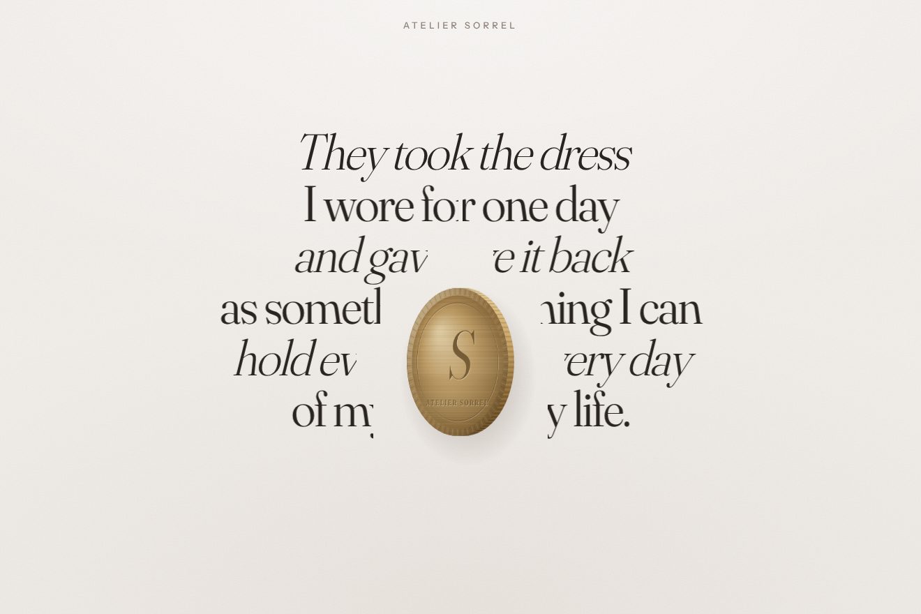
In our demo the quote is from a made-up bride, Clara Ivers, for a made-up atelier, Atelier Sorrel, that turns the dress into a medallion to keep: six lines in Fraunces, upright and italic alternating, on ivory paper. The medallion is brushed gold, drawn on a 2D canvas, with no 3D: a milled edge, an engraved S, «Worn once, kept for good» on the back, and in profile you see the rim with its milling. From the site come the progress between the start and the end of the section, the fall by the height minus two radii, the three half turns, the radius at 8% of the width between 44 and 140 pixels, the bell with 1.2 radii, 1.175 and the 2.5 exponent, and the name at the top stepping aside when the medallion passes over it. Every knob of the bell is in the Playground. Ours are the light running over the gold as it turns, the soft shadow following it on the paper, each line made of two copies clipped at the middle of the screen that follow the bell with a short spring, so they close with a one-pixel settle, the signature coming in from a blur at the end, and the medallion that lifts off the paper under the mouse and, pressed, does a full turn and squashes. With reduced motion the page is already in place and fades in: the site, here, moves anyway.
The other details
The dress on the home page, a white 3D sculpture, falls and turns on scroll with an Anime.js timeline that is never played: it stands still, and on every scroll the site moves it by hand to the right point with seek. In that timeline the camera goes down from 1.9 to −1.5, the dress makes a full turn and the zoom goes from 1.6 to 1.4; the dress fades towards the bottom through a value in its material, and the mouse tilts it slightly, at most a hundredth and five hundredths of π. The «+» marks on the dress, the ones that open the details, are page elements reprojected from the 3D position on every frame. Headlines split into lines rise with a delay written in CSS, a tenth of a second per line, on the expo curve. Before starting a video the site tries an empty one, written inside the code, to learn whether the browser allows videos to autoplay; otherwise it shows the fallback photo. And every WebGL scene, as soon as it mounts, is drawn once into a one-by-one pixel target, so the shaders are ready and the first real frame does not stutter.
Where it stumbles
The loader is fake: the percentage follows the clock, not the network, and the veil stays at least 2.9 seconds even when the page is ready, with scrolling locked. The weight is high for a site with few things: about 1.9 megabytes of JavaScript in 41 files, two videos of 1.5 and 3.6 megabytes for the opening alone, the 3D dress with 1.43 megabytes of geometry and more than two of textures, and the coin with another 1.6 megabytes of images, all JPG and none compressed for the graphics card. Reduced motion is half respected: the CSS stops its animations, but the WebGL scenes driven by JavaScript, the logo, the turning dress, the coin and the parting lines, move anyway. The logo on the home page exists only inside the WebGL canvas, and the lines of the quote, split into two halves, are read in pieces. And the body typeface, Beausite Classic, is loaded in its trial version, with «Trial» in the file name.
What we take away
Vero sells an object you can touch, and the site makes you feel it with almost nothing: a beige, a black, an orange, a typeface, and three gestures that all do the same thing, open. The sentence opens to show the video, the letters open from their bones, the lines open to let the coin through. The most useful lesson is the smallest: a hole made of two masks in exclusion costs one line of CSS, has the proportions of the screen and grows without a dropped frame. The rest is patience with curves.
The effects
- Fabric window transitionThe ivory home page of a made-up studio, Ondine Atelier, that turns dresses into objects: a big sentence in Bodoni Moda, upright capitals alternating with lowercase italics, «WHERE the DRESS becomes a FORM.». On a link click the two halves of the sentence step aside by half the hole on a measured spring with one pixel too many, and in between a window with the proportions of the screen opens on a real photo of pleated white silk that breathes; then the window takes the whole screen in 0.7 seconds and you land on the study page. «Back» does the gesture in reverse.Free
- Ink stroke titleThe opening of the page of a made-up atelier that keeps wedding dresses, Atelier Ternelle: on an ivory ground the title «Kept, not stored.» in a high-contrast Bodoni grows letter by letter. Each letter first shows only its thickest strokes, then the ink spreads out to the whole shape with an edge that always stays sharp, 0.7 s a letter and 0.15 s after the one before, in hand-written WebGL with a distance field computed on the spot. The edge is darker and glossy at first, like wet ink, then it dries; near the pointer the letters thin out and breathe, and pressing makes the ink pool.Free
- Gold medallion quoteA bride’s review for a made-up atelier, Atelier Sorrel, which turns a wedding dress into a medallion to keep: six large lines in a display serif on ivory paper. Scrolling, a brushed gold medallion with a milled edge and an engraved S comes down the middle turning three half turns around its upright axis, and every line parts in two like a curtain to let it through, the more the closer it is (a bell with a power of 2.5), then closes on a short spring with a one pixel settle. The signature comes in at the end.Free