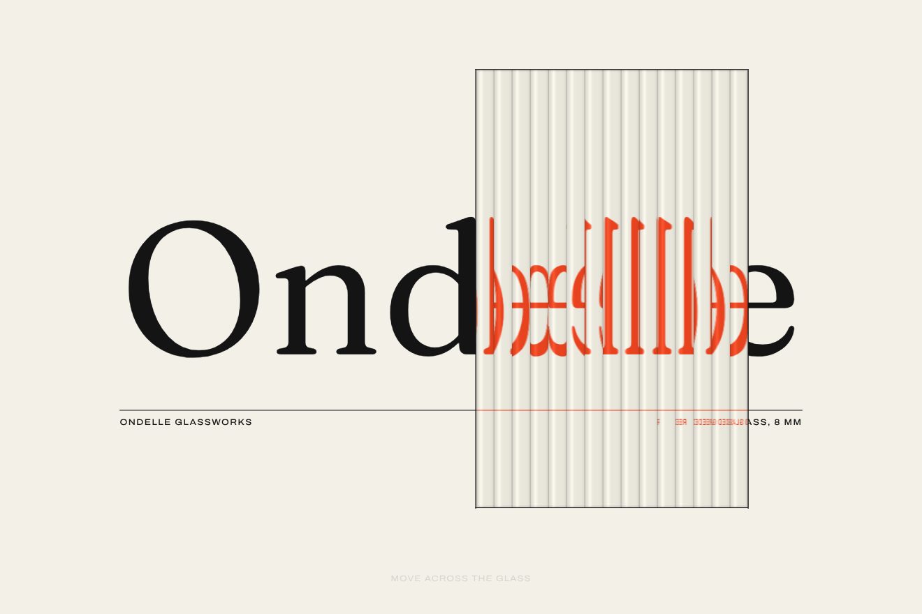
Fluted glass word
WebGL, Text, Hover
The opening of the page of a made-up atelier that keeps wedding dresses, Atelier Ternelle: on an ivory ground the title «Kept, not stored.» in a high-contrast Bodoni grows letter by letter. Each letter first shows only its thickest strokes, then the ink spreads out to the whole shape with an edge that always stays sharp, 0.7 s a letter and 0.15 s after the one before, in hand-written WebGL with a distance field computed on the spot. The edge is darker and glossy at first, like wet ink, then it dries; near the pointer the letters thin out and breathe, and pressing makes the ink pool.
Rebuilt from scratch studying verostudio.com by Rodéo studio, plutot.cool: the idea is theirs; code, copy and images are ours. Read how it’s made
A folder that runs on its own: index.html, style.css, script.js and the libraries from a CDN. The React and Vue tabs hold the same demo as a ready component, which switches its animations off when it leaves the page.
<!doctype html>
<!--
  "Ink stroke title" from Animorio · https://animorio.com
  License: free on your own sites and your clients’ sites, paid work included.
  Not for resale, redistribution, templates or code collections · https://animorio.com/en/license/
-->
<html lang="en">
<head>
  <meta charset="utf-8">
  <meta name="viewport" content="width=device-width, initial-scale=1">
  <title>Atelier Ternelle: Kept, not stored.</title>
  <link rel="stylesheet" href="https://cdn.jsdelivr.net/npm/@fontsource-variable/bodoni-moda@5.3.0/opsz.css">
  <link rel="stylesheet" href="https://cdn.jsdelivr.net/npm/@fontsource-variable/bodoni-moda@5.3.0/opsz-italic.css">
  <link rel="stylesheet" href="https://cdn.jsdelivr.net/npm/@fontsource-variable/instrument-sans@5.3.0/index.css">
  <link rel="stylesheet" href="style.css">
</head>
<body>
  <main class="stage" data-stage>
    <!-- the opening of the page of a made-up atelier that keeps wedding dresses, Atelier Ternelle.
         The title is drawn in hand-written WebGL from a distance field: each letter appears first as its thickest
         strokes, then the ink spreads out to the whole shape, 0.15 s after the letter before. Near the pointer the
         letters thin out and breathe; pressing makes the ink pool a little -->
    <header class="head">
      <p class="brand">
        <svg class="brand__mark" viewBox="0 0 24 24" aria-hidden="true">
          <path d="M12 6.2a1.9 1.9 0 1 1 1.9 1.9c-1 0-1.9.7-1.9 1.7v.6"/>
          <path d="M12 10.4 3.4 16.6c-.7.5-.4 1.6.5 1.6h16.2c.9 0 1.2-1.1.5-1.6Z"/>
        </svg>
        <span>Atelier Ternelle</span>
      </p>
      <button class="replay" type="button" data-replay aria-label="Replay the title">
        <svg viewBox="0 0 16 16" aria-hidden="true" class="replay__icon"><path d="M3.2 8a4.8 4.8 0 1 0 1.5-3.5"/><path d="M4.4 1.9v2.9h2.9"/></svg>
        <span>Replay</span>
      </button>
    </header>

    <section class="hero">
      <div class="title" data-title>
        <canvas class="title__ink" data-canvas aria-hidden="true"></canvas>
        <h1 class="title__text" data-h1>Kept, <em>not</em> stored.</h1>
      </div>
      <span class="rule" data-rule aria-hidden="true"></span>
      <p class="lede" data-lede>Wedding dresses cleaned by hand, mended and laid in acid-free tissue, kept for as long as you need.</p>
    </section>

    <footer class="foot">
      <span data-foot>Bridal conservation</span>
      <span data-foot>Since 1987</span>
    </footer>
  </main>

  <script src="https://cdn.jsdelivr.net/npm/gsap@3.15.0/dist/gsap.min.js"></script>
  <script src="script.js"></script>
</body>
</html>Change values, colours and text with the controls and watch the animation respond live. Or write in the code yourself. Then download the folder with your changes.
23 values to change
With the Animorio connector, Claude Code, ChatGPT, Cursor or VS Code take it from here, guide included, and fit it into your project. Paste this request:
Take “Ink stroke title” from Animorio and fit it into my siteThe title is written with fillText on a 2D canvas as large as the real one (up to twice the screen pixels). From the alpha of each pixel the CPU works out the distance to the edge, inside and outside, with Felzenszwalb's Euclidean distance transform in two passes (columns, then rows): a signed distance field, positive inside the letters. The Vero site uses a ready-made MSDF atlas; here it is computed on the spot, so the title changes with the text.
Measuring the characters with measureText, each pixel of the canvas knows which letter it belongs to (the border between two letters lies halfway across the gap), and for each letter the largest distance is kept, its thickest stroke. Index, thickest stroke and accent go in a second texture read without filtering, the distance in a texture with linear filtering.
In the fragment shader each letter has its own time: i = index * 0.15, j = easeOutCubic((time - i) / 0.7), threshold = mix(0.8, 0, j) * thickest stroke. It draws where distance minus threshold is positive, with a smoothstep less than a pixel wide: at first only the thickest strokes pass, at the end the whole letter, and the edge stays sharp at every step. A sine adds one pixel of ink at the end and takes it back.
Near the edge (three pixels) the colour moves towards a deeper black while the letter is fresh, and the gradient of the distance, read with four samples around, gives the direction of the edge: where it faces the light at the top left a thin band gets lighter, like a glossy bead. Both fade out in DRY_TIME.
The pointer position, followed with quickTo, raises the threshold with a Gaussian bell three quarters of a line wide, multiplied by a slow sine: the nearby letters lose their hairlines and breathe. Pressing lowers the threshold instead, the ink pools, and on release it comes back on an elastic spring.
Replay takes the threshold past the thickest stroke in 0.55 s, so the ink goes back to its bones and disappears, then the same timeline starts again. The real title stays in the h1 for screen readers; without WebGL the h1 shows and each letter comes in from a blur with the same stagger.
| Name | File | Default | What it changes |
|---|---|---|---|
LETTER_STAGGER | script.js | 0.15 | Seconds between one letter and the next (the site uses 0.15). |
LETTER_TIME | script.js | 0.7 | Seconds a letter takes to grow from its thickest strokes to its whole shape (the site uses 0.7). |
START_THRESHOLD | script.js | 0.8 | How much of each letter is hidden at the start: 0.8 shows only the thickest strokes (the site uses 0.8). |
BLEED | script.js | 0.9 | Pixels the ink spreads past the edge at the end of each letter before it settles back. |
DRY_TIME | script.js | 1.6 | Seconds the wet, glossy edge takes to dry to an even tone. |
HOVER_THIN | script.js | 0.16 | How much the letters near the pointer thin out, as a share of their thickest stroke. |
HOVER_RADIUS | script.js | 0.75 | Size of the area that thins around the pointer, in heights of a line. |
LOOP | script.js | true | Left alone, the pointer passes over the title and the title writes itself again. |
For the opening of a page where the title is everything: an atelier, a fashion house, a magazine, a portfolio, a luxury brand or a product launch. When the title should feel truly written, in a high-contrast typeface, and still be real text for Google and screen readers.
The same animation with adapted sizes: in a narrow box the title breaks into two lines and the size is measured on the height too; the distance field is recomputed at every resize, even halfway through. A tap on the title makes the ink pool like a mouse press.
The title is already whole and dry, the line, the rule and the button fade in; no thinning under the pointer, no pooling ink, and Replay is only a fade.
GSAP 3.15.0, Bodoni Moda (font variabile) 5.3.0, Instrument Sans (font variabile) 5.3.0.
Compressed with gzip, the three demo files weigh 10 KB; the libraries: GSAP 28 KB.
Tested on 10 November 2026
Use it in your own projects and in your clients’ projects. Do not resell it or redistribute it as is. GSAP stays under its own Standard license. Full license.
Support Animorio
Animorio stays free thanks to the people who support it. If you like, buy us a coffee: it helps us make the next animations.
You asked for
We made it for you: it’s in the library, with the preview, the Playground and the code to copy.
An animation you can’t find, or a site to take apart in the journal: tell us which. We pick the next ones from here.
With your account’s email and password.
or with your email
You’re signed in as .
With your account, you can download the zip of every animation and every pack, for free.