Hubtown, by Unseen Studio
Hubtown, how it’s made: the squares that become the logo, the light cube on the water and the chapters that light up
The site of Hubtown, a Mumbai developer, loads with thirteen squares that light up in pairs and rebuild themselves into the logo, opens at night with a blue cube floating on a lake, then scrolls through six chapters whose headlines light up letter by letter at random. We take it apart with three demos rebuilt from scratch.
The palette
- #020A19the almost black blue of the night and the loader
- #052261the deep blue of the gradients
- #D5E0FFthe pale blue of the text, the squares and the buttons
Tap a colour to copy its code.
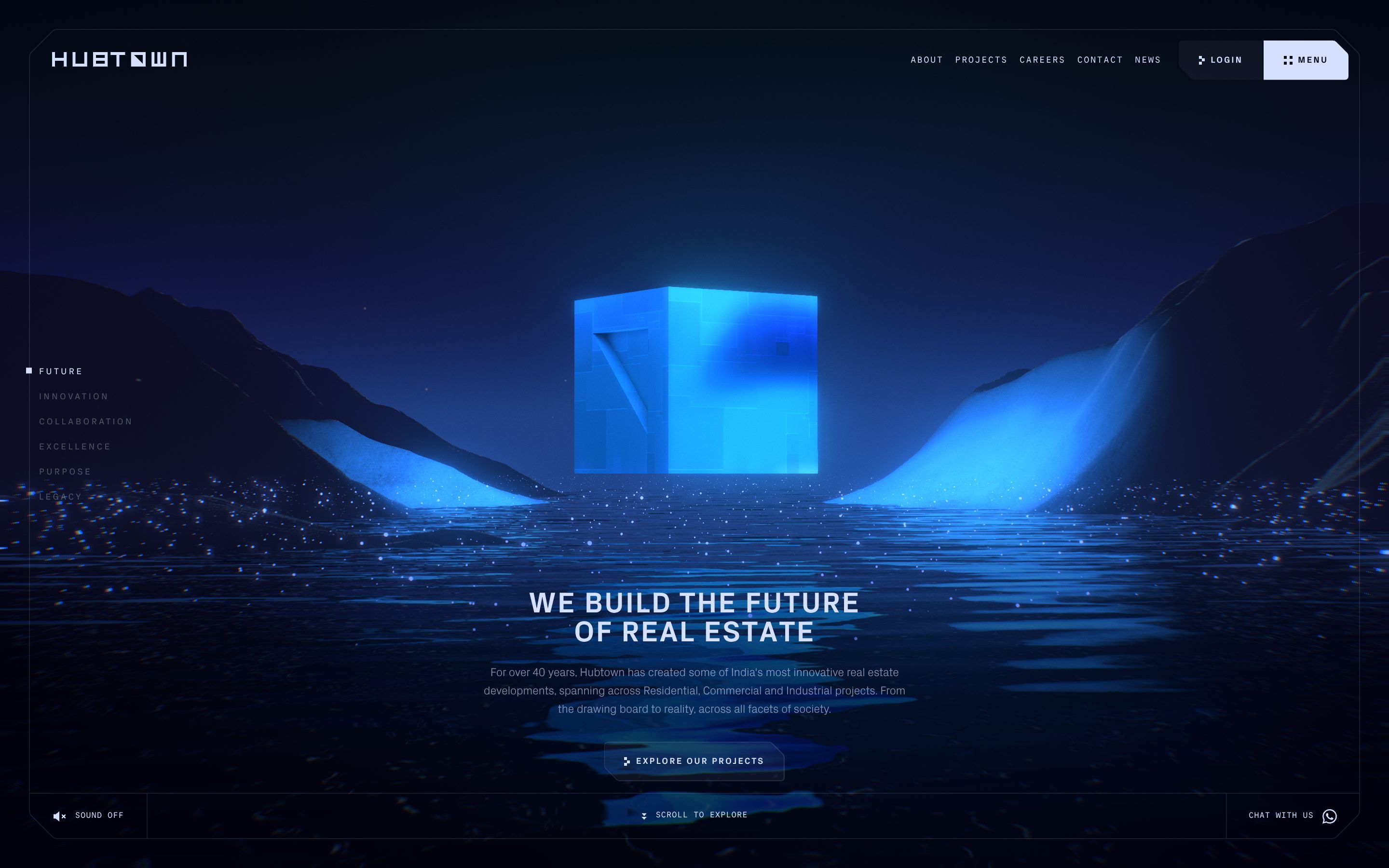
Hubtown is the site of an Indian developer, one of the big names in Mumbai, which the site says has been at work for more than forty years on homes, offices and industrial buildings across the city’s districts: Central Suburbs, South Mumbai, Western Suburbs and Thane. The pages are those of a company, about, projects, careers, contact, news, plus a login for customers. But the home page does not show a single building: it is a night journey through an invented landscape, all in blue. The background is an almost black blue, #020A19, text and marks are a pale blue, #D5E0FF, and a deep blue, #052261, sits in the gradients; the cube and the rivers of light are an electric blue that the code does not write as one colour but computes in the light. There are two typefaces: a grotesque in three weights, which the files simply call Grotesk, upper case and widely spaced in the headlines, and Commit Mono, a programmers’ face, for the small labels. On Awwwards it was Site of the Day on 10 June 2026, with 7.66 from the jury and the developer award, 7.3, where the highest mark is the one for animations and transitions, 8.4. It is signed by Unseen Studio.
It is a Nuxt site, that is Vue 3.5, and the landscape is Three.js, revision 179, written by hand scene by scene, without React. Textures arrive compressed as KTX2, the terrain relief comes from EXR height maps made in Houdini, the models are glTF files, one per scene. The camera and light moves were tuned with Theatre.js, a timeline animation editor, and the interface is animated with GSAP 3.13, with ScrollTrigger, SplitText, ScrambleText and CustomEase. Scrolling is Lenis. The values we quote come from the public code, the minified chunks the site loads, put back in order.
We take it apart in three moments, with a demo rebuilt from scratch for each one, for an invented developer, VEYRA: the logo, the letters, the words and the code are ours. From the site we took the ideas and, where we say so, the numbers.
The squares that become the logo
The loader is a dark blue rectangle with little on it: a pale square blinking in the middle, a percentage above and the words Loading content below, in terminal type. As the data arrives, more squares light up on both sides of it, in pairs, from the outside in; at a hundred they shift by a few pixels and a piece of a letter grows out of each one, until the row has become HUBTOWN. Below appear 100% Loaded and Ready to Explore, and the veil lifts.
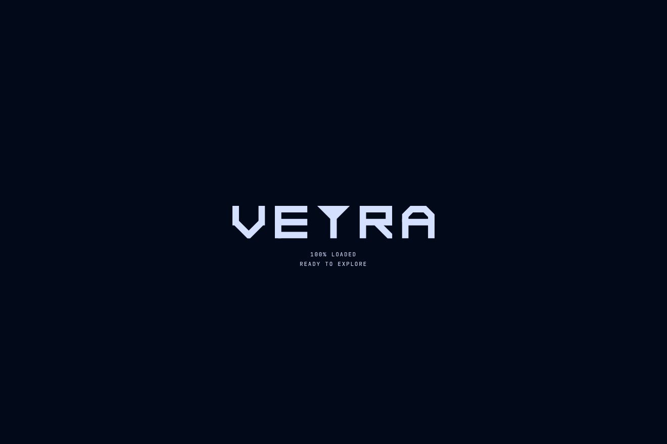
The logo is a single SVG 352 wide and 40 high, and the letters are drawn on a five by five grid where each cell is an 8 pixel square. Thirteen groups stand in a row, one every 28.667 units, and each is the point a piece of a letter will grow from: the H, U, B, T, O, W and N each have their square on the left and on the right, with the T in the middle. The central square starts three times its size and shrinks to it in two tenths of a second, blinking four times meanwhile, five hundredths each. Then in 0.315 seconds the percentage slides to the right edge and Loading content to the left one, and the twelve pairs come up faintly, to 20%, one every 33 milliseconds. From there the real loading takes over: at every sixth of progress, 16.67, 33.33 and so on, a pair lights up fully, the ones farthest from the centre first, the B with the O, then the U with the W, then the H with the N; and the text gets brighter with progress, from 0.4 to 1.
At a hundred the site waits a second and a half, then the squares move by their value in –dx, from minus 10.667 to 10.667 pixels, in half a second with the curve cubic-bezier(0.2, 0, 0, 1): it is the gap between the even row and the real place of the letter. And the letters grow out of their squares, with CSS animations a second long on the same curve: the vertical stems go from one cell to five with scaleY, the horizontal bars with scaleX, the B and the O are drawn as strokes with pathLength and stroke-dashoffset, and the triangle inside the O grows from its bottom corner; half the pieces start 67 milliseconds late. The two closing lines are ScrambleText, random letters that settle on the right ones in a second, the second a tenth after the first.
In our demo the logo is VEYRA, and its five letters are drawn with the same grammar of cells that stretch and strokes that draw; the row has nine squares, one in the middle and four pairs, and each knows which cell of its letter it will land on. From the site come the square that starts three times its size and blinks four times, the labels sliding to the edges, the pairs lighting up from the outside (for us at every quarter, since there are four), the second and a half of waiting, the half-second shift on the same curve, the letters in one second with the 67 millisecond delay and the two lines that rewrite themselves. The loading itself is fake, on a curve that speeds up and slows down like a real network, and at the end a thin Replay button starts it again.
The light cube on the water
Once loaded it is night, on a lake between two hills: in the middle floats a blue cube, lit from within, turning very slowly and rising and falling a little. The water reflects it in trembling stripes, there are points of light above the lake, and now and then a wave crosses the faces of the cube drawing a pattern of white hexagons, then fades.
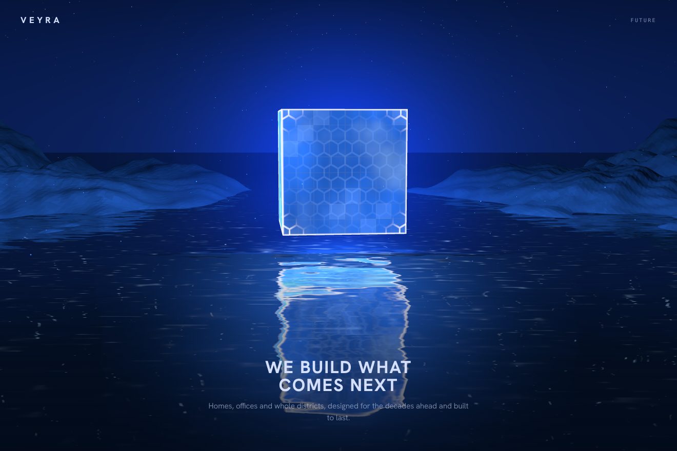
The cube is a model, but its motion and its look are written in the shaders. The vertex shader turns it around the vertical axis at minus a tenth of a radian per second, about one turn a minute, and lifts and lowers it on a sine, speed 0.7 and amplitude 0.15. The fragment shader stacks many layers: Perlin noise drifting slowly over the colour, two noise textures moving in opposite directions, an occlusion texture in the corners, a grid of lines computed from the coordinates, engraved details, and the edges, a thin white line a hundredth of the side wide, drawn where two faces meet. Over everything a fresnel, the light that grows where a face turns edge on, with exponent 3.5 and an addition of 3.6, and a glow colour of 1.58, 3.17 and 4.26, above one in every channel, which the bloom pass then turns into a halo. The hexagon wave is a texture: it starts from the centre of the cube, spreads like a sphere to the edges and starts again every ten seconds, but only half of the time, because its progress is multiplied by the sign of a sine.
The water is a plane with a normal texture rippling it and the reflection of the scene, and around it are the sky, the terrain with its relief texture and the particles. On arrival the camera starts thirty units further back and moves in on the site’s curve, called joe.out. And the site knows how to save itself: if the graphics card is an Intel HD or Intel Plus, it recognises it by name and leaves the particles out of the water’s reflection.
Our demo uses no model or texture from the site: the cube, the grid, the edges and the hexagons are computed in the shader, the hills are simple geometry, the reflection is the cube mirrored under the water and broken up by the ripples. From the site come the rotation of a tenth of a radian per second, the float at 0.7 with amplitude 0.15, the fresnel with its numbers, the hundredth-wide edges, the hexagon wave starting from the centre every ten seconds for half of the time and the camera arriving from thirty units with joe.out. Ours are the pointer that tilts the camera slightly, the cube’s light on the water, the particles rising slowly and the VEYRA headline below.
The chapters that light up
Scrolling down, the home page tells six words, Future, Innovation, Collaboration, Excellence, Purpose, Legacy, one per chapter, while the landscape changes underneath: a canyon with a river of light, blue trails in the dark, a plain dotted with glowing cubes like a city seen from a plane. With every chapter the big headline lights up letter by letter at random, the text rises line by line and a button with bevelled corners arrives, with two trails of light running along its edge. On the left an index: the square of the active entry flickers, then stays lit.
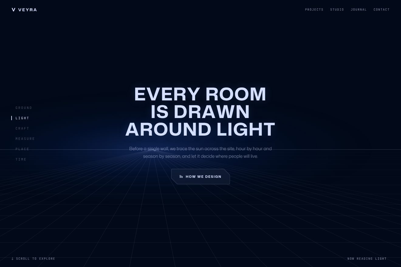
Each chapter is a section four or five screens tall, holding a stage pinned with position: sticky, and one ScrollTrigger per section says when the chapter enters and leaves; the thresholds are written by hand one by one, for example top+=50% bottom+=25%. The headline is split by SplitText into letters, and the letters appear in four tenths of a second, spread over a total of 1.1 seconds with from random: not left to right but in random order, like signs switching on. The text is split into lines that rise by 2.5 rem two tenths apart, and the button comes last; on the way out, everything fades together in one second. The curves are three CustomEases named after a person, joe.in, joe.out and joe.inOut, and almost everything uses joe.out, a curve that starts at once and settles slowly.
The index entries are written with ScrambleText, random capitals settling on the right ones, five hundredths apart. The 8 pixel square of the active entry does not simply switch on: its opacity comes and goes eight times, an eighth of a second each, before staying full; the other entries sit at 30% and rise to 70% on hover, rewriting themselves. The button is an SVG path recomputed whenever its size changes: the bevelled corners cut at 20 pixels, the others rounded at 4. Two strokes of the same path run over it, one starting at the top centre and the other at the opposite point, and on hover each travels half the perimeter in one second with power2.inOut, while its length grows and shrinks on a sine up to 50 pixels: two trails that stretch, chase each other and vanish where the other began. Meanwhile the background flashes to 10%, the label rewrites itself and the site plays a click.
In our demo the chapters are six VEYRA words, Ground, Light, Craft, Measure, Place, Time, over a horizon of fine lines that shifts with every chapter instead of the WebGL landscape. From the site come the scattered letters in 1.1 seconds with joe.out, the lines rising by 2.5 rem, the eight flickers at an eighth of a second, which for us light a thin bar beside the entry instead of the square, the entries at 30 and 70%, the ScrambleText labels and the button with 20 pixel bevels and two 50 pixel trails in one second, with the 10% flash and the 20 pixel frosted glass. Ours are the slightly less slow scrolling, the texts, the Now reading line at the bottom that rewrites itself with the chapter name, chapters lighting up faster when you scroll in a hurry and the trail that also runs over the button when the chapter enters.
The other details
The site has sound, off at first: an ambient loop, a sound for hover, one for click, one for the passages between the scenes of the home page, and a whoosh that rises and falls through a filter for the transitions; hover and click play at 15% volume, the scene change at 50%. The top menu and the loader labels are set in Commit Mono, the headlines and the index in upper case Grotesk, and every box, from the menu to the Login button, has the same bevelled top right corner, like a cut tab. The projects page has a 3D map, with the districts of Mumbai and the number of projects in each, and the cube returns there too, in a model of its own. Bottom right there is Chat with us, which opens WhatsApp.
Where it stumbles
The home page scrolls inside a box rather than the page, and the smooth scroll has a lerp of 0.04, meaning each frame the page covers only 4% of the distance left: it is deliberate, the landscape glides like a camera move, but finger and wheel feel far away from the page, and the sections add up to more than twenty-five screens. The main JavaScript chunk weighs about 2.4 MB before compression, and the models, textures and height maps of the landscape are some thirty files. On Awwwards the lowest mark is accessibility, 6.6.
There is also a small slip in the code: in the CSS configuration of colours and curves, the joe.inOut curve is written cubic-bezier.33,0,.2,1), missing its opening bracket, so the class meant to use it does not work. And joe.out itself has two different forms, one in the CSS, cubic-bezier(0, 0, .2, 1), and one in GSAP, drawn with CustomEase: two different curves with the same name.
What we take away
Hubtown does not show its buildings on the home page, and it is right: it sells an idea of the future and tells it with a landscape, a cube and a single light. The rest is discipline: two colours, two typefaces, an 8 pixel square that comes back everywhere, in the loader, the logo, the index, the buttons, and one curve that moves almost everything. The logo itself is born from the loader’s squares, and that is the detail that makes the site feel built, as a developer’s site should.
The effects
- Square-tile logo loaderA loading screen on a night blue: a small square flashes in the middle, the counter slides off to the right and “Loading content” to the left, and a row of nine squares lights up in pairs, from the outside in, while the page loads. At 100% the squares slide by a few pixels and land exactly on the middle cells of the logo’s letters, which build themselves from there on a five by five grid: columns that grow, rows that stretch, strokes that draw themselves. Then the veil lifts on the page.Free
- Light cube on waterA WebGL hero for a made-up real estate developer: at night, over dark still water, a cube made of blue light turns slowly on itself and floats. It has thin white edges, a fine grid on its faces and rims that light up from the side; every ten seconds a wave leaves its centre and crosses the faces, drawing a white hexagon pattern. The water mirrors it with ripples, and two hills catch its light.Free
- Randomly lit chaptersA chapter page for a made-up real estate developer, Veyra: the stage stays still and six chapters go by as you scroll. The capital title lights up letter by letter in random order, the text rises line by line and the bevelled glass button enters with two trails of light running round its edge. On the left the index of the chapters, written in scrambling letters, with the thin bar of the open one flickering and staying lit.Free