project://cult, by CULT, Based
project://cult, how it’s made: the halftone that melts, the crew that glitches and the words between brackets
The site of a CGI and branding studio, all red on black like an old screen: renders covered by a halftone that melts under the mouse, photos that break into strips, titles that condense out of blurred blobs. We take it apart with three demos rebuilt from scratch.
The palette
- #000000the black of the whole site
- #FF0000the red of the text, the outlines and the boxes
- #AB0000the dim red of the options not chosen
- #FF1A00the red of the halftone on the cards
- #00FF00the green of the videos in crazy mode
- #DA3131the red stripe of the cathode-ray tube
- #709F73the green stripe
- #2881CEthe blue stripe
Tap a colour to copy its code.
project://cult is the site of a CGI, branding and digital production studio: «we bend CGI x AI to turn brave ideas into the real products». Awwwards describes it as a CGI studio «inspired by Ye’s obsession with music and culture», and indeed the copy of the popups, the footer and the privacy page quotes or rewrites Kanye West songs, which are also the background music. The home page has eight projects, the awards, the services, the team, a motto and a contact form. It was made by CULT and Based, as the award page says; the bottom of every page reads ©2006.
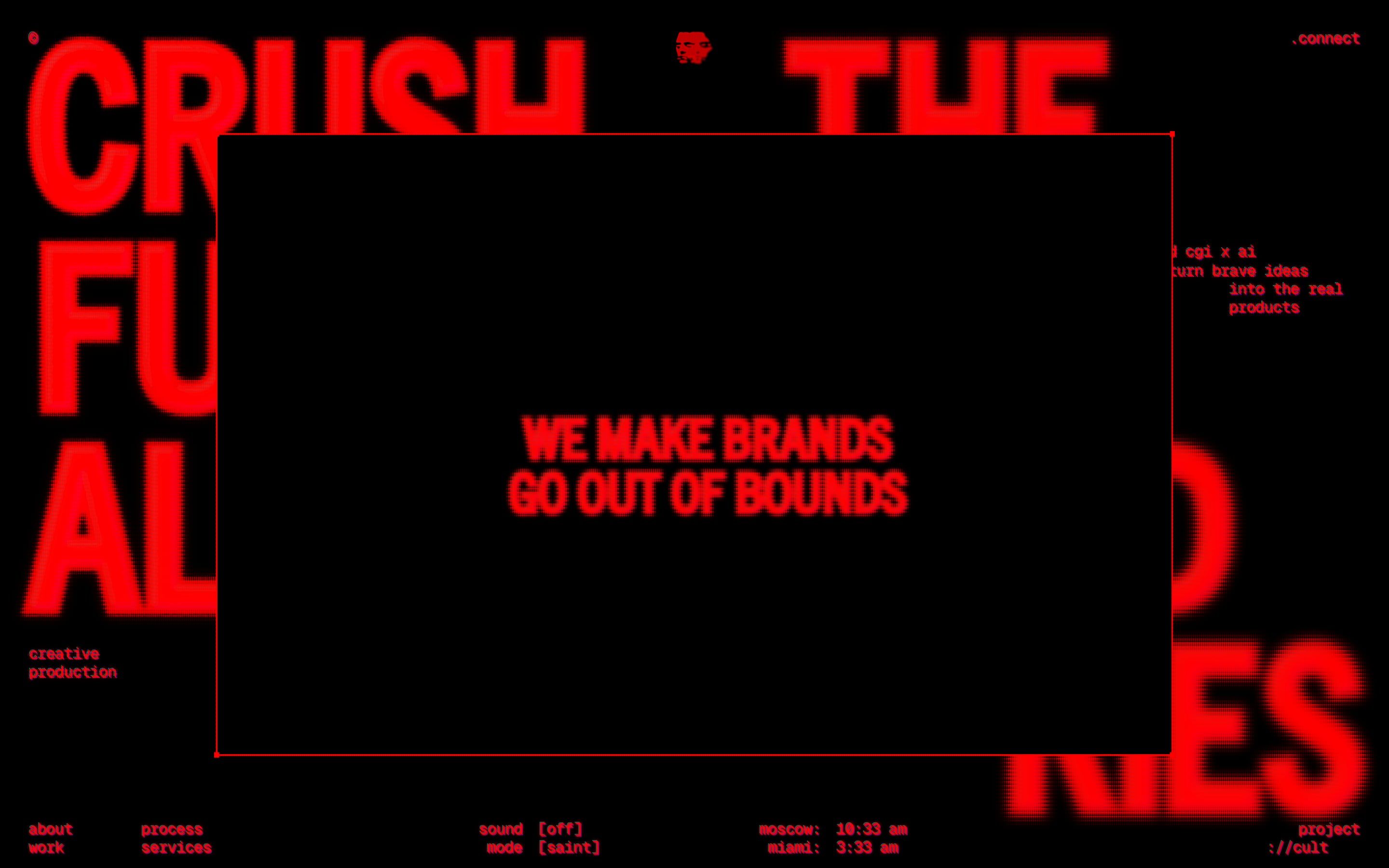
Everything is pure red, #FF0000, on black, with the small text in lowercase and full of terminal signs like «://» and «>>». There is also a second version, «crazy», switched on from the menu, that flips the colours: red background, black text, green videos. The titles are in Trade Gothic Next Condensed by Linotype, in capitals, with a thick outline of the same colour, a 2-pixel blur and an SVG noise filter that make them look swollen and glowing; the small text is in Geist Mono. Over the whole page run two layers of red, green and blue stripes, one horizontal and one vertical, blended in overlay mode: that is the cathode-ray-tube effect. Every box on the site, from the loader to the popups, the photos and the page transition, is the same SVG rectangle with a red outline and four 8-pixel squares in the corners.
Underneath there is hand-written HTML, CSS and JavaScript, with no framework: 34 scripts on the home page alone. The animations come from GSAP 3.12.5 with ScrollTrigger, the smooth scrolling is Lenis 1.3.4, with a duration of 0.9 seconds and the wheel multiplied by 1.2, switched off below 1024 pixels and on the iPad. WebGL is used in only two places; the rest is SVG filters, Canvas 2D and Web Audio. The site has an Awwwards Honorable Mention from 15 September 2026, but the award page shows only community votes and none from the jury: no score to report. In its awards section the site writes «awwwards / sotd»; on the Awwwards page, on 10 October, there is the Honorable Mention.
We take it apart in three moments, with a demo rebuilt from scratch for each, for three invented brands: drawings, copy and code are ours. From the site we took the ideas and, where we say so, the numbers.
The halftone that melts away
The project cards, at rest, are red rectangles full of black dots: where the picture is dark there is a dot, where it is light the red stays solid. Pass the mouse over one and the dots shrink one by one, in scattered order, the red fades and the full-colour render shows underneath.
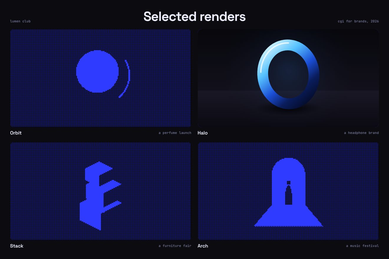
It is a canvas over each picture. The grid has cells as big as the card’s short side divided by 150, never less than 3 pixels: on a card 592 by 382 the cells are 3. The script reads the picture in small, at most 1024 pixels, and for each cell works out the brightness of its centre with the weights 0.299, 0.587 and 0.114; below 0.26 the cell gets a dot. Each dot has a wait between 0 and 1 taken from a hash of its row and column, so it looks random but stays the same when the window changes size. On hover a number goes from 0 to 1 in 240 milliseconds, in a straight line: the red is drawn with an opacity of 1 minus that number, and each dot stays full until the number passes its wait, then shrinks to nothing. When a card is at least 1200 real pixels wide, a WebGL shader does the same thing, with the waits written into a texture, one texel per cell. In the crazy version the colours swap: black background, red dots.
In our demo the studio is made up, Lumen Club, and the script paints the four renders: a ball, a ring, three boxes, a doorway full of sunset. We keep the shadows below the threshold, so the shape can be read even when covered. The field is ultramarine, the timing is half a second instead of 240 milliseconds, and a card also uncovers with a finger or the keyboard.
The crew that glitches
In the team section there is a red portrait cut into five boxes, a big one and four close-ups around it. On the left are the names; pick one and all the boxes break into strips sliding sideways and, when the noise is at its worst, another person is underneath.
As the section arrives every outline starts from zero width and height in its centre and grows to full size, while the four little squares fly from the centre to the corners: 0.6 seconds on power2.out. The photos pop up from scale 0 to 1 in 0.6 seconds on the curve 0.33, 1, 0.32, 1. The glitch lasts 780 milliseconds, 520 on narrow phones. The strength rises from 0 to 1 until half way and falls back to 0; on every frame a canvas copies the photo, then copies from itself up to 70 strips, each a random height and moved randomly up to 200 pixels times the strength, and last adds itself twice, moved right and left by 2 plus 10 pixels times the strength. Above 0.88 the canvas is fully opaque, and half way the photo underneath changes. The new pictures are loaded first, waiting two seconds at most. With the mouse the boxes move by 0.5, 1.2, 0.8 and 1.5 hundredths of the width, with a 0.3-second transition, and seem to stand at different distances.
Words between brackets
In the services section five huge words, Digital, Branding, Production, Support and contract, rise one after another through two square brackets. The word between the brackets is sharper, the others are blurred; as you scroll the brackets open, and as soon as you stop they close again.
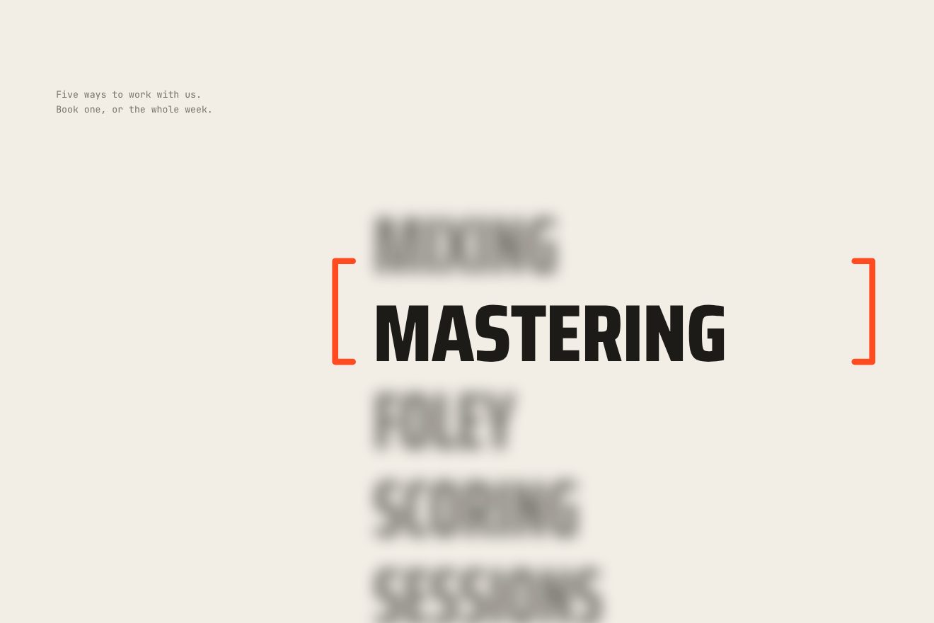
A tween tied to the scroll moves the words up by 21 hundredths of the width, from when 30% of the section reaches the middle of the screen to when 108% does. The word inside is the progress times five, rounded down: it gets a 2-pixel blur and the others 10, with a 0.55-second CSS transition on the curve 0.33, 1, 0.68, 1. The brackets are two SVGs. On every scroll event, while the section is on screen, they move apart by 1.6 hundredths of the width in 0.35 seconds on power2.out, and a 140-millisecond timer closes them again in 0.45. On a phone the words rise by 51.5 hundredths and the brackets open by 4.2. With reduced motion, or on a touch screen, brackets and blur are off.
In our demo it is a made-up sound studio, Low Tide Audio, on light paper, and the words scroll through a still stage. The word inside, besides getting sharp, widens a little thanks to the typeface’s width axis. We count the wait before closing in the frame loop instead of with a timer.
The other details
The loader is a joke, «pretend to load…». At two and at three seconds the corner squares blink five times and stay on; at three seconds the text starts typing, at 26 letters a second, and «project://cul» is left without its final t, with the cursor blinking. The counter starts at four seconds, one percentage point every 40 milliseconds. At six seconds the frame opens: from 0 to 0.35 in 0.28 seconds, a pause of 0.14 and then to 1 in 0.32, and the black disappears in 0.4. It ends at 7.14 seconds, when the counter is at about 78%: the 100% is never seen.
The titles condense out of blobs. Each goes through an SVG filter that blurs it by 50 pixels, 70 in the motto, and then multiplies the opacity by 255 and takes away 140: what is left are red blobs with sharp edges that merge into each other. On every frame the blur is multiplied by 0.92, or by 0.95, until it reaches 1, and the blobs shrink into the letters. The small text is typed at 26 letters a second, two more for each following line, with a block cursor. At the start of the scroll a black frame grows from 0 to 1 until it covers the title and shows «We make brands go out of bounds».
The menu holds two clocks, Moscow and Miami, a button for the music and the saint or crazy mode, which the browser remembers. The © sign at the top left opens a secret popup which, answering a question about Kanye West correctly, becomes a sampler: sixteen pads played with the keyboard, asdf and the other letters, through Web Audio, with at most 32 sounds at once. Over clickable things the cursor is a pixel hand in video-game style, with the middle finger raised. On the work page the strip of previews moves on a spring damped just right, worked out exactly on every frame, and it works with the arrow keys too.
Where it stumbles
Reduced motion is only partly there. It switches off the blobs in the titles, the brackets and the animated halftone, but the smooth scrolling, the seven-second loader, the typed text, the frame and the rest play the same. And with less motion requested, the line «We make brands go out of bounds» shows at once over the home page title.
The most recognisable effect does not reach everyone. On Safari, on computers and iPhones, and on any screen below 1024 pixels, the titles do not condense out of the blobs. And since the blur shrinks on every frame rather than with time, on a 120 Hz screen the effect runs twice as fast.
On a computer, the form’s send button cannot be clicked with the mouse: the page footer rises 10 hundredths of the width over the end of the section and covers it. We tried it at 1280, 1440 and 1920 pixels; with the keyboard it works. But the keyboard has its own problems: the secret popup and the contact popup open from elements the Tab key does not reach, and the form fields show no focus.
It weighs much more than you see. At load it is about 1 MB; after twenty seconds of doing nothing it is 10.8 MB. During the loader five videos come down, about 4.9 MB, the background music is downloaded, 3 MB, even with the sound off, and the secret popup’s samples, 1.6 MB, are downloaded and decoded before anyone opens it.
The privacy page holds the lines of a song rewritten as code and no information about data, while the forms ask for a name, an email or a phone number.
What we take away
A site can have one colour and one box and still be varied: here the red and the rectangle with the little squares come back everywhere, and each section does something different with them. And the most beautiful effects are the cheapest: the halftone is a 2D canvas with a few thousand circles in one path, the glitch is a canvas copying itself. WebGL only comes in when it is really needed.
The effects
- The halftone that melts awayEach render of a CGI studio sits under a flat field of colour, with a black dot wherever the picture is dark: at rest it looks like a halftone print. With the mouse over it the dots shrink one by one, each after its own wait, the colour fades and the full-colour render shows through; move away and the halftone comes back.Free
- Words between bracketsA studio’s services as a column of huge words scrolling through two brackets fixed in the middle of the screen: the word between them is sharp and wider, the others blurred. While you scroll the brackets open, pushed by every movement, and as soon as you stop they close again on the word.Free