Belgrade Arbor, by Square43 Studio
Belgrade Arbor, how it’s made: the canopy that changes shape, places on the tilted map and the view from above through the clouds
The site of Belgrade Arbor, a complex of homes and offices in New Belgrade, opens with a pencil drawing that turns into the building and tells the project as you scroll: photos cut into soft shapes that change shape, a 3D map of the surroundings, the site seen from above through the clouds. We take it apart with three demos rebuilt from scratch, in the minimal style.
The palette
- #FDFBEFthe vanilla white of the pages
- #2E3A26the pine green of the dark sections
- #A68150the gold of the logo and the headings
- #F4F0DBthe sand of the light backgrounds
- #314759the blue of the roots section
- #E7FD55the lime of the links on the green
Tap a colour to copy its code.
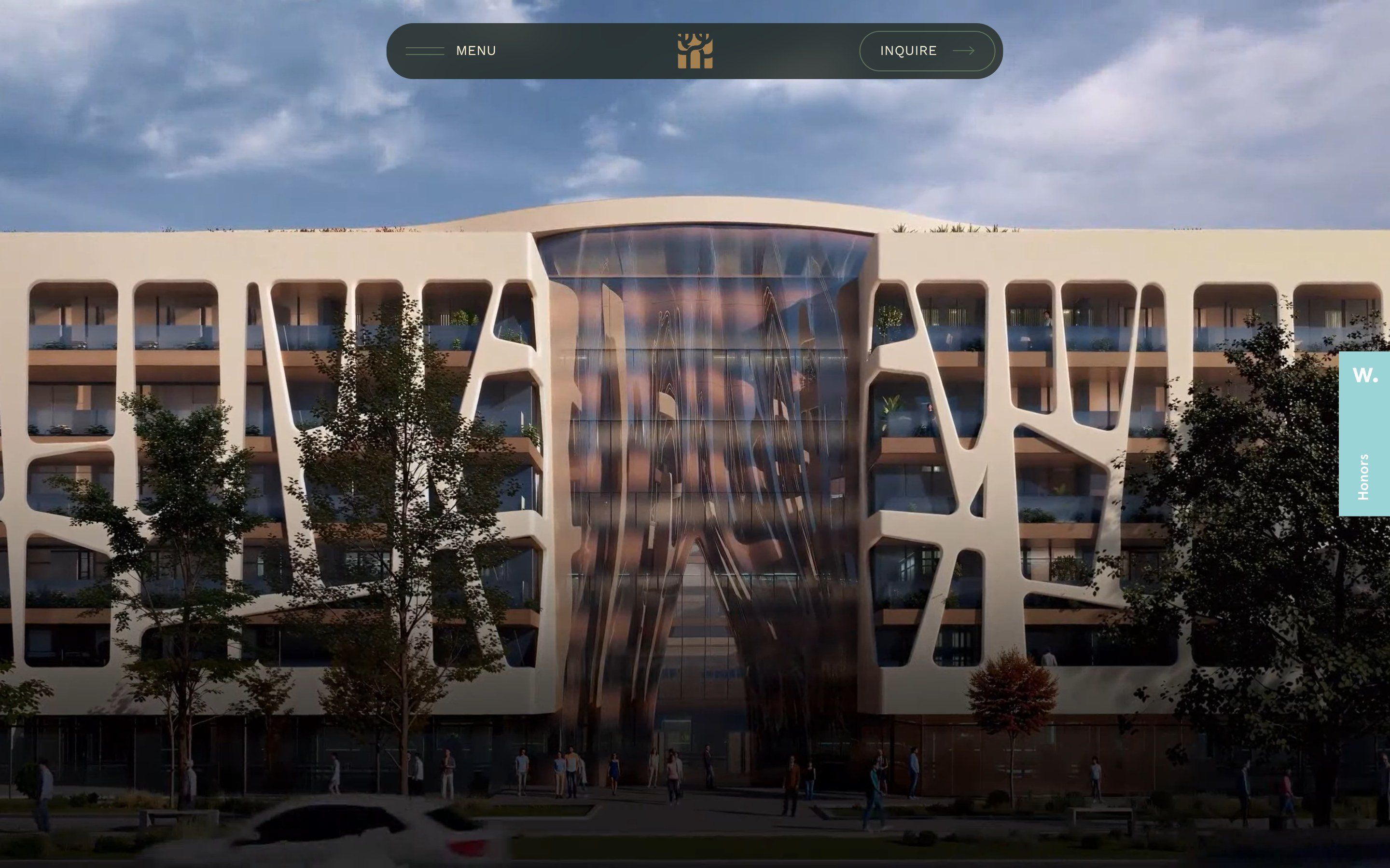
belgradearbor.rs is the site of Belgrade Arbor, a complex of apartments and offices in New Belgrade, with a facade the site describes as inspired by the shape of a tree crown. It opens with a video in which a pencil drawing of the facade becomes, piece by piece, the real building. Then it tells the project as you scroll: the design, the surroundings, the homes, the offices, the amenities, the view from above, the payment plan. The colours are a vanilla white, #FDFBEF, a pine green, #2E3A26, and the gold of the logo, #A68150; the headings are in a thin serif, PP Editorial Old, the rest in Work Sans. On Awwwards it is Site of the Day on 17 October 2026, with 7.22, and it scored 7.33 in the developers’ vote; it is signed by Square43 Studio.
It is built with Next.js 16.2, compiled with Turbopack and hosted on Vercel, with React 19 and translations by next-intl. The animations are GSAP 3.15, with ScrollTrigger, SplitText and MorphSVG; smooth scrolling is Lenis, with a duration of 2 seconds; the map of the surroundings is Three.js r184 with React Three Fiber. The galleries use keen-slider and the videos are plain video tags that only start when they come within 400 pixels of the screen.
We take it apart in three moments, with a demo rebuilt from scratch for each, in the minimal style, for a made-up residence, Linden Court: the shapes, the places, the plan and the code are ours. From the site we took the ideas and, where we say so, the numbers.
The canopy that changes shape
After the opening there is a section nine screens long in which the page stays still. On the right two photos cut into soft shapes, like leaves or crowns, turn from one shape into the next as you scroll; on the left three texts take turns: the facade inspired by the canopy, the complex that is not just another tower, and the big title, A New Chapter in Prestigious Living.
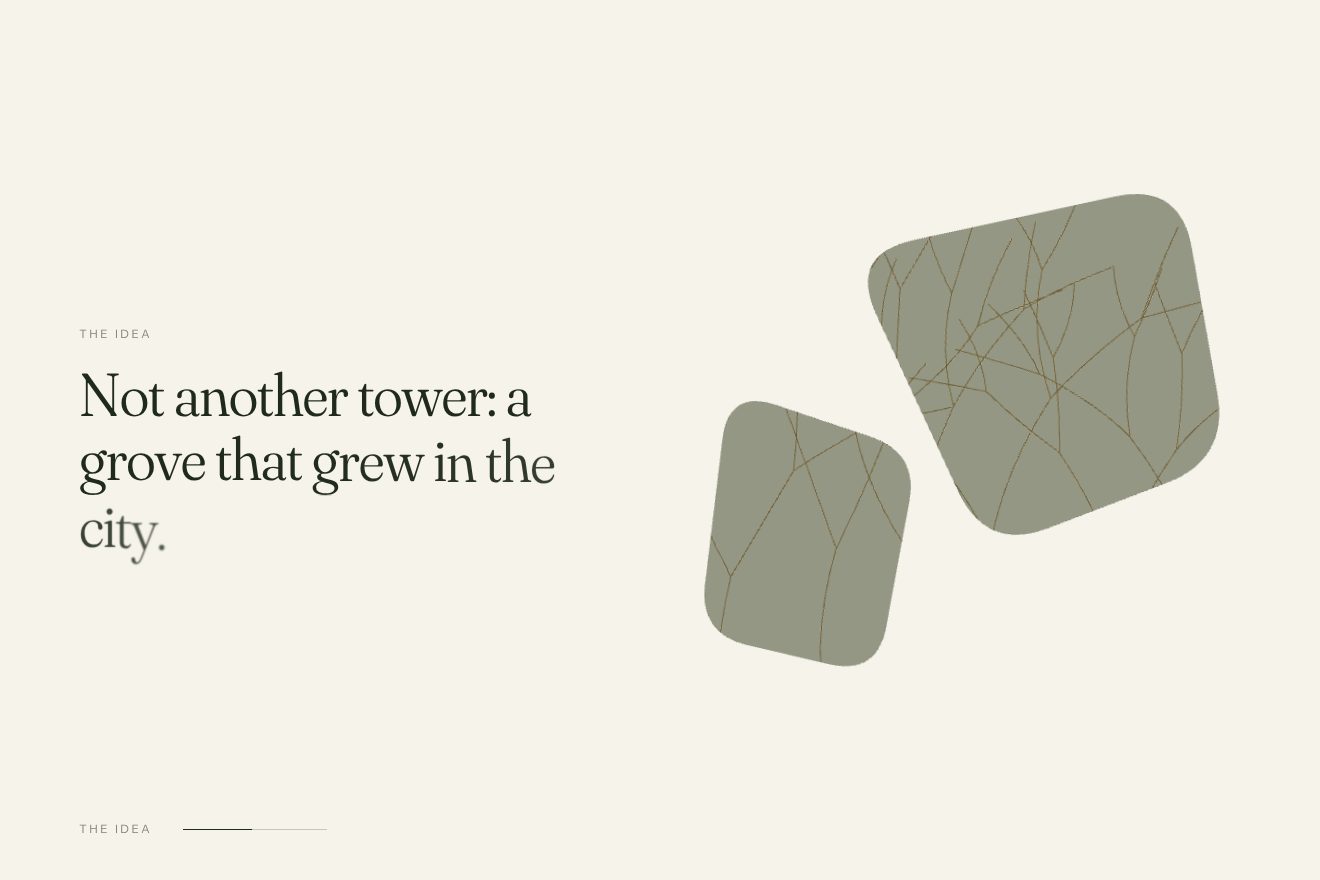
The whole section is a GSAP timeline tied to the scroll, with scrub: at the start the photos arrive from a 4 pixel blur and a scale of 1.1; from 0.15 of the run, for 0.33, the two clipPath paths change shape with MorphSVG, with ease none, while inside each shape two images swap and the frames change size. At 0.68 everything blurs again. The texts are not tied to the scrub: three ScrollTriggers switch three paused timelines on and off, at 0-22, 33-60 and 75-100 per cent, and at every change the letters rise 2rem out of a 4 pixel blur, in 0.7 seconds. At the bottom a line fills with the scroll, next to a counter going from 01 to 03; some leaves in the foreground sway 5 degrees back and forth, forever, in 4 seconds.
In our demo the frames hold a facade of branches in thin lines, which goes from day to evening, and the name of the statement takes the place of the counter. The change of shape with ease none from 0.15 of the run, the letters from 2rem and 4 pixels and the texts changed by stretches rather than by the scrub are the site’s; on top of that the letters arrive light and gain weight.
Places on the tilted map
In the surroundings section the list of nearby places is on the left, the station, a school, the West 65 and Airport City complexes, a food market, the airport, and on the right a street map in perspective with the places’ markers and a gold block that is the complex. Hovering a name lights the map up at that point.
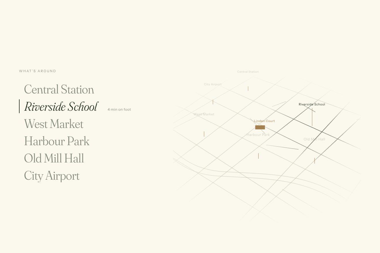
The map is a Three.js plane, 7 by 7, with the street image on it, laid back by 0.7 of a right angle and turned by 0.35 of a half turn. It follows the mouse slightly, by 0.02 and 0.03 radians at most, covering 0.08 of the way every frame. The light is a shader: a circle of radius 0.05 with a soft edge of 0.05 that lightens the map towards white at 0.9, and that switches on and off at 0.12 per frame. The map’s edges are faded by an SVG mask with a blur of 24, the markers are HTML elements that grow from nothing. In the list each name, on hover, rises and gives way to its italic copy; a 2 pixel bar slides to the item in 300 milliseconds, 80 per cent of the row tall, and the details come in over 220 milliseconds after 40. The map only exists above 1120 pixels: below it becomes a gallery to swipe.
In our demo the map is drawn in lines in an SVG and put in perspective with CSS, without Three.js; the light is a radial gradient mask over a second copy of the streets, and the markers are stems that stand up. The lean towards the mouse at 0.08 per frame, the name rolling into italics, the bar in 0.3 seconds at 80 per cent and the map uncovered from the top in 1.2 seconds are the site’s.
The view from above, through the clouds
Towards the end the title View from above comes in over an aerial photo of the complex, the section stops and, as you scroll, the photo slides sideways from one wing to the other, with the letters A and B on the roofs, while clouds pass in front.
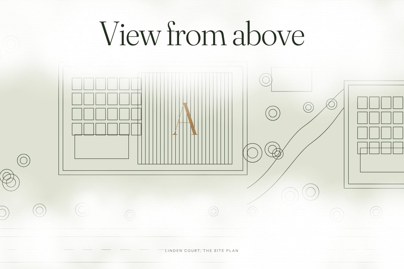
The section is pinned, and the run is twice as long as the part of the photo that does not fit the screen. On a computer all of it passes, below 1120 pixels only from 15 to 85 per cent and on a phone from 22 to 78; the slide is tied to the scroll with power1.inOut, so it starts and ends slowly. The clouds are three images that move by 10, 20 and 30 per cent, so at three speeds. The title’s letters come in rising 15 per cent from a 10 pixel blur, one every 0.04 seconds, in 0.6; further down they blur again and shrink to 0.7. At the start two vanilla curtains open towards the sides in one second.
In our demo the photo is replaced by a plan drawn in thin lines, with the wing letters in gold, and the clouds are painted once on three canvases. The run twice the part that does not fit, the shares for narrow screens, the slide with power1.inOut, the three layers, the title coming in and out of the blur and the curtains are the site’s.
The other details
The loader is a fake counter: a number goes from 0 to 100 in 2 seconds with power1.inOut, then the veil disappears in half a second. It does not depend on what is loading. Then the opening video starts, 2560 by 1440, fifteen and a half seconds; the title Belgrade Arbor appears only when the video ends, letter by letter, every 0.05 seconds.
The homes, offices and amenities sections all come in the same way: they are uncovered from the left with a clip-path in 1.7 seconds, while the background goes from 1.1 to 1, and 1.3 seconds later the box with the video is uncovered. The background photos are 20rem taller than the section and move down with the scroll. In the roots section the giant title Your roots arrives from the right, letters that start one screen away, in 1.7 seconds, and the images open inside drawn masks two seconds later, while the mouse moves the pieces at three different depths. Between one page and the next a pine green panel rises in one second and the page slides up by half a screen.
Where it stumbles
There is no reduced motion: prefers-reduced-motion never appears in the code or the stylesheets, so the nine-screen section, the clouds, the flying titles and the page panel move for everyone.
The title of the first screen is tied to the end of the video: it only shows after fifteen and a half seconds, and the fake loader in front adds two more. The opening video weighs 9 MB and has an audio track although it is muted; the section videos go from 5 to 6.6 MB.
The Three.js part weighs 878 KB, 231 compressed, and is downloaded on every device, even where the map is not there. The published site still holds Leva, the panel for adjusting the position of the map’s markers, hidden but ready, and the console warns about an element GSAP cannot find in the homes gallery. Some photos have copied alternative texts, Location even where the homes or the offices are shown.
What we take away
One idea, the canopy, kept in every piece: the soft shapes of the photos, the swaying leaves, the very name of the complex. And the rule of changing the text by stretches, not by the scrub: the frames follow the scroll to the millimetre, but a sentence is never left halfway, blurred, when you stop.
The effects
- The canopy that changes shapeThe scroll story of a residence, in the minimal style: two frames shaped like a tree crown, with a facade of thin branches inside, turn from one shape into the next as you scroll, and the facade goes from day to evening. On the left three statements, one at a time, rising out of a blur and gaining weight.Free
- Places on the tilted mapWhat is around a residence, in the minimal style: on the left the places, large; on the right a street map in thin lines, laid down in perspective. Pointing at a place its name rolls into italics, on the map a soft light glides there and its marker stands up.Free
- View through the cloudsThe site plan of a residence seen from above, in the minimal style: two curtains open, the title comes out of a blur, then the scroll holds the scene still and moves the plan, drawn in thin lines, sideways from one wing to the other, while three layers of cloud drift past at three speeds.Free