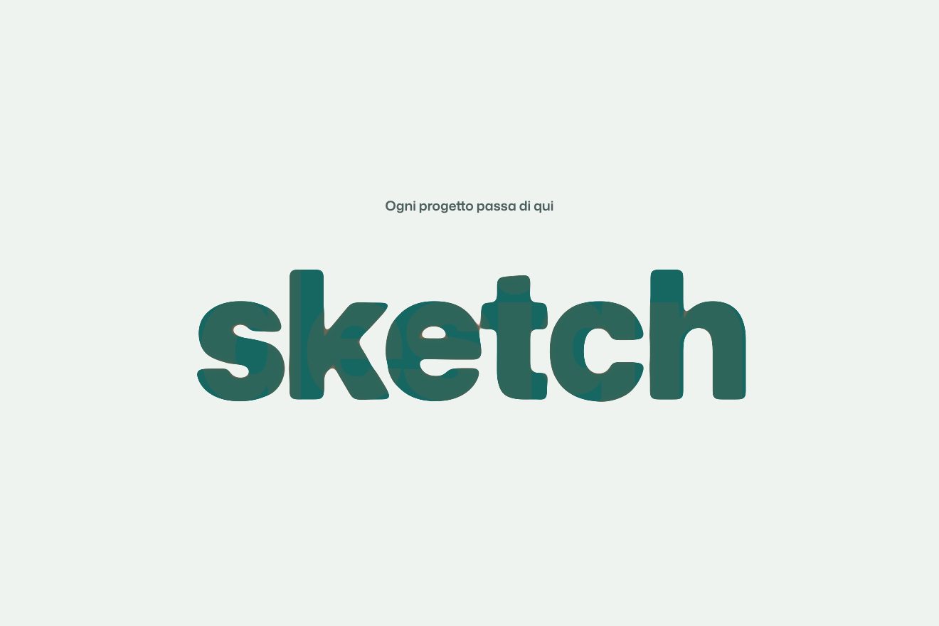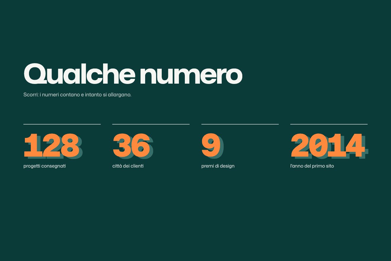
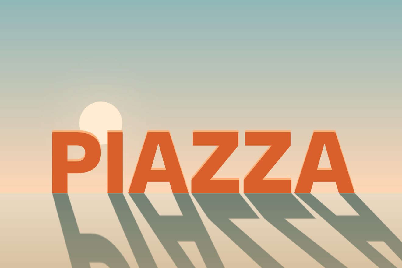
Standing letters with a long shadow
Text, Scroll, 3D
NewFree
A minimal-style text animation: a thin vermilion die presses a word, letter by letter, into a thick paper card. The letters have no colour, they are pressed paper you only see through the shadow and light on their edges; at every strike the paper gives with a spring and the letter gains weight. Last of all the period, the only thing in foil.
A folder that runs on its own: index.html, style.css, script.js and the libraries from a CDN. The React and Vue tabs hold the same demo as a ready component, which switches its animations off when it leaves the page.
<!doctype html>
<html lang="en">
<head>
  <meta charset="utf-8">
  <meta name="viewport" content="width=device-width, initial-scale=1">
  <title>The blind-pressed word</title>
  <link rel="stylesheet" href="https://cdn.jsdelivr.net/npm/@fontsource-variable/fraunces@5.3.0/full.css">
  <link rel="stylesheet" href="style.css">
</head>
<body>
  <main class="stage">
    <!-- the card: the outer box is moved by GSAP, the sheet inside carries the paper and its shadow -->
    <div class="card" data-card>
      <div class="card__sheet" data-sheet></div>
    </div>

    <!-- the word: the script writes one box per letter, then the period in foil -->
    <h1 class="word" data-word aria-label="relief"></h1>
  </main>

  <script src="https://cdn.jsdelivr.net/npm/gsap@3.15.0/dist/gsap.min.js"></script>
  <script src="script.js"></script>
</body>
</html>Change values, colours and text with the controls and watch the animation respond live. Or write in the code yourself. Then download the folder with your changes.
13 values to change
With the Animorio connector, Claude Code takes it from here, guide included, and fits it into your project. Paste this request:
Take “The blind-pressed word” from Animorio and fit it into my siteEvery letter is the same colour as the card: you only see it through two text-shadows, a dark one shifted up and to the left and a white one down and to the right, like a hollow lit from the left. A single value, the depth, sets how far the shadows move (in proportion to the font size), their blur, a hint of darkness in the colour and Fraunces’ SOFT axis, which hardens as the letter is pressed.
Fraunces has no width axis, and when a letter gains weight it widens and pushes its neighbours. So every letter gets a box as wide as itself at its heaviest weight, measured with measureText on a canvas in the same face, and the glyph sits in the middle: the weight changes and no letter moves.
The GSAP timeline moves numbers, not pixels: which letter the die is on (even halfway between two), how high it is lifted, how far it is widened over the whole word. A function on the ticker turns those numbers into the frame, reading the letter boxes and the baseline (a zero-height box aligned to the baseline): if the window changes size halfway, the die stays on the right letter.
Every strike is a group of tweens at the same instant: the depth overshoots its mark in 70 milliseconds and comes back with an elastic.out, the weight rises with a power2.out, the box squashes by a hair and comes back, the card drops a pixel and a half and its shadow tightens. The letters already pressed get a small extra knock, divided by the distance and staggered by 30 milliseconds.
The period has its own, lighter weight, because filled with colour it would look like a disc. The die centres on the period’s ink, not its box: measureText says where the glyph sits (actualBoundingBoxLeft and Right, Ascent), and the frame becomes a small square around it.
| Name | File | Default | What it changes |
|---|---|---|---|
WORD | script.js | 'relief' | The pressed word (up to 10 letters). |
DEPTH | script.js | 1 | How deep the impression is: 0.5 barely marked, 2 pressed deep. |
PRESS | script.js | 0.4 | Seconds between one strike of the die and the next. |
SPRING | script.js | 1 | How much the paper bounces after the strike: 0 stops dead, 2 trembles for longer. |
LIGHT | script.js | 330 | The weight of the letter when the die touches it (100 to 900). |
HEAVY | script.js | 600 | The weight of the letter once fully pressed (100 to 900). |
FOIL | script.js | true | The final period in vermilion foil. |
REST | script.js | 2.6 | Seconds the word stays pressed before the paper relaxes. |
For a headline or a wordmark that should feel touched by hand: the opening of a stationer’s, a print shop’s or a design studio’s site, wedding invitations, the page of an elegant hotel or of a restaurant with a blind-pressed menu, an all-white portfolio.
The same animation with the sizes adapted: the card is taller in proportion than on a computer, the word fills its width and the shadows get shorter with the font size.
Nothing moves: the card and the word already pressed, with its foil period, fade in and stay still.
GSAP 3.15.0, Fraunces (font variabile) 5.3.0.
Compressed with gzip, the three demo files weigh 6.4 KB; the libraries: GSAP 28 KB.
Tested on 19 October 2026
Use it in your own projects and in your clients’ projects. Do not resell it or redistribute it as is. GSAP stays under its own Standard license. Full license.
With your account’s email and password.
or with your email
You’re signed in as .
With your account, you can download the zip of every animation and every pack, for free.